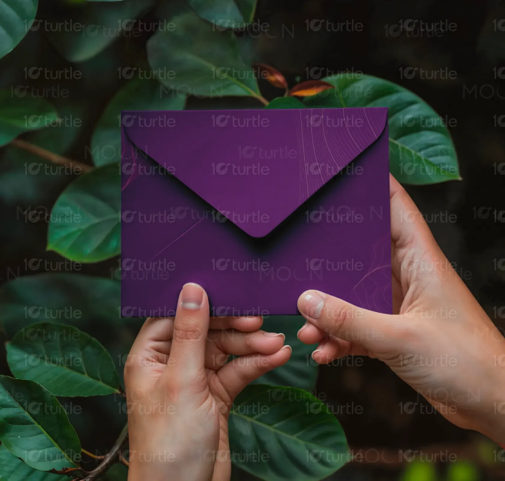
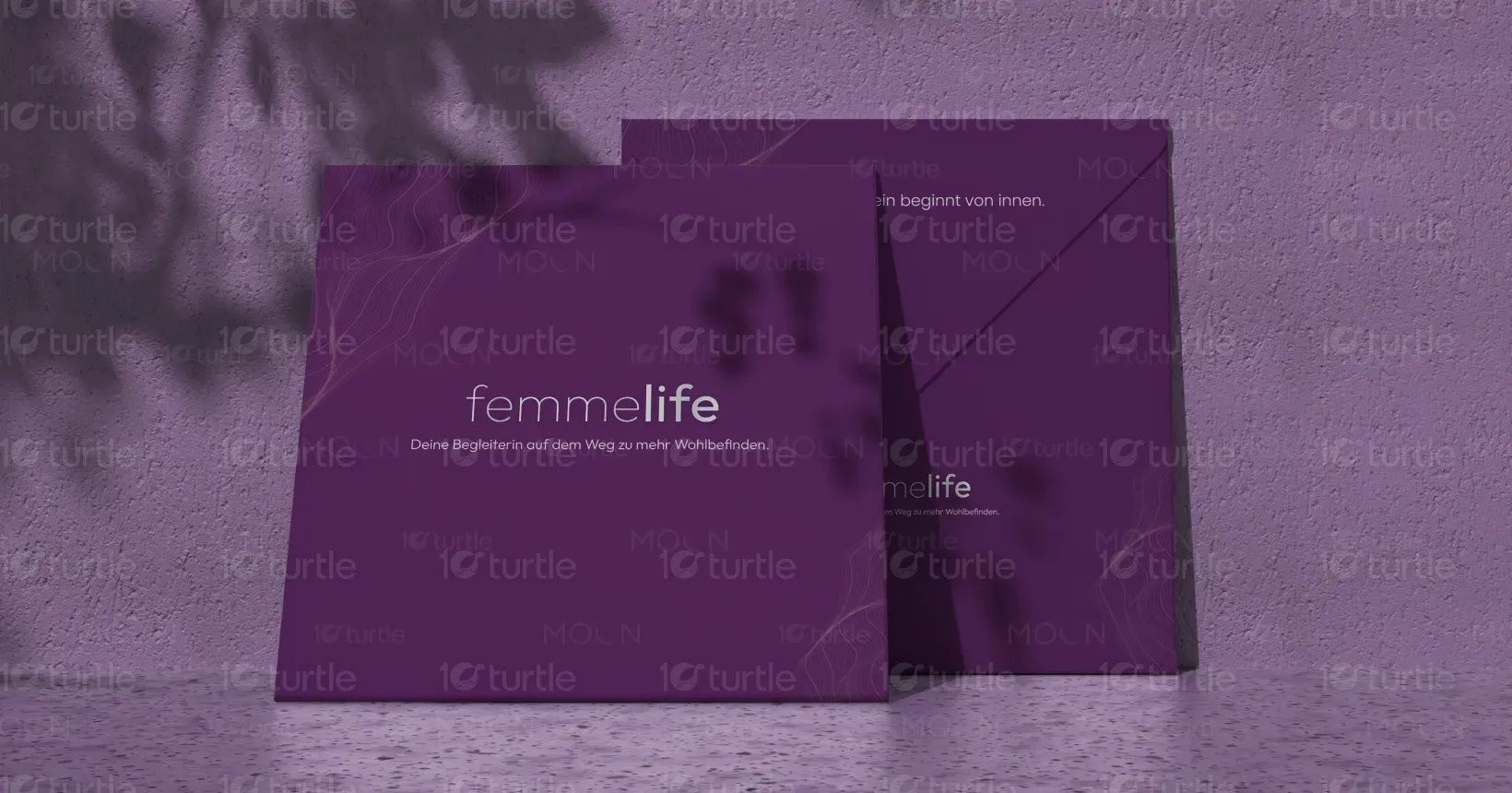
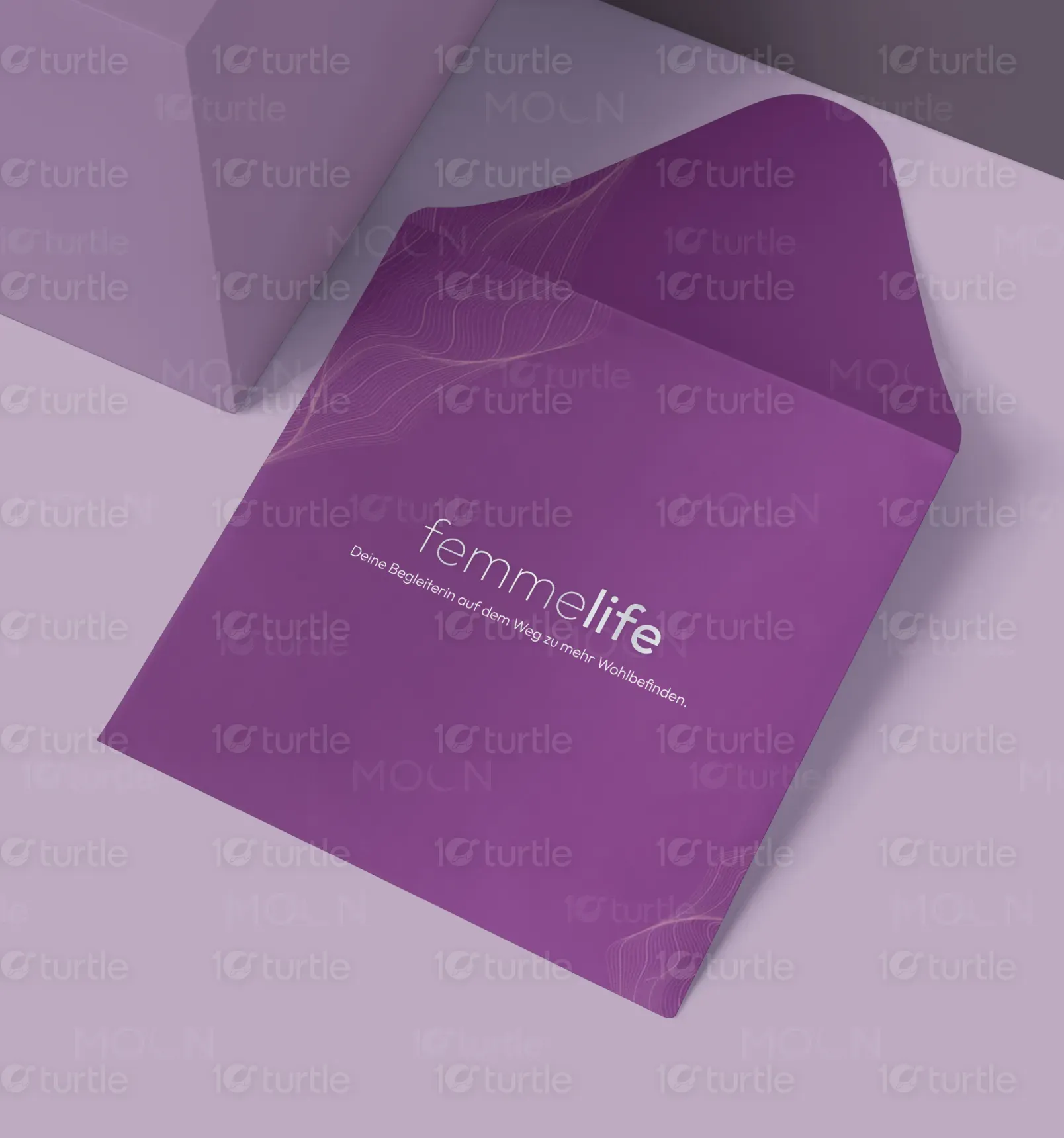
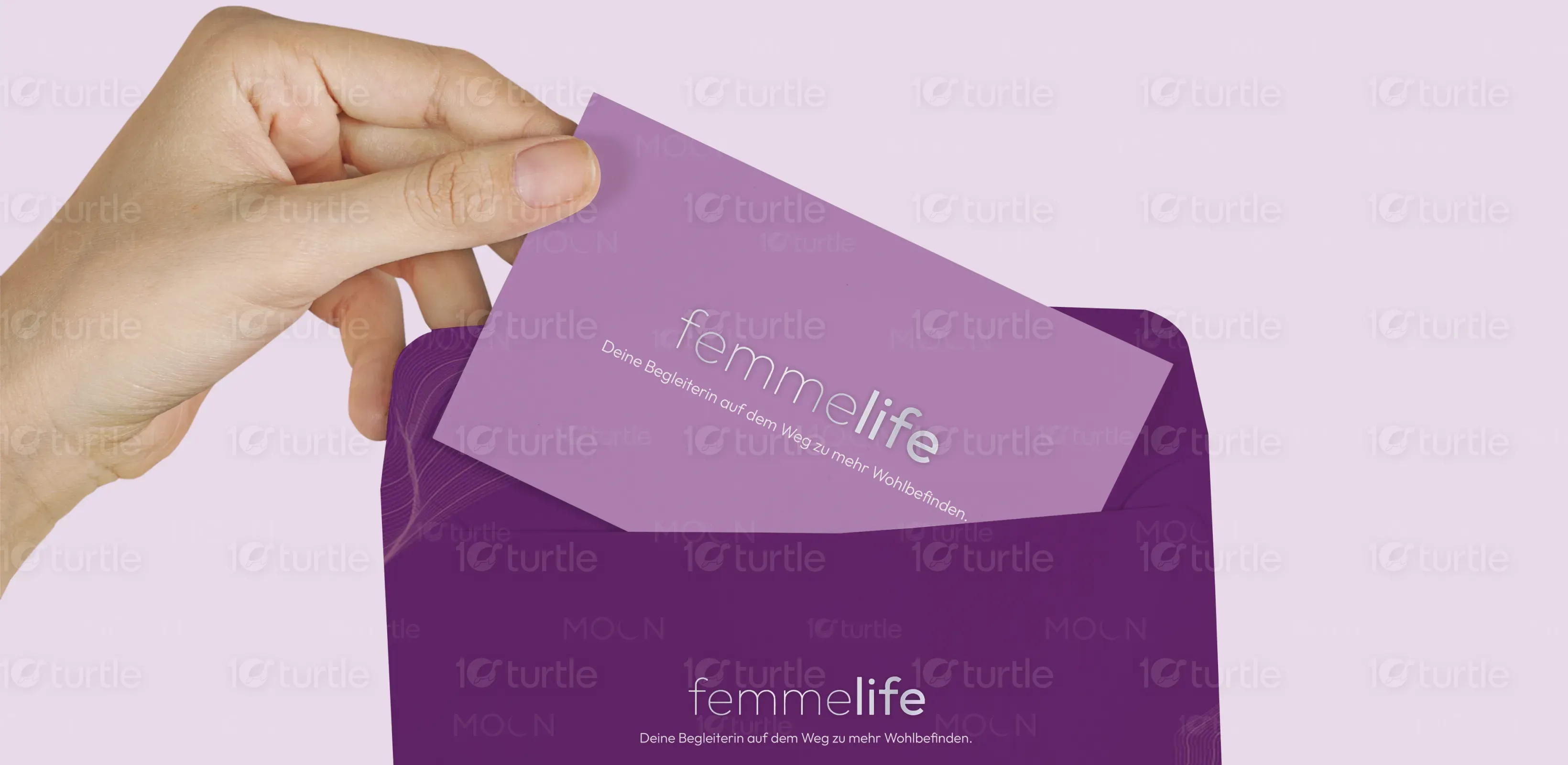
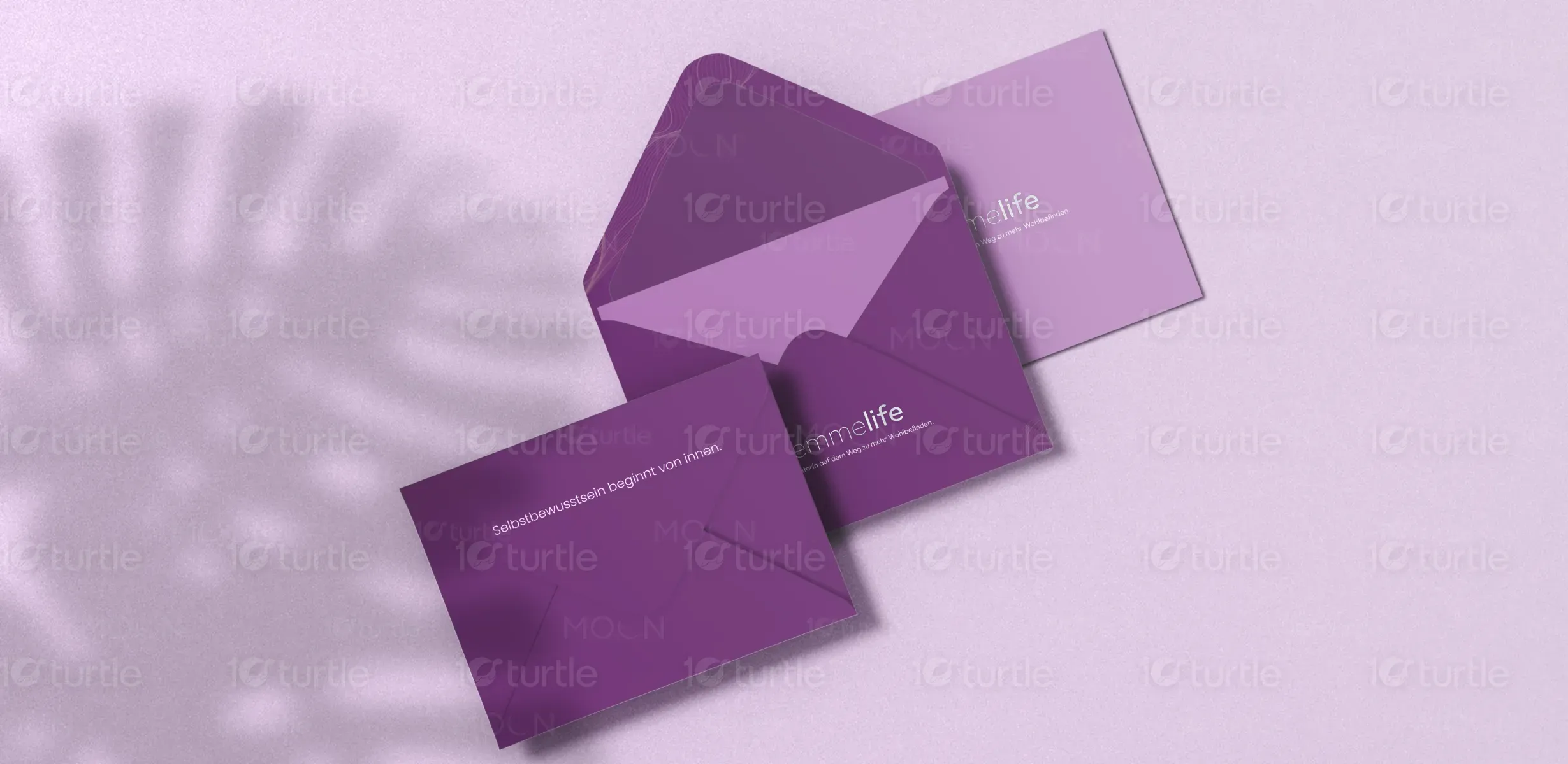
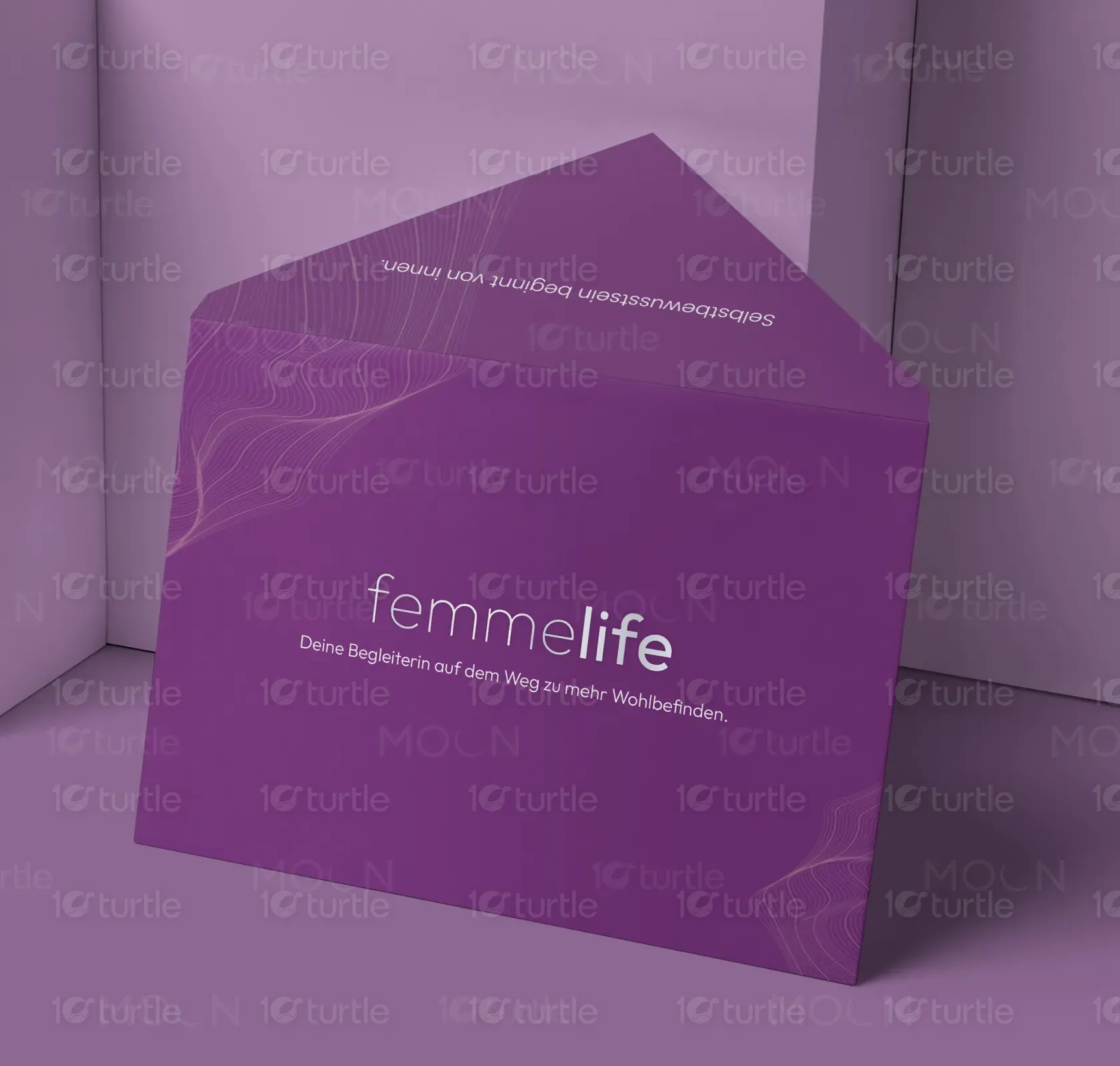
FEMME LIFE is a bespoke envelope design project that redefines luxury stationery through minimalist aesthetics, sustainable materials, and thoughtful craftsmanship. It perfectly balances high-end appeal with environmental responsibility, setting a new standard for premium brand communication.
Graphics Design
Industry
Creative Technology
Tools we used


Project Completion
2025
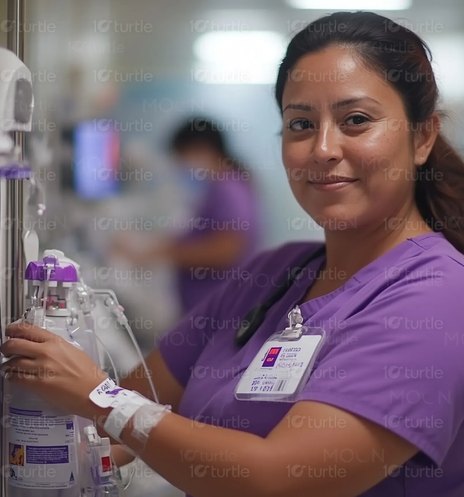
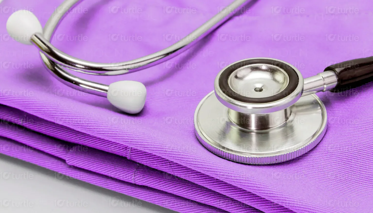
Key Market
Luxury Goods
FEMME LIFE delivers a high-end envelope solution, masterfully blending a minimalist, premium aesthetic with unparalleled sustainability. Crafted from eco-friendly paper with a matte finish, it conveys sophistication while prioritizing environmental stewardship.
Industry
Creative TechnologyWhat we did
Brand Identity DesignPackaging GraphicsTypography SelectionPlatform
-The luxury stationery market faced a significant void: products either excelled in aesthetics at the expense of sustainability or offered eco-friendliness without premium design. Brands struggled to find elegant packaging solutions that simultaneously met growing demands for environmental responsibility, leaving them to compromise on either style or ethics.
We designed FEMME LIFE as the definitive answer, a high-end envelope that masterfully marries luxury aesthetics with responsible material choices. Its minimalist design, monochromatic palette, and metallic accents convey premium appeal, while its eco-friendly paper and tactile matte finish ensure a sophisticated, sustainable product. This solution provides discerning brands with an unmatched packaging experience that stands out in a crowded market.
Our vision for FEMME LIFE was to craft a visual identity that speaks to understated luxury and conscious consumption. We aimed for a design that feels both exclusive and responsible, where every line, texture, and detail contributes to a cohesive narrative of modern sophistication. The goal was to establish a benchmark for premium, eco-conscious design in the stationery sector.

The brand assets for FEMME LIFE embody a commitment to minimalist design and premium quality. Our focus was on creating a visual language that is both distinct and versatile, suitable for high-end applications while maintaining a cohesive and sophisticated presence.
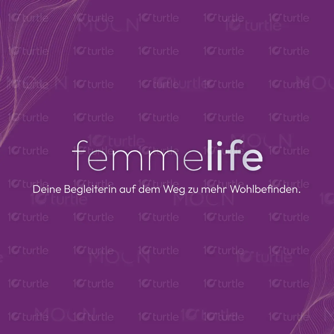
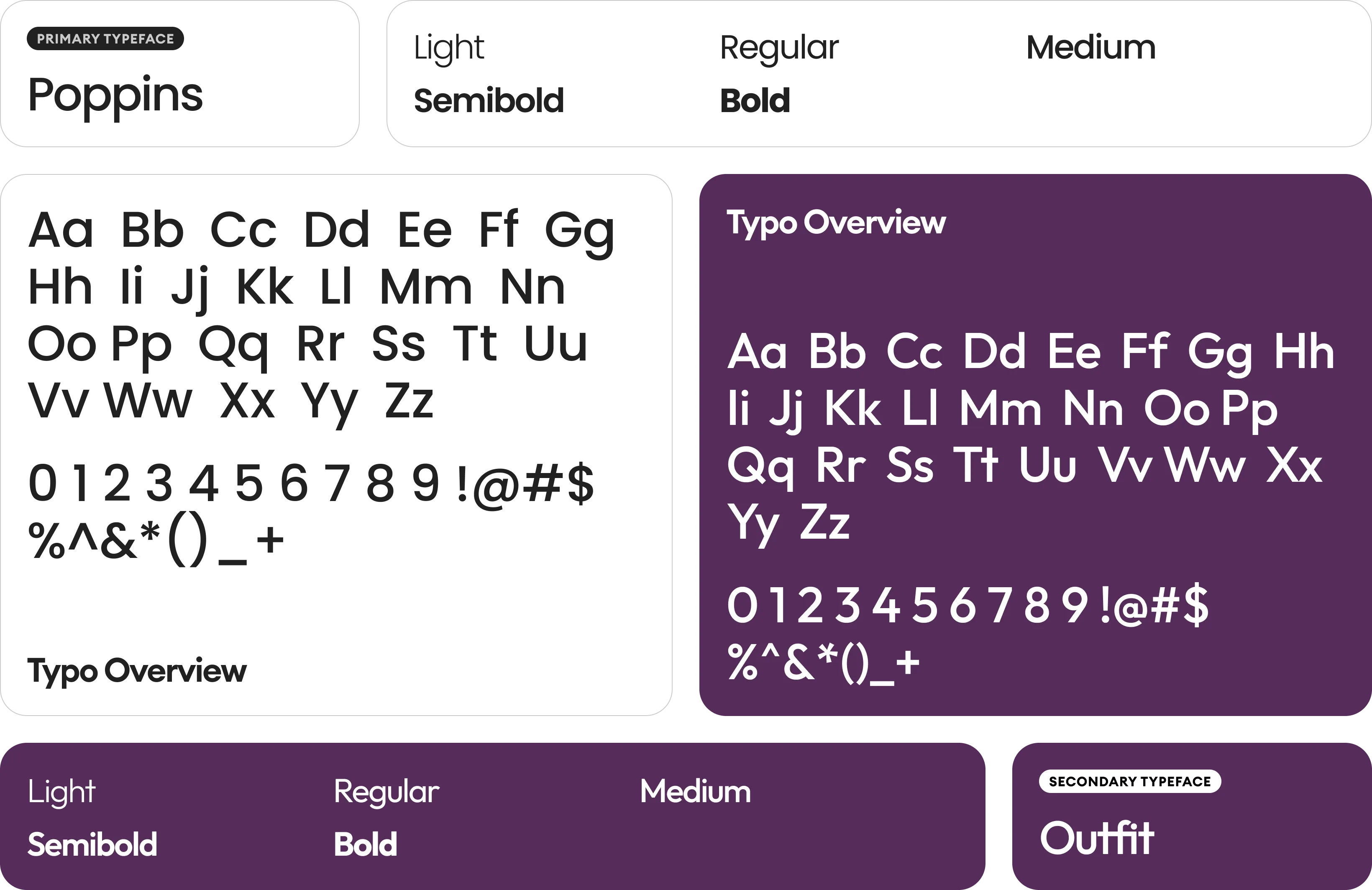
Our typographic strategy focused on elegant, clean sans-serif typefaces to complement the minimalist design. We selected fonts that offer excellent legibility and a refined aesthetic across various weights, crucial for conveying a premium feel in both formal and luxury contexts. This approach ensures the brand messaging is delivered with clarity and sophisticated impact.

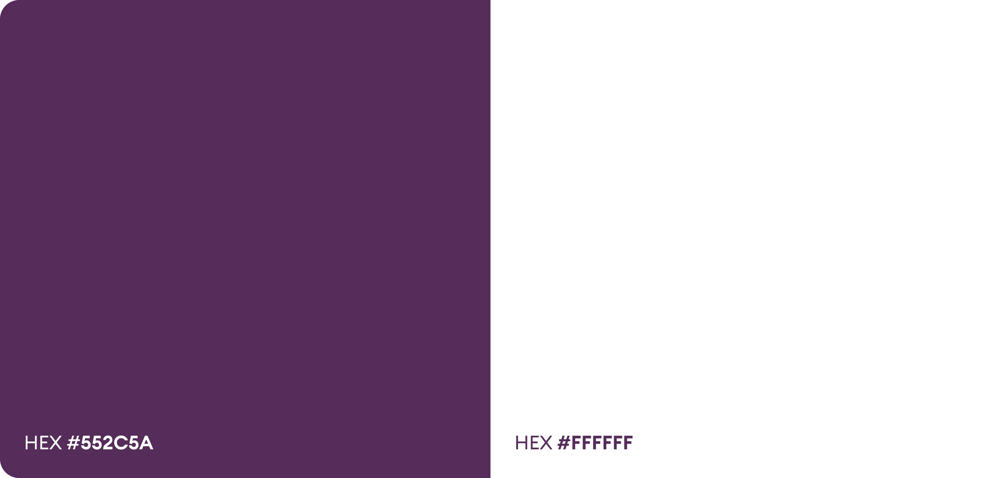
The FEMME LIFE palette embraces a sophisticated monochromatic scheme, augmented by subtle metallic accents. This choice reinforces a modern, high-end appeal, allowing the quality of the materials and typography to truly shine. It evokes a sense of timeless elegance and understated luxury.