This presentation design blends clarity with elegance through a minimalistic, grid-based layout and strong visual hierarchy. Clean sans-serif typography ensures readability, while subtle animations and transitions enhance engagement without distraction. Strategic use of whitespace, icons, and modern graphic elements help break down complex information into digestible content. The overall aesthetic is refined and professional, designed to resonate across industries—from startups to corporate sectors—ensuring that every slide communicates with impact and consistency.
PPT Design
Graphic Design
Industry
Finance, Legal & Insurance
Tools we used


Project Completion
2025
Key Market
Global
This presentation design is a versatile and impactful communication tool created to elevate business pitches, product overviews, or educational content. It serves as a visual storytelling medium that merges aesthetics with function. With consistent slide formatting, customizable layouts, and a brand-aligned look, it ensures that key messages are both clear and compelling. Ideal for modern brands and professionals, its unique selling points include flexibility, cohesive structure, and visual polish that enhances credibility in any setting.

Industry
Finance, Legal & InsuranceWhat we did
PPT DesignGraphic DesignPlatform
-Many presentation templates in the market are either too generic or visually overwhelming—resulting in poor engagement, brand inconsistency, and unclear messaging. Presenters often struggle to find a balance between informative slides and visual appeal. Whether it's cluttered layouts, poor font choices, or mismatched color schemes, these design flaws often lead to lost attention, reduced impact, and difficulty in conveying complex data or concepts.
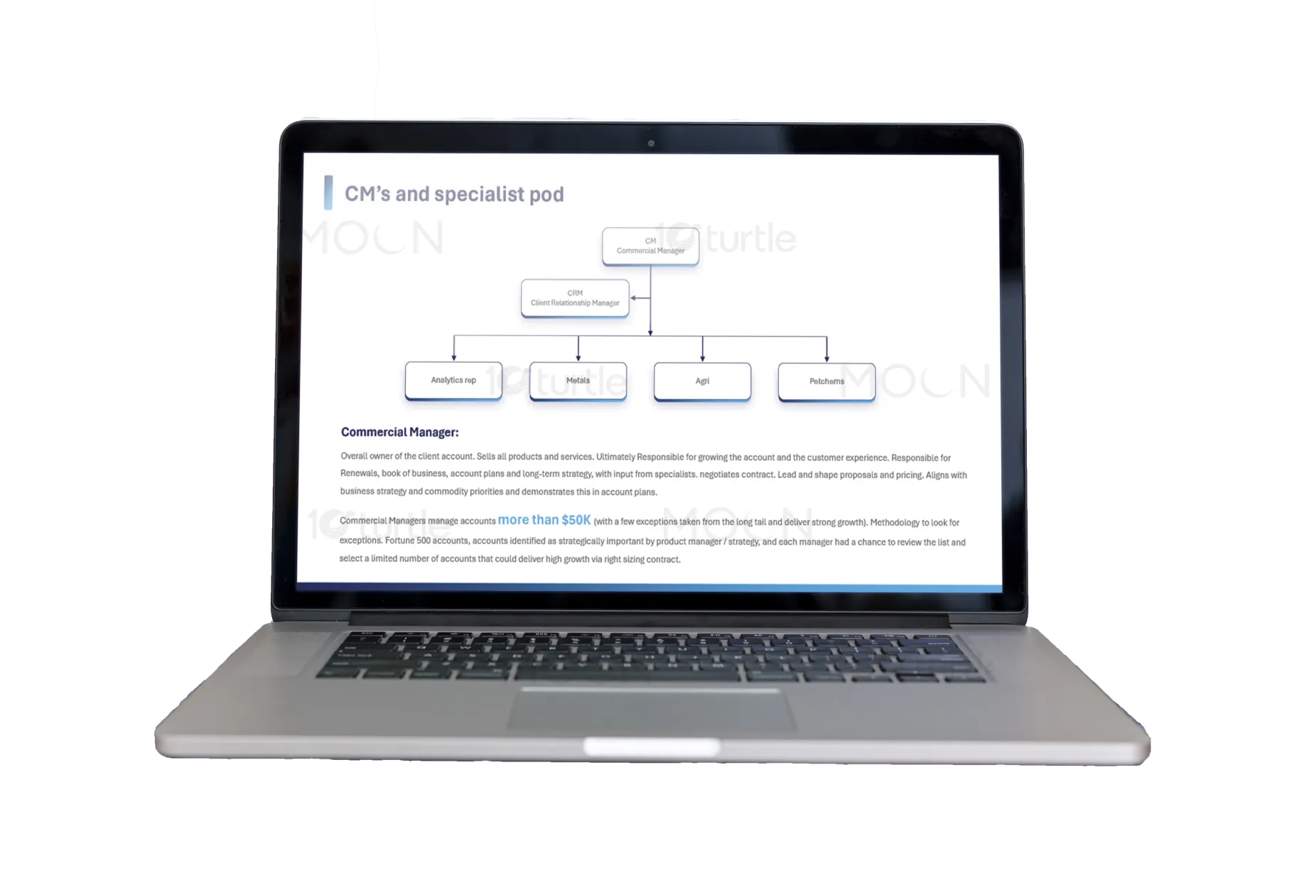
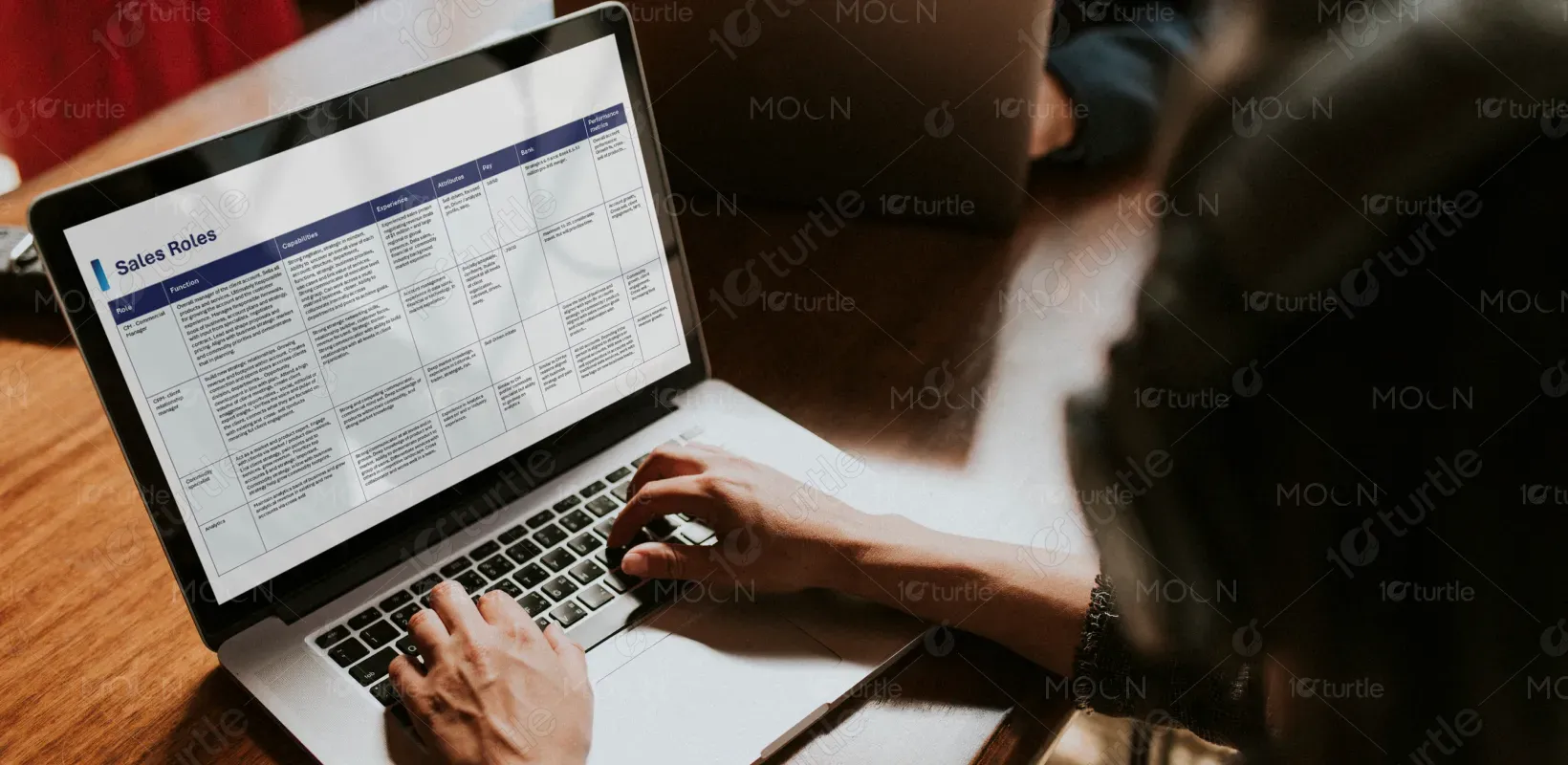
This design addresses those challenges through a clean, branded framework that prioritizes readability, alignment, and visual storytelling. Each slide is thoughtfully designed with modular sections that accommodate content variety—from data visualizations and timelines to image highlights and callouts. The use of modern icons, intentional spacing, and intuitive flow guides the viewer’s attention naturally. It allows for quick content input without compromising design integrity—making it highly functional for teams and solo presenters alike.
The long-term vision is to establish this presentation as a go-to tool for powerful storytelling and brand expression. Whether used in boardrooms, webinars, or investor meetings, the design is meant to adapt and scale with evolving communication needs. It aims to set a new standard in professional presentation design—where aesthetics and strategy work together to create lasting impressions and spark meaningful conversations.
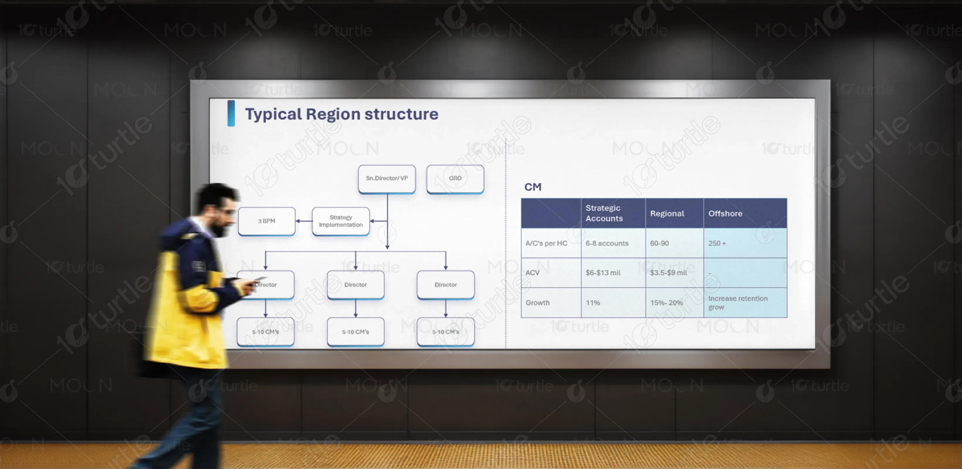


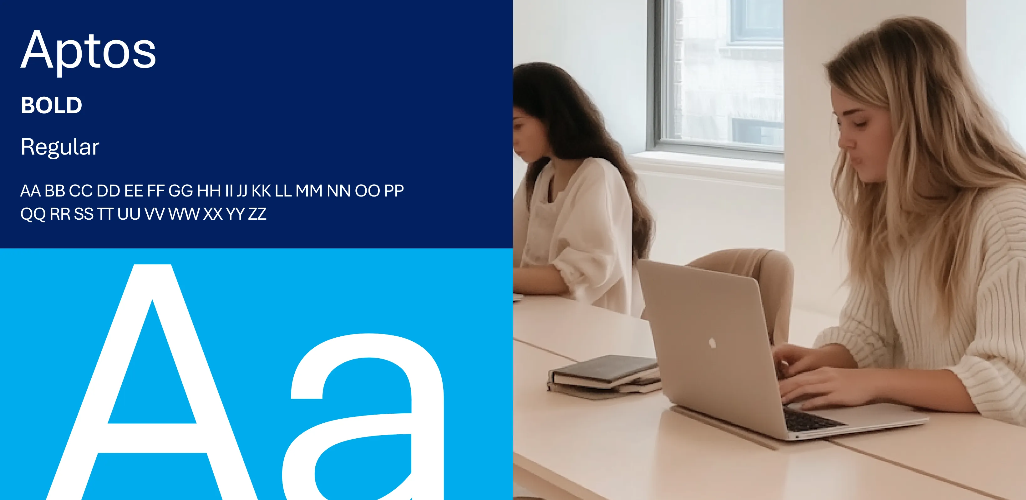
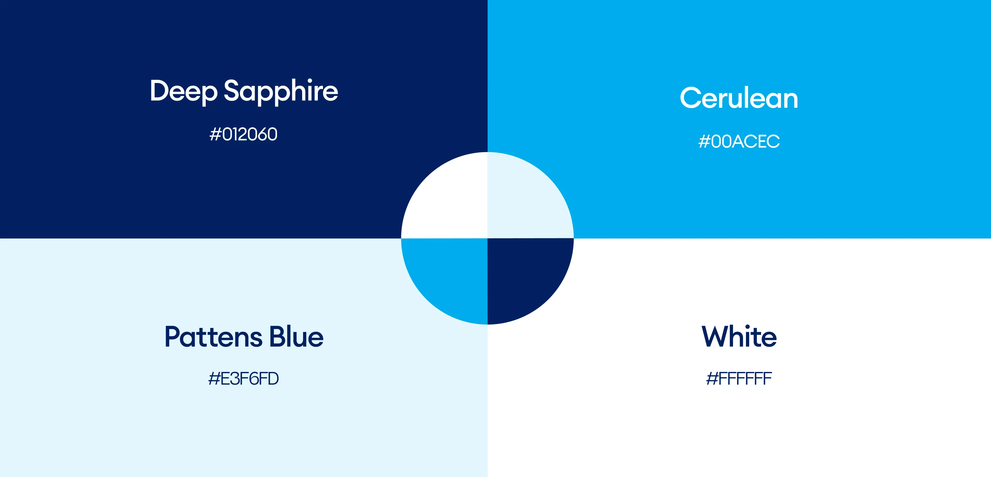
The color palette features a blend of neutral tones—such as soft grays and whites—complemented by a bold accent like navy blue, emerald green, or muted gold. This approach creates a sophisticated and modern feel while supporting readability and focus. The accent color highlights key messages or data points, guiding the audience through the narrative. The palette aligns with brand professionalism, evokes trust and clarity, and provides visual consistency across slides and platforms.