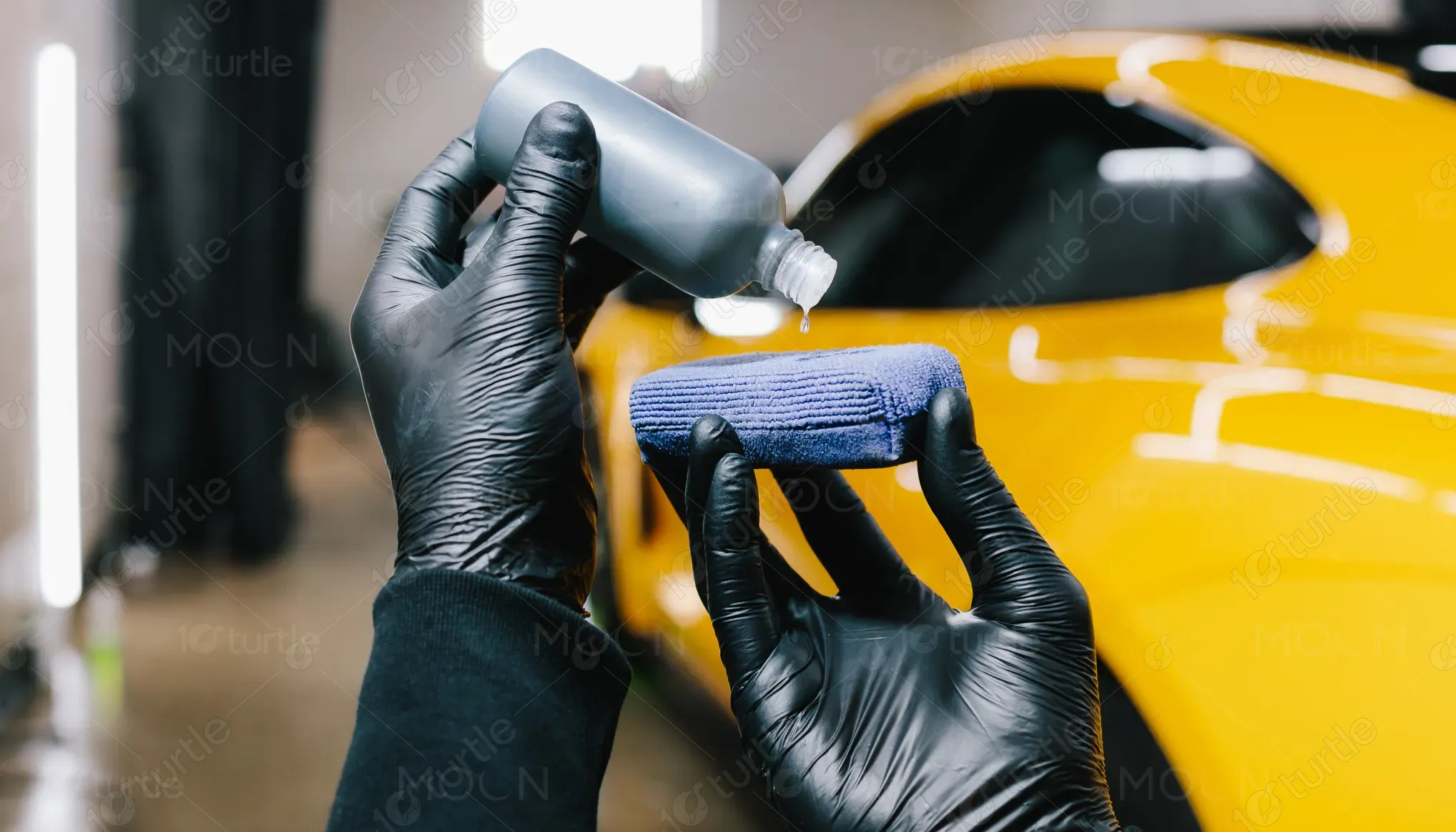
The design follows a premium, automotive-focused visual system that balances technical credibility with a refined luxury aesthetic. A dark, high-contrast layout establishes trust and professionalism, while structured sections guide the reader smoothly through information. Bold typography creates a clear hierarchy for headings, benefits, and process steps, ensuring fast readability in both print and real-world handling. High-quality car imagery and product visuals reinforce authenticity and performance, while accent graphics and clean line work support clarity without clutter. The overall approach prioritizes precision, consistency, and visual confidence, matching the expectations of a high-end automotive audience.
Flyer Design
Graphic Design
Industry
Transport, Automotive & Logistics
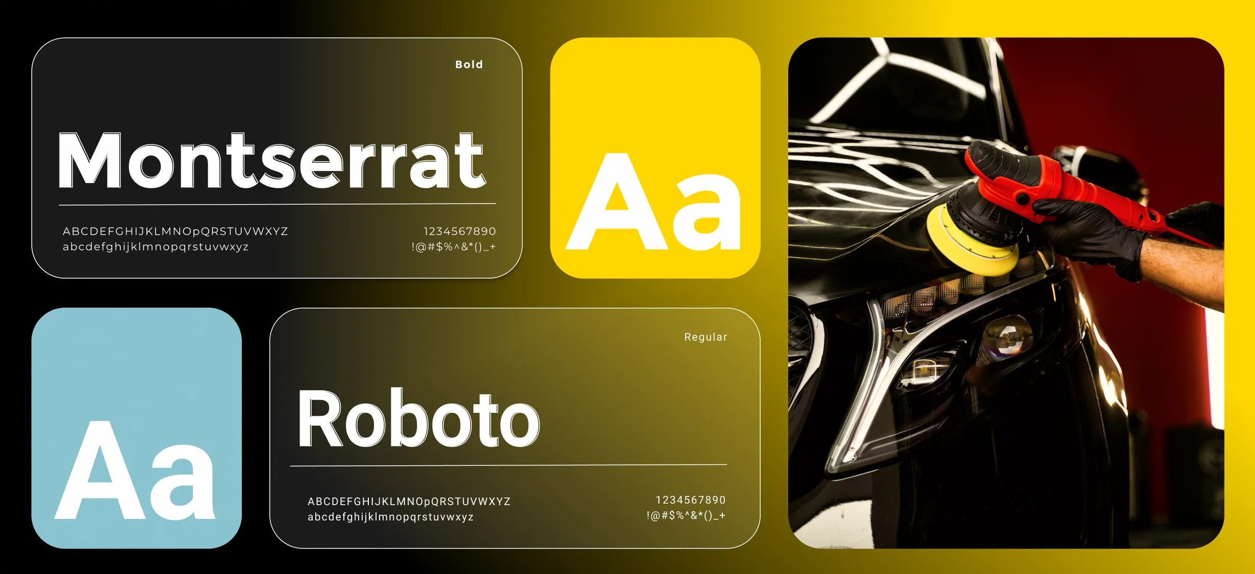
Tools we used
Project Completion
2025
Key Market
Global
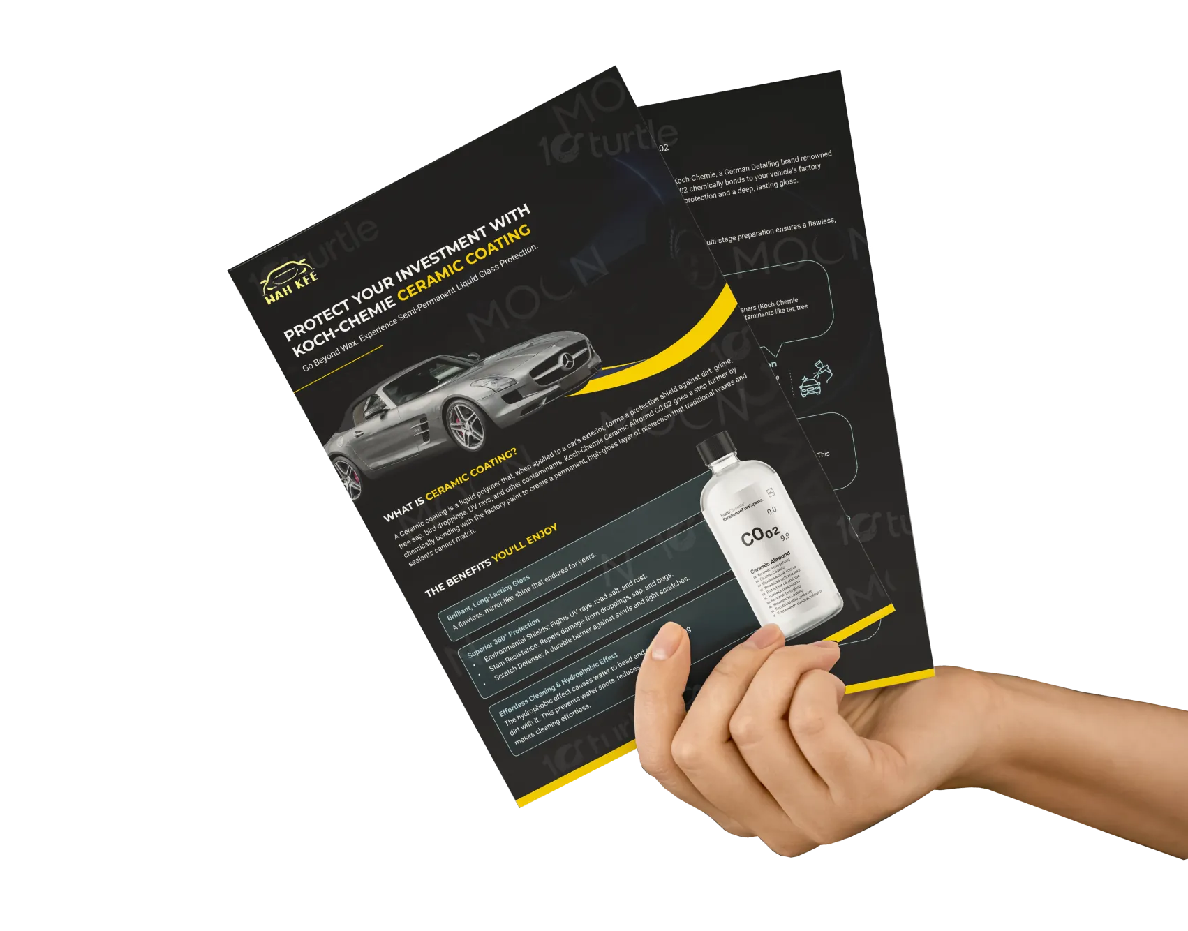
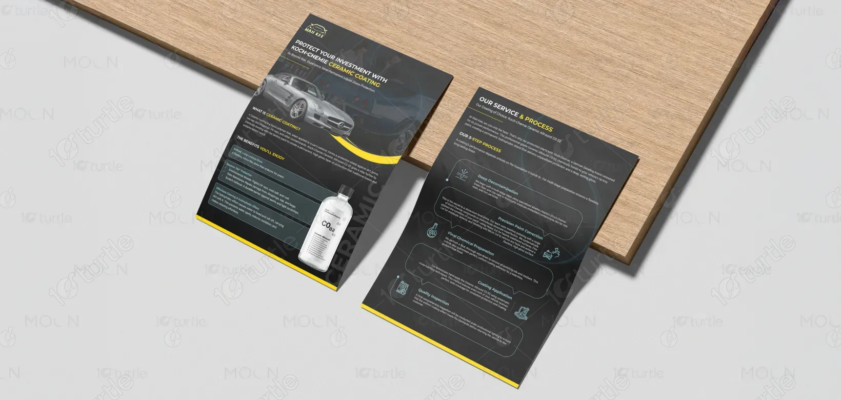
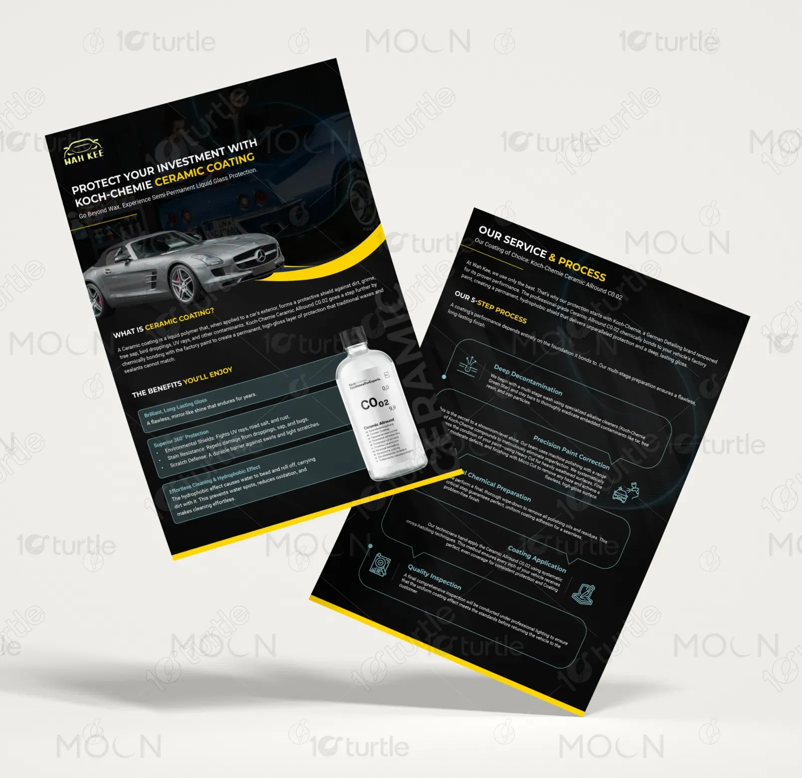
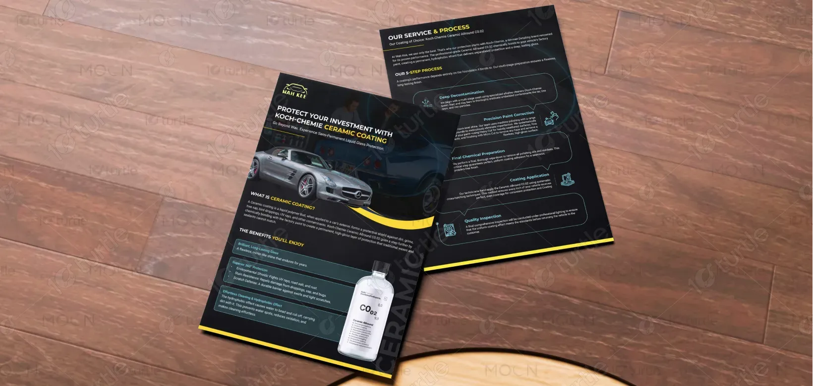
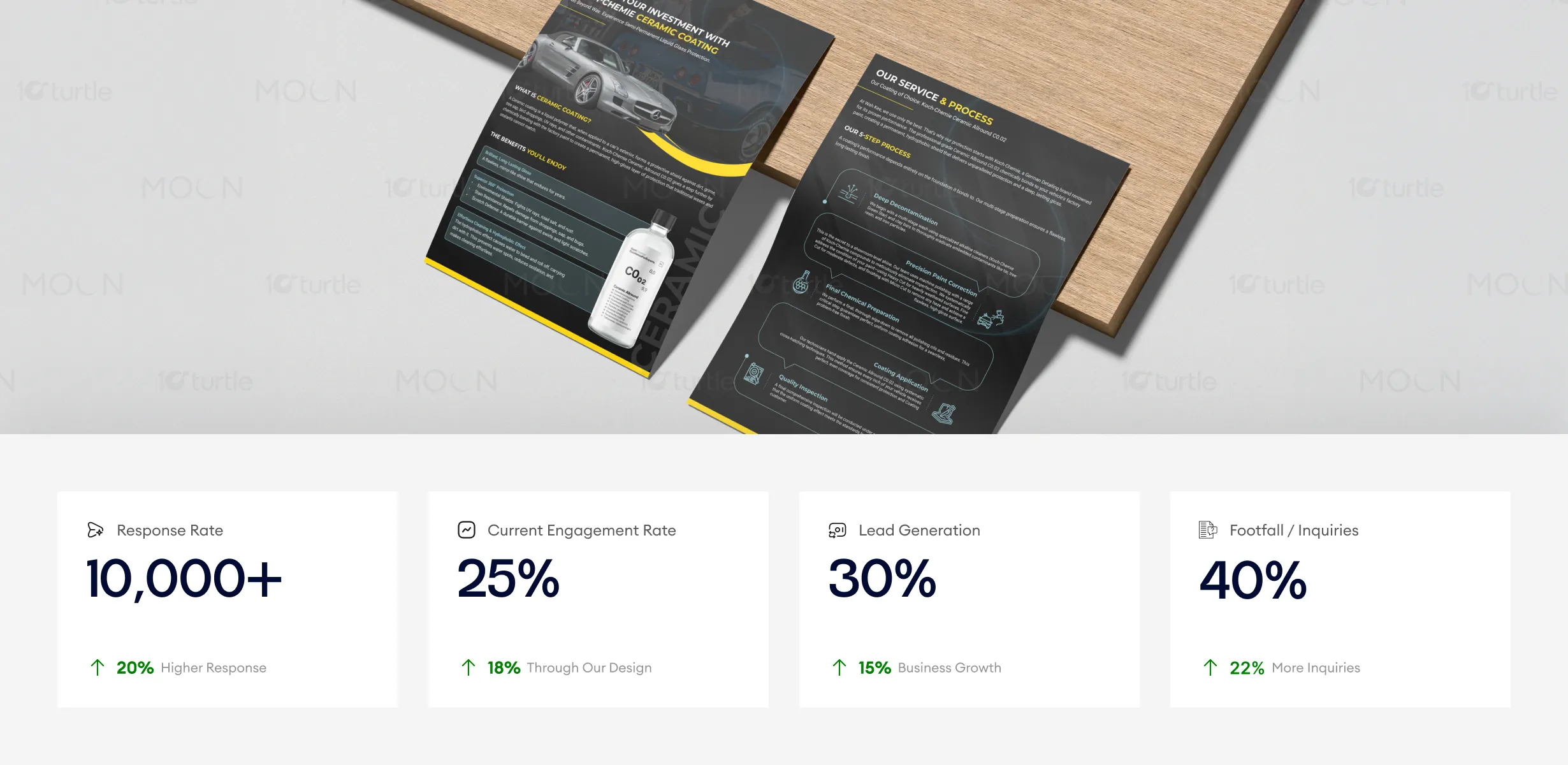
This A4 flyer represents a ceramic coating service offering, designed to educate customers while positioning the brand as a premium, reliable automotive protection specialist. Its primary purpose is to clearly communicate the value of ceramic coating, outline the service process, and build trust at the point of customer interaction. Within the automotive detailing industry, the flyer functions as both a sales support tool and an informational guide, helping customers understand the benefits, process, and long-term value of the service in a concise, visually engaging format.

Industry
Transport, Automotive & LogisticsWhat we did
Flyer DesignGraphic DesignPlatform
-Many automotive protection services struggle with unclear messaging and low perceived value, often overwhelming customers with technical jargon or inconsistent visuals. This leads to confusion, reduced trust, and hesitation in purchasing premium services. Additionally, poorly designed marketing materials can fail to communicate professionalism, making it difficult for customers to distinguish high-quality ceramic coating services from lower-end alternatives.
The design addresses these challenges through a structured, user-focused layout that breaks information into clear, scannable sections. A strong headline immediately establishes value, while visual segmentation ensures each topic—benefits, process, and product—remains easy to understand. Consistent typography, iconography, and spacing improve readability, while high-quality imagery reinforces product credibility. The flyer is designed to perform well across multiple touchpoints—on car dashboards, in hand, or on countertops—ensuring clarity and impact regardless of context.
The design’s premium, automotive-focused visual system creates a strong first impression, resonating with a high-end audience. The layout is professional and visually engaging, improving response and engagement rates. Its clarity and authenticity, reinforced by high-quality imagery, drive lead generation and customer inquiries, positioning the flyer as an effective tool for attracting and converting potential clients.
The design supports a long-term vision of positioning the brand as a trusted premium automotive care authority. Its clean structure and modular layout allow for easy adaptation across future materials such as brochures, posters, social media, and digital assets. By maintaining a consistent visual language and tone, the design strengthens brand recognition and ensures the service remains visually relevant as the brand expands its offerings or market presence.
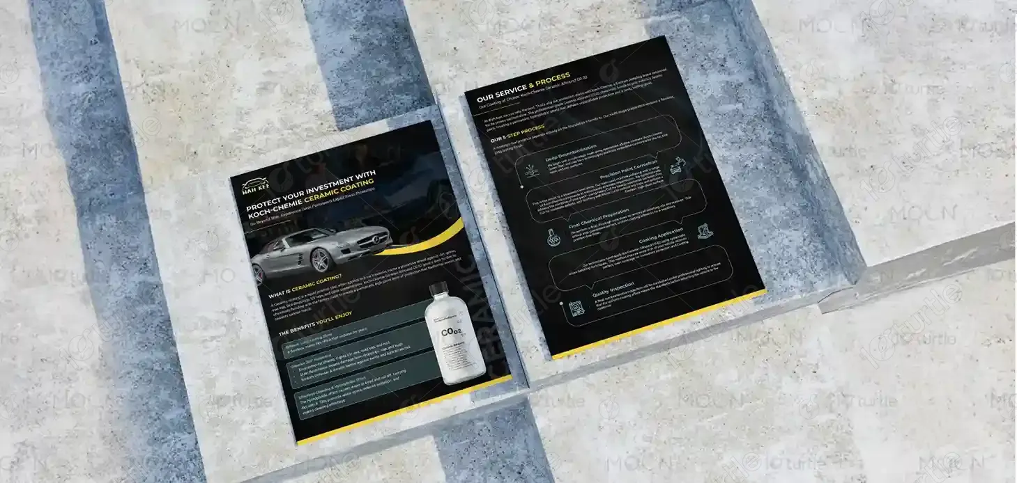
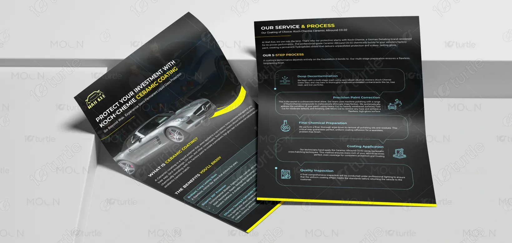
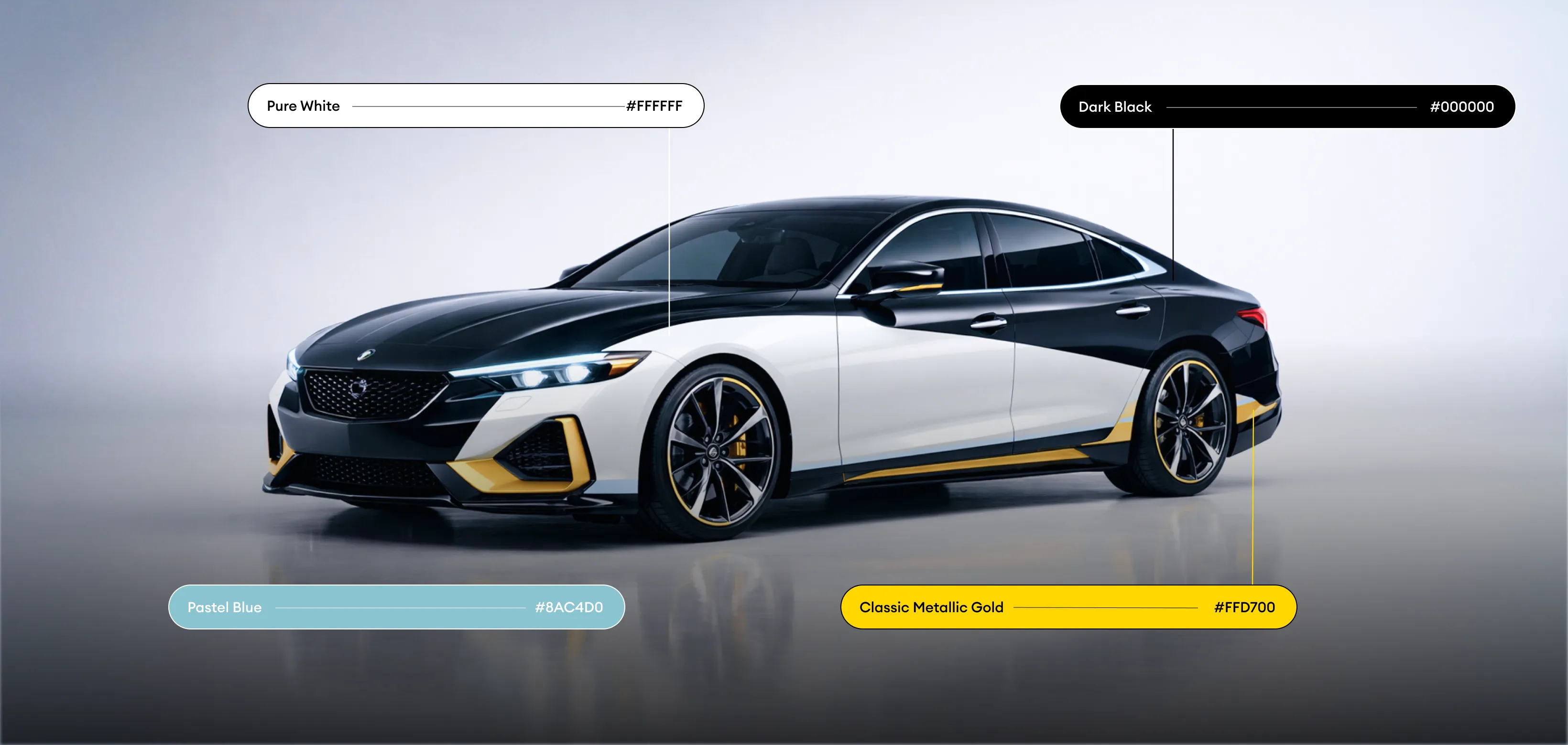
The color palette is built around black and dark grey to convey luxury, durability, and technical expertise, with yellow accents used strategically to highlight key information and guide attention. This contrast improves readability while reinforcing a performance-driven, premium identity. Supporting visual elements—clean icons, subtle lines, and controlled imagery—maintain clarity without distraction. The overall visual language is confident, modern, and professional, ensuring strong recognition across both print and physical environments.