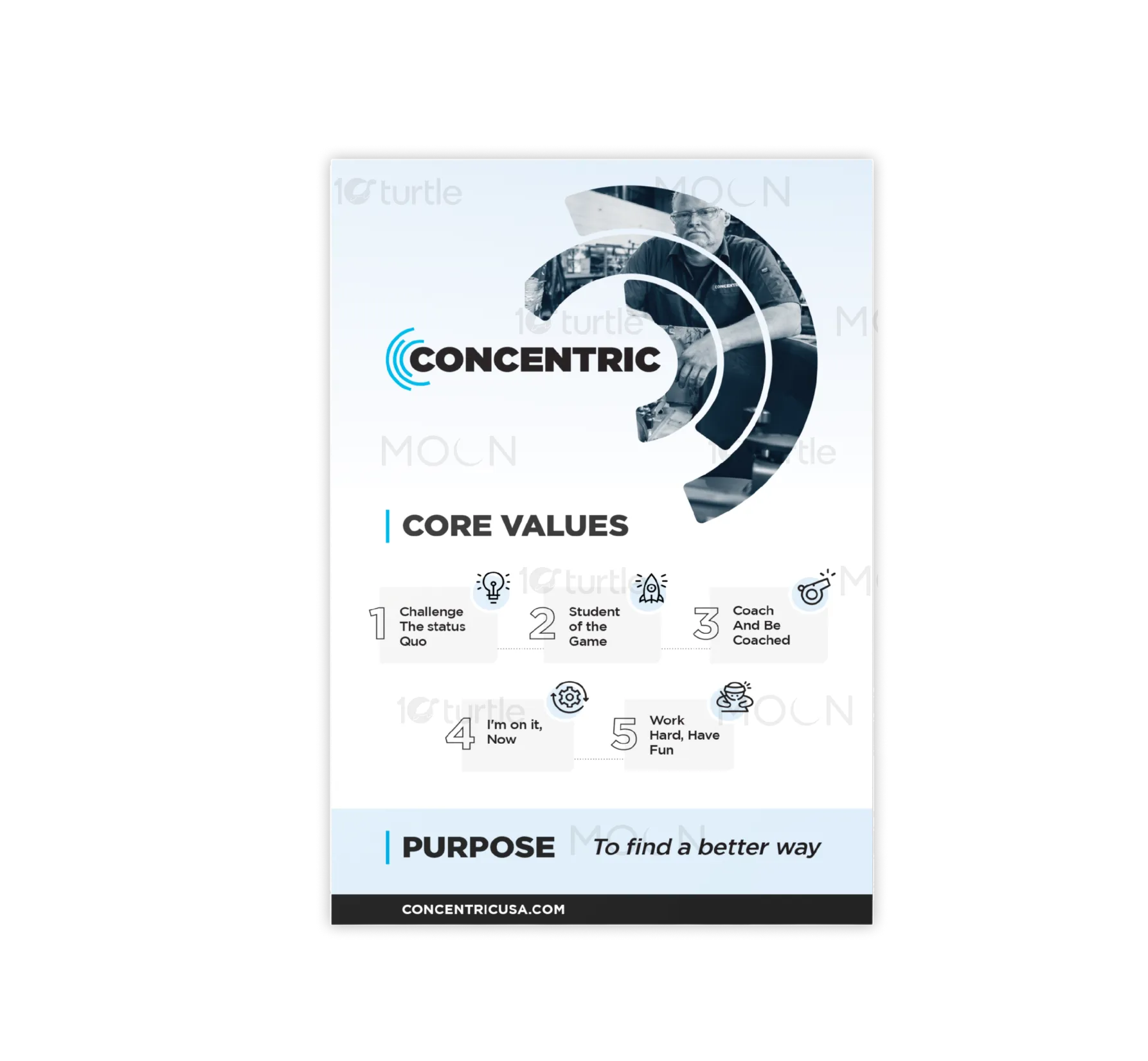
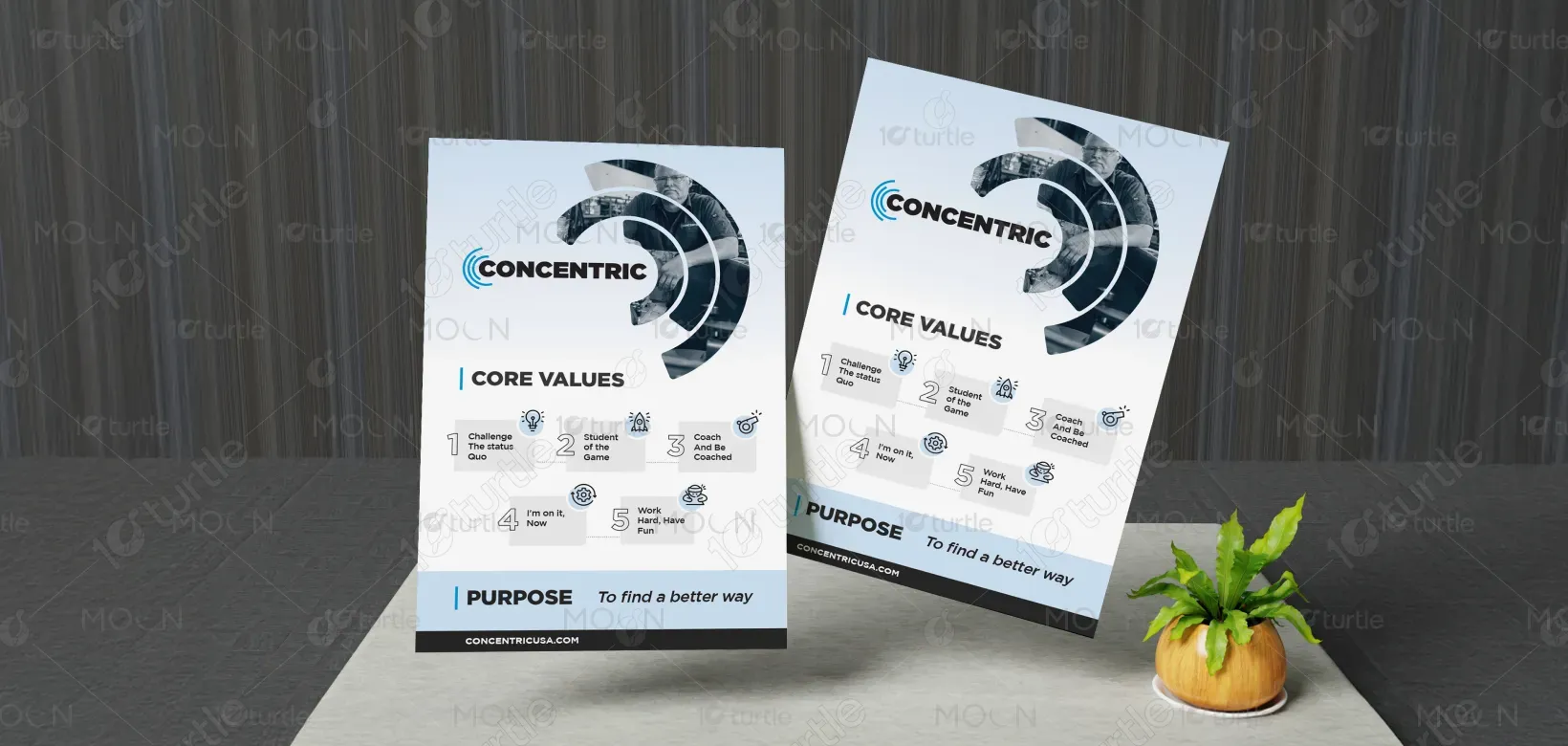
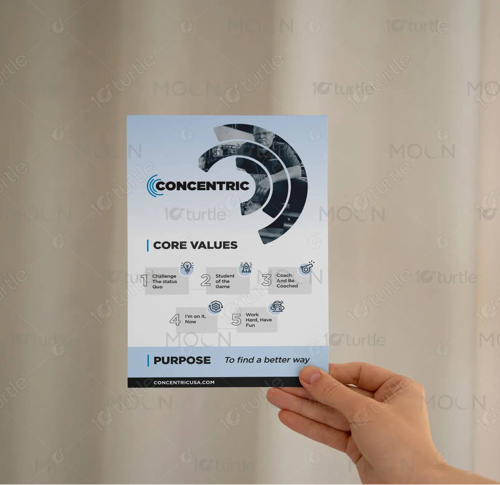
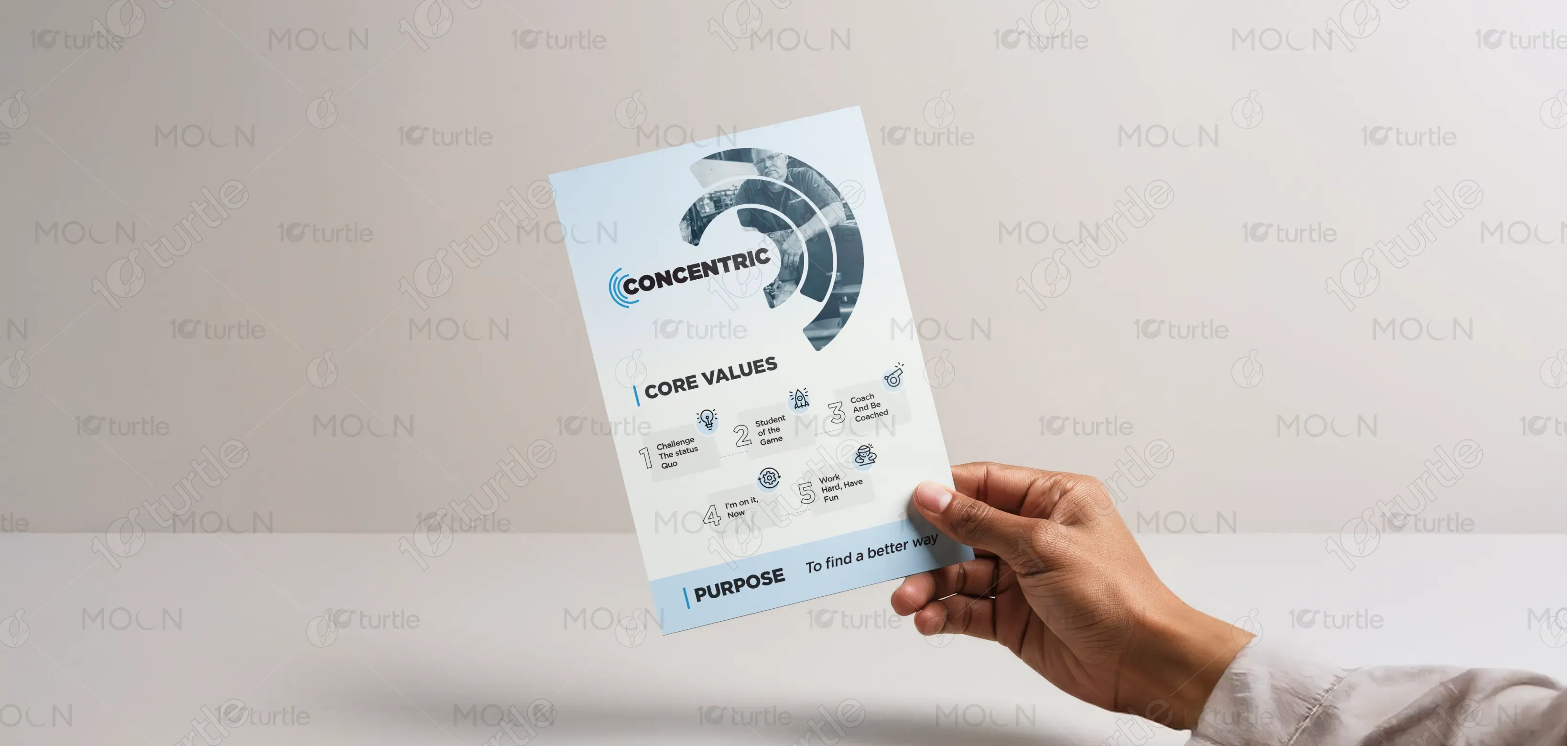
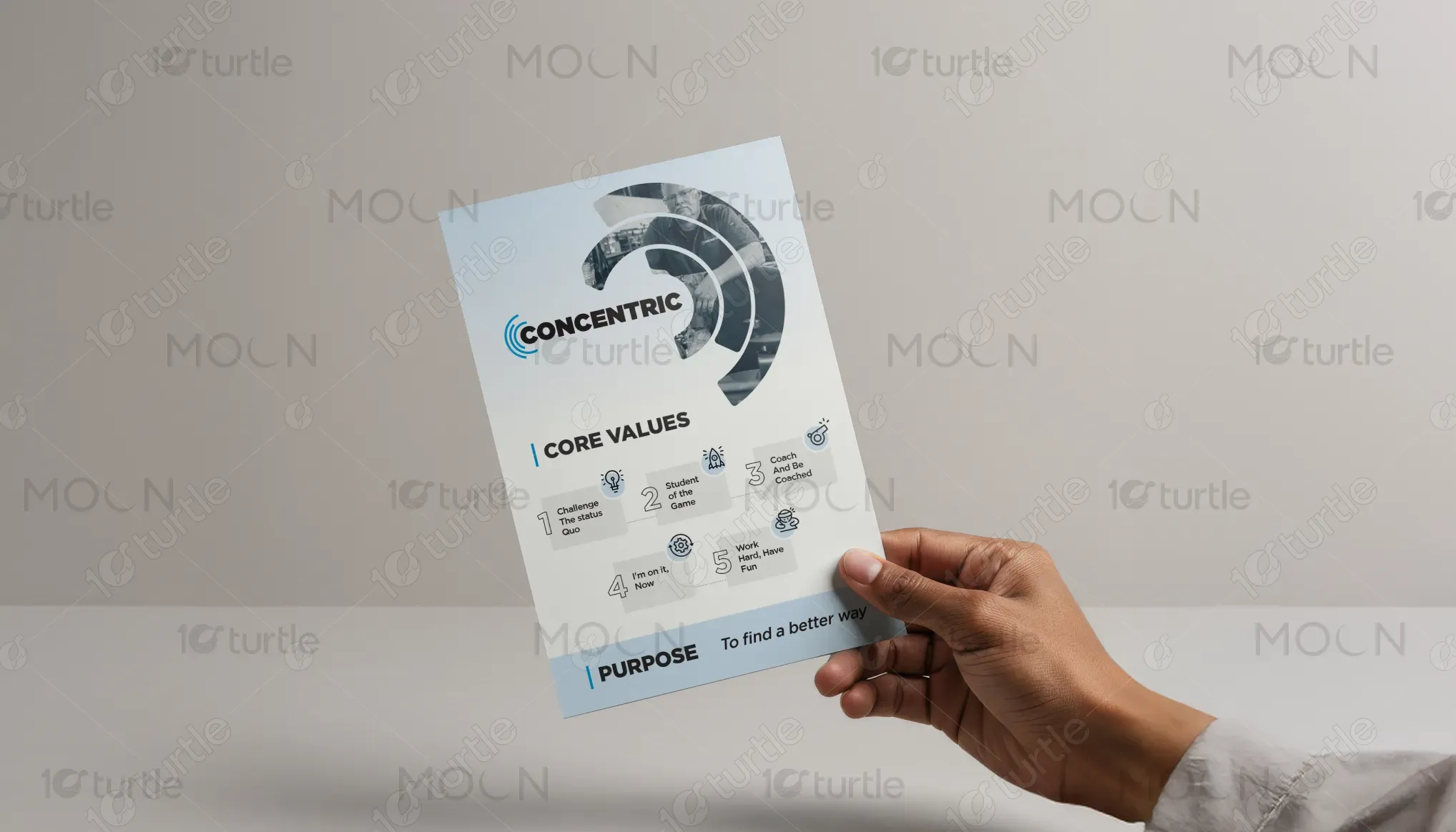
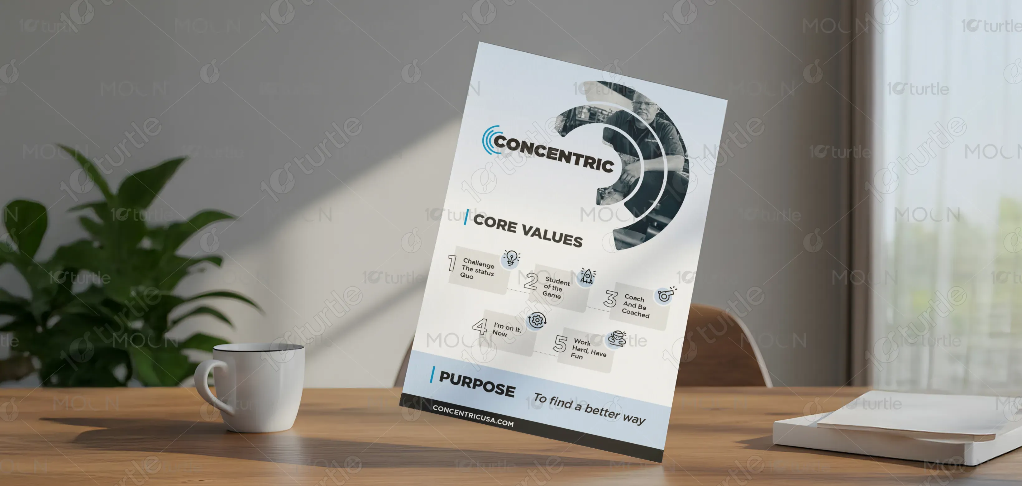
The Concentric USA flyer design embodies a bold, motivational tone that aligns with the brand’s dynamic and progressive spirit. Using strong typography, high contrast, and structured composition, the design captures themes of leadership, teamwork, and accountability. The layout highlights Concentric’s core values through impactful keywords and rhythmic text alignment, evoking energy and motion. The use of white space balances the intensity, while the confident visual hierarchy ensures instant readability and engagement at a glance.
Flyer Design
Graphic Design
Industry
Professional & B2B Services
Tools we used


Project Completion
2025
Key Market
Global
This flyer represents Concentric USA’s commitment to building a high-performance culture rooted in purpose, learning, and collaboration. It promotes their brand philosophy — “To Find a Better Way” — by showcasing their core values in a visually compelling format. Each message, from “Work Hard, Have Fun” to “Coach and Be Coached,” emphasizes the mindset that drives the company. Designed for internal culture-building and recruitment, it bridges corporate professionalism with human-centered motivation.
Industry
Professional & B2B ServicesWhat we did
Flyer DesignGraphic DesignPlatform
-The main challenge was balancing corporate communication with emotional appeal. Many industrial or logistics companies rely on rigid, technical visuals that fail to inspire. The goal here was to break that mold — to make an internal values poster feel as energizing as a sports brand campaign. Another challenge was ensuring that multiple key phrases maintained visual harmony without cluttering the space, while still reflecting the company’s authentic culture and drive for improvement.
The design strategically uses typographic rhythm and spatial balance to highlight each core belief while maintaining a cohesive narrative flow. The bold headers create a pulse that mimics Concentric’s fast-paced environment, while subtle color control ensures visual unity. By emphasizing action-oriented statements, the layout communicates energy and intent. The result is a flyer that doubles as a motivational wall piece, fostering team alignment and inspiring every employee to embody the brand’s purpose daily.
The long-term vision is to make this design a cornerstone of Concentric’s internal identity system - a visual reminder of the company’s values across all facilities. It’s meant to spark consistency in culture, empower teams, and strengthen brand pride. As Concentric grows, this design direction can evolve into a broader campaign - spanning digital communications, on boarding kits, and motivational collateral - ensuring that “To Find a Better Way” remains more than a slogan, but a lived experience.
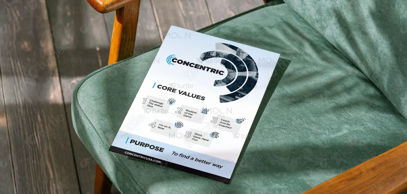
The flyer uses a monochrome base of black, white, and gray, symbolizing clarity, strength, and discipline, accented with subtle red-orange highlights that evoke drive, focus, and passion. This palette aligns seamlessly with Concentric’s brand identity—professional yet energetic. The controlled use of color directs attention to key values while maintaining a premium, industrial feel. The interplay of contrast enhances legibility and projects the brand’s confidence and modernity.