The design adopts a clean, clinical, and technology-forward visual direction aligned with the healthcare industry. A structured layout guides readers from service overview to process steps and contact information. Strong typographic hierarchy ensures quick scanning, while concise service breakdowns improve clarity. Technical yet approachable language builds credibility. Balanced spacing, professional imagery, and minimal distractions reflect precision and reliability. The overall visual system reinforces ScanMed’s authority as an OEM-certified MRI coil specialist.
Flyer Design
Graphic Design
Industry
Healthcare & Wellness
Tools we used


Project Completion
2025
Key Market
Global
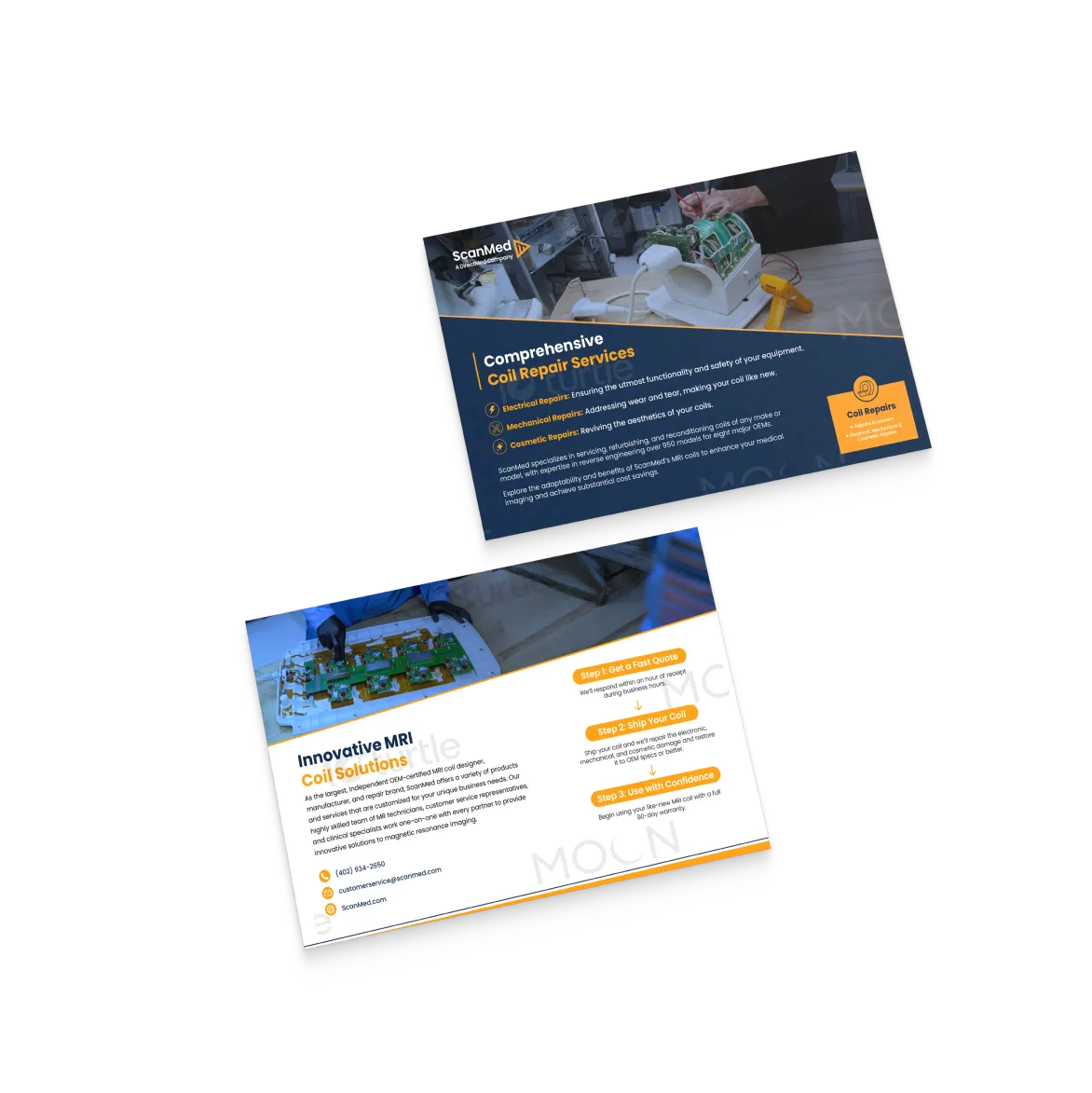
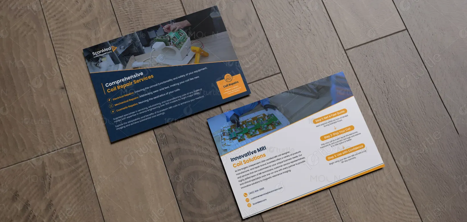
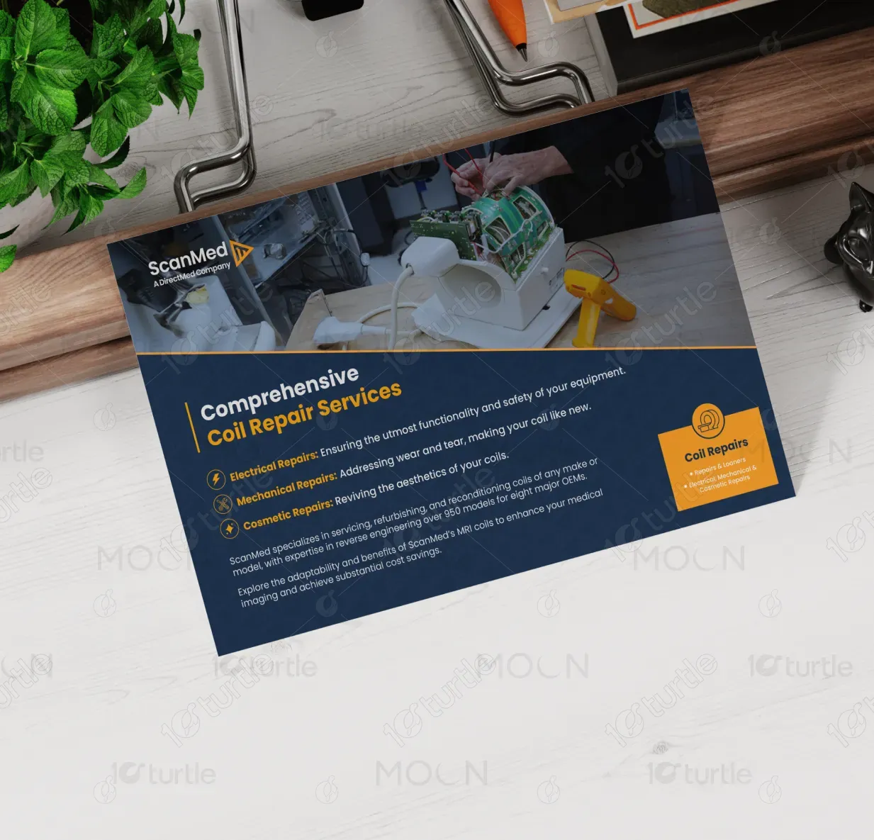
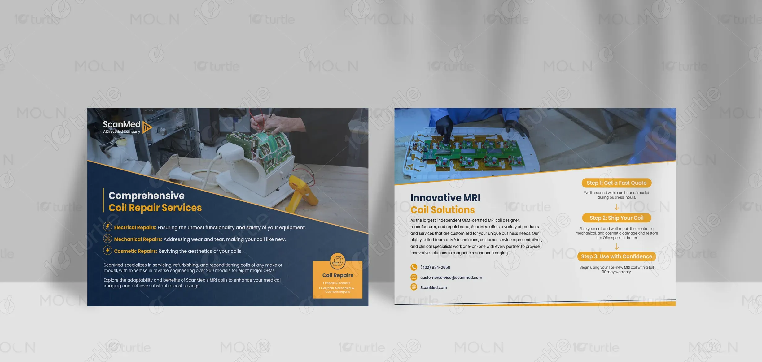
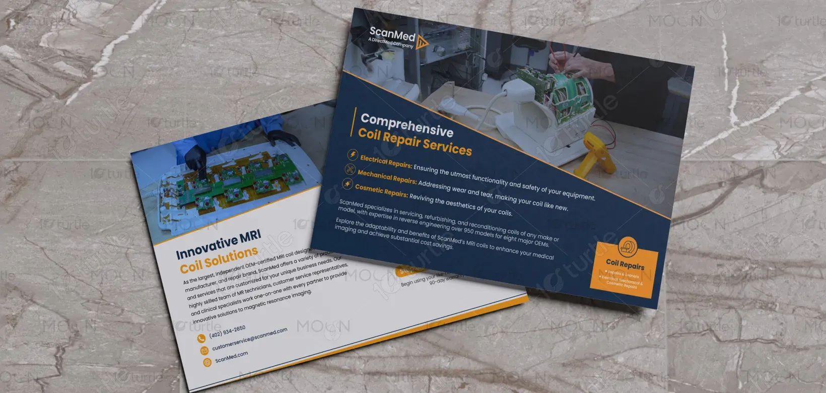
This design represents a promotional flyer highlighting ScanMed’s MRI coil repair, refurbishment, and loaner services. It communicates the company’s expertise in servicing coils across multiple OEM models while emphasizing cost savings and operational efficiency. Positioned within the medical imaging and healthcare technology sector, the flyer targets hospitals, imaging centers, and diagnostic facilities. Its purpose is to clearly explain services, simplify the repair process, and encourage immediate inquiries through fast-quote messaging.

Industry
Healthcare & WellnessWhat we did
Flyer DesignGraphic DesignPlatform
-MRI facilities often face equipment downtime due to damaged or malfunctioning coils. OEM replacements can be expensive and time-consuming, leading to operational delays and revenue loss. Additionally, unclear service communication and lack of transparency in repair processes can reduce trust. Healthcare providers require fast, reliable, and cost-effective solutions without compromising performance or safety standards.
The design addresses these challenges by clearly outlining ScanMed’s comprehensive repair capabilities — electrical, mechanical, and cosmetic. A step-by-step process (Get a Quote, Ship Your Coil, Use with Confidence) simplifies understanding and builds trust. Emphasizing OEM-certified expertise and a 90-day warranty reinforces reliability. Clear contact details and concise messaging ensure immediate action. The structured hierarchy and professional tone enhance usability and engagement for time-sensitive healthcare professionals.

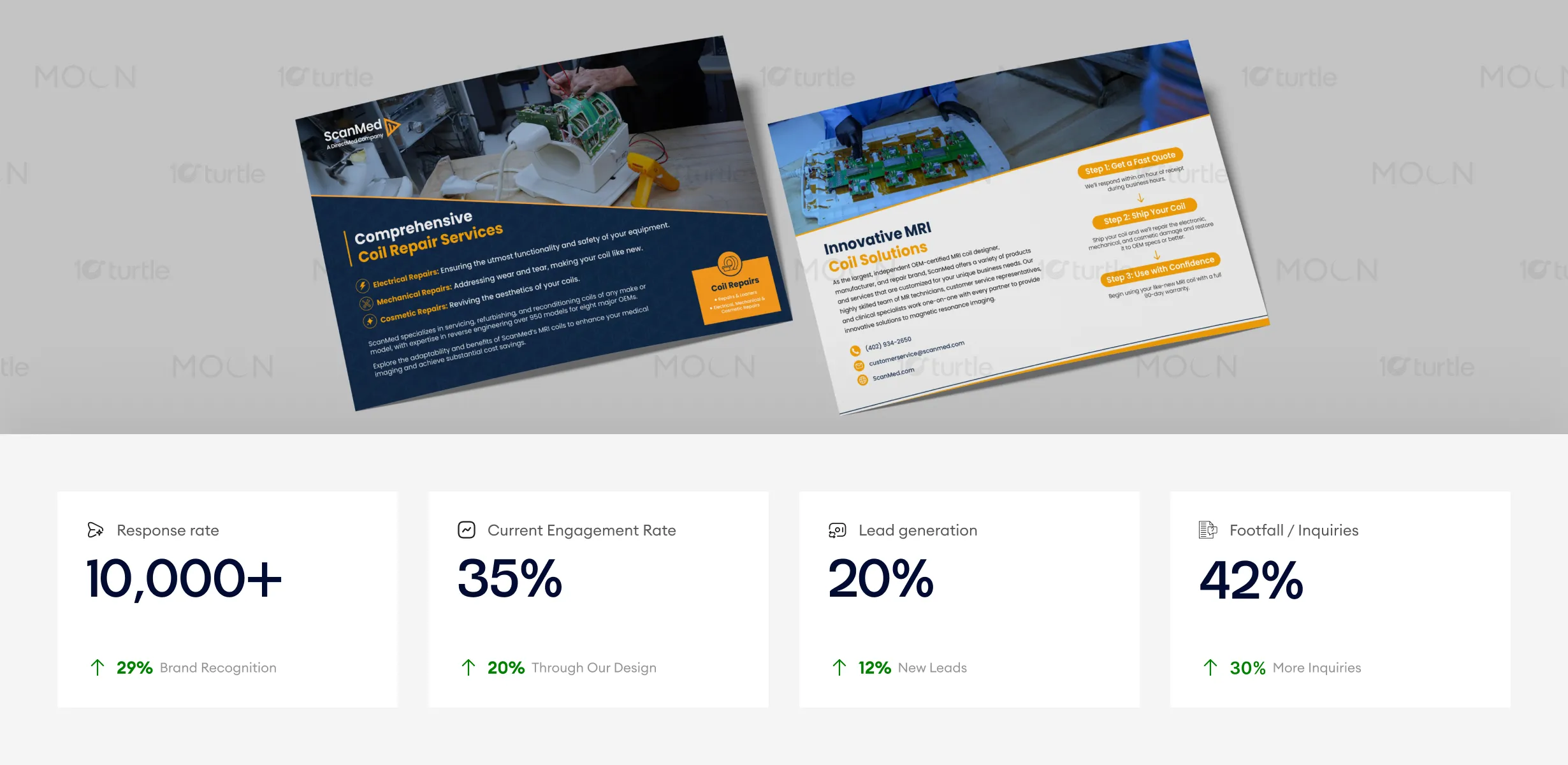
The brochure’s clean, professional design enhances the user experience, leading to improved engagement and response rates. By providing a clear and structured message with visually appealing technical content, the design has proven effective in generating leads and inquiries. The use of strong imagery, concise language, and well-defined next steps have contributed to higher conversions and enhanced brand authority in the competitive healthcare sector.
ScanMed’s long-term vision is to be the leading independent MRI coil repair and innovation partner globally. The design supports this vision by positioning the brand as technologically advanced, dependable, and service-oriented. A consistent professional identity strengthens brand recognition across marketing materials, digital platforms, and sales outreach. Over time, this cohesive communication strategy builds credibility, industry authority, and long-term partnerships with medical institutions.

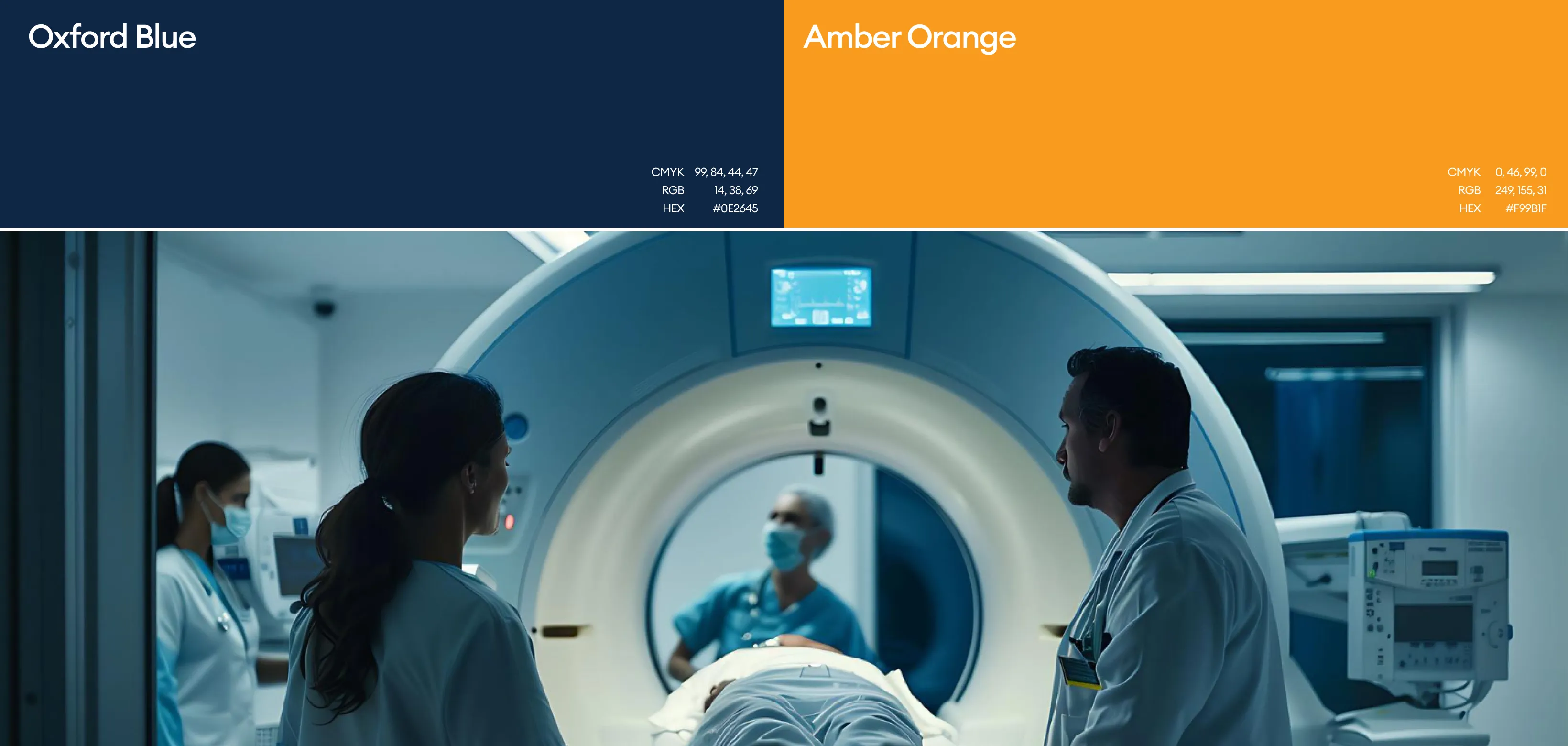
The visual identity reflects trust, precision, and innovation. Clean whites and light neutrals convey sterility and professionalism, while cool blues and technical grays reinforce healthcare credibility and technological expertise. Strong contrast ensures readability across print and digital formats. Minimalist layouts, clear typography, and structured spacing support clarity and efficiency, aligning with the high-performance expectations of medical imaging environments.