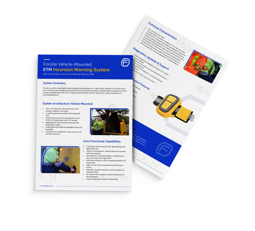
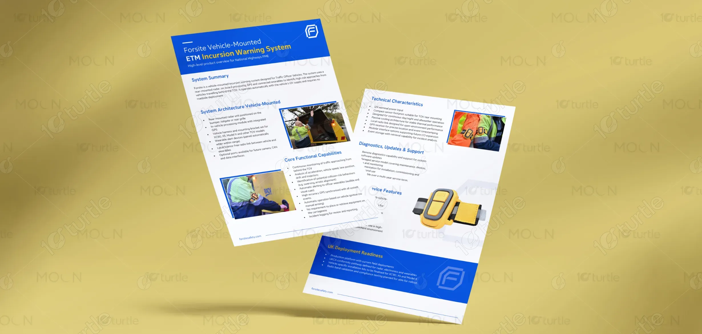
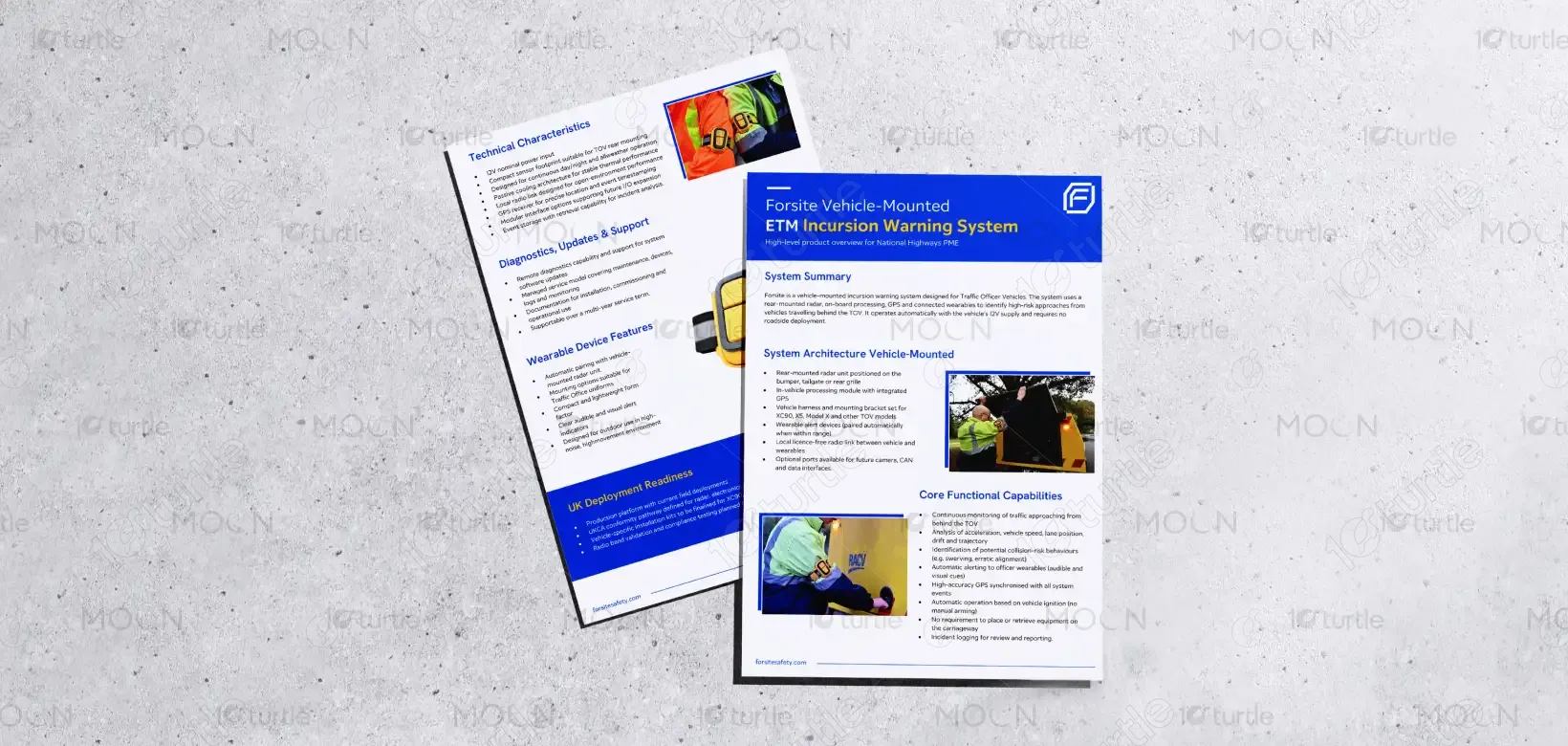
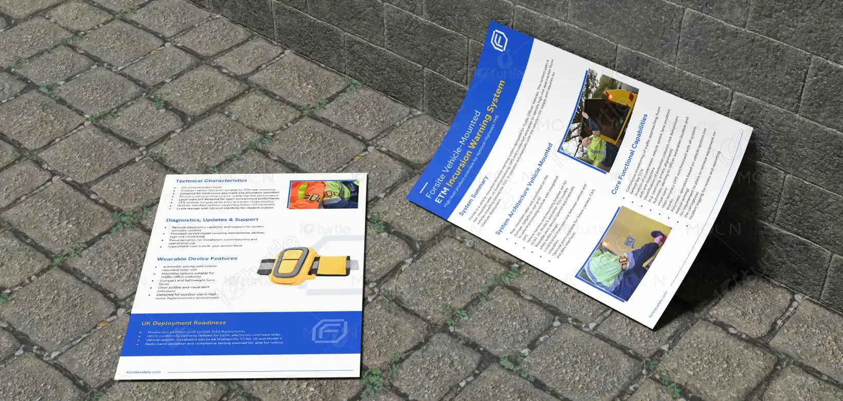
The flyer follows a structured, information-first layout tailored for a technical audience. A strong top header establishes product identity, while clearly segmented sections guide the viewer through system capabilities, architecture, and benefits. The use of bold typography ensures readability, supported by a blue-dominant color palette that conveys trust and authority, complemented by yellow accents to signify caution and safety. Real-world imagery reinforces practical application, while consistent spacing and alignment maintain visual clarity across the composition.
Flyer Design
Graphic Design
Industry
Transport, Automotive & Logistics
Tools we used

_11zon.webp)
Project Completion
2025
Key Market
Global
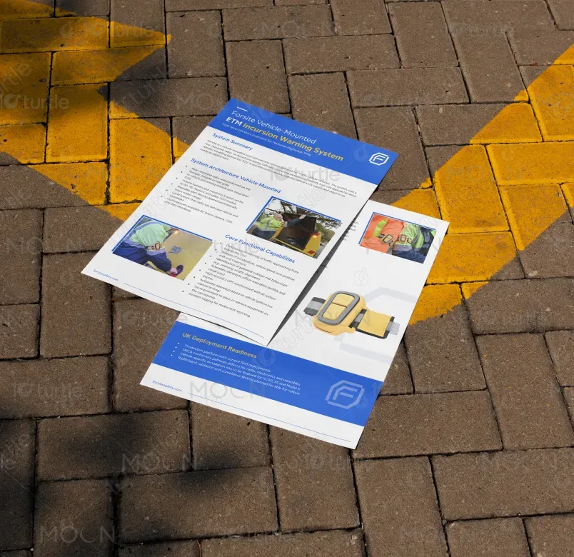
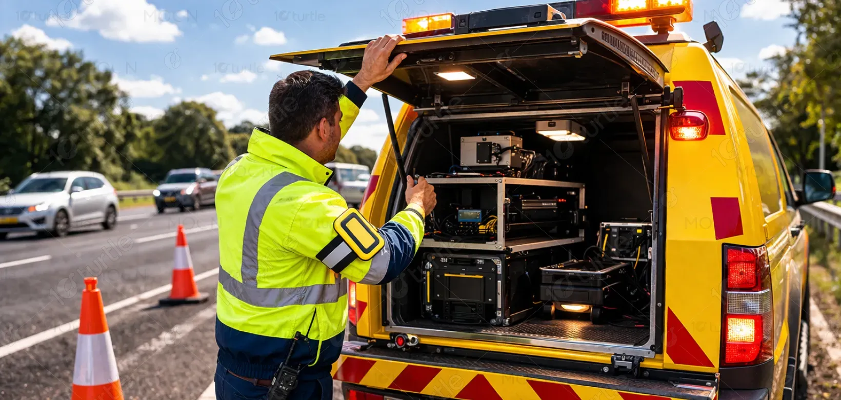
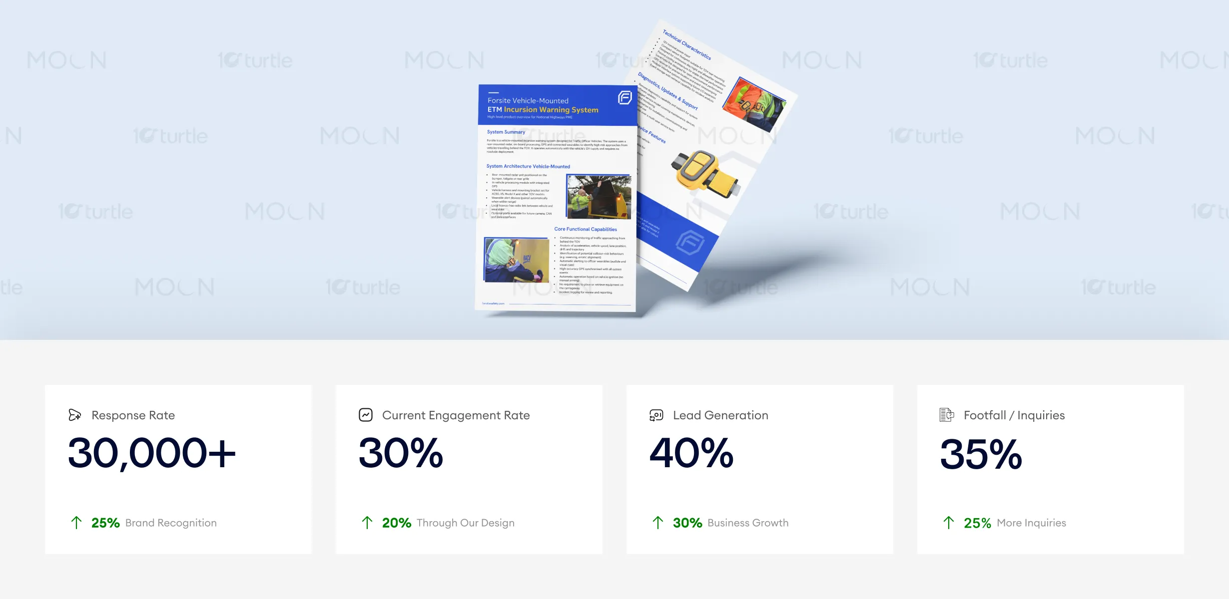
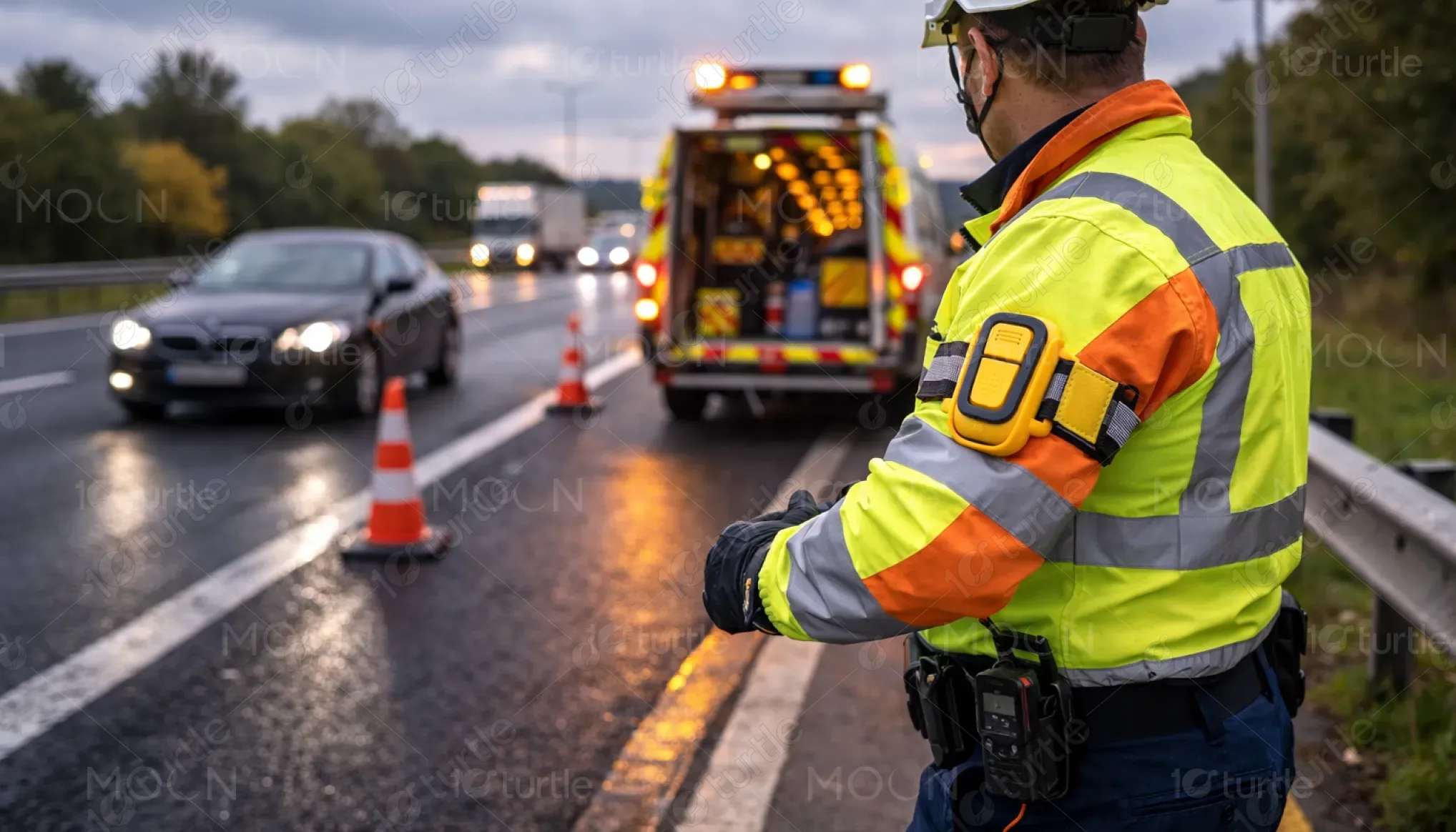
This flyer presents the Forsite Vehicle-Mounted ETM Incursion Warning System, a safety solution designed for traffic officer vehicles operating in high-risk roadside environments. The design communicates how the system uses radar, GPS, and wearable technology to detect approaching vehicles and provide real-time alerts. Positioned within the road safety and intelligent transport systems industry, the flyer highlights the product’s role in improving situational awareness and reducing roadside incident risks.
Industry
Transport, Automotive & LogisticsWhat we did
Flyer DesignGraphic DesignPlatform
-Traffic officers working on highways face significant risks due to limited visibility of fast-approaching vehicles and delayed reaction times. Existing safety measures often rely on manual observation or static warning systems, which are insufficient in dynamic, high-speed environments. This results in increased exposure to accidents, reduced operational efficiency, and heightened safety concerns for both personnel and road users.
The design addresses these challenges through a clear and logically structured presentation of the system’s capabilities. Key information is broken into digestible sections, enabling quick comprehension. Visual hierarchy prioritizes critical features such as real-time monitoring and automated alerts. Supporting imagery demonstrates real-world usage, while concise bullet points improve scanability. The overall approach ensures that complex technical information is communicated in an accessible and user-centric format, improving clarity and engagement.
The flyer’s technical, information-first approach successfully captures the audience’s attention by clearly communicating product benefits and capabilities. The use of bold typography and trust-building colors contributes to higher engagement and response rates. To further enhance these metrics, optimizing distribution channels and adding a compelling call-to-action could drive even more footfall and inquiries.
The design supports a vision of positioning Forsite as a reliable, technology-driven safety innovator in the transport sector. It establishes a scalable visual system that can extend across brochures, presentations, and digital platforms. By maintaining consistency in visual language and messaging, the design reinforces long-term brand recognition and credibility, enabling the product to adapt to future technological advancements and market expansion.
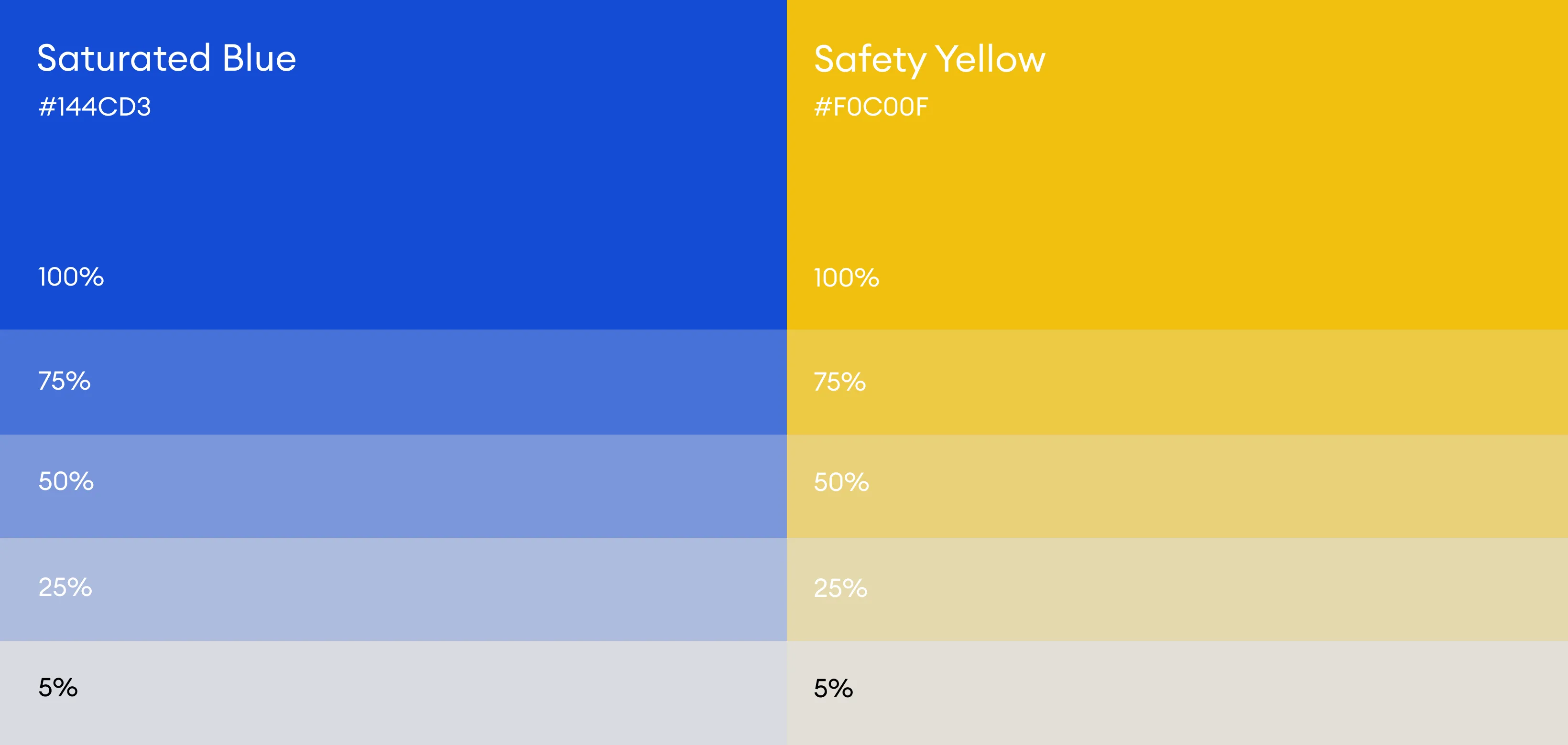
The design utilizes a blue and yellow color scheme to balance professionalism and safety signaling. Blue communicates reliability, authority, and technological competence, while yellow acts as a high-visibility accent associated with caution and alertness. Neutral backgrounds maintain readability, and consistent typography ensures clarity across sections. Supporting visual elements, including real-world imagery and clean iconography, enhance comprehension and create a cohesive visual identity suitable for both print and digital formats.