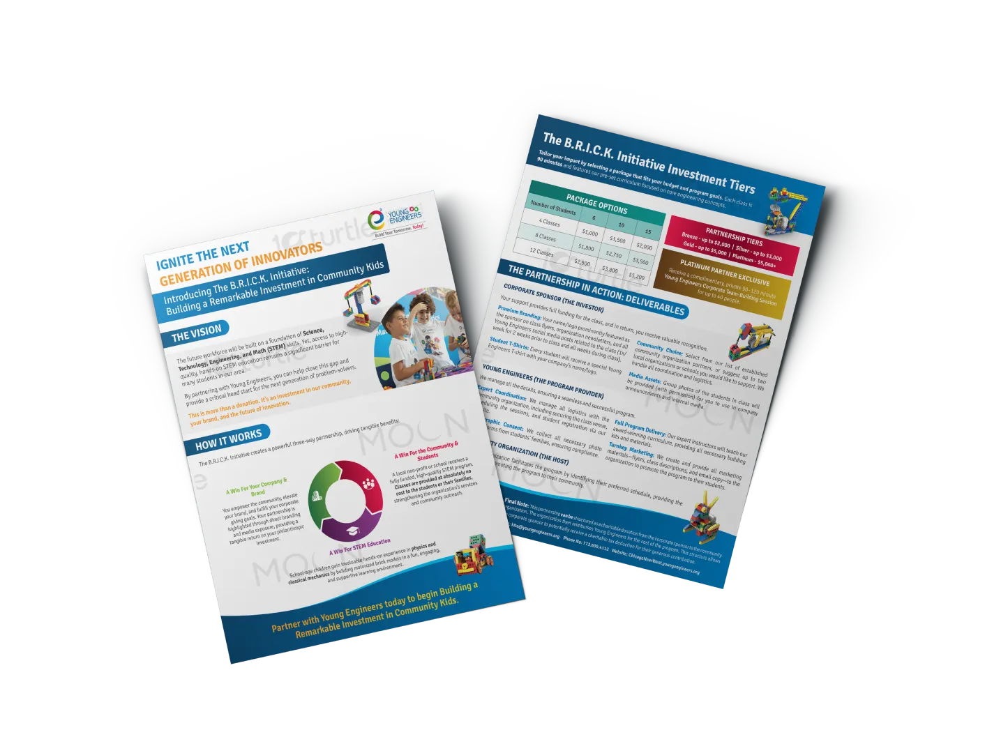
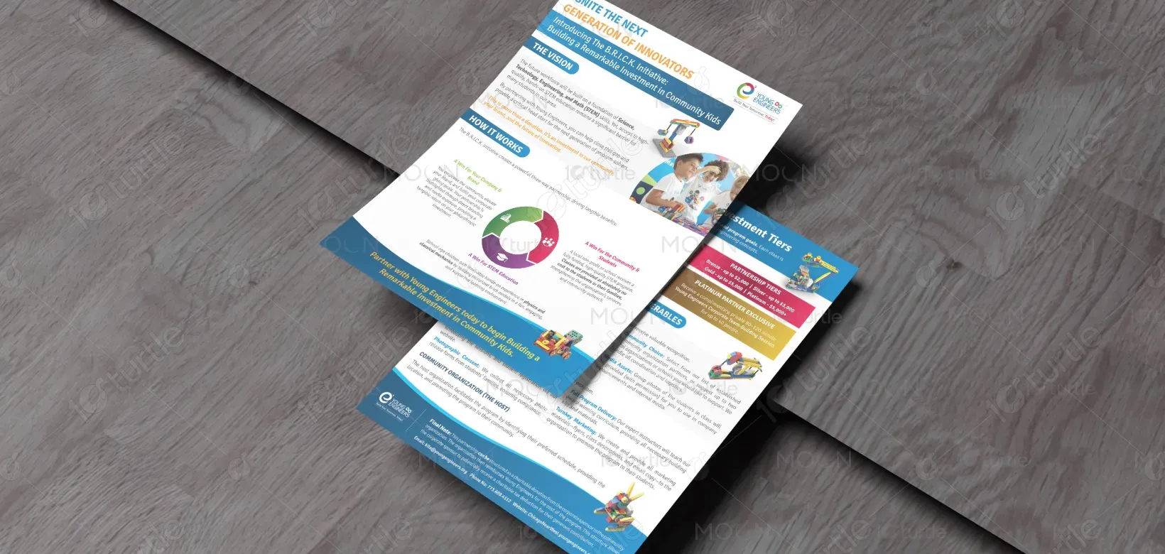
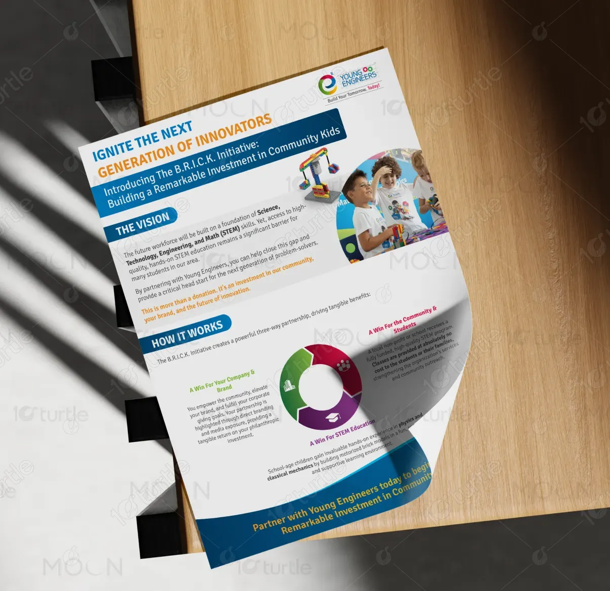
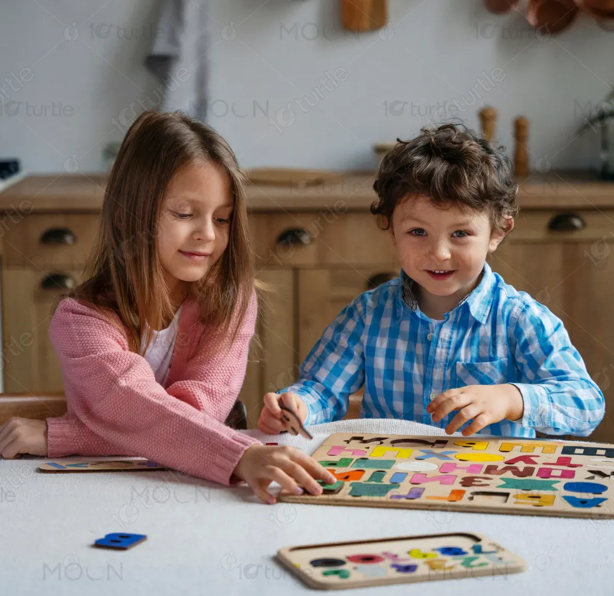
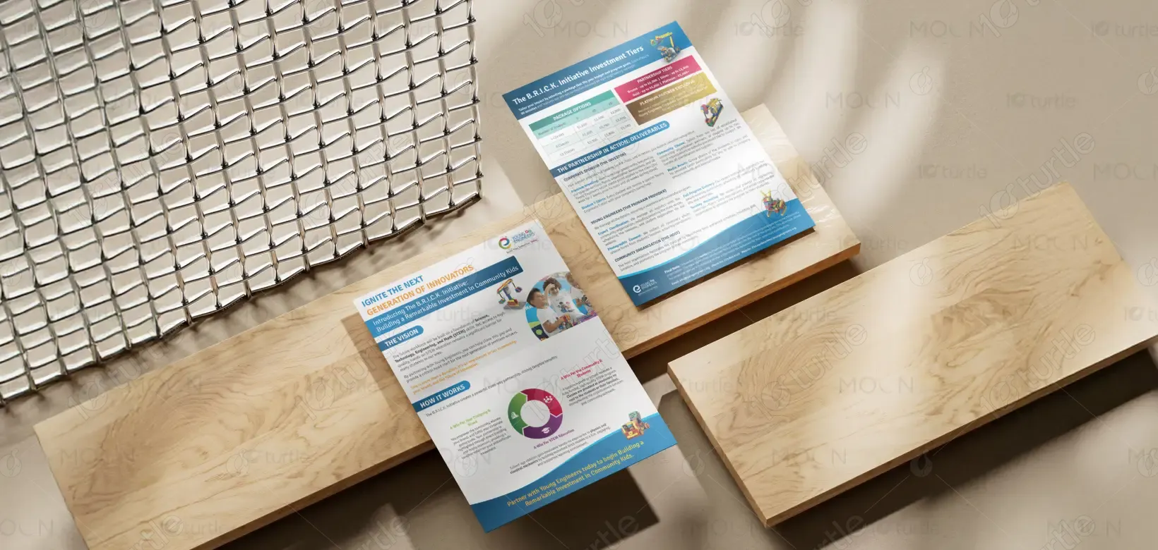
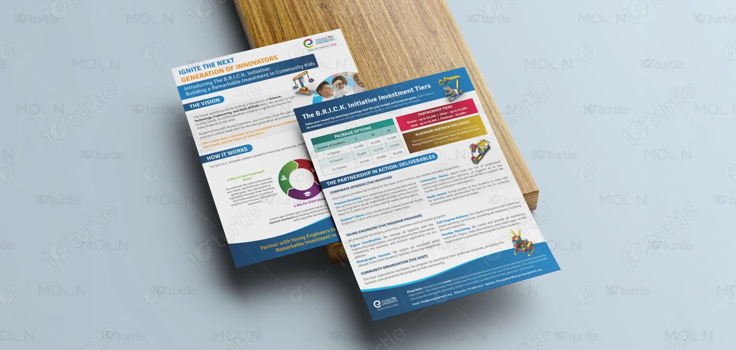
The flyer follows a clean, structured, and professional layout that ensures clarity and strong visual impact. A bold header immediately captures attention, while clearly divided sections guide the reader smoothly through the content. Strategic use of typography creates a strong hierarchy, making headlines stand out and body text easy to read. Balanced white space prevents clutter, and vibrant imagery of children engaged in STEM activities adds authenticity and emotional connection. The combination of blue brand tones with energetic accent colors enhances readability and reinforces brand identity.
Flyer Design
Graphic Design
Industry
Education & Training
Tools we used

Project Completion
2025
Key Market
Global
This design represents the B.R.I.C.K. Initiative, a community-focused STEM education program aimed at inspiring and educating young learners. The flyer’s primary purpose is to inform and attract sponsors, partners, and stakeholders by clearly explaining the program’s vision, structure, and benefits. It acts as both an informational and persuasive tool, highlighting community impact, youth development, and brand collaboration opportunities within the education sector.
Industry
Education & TrainingWhat we did
Flyer DesignGraphic DesignPlatform
-Many educational initiatives struggle with low visibility, unclear messaging, and limited sponsor engagement. Overloaded or poorly structured communication materials often fail to capture attention or build trust. As a result, valuable community programs may face funding challenges and reduced participation. This gap between opportunity and awareness limits growth and long-term sustainability.
The flyer solves these challenges through a clear information hierarchy and user-focused layout. Content is divided into logical sections such as Vision and How It Works, making it easy to understand. Strong headings, supportive visuals, and infographic elements simplify complex information. Consistent branding builds credibility, while real imagery increases emotional engagement. The design ensures clarity, professionalism, and adaptability across print and presentation formats.
The flyer performs well in engaging and guiding the audience through essential information, leading to higher response rates and inquiries. The clean structure, emotional imagery, and strategic use of colors help boost engagement and generate leads effectively. To further increase these metrics, focusing on optimizing placement and targeting specific demographic segments could improve both the response rate and footfall even more.
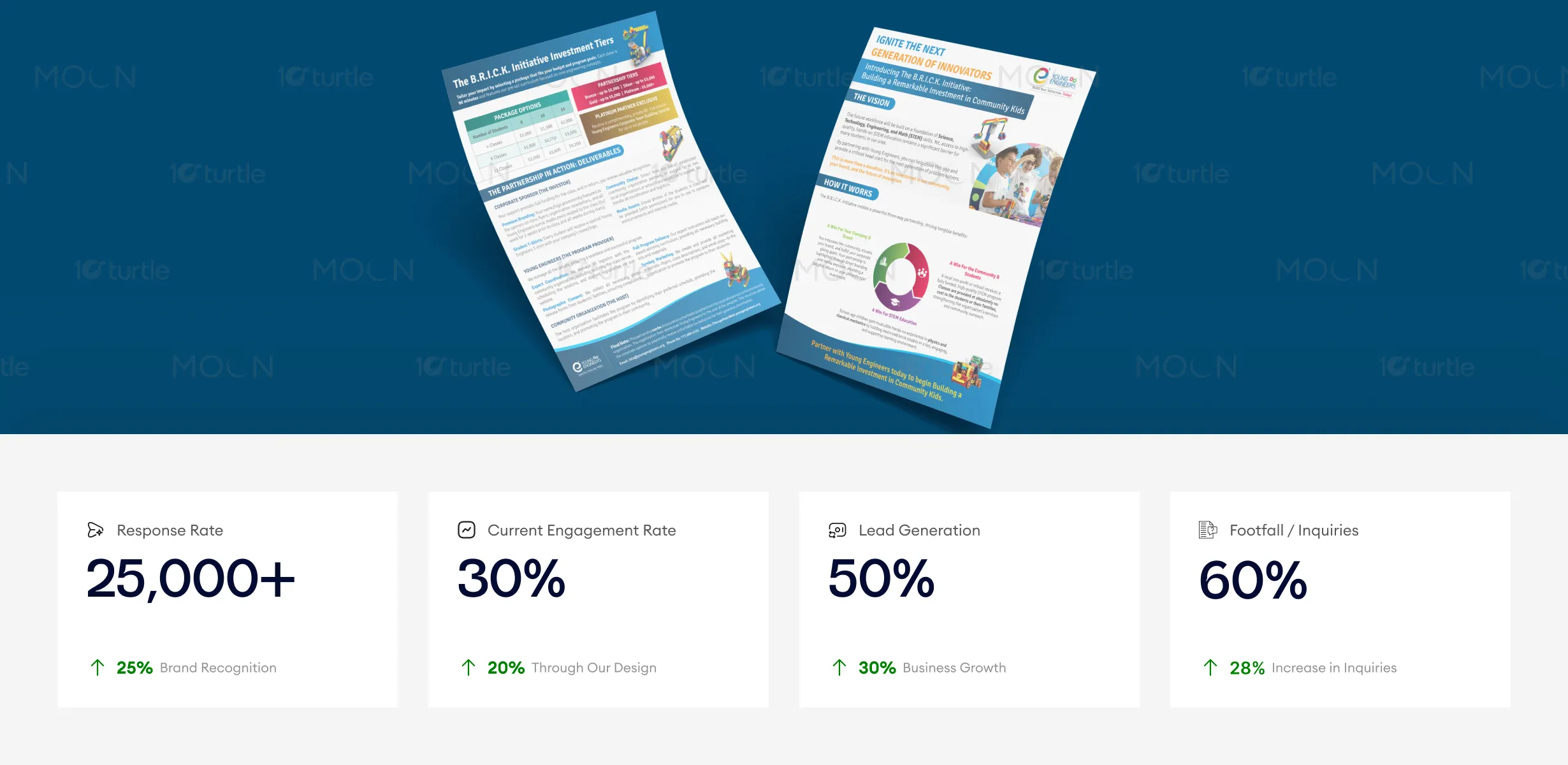
The flyer’s clean, structured design ensures the message is easy to follow and visually appealing, leading to higher engagement and a stronger connection with the audience. Its strategic use of color, typography, and emotional imagery creates a well-rounded design that encourages action and increases lead generation and footfall. These design choices help foster both immediate responses and long-term engagement with the initiative.
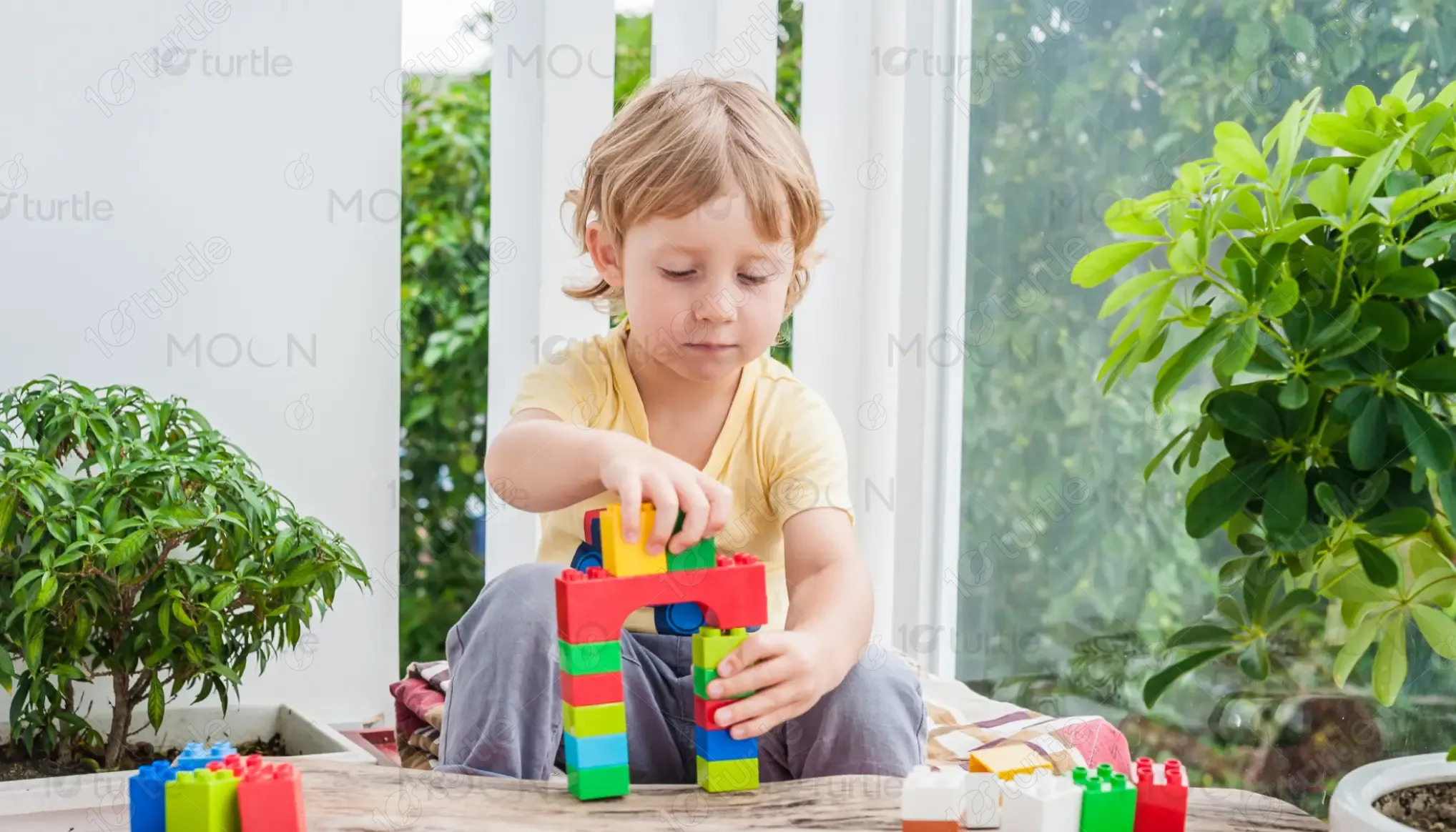
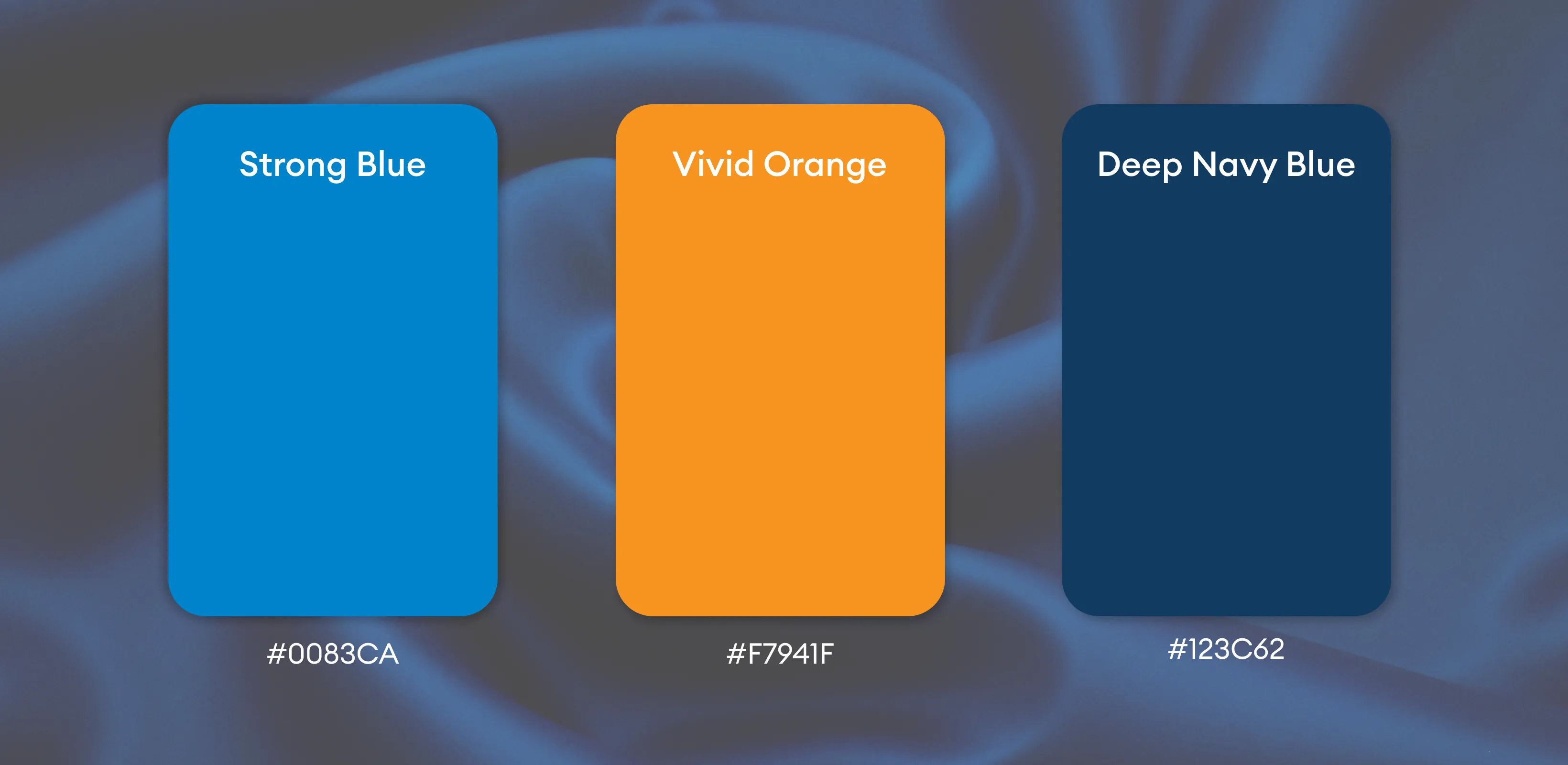
The design uses strong blue tones to communicate trust, professionalism, and educational credibility. Accent colors such as green, red, and purple introduce creativity, growth, and innovation. Clean typography and generous white space enhance readability and balance. The overall visual language reflects a dynamic yet structured identity, aligning perfectly with the brand’s mission to inspire and educate future innovators.