Print Design
Editorial Design
Typography System
Overview
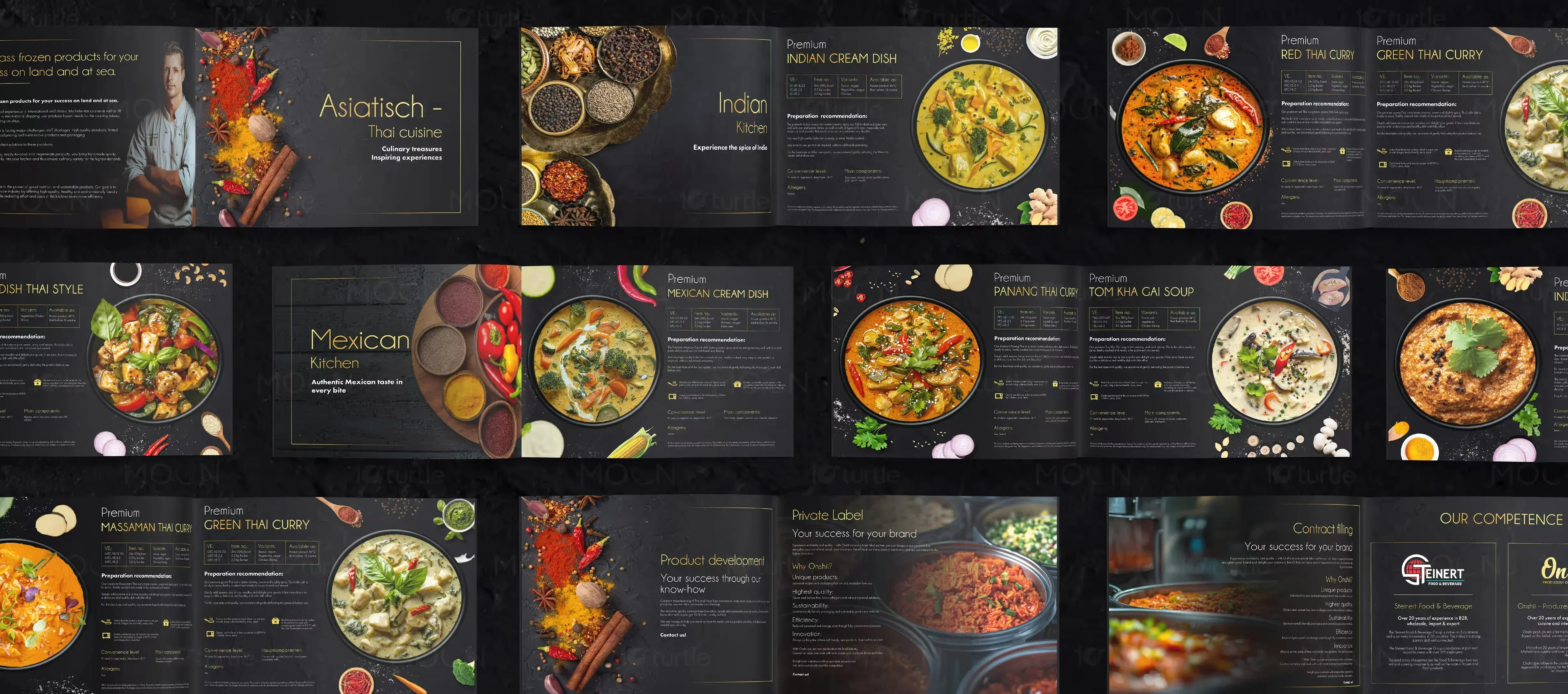
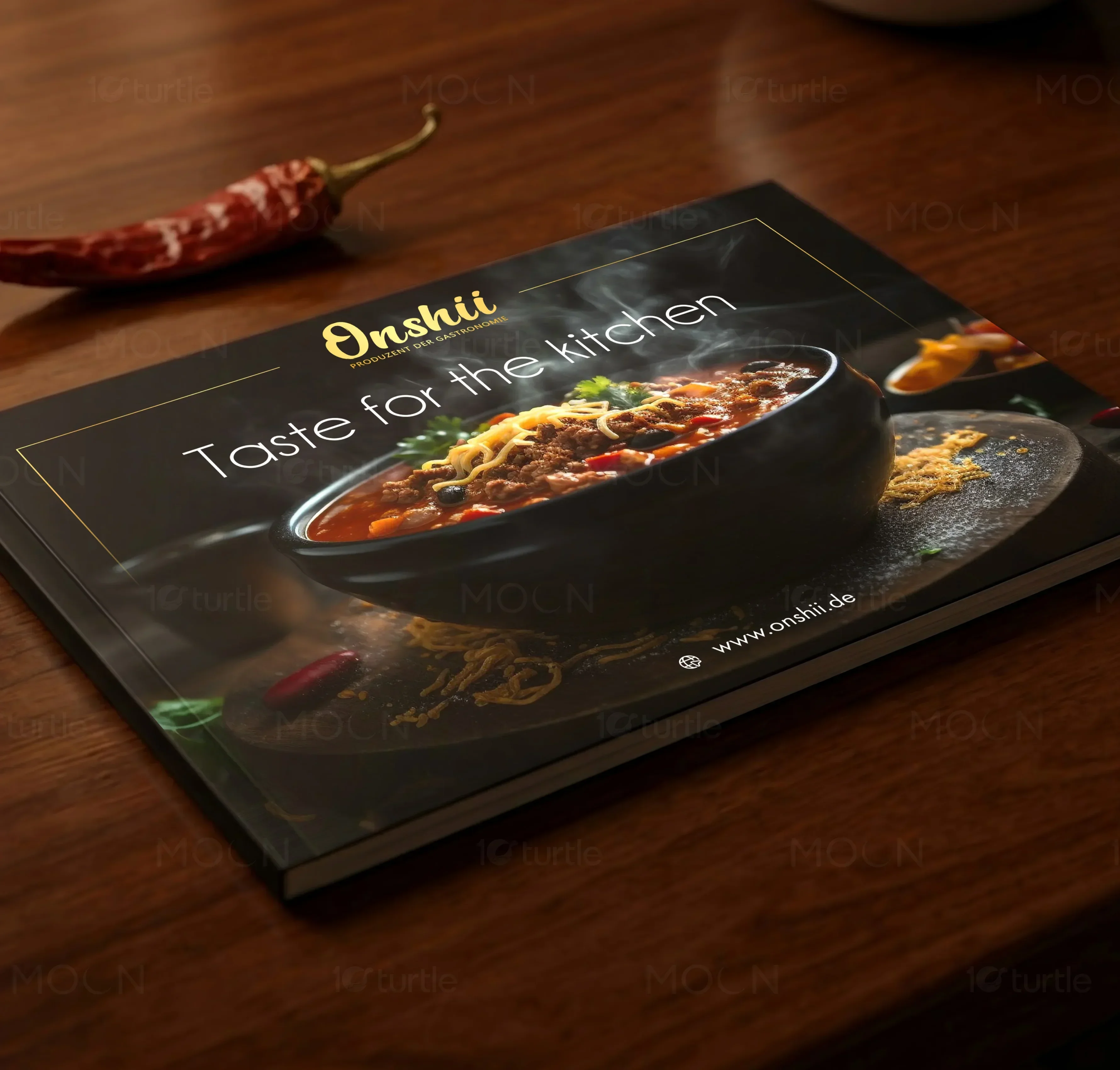
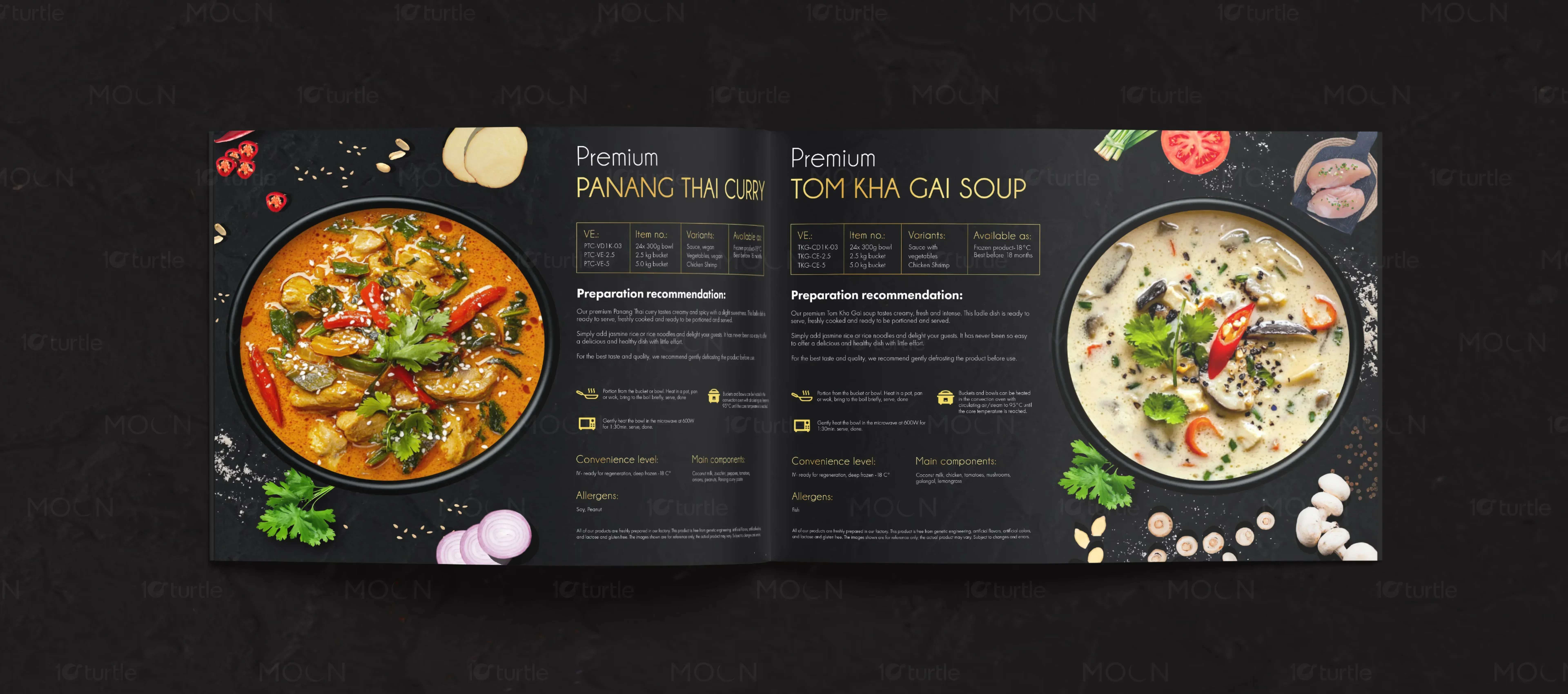
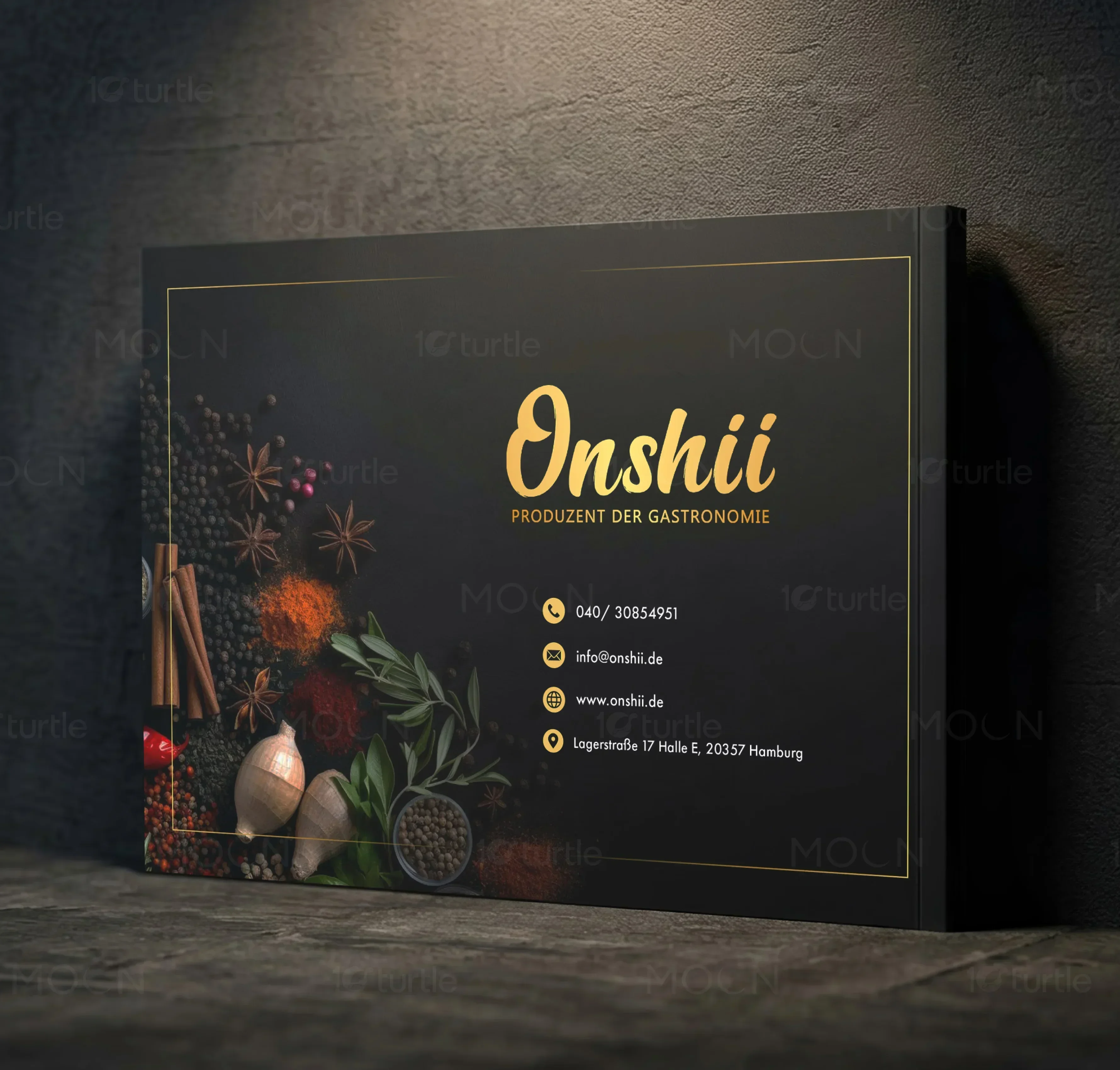
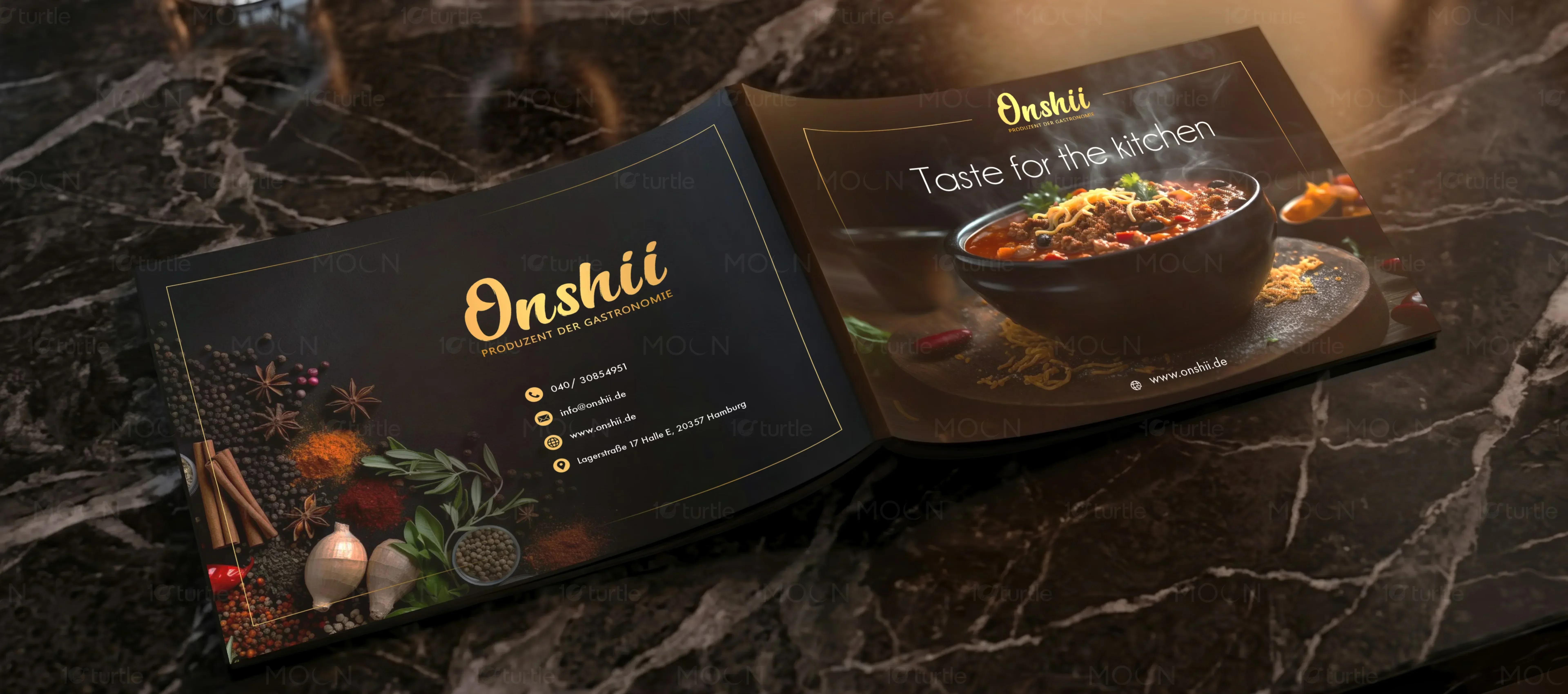
A premium menu design developed for Onshii, an upscale food solutions partner. The design implements a modular, high-contrast grid system with gold accents and high-end culinary photography. This layout balances visual appetite appeal with a clear informational hierarchy to simplify selection processes.
The Challenge

Onshii required an editorial catalog that could organize a massive variety of global culinary offerings without feeling cluttered. The previous layout structure buried high-end dishes, used inconsistent typographic hierarchy, and failed to project a luxury aesthetic that would appeal to premium hospitality partners.
The Solution
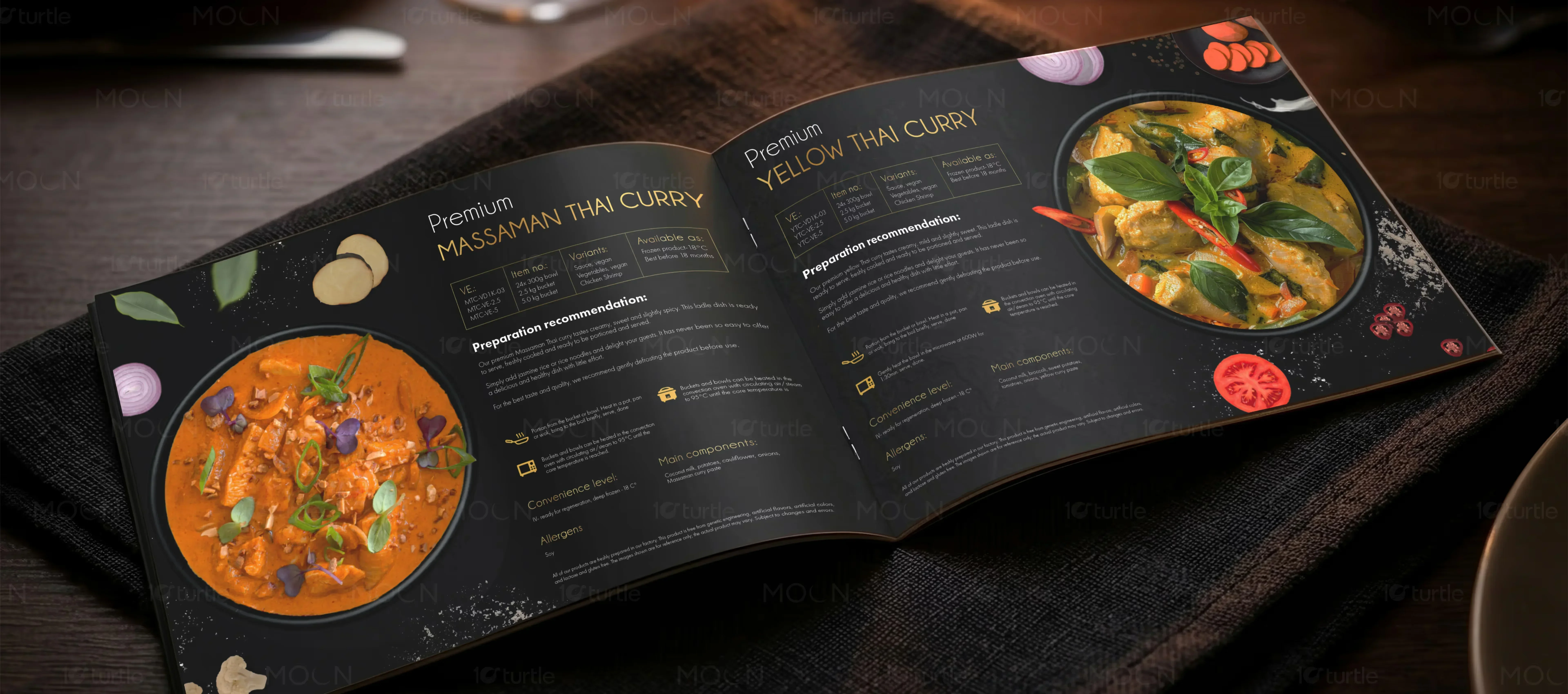
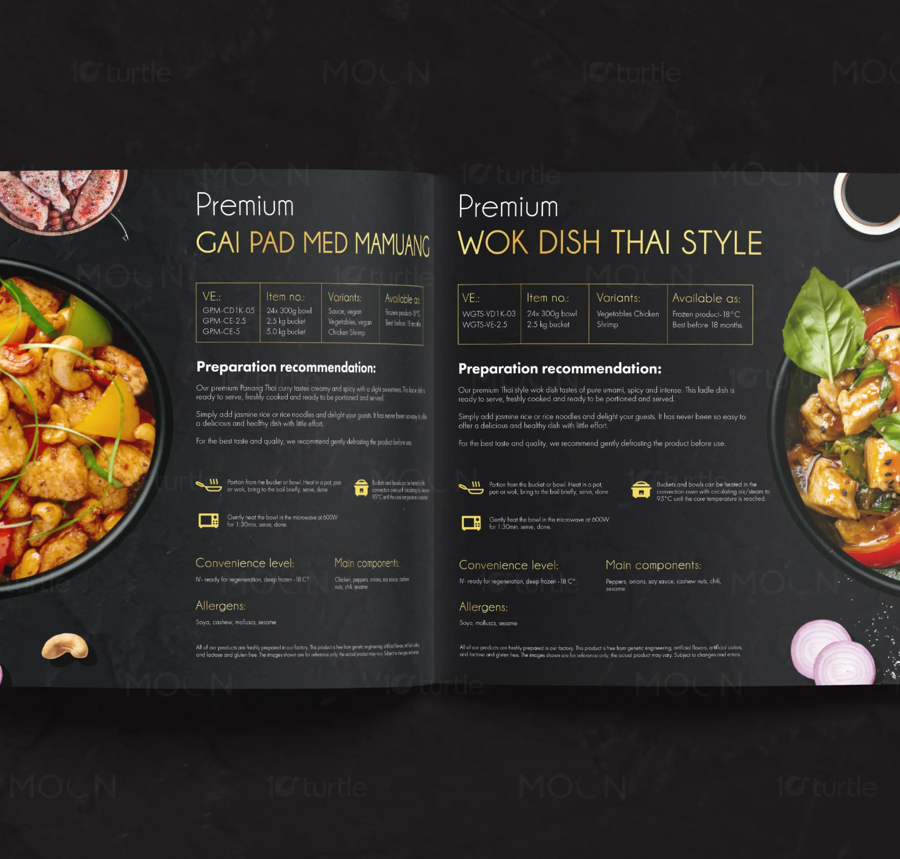
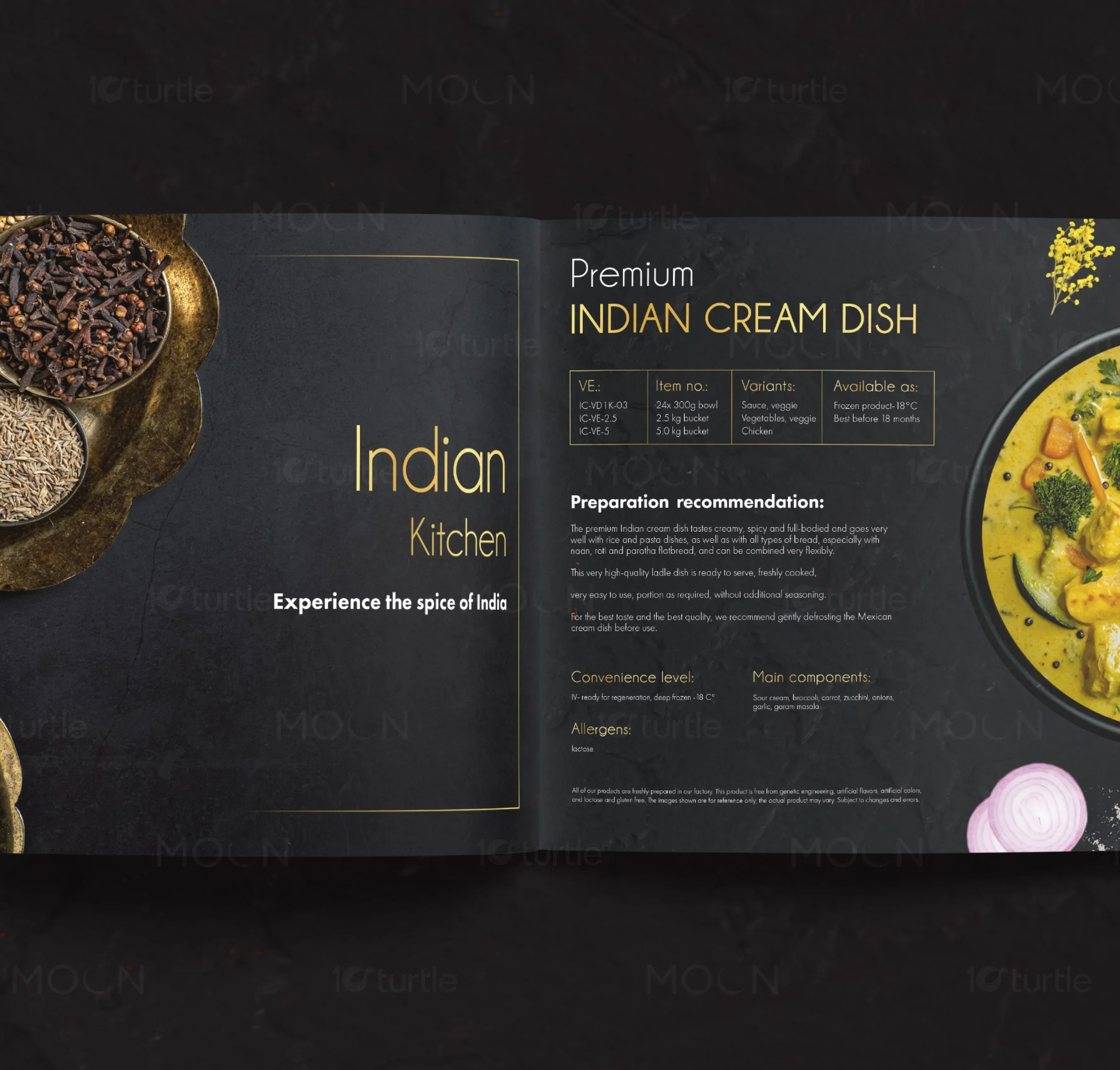
We engineered a custom editorial menu system utilizing a sophisticated dark charcoal background and refined gold accents. By establishing a rigid modular grid, we grouped diverse categories into intuitive visual blocks, paired with clean typography and high-contrast food photography to command attention and emphasize premium quality.
The Impact
The new menu design elevated the perceived value of the private label offerings and reduced decision fatigue. The modular system allowed for seamless digital and physical distribution, resulting in a dramatic increase in product inquiries and client engagement from premium hospitality brands.
Effective menu design represents a delicate balance between fine art and tactical human engineering. In the high stakes landscape of premium food service and luxury hospitality, a menu is never just a simple list of ingredients and price points. Instead, it serves as the ultimate visual and tactile ambassador for a brand's culinary standards, quietly shaping purchasing behavior, directing attention, and defining the perceived value of every dish before a single bite is taken. To achieve this, a layout must leverage strategic design principles that guide the eye naturally across the page, turning a basic browsing experience into an active and satisfying culinary exploration.
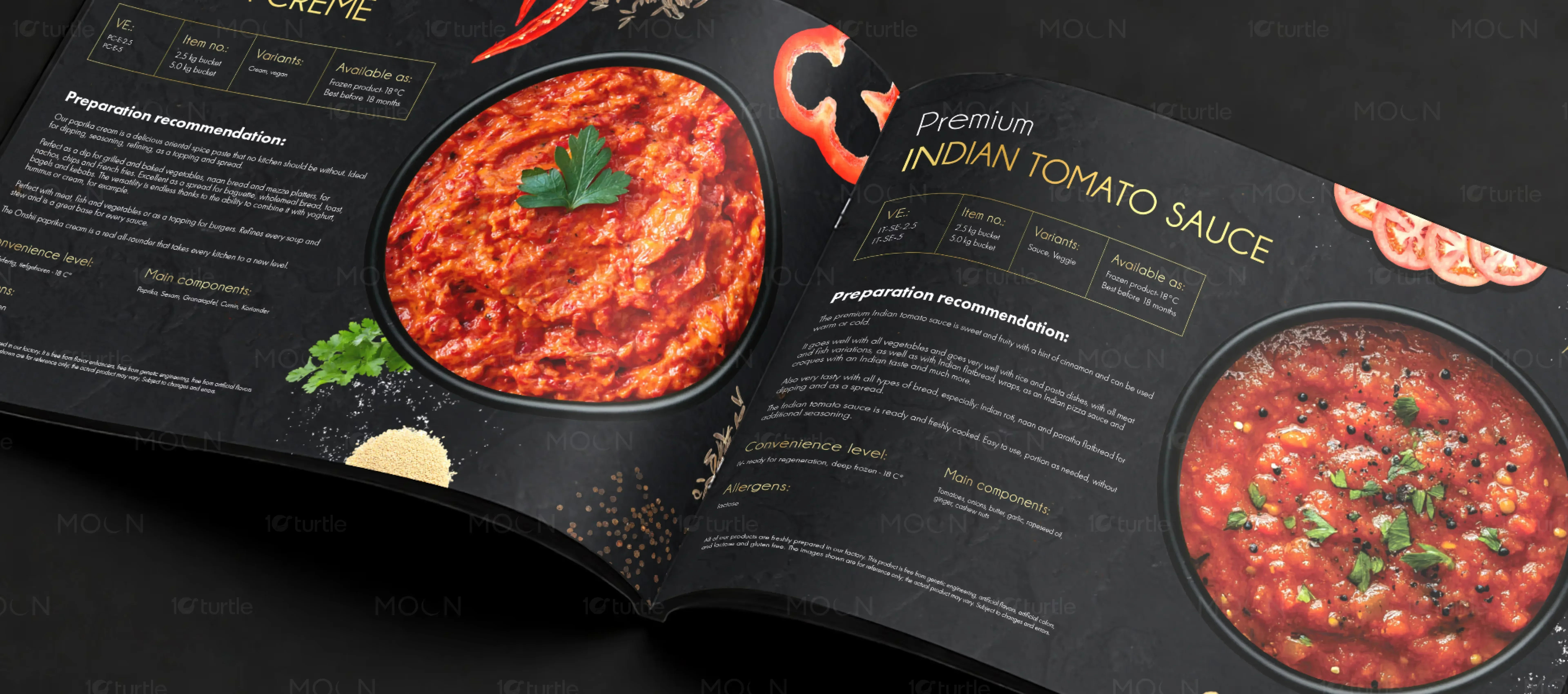
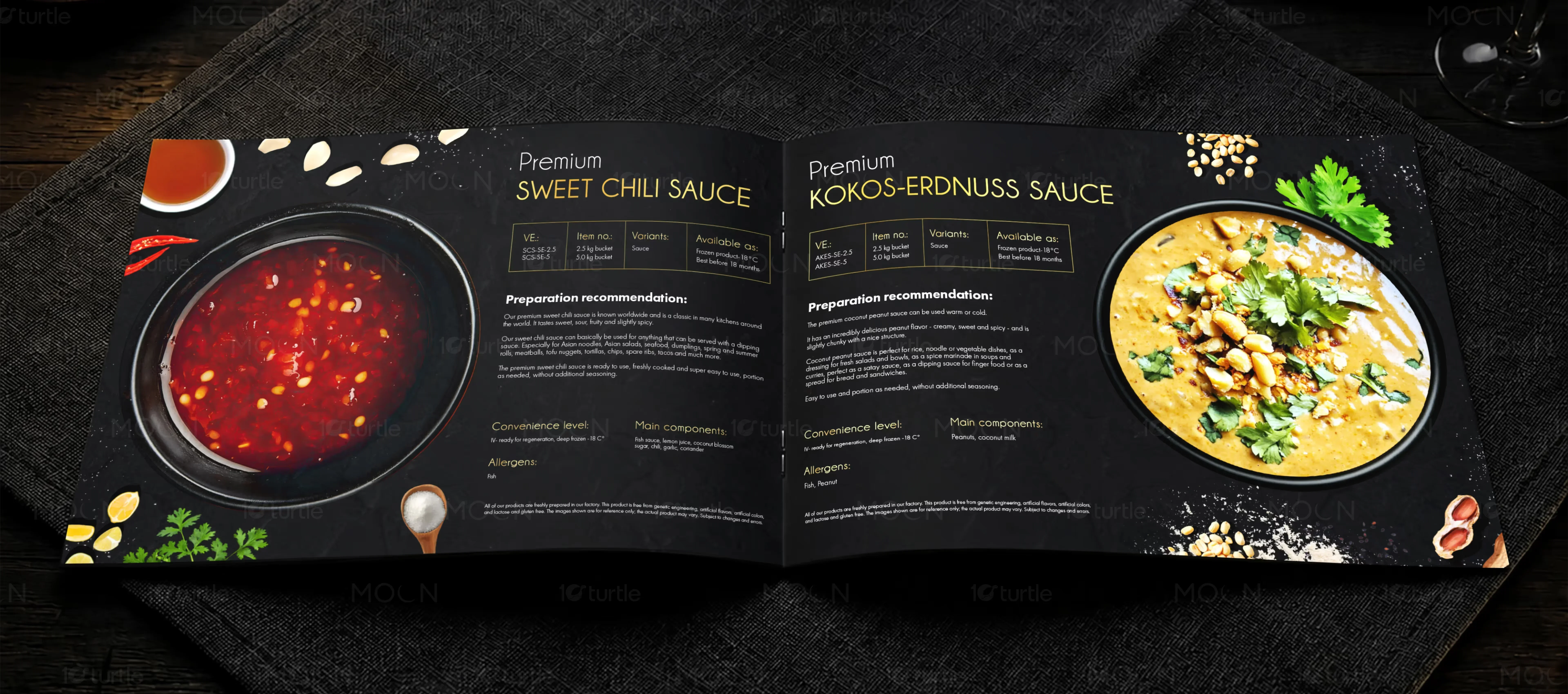
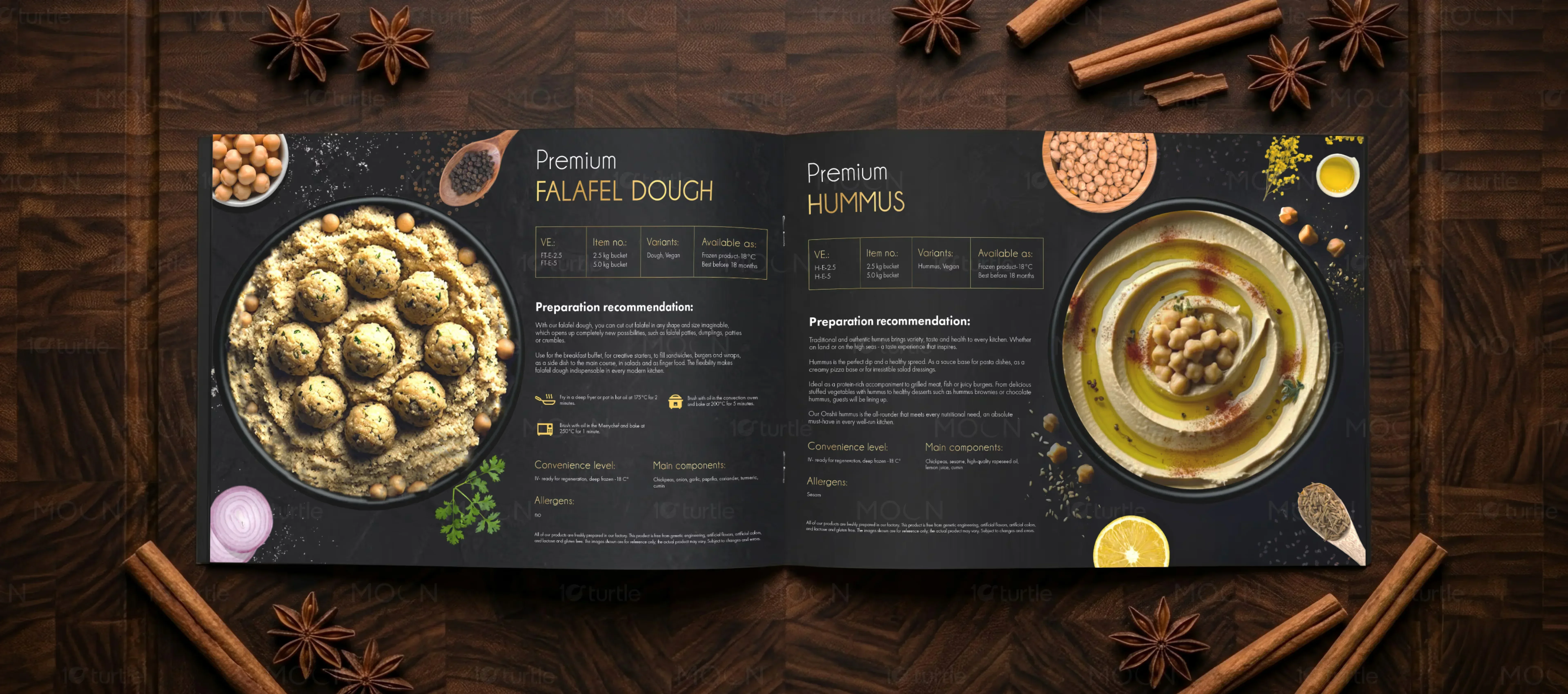
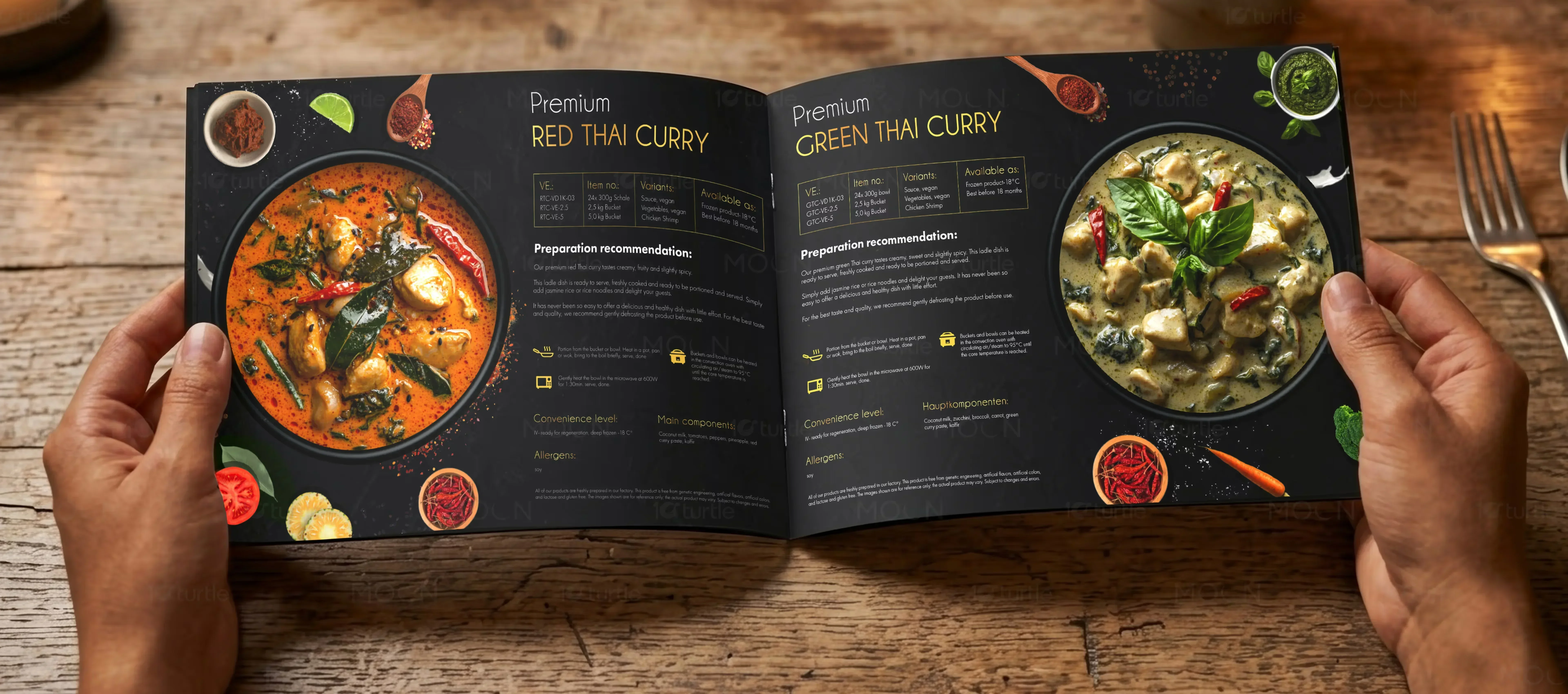
When designing a menu or high-end product catalog, the primary challenge lies in structuring complex information. A chaotic layout with poor visual hierarchy creates immediate cognitive friction, forcing readers to work hard to locate options, which ultimately lowers their confidence in the brand's quality. Our approach to creating an impactful menu system begins with a highly disciplined modular grid. This system allows us to group diverse culinary offerings into defined, easy-to-digest visual frames. By compartmentalizing items into distinct columns and blocks, we ensure that even a highly diverse list of products remains visually approachable. This structure acts as an intuitive guide, giving the viewer's eye a clear path to follow as they move from category to category.
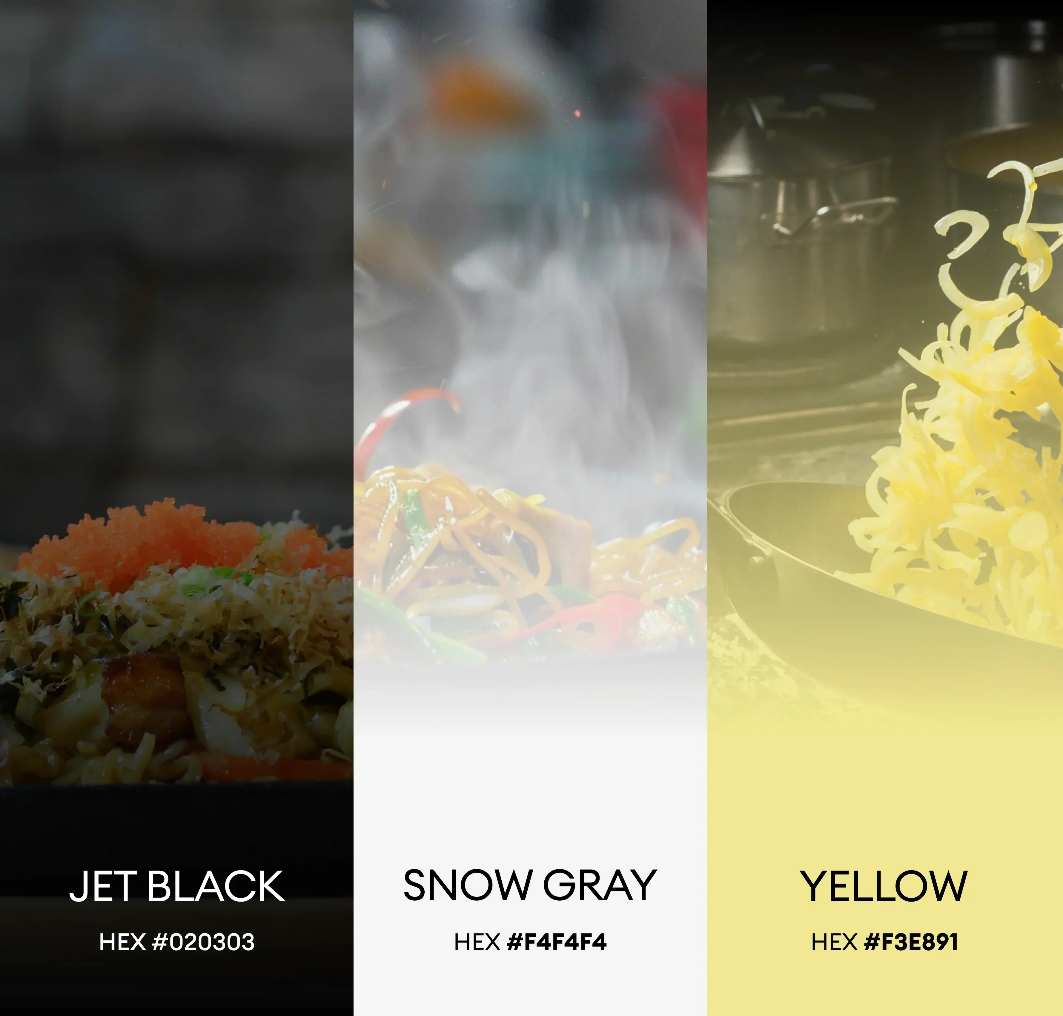
The color palette of a menu plays an equally crucial role in establishing its emotional resonance and appetite appeal. For this sophisticated food design project, we elected to build a dramatic dark theme based on rich charcoal tones and deep warm neutrals. A dark background serves a highly tactical purpose: it functions as a visual stage, absorbing surrounding light and allowing high-contrast culinary photography to pop with intense, lifelike color. By pairing these deep, velvety tones with elegant gold accents, we introduced a layer of luxury and refinement. Gold is not merely used for decoration, but as a functional highlighter. It is applied to borders, section dividers, and key culinary selections, signaling premium status and drawing immediate focus to high-margin, signature offerings.
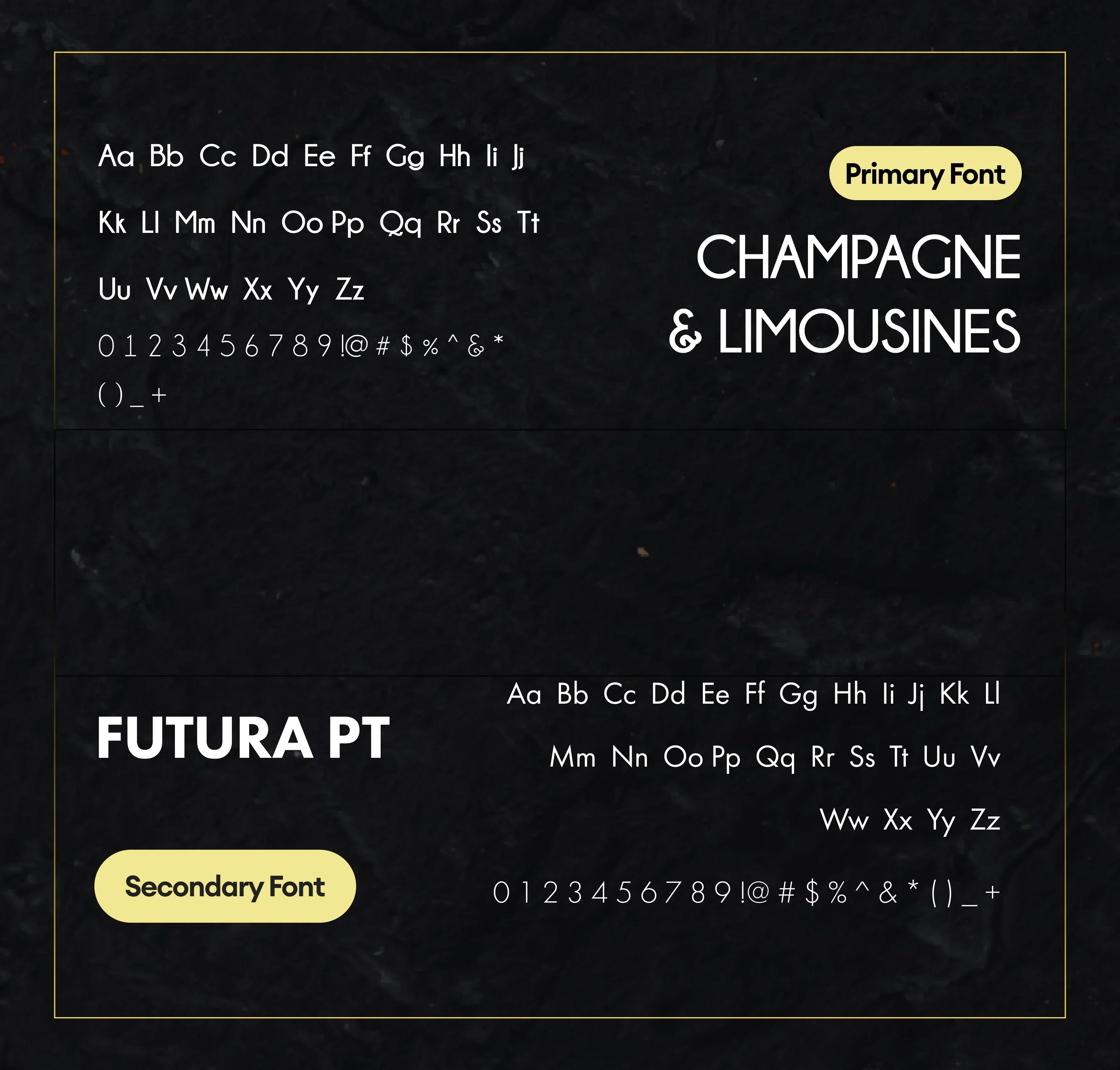
Typography is another core pillar of a successful menu layout, establishing both the visual tone and the speed of readability. For section headings, we selected a bold, modern sans-serif typeface that projects authority, stability, and contemporary sophistication. This bold letterform creates strong entry points on the page, helping readers instantly recognize transitions between different categories. For the body text, descriptions, and pricing, we chose a clean, highly legible typeface with compact metrics. This font allows us to fit detailed ingredient descriptions and private label specifications into tight informational blocks without sacrificing readability. Furthermore, we deliberately designed the pricing format to integrate smoothly with the item descriptions, eliminating traditional leader dots or heavy symbols. This visual alignment prevents readers from scanning the menu purely by price, encouraging them instead to focus on the premium quality and sensory descriptions of the dishes.
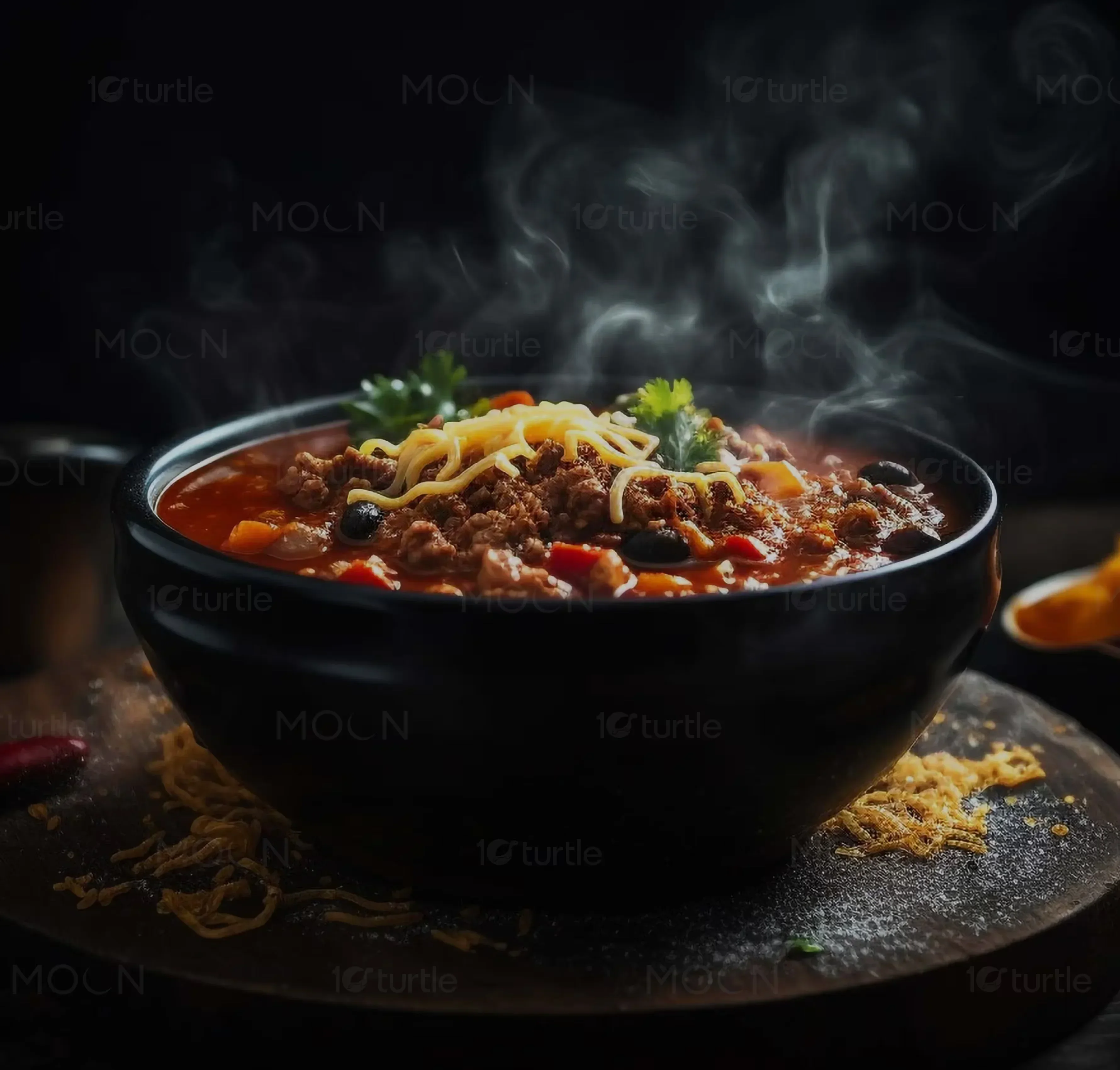
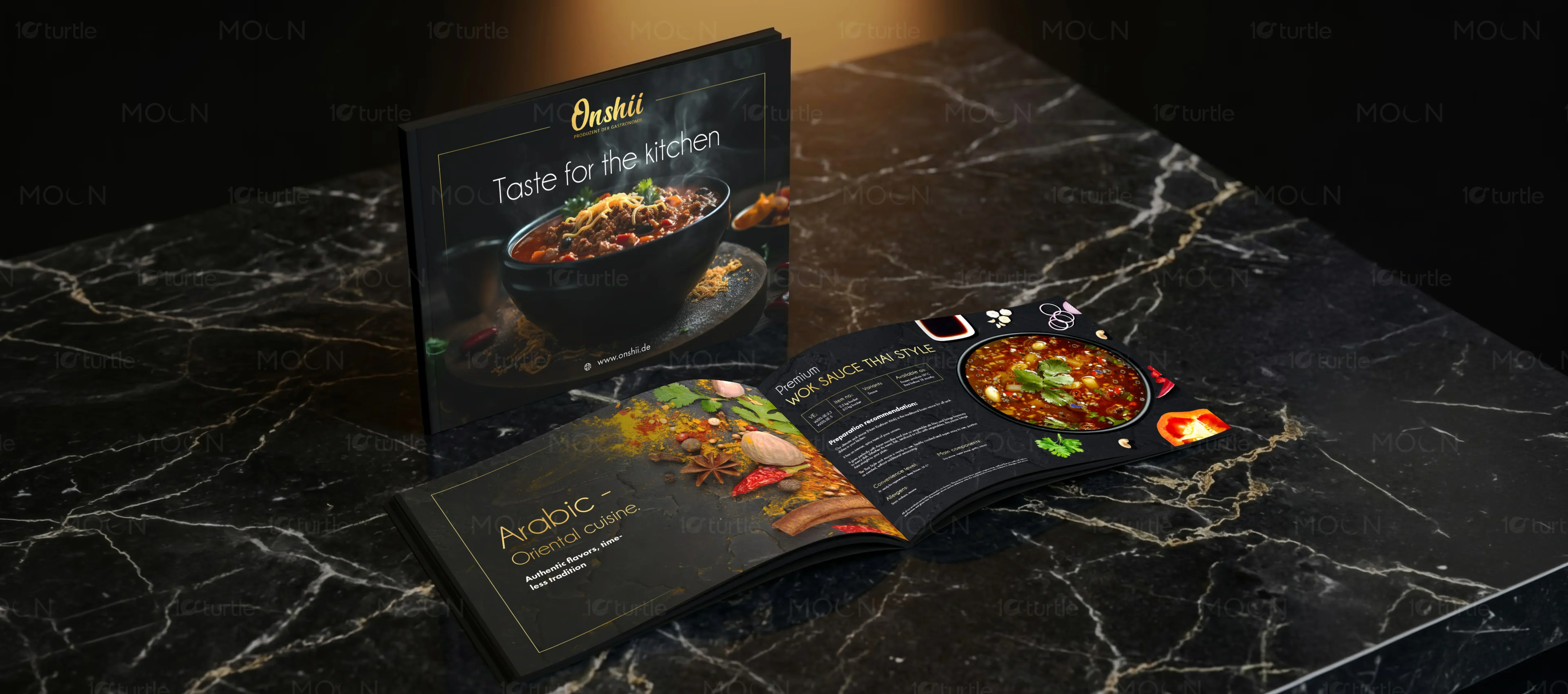
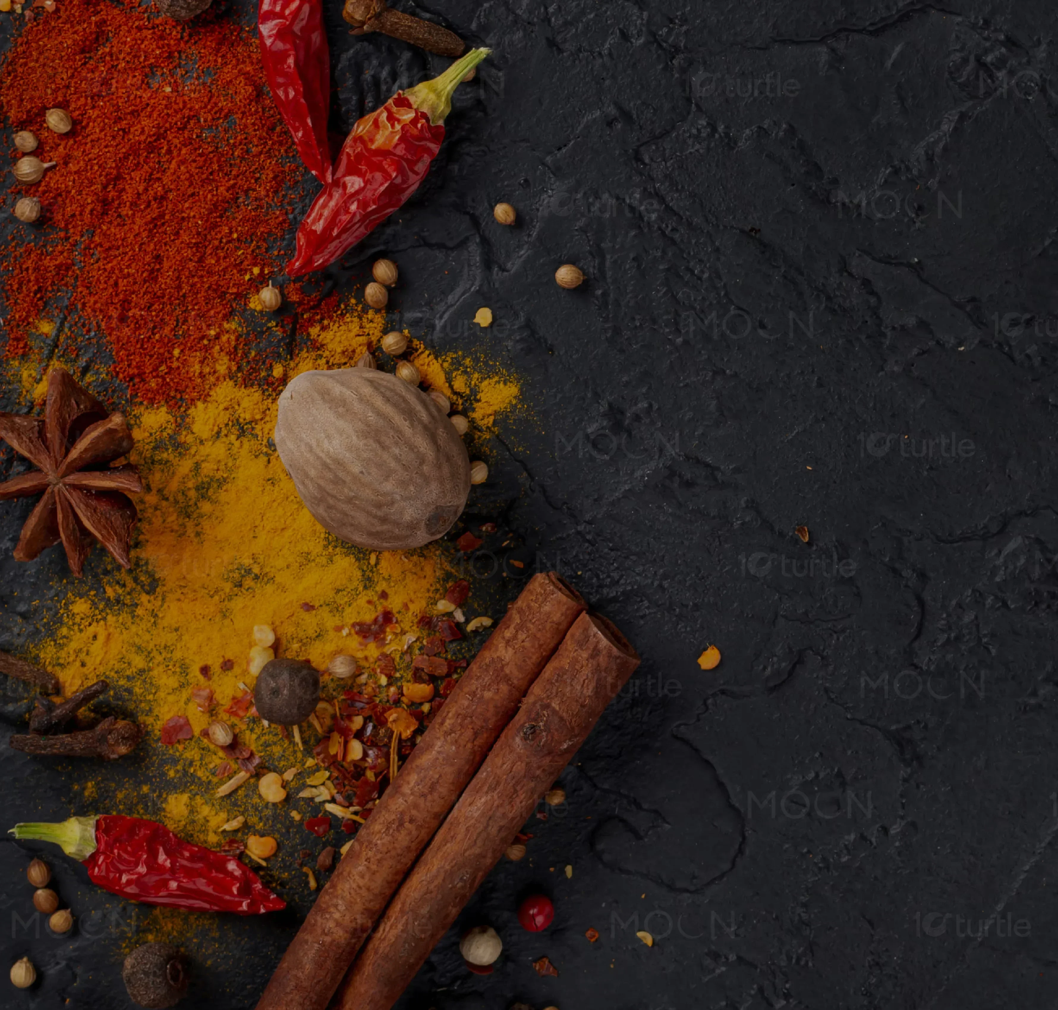
To complement the structured typography and rich colors, high-impact culinary photography must be integrated with careful restraint. Too many photos can make a menu layout feel cluttered and cheap, resembling a low-end fast-food flyer rather than an upscale gastronomic experience. In this premium menu system, photography is treated with the same respect as a high-end editorial feature. We placed large, vibrant, high-contrast food images at strategic layout intersections. These images serve as structural anchors that break up the grid, providing visual relief and stimulating the viewer's appetite. Each photo is meticulously styled to highlight the raw textures, fresh ingredients, and rich sauces of the culinary creations, ensuring that the visual representation matches the luxury brand identity.
Beyond the visual elements, a great menu must be structured around intuitive navigation systems that accommodate diverse reader requirements. This is achieved by implementing distinct, easy-to-read graphical indicators for dietary needs, chef suggestions, and flavor profiles. Using minimalist, custom icons that blend seamlessly with our gold accented aesthetic, we allow readers to scan for gluten-free, organic, or signature dishes in fractions of a second. This layer of thoughtful categorization enhances the user experience, transforming the menu from a passive list into an active procurement and dining tool that respects the reader's time and intelligence.
Finally, the physical production of a printed menu must match the digital layout's graphic sophistication. For this luxury portfolio piece, we specified high-grade, heavy weight matte paper stocks with a soft-touch protective laminate. This ensures that the menu feels satisfyingly substantial in the hand, resisting moisture and handling wear while maintaining a premium tactile quality. To complete the premium experience, we integrated spot UV varnishes on key editorial images and incorporated genuine gold foil stamping on the cover details. These physical finishes work in absolute harmony with our digital design choices, providing a tactile confirmation of the brand's culinary mastery. Whether displayed on a digital tablet or held in hand at a physical table, this menu design proves that every detail, from the width of a grid line to the thickness of the paper, directly contributes to a cohesive, high-end culinary narrative.
restaurant menu design
menu design services
premium product catalog design
editorial food catalog layout
modular menu design system
luxury print menu production