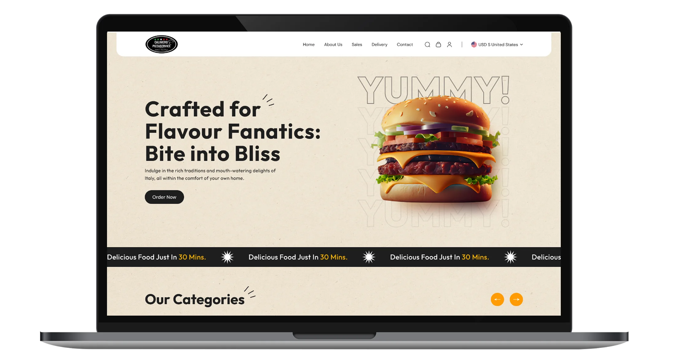
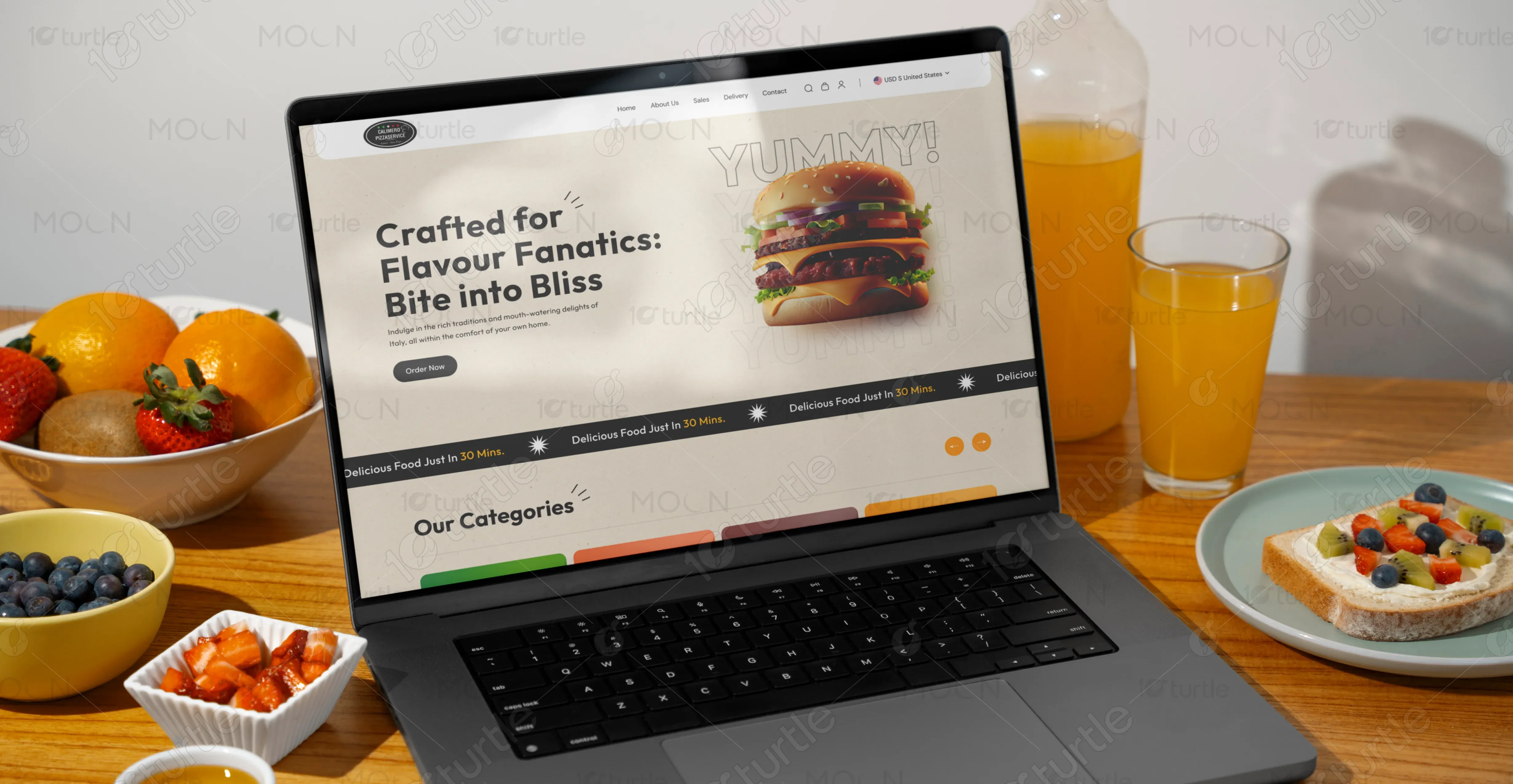
Crafted to elevate the food-ordering experience, this design blends bold visuals, clean structure, and intuitive navigation. Its dynamic layout highlights categories, offers, combos, and customer reviews with clarity. Warm tones and appetizing imagery create an inviting digital presence tailored for modern food lovers.
UX Design
Ul Design
Research
Websites Design
Industry
Food & Beverage
Tools we used

Project Completion
2024
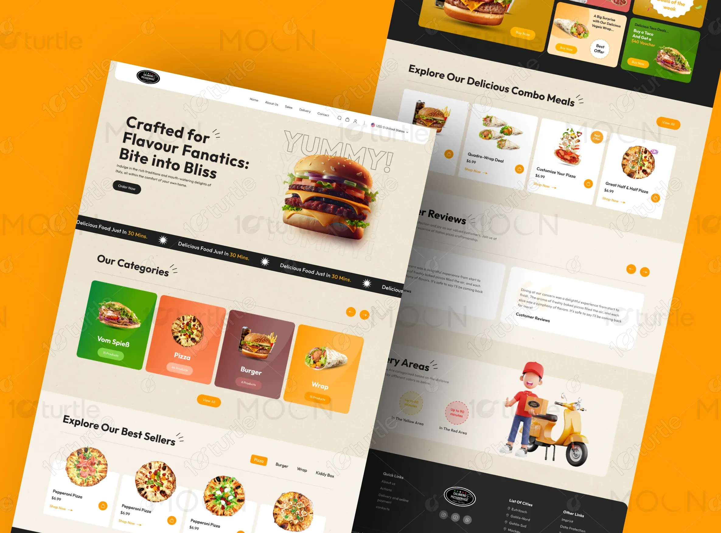
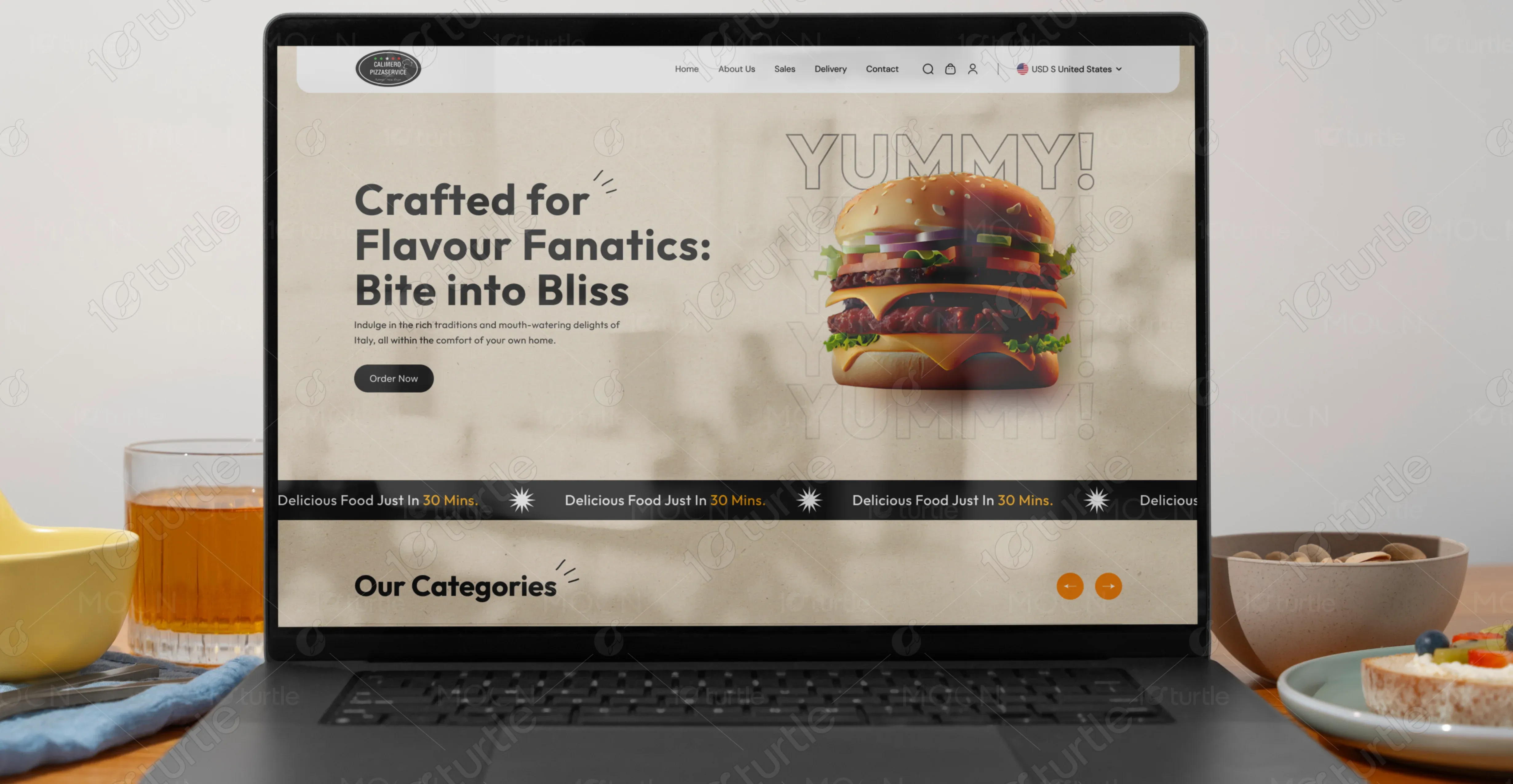
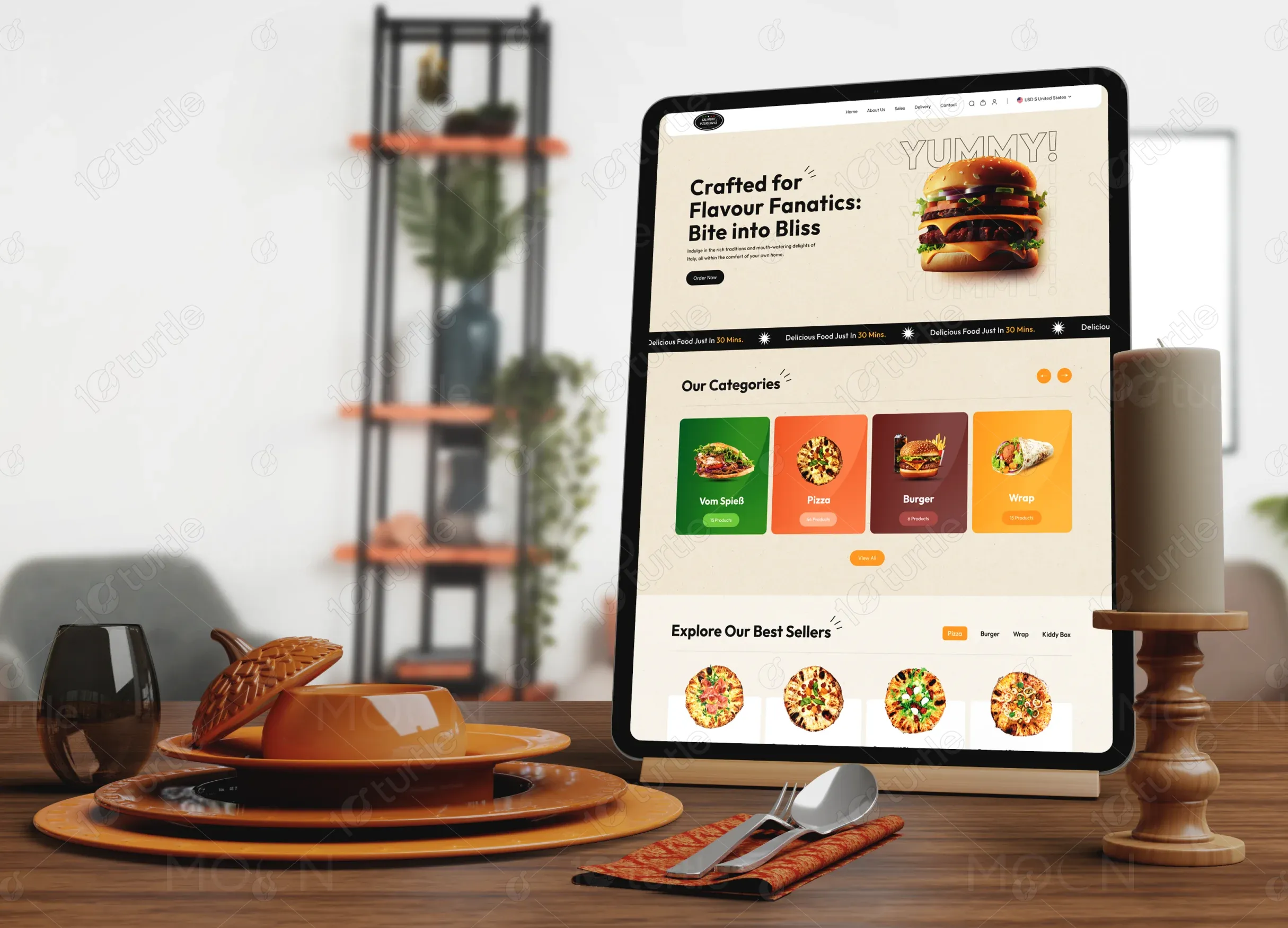
The website layout focuses on simplicity, user flow, and visual appeal. Each section guides users effortlessly toward ordering, exploring products, or checking offers. Strategic spacing, vibrant product cards, and graphical elements enhance usability. The design maintains consistency across typography, colors, and imagery, creating a cohesive and delightful browsing experience.
Industry
Food & BeverageWhat we did
User ResearchUl UX DesigningResponsive ExperiencePlatform
-Calimero Pizza Service needed a modern, visually compelling website that could clearly showcase its wide food variety while simplifying navigation for customers. The previous Structure lacked hierarchy, product visibility, and engaging elements. Users found it difficult to explore categories, discover offers, and make quick purchase decisions, reducing overall conversion potential.
The redesigned interface delivers a structured, visually engaging layout that highlights categories, offers, and best sellers clearly. Strong visual hierarchy, intuitive navigation, and appetizing imagery guide users effortlessly through the ordering journey. Responsive components, improved clarity, and strategic call-to-actions ensure quicker decision-making, enhanced engagement, and a smoother overall user experience.
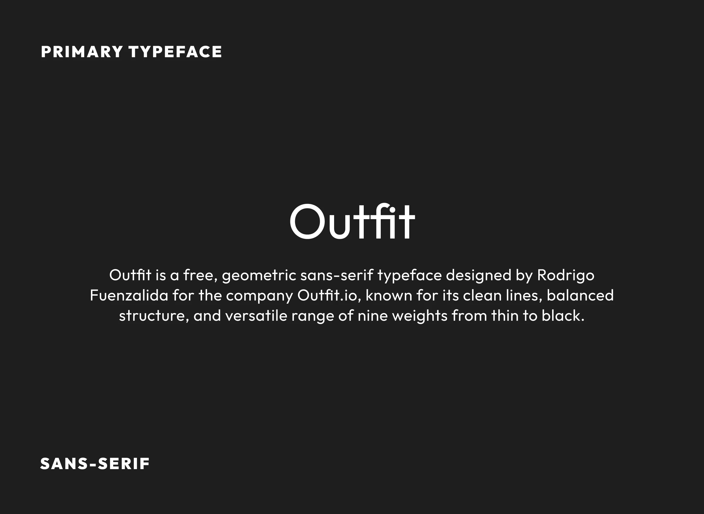
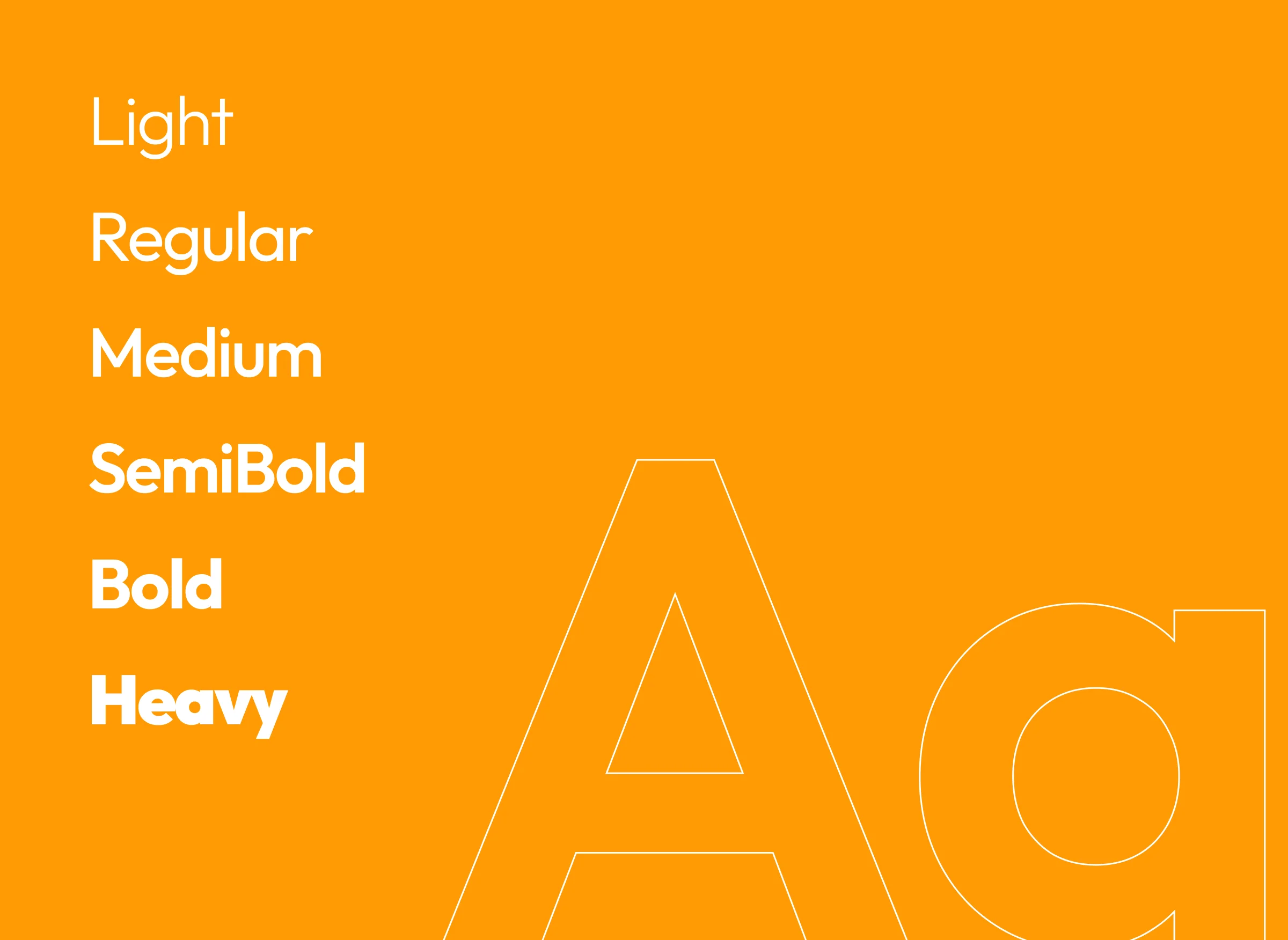
By combining warm color tones, modern typography, and high-quality food visuals with a clean layout, the website maintains premium aesthetics. Intuitive navigation, clear categorizations, and micro-interactions ensure an inviting and user-friendly experience.
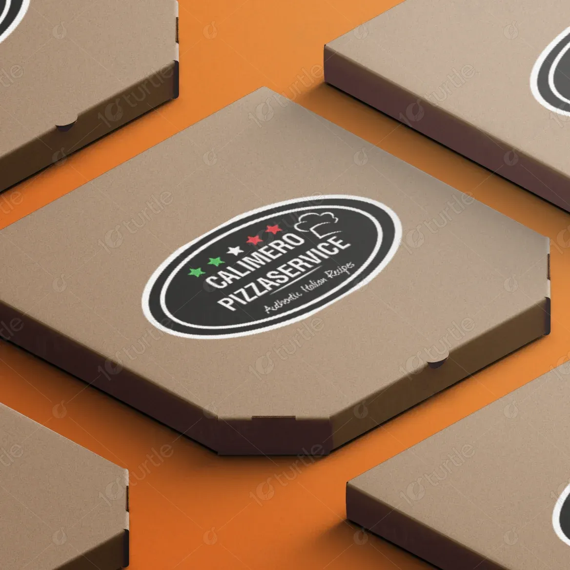
The logo reflects a handcrafted and authentic identity, symbolizing fresh, flavorful food served with care. Its traditional emblem style adds trust, while clean lines make it modern and versatile. The combination of bold typography and minimal graphic charm helps establish a memorable brand personality.
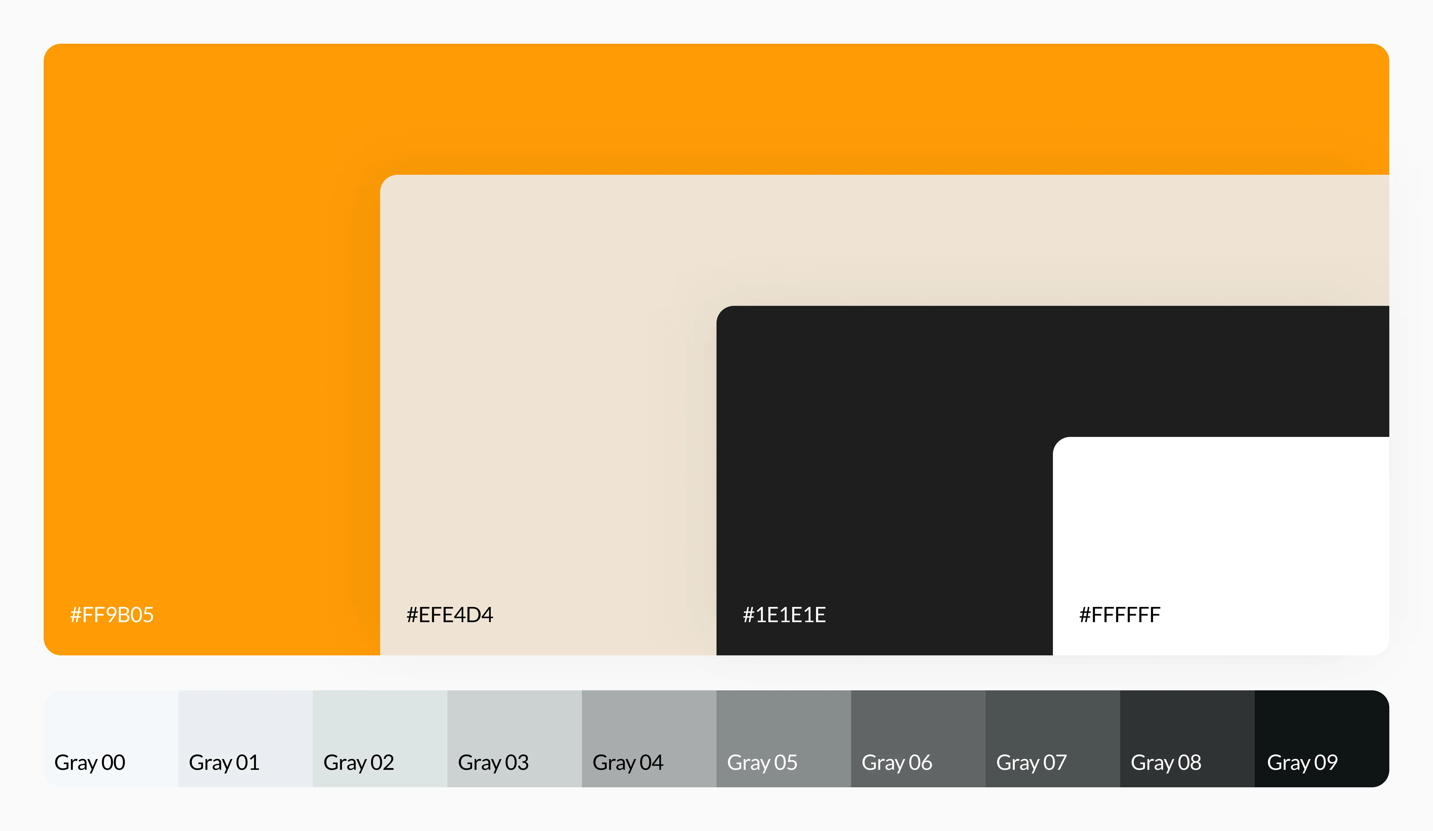
The palette blends warm yellows, oranges, and earthy beige tones to evoke freshness and comfort. Vibrant accent colors highlight important actions and deals. Neutral backgrounds keep the layout balanced, allowing the food imagery to stand out and create a richly appetizing visual appeal.
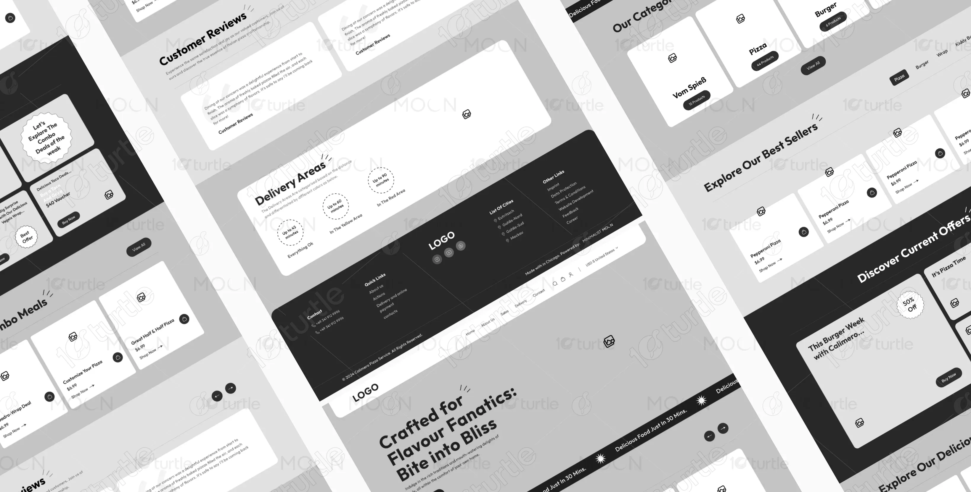
The wireframe defines a simple, intuitive structure: hero section, categories, best sellers, offers, combos, reviews, and delivery details. Each block is planned for clarity and conversion. The wireframe ensures smooth navigation and functional placement of visual elements before transitioning to high-fidelity design.
