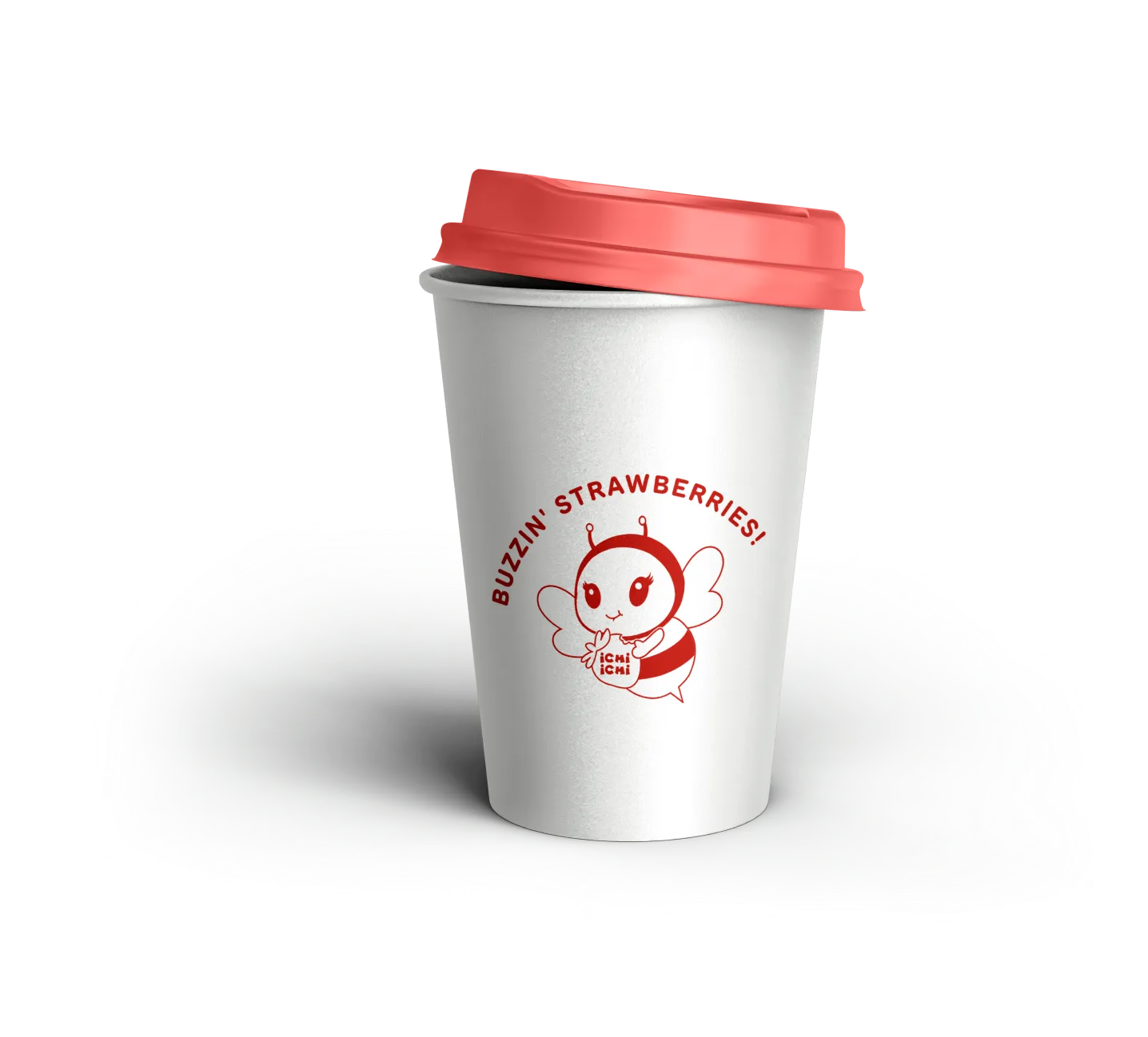
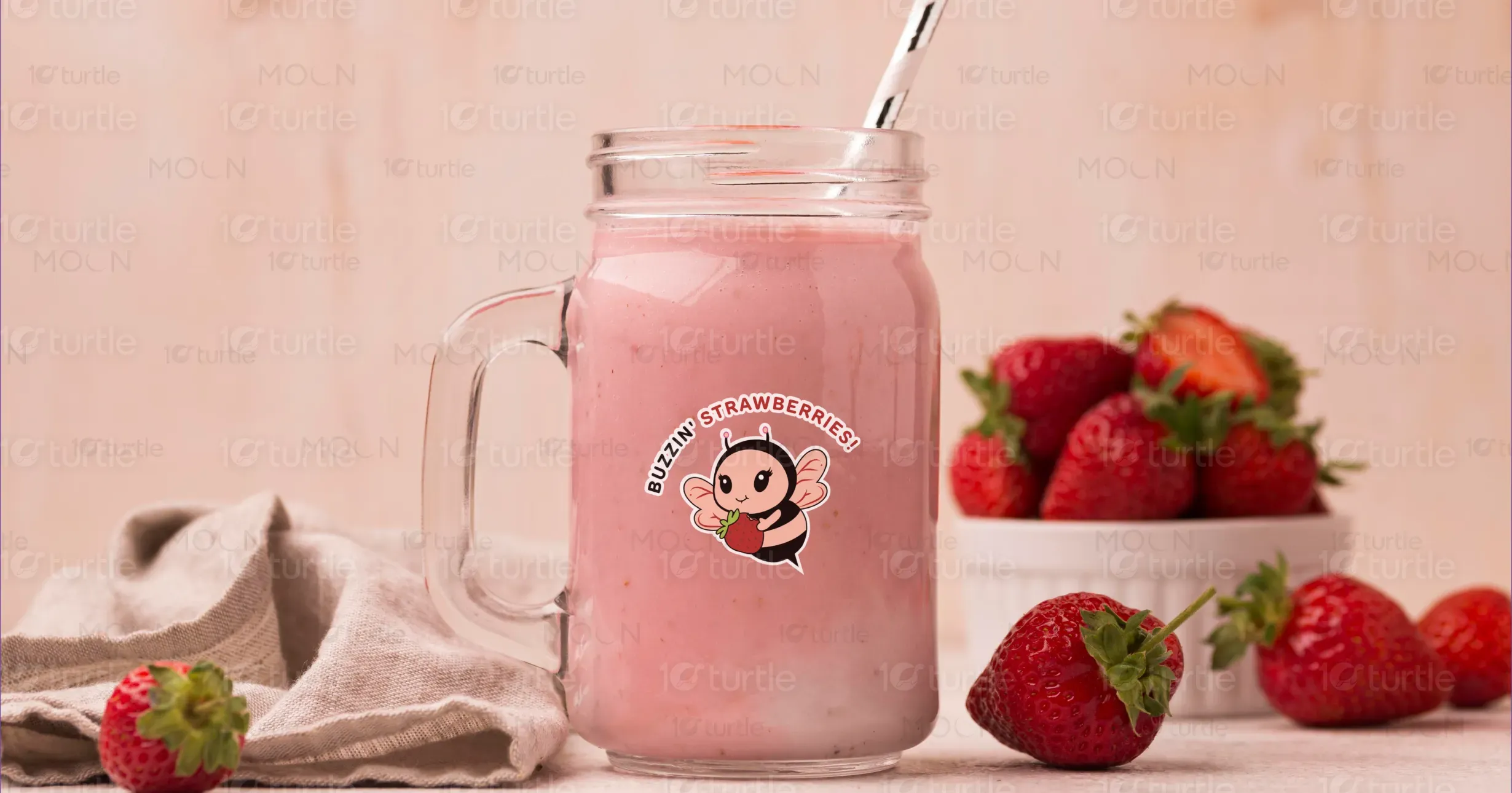
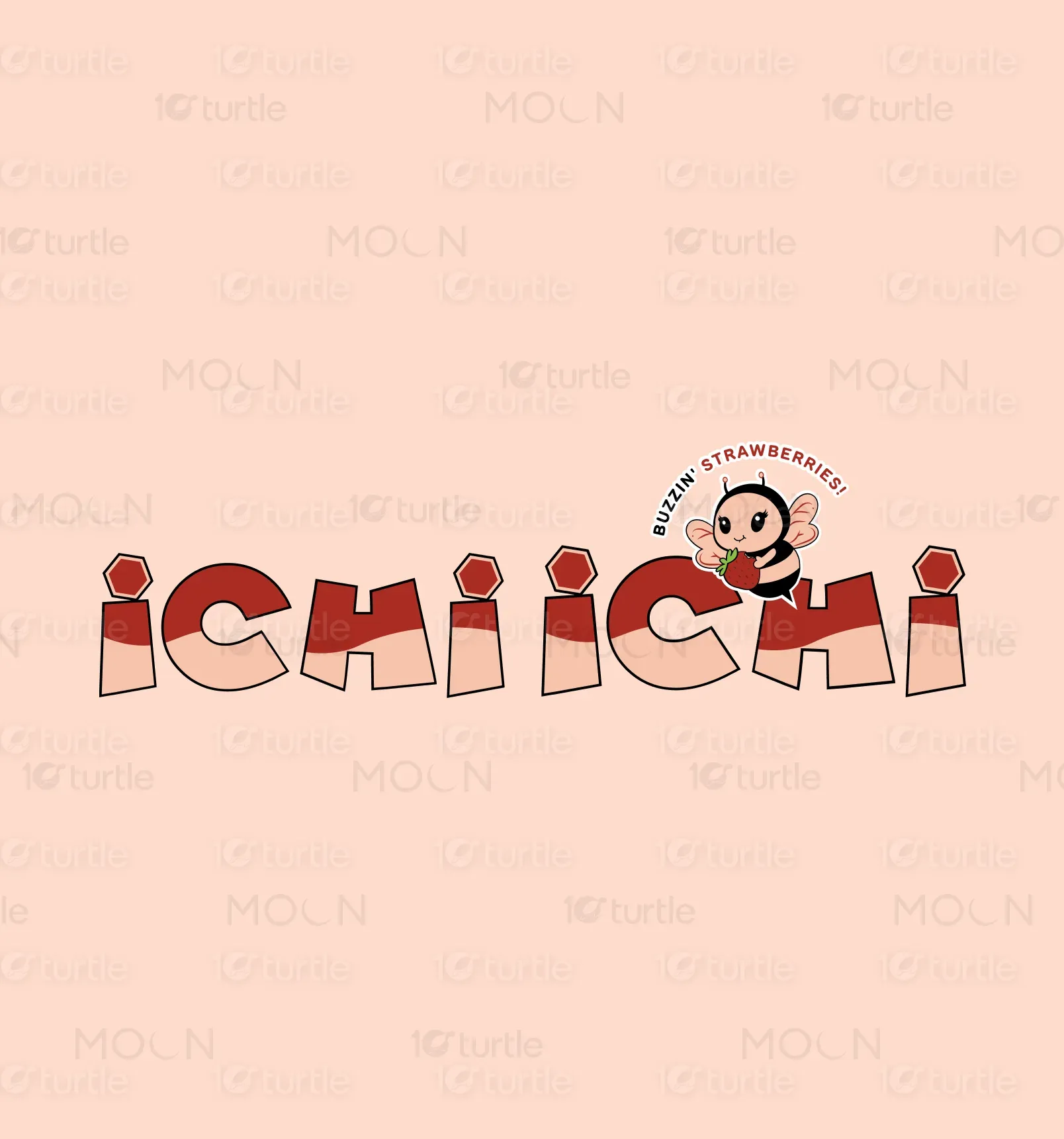
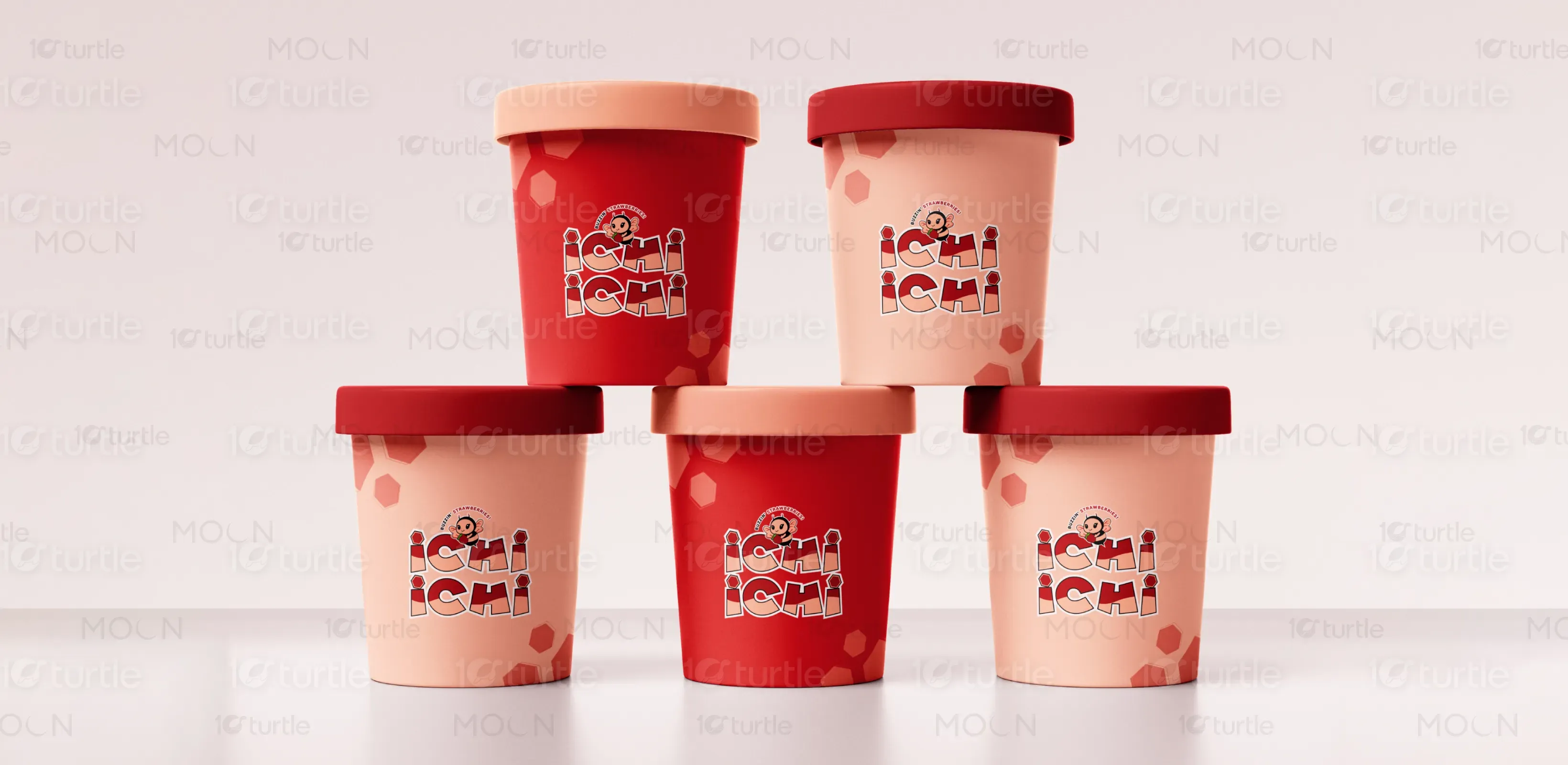
This logo design for Ichi Ichi perfectly encapsulates the brand’s playful and vibrant personality. The bold, dynamic typography with its layered red tones exudes energy and warmth, while the charming bee mascot holding a strawberry adds a whimsical touch that connects with the brand’s “Buzzin’ Strawberries!” tagline. The inclusion of hexagonal accents ties into the bee theme, symbolizing creativity and nature. The overall design is inviting, memorable, and cohesive, making it an excellent representation of the brand’s fresh and fun identity.
Logo Design
Graphic Design
Industry
Food, Beverage & Hospitality
Tools we used




Project Completion
2024
Key Market
Local & Regional
Ichi Ichi is a fun and vibrant dessert brand specializing in refreshing strawberry-based shakes and treats. The brand embodies joy, creativity, and an unwavering commitment to quality, delivering delicious products that bring smiles to customers' faces with every sip and bite.
Industry
Food, Beverage & HospitalityWhat we did
Logo DesignGraphics DesignPlatform
-Calico, a brand specializing in household chemicals with ambitions to expand into nutritional supplements, faces the challenge of creating a cohesive brand identity that reflects both trust and innovation. The goal is to appeal to a diverse global audience while emphasizing safety, quality, and eco-consciousness. Balancing its existing product line with future aspirations demands a versatile yet consistent visual and strategic approach.
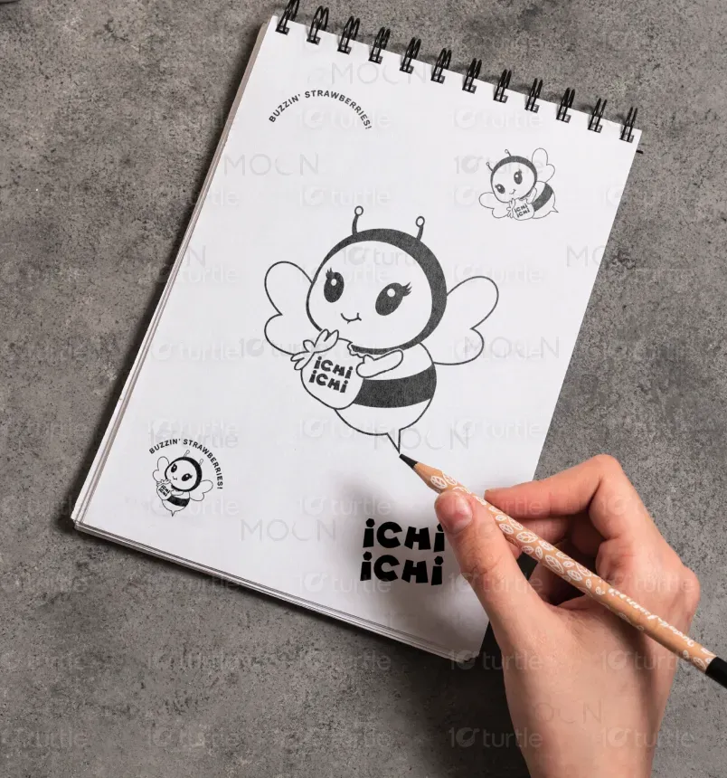
We created a thoughtfully designed branding solution that captures the vibrant essence of Ichi Ichi. The logo combines bold, geometric typography with a playful color palette, while the adorable bee mascot adds a memorable and relatable element, perfectly complementing the brand's cheerful and dynamic personality. Hexagonal accents seamlessly tie into the bee-inspired theme, reinforcing the brand’s natural and fresh narrative.The design balances creativity and approachability, delivering a cohesive identity that stands out while staying true to Ichi Ichi’s core values. This solution ensures strong visual impact across all marketing and packaging materials.
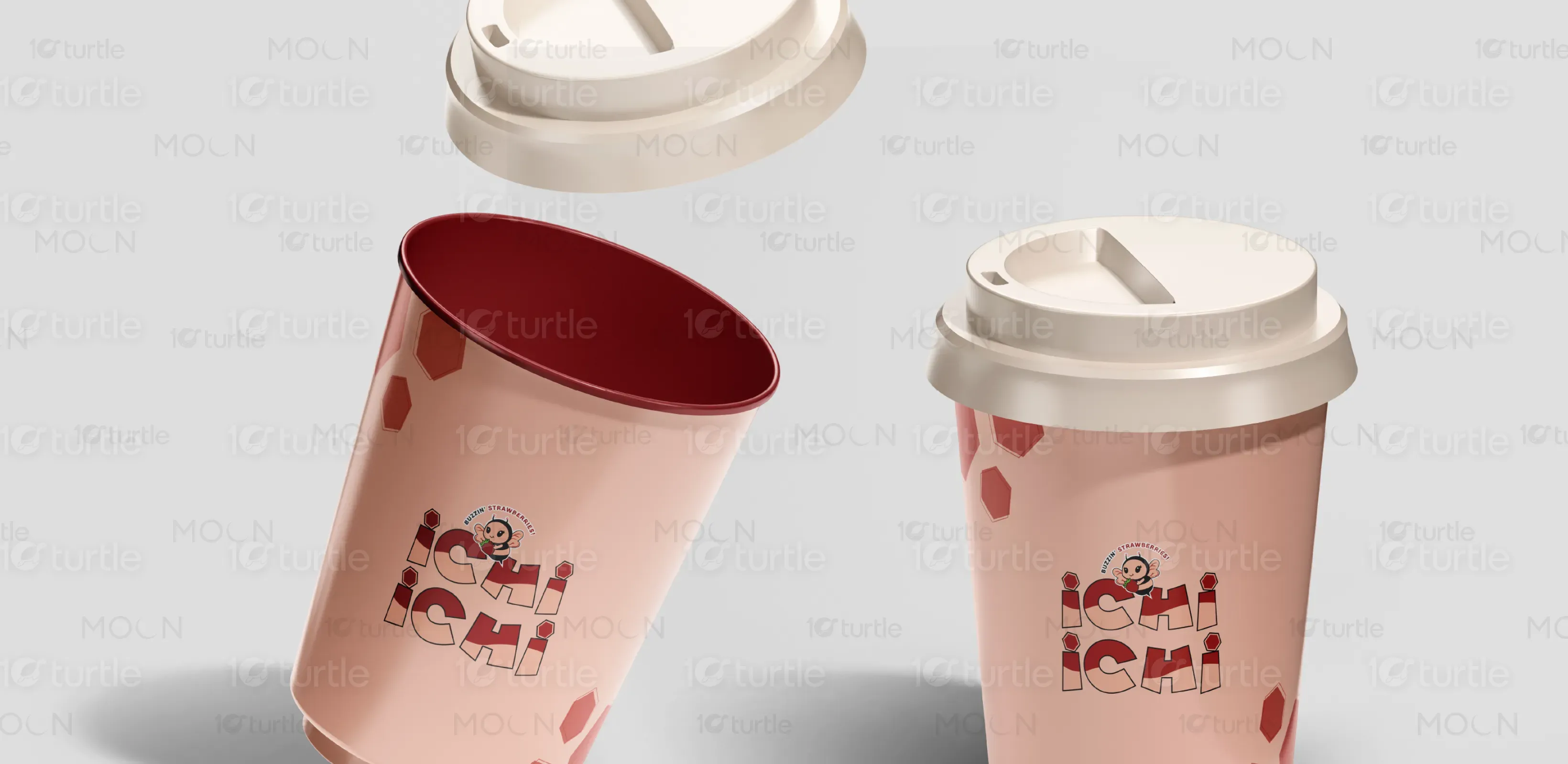
Our vision is to establish Ichi Ichi as the go-to destination for delightful and memorable dessert experiences. We aim to create a brand that not only satisfies sweet cravings but also builds lasting emotional connections with our customers through creativity, warmth, and showed a sense of sweetness of bee.
The logo features the brand's cheerful bee mascot, symbolizing sweetness and happiness. Its playful typography integrates strawberry elements, emphasizing the brand's signature ingredient and joyful personality.
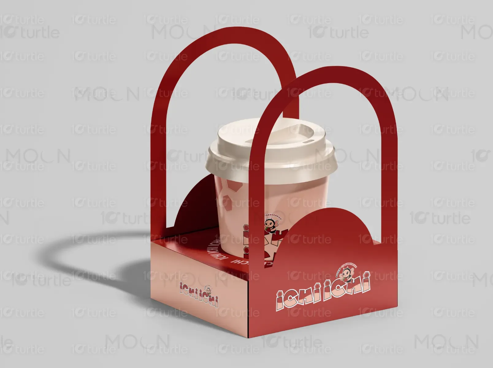
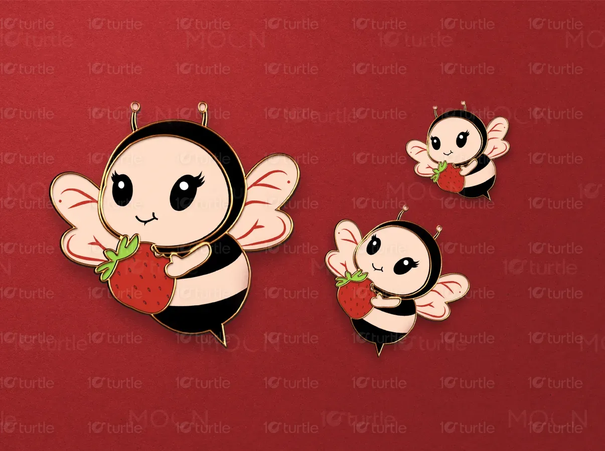
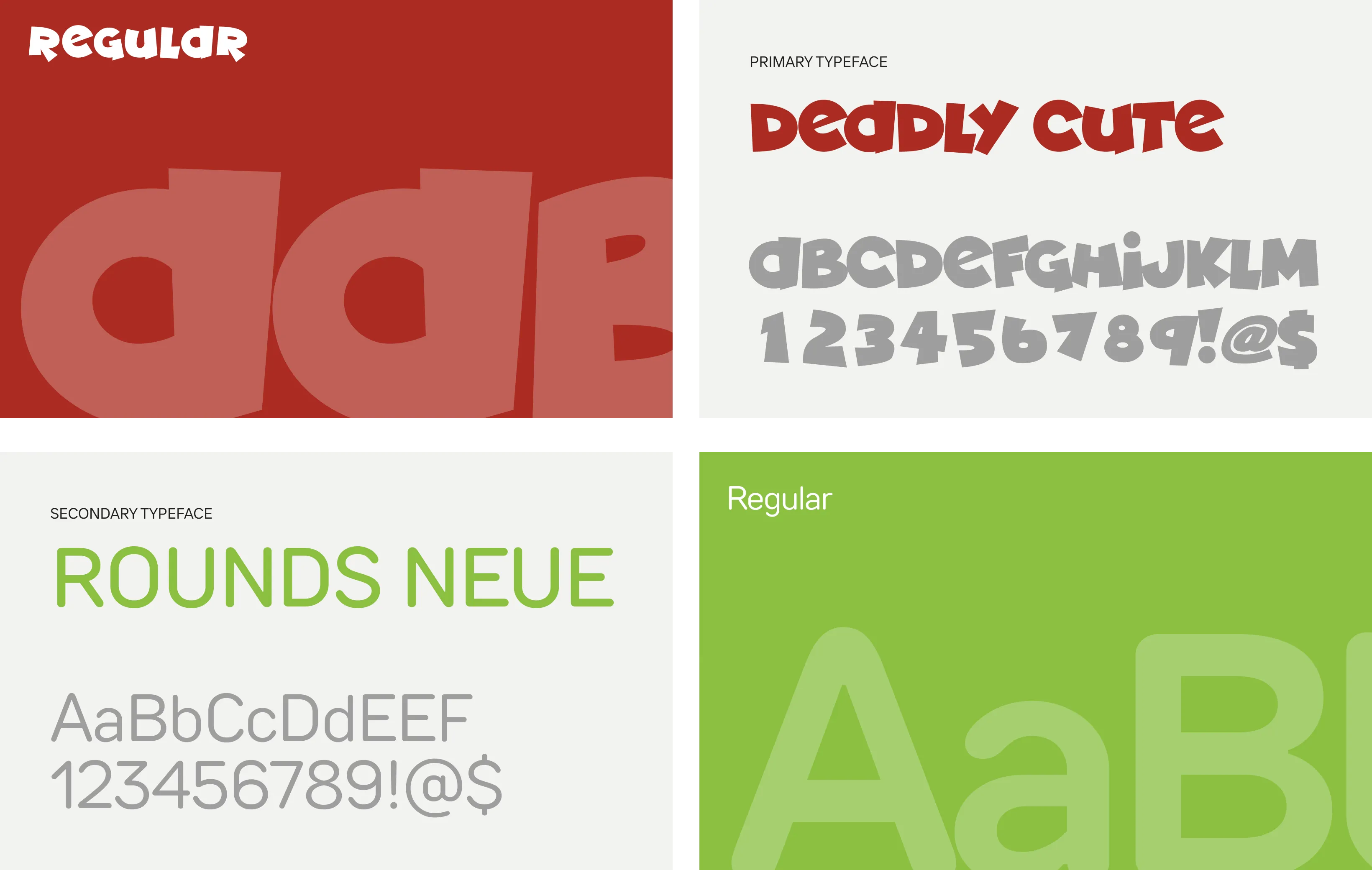
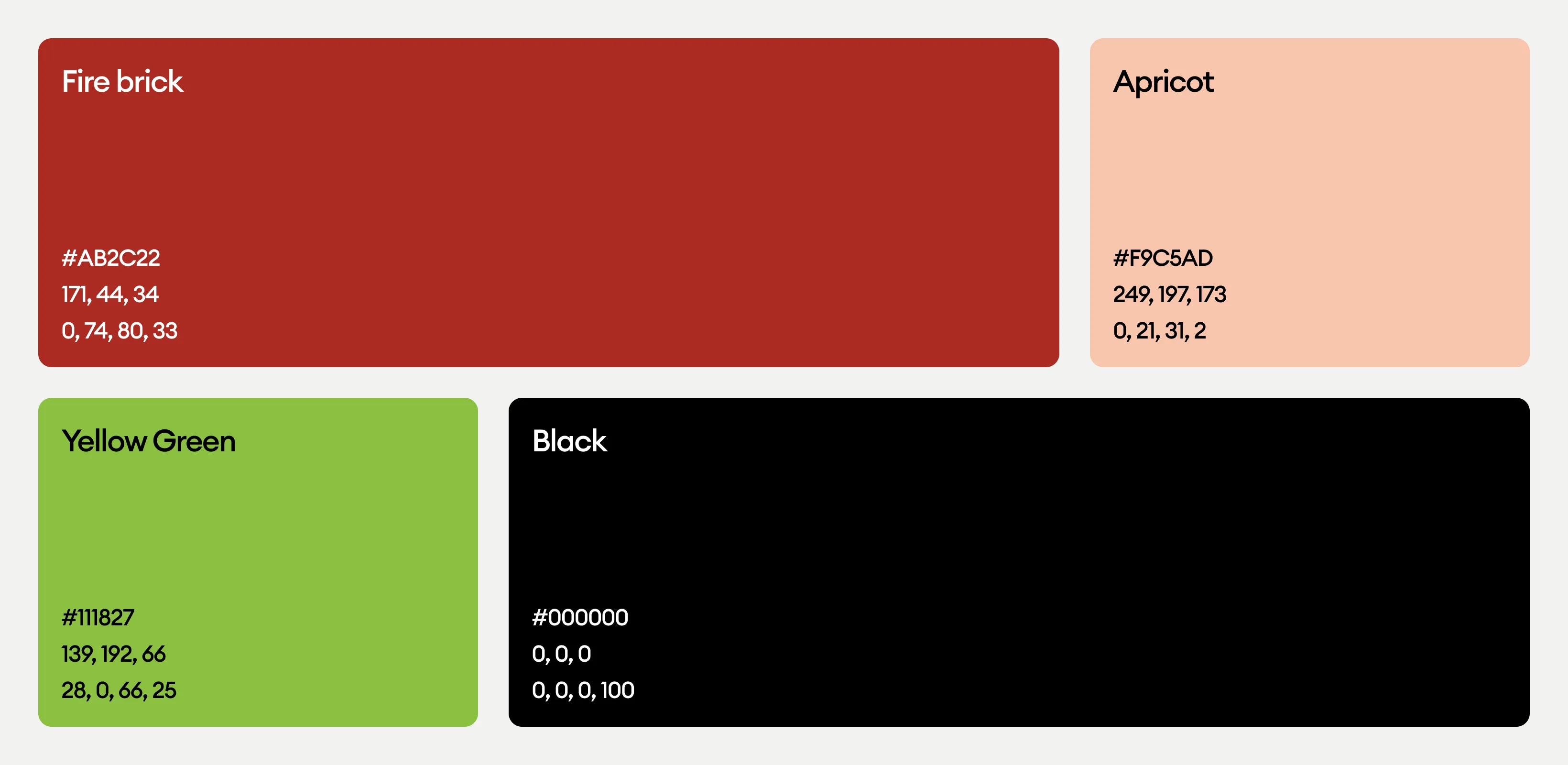
In this logo, bright red and soft beige to convey sweetness, warmth, and energy, shades of green and black for contrast and balance, The palette is fresh and vibrant, reinforcing the strawberry theme and overall cheerfulness.
