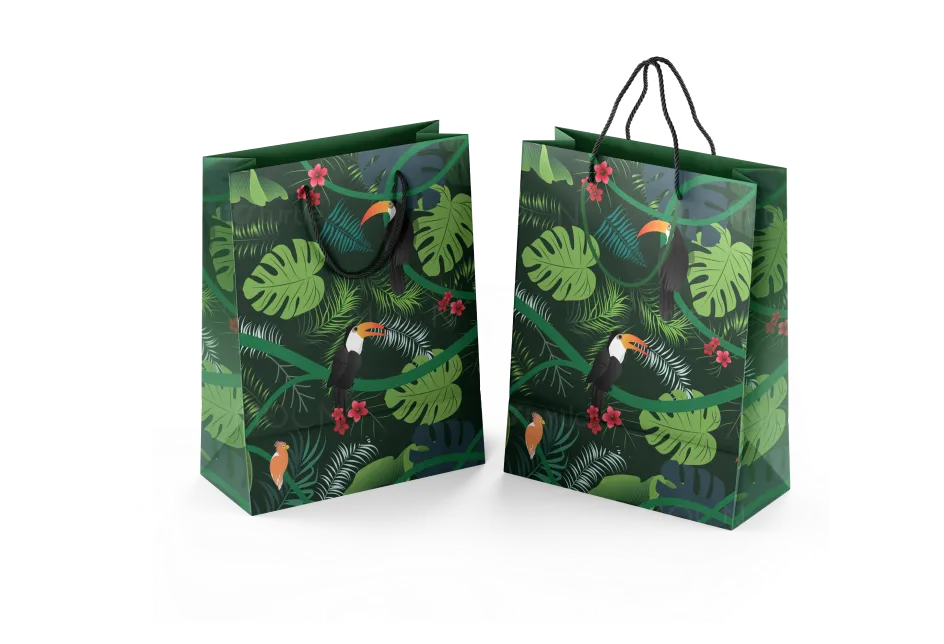
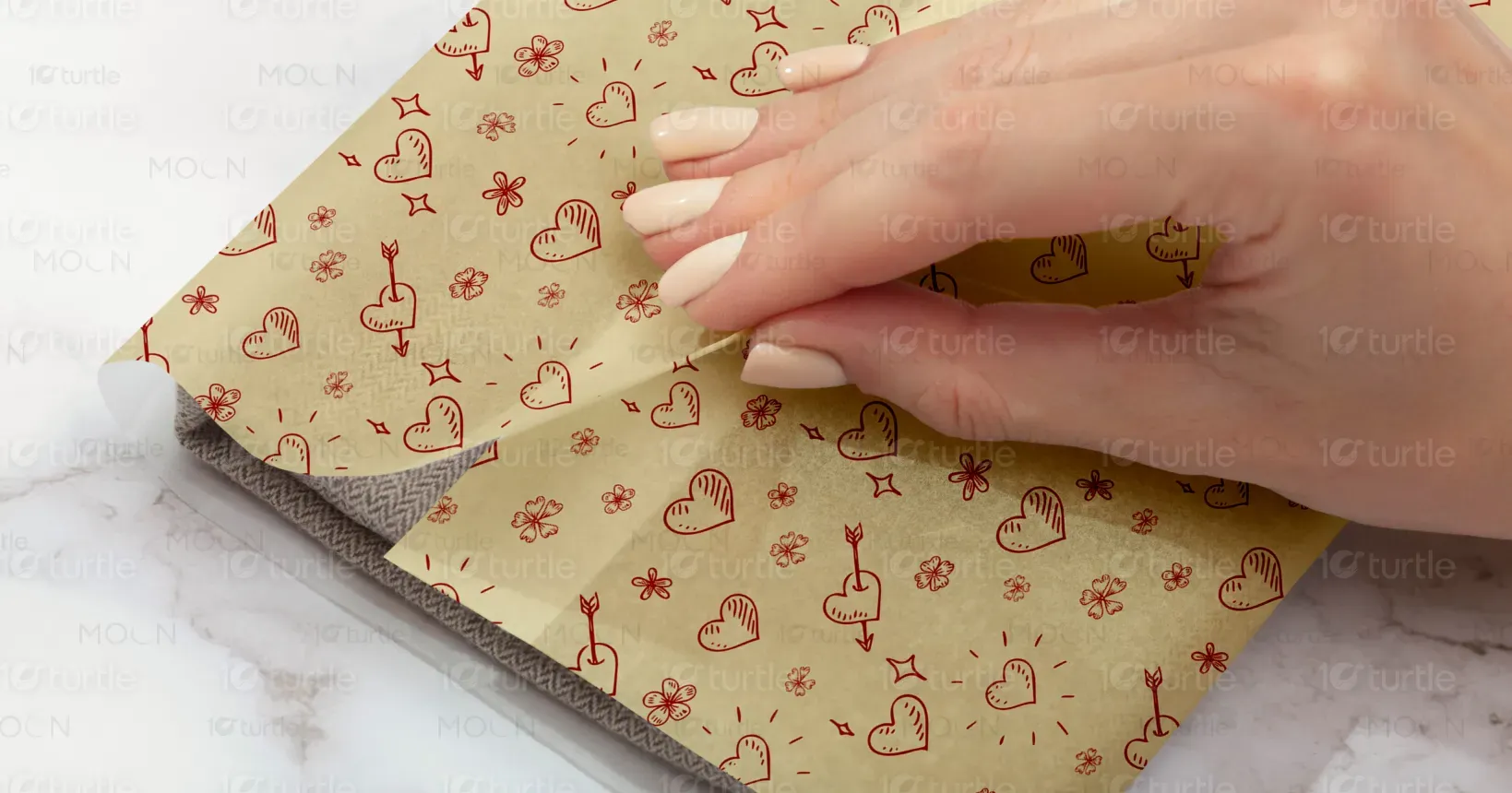
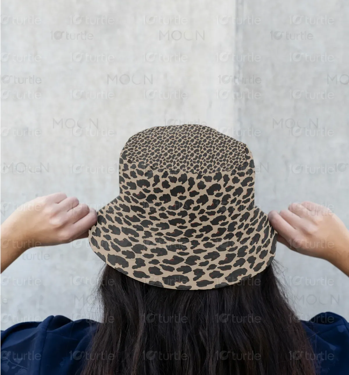
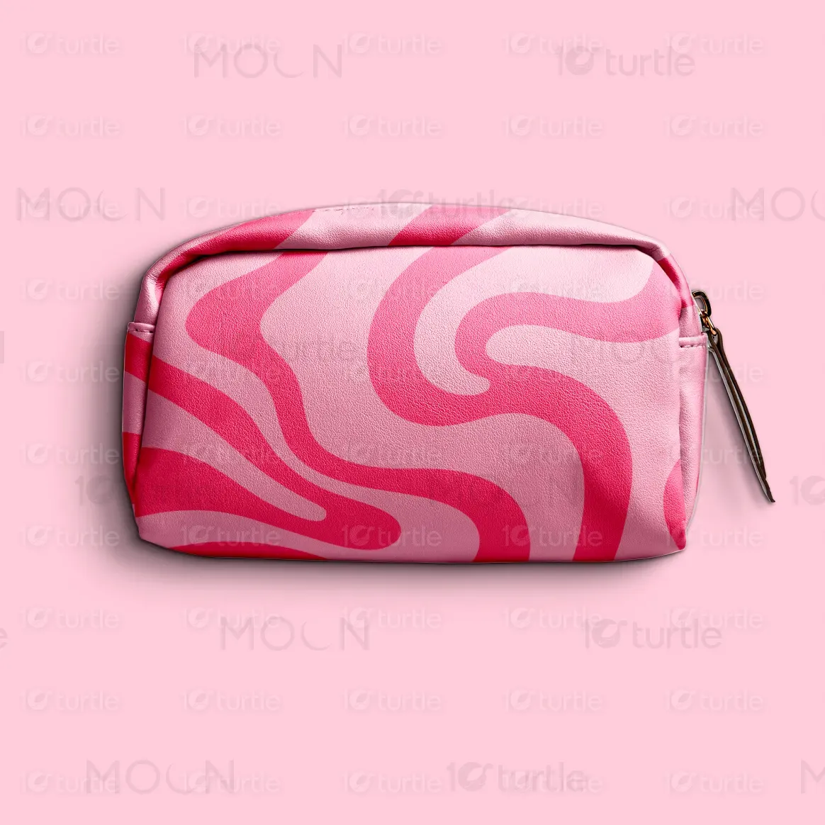
Each pattern in this series brings its own personality to the forefront—whether it’s the playful romance of heart motifs, the lush vibrance of tropical foliage, the bold swirls of modern abstraction, or the timeless energy of leopard spots. The design philosophy blends visual storytelling with emotional resonance. We approached these patterns with distinct moods in mind, using layout, scale, and iconography to craft a collection that speaks to a wide spectrum of consumers seeking both form and function.
Pattern Design
Graphic Design
Industry
Fashion, Beauty & Lifestyle
Tools we used


Project Completion
2025
Key Market
Global
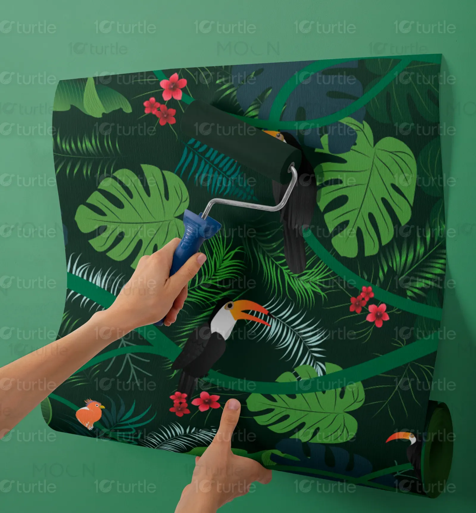
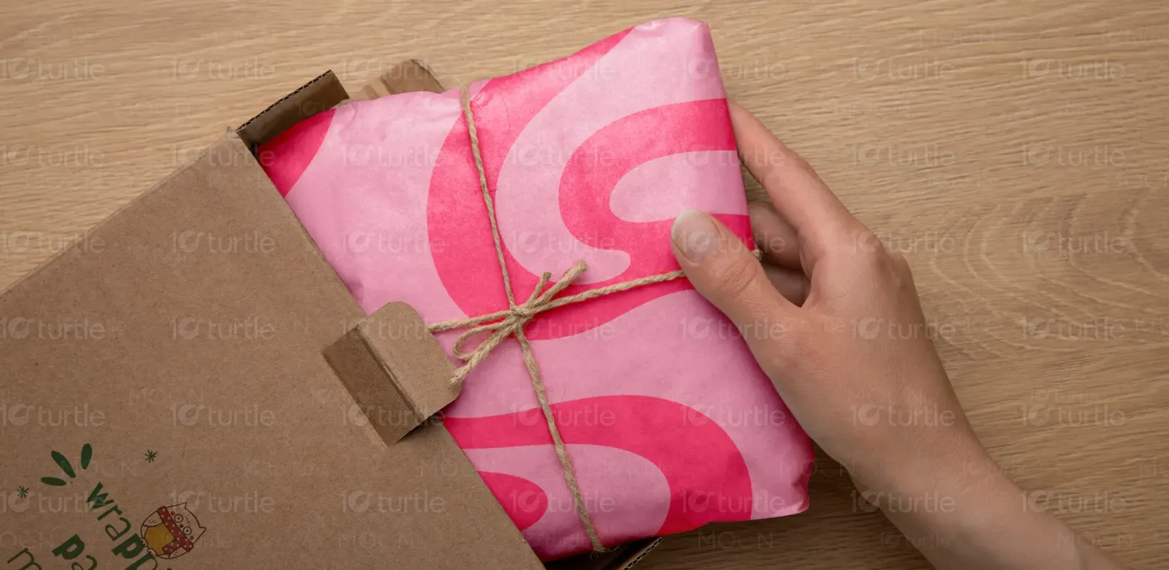
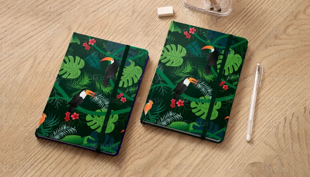
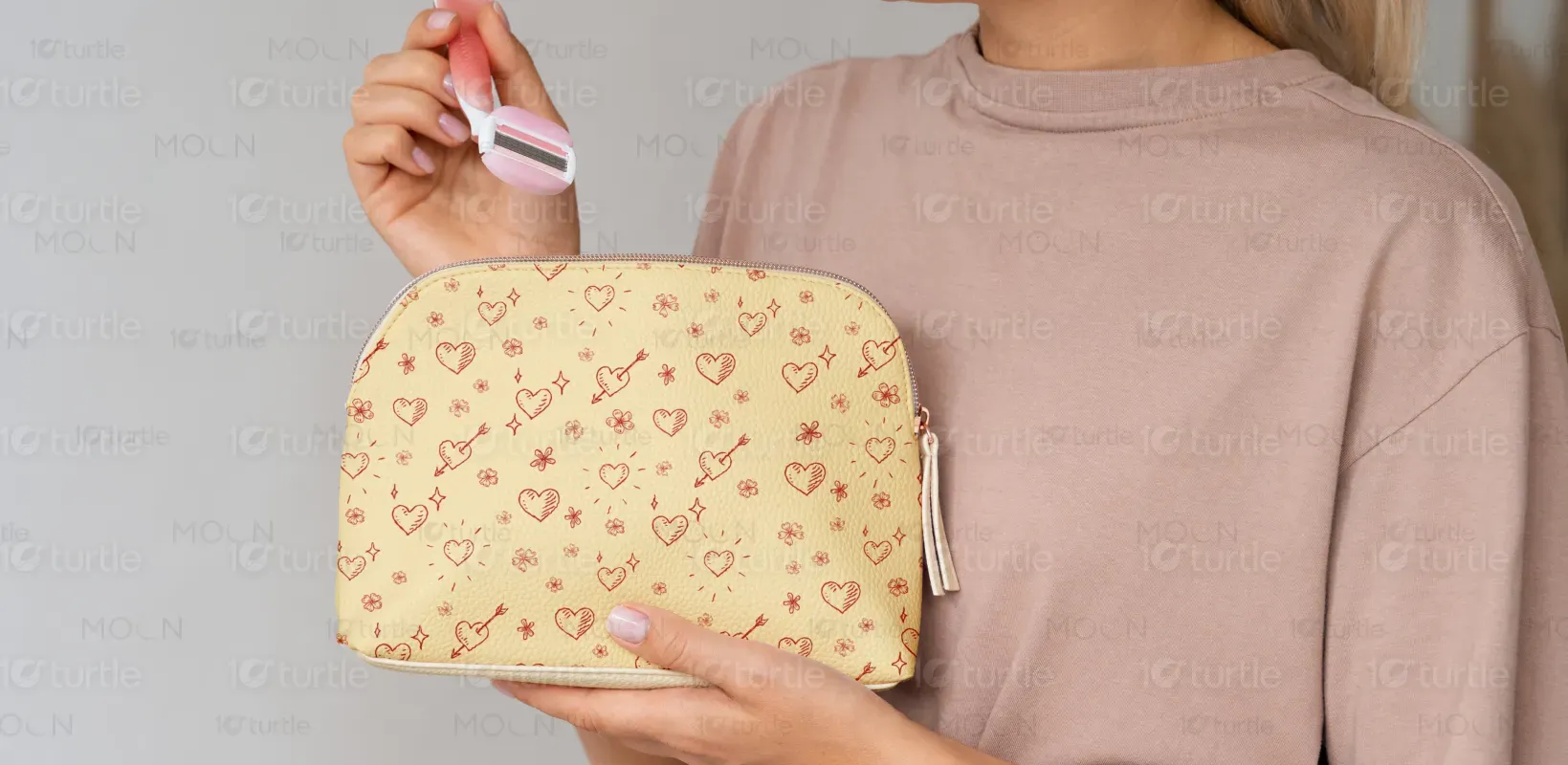
This collection showcases four distinct pattern designs applied to wrapping paper, wallpaper, a cosmetic pouch, and tapestry fabric. Each design serves a specific market niche: from gift packaging to home decor to fashion accessories. The line stands out for its versatility, bold use of pattern, and emotional appeal—each design tells a story. The unique selling points lie in their high visual impact, trend-forward aesthetics, and adaptability across various products and surfaces.
Industry
Fashion, Beauty & LifestyleWhat we did
Graphic DesignPattern DesignPlatform
-Designers often face the challenge of creating patterns that are not only visually striking but also scalable and versatile across different product types. Many patterns lose their appeal when translated from one surface to another—what works on a bag may not suit wallpaper. Additionally, overused motifs and generic templates saturate the market, making it harder to capture attention or convey originality in a meaningful way.
This collection tackles the issue with patterns specifically tailored to their medium, ensuring optimal scale, detail, and context relevance. For example, the heart print on the wrapping paper is whimsical and romantic, perfect for gifting. The tropical wallpaper uses depth and contrast to add drama and dimension to interiors. Each design was created with flexibility and strong visual identity, ensuring adaptability without losing essence. Bold graphics and emotionally resonant imagery set these apart in a crowded design landscape.
The long-term goal is to expand these patterns into a cross-category brand—extending to fashion, interior decor, and stationery. We envision licensing opportunities, collaborations, and even branded product lines. The aspiration is to make this design language iconic and instantly recognizable, contributing to a design-forward lifestyle brand that prioritizes emotional connection through pattern and color.
The color scheme is a mix of bright blues, greens, and warm earth tones, chosen for their psychological impact on young readers. Blue conveys trust and security, reinforcing the book’s purpose of safety and guidance. Green represents growth and empowerment, aligning with the book’s theme of self-development. Warmer tones like red and orange add energy and excitement, keeping engagement levels high. The combination ensures a visually stimulating experience while maintaining clarity and readability.