The design embraces a quiet, contemplative aesthetic to reflect the deeply personal and emotional journey of letting go of a home. Minimalist layouts, soft typography, and ample white space allow the words to breathe and resonate. Gentle visual rhythm mirrors the narrative’s tone—intimate, honest, and unhurried. Visual cues like subtle textures and muted tones create a sense of comfort and introspection. It’s less a sales tool and more a visual journal, crafted to evoke connection, remembrance, and readiness for change.
Guide Book Design
Graphic Design

Industry
Property, Construction & Real Estate
Tools we used


Project Completion
2025
Key Market
Global
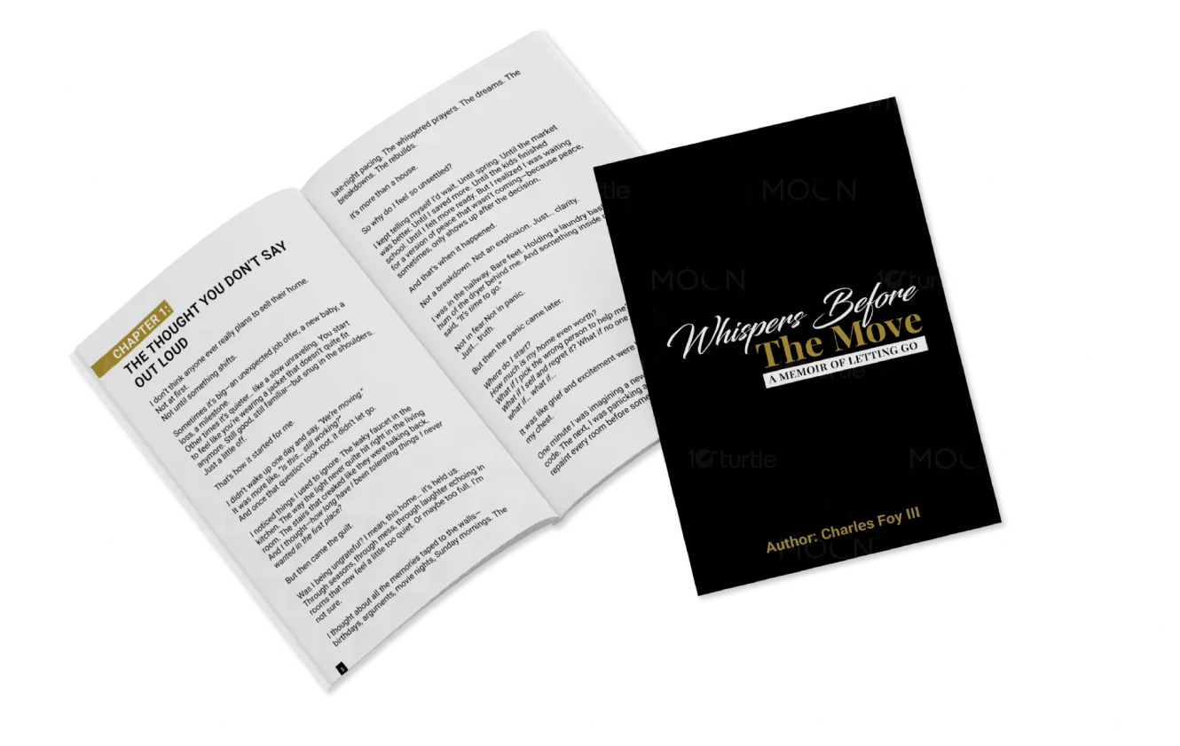
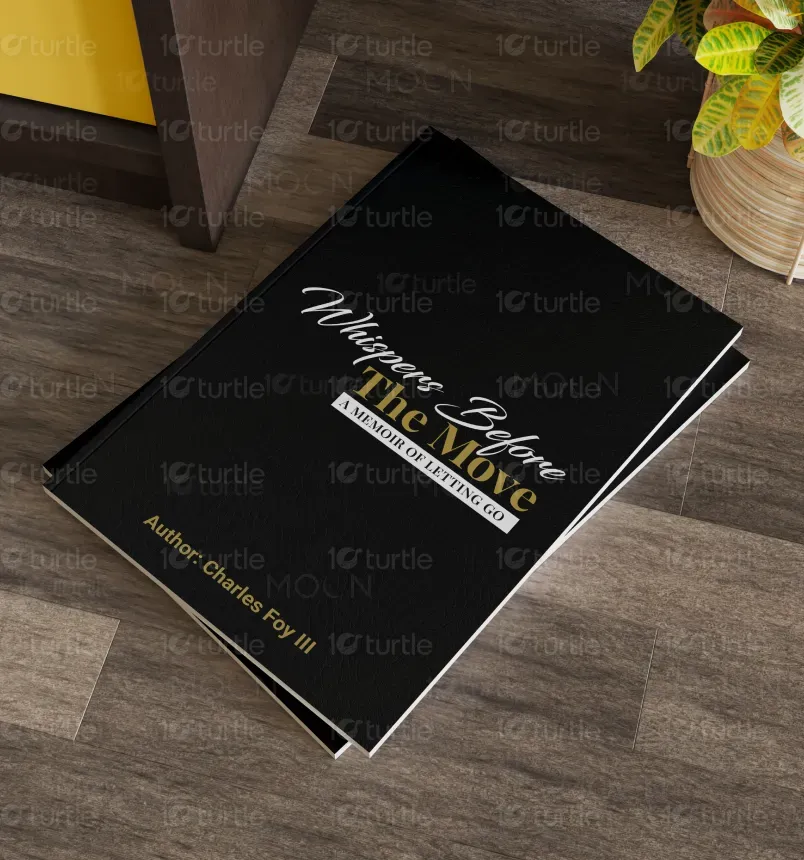
"Whispers Before the Move" is a narrative memoir designed as a guidebook for the emotional journey of moving, rather than the transactional one. Created by realtor and author Charles Foy III, it walks readers through the quiet, internal process of deciding to leave a home. Unlike traditional real estate materials, this piece offers empathy over instruction, storytelling over checklists. Its unique value lies in humanizing one of life’s most disruptive events—showing that letting go is part of moving forward.
Industry
Property, Construction & Real EstateWhat we did
Guide Book DesignGraphic DesignPlatform
-Most real estate materials focus on logistics: market timing, staging tips, price points. But none speak to the emotional weight of leaving a home. This absence leaves many homeowners feeling unseen and overwhelmed during a major life transition. The existing market lacks tools that acknowledge grief, memory, and hesitation—leaving a critical gap for those needing more than just technical advice. The industry often forgets that homes aren’t just assets—they’re deeply personal spaces filled with meaning.
This guide offers a narrative-first approach—blending memoir with subtle guidance. Instead of pitching services, it invites the reader into a shared emotional experience. The design and content validate unspoken feelings, provide space for reflection, and gently introduce the idea of seeking help. With conversational tone and journal-style progression, it becomes a trusted companion—meeting people where they are emotionally, and guiding them toward readiness without pressure. It redefines what a real estate guide can be: human, heartfelt, and healing.

The long-term vision is to transform how people experience real estate transitions—shifting from cold transactions to compassionate transformations. Whispers Before aspires to become a flagship model for emotional marketing within the housing industry. Through thoughtful storytelling and client-first design, the brand will champion empathy, redefine agent-client relationships, and inspire new standards in how homes are introduced, honored, and passed on. The ultimate goal is to create a movement where emotional well-being is central to every move.


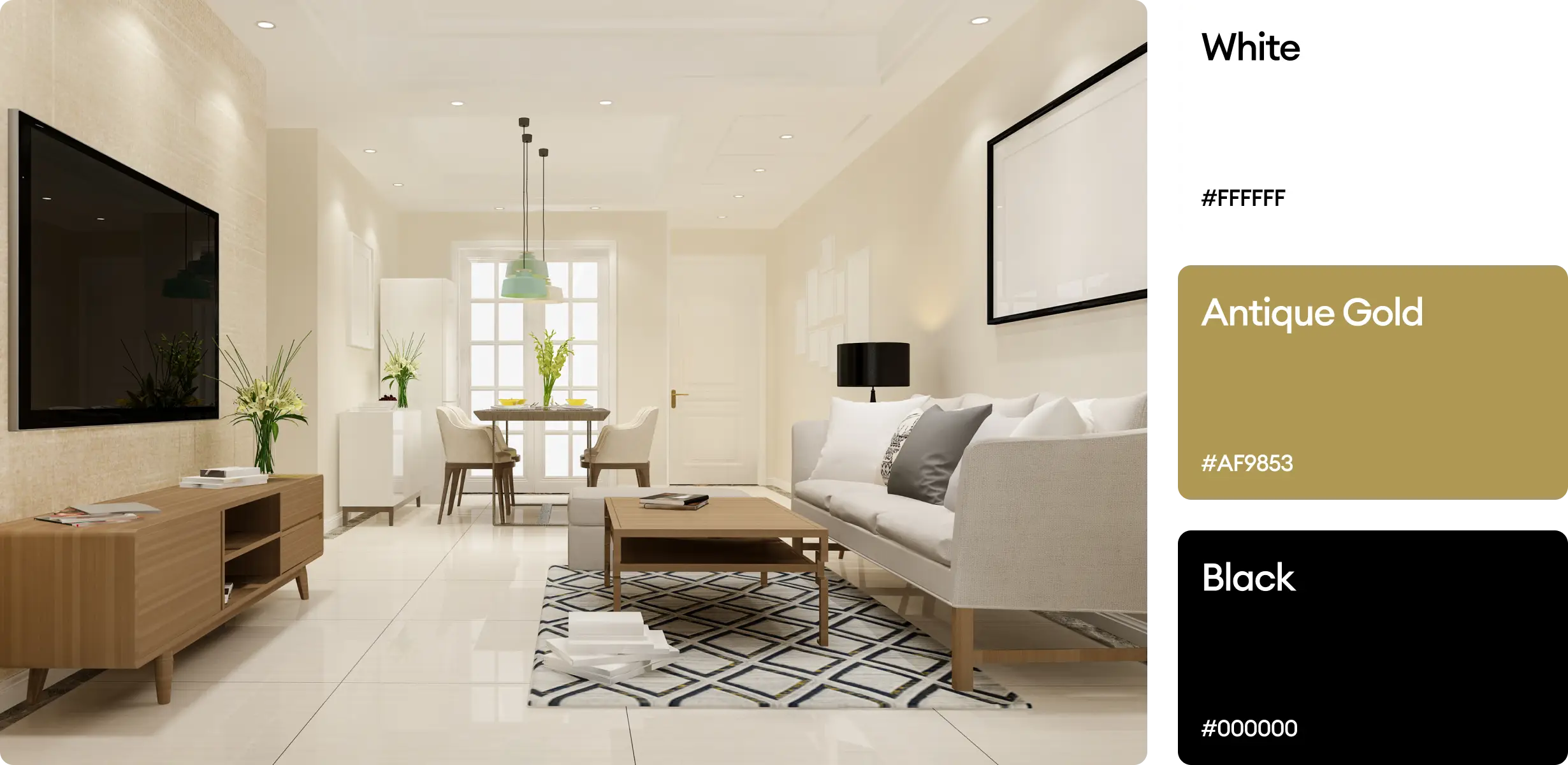
The chosen palette features muted earth tones—warm grays, soft beiges, dusty blues, and gentle creams. These colors ground the emotional weight of the story while offering a calm, reflective mood. Each hue evokes memory, stillness, and comfort—like old wallpaper or morning light on a hardwood floor. The palette aligns with the brand’s intimate tone and encourages the reader to slow down, exhale, and feel. This is not just visual branding—it’s emotional resonance made visible.