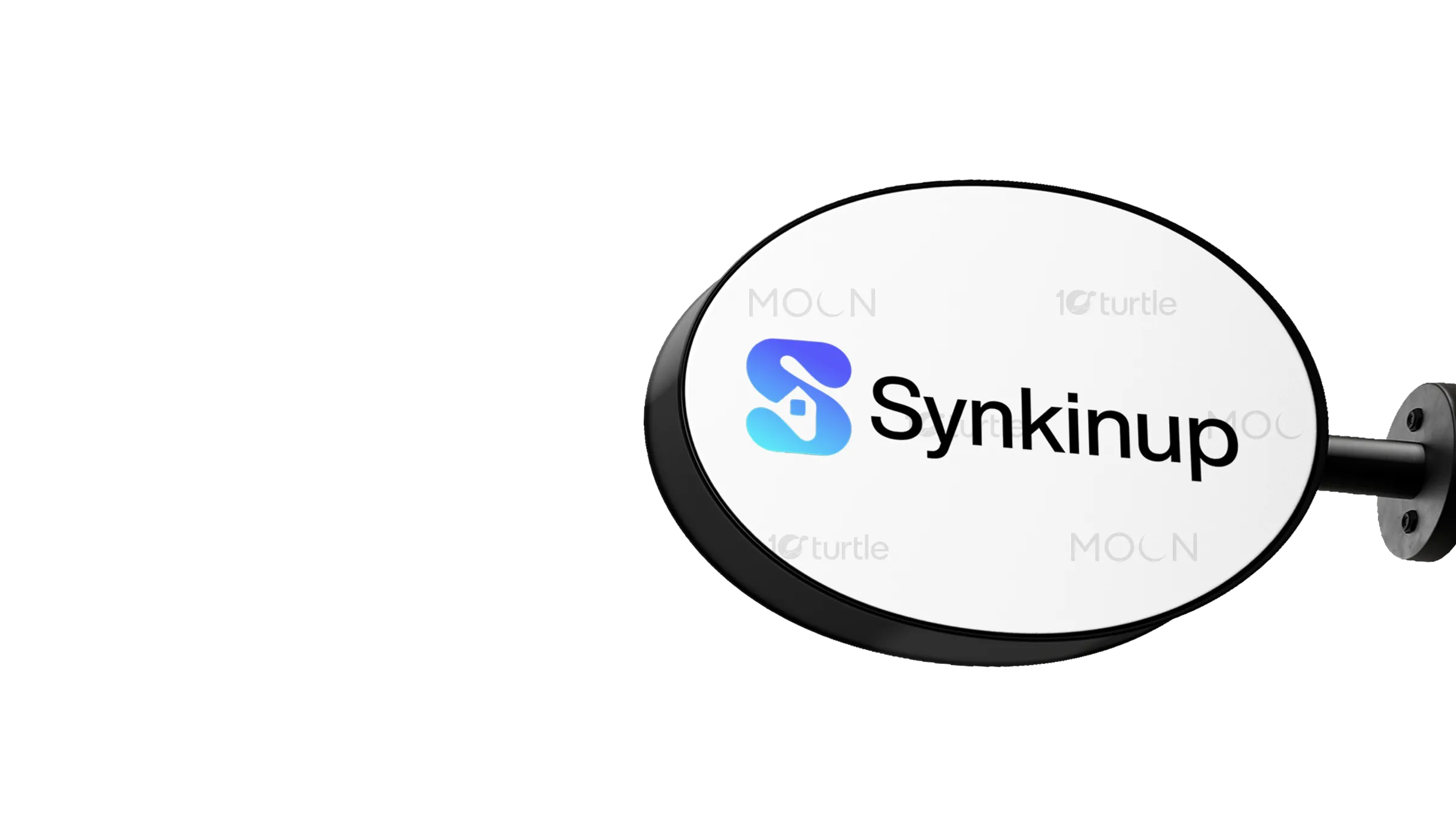
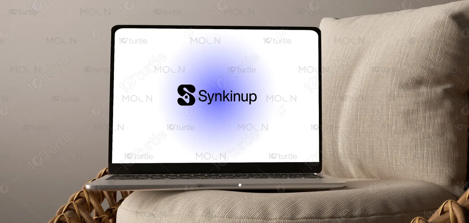
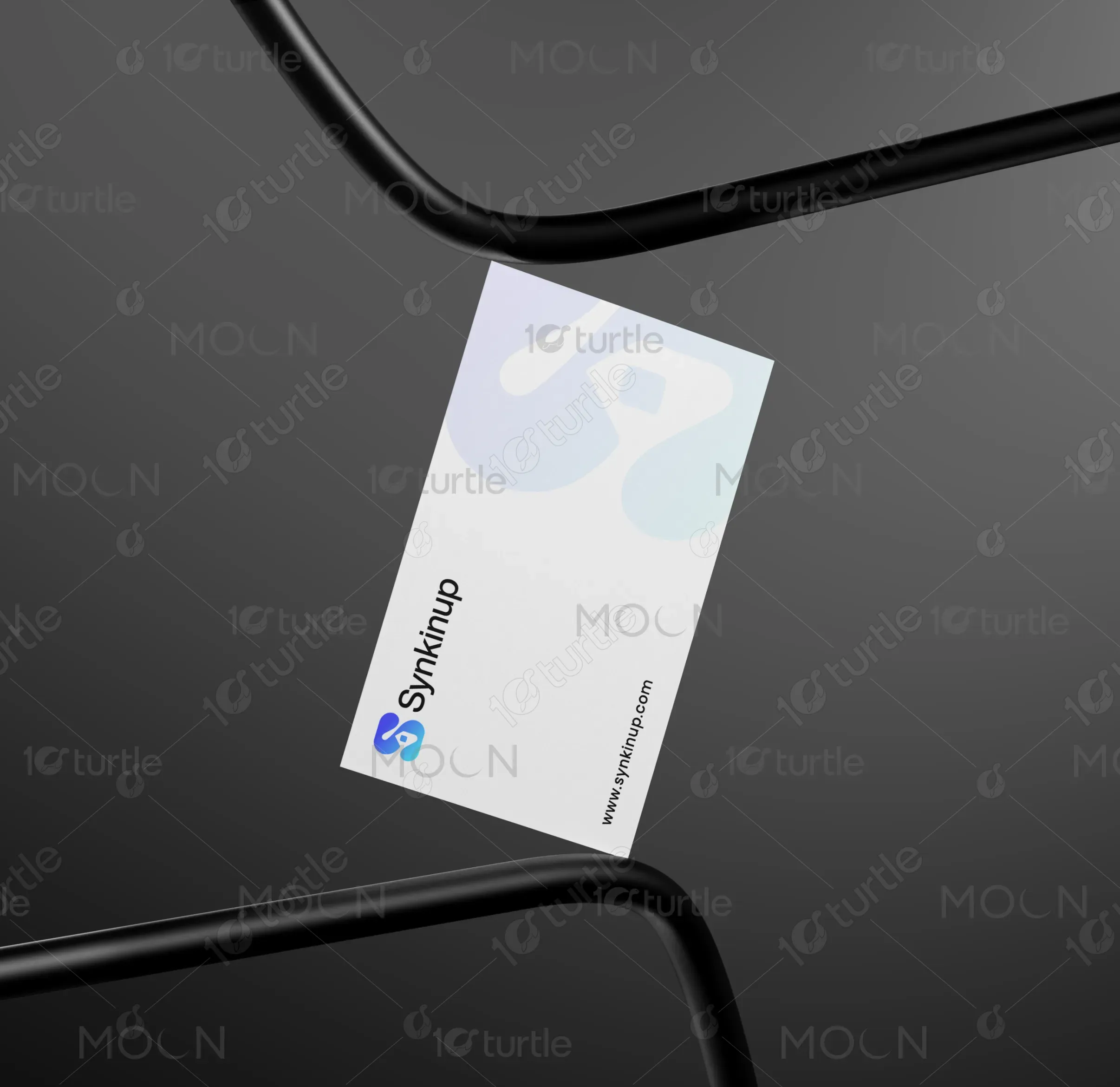
The "Synkinup" logo concept focuses on minimalist, fluid design elements, with a dynamic "S" that subtly forms a chain or loop, representing connectivity and syncing. The inner negative space forms a house silhouette, symbolizing family and kinship. The logo merges modern tech aesthetics with warmth and care. The soft gradient, transitioning from blue-violet to aqua, evokes feelings of trust, calm, and connection, aligning perfectly with the app’s purpose of bringing families and caregivers together in a seamless, supportive experience.
Logo Design
Graphic Design
Branding
Industry
Healthcare & Wellness
Tools we used

Project Completion
2025
Key Market
Global
The "Synkinup" logo represents a mobile app that connects caregivers and families, helping them manage caregiving tasks and relationships. The app's core purpose is to synchronize communication, offer personalized support, and create a seamless connection between caregivers and families. The design reflects a modern yet warm and approachable brand, symbolizing the app’s goal of nurturing relationships while maintaining an efficient and user-friendly interface. The clean, minimalist aesthetic appeals to a wide audience, emphasizing trust, care, and connection.
Industry
Healthcare & WellnessWhat we did
Logo DesignGraphic DesignBrandingPlatform
-A common challenge in caregiving apps is striking the right balance between modern, tech-driven interfaces and the emotional needs of families and caregivers. Many existing apps feel too sterile or overly complicated, creating a barrier for users who need both functionality and emotional reassurance. This disconnect can lead to low engagement and a lack of trust. "Synkinup" aims to fill this gap by offering a simple, welcoming logo that visually represents connection, while its easy-to-use interface addresses the real emotional needs of caregivers.
"Synkinup" solves the problem by offering a logo that conveys the dual importance of technology and human connection. The design emphasizes simplicity, making the app approachable for users of all ages and tech-savviness. The "S" symbol works as a scalable icon, instantly recognizable in small sizes, while the gradient adds a modern touch. This design mirrors the app’s user-centric interface, which facilitates seamless communication and connection, creating a simple yet effective solution for caregivers and families to manage their relationships and responsibilities.
The long-term vision for the "Synkinup" design is to create a symbol that grows with the app, evolving into a recognizable icon for caregiving solutions worldwide. As the app evolves, the design will serve as a visual anchor for a range of new features and services, while maintaining its core values of simplicity, connection, and trust. The logo aims to become synonymous with modern caregiving, impacting the industry by encouraging more efficient and emotionally supportive ways to manage family and caregiving tasks.
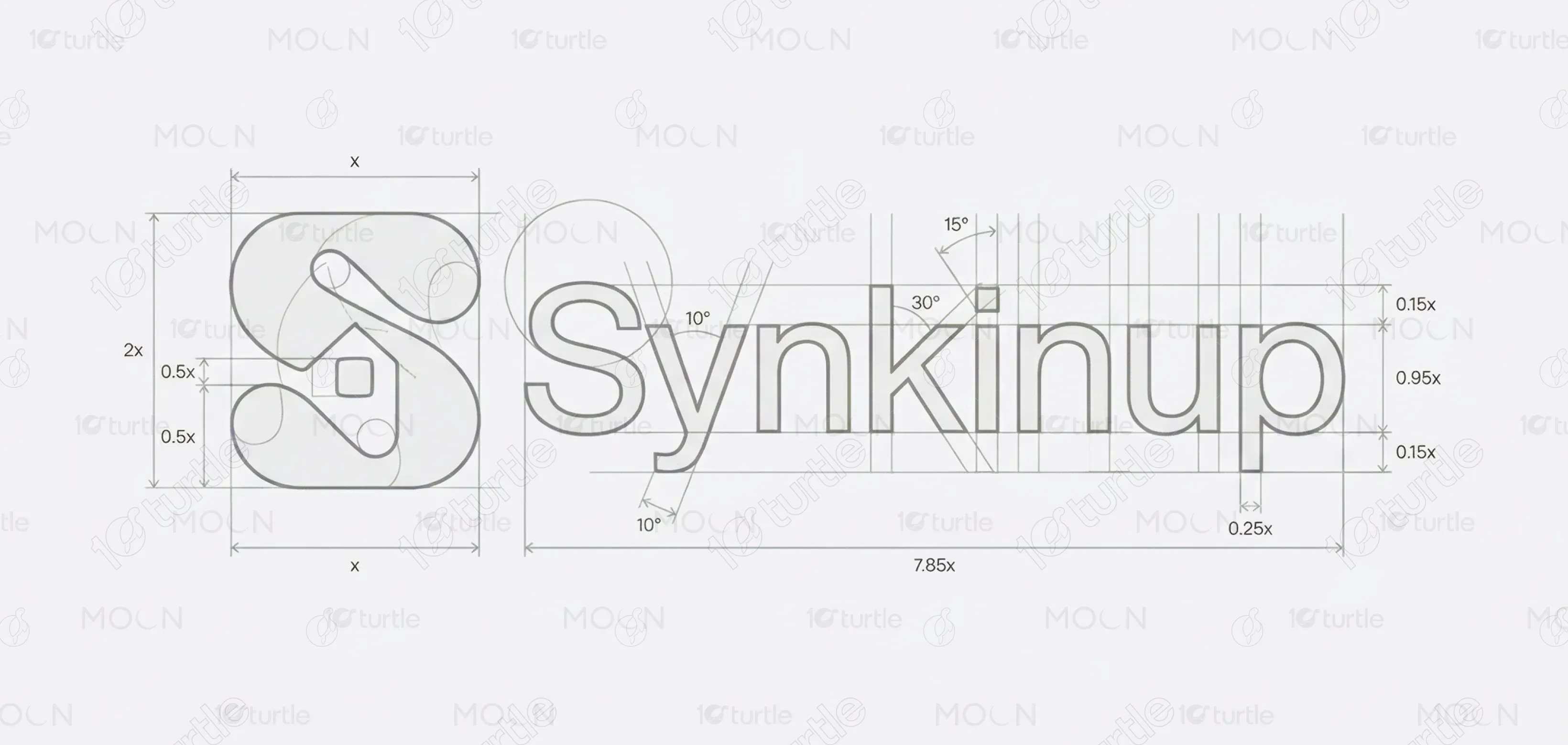
The Synkinup logo blends modern design with a sense of security and connection. The stylized "S" is integrated with a lock shape, symbolizing secure connections. The clean, bold typography enhances readability and reflects a professional, trustworthy image. The use of black emphasizes strength, reliability, and simplicity, while the smooth curves of the icon give it a dynamic, contemporary feel. This logo perfectly encapsulates Synkinup’s focus on secure, user-friendly digital connections in a sleek and memorable visual identity.
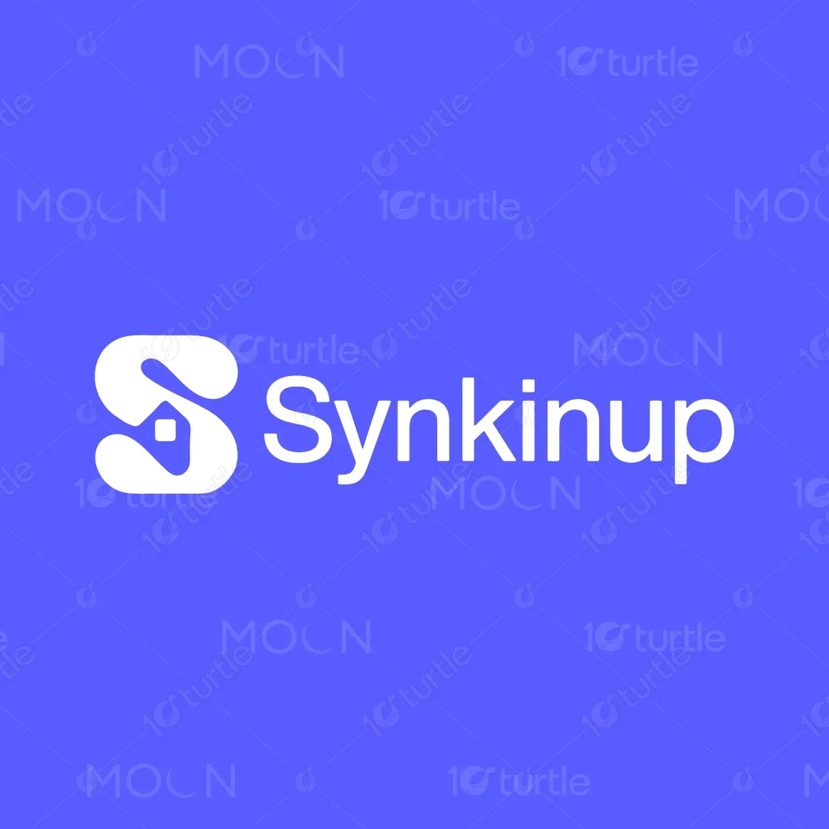
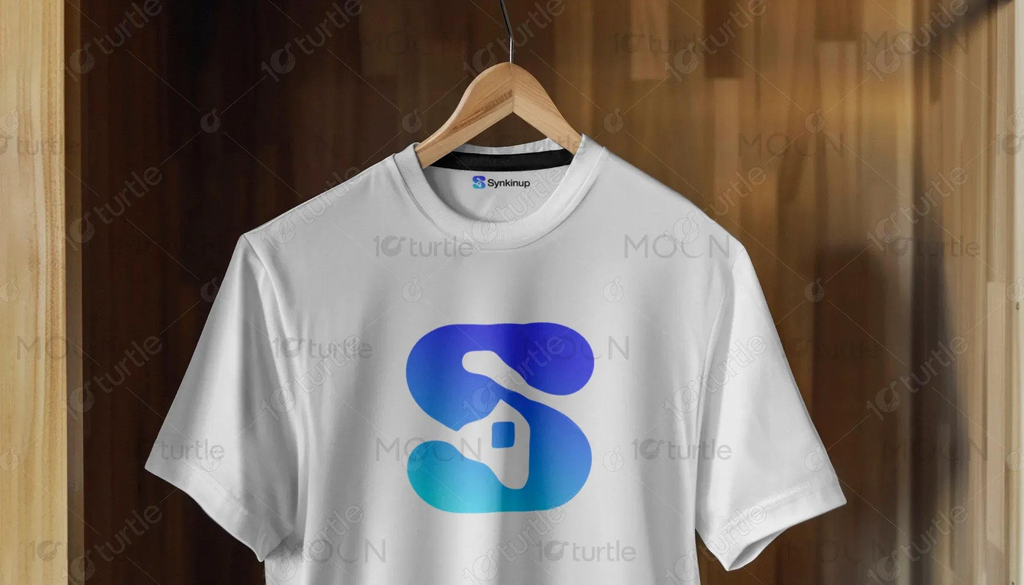
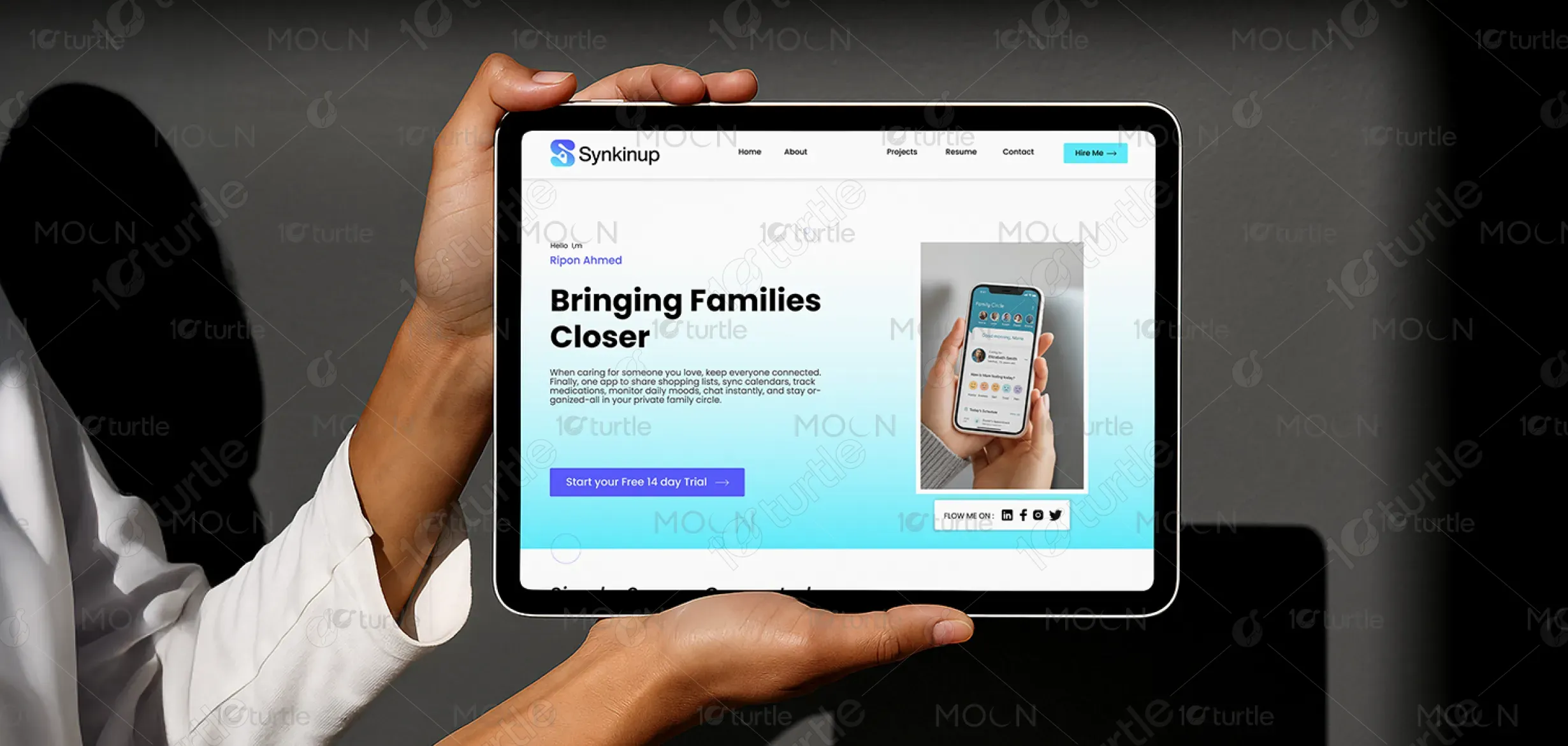
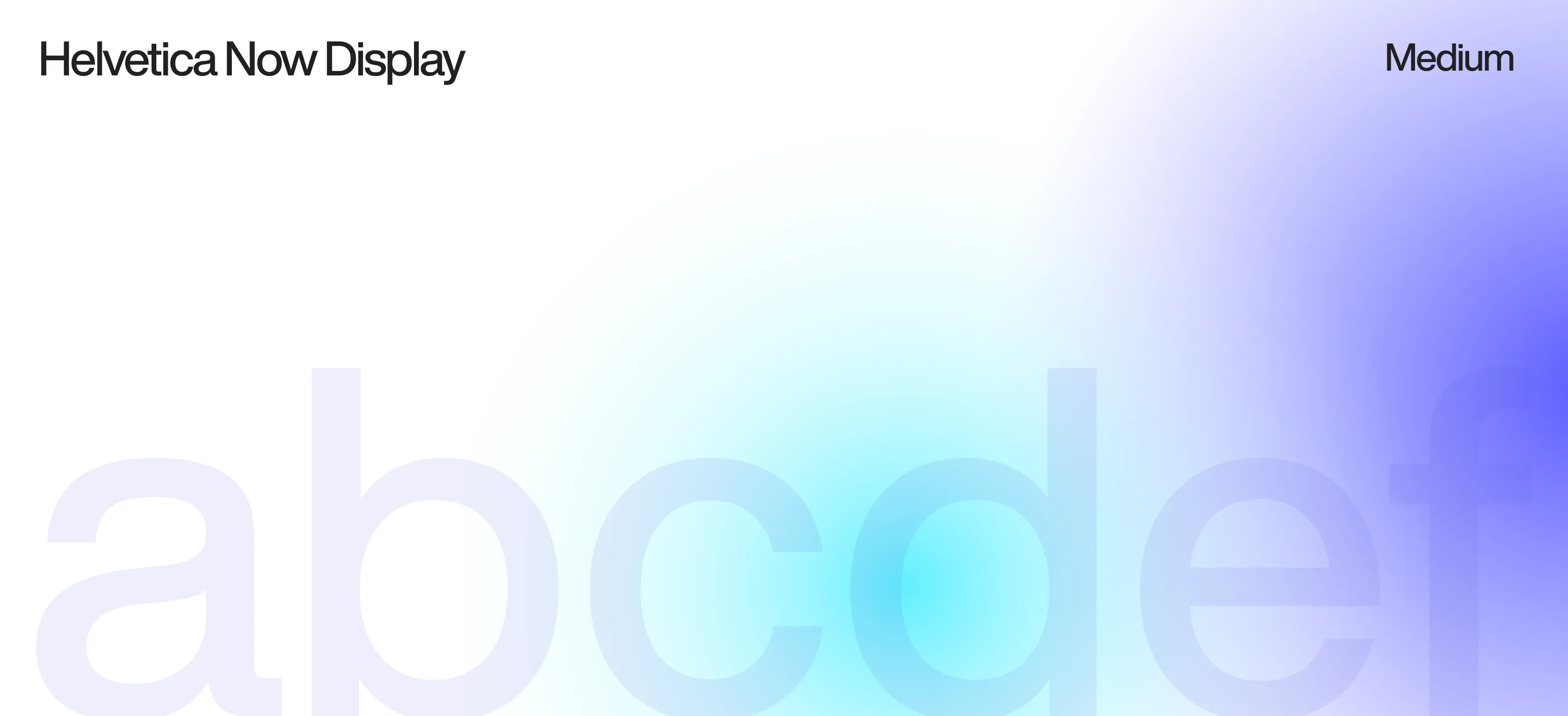
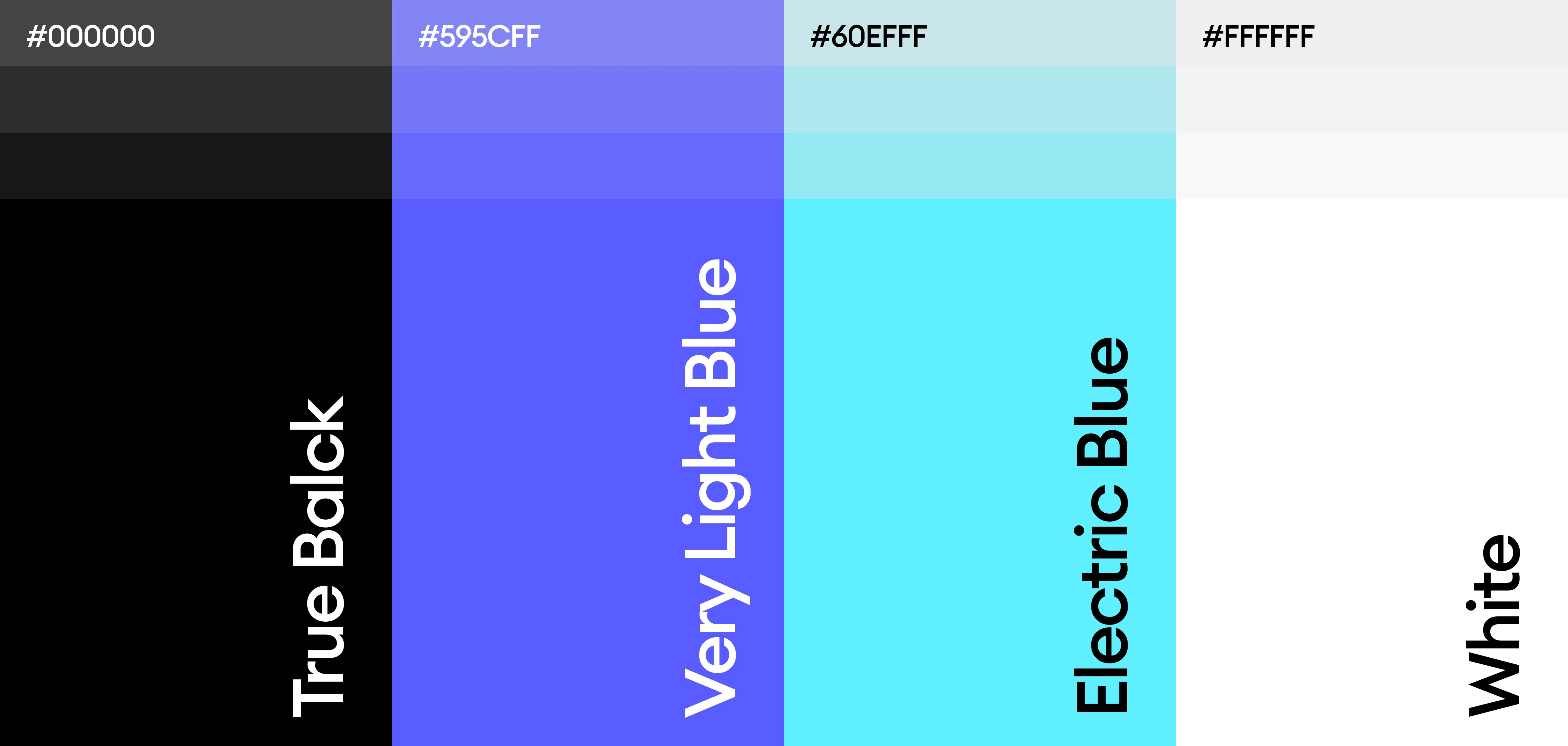
The color palette consists of a soft gradient transitioning from blue-violet to aqua, which symbolizes trust, calm, and modernity. The colors are chosen to evoke a sense of warmth and care while maintaining a contemporary feel. The gradient adds depth and dimension, making the logo visually appealing while ensuring it stands out in both light and dark backgrounds. These colors align with the app’s focus on creating a peaceful, reliable, and tech-driven experience that users can depend on for their caregiving needs.
