Brand Identity Design • Mascot Illustration • Packaging Design • Beverage Branding
Overview
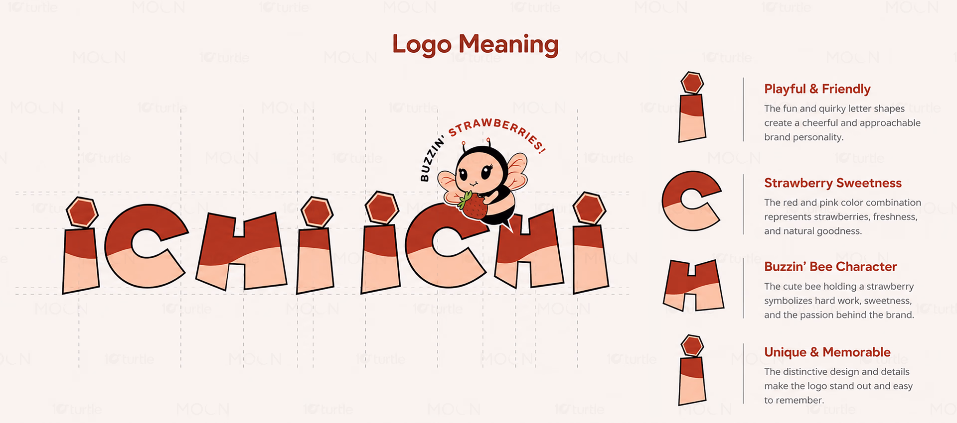
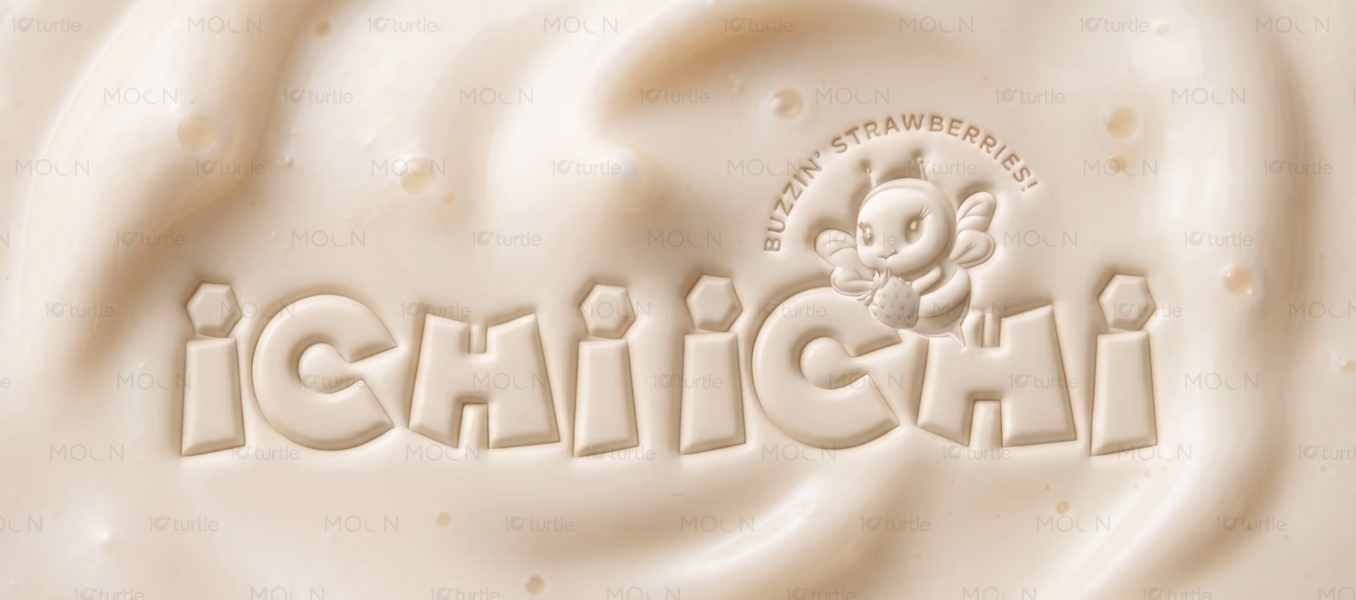
ICHI ICHI is a beverage branding project centered around strawberry-based drinks and playful customer engagement. The identity uses a distinctive bee mascot, soft strawberry-inspired colors, and friendly visual language to create strong shelf and social media appeal. Designed for beverage cups, packaging, and café applications, the branding balances fun and clarity. Its unique character-driven approach helps differentiate the brand while making the product instantly recognizable and appealing to younger audiences.
The Challenge

The beverage market is crowded with brands using generic fruit imagery and minimal differentiation. Many products struggle to create emotional connections beyond flavor claims. Younger consumers increasingly seek brands with personality and shareable visual identities. Without a memorable character or cohesive branding system, customer recall becomes difficult. The challenge was creating a distinctive strawberry beverage identity that feels approachable and instantly recognizable.
The Solution
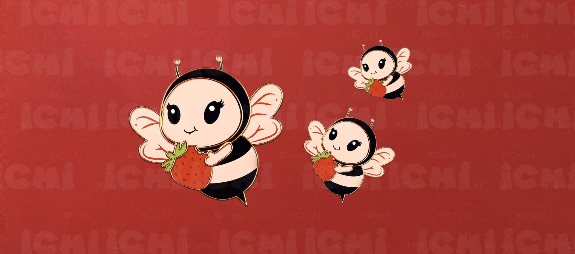
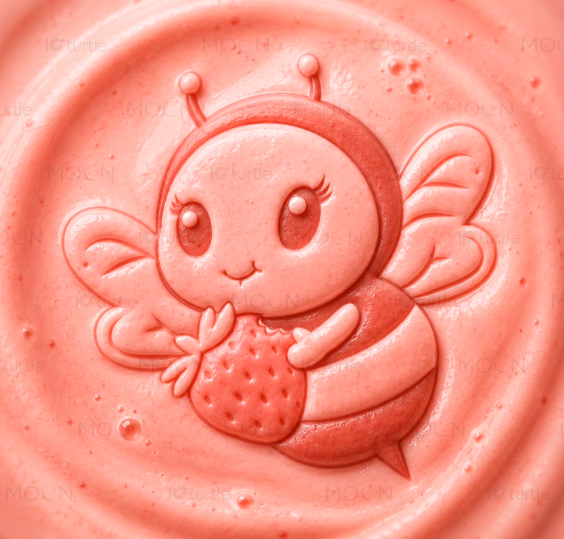
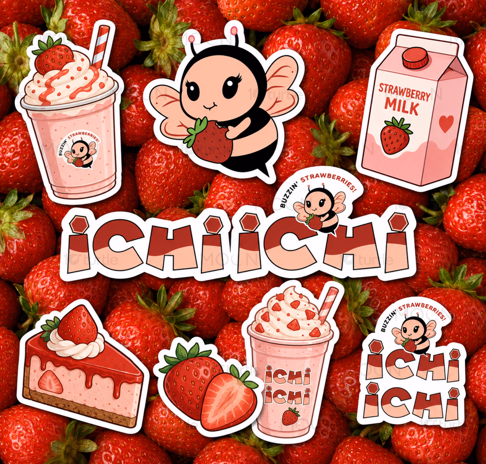
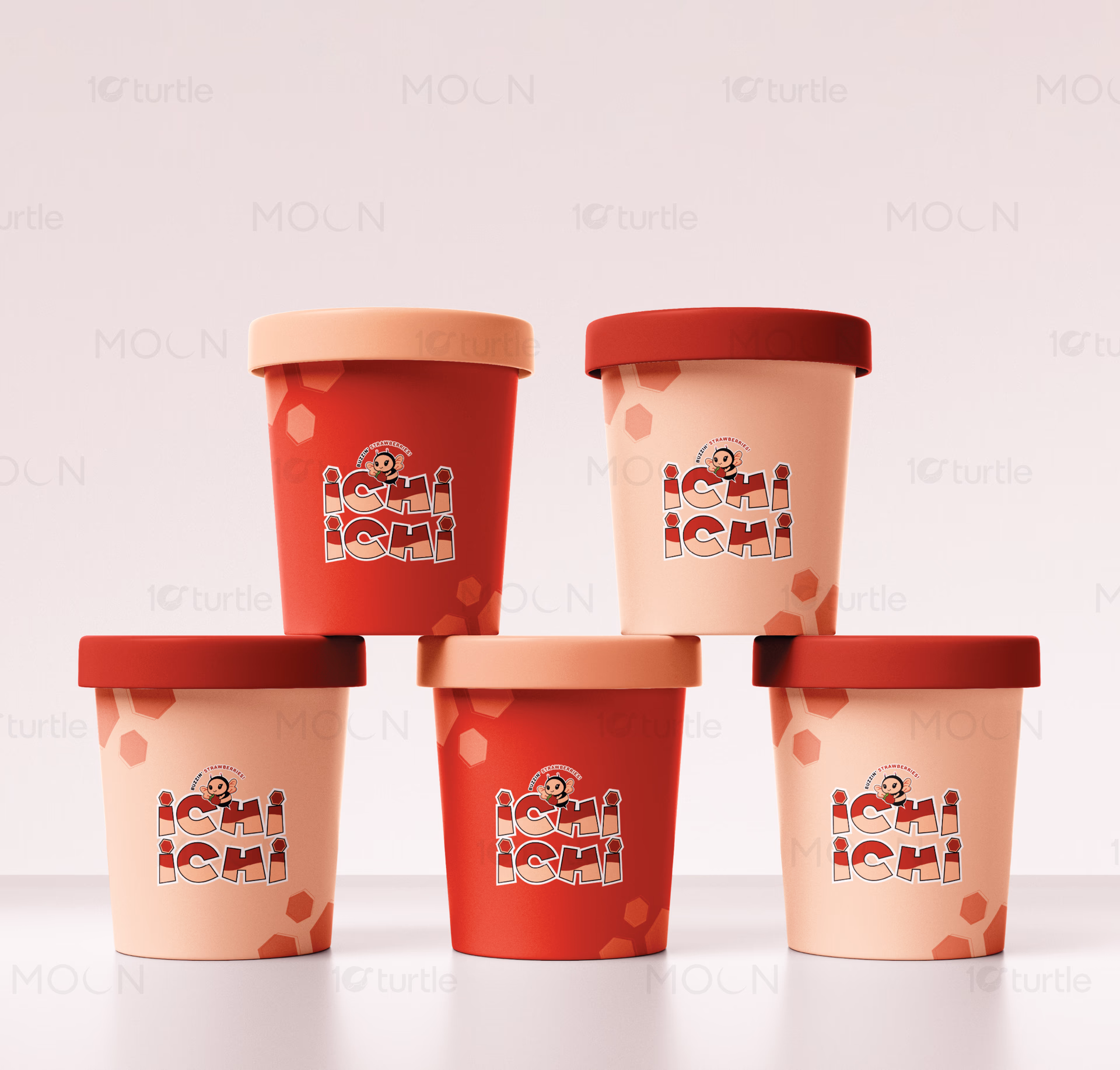
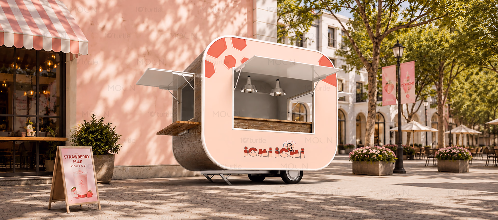
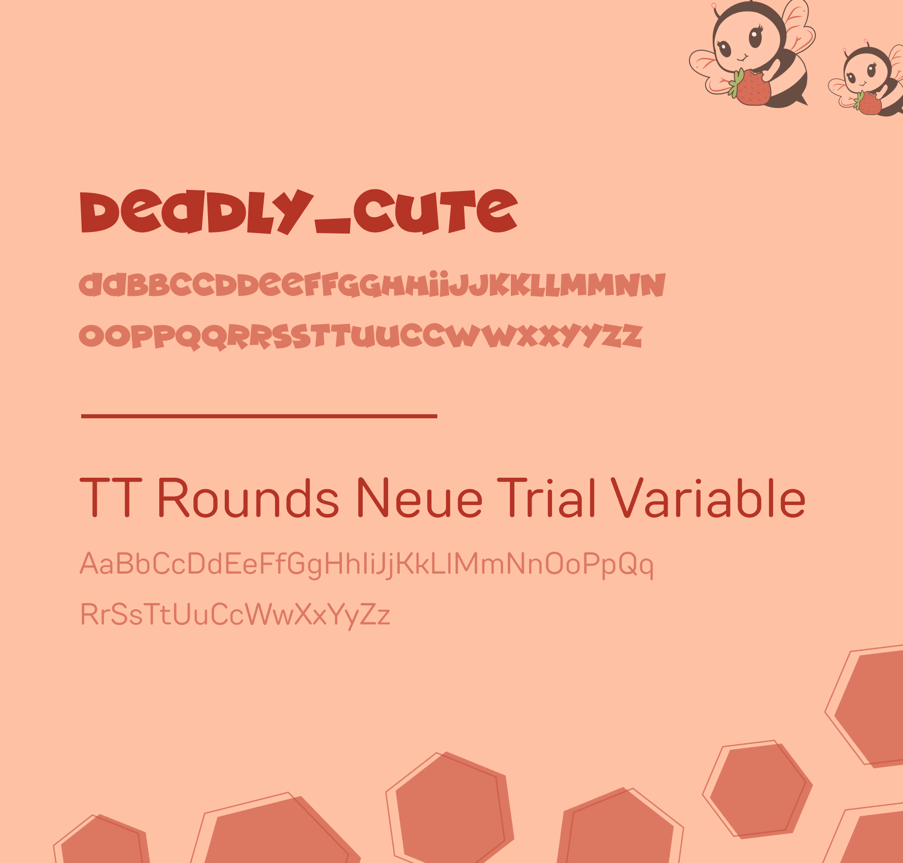
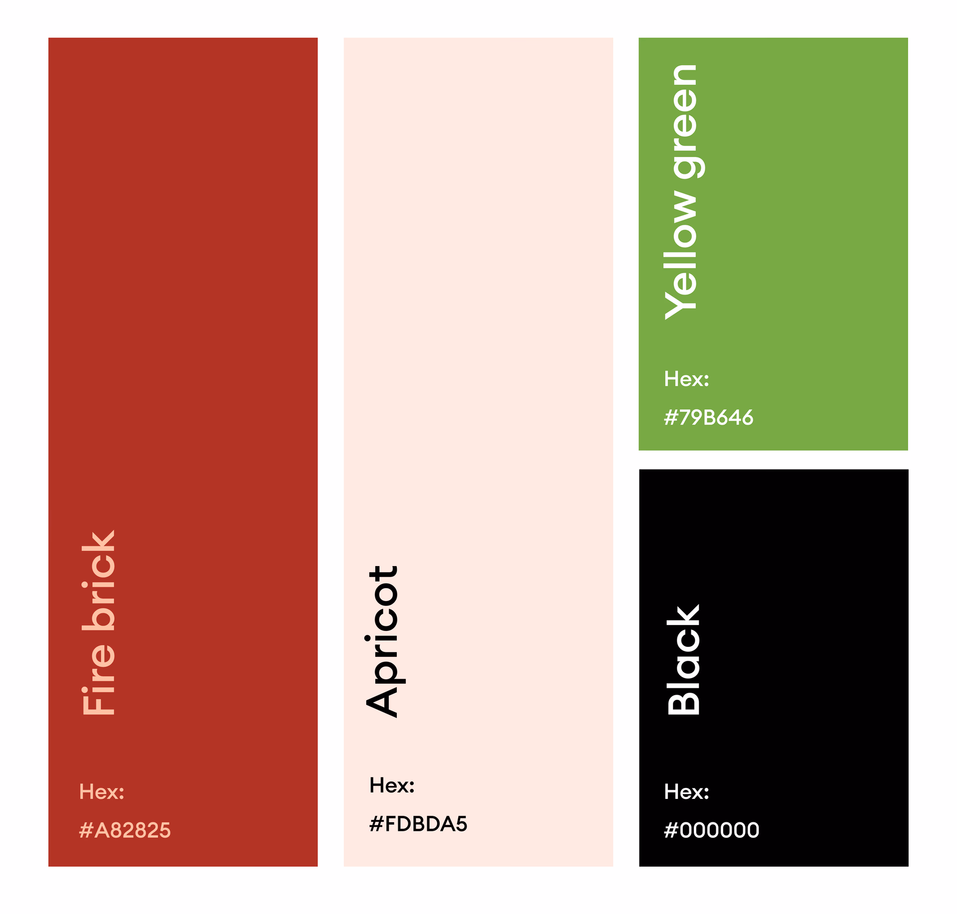
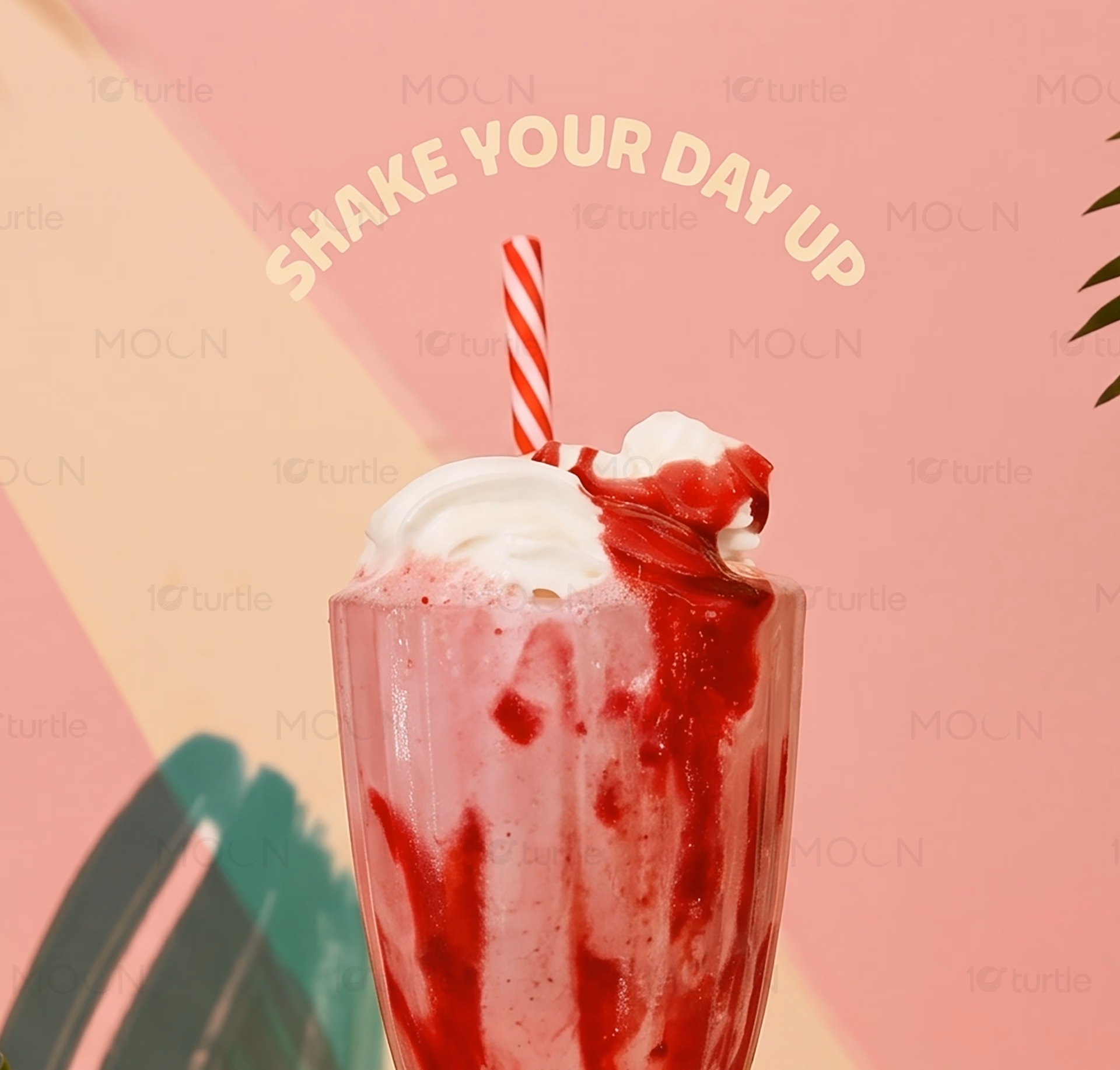
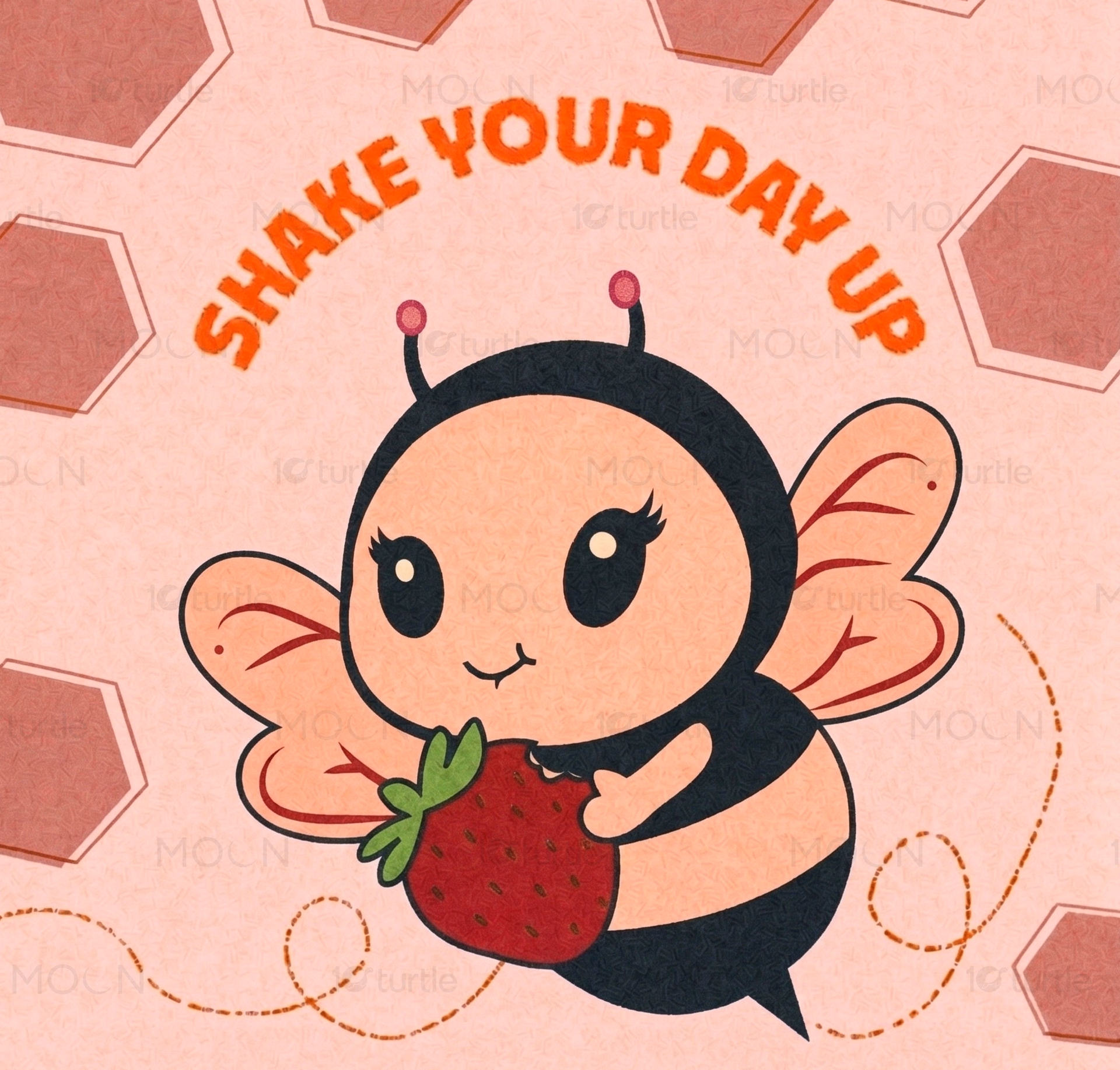
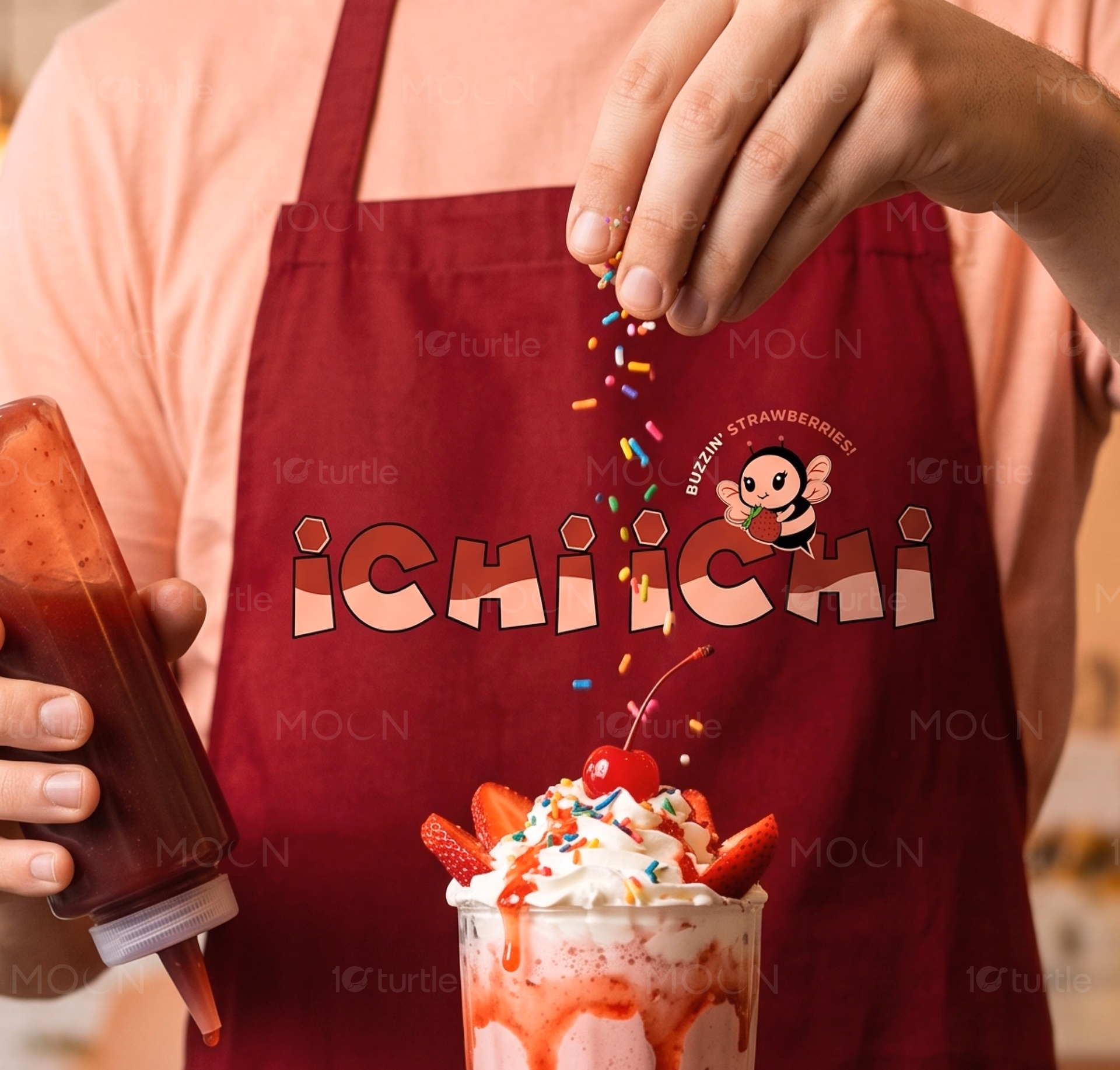
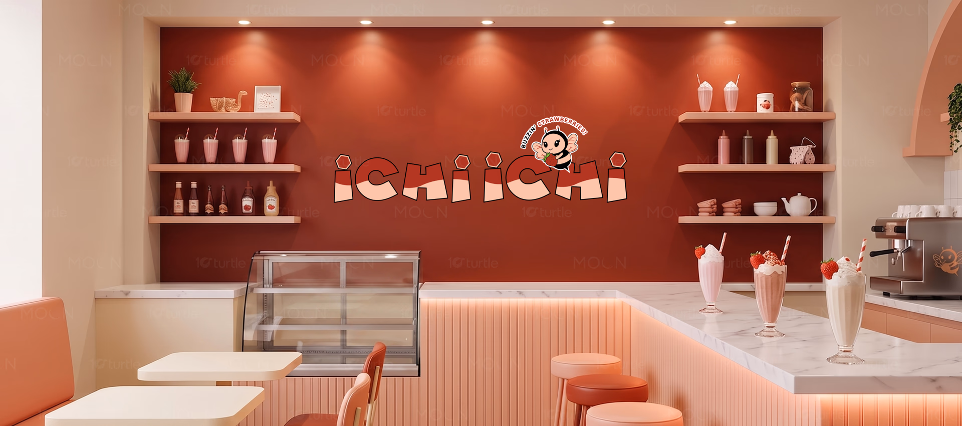
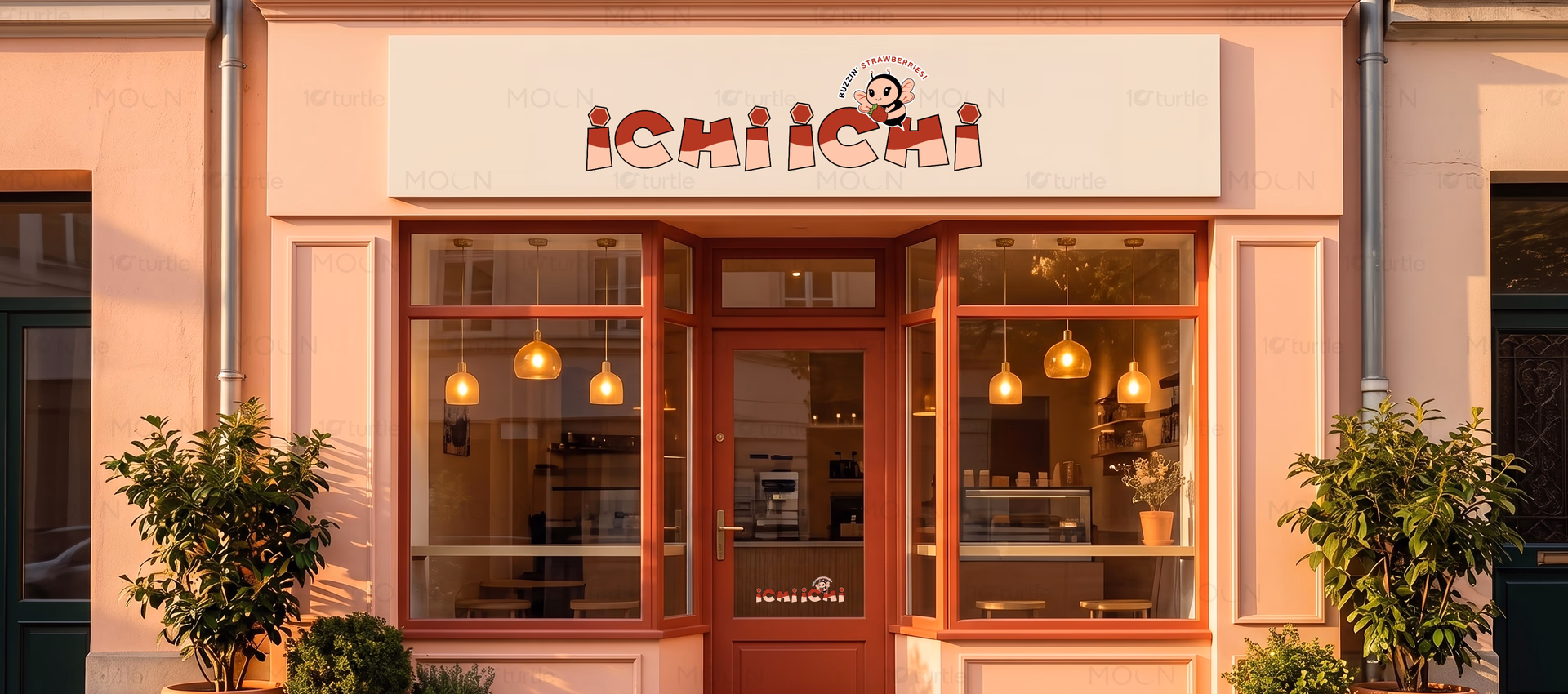
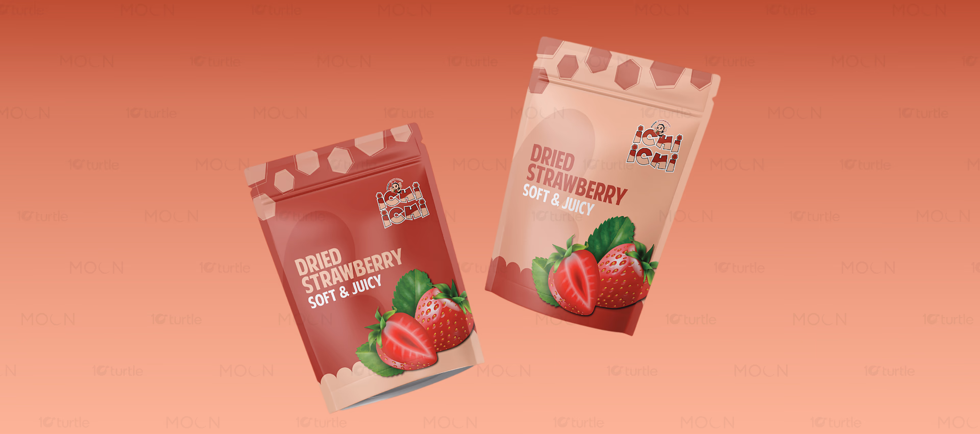
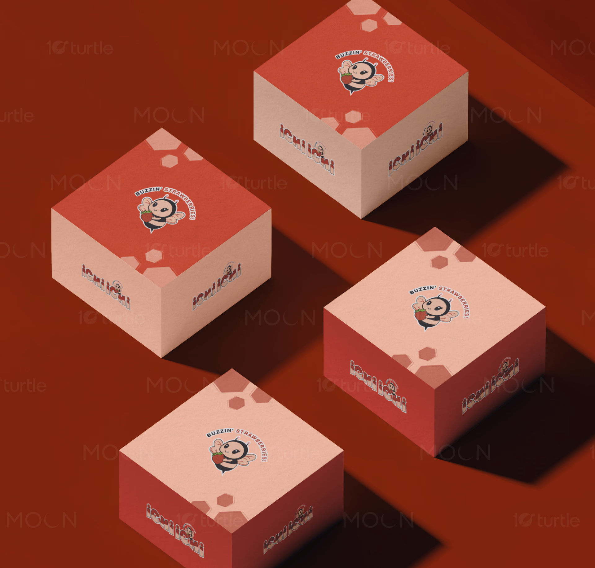
The branding introduces a charming bee mascot holding a strawberry, creating an immediate visual association with the product. Soft pink beverage tones reinforce freshness and strawberry flavor cues. Rounded illustration styling and clean logo placement make the identity highly adaptable across cups and packaging. The playful character adds emotional appeal while maintaining strong brand consistency. Together, these elements create a recognizable and engaging customer experience.
The Impact
The identity establishes a strong foundation for long-term brand recognition within the beverage category. The mascot creates a memorable visual asset that can extend across future marketing campaigns and packaging formats. Consumers are likely to associate the brand with freshness, fun, and approachable quality. The cohesive color palette and character-driven design help distinguish ICHI ICHI from competitors while supporting scalable brand growth.
ICHI ICHI is a strawberry beverage brand designed to create a memorable and engaging customer experience through playful visual storytelling. In a competitive beverage market filled with similar product offerings, establishing a unique identity is essential. The goal of the project was to create a recognizable brand that communicates freshness, fun, and approachability while appealing to younger consumers and café visitors.
A major challenge within the beverage industry is differentiation. Many fruit drink brands rely on conventional imagery and standard packaging formats that fail to leave a lasting impression. For a strawberry-focused beverage concept, the opportunity was to build a stronger emotional connection through character-driven branding. Rather than focusing solely on product visuals, the design strategy centered around creating a memorable brand personality that customers could instantly recognize.
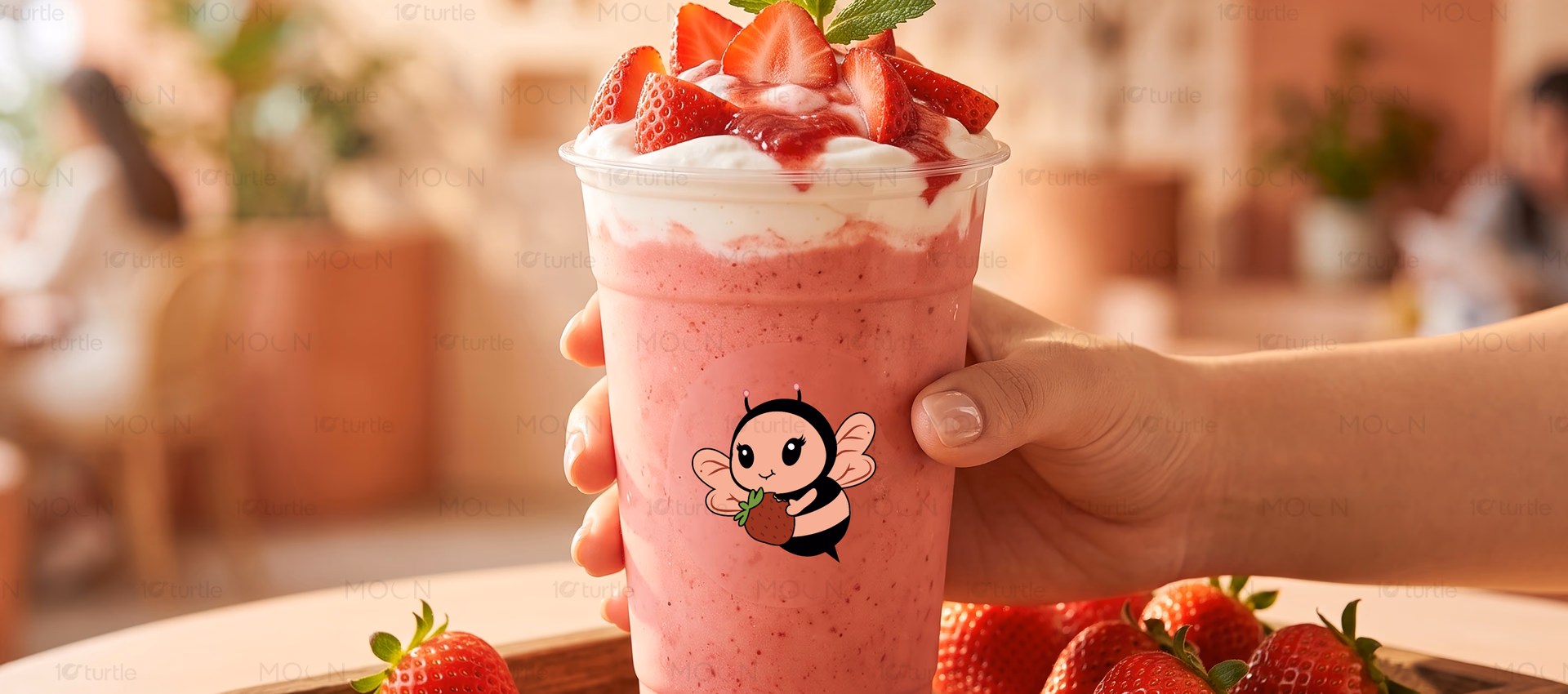
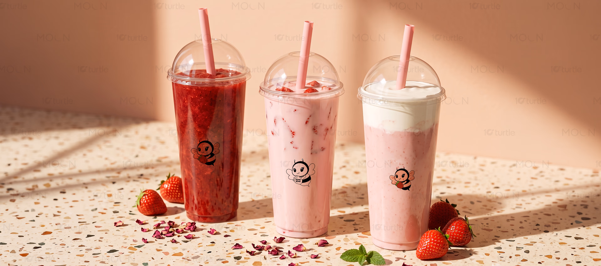
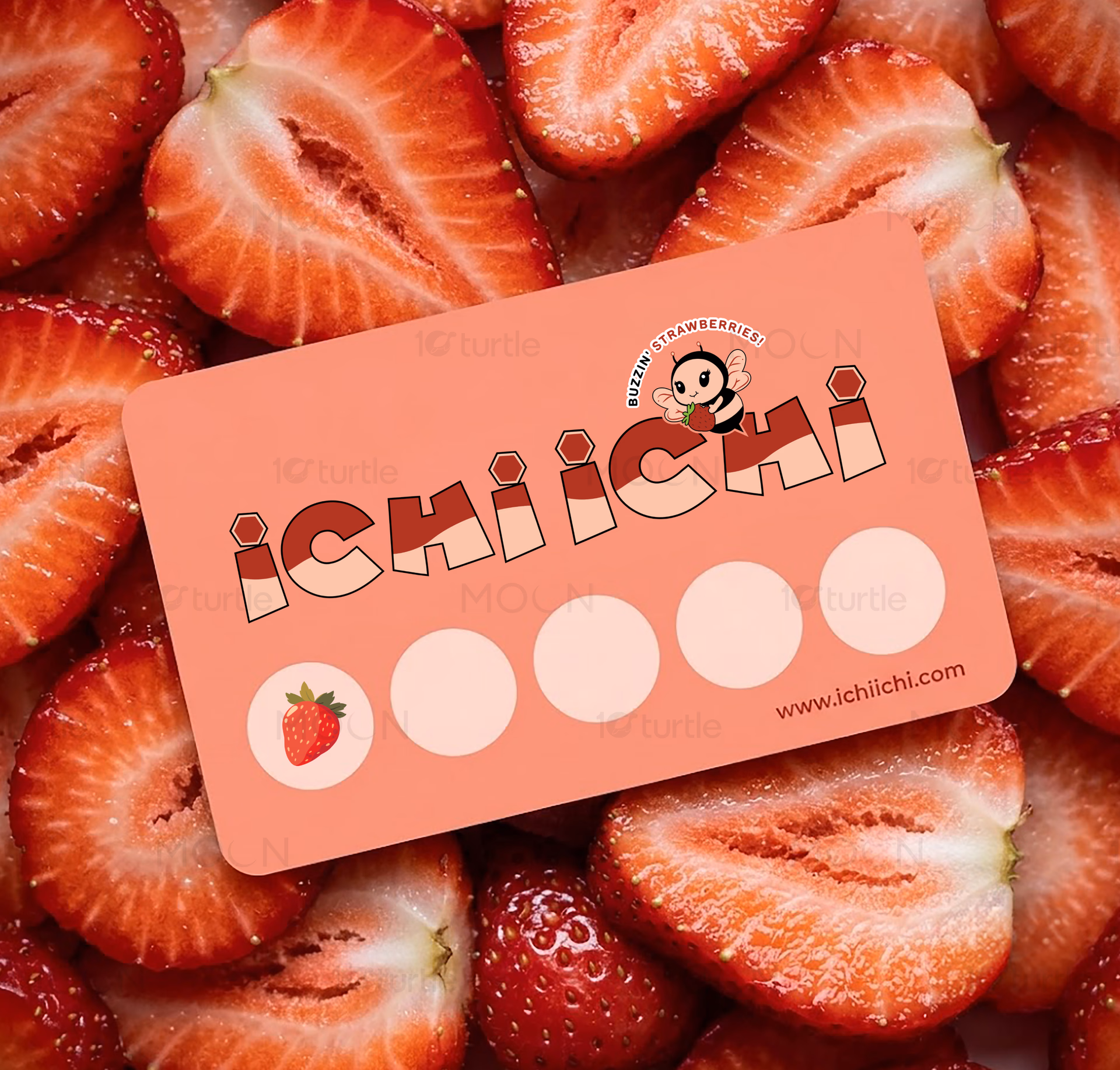
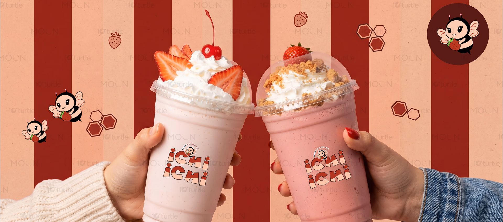
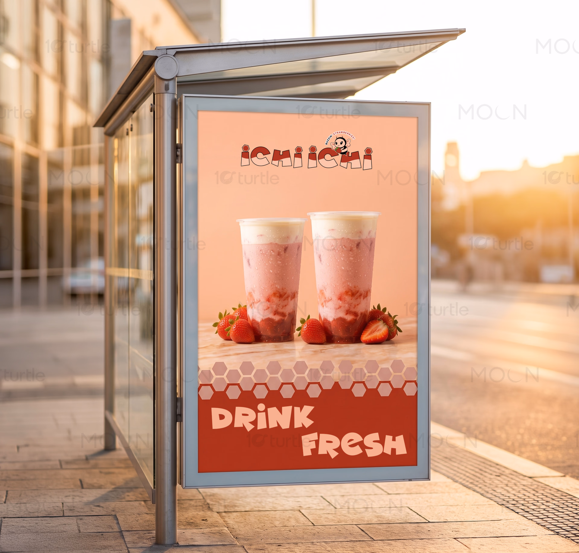
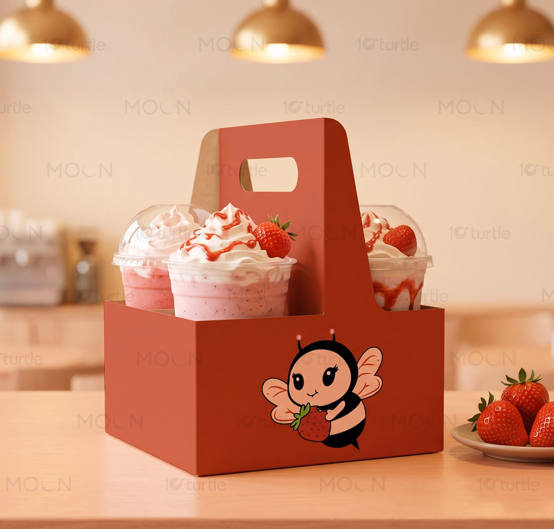
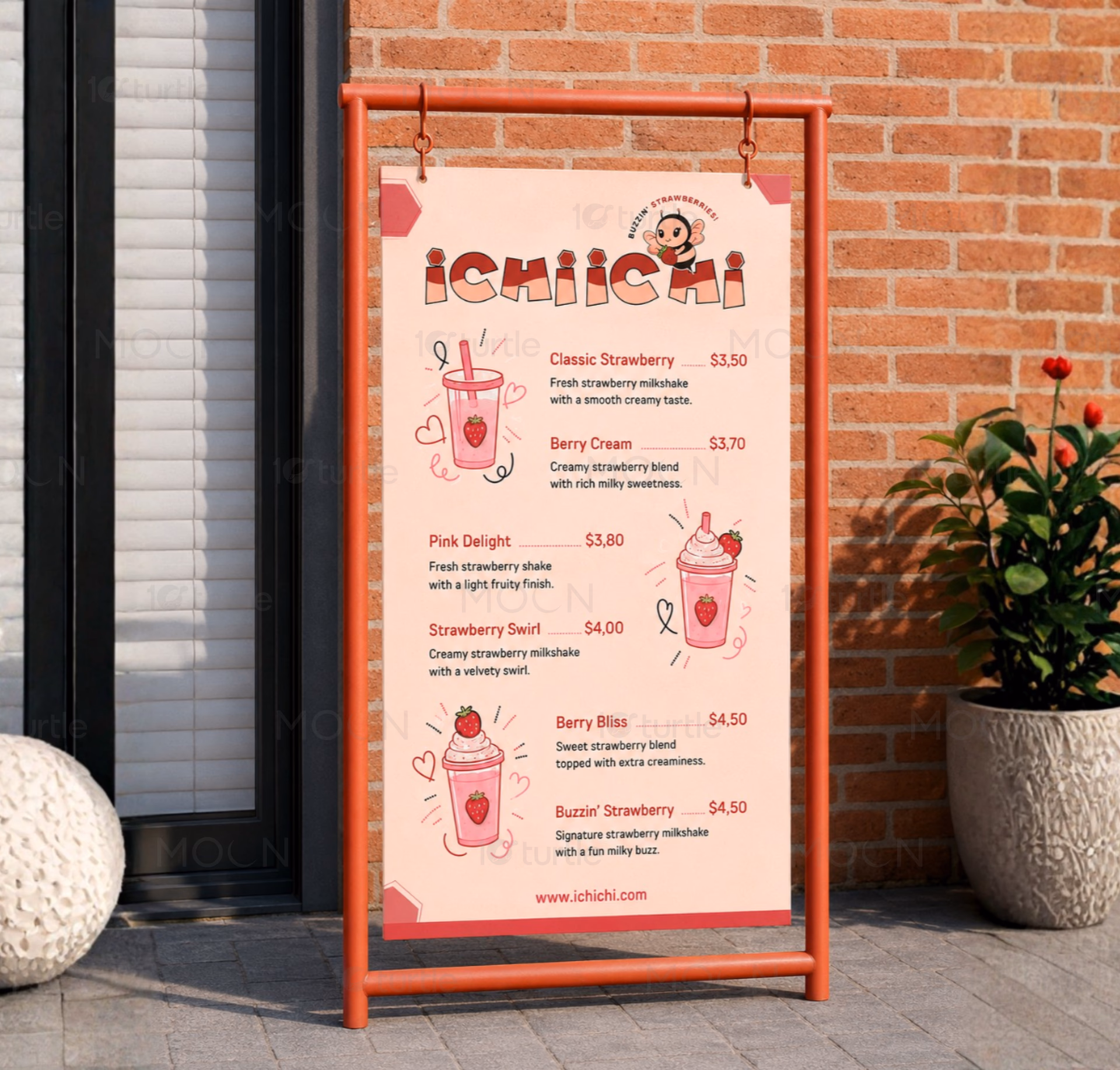
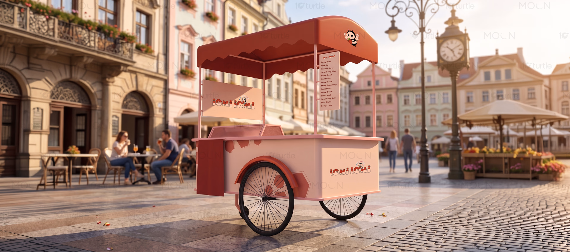
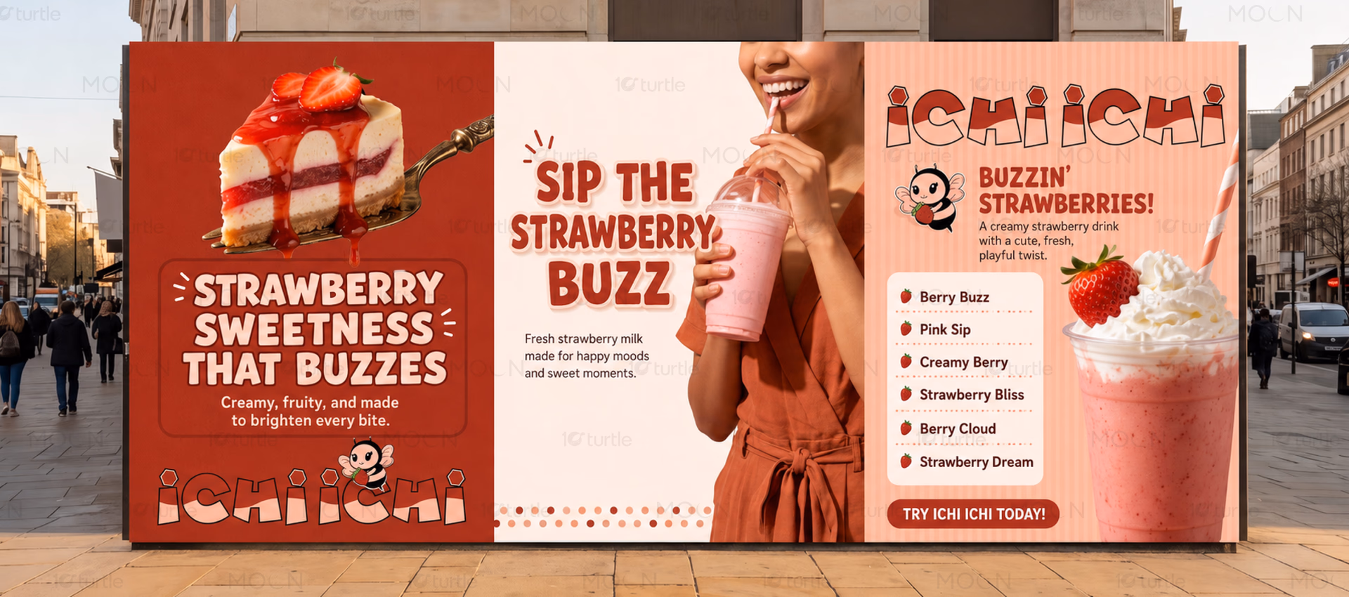
The resulting brand identity introduces a cheerful bee mascot holding a strawberry, becoming the centerpiece of the visual system. This playful illustration style helps create a friendly and approachable brand image while reinforcing the strawberry theme. The mascot appears prominently on branded beverage cups, creating consistency across customer touchpoints and enhancing visual recall. Its rounded features and expressive appearance contribute to a youthful and welcoming aesthetic.
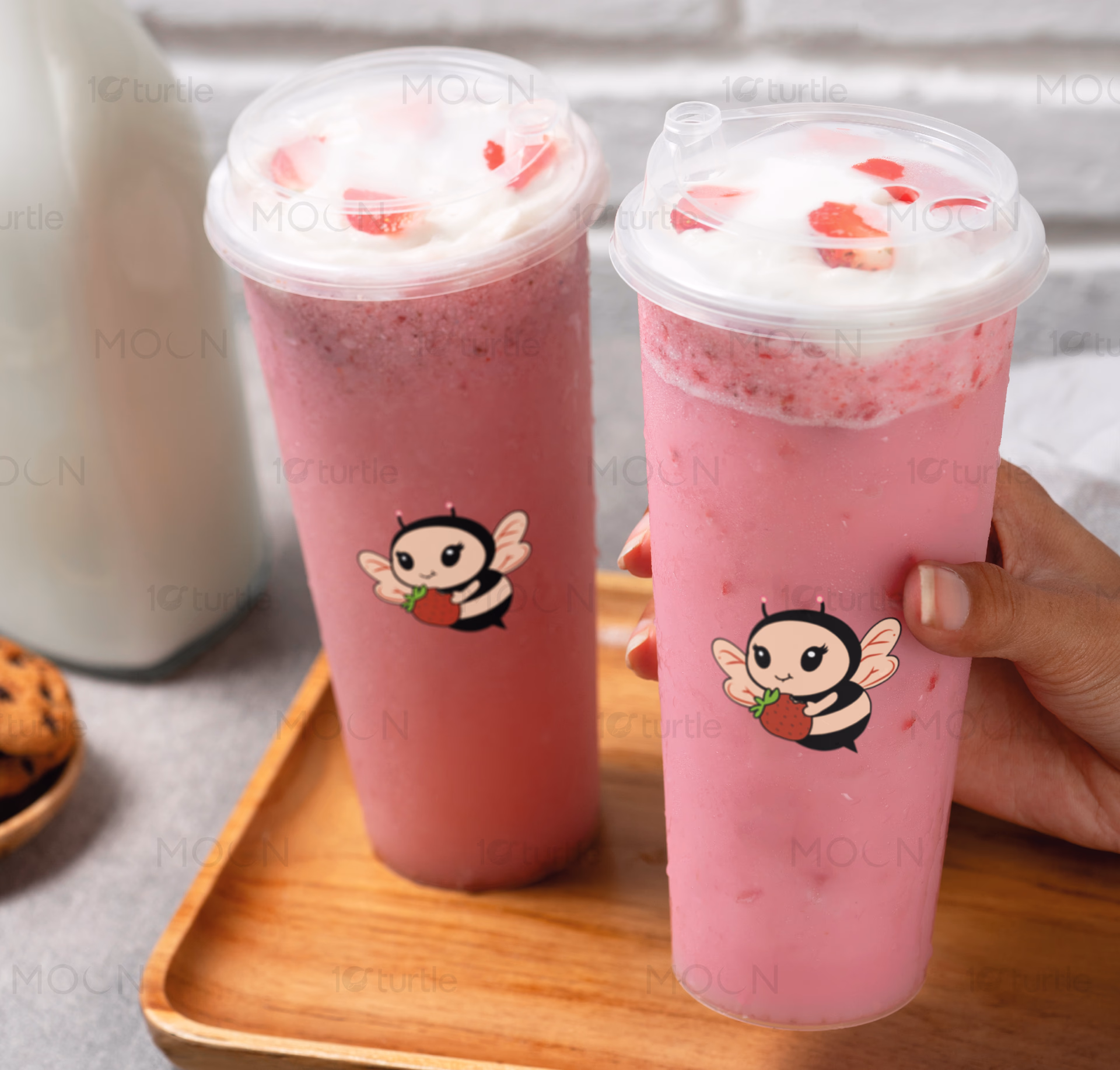
Color plays an important role throughout the branding. Soft strawberry pinks dominate the visual presentation, immediately communicating flavor and freshness. The beverage itself complements the brand palette, creating visual harmony between product and packaging. Clean logo placement ensures clarity while allowing the mascot to remain the focal point. Together, these elements create a cohesive identity that feels modern, engaging, and highly adaptable.
The beverage cup application demonstrates how the brand functions in a real-world environment. The logo and mascot remain highly visible against the soft pink drink background, while the overall presentation feels premium yet approachable. This balance helps the brand appeal to both casual consumers and social media audiences who are drawn to visually distinctive products.
Through thoughtful mascot branding, cohesive color direction, and strong visual consistency, ICHI ICHI successfully transforms a simple strawberry beverage into a recognizable brand experience. The project showcases how strategic beverage branding and illustration can strengthen customer engagement, improve memorability, and create long-term differentiation in the food and beverage market. As the brand expands across packaging, merchandise, and café applications, the identity provides a flexible foundation for future growth while maintaining its playful and refreshing character.
#ichiichi #strawberrybranding #beveragebranding #mascotdesign #brandidentity