
Overview
This flyer design case study combines three business promotion pieces created for service-based brands: SERVPRO Team Isaacson, Get Right, and Barbour & Company. The set supports team introduction, headshot booking, and real estate agent recruitment through bold headers, brand-specific colors, concise selling points, QR codes, and compact layouts built for print distribution and quick response.
The Challenge

Service-based businesses often need to communicate a lot of information in very little space. A weak flyer can feel overcrowded, unclear, or too generic, causing potential clients to miss the offer or ignore the call-to-action. For restoration teams, photography services, and real estate brokerages, trust must be built quickly through strong visuals, clear benefits, and professional formatting. The challenge was to make each flyer informative, branded, and action-driven without sacrificing readability.
The Solution

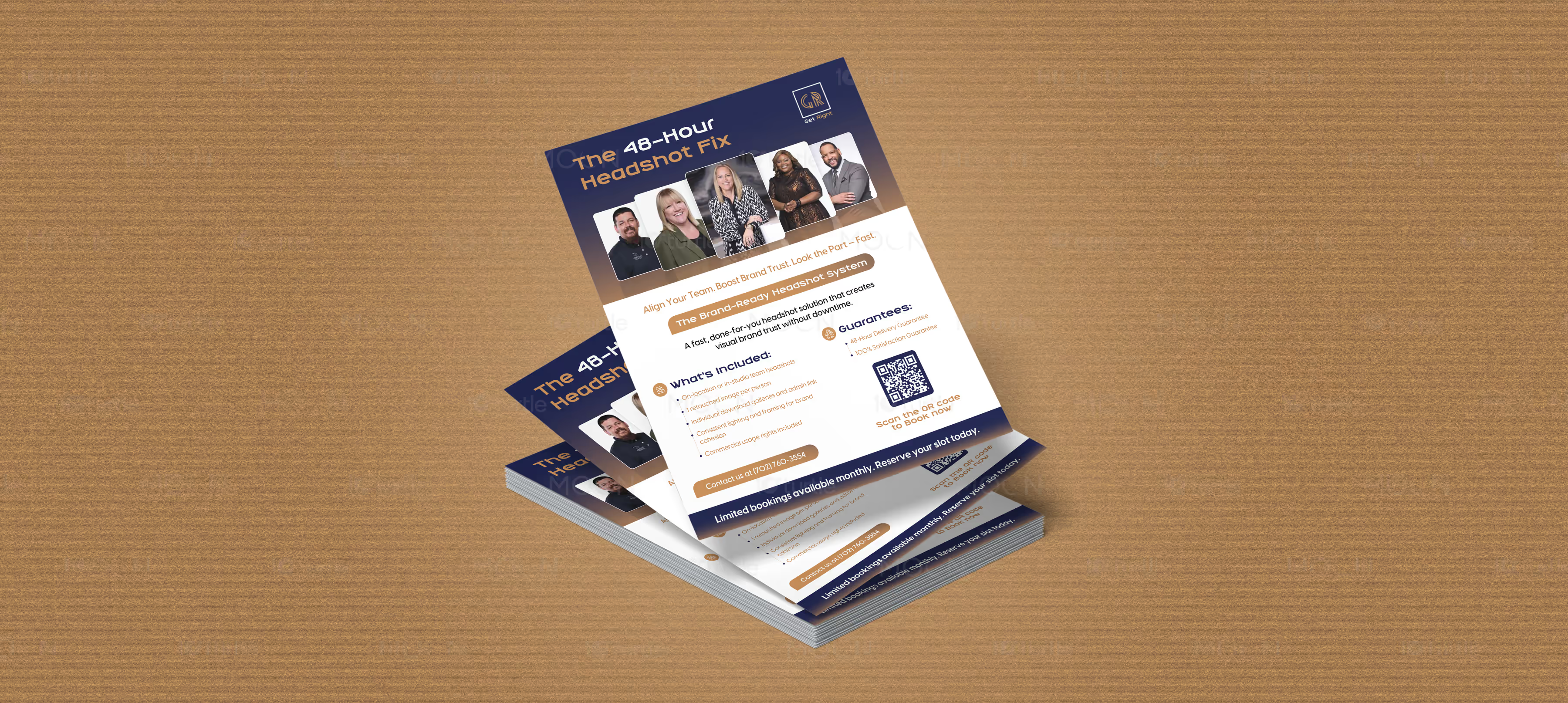
This collection solves the problem with sharp hierarchy, strong brand colors, and purpose-led layouts. The SERVPRO flyer uses orange geometric shapes, city-building photography, team credentials, resources, and project details to create a reliable contractor-focused presentation. The Get Right flyer uses navy, gold, professional headshots, service guarantees, booking details, and a QR code to make the offer instantly clear. The Barbour & Company flyer uses purple accents, leadership messaging, mission and vision blocks, category panels, and a QR code to support real estate agent recruitment.
The Impact

The flyer collection helps each business present its offer with confidence and speed. Clear content sections make the designs easier to scan in meetings, events, mailers, and direct handouts. QR codes connect the printed format to digital action, improving booking, inquiry, and recruitment potential. Long term, these flyers strengthen brand recognition, support local marketing, and make each service feel more credible and organized.


Flyer design remains one of the most direct ways for service-based businesses to communicate offers, build trust, and encourage fast action. This case study brings together three promotional flyer designs into one unified body of work, covering restoration and contractor services, professional headshot booking, and real estate agent recruitment. Although each flyer serves a different business purpose, the collection shares the same strategic goal: making information easy to scan, visually credible, and simple to act on.
The first challenge in promotional flyer design is attention. A flyer has only a few seconds to communicate who the brand is, what it offers, and why the reader should respond. If the layout feels cluttered or the call-to-action is weak, the piece becomes forgettable. This is especially important for local business marketing, where flyers may be handed out at events, shared with prospects, placed in folders, or used as printed sales support. Every headline, photo, icon, QR code, and contact detail has to earn its place.
The collection uses brand-specific styling to keep each flyer distinct. The SERVPRO Team Isaacson design uses a bold orange and white palette with architectural imagery and angular graphic shapes. The front creates a strong first impression with building photography and brand color, while the back organizes team credentials, resources, and work details into clear sections. This approach supports contractor credibility by making the information feel structured and professional.
The Get Right flyer uses a navy and gold color system, professional headshot examples, rounded content cards, QR code placement, and a direct booking message. The “48-Hour Headshot Fix” headline immediately explains the offer, while sections for inclusions and guarantees help reduce hesitation. This is a strong example of print flyer design built around one clear service promise.
The Barbour & Company real estate flyer takes a more recruitment-focused direction. Purple accents, leadership messaging, mission and vision panels, a QR code, and organized support categories help communicate value to real estate agents. The layout is professional, people-focused, and practical, making it useful as a real estate flyer design for brokerage growth and agent outreach.
Across all three designs, the common strength is clarity. Each flyer uses strong hierarchy, limited color systems, photography, short content blocks, and visible calls-to-action. As brand collateral, the collection gives each business a polished printed asset that can support meetings, campaigns, referrals, and direct response. Long term, effective flyer design helps service brands look more credible, communicate faster, and turn interest into measurable action.
#flyerdesign
#printflyer
#businessflyer
#promotionalflyer
#salesflyer
#realestateflyer
#headshotmarketing
#servicebusiness
#brandcollateral
#qrcodeflyer
#localmarketing
#printdesign