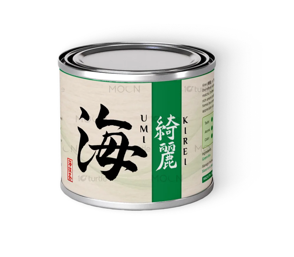
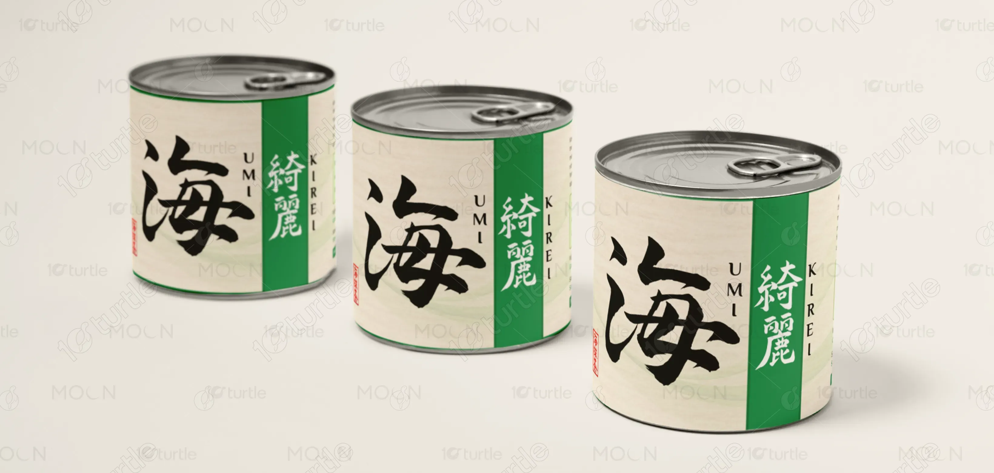
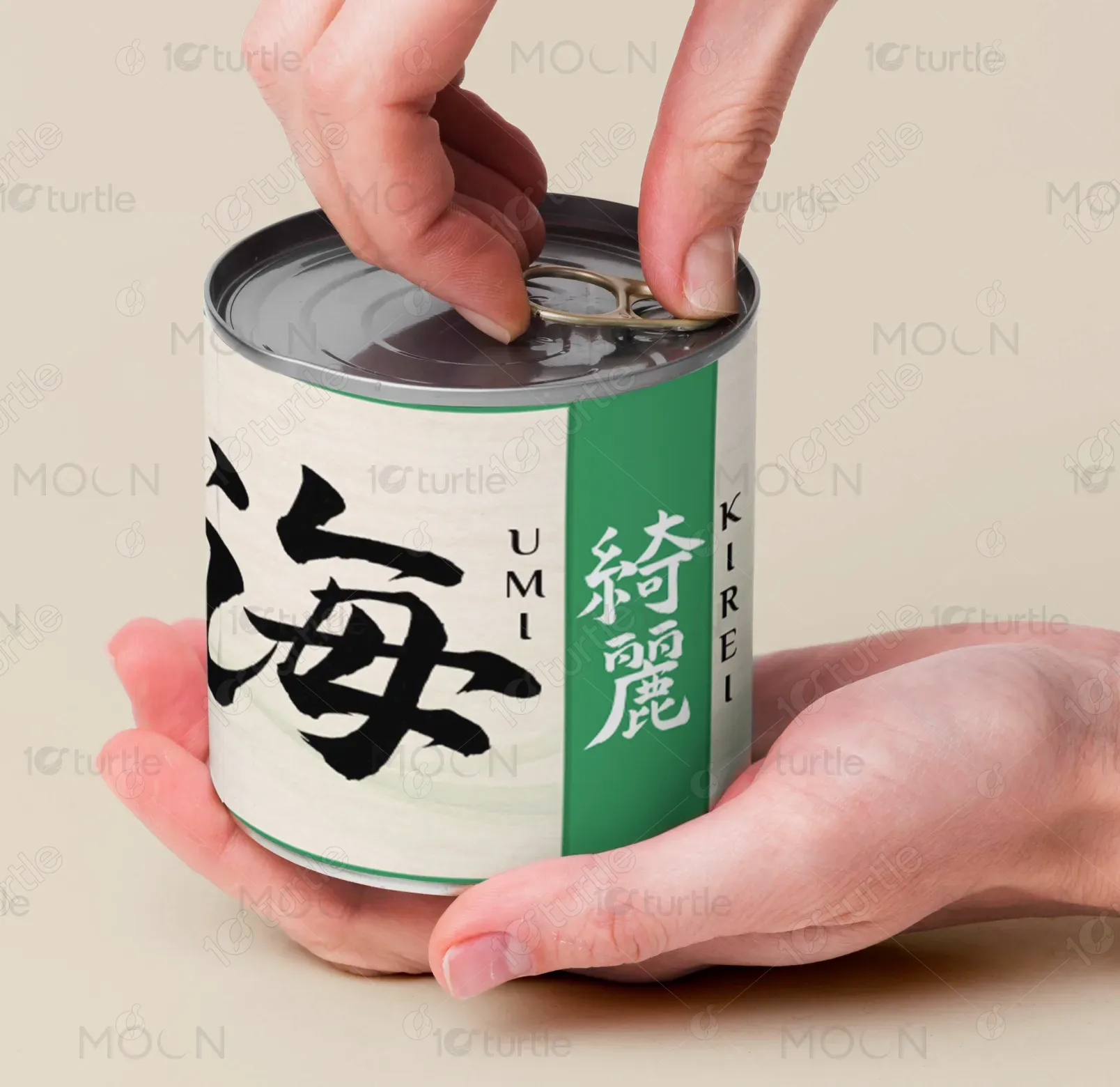
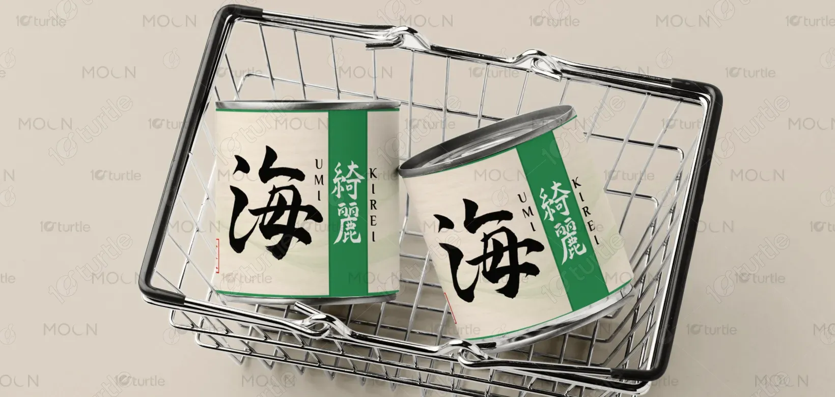
The design embraces a clean, minimal aesthetic inspired by traditional Japanese art. The use of soft earthy tones and refined typography emphasizes the natural purity of the matcha. The kanji characters for "Umi" (海) and "Kirei" (綺麗) are boldly featured, enhancing the connection to Japanese culture. Subtle waves and a delicate layout echo the calming nature of tea rituals, while modern elements like the iconography and simple color palette ensure the packaging feels contemporary yet timeless.
Label Design
Graphic Design
Industry
Food, Beverage & Hospitality
Tools we used


Project Completion
2025
Key Market
Global
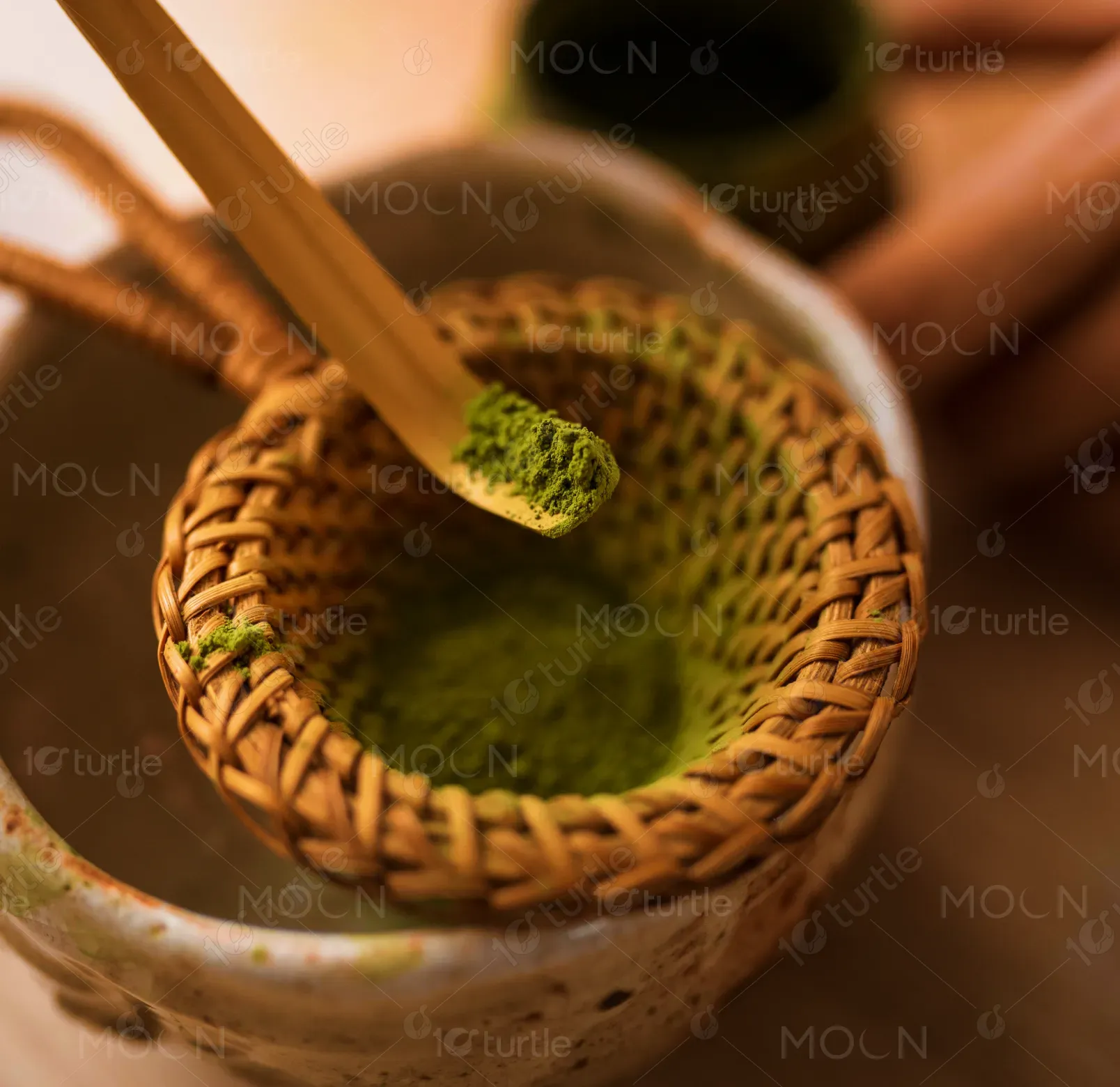
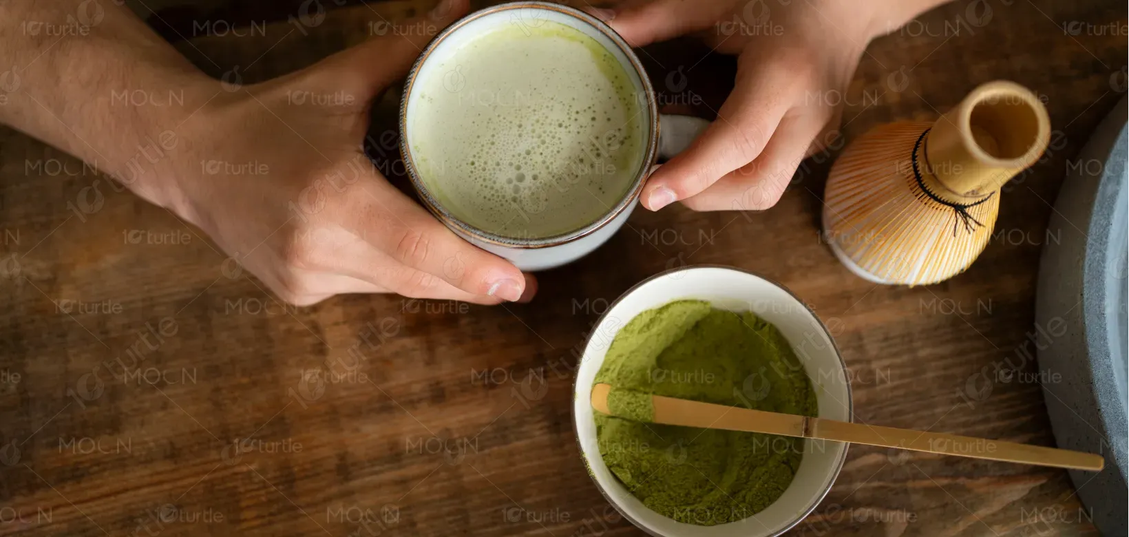
This Japanese matcha blend, labeled “Umi Kirei,” offers an exquisite, high-quality green tea experience. Intended for usucha (thin tea) and matcha lattes, it provides a smooth, full-bodied flavor with a rich umami profile. The packaging reflects the elegance and sophistication of Japanese culture, making it perfect for both traditional tea ceremonies and contemporary matcha enthusiasts. Its minimalistic design appeals to users seeking an authentic, luxurious, and visually tranquil product, reinforcing the cultural and sensory experience.
Industry
Food, Beverage & HospitalityWhat we did
Label DesignGraphic DesignPlatform
-The market for matcha products is saturated with designs that either overcomplicate the aesthetic or fall into generic, mass-produced packaging. Many brands fail to convey the authentic and refined nature of the product, instead opting for flashy or overly commercial designs. This results in a disconnect between the product's quality and its presentation, leaving discerning consumers unenthusiastic about the experience. There is a gap for high-end matcha packaging that speaks to both tradition and modern luxury in a minimal way.
The “Umi Kirei” packaging solves this problem by embracing simplicity and elegance. It uses minimalist design elements such as clean typography, subtle icons, and a restrained color palette to communicate sophistication and authenticity. By focusing on the cultural essence of matcha, the design speaks to consumers who value both tradition and modern luxury. The packaging's refined aesthetic aligns with the quality of the product inside, offering a sense of tranquility and exclusivity.
The long-term vision for the design is to establish "Umi Kirei" as a premium brand synonymous with luxury and authenticity in the matcha market. The minimal aesthetic will evolve into a recognizable symbol of quality, attracting both traditional tea lovers and a younger, modern audience. As the brand grows, the design aims to maintain its timeless appeal while expanding into new product lines and markets, fostering an enduring connection with consumers who value craftsmanship and subtlety.
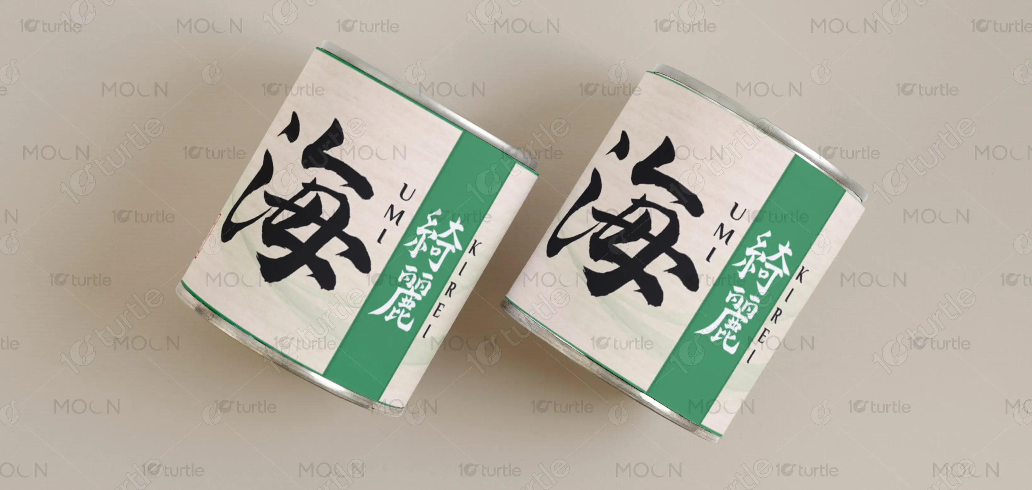
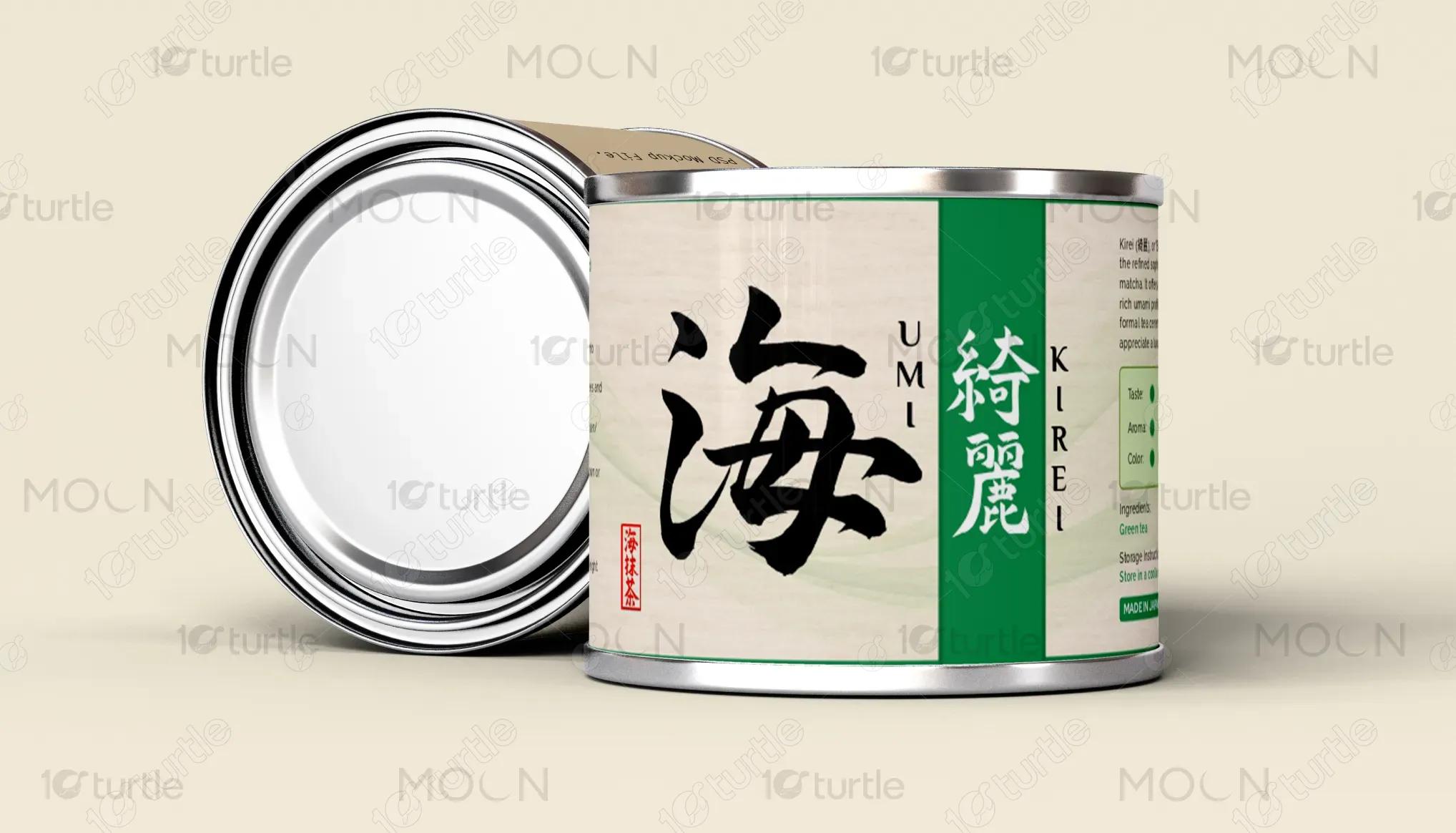
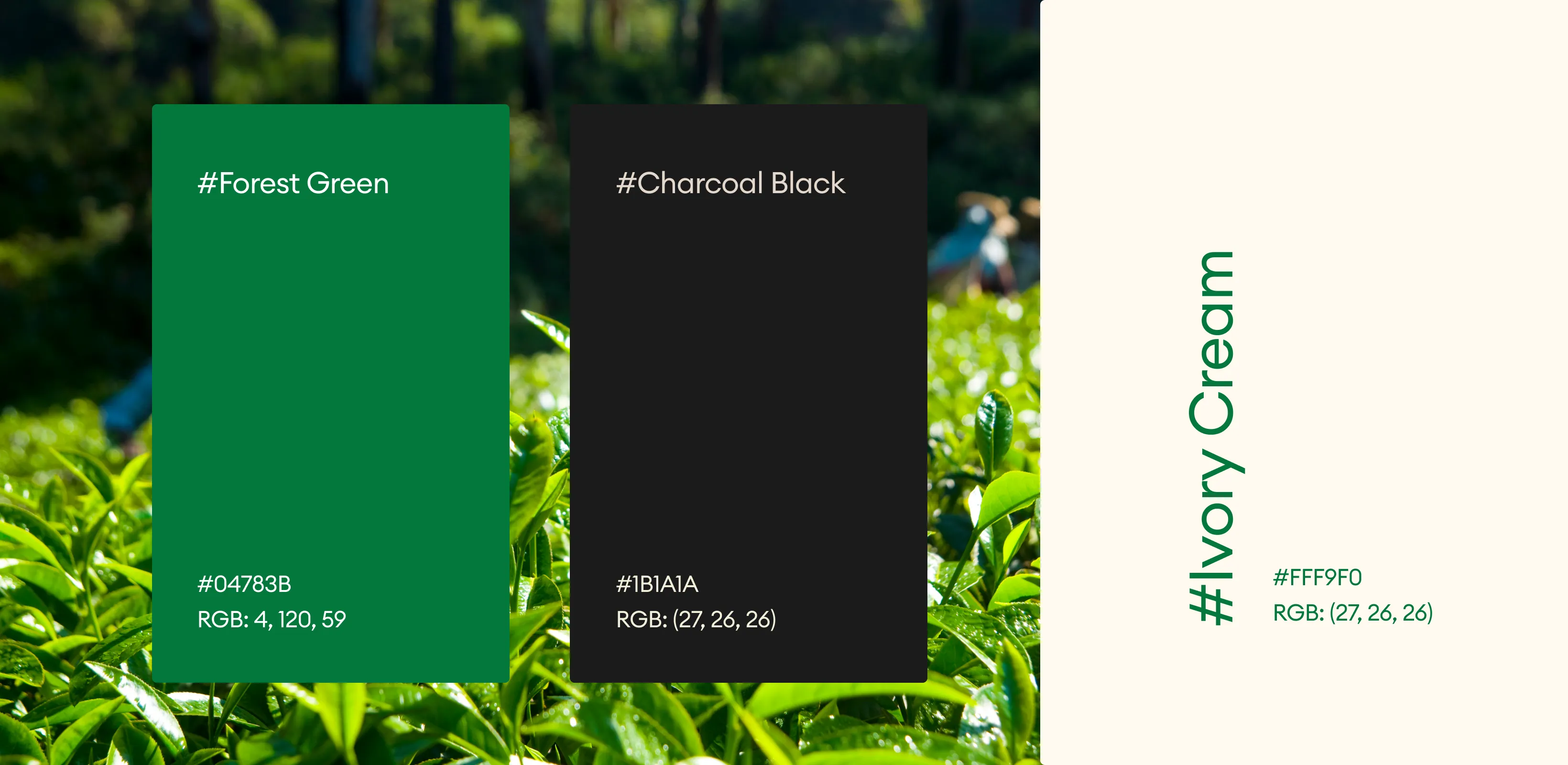
The chosen color scheme revolves around soft greens, earthy tones, and accents of deep red. The green represents the vibrant, fresh nature of matcha, evoking calmness, health, and nature. The earthy tones ground the design in organic, natural beauty, while the red accent (used for the seal) adds a subtle touch of elegance and Japanese tradition. This palette not only aligns with the brand’s identity but also evokes a sense of serenity and refinement, appealing to a sophisticated audience.