The design embodies calmness and professionalism, creating a welcoming space that soothes patients from the moment they enter. The sleek white marble reception desk, accented with soft gold, conveys sophistication and cleanliness—key qualities of a dental environment. The dark navy backdrop enhances the logo’s visibility, while natural light and greenery add freshness and tranquility. Every element reflects the centre’s commitment to comfort and reassurance, aligning with its focus on gentle, anxiety-free dental experiences.
Logo Design
Graphic Design
Industry
Healthcare & Wellness
Tools we used


Project Completion
2025
Key Market
Global
The design represents Melbourne Sedation Dental Centre, a modern facility specializing in anxiety-free dental care. The goal was to create an environment that projects calm, trust, and comfort while maintaining a professional aesthetic. Positioned in a premium location, the design merges modern luxury with patient-centered warmth. Its unique selling point lies in combining clinical precision with emotional ease—achieved through elegant materials, minimalism, and a serene visual identity that reassures visitors even before treatment begins.

Industry
Healthcare & WellnessWhat we did
Logo DesignGraphic DesignPlatform
-Dental clinics often evoke anxiety due to cold, sterile environments and intimidating setups. Many patients hesitate to seek care because they associate dental visits with discomfort. The challenge was to break this stereotype and craft a space that feels safe, inviting, and soothing—without losing professional credibility. Designing a dental space that balances clinical hygiene with emotional comfort required thoughtful color, texture, and spatial balance to ensure calmness without compromising functionality.
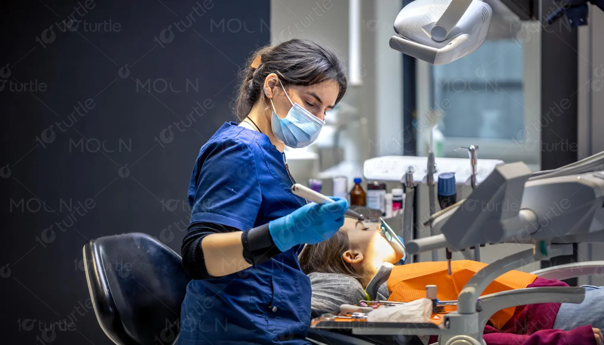
The design integrates a soothing color palette, soft lighting, and natural textures to counter dental anxiety. The warm, minimalist aesthetic reduces visual stress, while the friendly, calming logo reinforces comfort and trust. The choice of marble and matte finishes delivers both hygiene and elegance. The layout ensures openness and natural light flow, reducing the clinical feel and encouraging relaxation. Together, these elements redefine the dental experience—transforming fear into calm confidence.
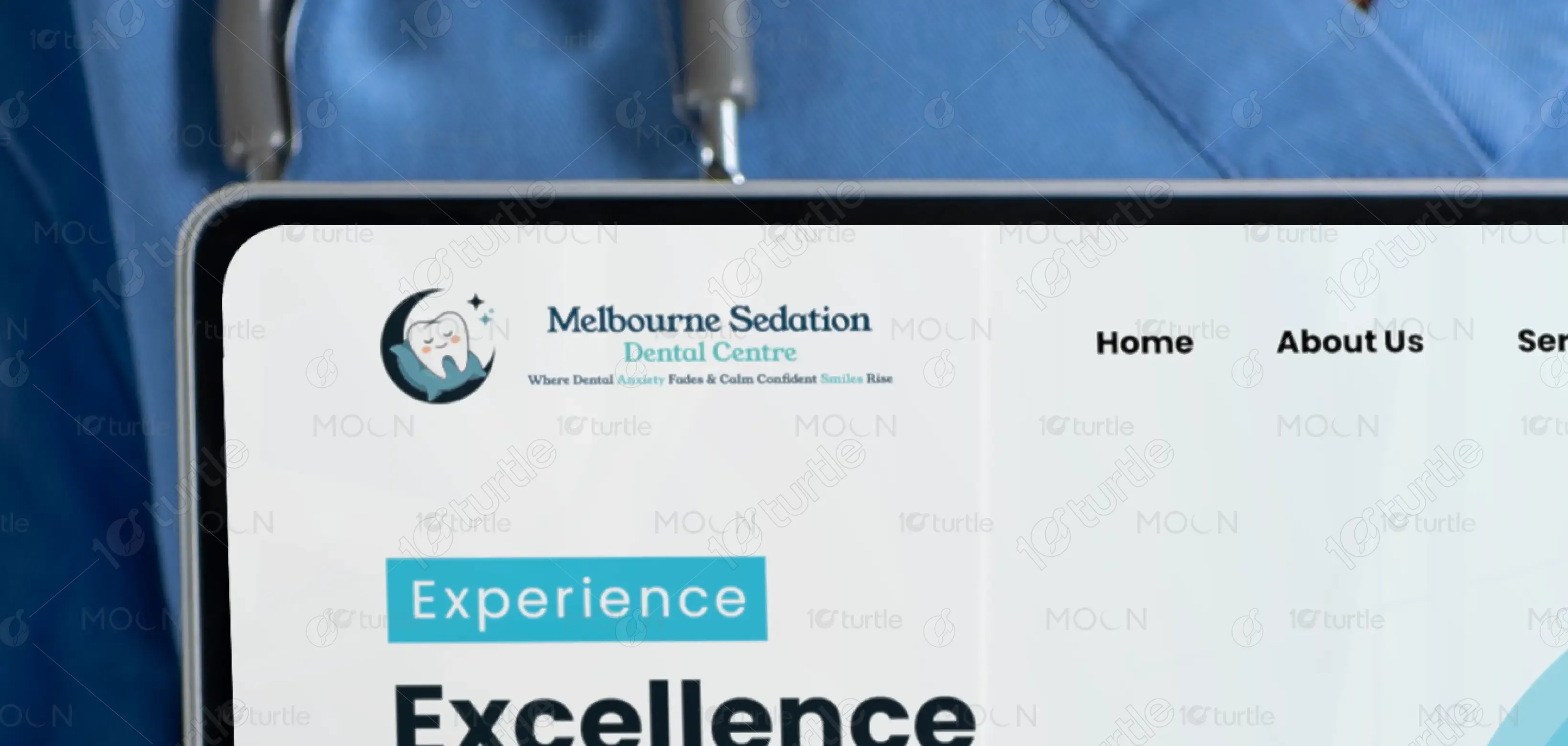
The long-term vision is to establish Melbourne Sedation Dental Centre as a benchmark for patient-centered dental spaces—where emotional wellness and modern care coexist. The design aims to evolve into a signature visual identity for sedation dentistry, inspiring future clinics to adopt comfort-driven design principles. By harmonizing aesthetics, care, and calmness, it seeks to leave a lasting impression on every visitor, making dental care feel reassuring, elegant, and anxiety-free.
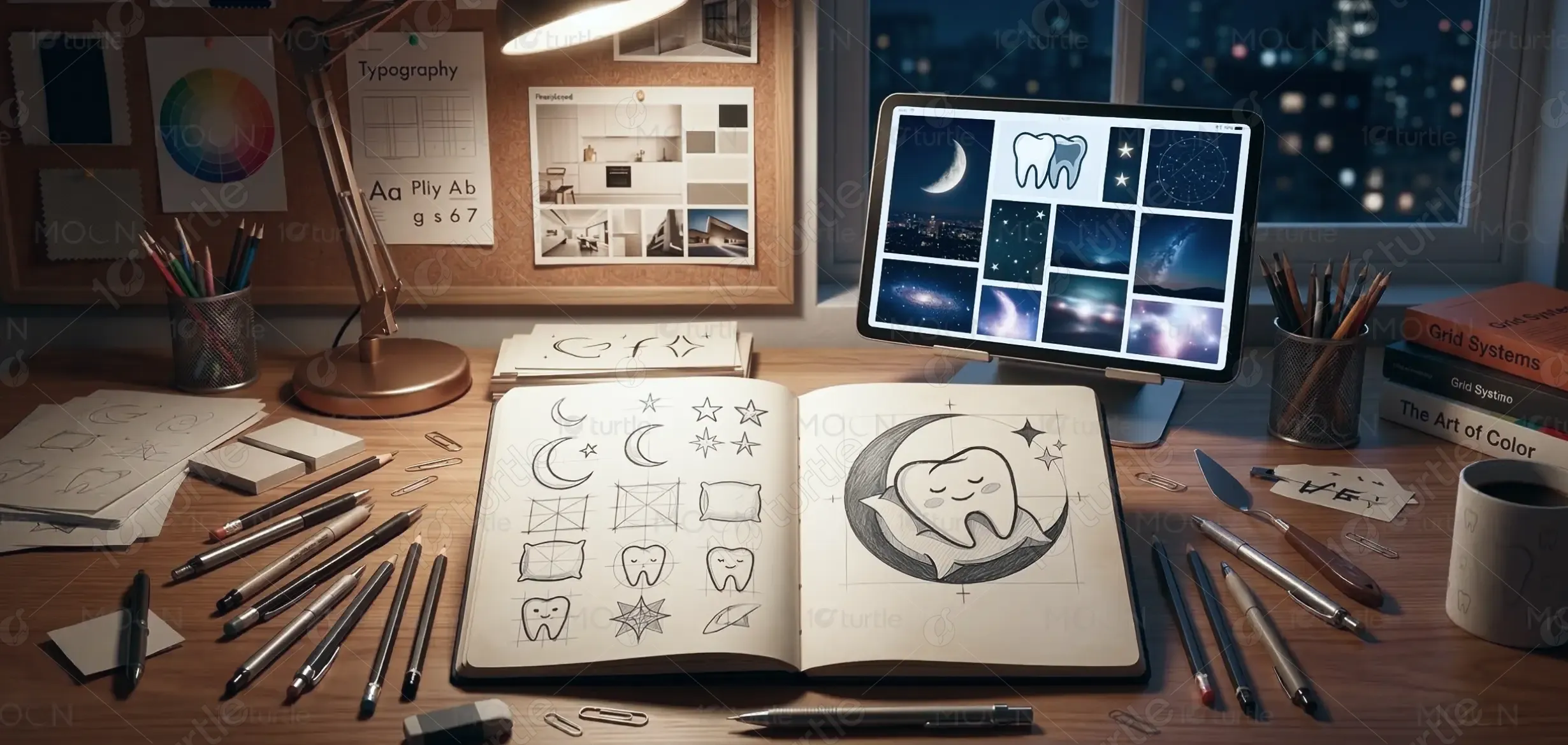
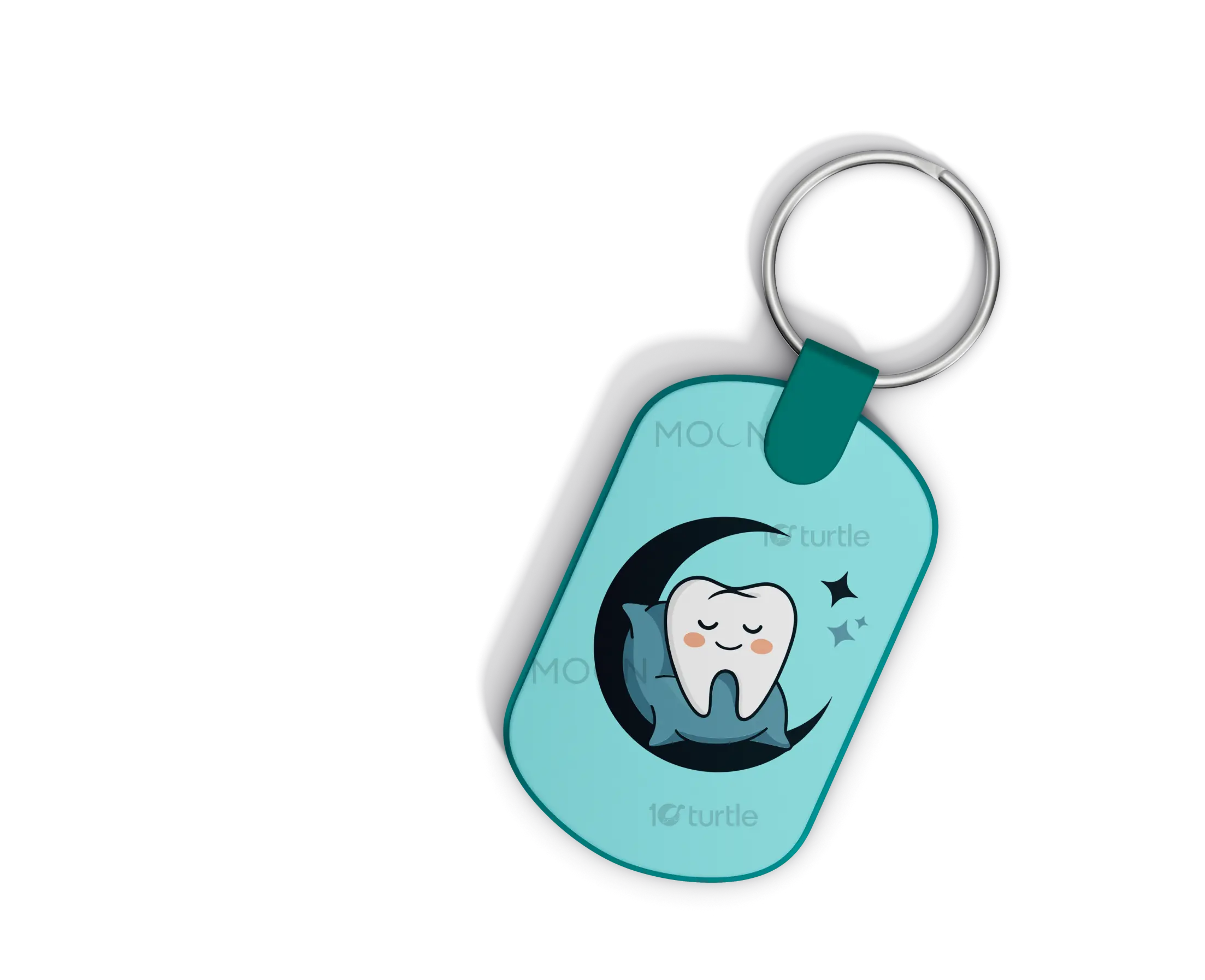
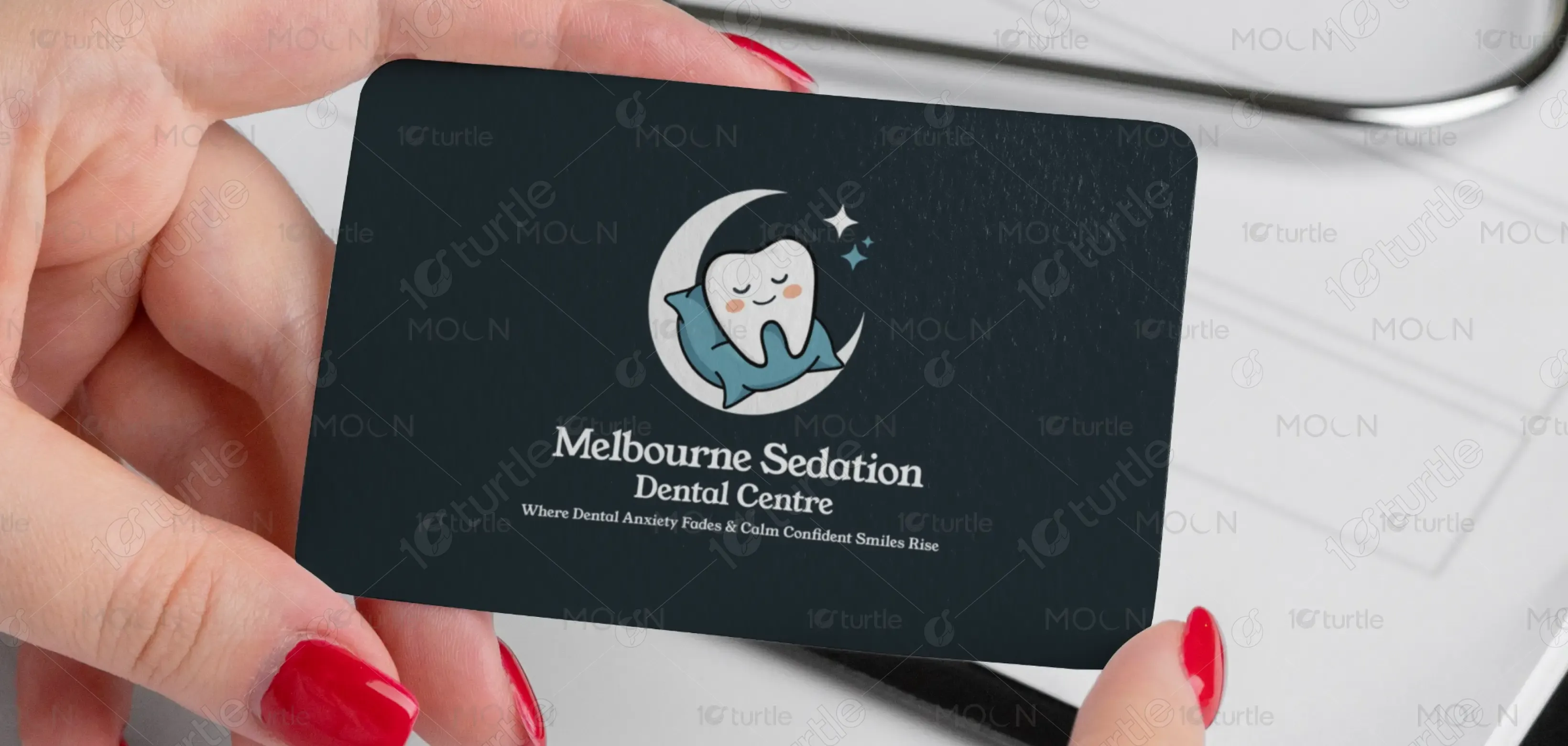
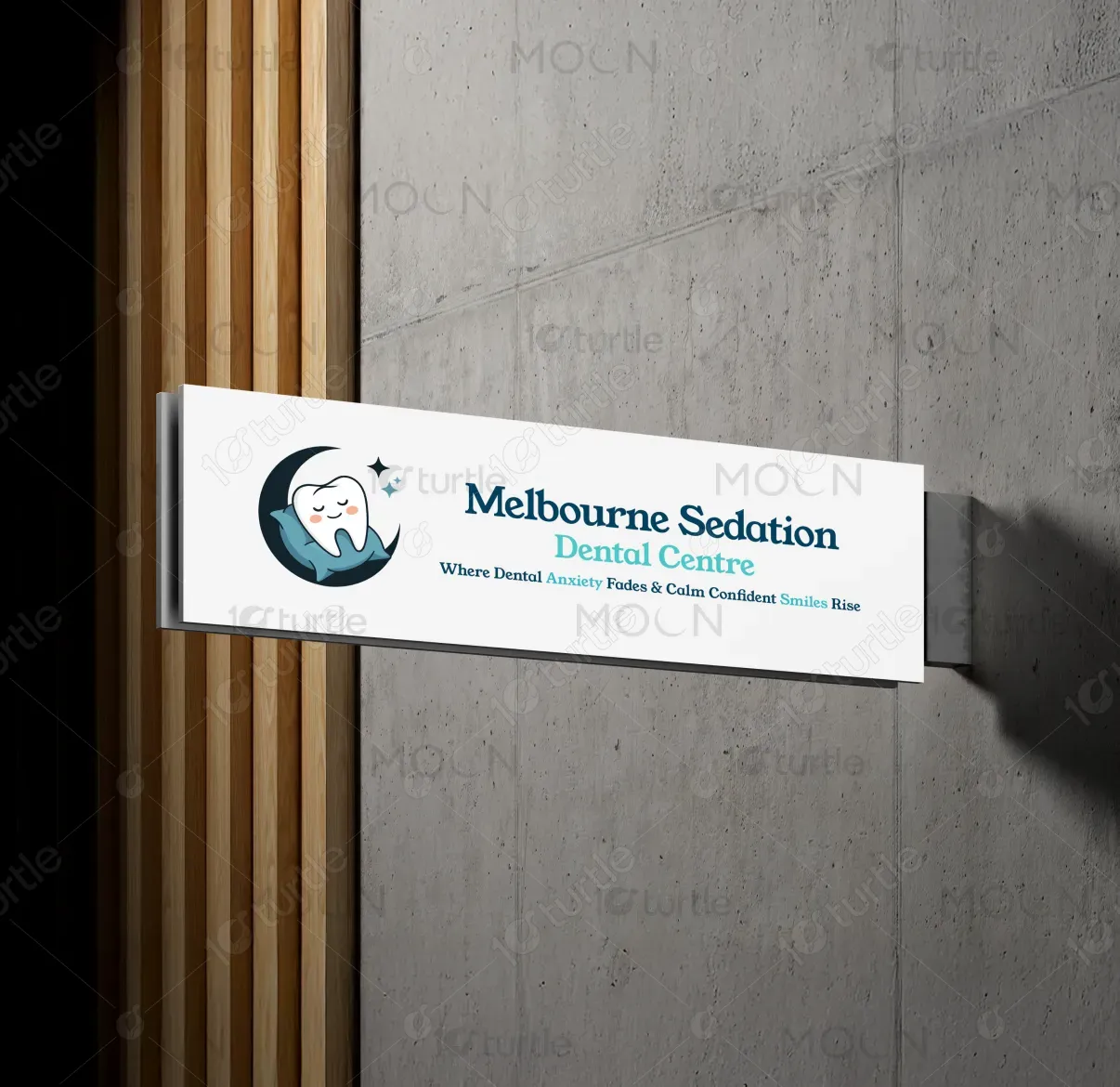
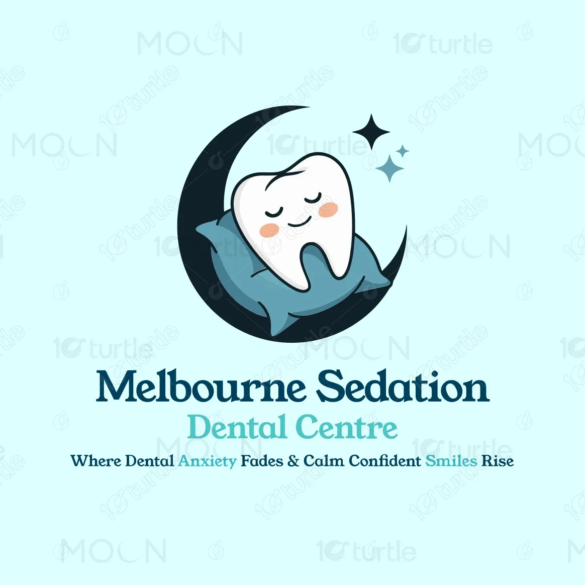
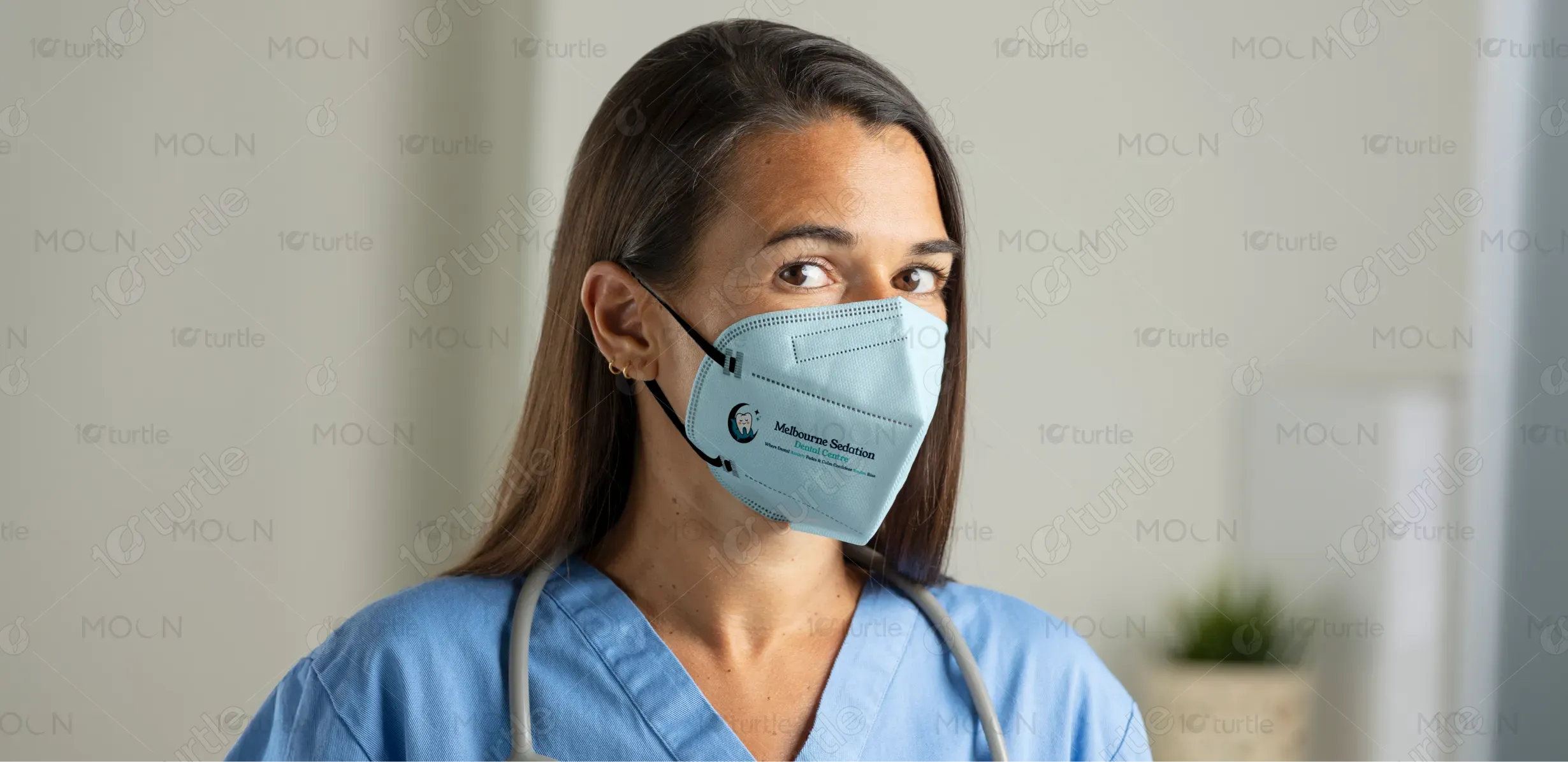
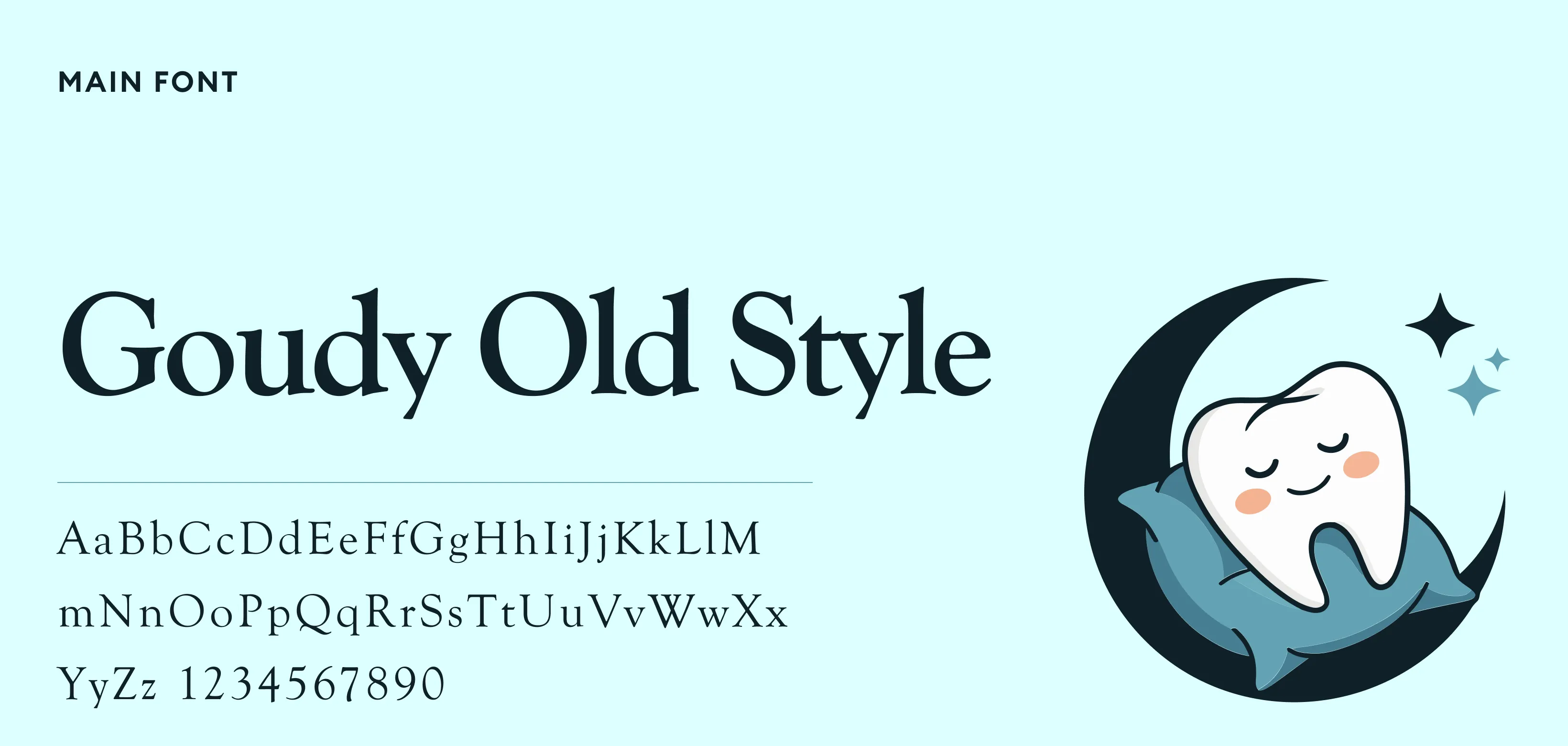
The logo features a smiling tooth resting peacefully on a crescent moon, symbolizing comfort and calmness. It reflects the clinic’s mission to ease dental anxiety through gentle care and sedation. The soft, friendly design conveys trust, relaxation, and confident smiles.
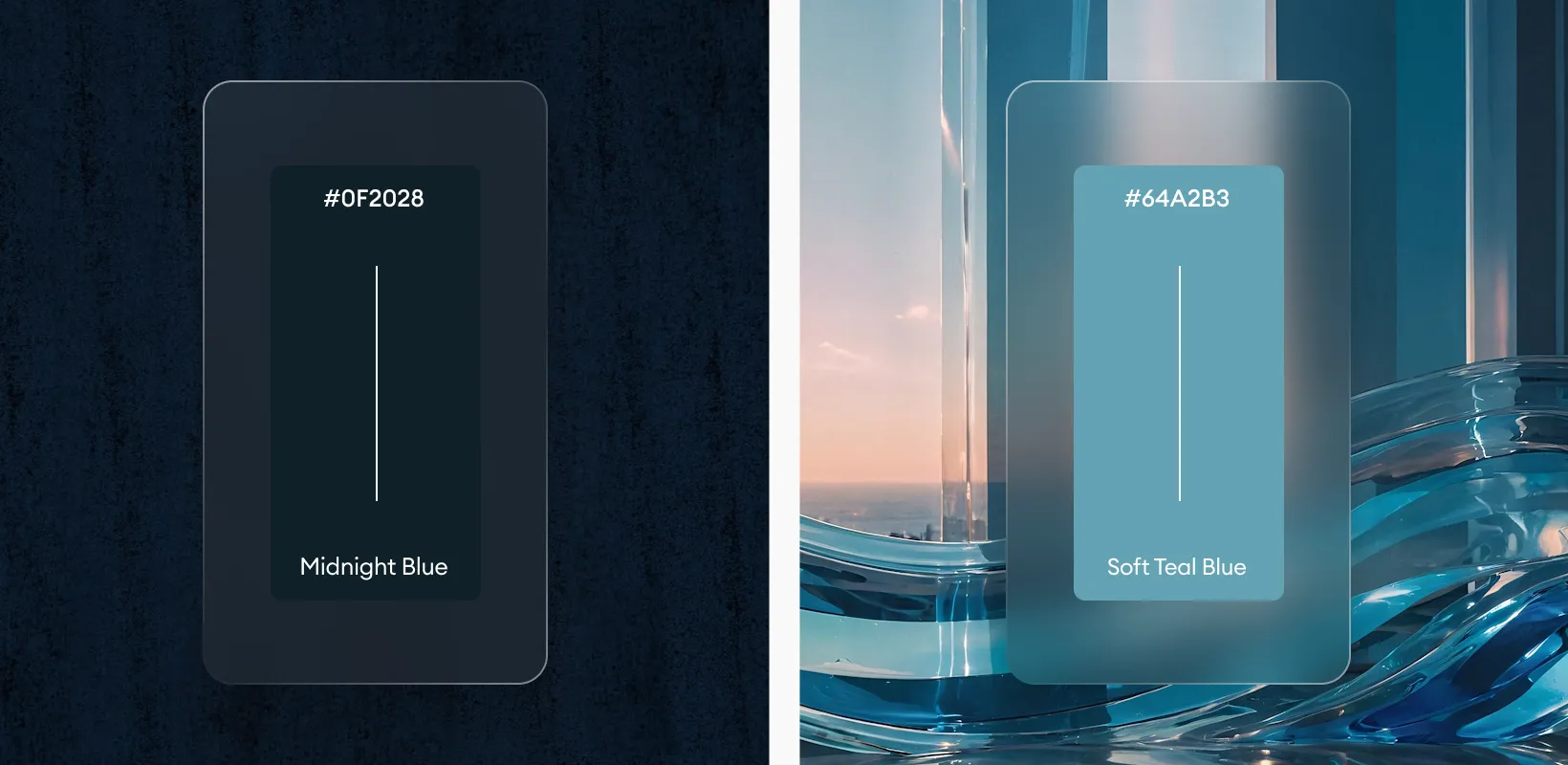
The palette combines deep navy, white marble, and soft gold accents, symbolizing trust, purity, and sophistication. Navy exudes professionalism and calm authority; white reinforces cleanliness and precision, while gold adds warmth and subtle luxury. The natural green from indoor plants balances the palette, bringing a touch of vitality. Together, these colors cultivate an atmosphere of relaxation and confidence—perfectly aligned with the brand’s promise of gentle, stress-free dental care.
