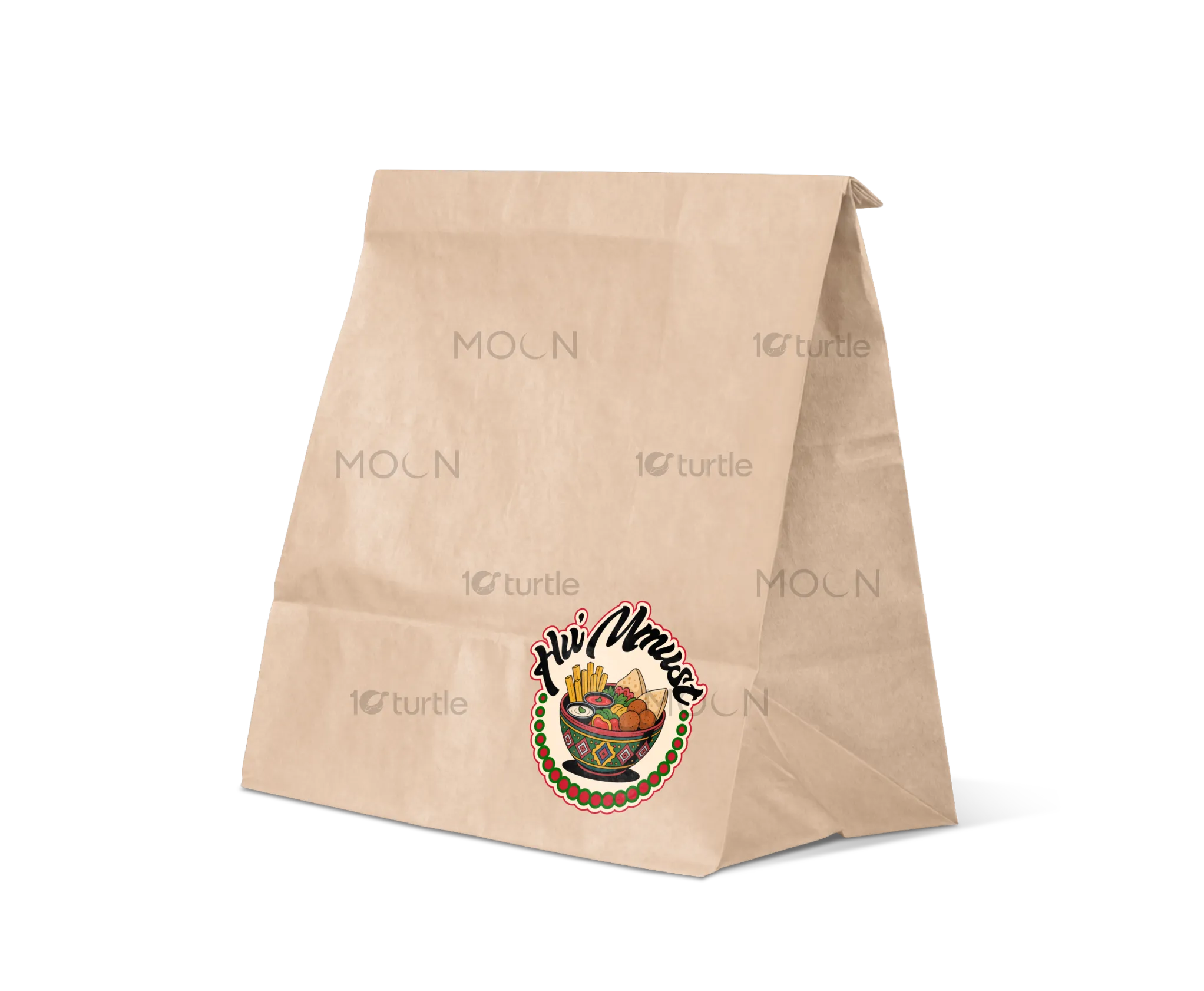
The Huma’s Bowl logo embodies warmth, freshness, and comfort — core emotions tied to great food experiences. The design combines organic curves and clean typography to reflect the restaurant’s balance of tradition and modern dining. The bowl element symbolizes nourishment and togetherness, while the visual flow evokes flavor, aroma, and handcrafted care. A harmonious color palette enhances appetite appeal, ensuring the logo communicates authenticity and passion for wholesome cuisine in a contemporary, memorable form.
Logo Design
Graphic Design
Industry
Food, Beverage & Hospitality
Tools we used


Project Completion
2025
Key Market
Global
Huma’s Bowl is a modern restaurant brand built around the idea of wholesome, flavorful meals served with heart. It caters to food lovers who value both quality and comfort, offering a dining experience that feels homemade yet elevated. The logo was created to embody warmth, simplicity, and authenticity — capturing the sensory pleasure of good food through organic forms and inviting colors. This distinct identity helps Huma’s Bowl stand out in a competitive food market that often lacks emotional depth.
Industry
Food, Beverage & HospitalityWhat we did
Logo DesignGraphic DesignPlatform
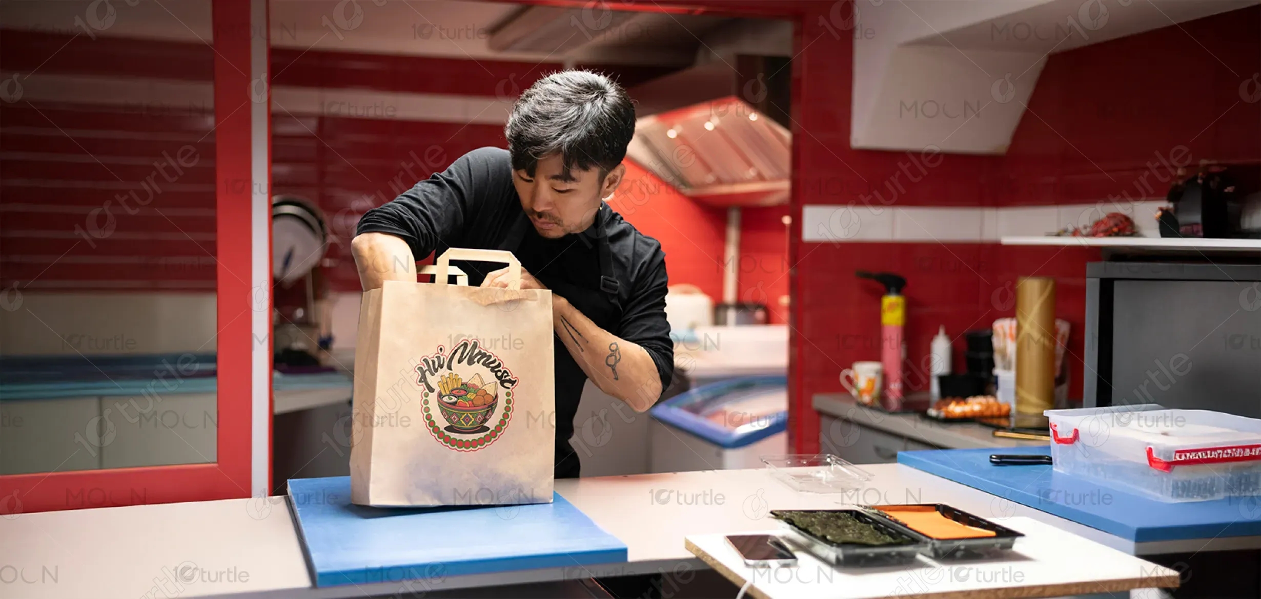
-The challenge lay in creating a logo that captured both authenticity and modernity — a balance often missing in restaurant branding. Many food brands rely on generic bowl icons or overused script fonts, losing originality and emotional connection. Huma’s Bowl needed a symbol that felt artisanal but professional, representing real ingredients, care, and cultural warmth without being cliché. The key was to design a mark that communicates trust and appetite appeal while maintaining versatility across packaging, signage, and digital media.
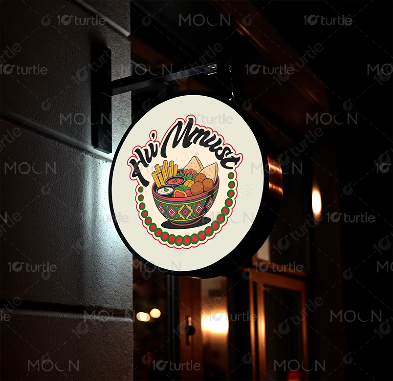
The solution was a minimal yet expressive logo centered around the bowl — a universal symbol of nourishment and community. Subtle curvature and thoughtful typography bring a handcrafted touch, while balanced spacing ensures a clean, modern presence. The design integrates visual cues of freshness and comfort, evoking the sensory warmth of home-cooked meals. Its adaptable form works seamlessly on menus, uniforms, and digital platforms, creating a cohesive visual language that enhances brand recall and customer connection.
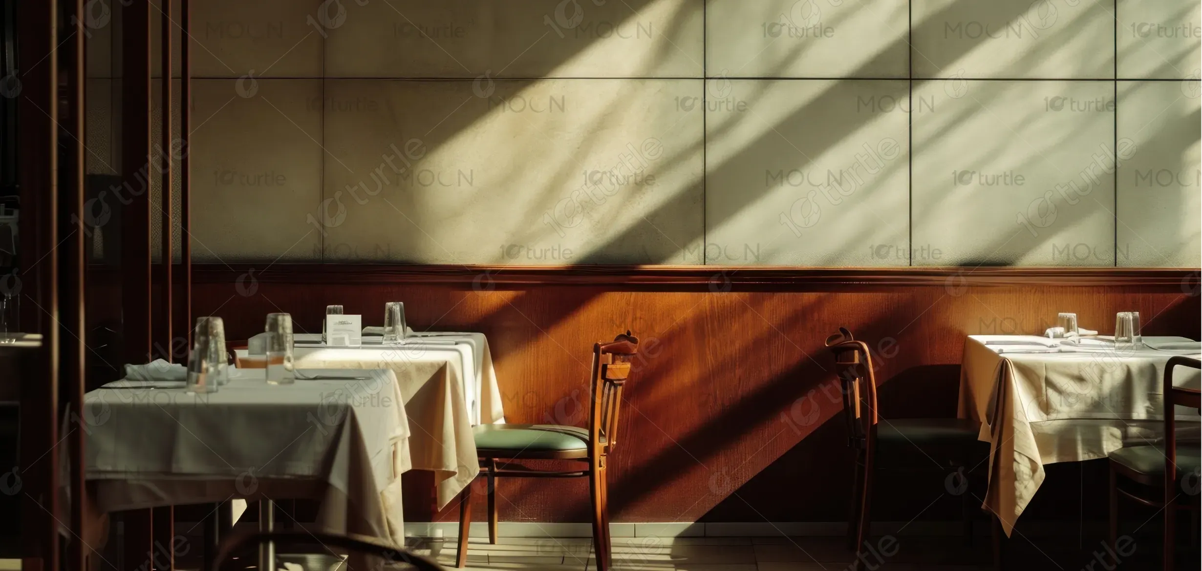
The long-term vision for the Huma’s Bowl design is to establish a timeless, trusted identity in the restaurant space — one that embodies quality, community, and care. As the brand grows, the logo will remain a versatile cornerstone across sub-brands, packaging, and franchising. The goal is to make Huma’s Bowl instantly recognizable, fostering emotional loyalty through consistent, heartfelt visual storytelling that evolves with the brand’s journey in the culinary industry.
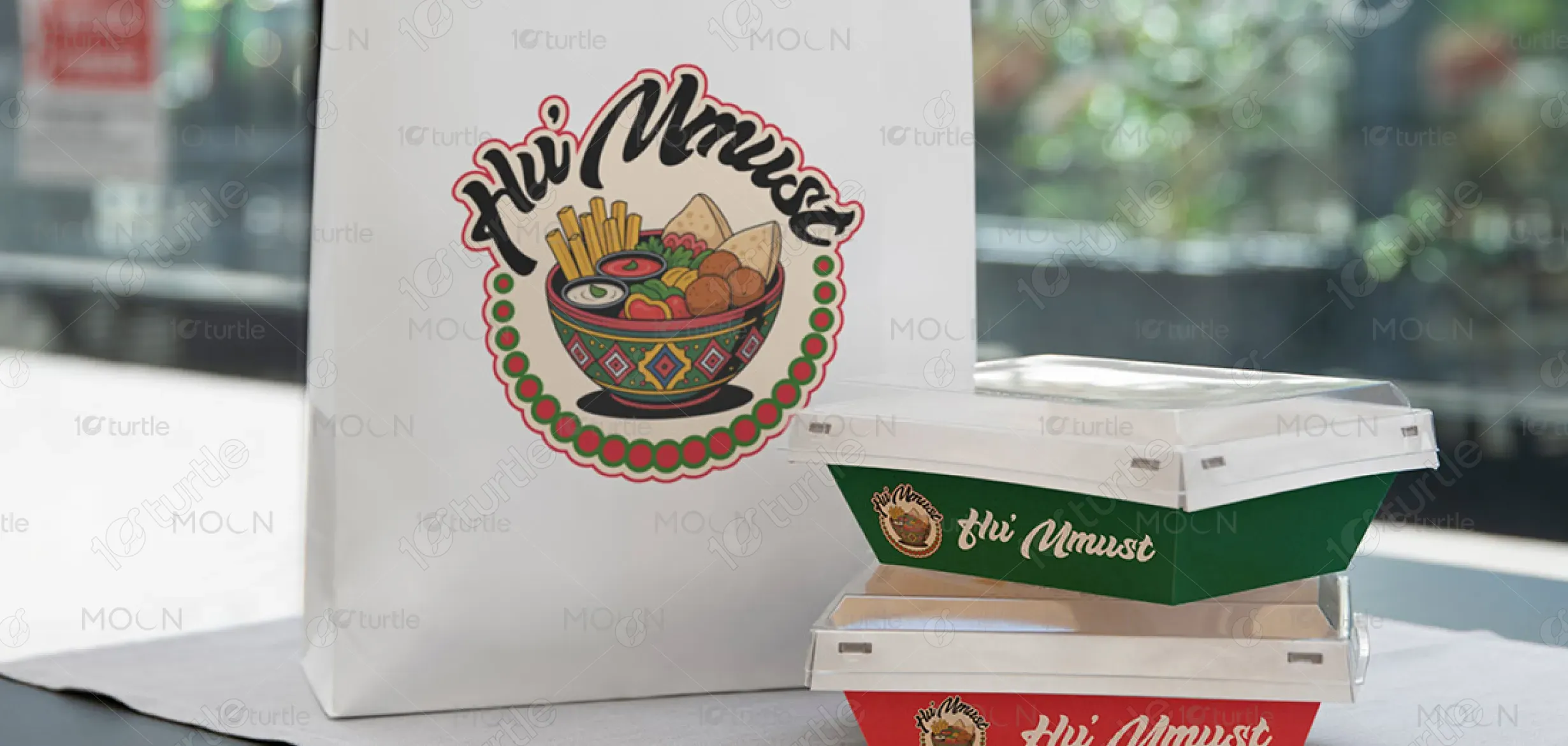
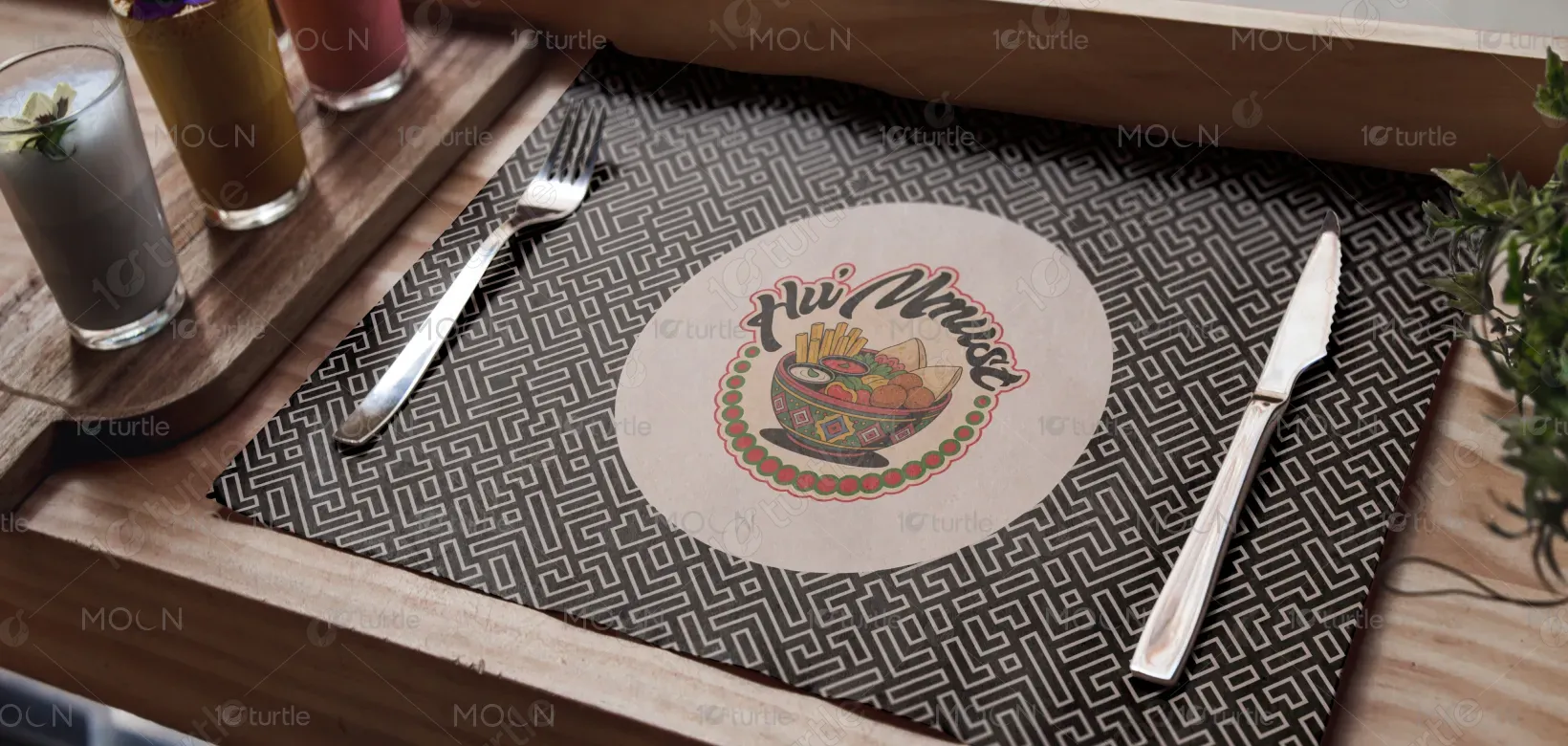
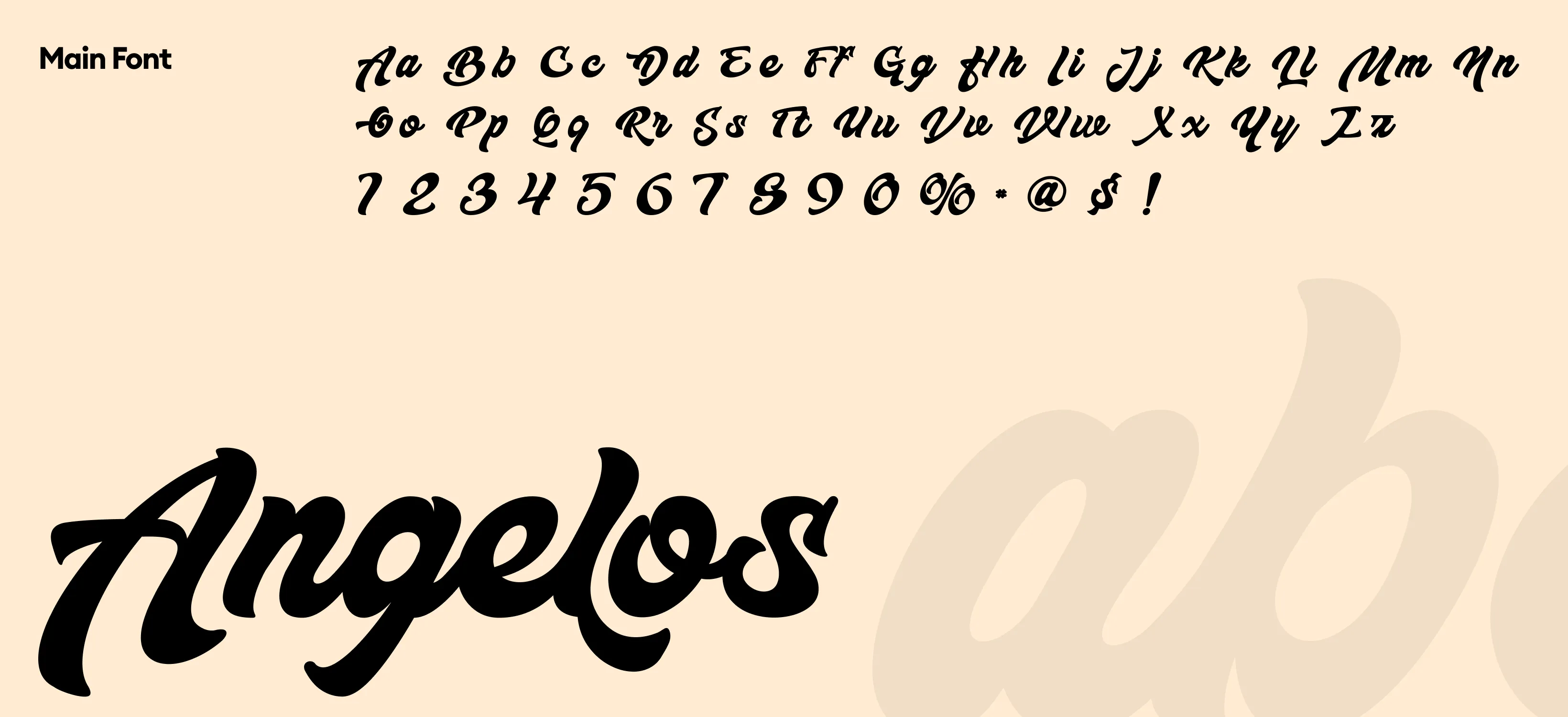
The HU'MMUST logo blends simplicity and warmth through organic shapes and modern typography. The central bowl symbol represents nourishment, community, and comfort, capturing the essence of wholesome dining. Flowing, fluid lines evoke freshness and care in every dish, while the clean typeface ensures legibility and sophistication. The design balances modern aesthetics with approachability, offering a visual identity that feels both welcoming and refined — perfect for a contemporary restaurant experience.
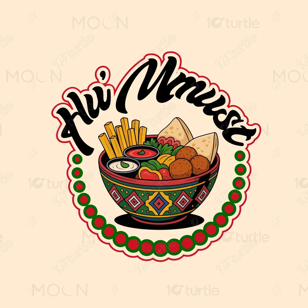
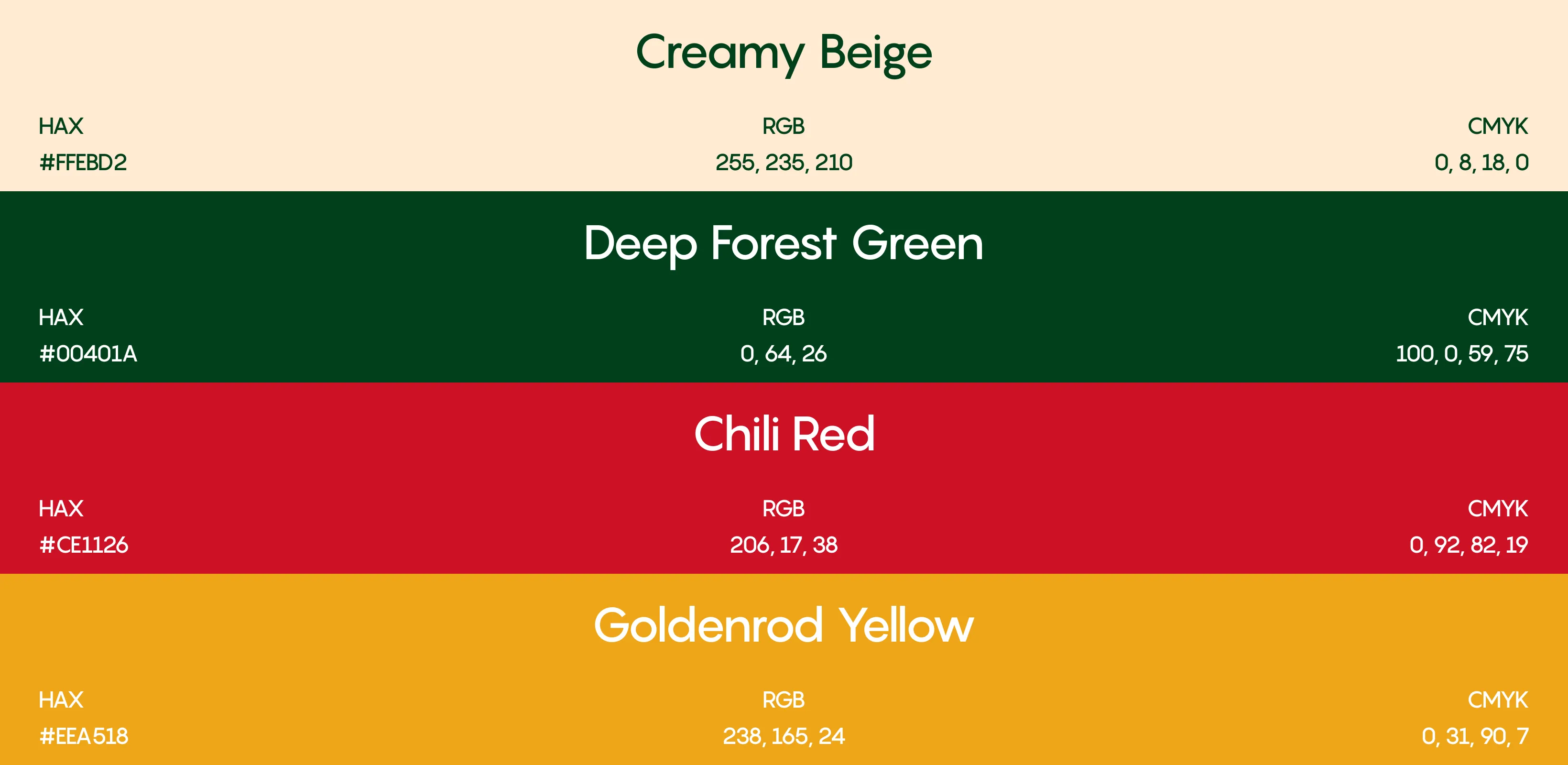
The color palette blends warm, earthy tones and rich neutrals inspired by natural ingredients — think terracotta, muted orange, or golden beige, paired with deep brown or olive accents. These hues evoke warmth, freshness, and appetite, reflecting the brand’s wholesome and welcoming spirit. The palette’s grounded warmth connects emotionally with diners, while the contrast ensures high visibility and sophistication. It visually reinforces Huma’s Bowl’s identity as both comforting and refined, aligning perfectly with its food philosophy.
