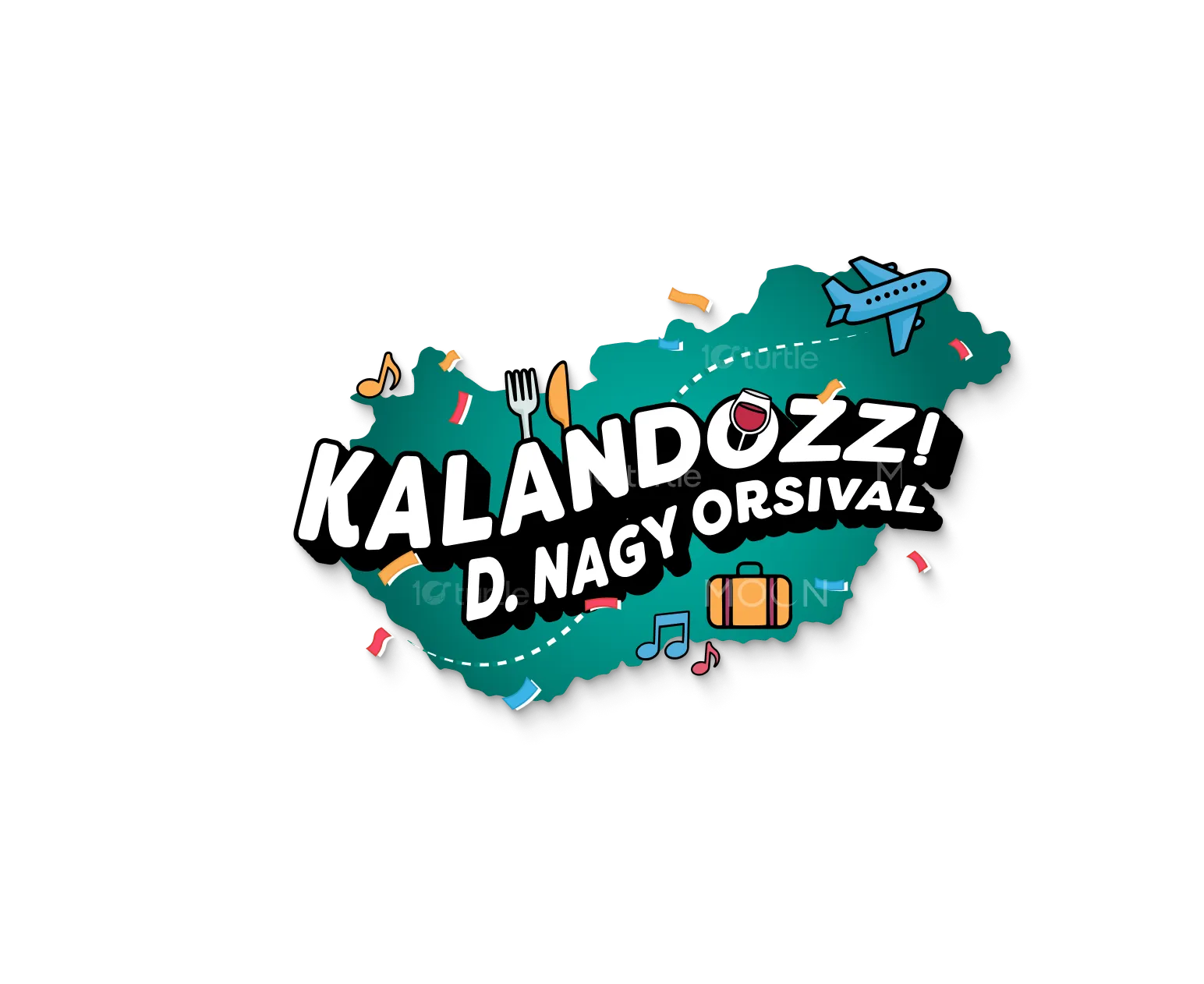
The design concept centers on adventure, exploration, and vibrant energy. Using playful illustrations, bold typography, and dynamic icons like airplanes, music notes, and food symbols, the logo visually communicates fun and discovery. The bright, contrasting color palette enhances approachability while maintaining clarity across digital and physical applications. The overall creative direction reflects a youthful, engaging, and travel-friendly brand identity that is easily adaptable to merchandise, digital platforms, and promotional campaigns, ensuring versatility and memorability in every context.
Logo Design
Graphic Design
Industry
Travel, Tourism & Experiences
Tools we used


Project Completion
2025
Key Market
Global
This design represents Kalandozz! D. Nagy Orsival, a travel and lifestyle brand encouraging exploration and cultural discovery. The concept blends modern aesthetics with playful iconography to highlight travel, food, and entertainment. Its unique selling points include versatility (usable on merchandise, apps, and digital media) and its strong visual identity that instantly conveys adventure. By combining function and creativity, it appeals to a broad audience looking for engaging, memorable branding that encourages active participation in experiences.

Industry
Travel, Tourism & ExperiencesWhat we did
Logo DesignGraphic DesignPlatform
-The challenge was to create a design that effectively represents multiple aspects of adventure—travel, food, music, and lifestyle—without appearing cluttered or losing brand clarity. Many travel-related logos often focus solely on location or transport, making them one-dimensional and less engaging. This gap reduces emotional connection with audiences who seek holistic experiences rather than singular themes. Therefore, balancing clarity, versatility, and vibrancy while keeping the design adaptable across platforms was a critical issue to address.
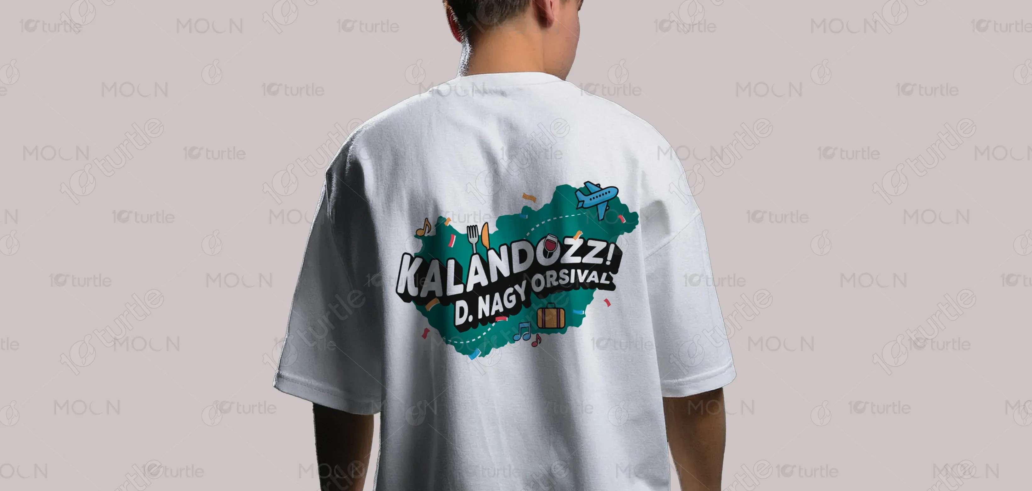
The logo solves this challenge by integrating clean, recognizable icons with bold, playful typography. Each element—airplane, food, suitcase, and music adds depth, creating a narrative of diverse adventures. The dynamic color palette ensures strong visibility across print, fabric, and digital screens. Its compact yet flexible composition works seamlessly for branding on products, merchandise, and apps. By combining fun with functionality, the design captures the spirit of exploration and effectively communicates the brand’s promise of multi-dimensional experiences.
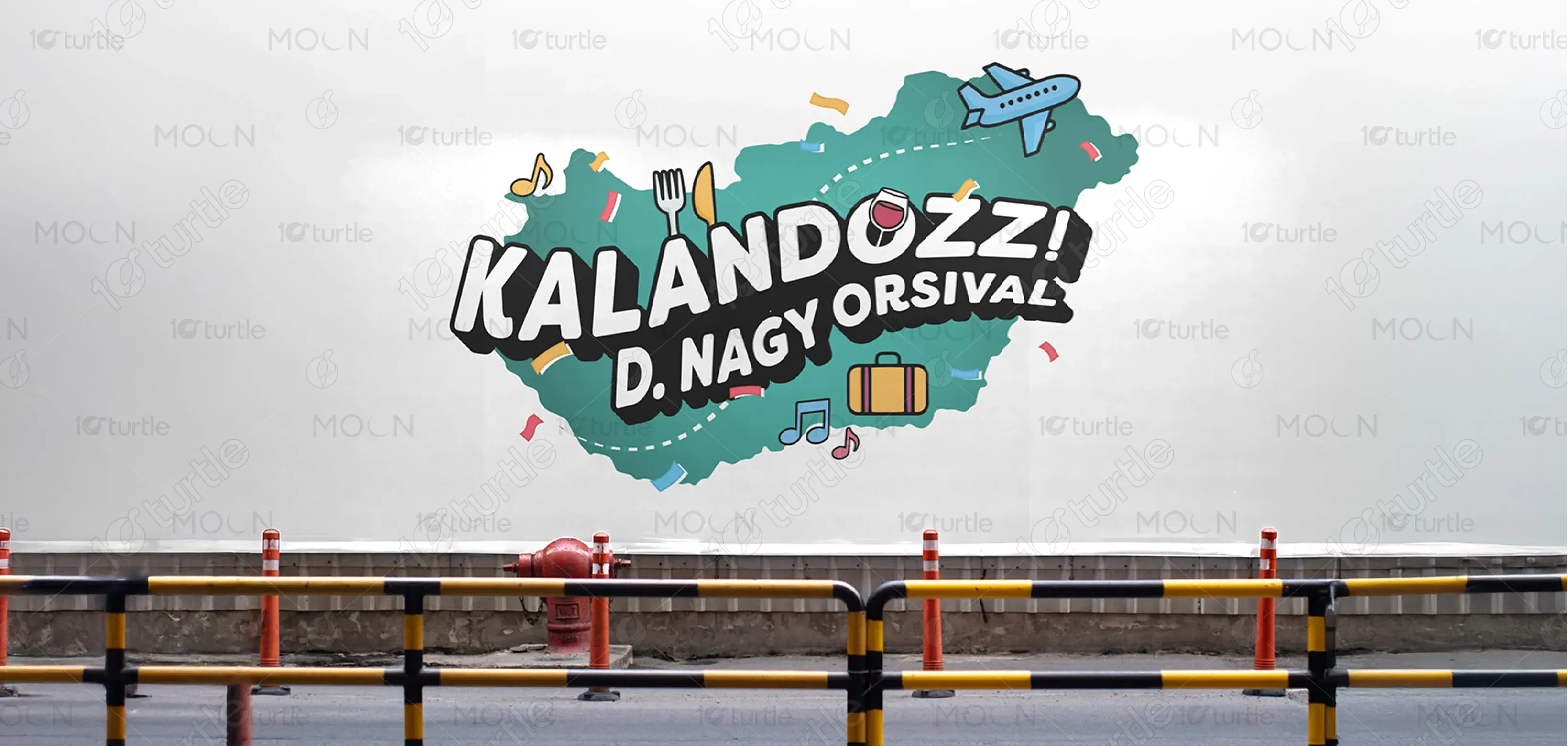
The long-term vision is to establish Kalandozz! as a recognizable lifestyle brand that goes beyond travel into culture, food, music, and entertainment. The design aspires to create a consistent yet evolving identity that resonates globally, fostering a community of explorers. Over time, the design aims to expand its influence into digital experiences, merchandise collections, and events, leaving a lasting impression as a symbol of joyful discovery and shared adventures.
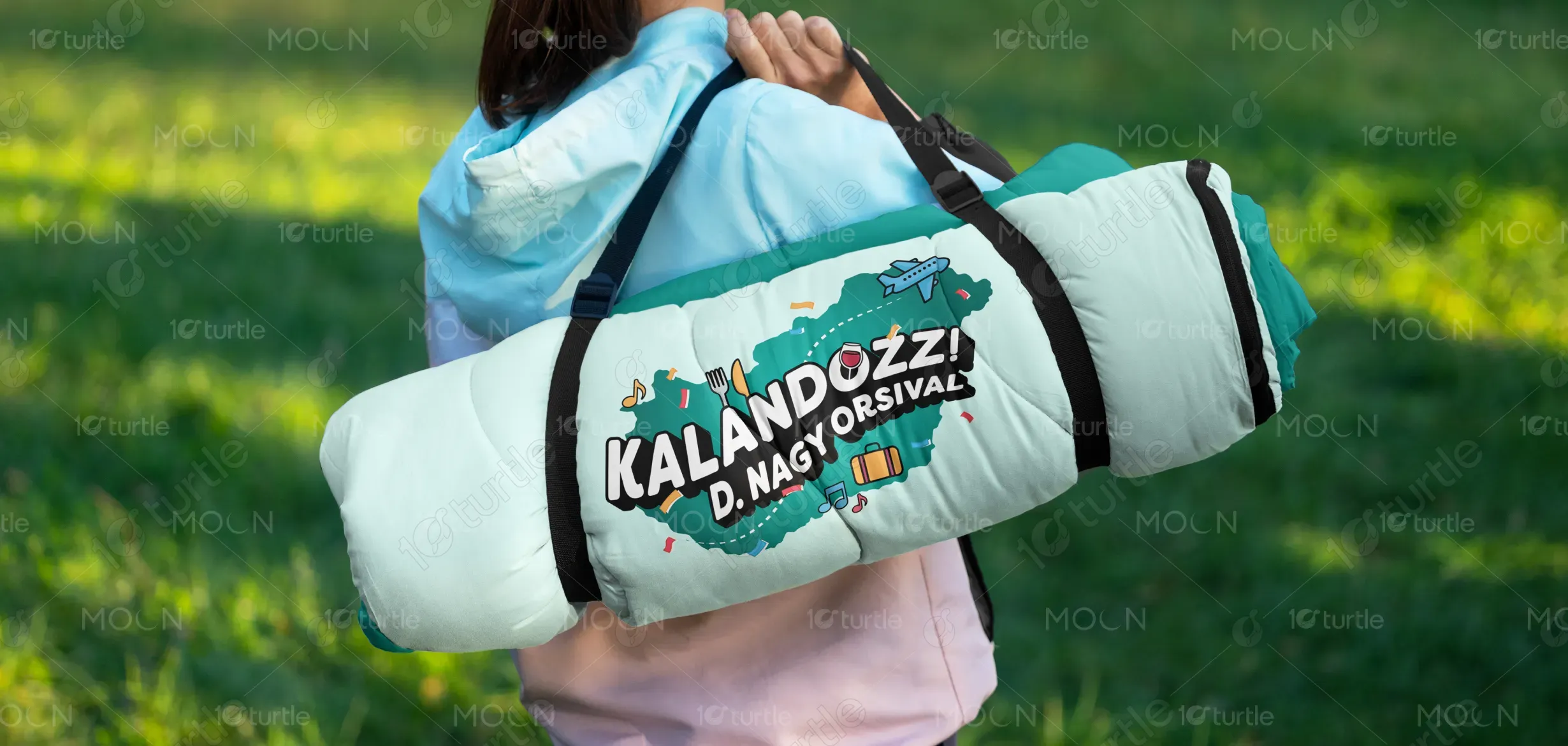
The logo combines bold, modern typography with illustrative icons, creating a lively and inclusive visual. The central placement of “KALANDOZZ!” emphasizes excitement, while the supporting text grounds the brand identity.
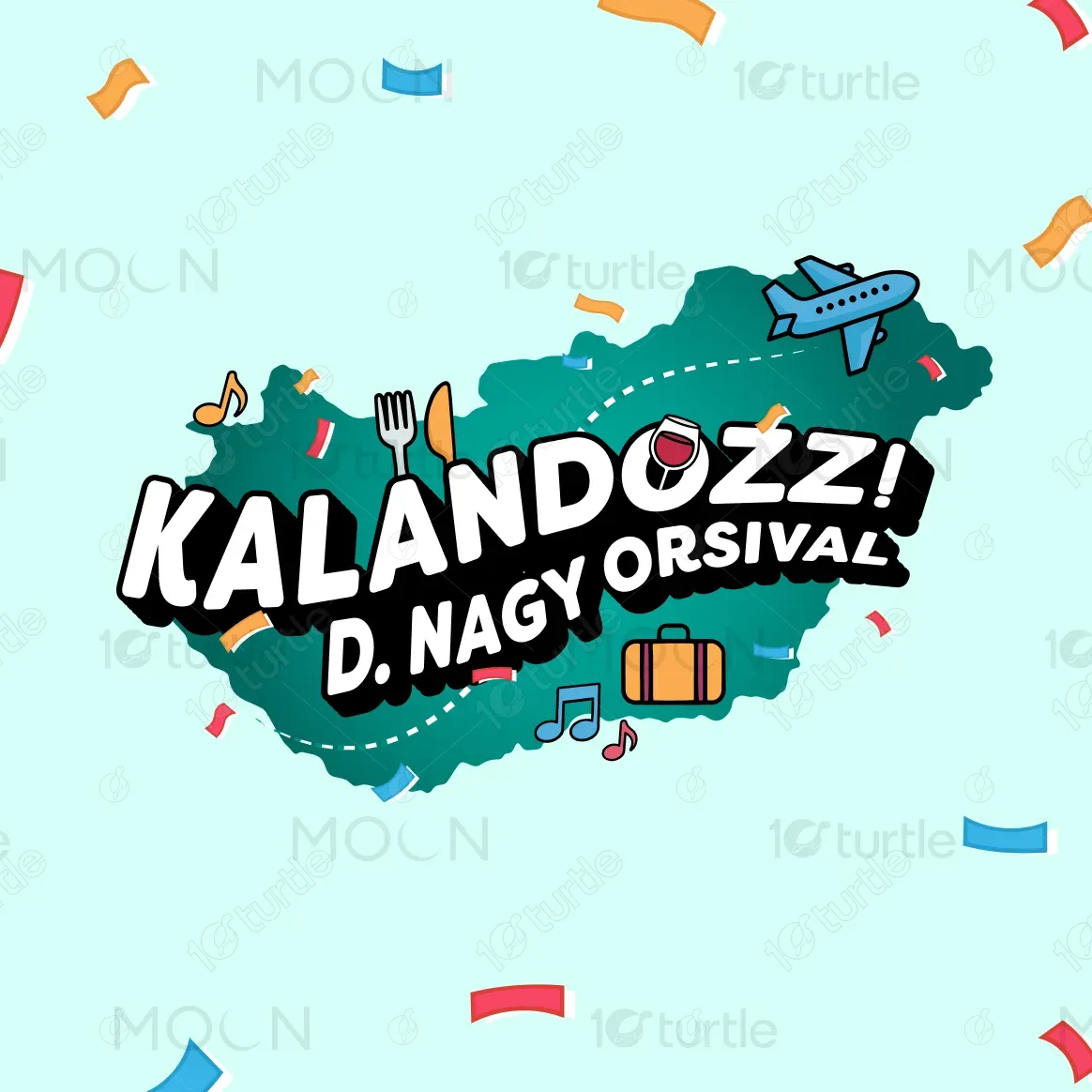
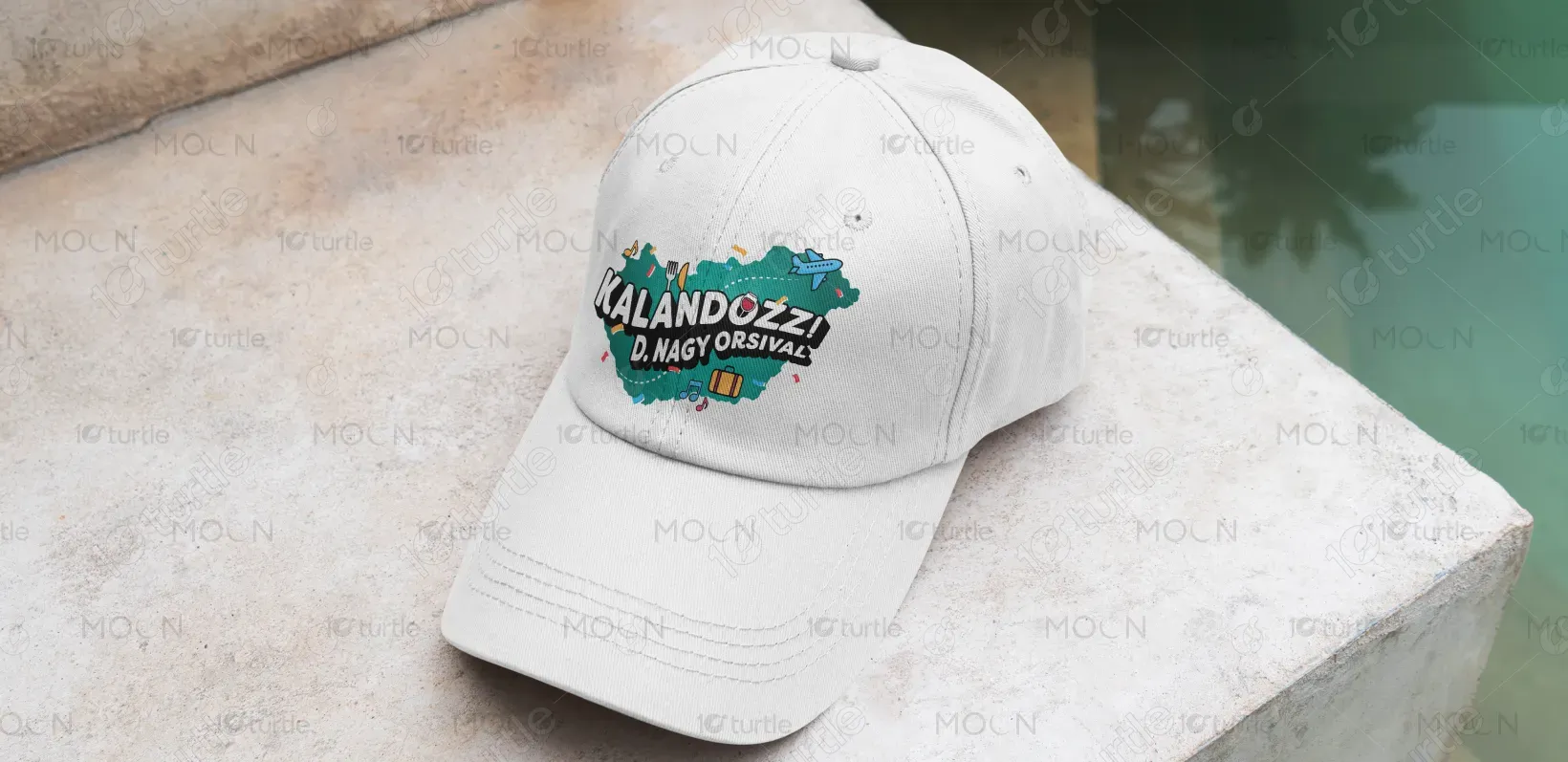
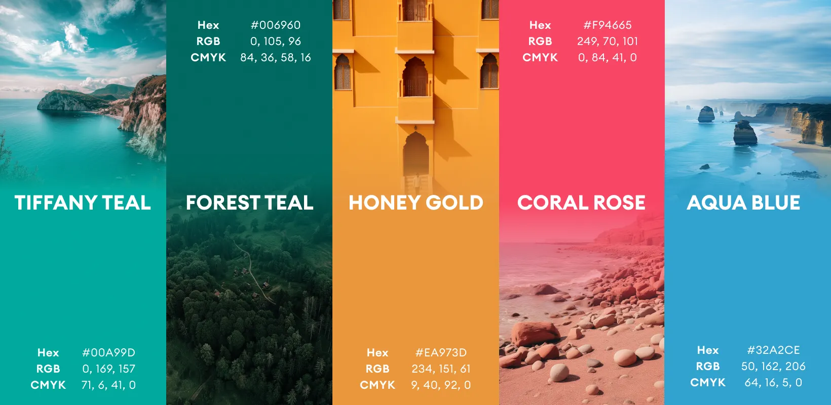
The palette uses mint green, teal, and accents of pink, yellow, and orange, chosen for their energetic and youthful vibe. Mint and teal evoke freshness, calmness, and exploration, while bright accents inject fun, excitement, and diversity—reflecting the variety of experiences the brand promotes. The balance of soothing and vibrant tones ensures visual harmony while reinforcing inclusivity and approachability. This scheme not only supports the brand identity but also enhances recognition and emotional connection across platforms.
