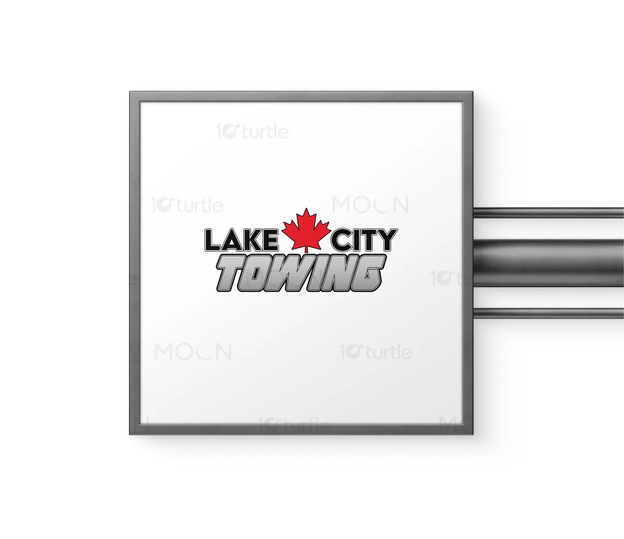
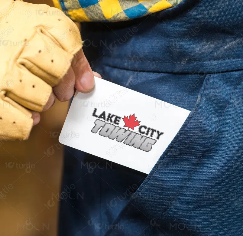
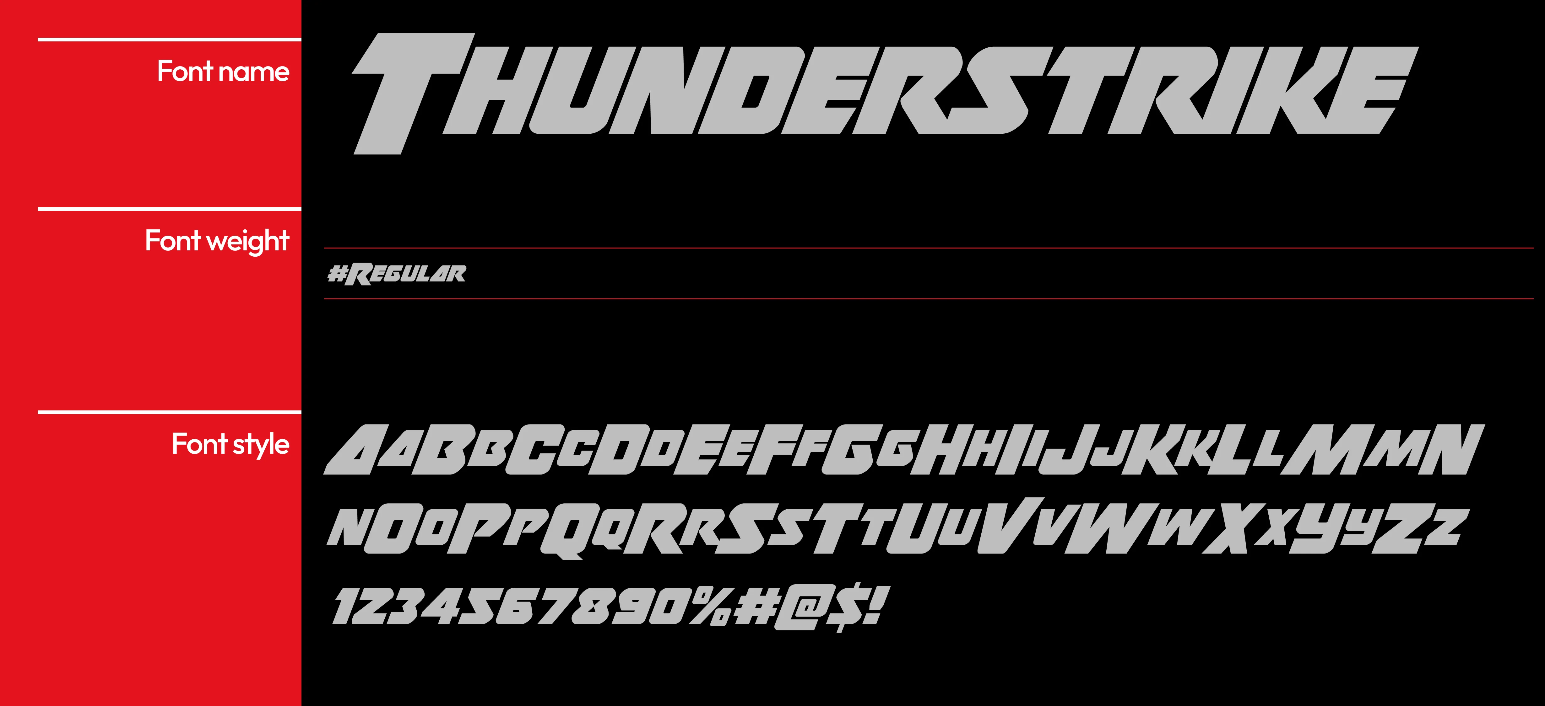
The logo design for Lake City Towing blends bold typography with a strong visual element—a red maple leaf—symbolizing Canada’s national identity. The clean, modern font used for "Lake City" and "Towing" enhances readability and ensures the logo’s impact. The contrast of gray and red creates a striking balance between strength and approachability, aligning with the company’s mission to offer reliable, professional, and accessible towing services. The logo’s simplicity ensures it is adaptable across various platforms, from tow trucks to business cards.
Logo Design
Graphic Design
Industry
Transport, Automotive & Logistics
Tools we used


Project Completion
2025
Key Market
Global
Lake City Towing offers towing and roadside assistance services, specializing in fast, reliable, and safe vehicle recovery. The logo features a bold, modern design with a Canadian maple leaf at the heart of its branding, emphasizing national pride and trustworthiness. The clean typography and striking color contrast ensure visibility across different mediums, making it perfect for vehicle decals, uniforms, and marketing materials. This design appeals to consumers looking for dependable service, with a strong visual identity that reflects the brand’s commitment to quality and professionalism.

Industry
Transport, Automotive & LogisticsWhat we did
Logo DesignGraphic DesignPlatform
-The towing industry faces a challenge in distinguishing brands in a highly competitive market. Many towing companies use generic or overly complex logos that fail to communicate reliability or trust quickly. The issue is further compounded by the need for logos that are legible and impactful on vehicles, business cards, and digital platforms. With a cluttered market, consumers often struggle to identify which towing service is best for their needs, relying on brand recognition for quick decision-making in emergencies.
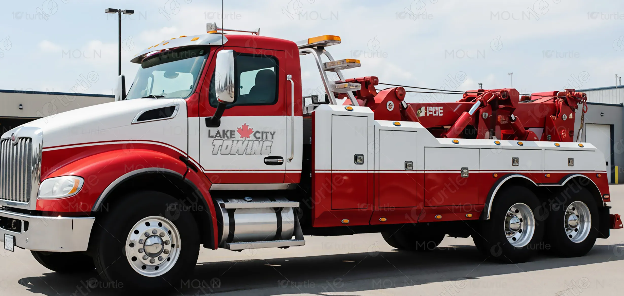
The Lake City Towing logo solves this problem by combining simplicity with visual strength. The clean and bold typography ensures immediate legibility, while the maple leaf adds a sense of national pride and uniqueness. The strong contrast between gray and red helps the logo stand out across various applications—especially on the side of tow trucks—making it visible from a distance and instantly recognizable. The design is versatile enough for both large-scale advertising and smaller promotional materials, ensuring broad market reach and enhanced brand recall.
The vision for Lake City Towing’s logo is to establish a recognizable, trustworthy brand in the towing industry. The design aims to evolve alongside the business, adapting to new marketing platforms and technologies while maintaining a consistent, strong identity. In the long term, the goal is to position Lake City Towing as a leader in roadside assistance, with a logo that reflects the company’s growth and commitment to offering professional, reliable, and fast service to its customers across Canada.

Lake City Towing stands for reliability, strength, and community-driven service. The bold typography and the iconic maple leaf symbolize Canadian pride, trust, and readiness to serve — anytime, anywhere. The metallic silver tone of “TOWING” reflects durability and professionalism, embodying the brand’s commitment to excellence in roadside assistance and vehicle recovery.

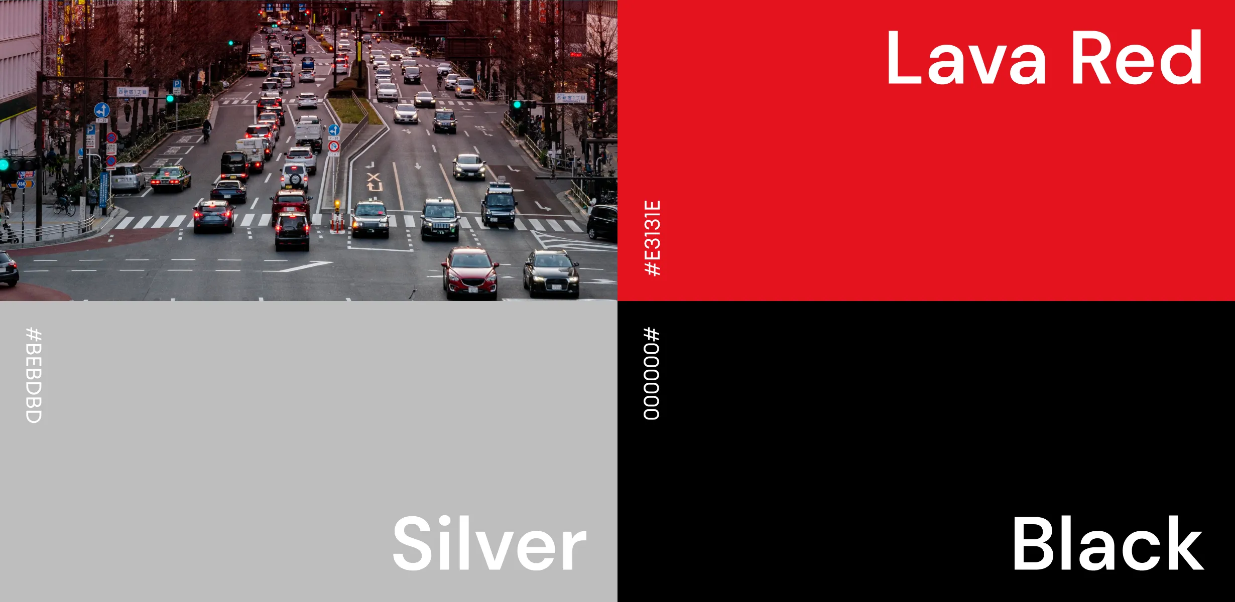
The color palette features a bold red, gray, and black combination. The red maple leaf symbolizes national pride and energy, invoking feelings of trust and urgency—important traits for a towing service. Gray adds a sleek, professional tone, while black provides contrast and enhances readability. Together, the colors create an impactful and easily recognizable logo, ensuring visibility and emotional resonance with the target audience. This palette aligns with the brand’s goal to communicate reliability, strength, and approachability, making it a fitting choice for a service-oriented business.
