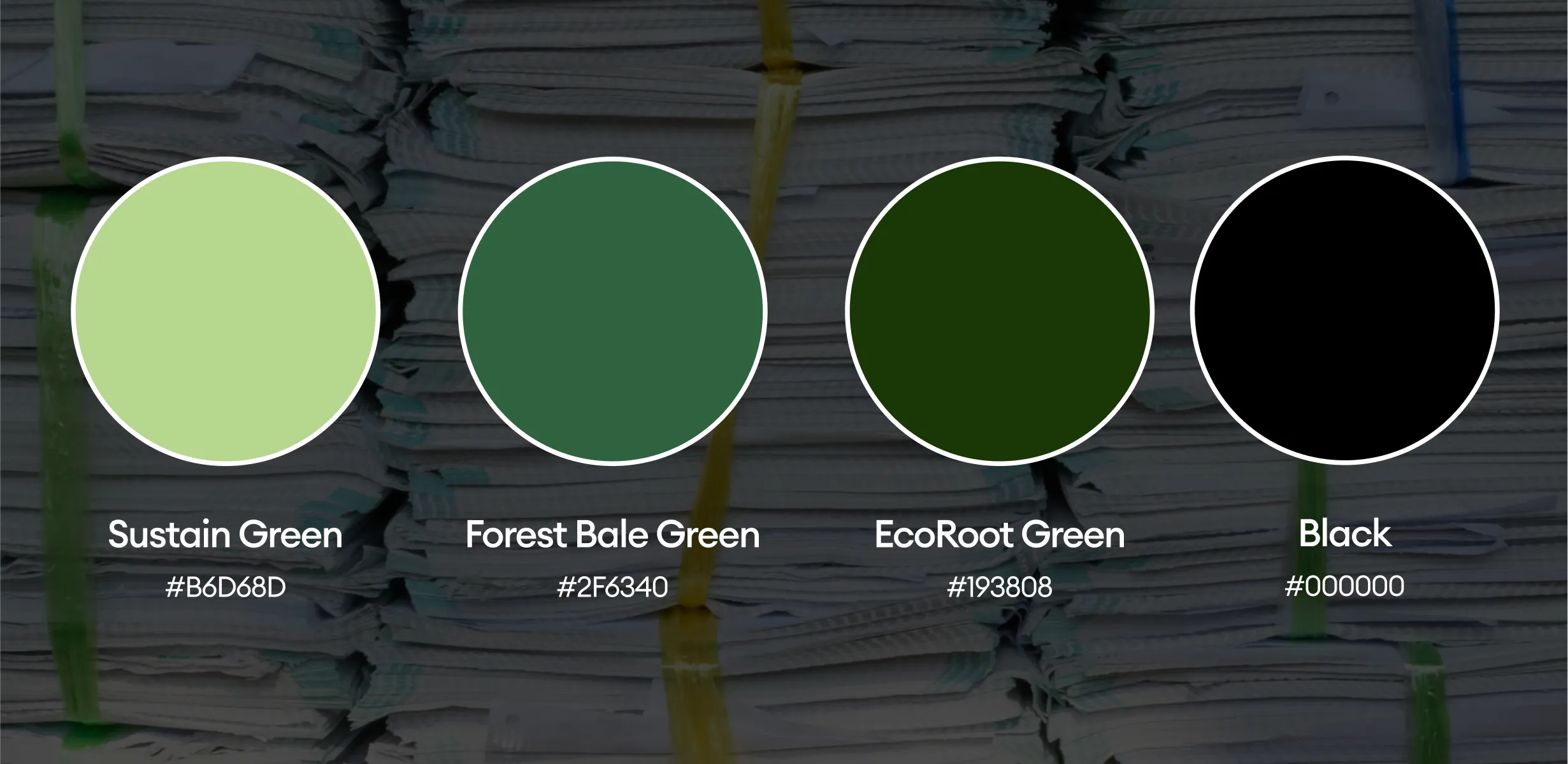
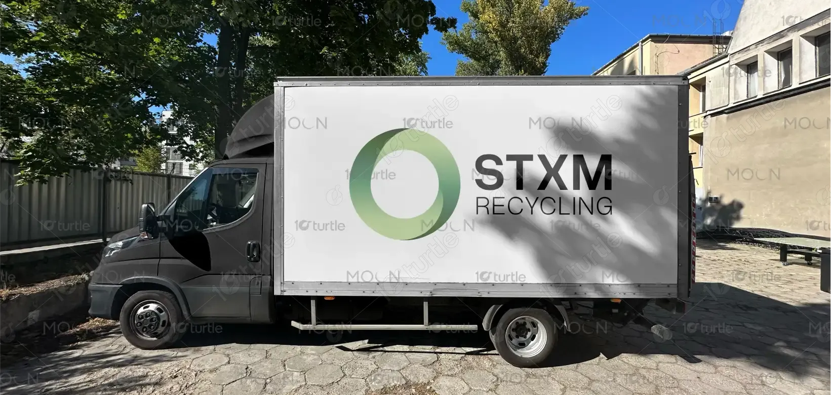
The design concept revolves around the idea of sustainability and recycling, using a minimalistic yet impactful approach. The logo features a stylized circular shape that symbolizes the recycling loop. The soft gradient green tones reflect growth, nature, and environmental responsibility. The clean, modern typography of "STXM RECYCLING" complements the visual identity, making it versatile for various branding applications. The circle itself evokes ideas of continuity, transformation, and eco-friendly practices, effectively communicating the brand's commitment to environmental consciousness.
Logo Design
Graphic Design
Industry
Industrial, Manufacturing & Agriculture
Tools we used


Project Completion
2025
Key Market
Global
The logo represents STXM Recycling, a company focused on sustainable recycling solutions. The design merges modern aesthetics with environmental symbolism, portraying the company's dedication to reducing waste and promoting green practices. The logo’s circular shape signifies the continuous recycling process, while the green hues convey environmental consciousness and growth. Positioned in a competitive market of eco-friendly solutions, the design positions STXM Recycling as a forward-thinking, innovative brand that appeals to environmentally-conscious businesses and individuals.

Industry
Industrial, Manufacturing & AgricultureWhat we did
Logo DesignGraphic DesignPlatform
-One of the main challenges in designing this logo was ensuring that it would stand out in a market filled with generic environmental logos. The recycling sector often uses conventional, overused symbols like arrows or leaves, which may fail to capture the audience’s attention. The challenge was to create something unique that communicates STXM Recycling’s brand ethos while standing apart from other environmentally-focused logos, which often lack differentiation in their design approach.
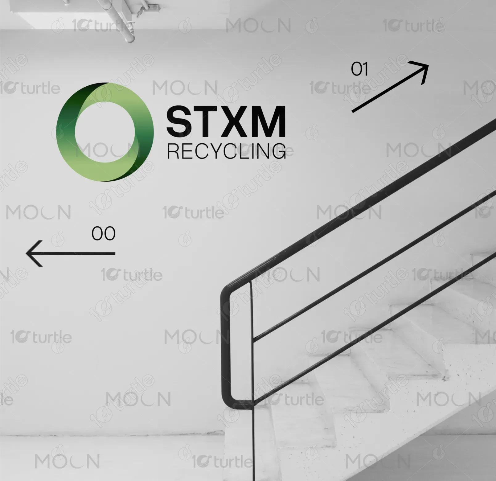
This logo solves the problem by incorporating a fresh, contemporary take on recycling symbolism, moving away from clichéd imagery. The circular shape, combined with the gradient green palette, provides a visually appealing yet meaningful representation of the brand's commitment to sustainability. The minimalistic design ensures flexibility across digital and print mediums, and the strong, modern typography adds a professional touch. The logo stands as a clean, unique representation of a progressive recycling company in the global green economy.

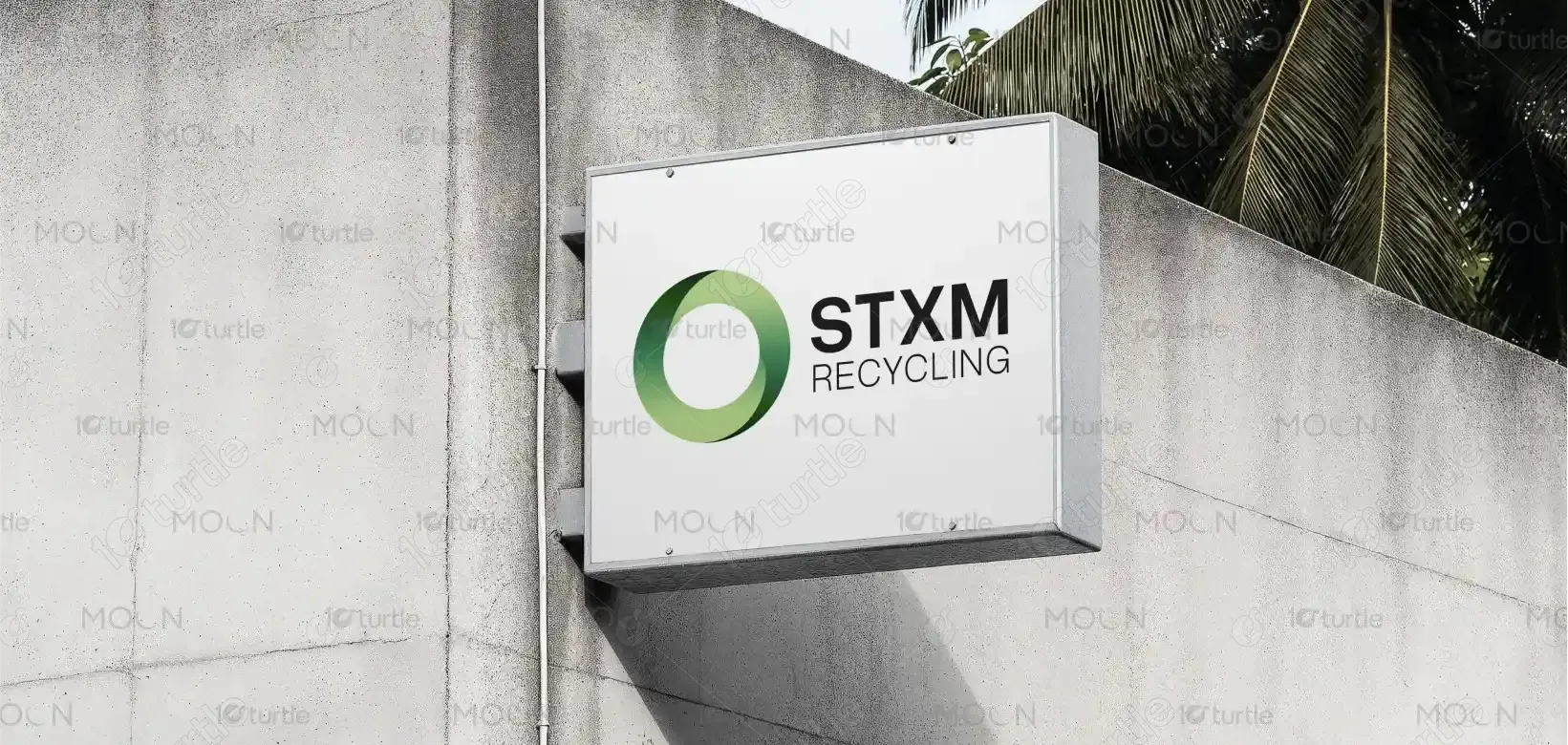
The logo effectively integrates the core message of STXM Recycling, emphasizing sustainability, innovation, and environmental responsibility. By combining the circular form with a gradient green color scheme, it conveys the idea of a closed-loop system essential to recycling, where nothing is wasted. This design visually supports the company’s mission to create a cleaner, more sustainable future. It aligns with STXM Recycling's goal of providing efficient, cutting-edge recycling solutions while maintaining a strong visual identity that resonates with eco-conscious consumers. This logo reinforces the brand’s commitment to reducing environmental footprints and advancing green technologies.


The logo uses a gradient green color palette, symbolizing growth, nature, and eco-friendliness. The two tones of green reflect the brand’s focus on environmental impact—light green for new growth and darker green for sustainability and durability. This palette invokes a sense of calm and trust while appealing to the environmental-conscious consumer. The green tones also resonate with the recycling industry, where color symbolism is often associated with the planet and the natural world, reinforcing the brand's identity.
