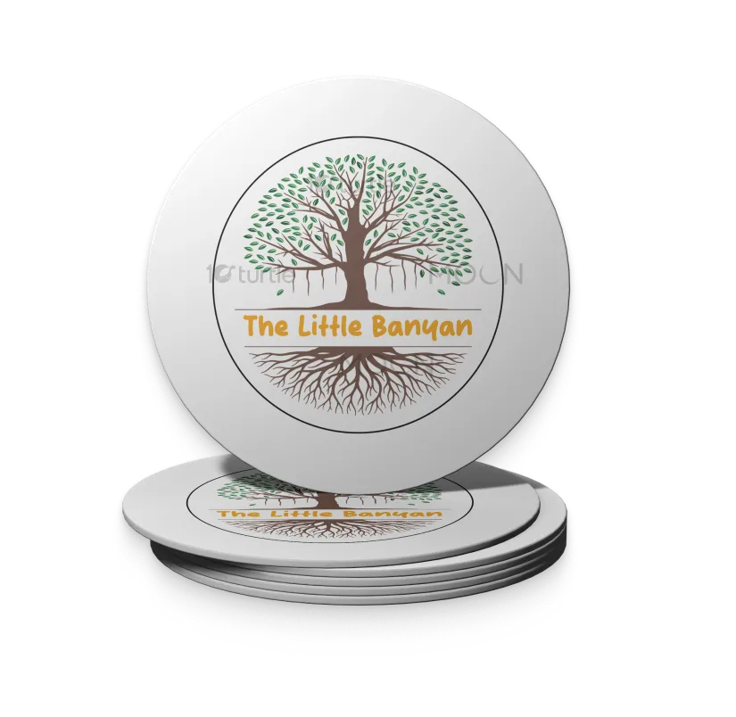
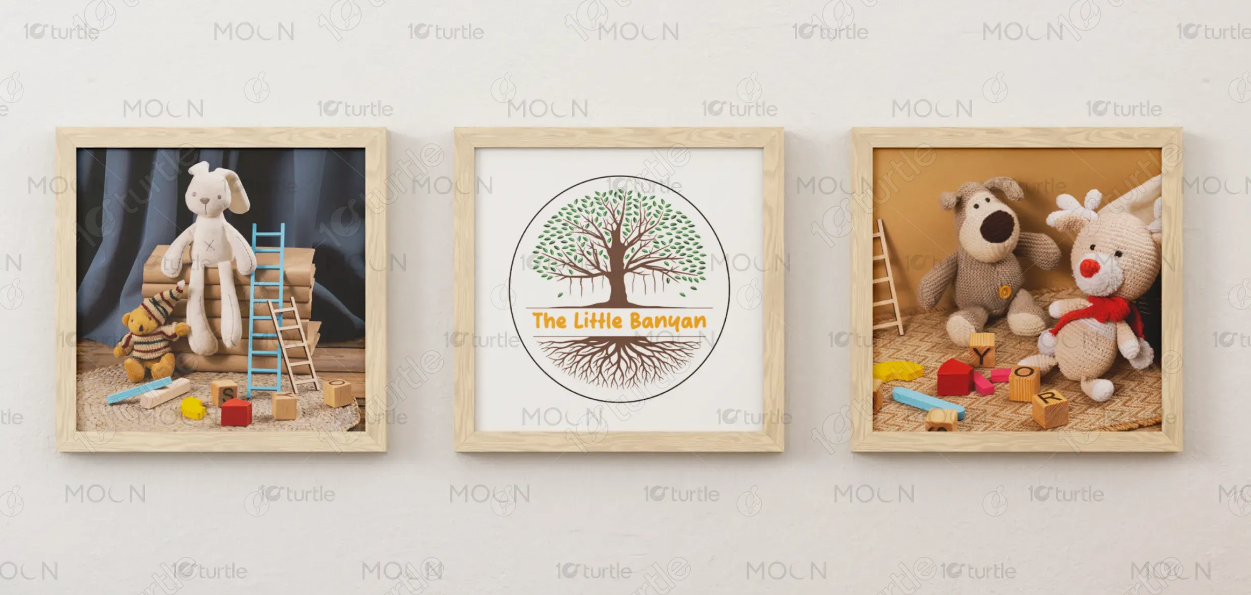
The design of The Little Banyan logo embodies nature, growth, and stability through the symbolic banyan tree. The tree’s wide branches with lush green leaves represent nourishment, expansion, and inclusivity, while the intricate root system reflects strong foundations and deep connections. The earthy brown and green tones add authenticity and warmth, complemented by the vibrant golden text that highlights optimism and creativity. This harmonious blend creates a logo that feels natural, grounded, and inspiring, aligning perfectly with the brand’s ethos.
Logo Design
Graphic Design
Industry
Education & Training
Tools we used


Project Completion
2025
Key Market
Global
The Little Banyan represents a brand built on values of growth, community, and resilience. Inspired by the banyan tree’s cultural symbolism of wisdom and shelter, the logo captures both strength and nurturing qualities. The brand positions itself uniquely by blending tradition with a modern aesthetic appeal, making it stand out in markets that value sustainability, authenticity, and trust. Its distinct design and storytelling give it a meaningful edge that resonates deeply with its audience.

Industry
Education & TrainingWhat we did
Logo DesignGraphic DesignPlatform
-Many brands fail to convey authenticity and emotional resonance through their identity. Logos often lean toward generic styles that lack cultural depth or fail to build a connection with the target audience. This gap leaves consumers disengaged and unable to associate values like trust, growth, or sustainability with the brand. In industries focusing on community-driven initiatives, wellness, or education, this lack of symbolic storytelling can hinder brand recognition and long-term loyalty.
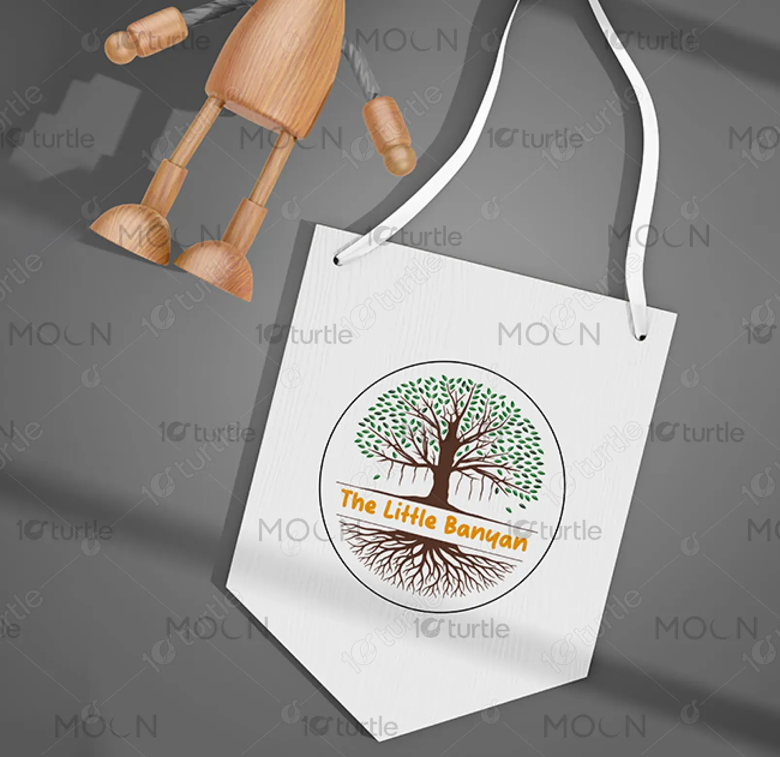
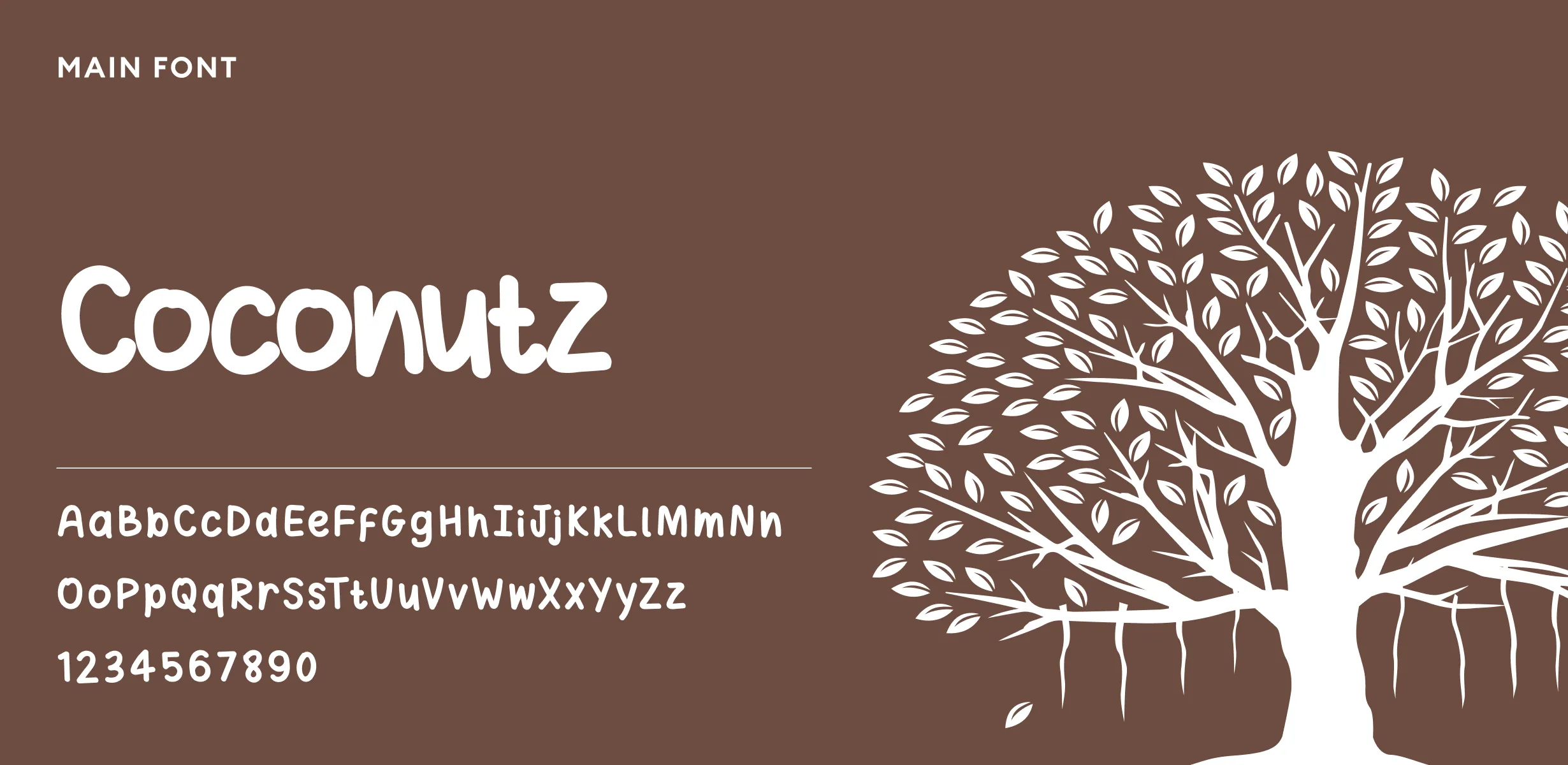
The Little Banyan logo bridges this gap by using a culturally symbolic and universally relatable element—the banyan tree. Its design highlights both visible growth (leaves and branches) and unseen strength (roots), creating a narrative of balance, grounding, and expansion. The use of warm, earthy colors with a golden accent ensures visibility while conveying optimism and heritage. By combining modern typography with traditional symbolism, the design becomes approachable, memorable, and emotionally impactful, helping the brand foster lasting connections with its audience.
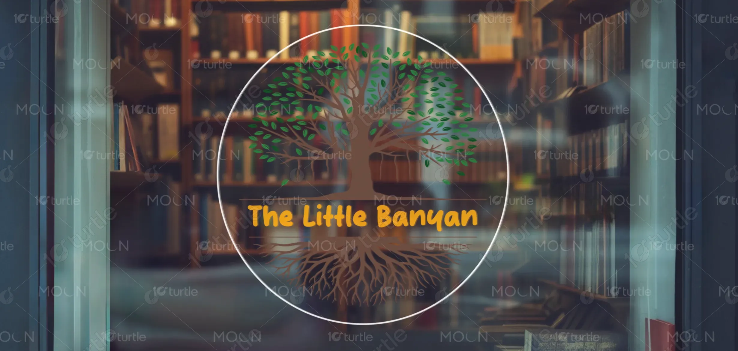
The Little Banyan aspires to grow into a trusted and enduring brand that embodies wisdom, inclusivity, and positive transformation. Just as the banyan tree expands its shelter across generations, the brand envisions creating a lasting impact—nurturing communities, inspiring growth, and standing as a symbol of strength and sustainability. Its long-term goal is to evolve into a recognizable identity that resonates across cultures and industries while staying true to its roots of authenticity and care.
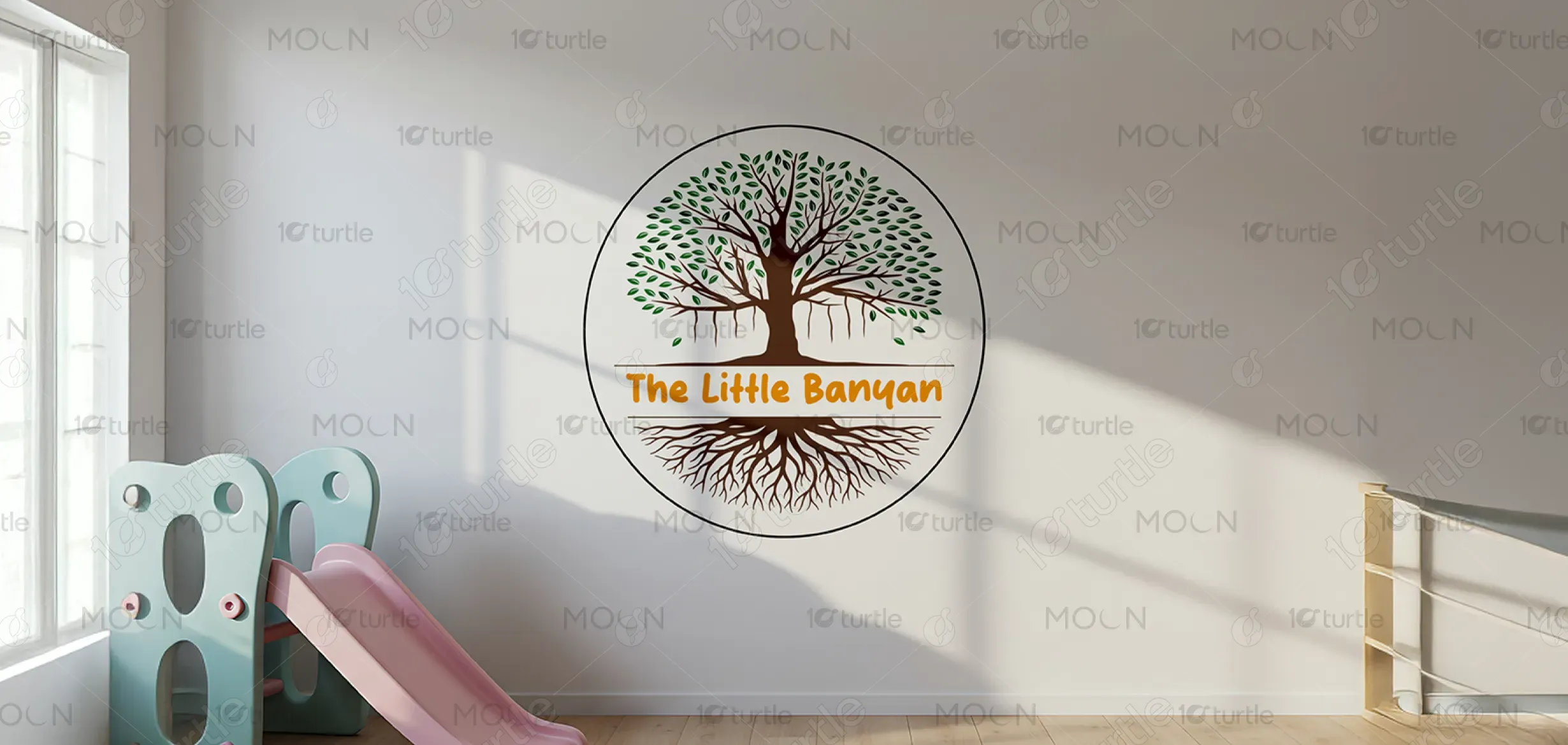
The logo for "The Little Banyan" beautifully represents growth, education, and nurturing. The banyan tree, known for its deep roots and expansive branches, symbolizes a strong foundation in learning, while the vibrant green leaves reflect the blossoming of young minds. The circular design brings a sense of unity and inclusiveness, making it perfect for an educational or childcare initiative. The warm orange color adds an inviting touch, signaling warmth and creativity, ideal for a space focused on fostering curiosity and development.
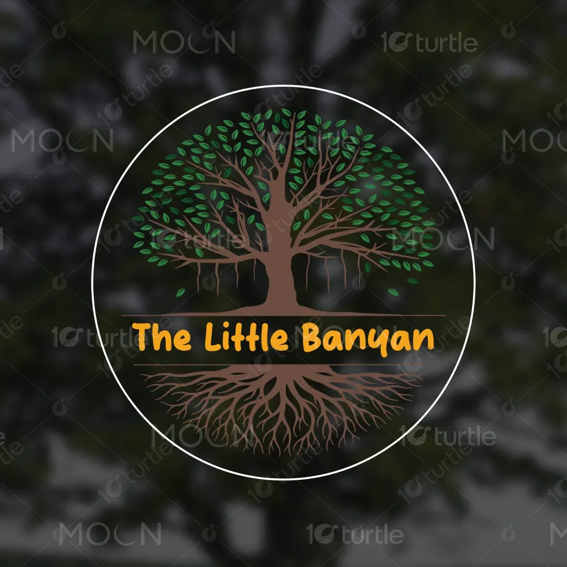
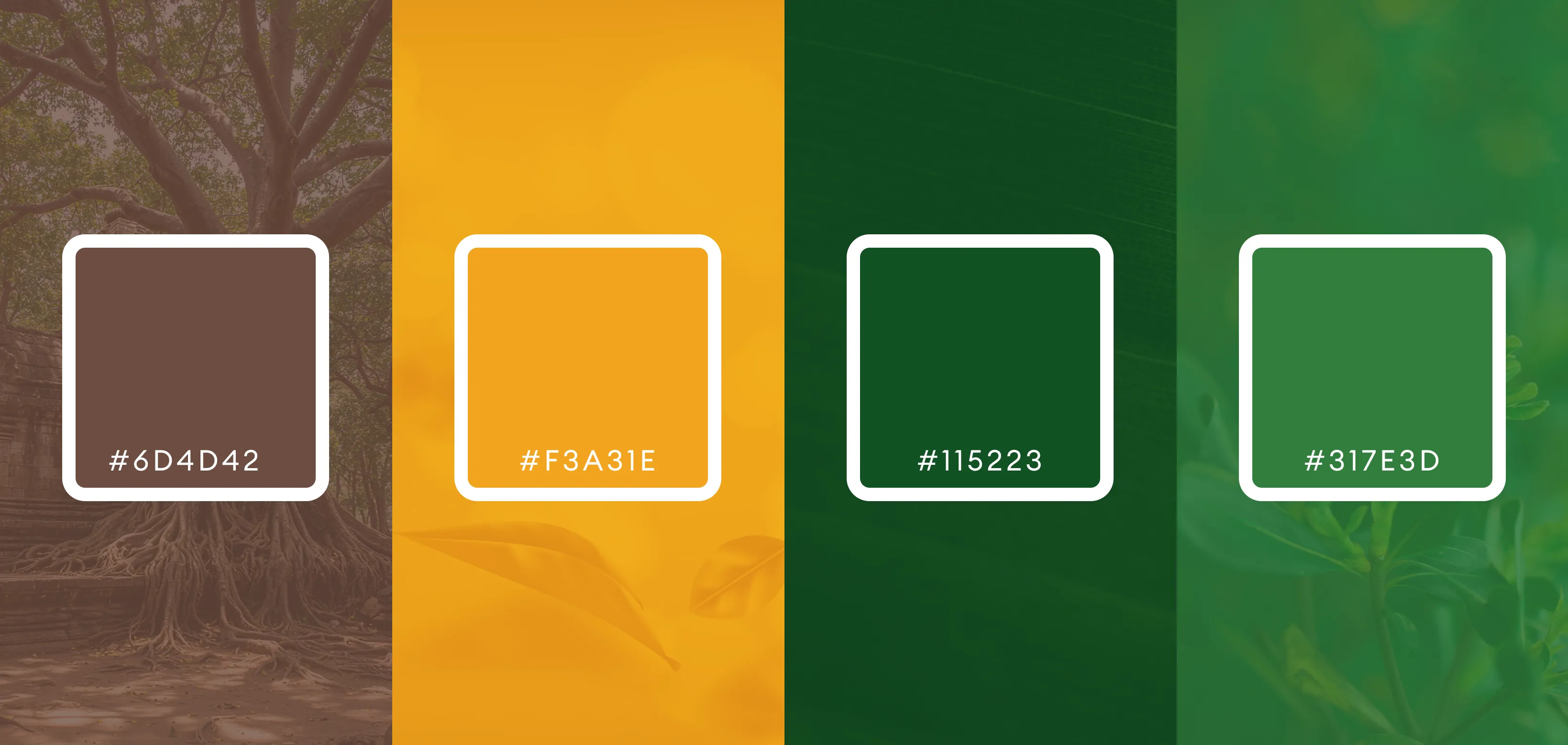
The color palette of The Little Banyan is thoughtfully designed to reflect nature, stability, and optimism. The earthy brown tones of the trunk and roots symbolize grounding, strength, and deep connections, while the lush green leaves represent growth, renewal, and harmony with nature. To balance this organic feel, the golden yellow text adds a touch of vibrancy, creativity, and warmth, making the brand approachable and inspiring. Together, these colors create a natural yet impactful aesthetic that aligns perfectly with the brand’s identity.
