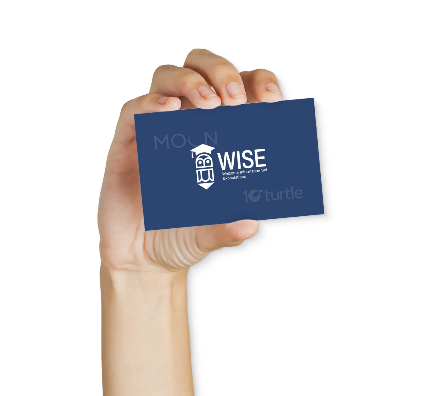
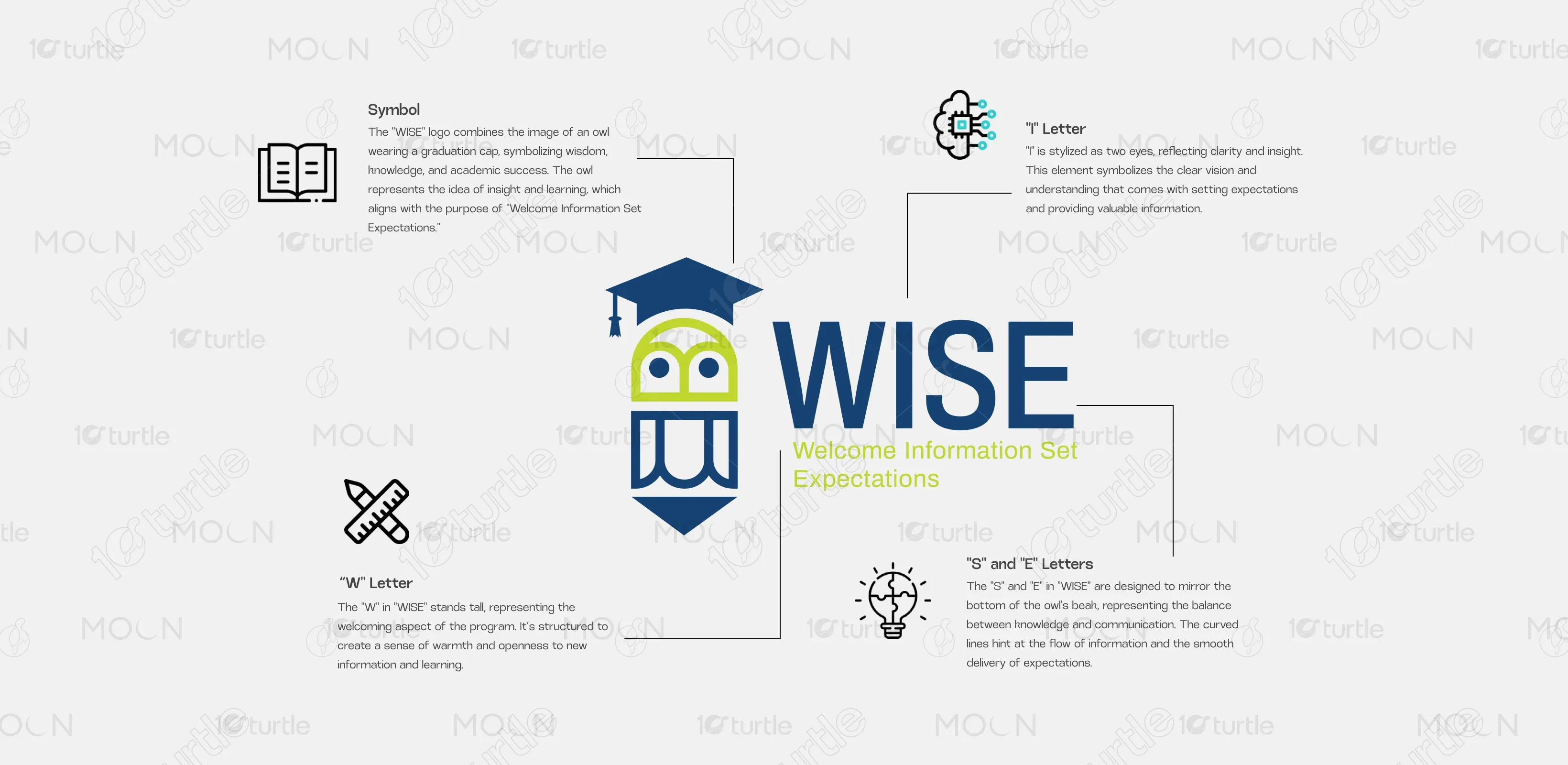
The WISE logo combines clarity, symbolism, and approachability. The owl-shaped icon doubles as a pencil—symbolizing wisdom and education—while wearing a graduation cap, emphasizing academic achievement. Clean geometric lines paired with a modern sans-serif font communicate professionalism and trust. The blend of navy blue and lime green provides contrast and vibrancy, balancing seriousness with warmth. The logo is both memorable and versatile, perfect for various educational touchpoints, from print to digital, while aligning with the WISE brand’s mission to guide and inform.
Logo Design
Graphic Design
Industry
Technology, SaaS & Startups
Tools we used


Project Completion
2025
Key Market
Global
The WISE (Welcome Information Set Expectations) logo represents an educational onboarding and orientation initiative designed to help new students, staff, or members transition smoothly into academic or organizational environments. Its purpose is to provide essential information clearly and engagingly. The brand stands out through its visual identity—an owl pencil hybrid wearing a cap—making it instantly recognizable in the education sector. Its clean and intelligent design reflects clarity, guidance, and knowledge-sharing, aligning with institutional goals and setting a high standard for academic communication.

Industry
Technology, SaaS & StartupsWhat we did
Logo DesignGraphic DesignPlatform
-The key challenge in designing for educational initiatives like WISE lies in balancing professionalism with approachability. Many academic brands either look too corporate (causing disconnect with younger audiences) or too playful (losing credibility). Another gap is the lack of visual storytelling that resonates with diverse stakeholders—students, faculty, and administrators alike. Existing onboarding tools often lack cohesive branding, which dilutes engagement and recognition across platforms. Thus, the WISE brand needed a symbol that could unify function, trust, and friendliness in one visual language.
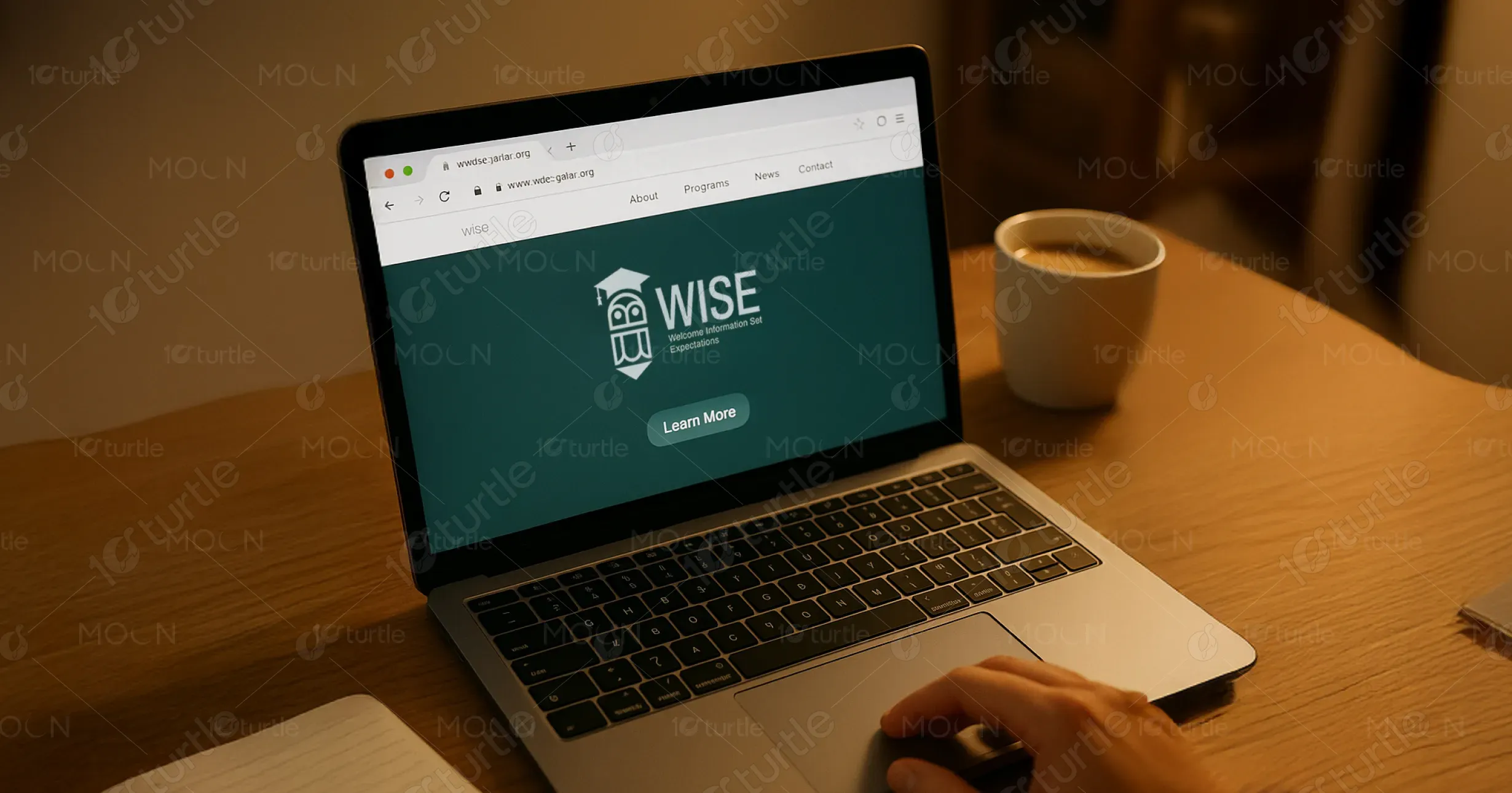
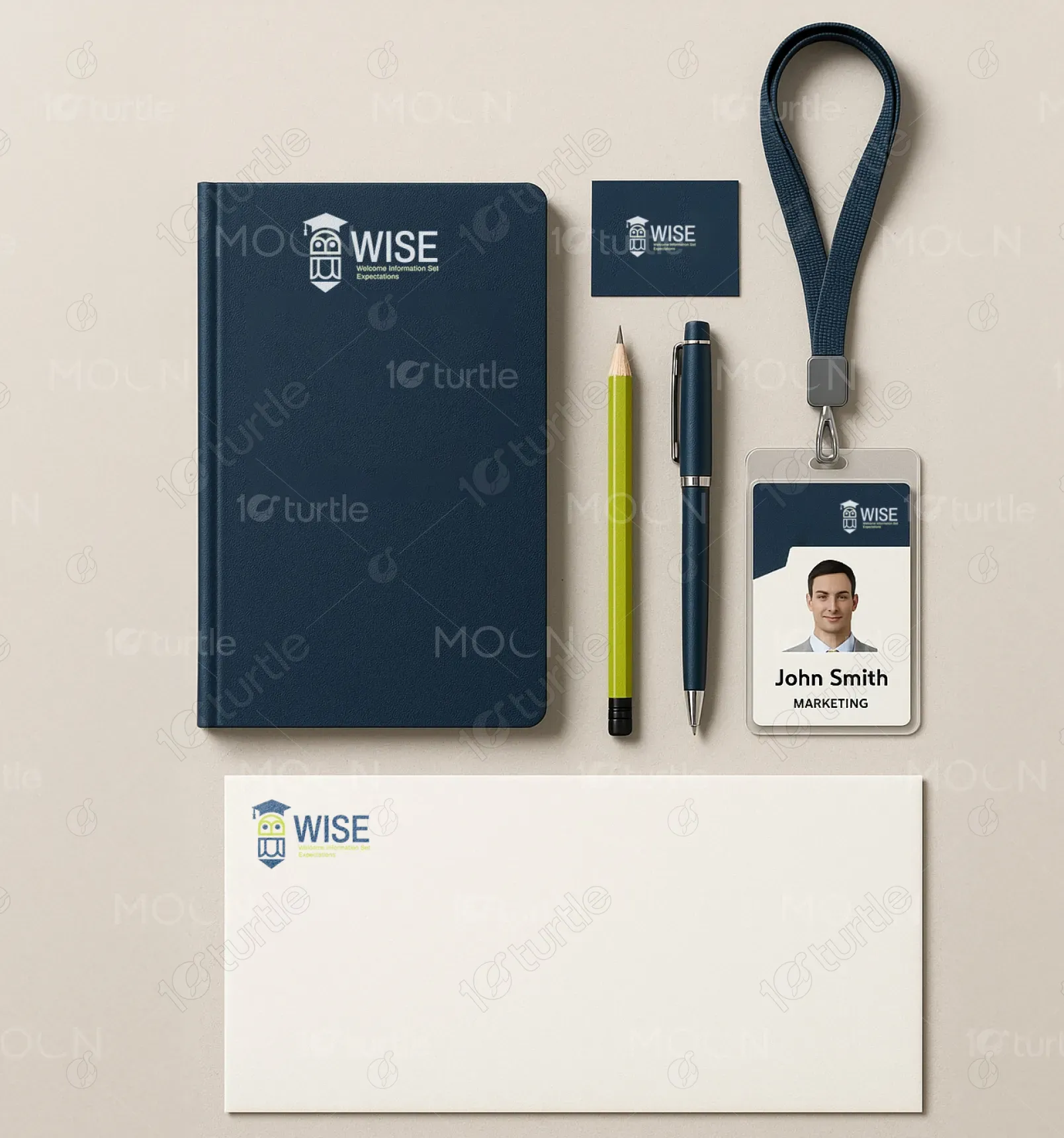
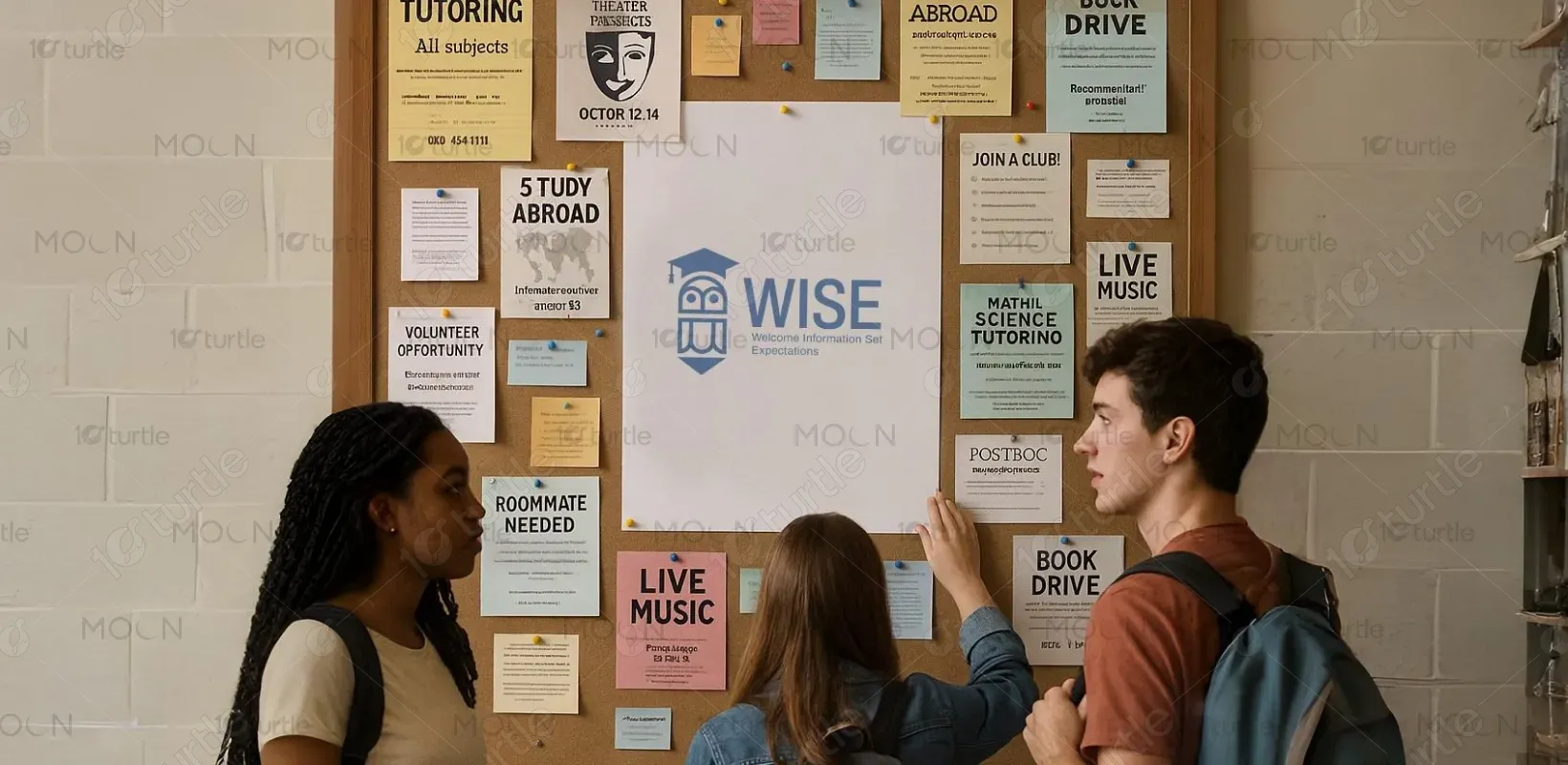
The WISE logo bridges the gap by blending symbolic imagery with smart design elements. The owl-pencil-cap icon cleverly merges key educational metaphors—wisdom, learning, and guidance—into a single shape. The structured typeface and bold uppercase lettering ensure legibility and authority. The lime green accent evokes energy and optimism, making the brand feel current and student-friendly. Its scalable and adaptable design works seamlessly across posters, websites, signage, and digital interfaces—making WISE a coherent, recognizable, and emotionally resonant solution in academic onboarding.
The long-term vision for the WISE logo is to become an emblem of excellence in educational onboarding and academic support systems. It aims to be instantly recognized across institutions as a symbol of clarity, inclusivity, and trusted guidance. As WISE programs expand, the logo will anchor sub-brands or modules (e.g., faculty WISE, digital WISE, etc.), maintaining coherence while growing its impact. Ultimately, the design aspires to create a lasting identity that fosters trust, welcomes learners, and elevates orientation experiences globally.

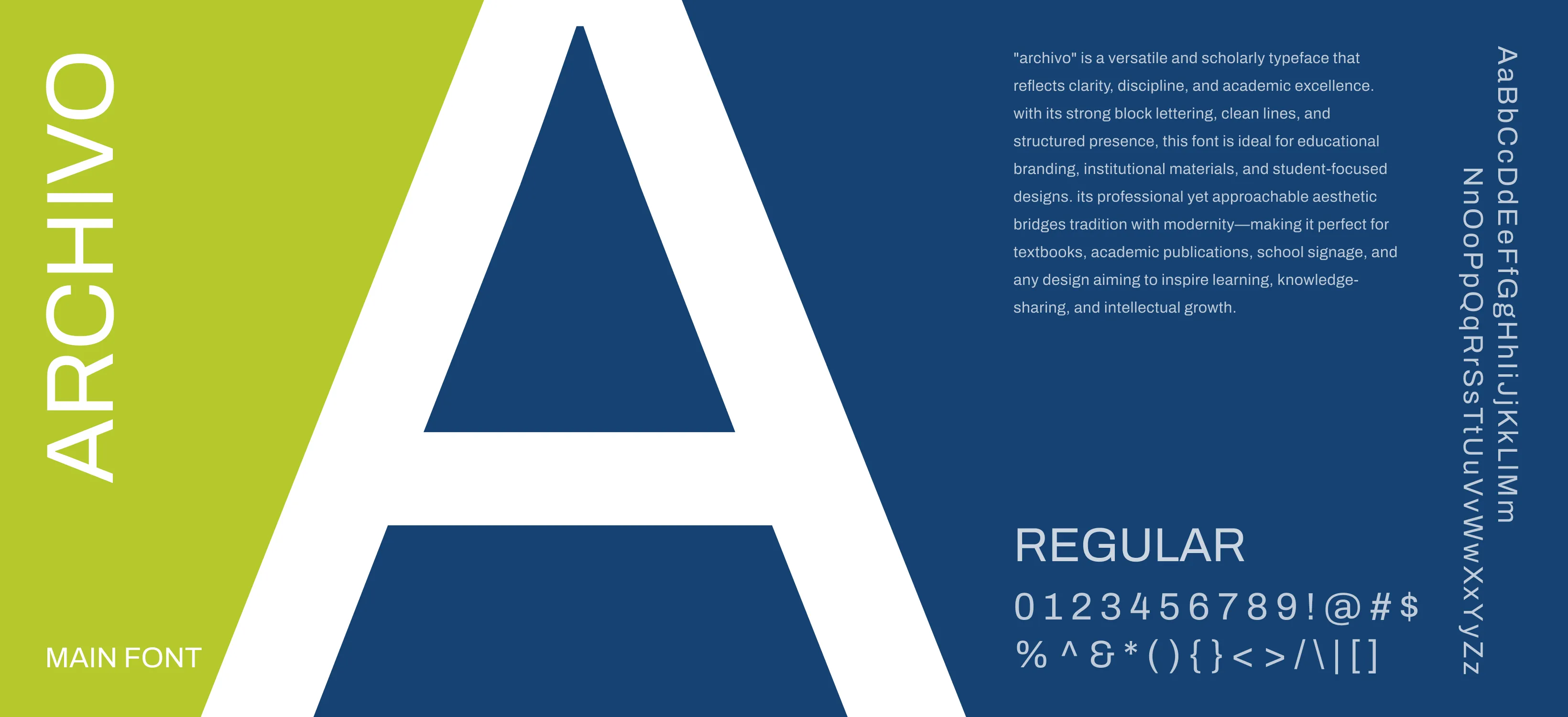
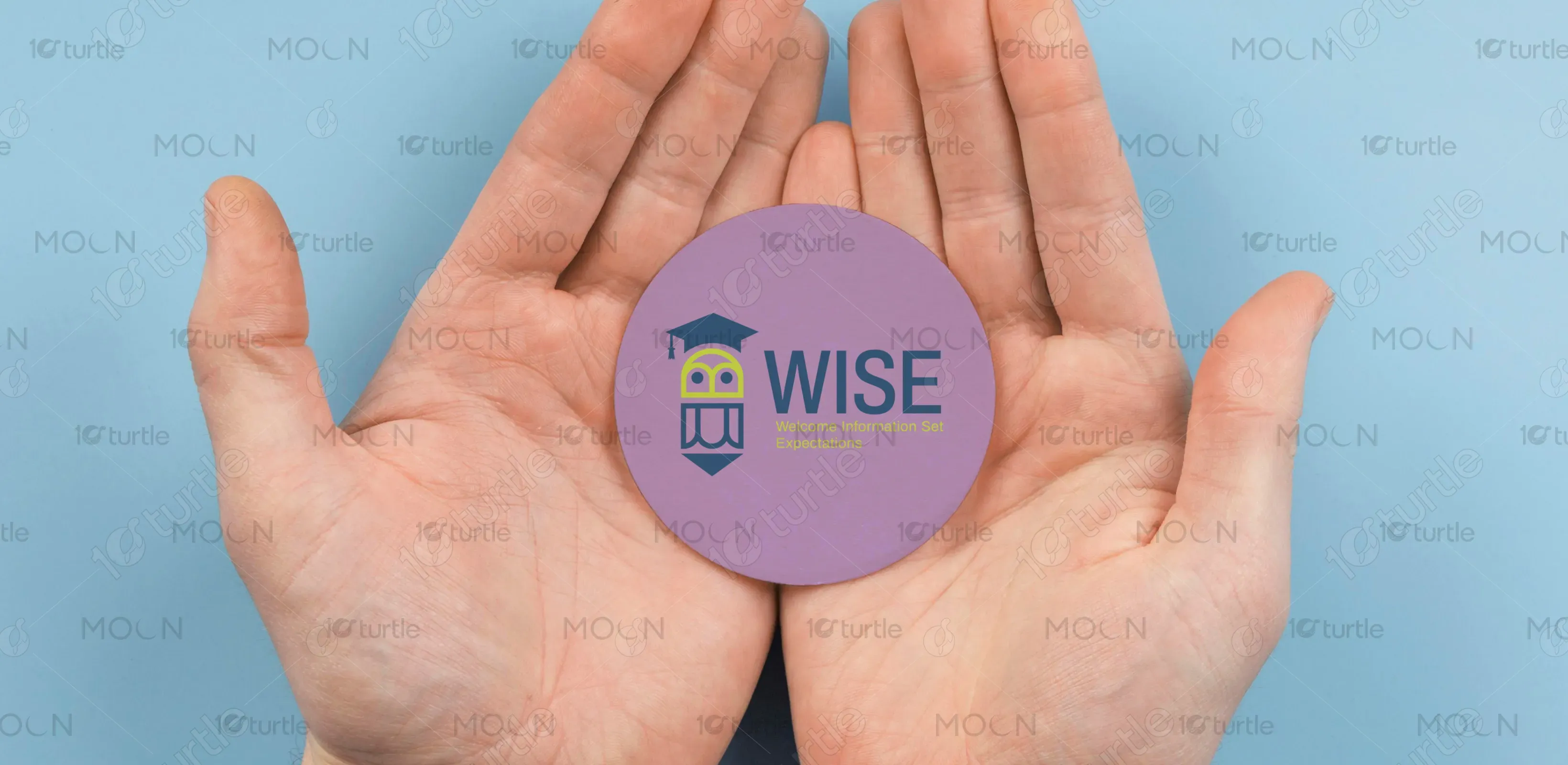
The color palette—deep navy blue and lime green—was selected for both functional and emotional impact. Navy blue represents intelligence, trust, and professionalism—qualities essential in education. Lime green adds vibrancy, freshness, and accessibility, symbolizing growth, new beginnings, and open-mindedness. Together, the palette balances authority with friendliness, making it suitable for academic contexts while remaining visually engaging for new learners. This dual-tone scheme reinforces WISE’s promise to inform, support, and inspire with clarity and warmth.

