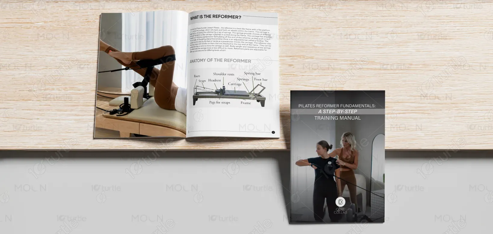
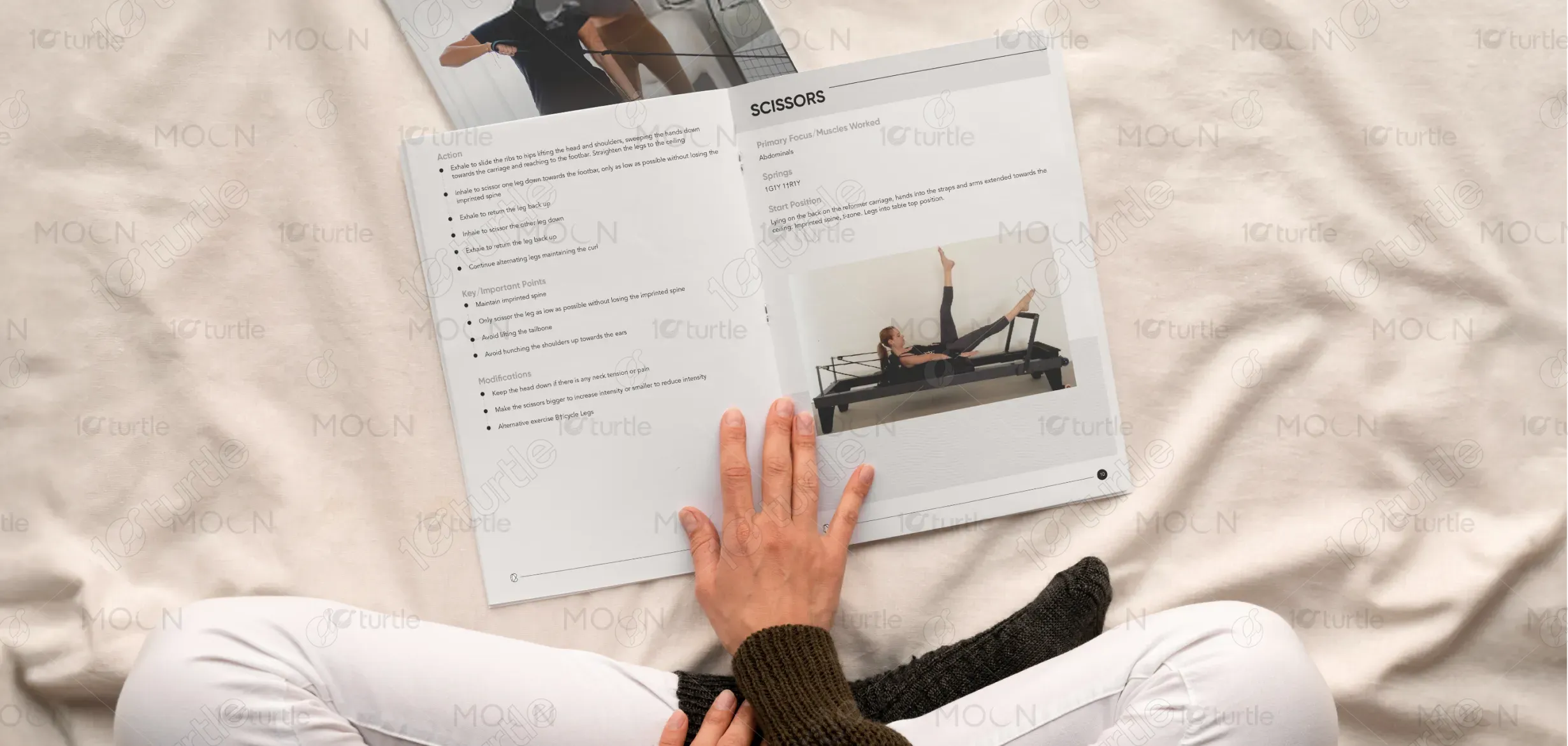
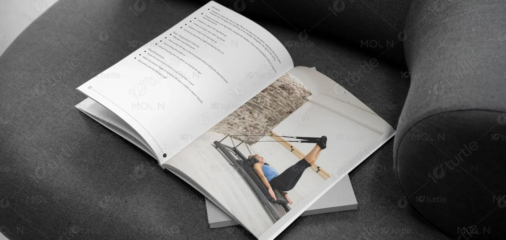
The design follows a clean, instructional, and modern visual approach tailored for professional Pilates education. A strong grid system, ample white space, and consistent typographic hierarchy ensure information is easy to scan and understand. Clear sectioning, balanced layouts, and controlled use of imagery guide the reader through exercises, cues, and concepts without visual clutter. The overall design prioritizes clarity, legibility, and instructional flow, making the manual suitable for both print and long-term reference use.
Manual Design
Graphic Design
Industry
Healthcare & Wellness
Tools we used


Project Completion
2025
Key Market
Global
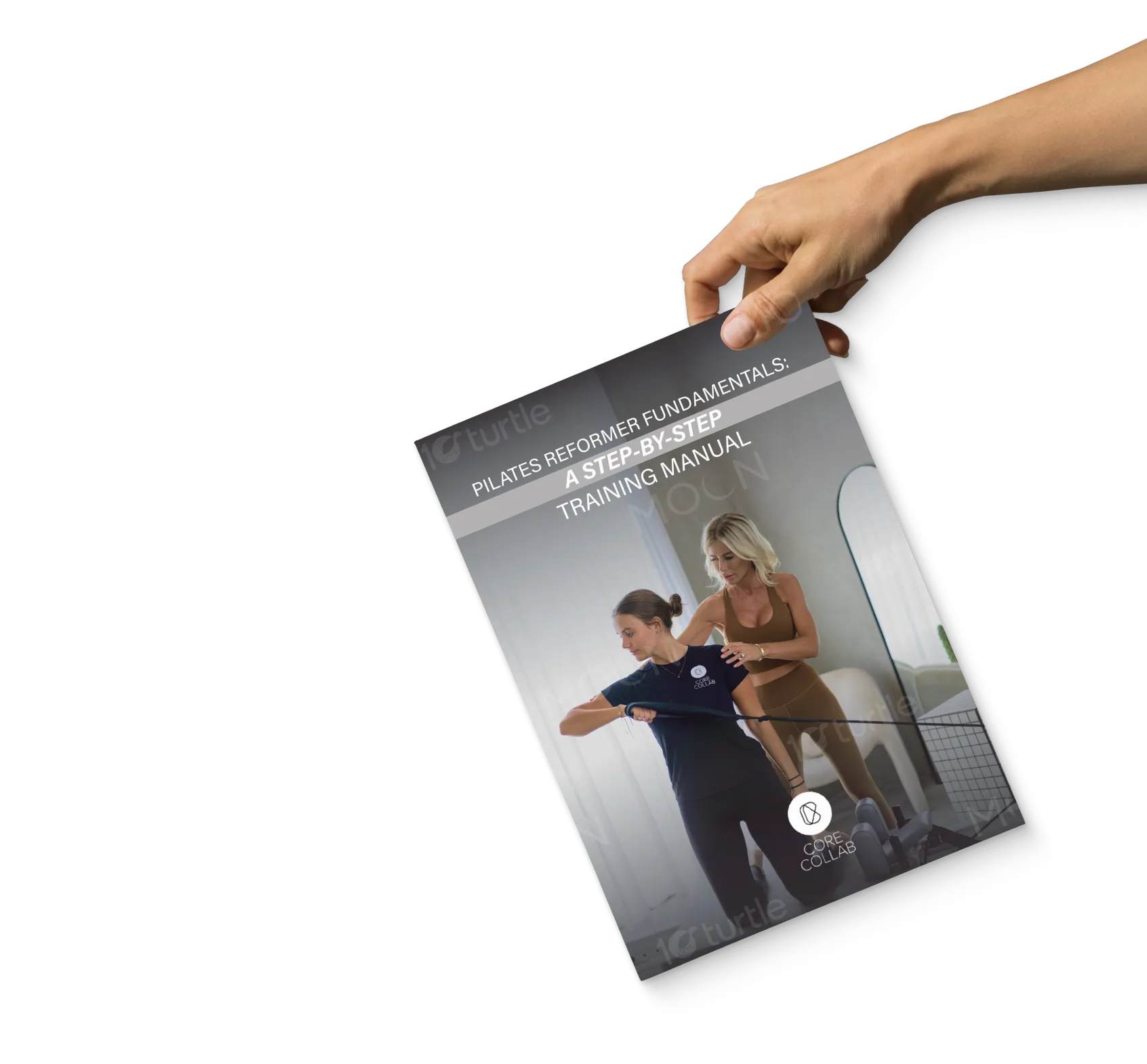
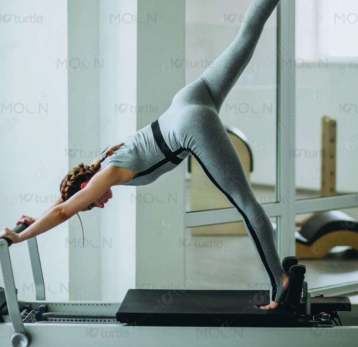
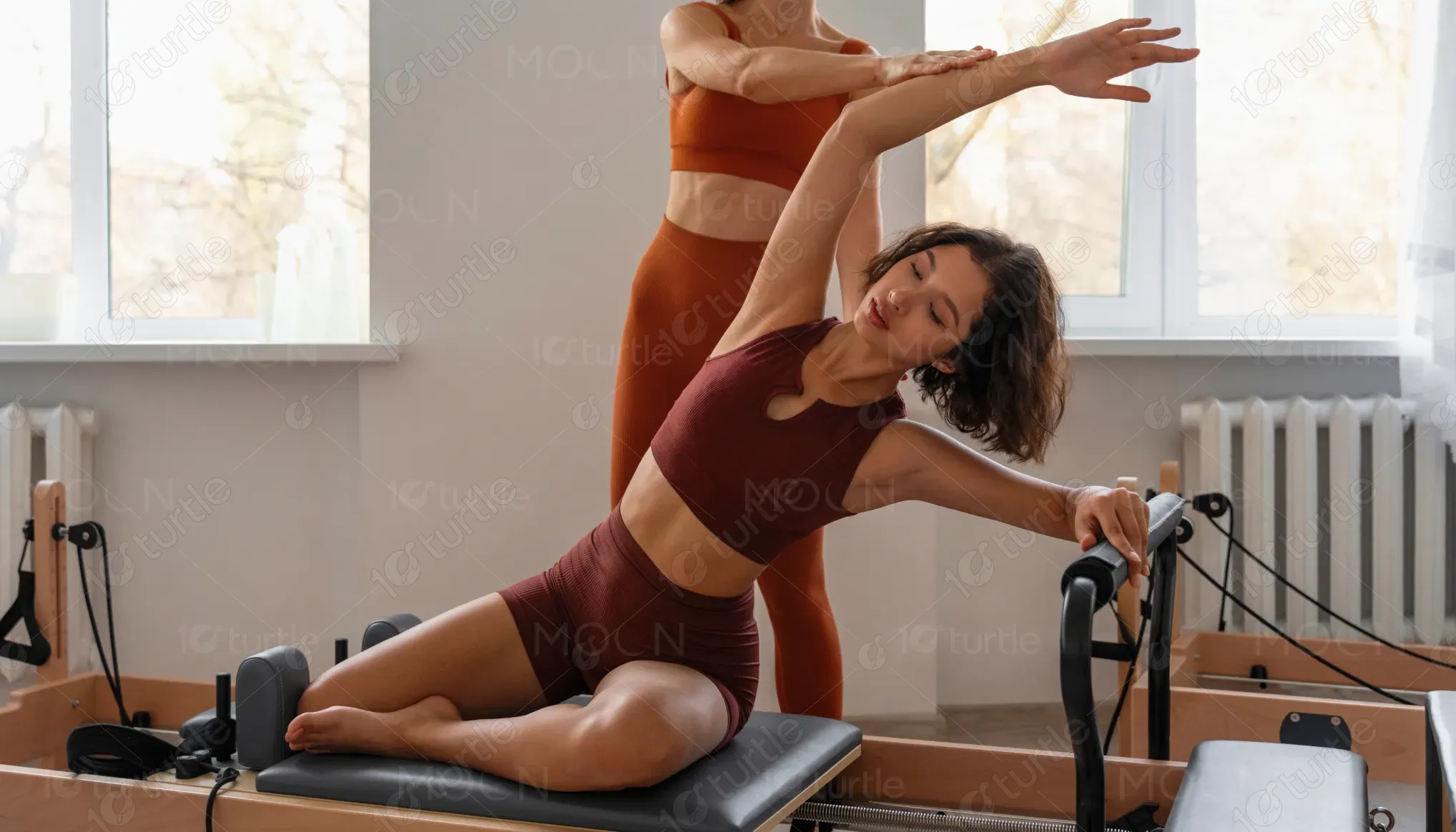
This design represents a professional Reformer Pilates training manual created to support instructors, trainees, and wellness professionals. Its primary purpose is to communicate structured exercise guidance, technique principles, and instructional clarity in a reliable and accessible format. Positioned within the health and fitness education space, the manual functions as both a learning resource and a teaching aid, balancing visual simplicity with functional depth.
Industry
Healthcare & WellnessWhat we did
Manual DesignGraphic DesignPlatform
-Many fitness and training manuals suffer from dense layouts, inconsistent formatting, and unclear visual hierarchy, making them difficult to follow during active learning or real-time instruction. Poor organization often leads to misinterpretation of exercises, reduced engagement, and lack of confidence among learners. For instructors and trainees, this creates barriers to effective teaching, learning continuity, and professional credibility.
The design addresses these challenges through a structured, user-centric layout system that prioritizes clarity and usability. Clear headings, consistent spacing, and logical content flow improve readability and comprehension. Visual consistency across pages reinforces familiarity, while clean typography and restrained color usage reduce cognitive load. The result is a manual that supports quick reference, focused learning, and confident application in both classroom and studio environments.
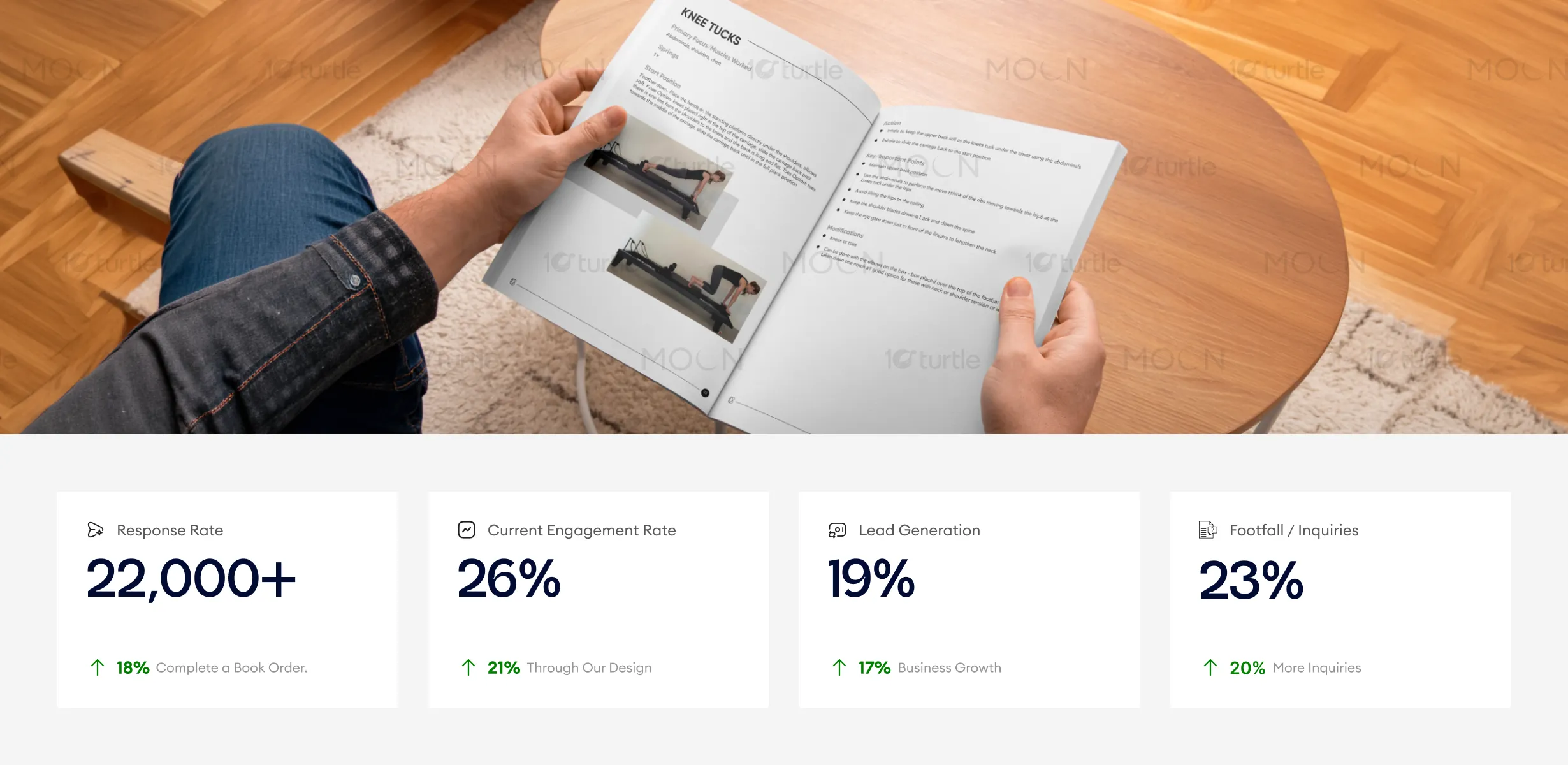
The manual’s structured instructional design improves comprehension and usability, making it easier for readers to follow exercises and retain information. Clear hierarchy, clean layouts, and supportive imagery enhance engagement and trust in the training program. This clarity helps drive higher program inquiries, training sign-ups, and ongoing learner engagement.
The long-term vision is to establish the manual as a reliable, scalable educational asset within the Pilates and wellness industry. The design is adaptable for future editions, digital formats, and extended training materials, ensuring longevity and brand consistency. By maintaining a professional and timeless aesthetic, the manual helps position the brand as credible, knowledgeable, and committed to quality education.
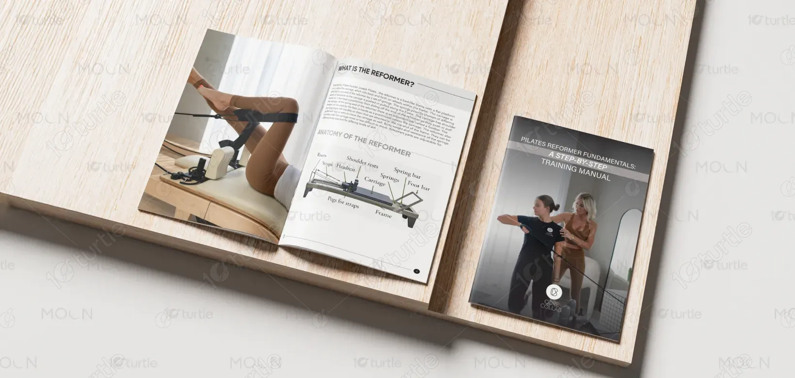
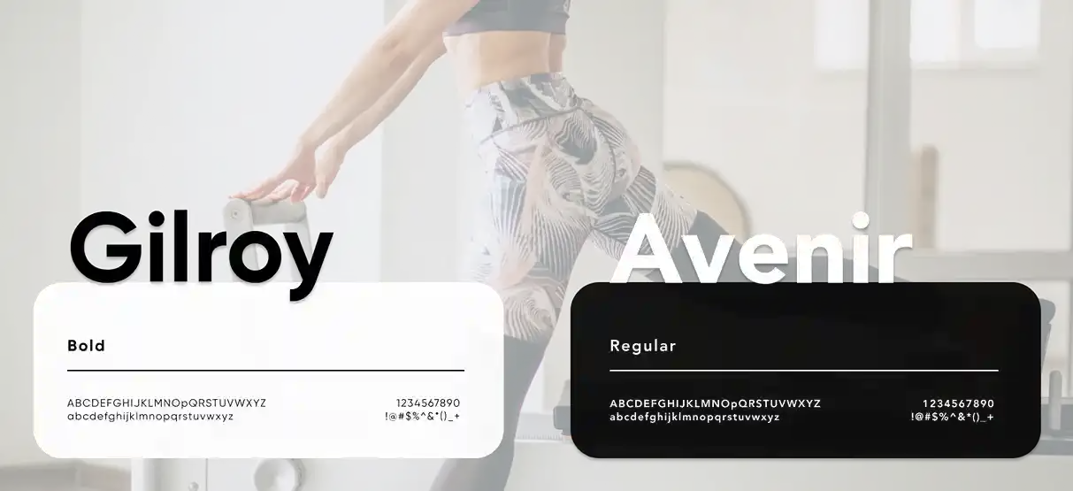
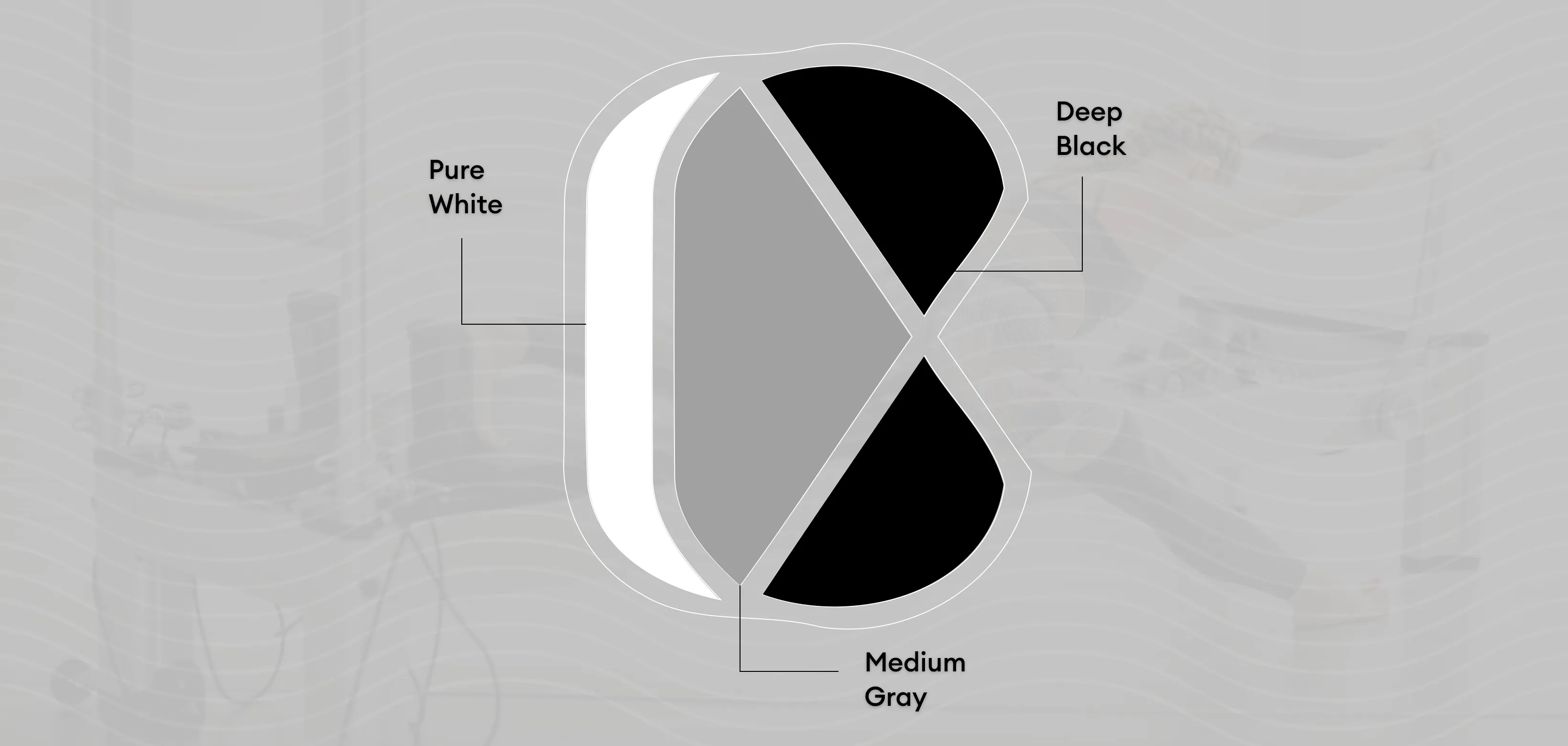
The color palette is calm, neutral, and professional, reinforcing focus and clarity rather than distraction. Soft, balanced tones support readability while aligning with the wellness-oriented nature of the content. Minimal graphic elements and clean visual cues complement the instructional purpose, ensuring the design feels approachable, credible, and suitable for extended use across print and digital formats.