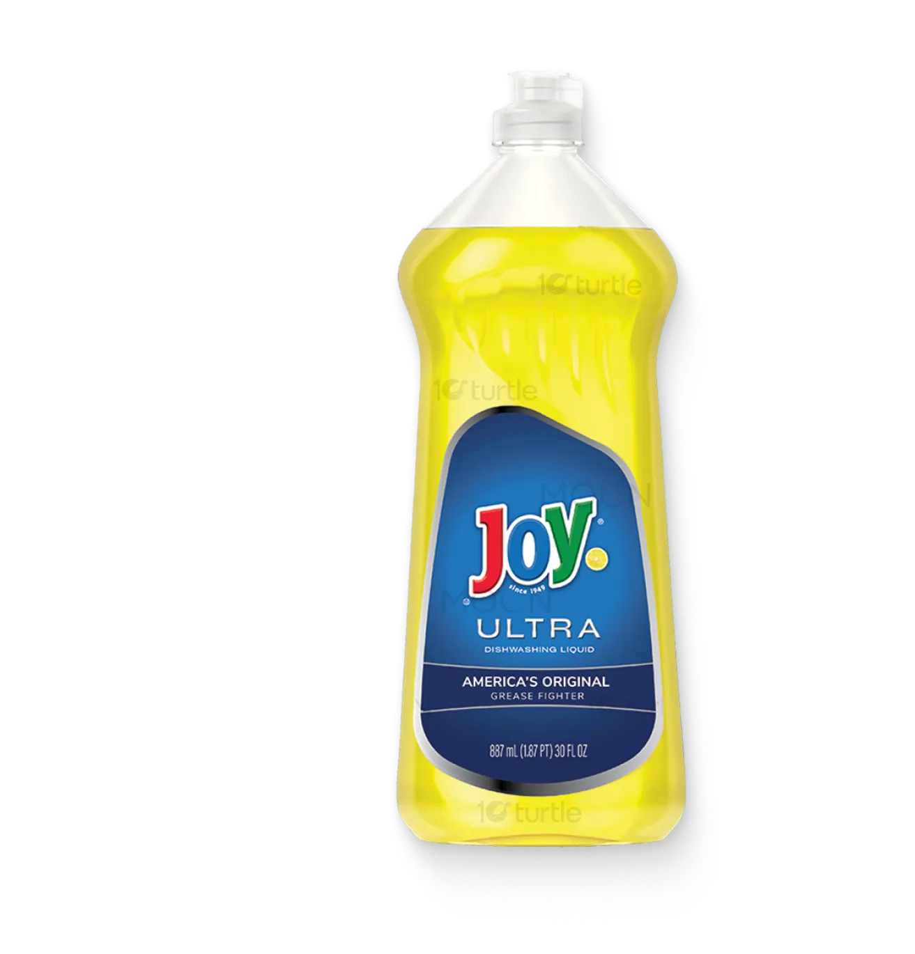
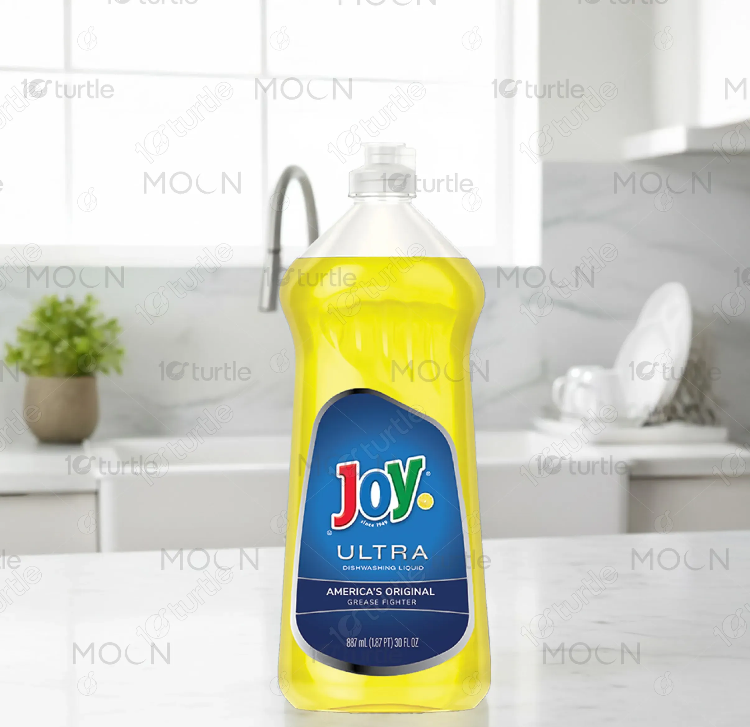
The design for Joy Ultra Dishwashing Liquid reflects a clean, fresh, and efficient brand identity, focusing on ease of use and reliability. The bottle’s sleek, ergonomic shape is complemented by a vibrant yellow color that evokes freshness and cleanliness. The bold, recognizable logo and color scheme are consistent with the product’s positioning as a reliable kitchen companion. The minimalist design ensures that the brand stands out on shelves, communicating both function and ease to the consumer.
Packaging Design
Graphic Design
Industry
Consumer Goods & Retail
Tools we used


Project Completion
2025
Key Market
Global
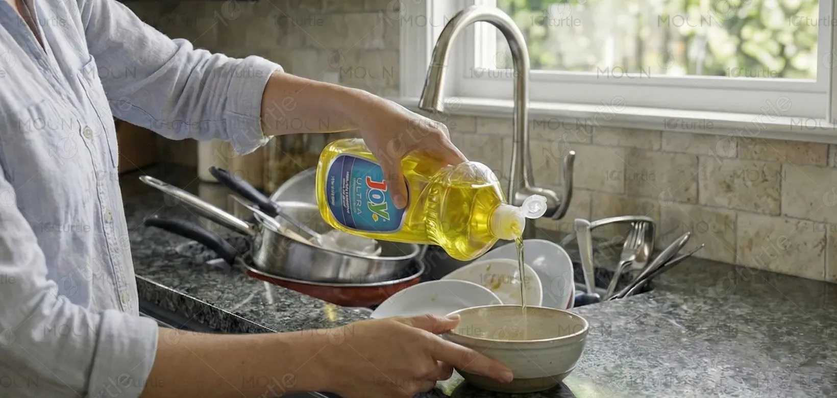
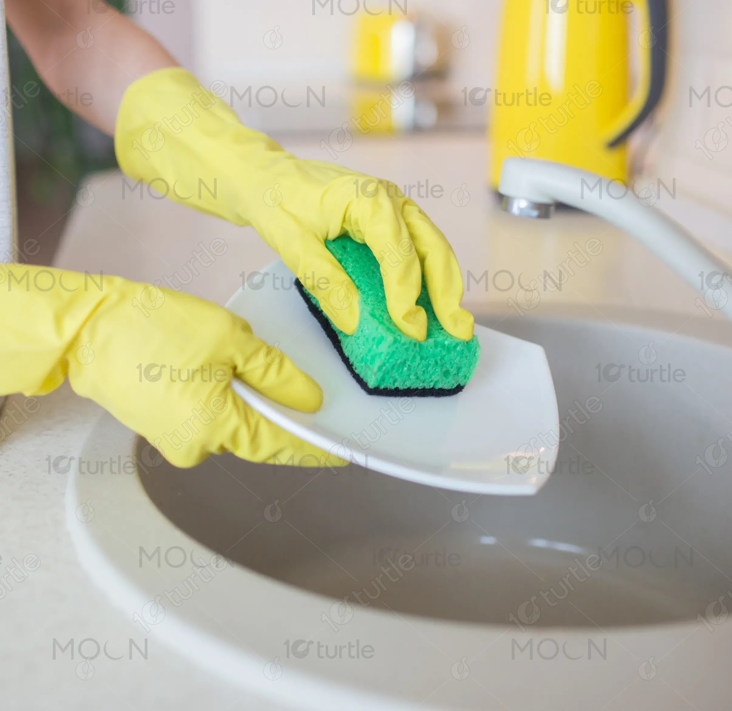
Joy Ultra is a premium dishwashing liquid that promises superior grease-fighting power, helping consumers clean their dishes more effectively and with less effort. Designed for kitchen use, it caters to individuals seeking an efficient, fast, and dependable solution for dishwashing. The product's formula delivers long-lasting results while the bottle design reflects simplicity and user-friendliness. Joy Ultra stands out due to its strong brand heritage, trusted formula, and practical, well-designed packaging aimed at a wide market.
Industry
Consumer Goods & RetailWhat we did
Packaging DesignGraphic DesignPlatform
-The key challenge in the dishwashing liquid market is finding a balance between functionality and visual appeal on retail shelves. Many brands have either outdated designs or overly complex packaging, making it difficult for customers to identify premium products quickly. Consumers often look for products that offer both superior performance and easy access, but struggle with bottles that are either too bulky or poorly designed, affecting the overall user experience.
Joy Ultra's packaging addresses this issue with a sleek, ergonomic bottle that is easy to handle and pour. The design uses bold typography and an eye-catching color scheme to differentiate it from competitors, while the formula inside is a trusted grease fighter that enhances the brand’s reputation. The clean lines and simplicity of the design make it immediately recognizable, appealing to consumers who seek both functionality and aesthetic appeal in their household products.

The vision for Joy Ultra is to solidify its position as the leading dishwashing brand trusted for efficient cleaning. The product aims to evolve by introducing new scents, eco-friendly packaging, and innovative cleaning technologies that further enhance the user experience. Long-term, the brand hopes to expand its reach globally and strengthen its connection with households by remaining synonymous with powerful, easy-to-use, and high-quality cleaning solutions.
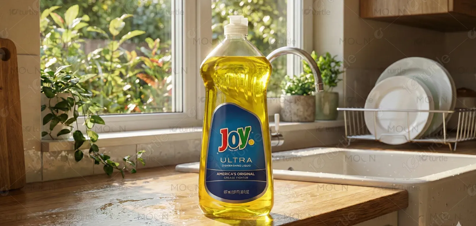
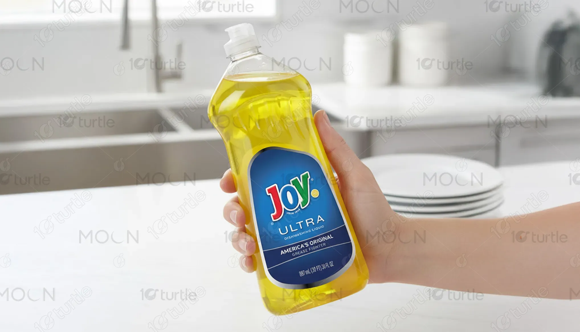

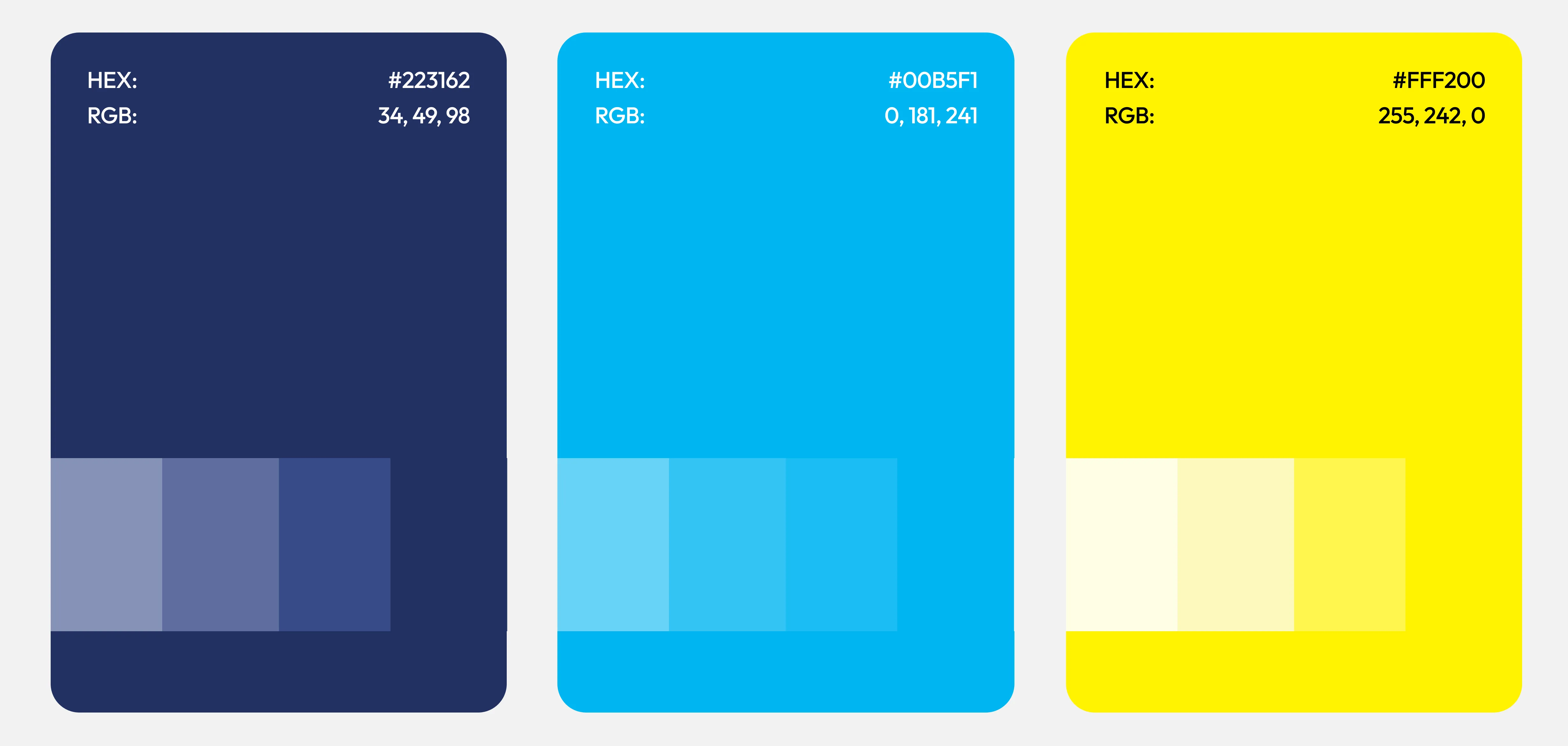
The color palette for Joy Ultra features vibrant yellow, representing cleanliness, energy, and freshness, while the bold blue provides a sense of trust and reliability. The use of these colors strengthens the product’s identity as a dependable, household essential. Yellow is universally associated with warmth and positivity, while blue resonates with consumers seeking a brand that delivers on its promises. This dynamic combination appeals to a broad demographic while staying true to the brand’s core values of efficiency and simplicity.