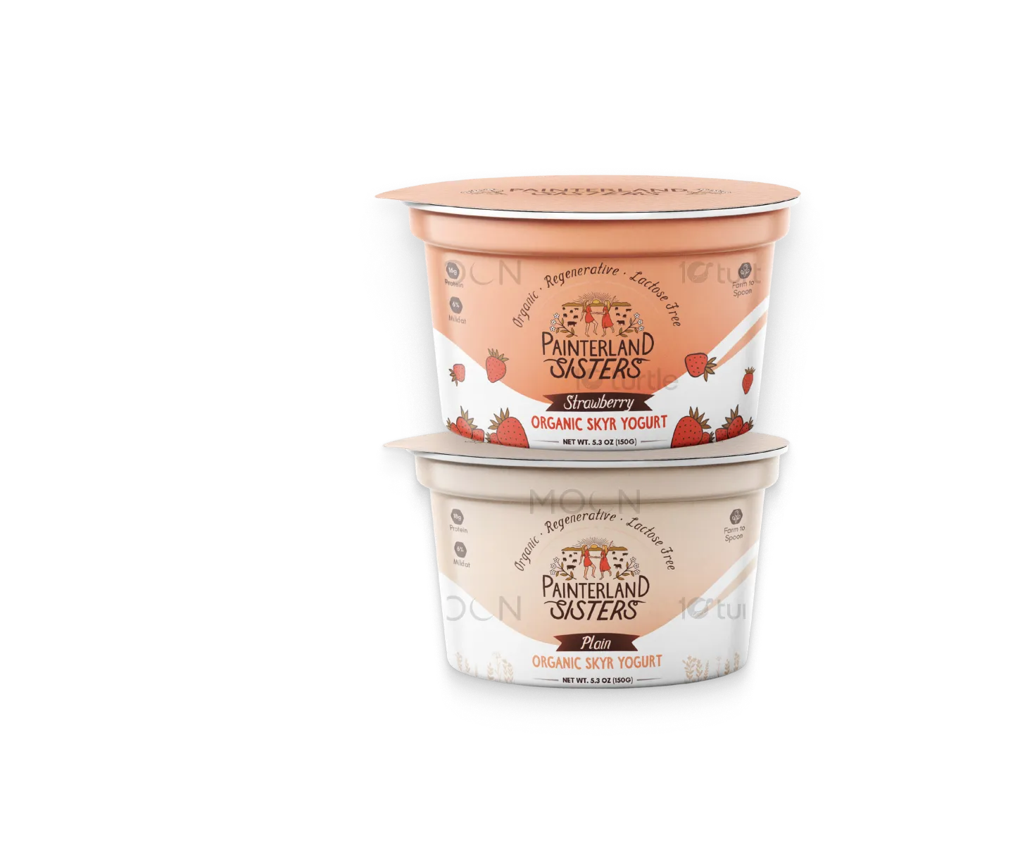
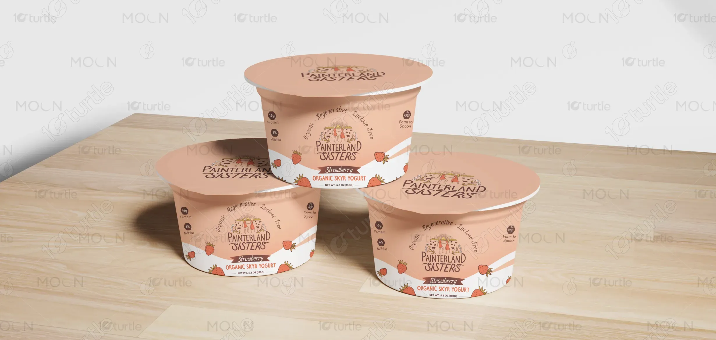
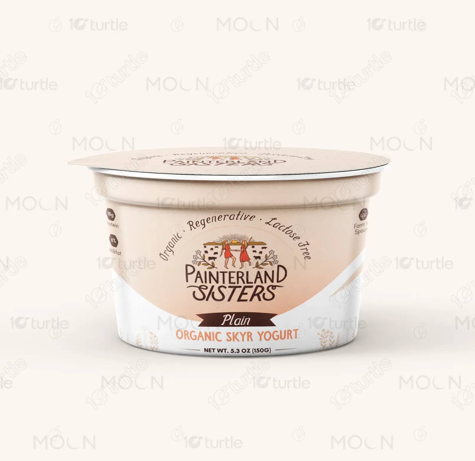
The packaging design for Painterland Sisters Organic Skyr Yogurt embraces a clean, modern aesthetic rooted in authenticity and nature. The curved color block creates a smooth flow across the container, reinforcing freshness and simplicity. Illustrations of fruits for flavored variants add vibrancy and direct recognition, while the minimal layout ensures clarity and trustworthiness. Earthy, muted tones align with organic and regenerative values, making the design approachable yet premium. The playful hand-drawn elements and family farm identity highlight a wholesome, farm-to-spoon story.
Packaging Design
Graphic Design
Label Design
Industry
Food, Beverage & Hospitality
Tools we used


Project Completion
2025
Key Market
Global
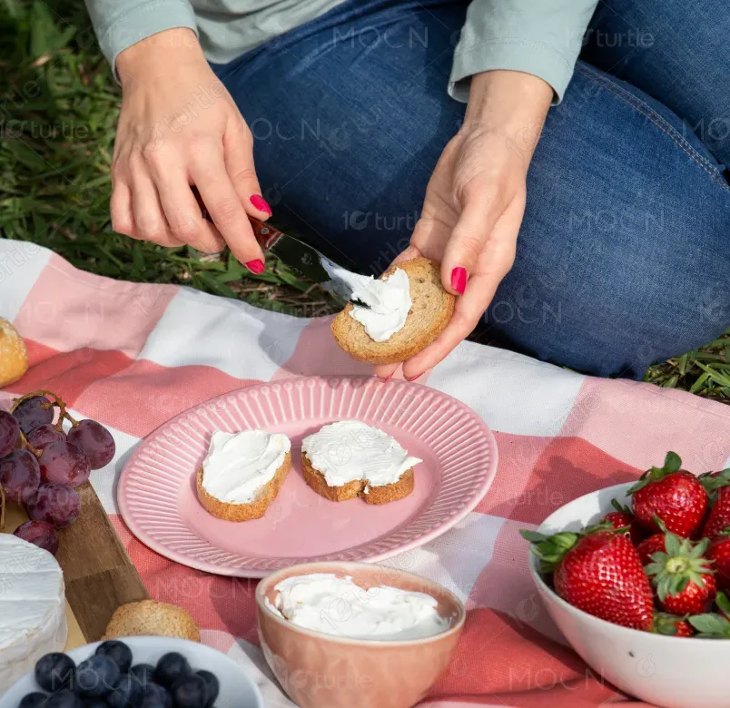
Painterland Sisters Organic Skyr Yogurt packaging is crafted to highlight the brand’s dedication to organic, regenerative farming and family heritage. Designed for health-conscious consumers, the product emphasizes high protein, low fat, and lactose-free benefits. The design ensures instant flavor recognition through fruit illustrations while maintaining consistency across the range with structured typography and a clear logo placement. This balance of natural storytelling and functional labeling creates strong shelf presence, appealing to both modern wellness shoppers and families seeking wholesome dairy alternatives.
Industry
Food, Beverage & HospitalityWhat we did
Packaging DesignGraphic DesignLabel DesignPlatform
-The yogurt market is saturated with designs that often overemphasize flashy graphics or complex messaging, making it hard for consumers to identify genuine organic, farm-based products. Many packages lack authenticity, blending into generic dairy branding and failing to communicate unique values like regenerative farming. Consumers also struggle to quickly differentiate between flavors when designs are too similar. This gap creates confusion and weakens emotional connection, especially for buyers seeking transparency, simplicity, and trust in their food choices.
Painterland Sisters addresses this challenge by combining clear, illustrative elements with an authentic brand story. Each flavor variant is color-coded and supported with simple fruit graphics for quick recognition. The earthy tones and hand-drawn illustrations reinforce the brand’s organic and regenerative farming ethos, setting it apart from mass-market competitors. The layout highlights key benefits—“High Protein, Low Fat, Lactose-Free”—making nutritional value easy to spot. By blending functionality with storytelling, the design ensures both shelf impact and consumer trust.
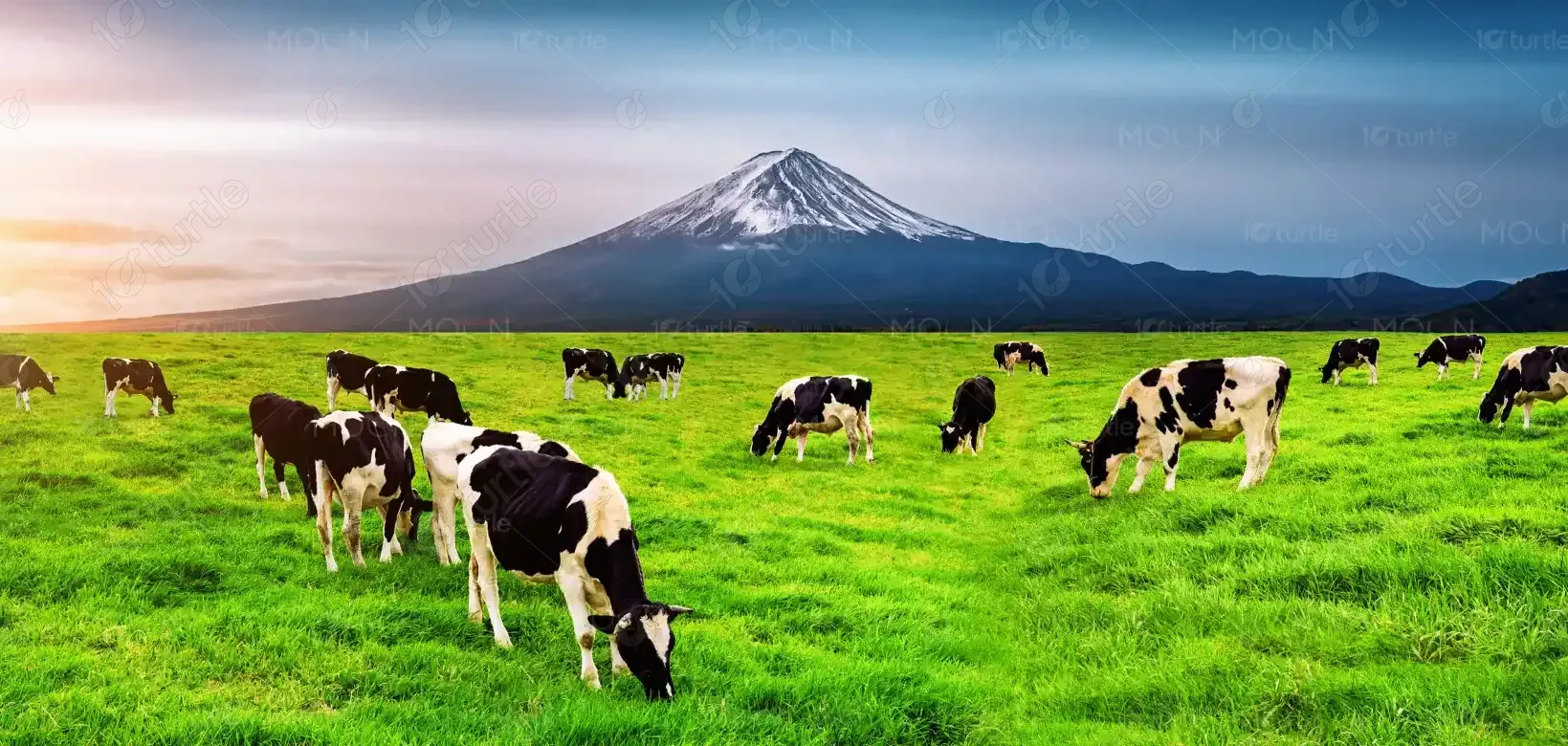
Painterland Sisters envisions becoming a household name synonymous with organic integrity and regenerative farming advocacy. The goal is to expand beyond yogurt, creating a recognizable lifestyle brand that champions sustainability, health, and family-farm values. Through consistent design language and evolving product innovations, the brand aspires to inspire conscious consumption, support rural communities, and redefine dairy culture. Long-term, the aim is to lead in both local and global markets as a trusted voice for farm-to-spoon nourishment.
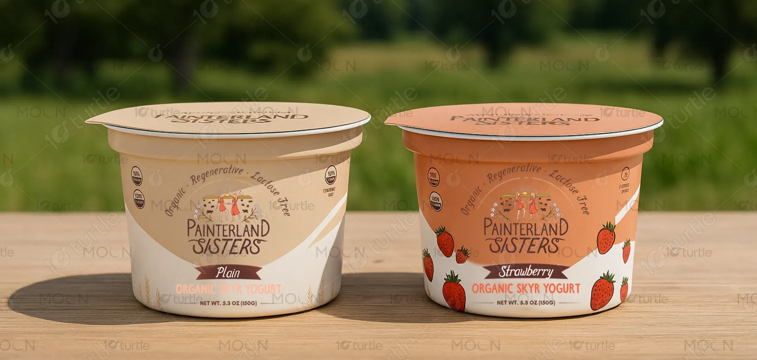
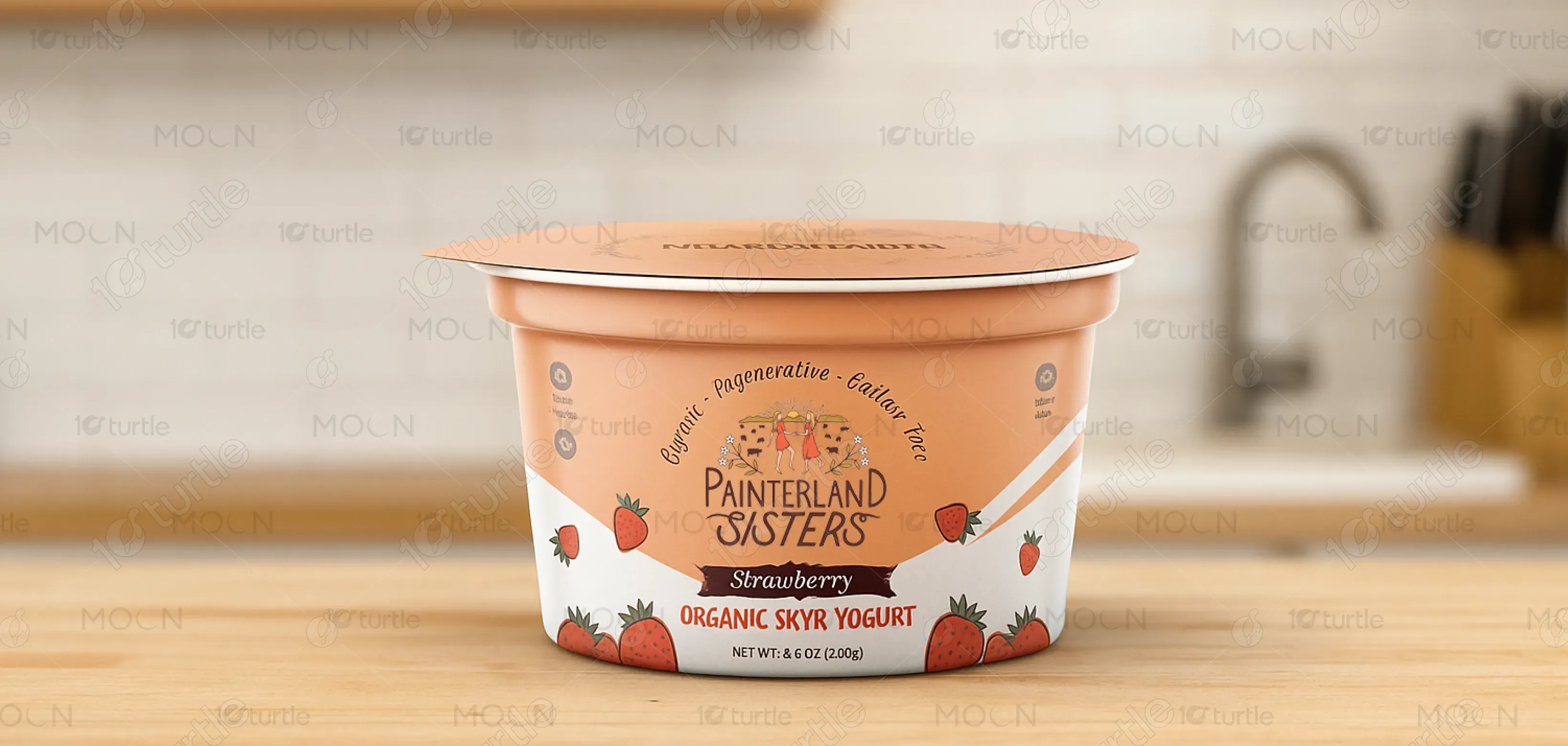
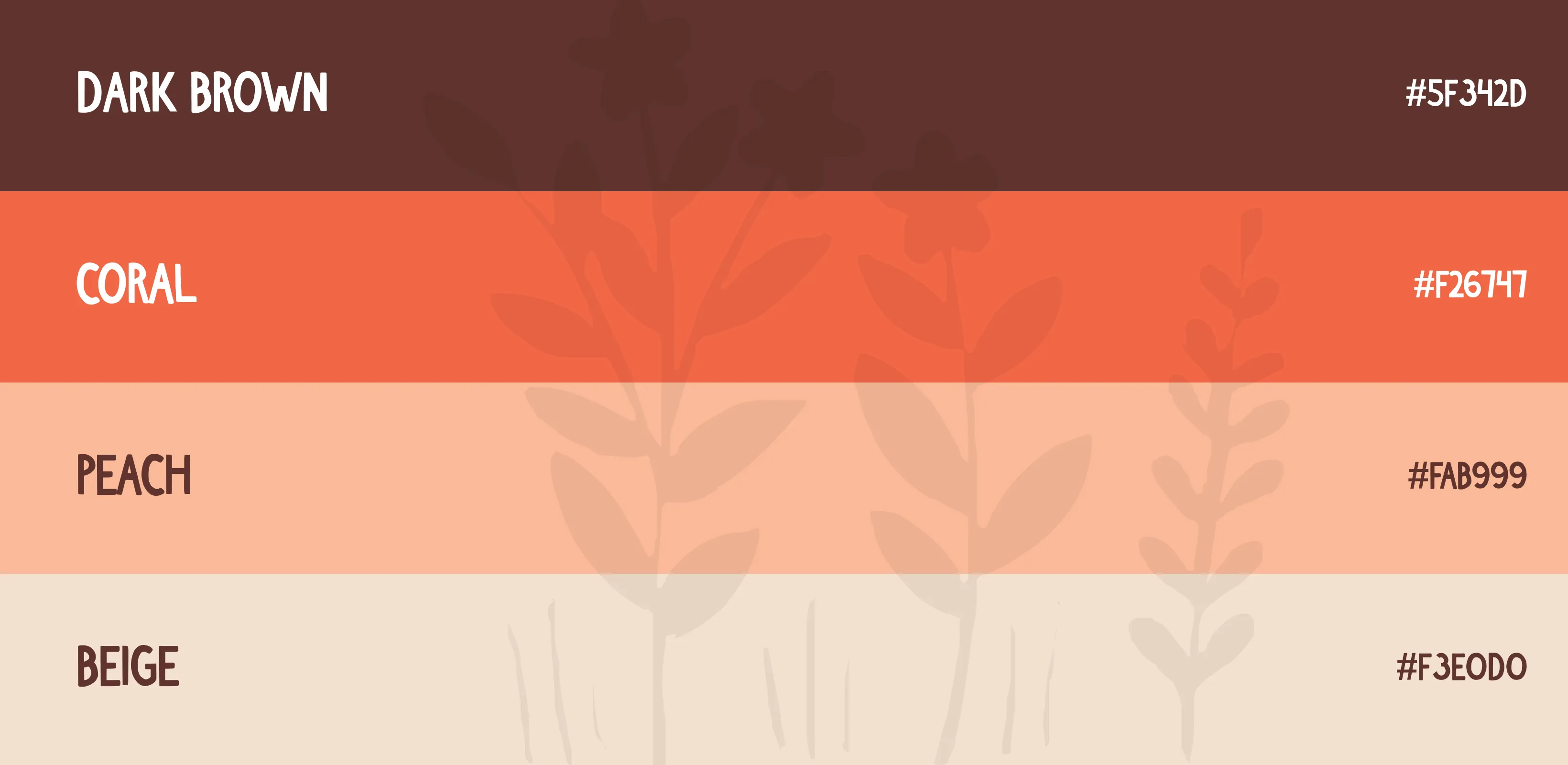
The packaging uses a natural, earthy palette to reflect authenticity and flavor distinction. Strawberry variant incorporates warm peach-pink with fresh red fruit accents, evoking sweetness and vibrancy. Plain variant uses soft beige and cream tones, representing purity and simplicity. White serves as a base color across both, enhancing freshness and readability. These muted, organic-inspired hues resonate with health-conscious consumers, conveying trust, sustainability, and a farm-fresh identity while ensuring visual differentiation and brand consistency on the shelf.