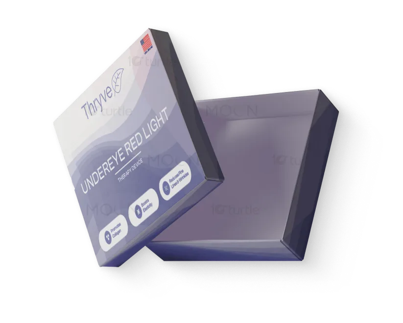
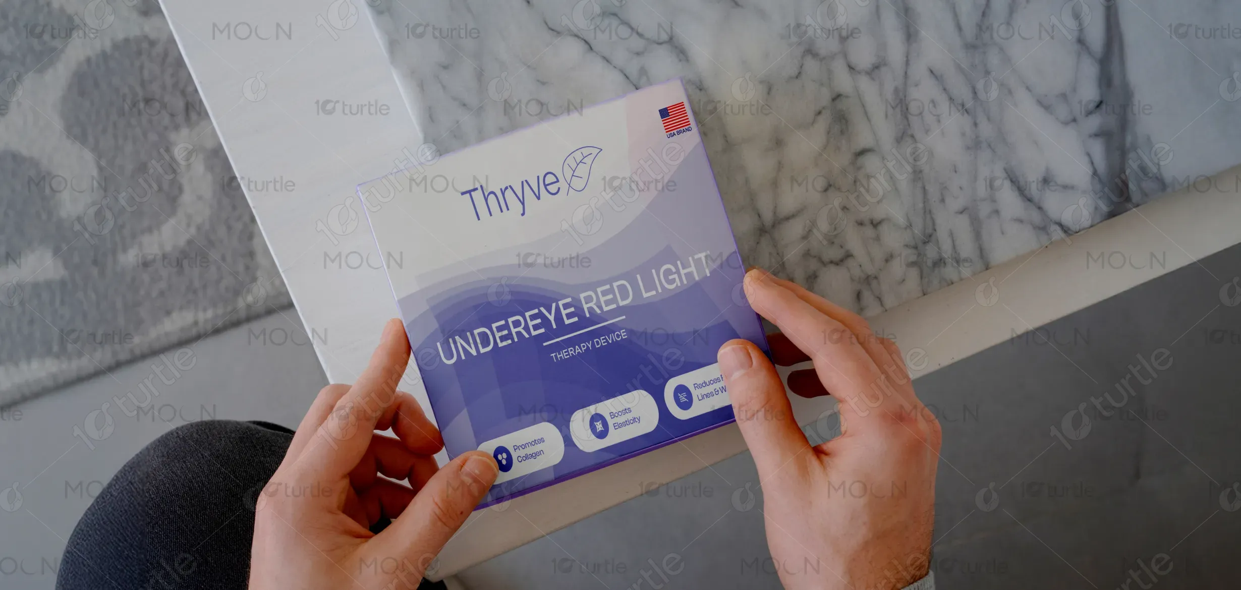
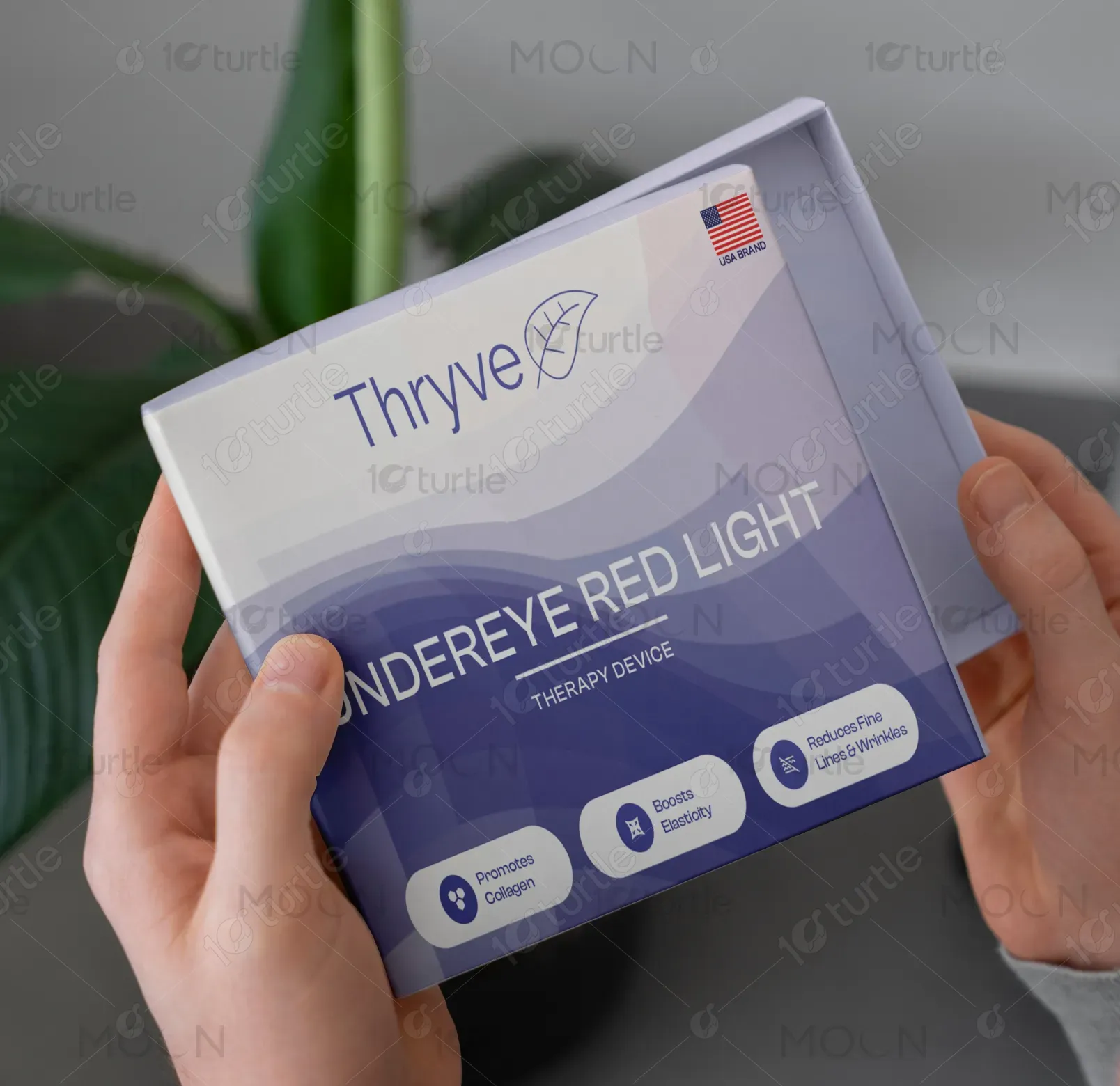
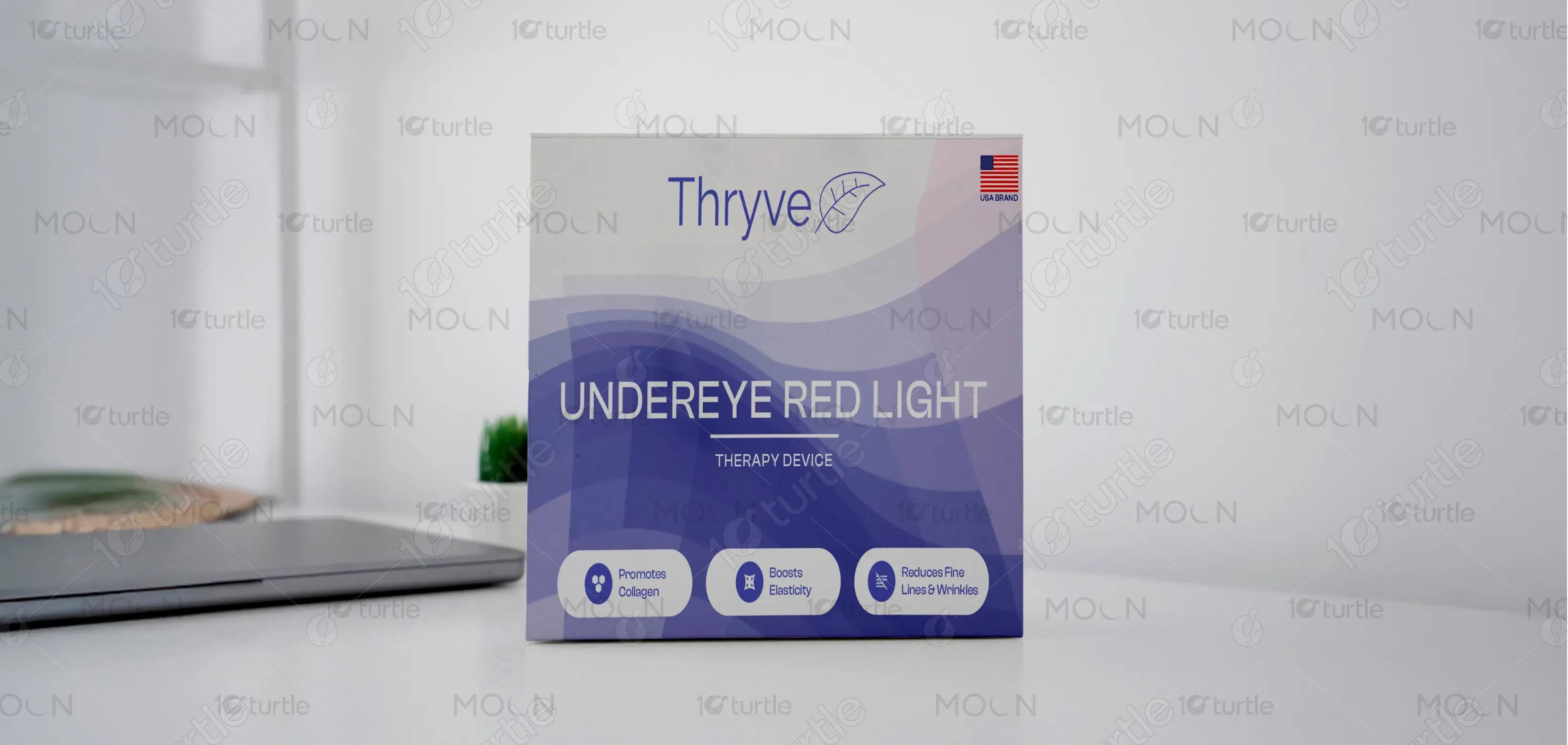
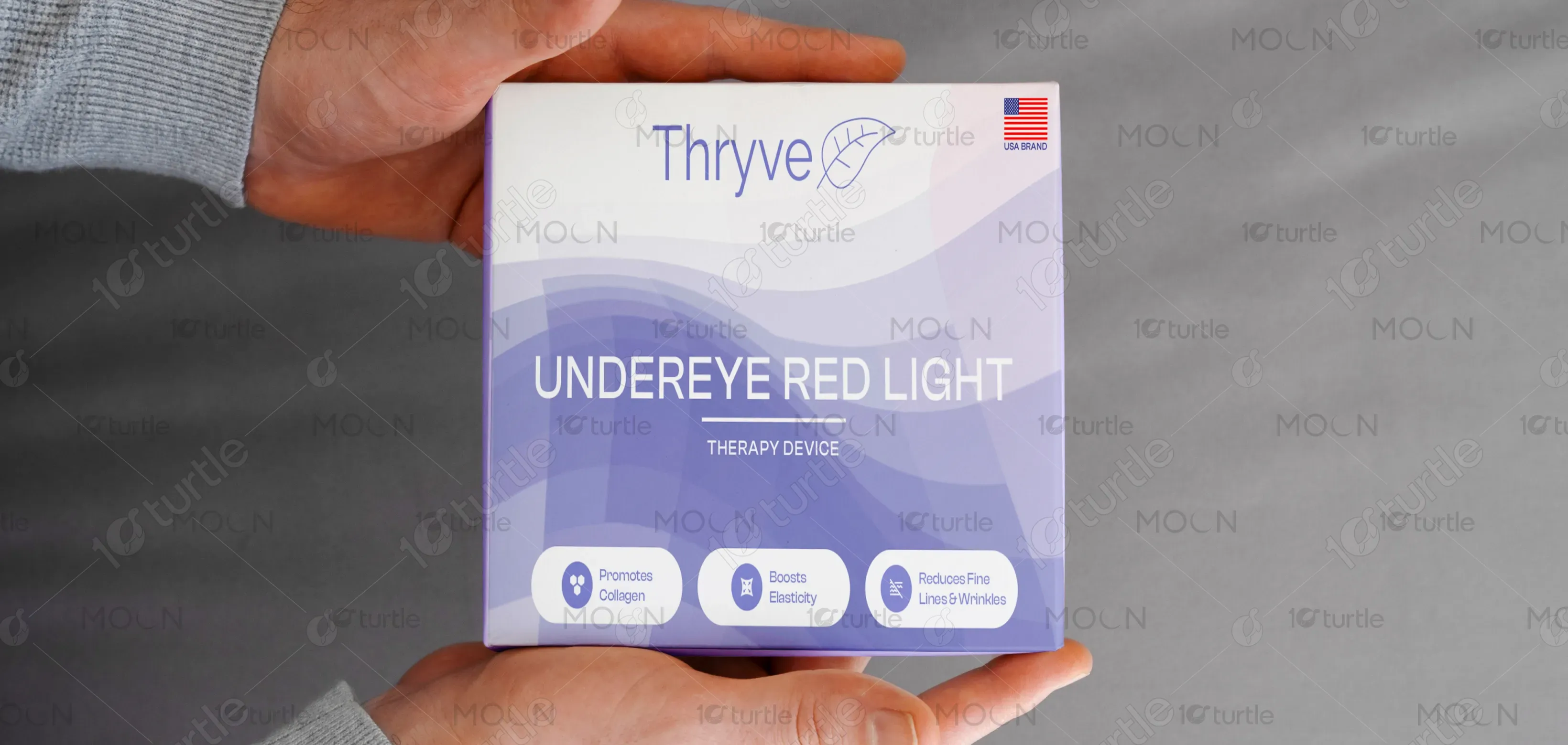
The design emphasizes a clean, modern aesthetic with soft gradients and wave-like patterns that suggest calmness and rejuvenation. The minimalist layout highlights product benefits upfront, making it easy for consumers to understand at a glance. The use of bold typography ensures clarity, while subtle curves evoke wellness and natural flow. A small U.S. flag adds authenticity and trust. Overall, the packaging communicates professionalism, reliability, and a premium self-care experience tailored to a wellness-conscious audience.
Packaging Design
Graphic Design
Industry
Healthcare & Wellness
Tools we used


Project Completion
2025
Key Market
Global
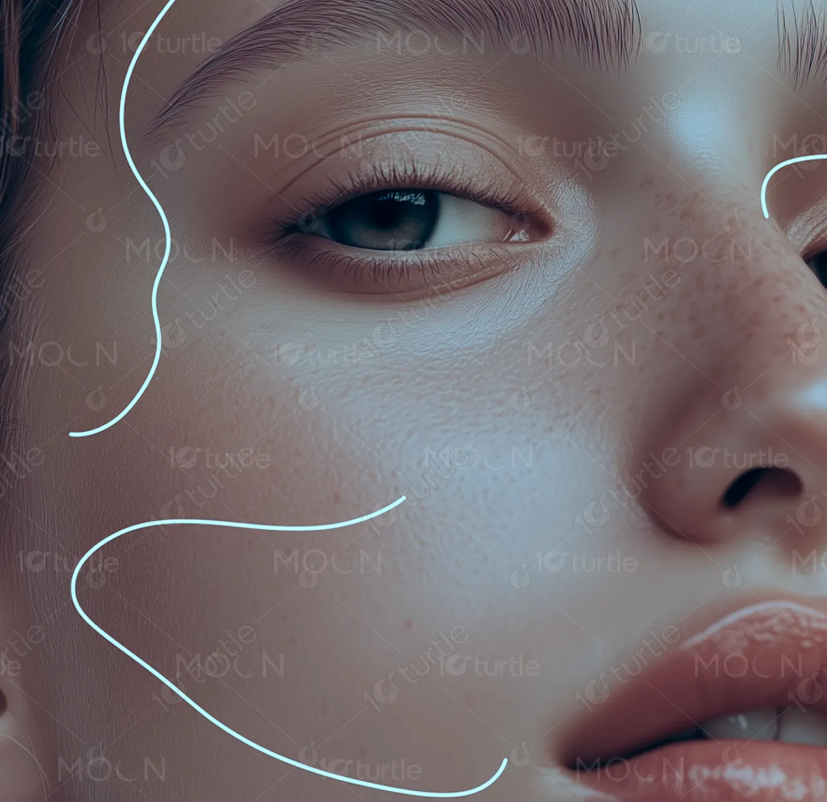
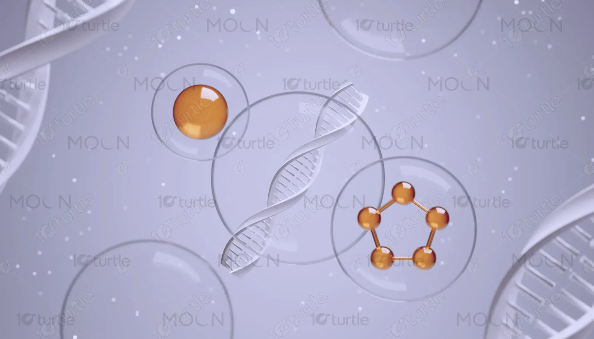
The Thryve Undereye Red Light Therapy Device is a wellness innovation designed to reduce fine lines, boost elasticity, and promote collagen production. Portable and user-friendly, it merges skincare science with everyday convenience. The packaging captures this balance of sophistication and simplicity, making it stand out in a competitive beauty-tech market. Its unique selling points include advanced red light therapy, ease of use, and spa-like results at home—appealing to health-conscious consumers seeking effective, non-invasive skincare solutions.
Industry
Healthcare & WellnessWhat we did
Packaging DesignGraphic DesignPlatform
-The main challenge was creating packaging that educates while remaining visually appealing. Many beauty-tech devices either overwhelm consumers with technical jargon or oversimplify to the point of losing credibility. Additionally, skincare consumers often distrust wellness gadgets due to inconsistent results in the market. This gap demanded a design that instills confidence, communicates functionality clearly, and aligns with consumer expectations of premium self-care products. The issue is widespread, as products like facial rollers or light masks often lack trust-building packaging.
The solution was a design that balances clarity and sophistication. Key benefits—collagen promotion, elasticity boosting, and wrinkle reduction—are prominently displayed on the front for instant recognition. A calming gradient palette reflects self-care and relaxation, while structured typography conveys credibility. The inclusion of product details, origin (Austin, TX), and the American flag reinforces authenticity. This user-centric design bridges the gap between technical innovation and consumer trust, making it approachable, aspirational, and reliable in the beauty-tech space.
The long-term vision is to position Thryve as a trusted leader in wellness technology by creating packaging that resonates emotionally and visually with its audience. Future iterations could expand into a unified product line with cohesive visual identity, ensuring strong brand recognition. The goal is not just to sell a device but to create an enduring impression of wellness, confidence, and lifestyle enhancement—ultimately shaping consumer perception of self-care technology as essential, effective, and aesthetically desirable.
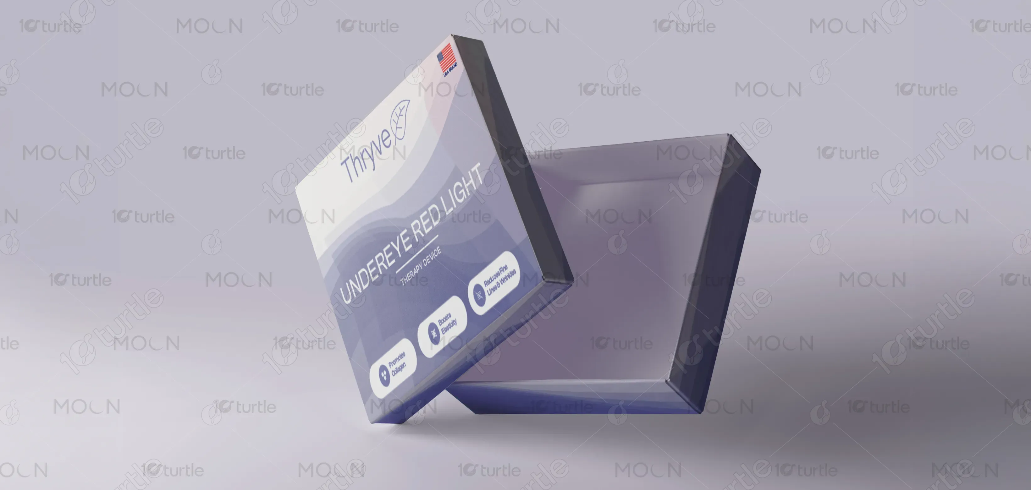
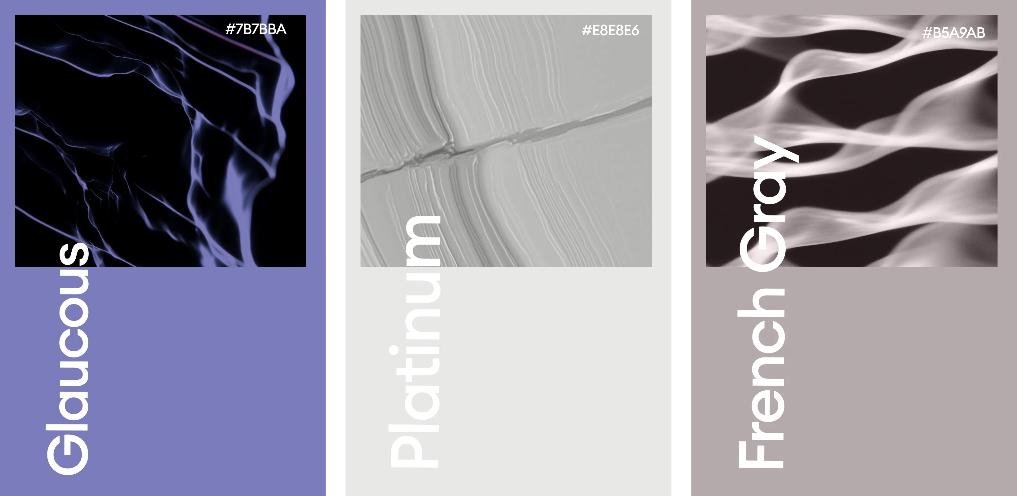
The chosen palette features calming shades of lavender, deep violet, and soft gray gradients. These colors symbolize relaxation, rejuvenation, and sophistication—key emotions tied to self-care. The gradient waves create a sense of flow, representing energy, balance, and natural healing. Blue tones suggest trust and scientific reliability, while purple hues reflect luxury and innovation. This palette aligns perfectly with Thryve’s identity, blending wellness with modern technology, and ensures the product stands out in the beauty-tech category with both elegance and clarity.