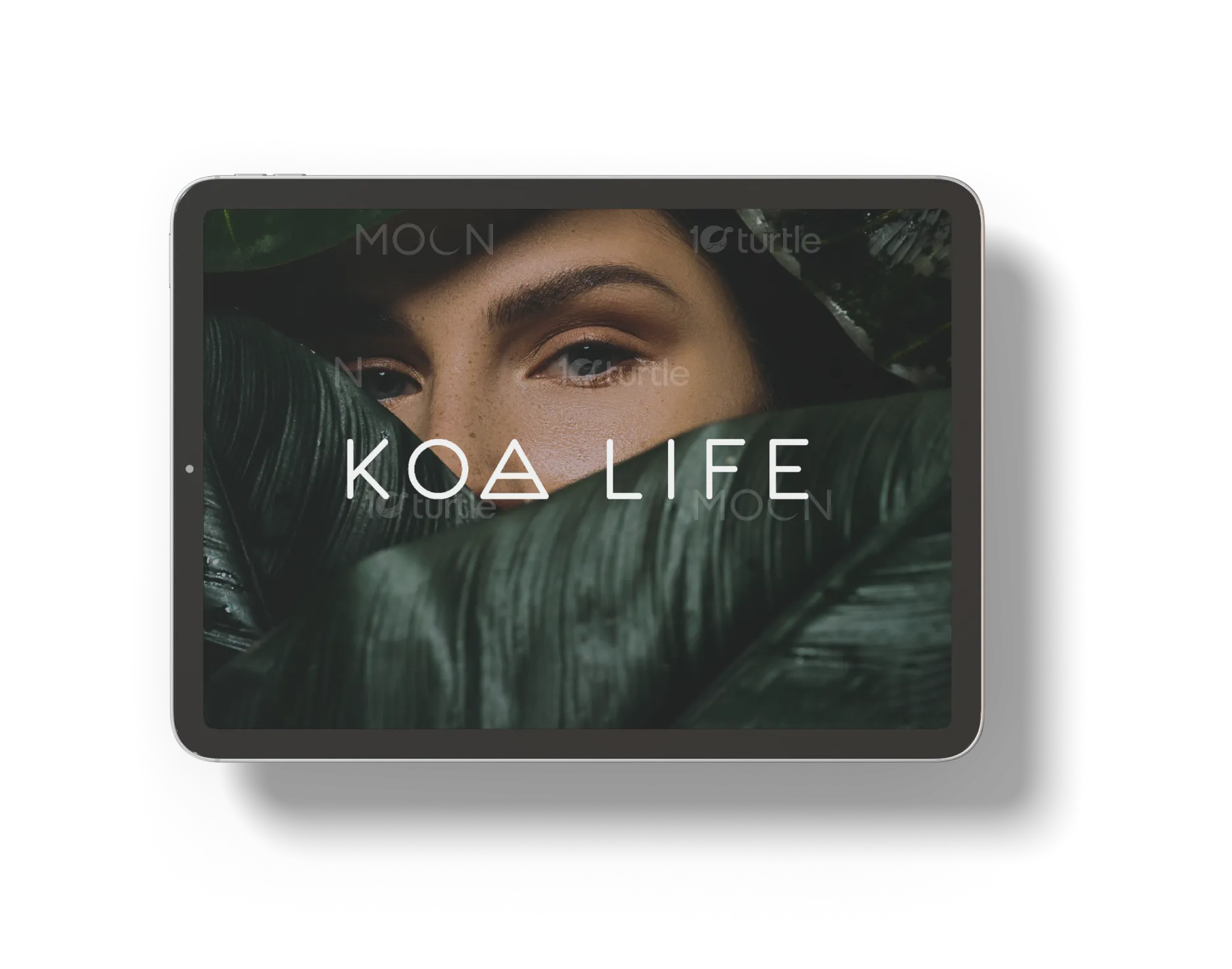
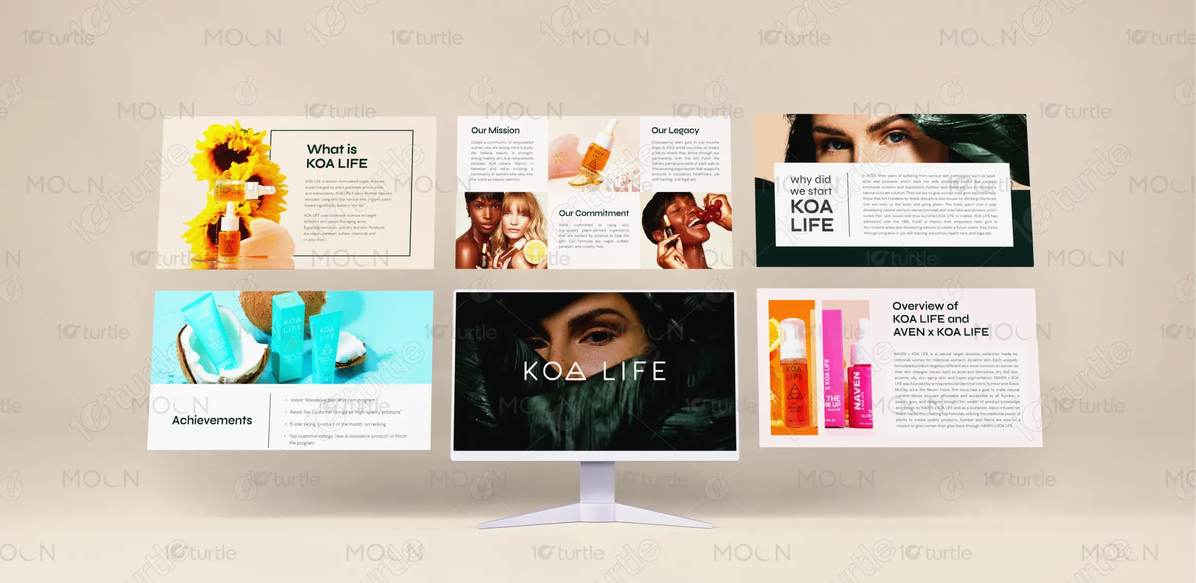
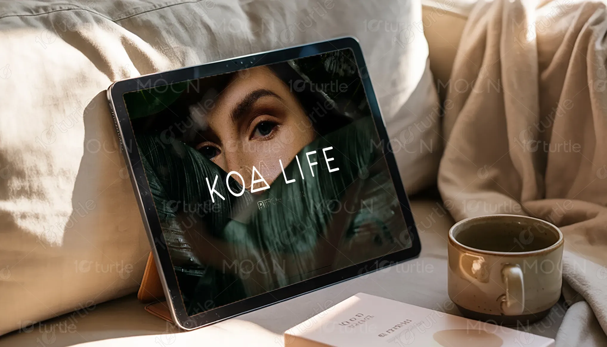
The KOA LIFE pitch deck embraces a modern, feminine aesthetic that merges nature with science. Through rich imagery, clean typography, and a muted yet vibrant color palette, the design reflects the brand's core values—purity, empowerment, and sustainability. Strategic use of white space, earthy textures, and product close-ups creates an immersive storytelling experience. The design balances elegance with function, guiding investors and partners through KOA LIFE’s mission and achievements with clarity, warmth, and visual confidence.
Pitch Deck Design
Graphic Design
Industry
Fashion, Beauty & Lifestyle
Tools we used


Project Completion
2025
Key Market
Global
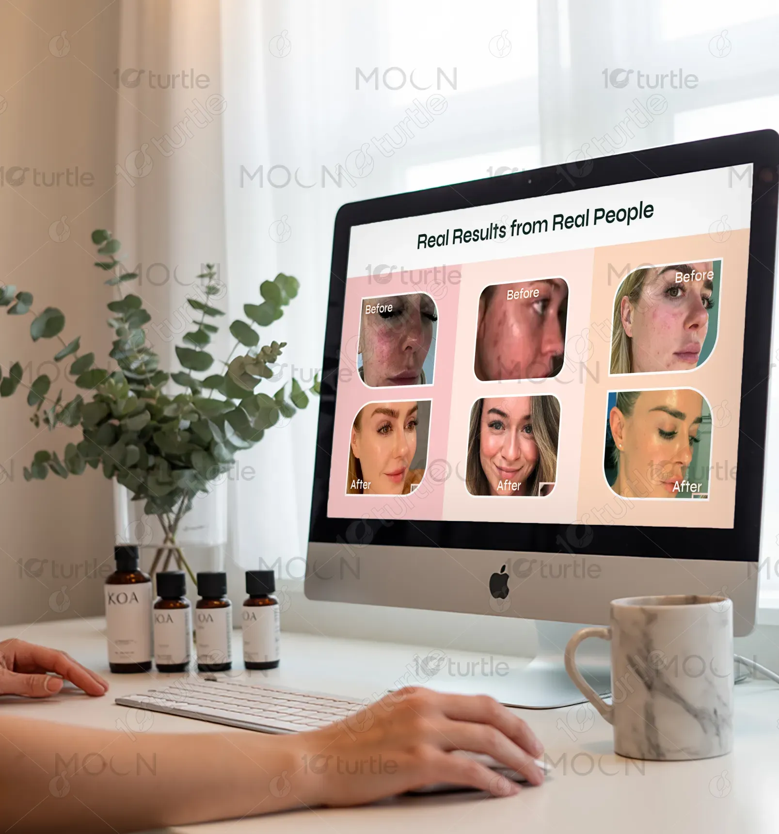
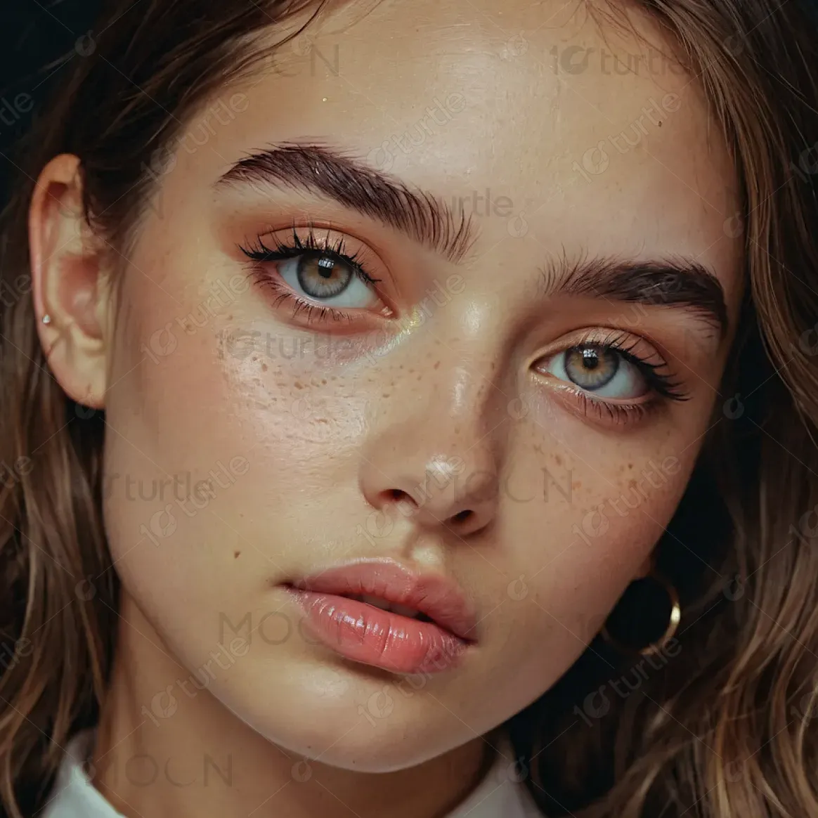
KOA LIFE is a doctor-formulated, vegan skincare brand developed to empower women through clean, plant-based beauty. The pitch deck showcases the brand's unique position in the conscious beauty movement—offering science-backed skincare that is cruelty-free, chemical-free, and sustainably sourced. Designed for modern wellness consumers, KOA LIFE delivers potent formulas with visual storytelling that highlights emotional connection, brand credibility, and product effectiveness. Its appeal lies in blending luxurious self-care with an accessible, community-driven ethos.
Industry
Fashion, Beauty & LifestyleWhat we did
Pitch Deck DesignGraphic DesignPlatform
-One major challenge was balancing the clinical credibility of KOA LIFE’s formulations with the brand’s emotional, nature-based identity. Many wellness brands lean too heavily into either scientific sterility or botanical clichés, resulting in a disconnect with modern, values-driven consumers. KOA LIFE needed a visual system that communicated trust, innovation, and warmth simultaneously—without overwhelming the viewer or diluting the core message. The design also had to feel inclusive and empowering, avoiding outdated beauty stereotypes.
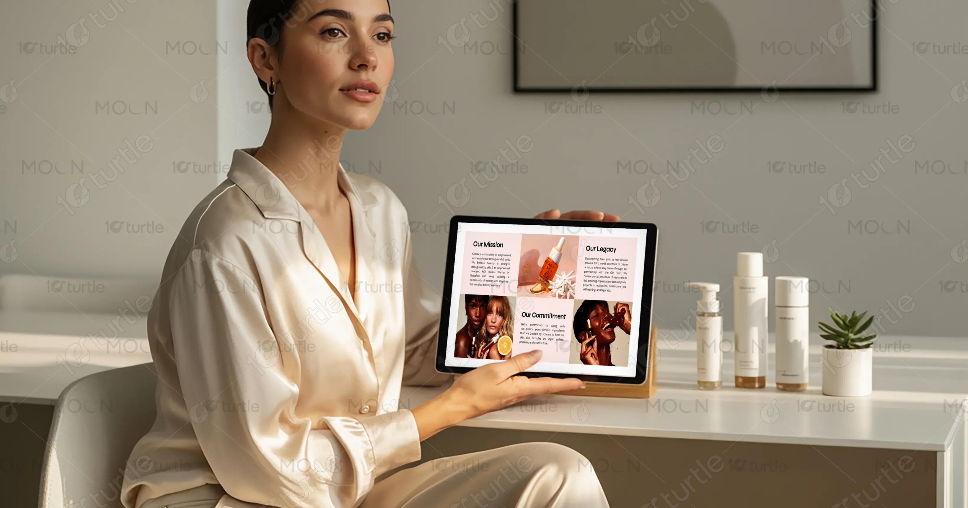
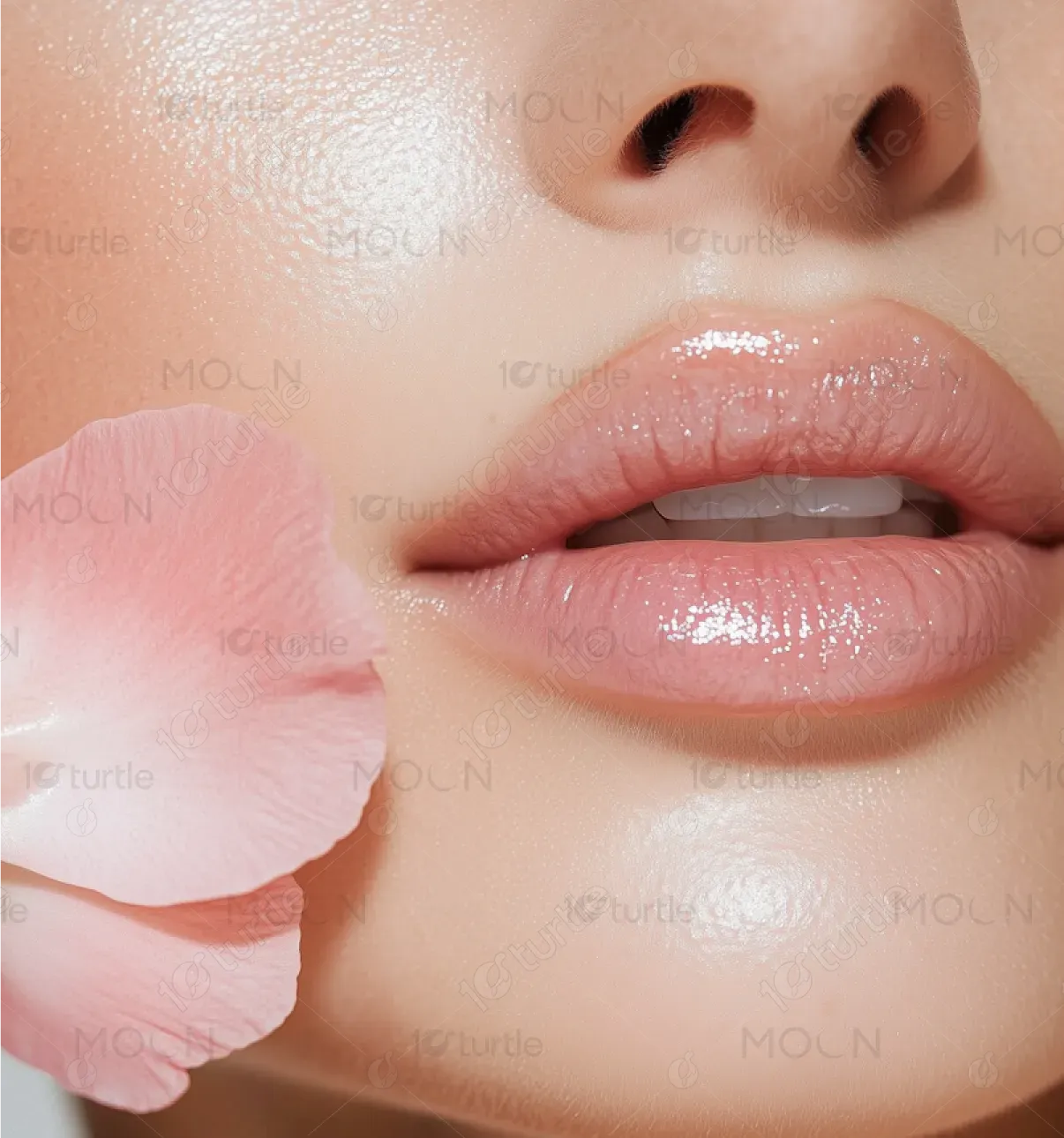
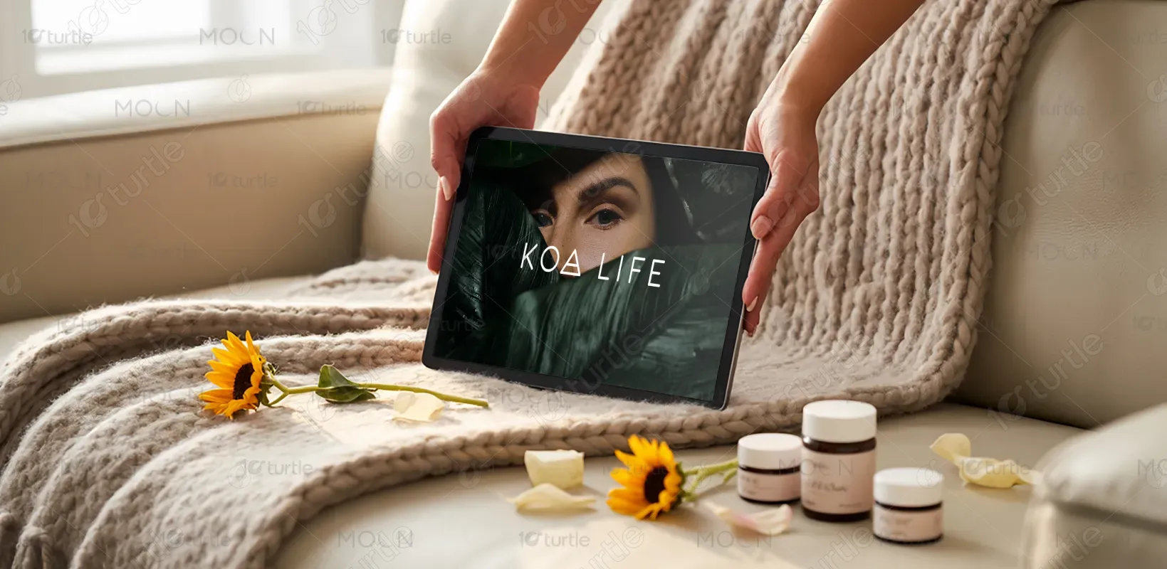
We developed a design language that speaks both to science and soul—using clean, rounded typography paired with lush imagery and soft organic shapes. High-resolution product shots with natural elements (sunflowers, citrus, and skin contact) help root the brand in nature, while structured layouts and grid systems bring clarity and professionalism. Real women, warm tones, and empowering copy humanize the experience, while investor-focused slides remain data-driven and easy to navigate. This harmony elevates the pitch beyond a product—it’s a movement.
The long-term vision is to establish KOA LIFE as a pioneer in conscious beauty, visually recognized for empowering women and honoring natural science. As the brand expands globally, the design system will scale across campaigns, packaging, digital platforms, and investor materials—maintaining a strong, consistent presence. The goal is to create a legacy aesthetic that future-proofs the brand, making KOA LIFE synonymous with clean beauty innovation, female leadership, and botanical science.
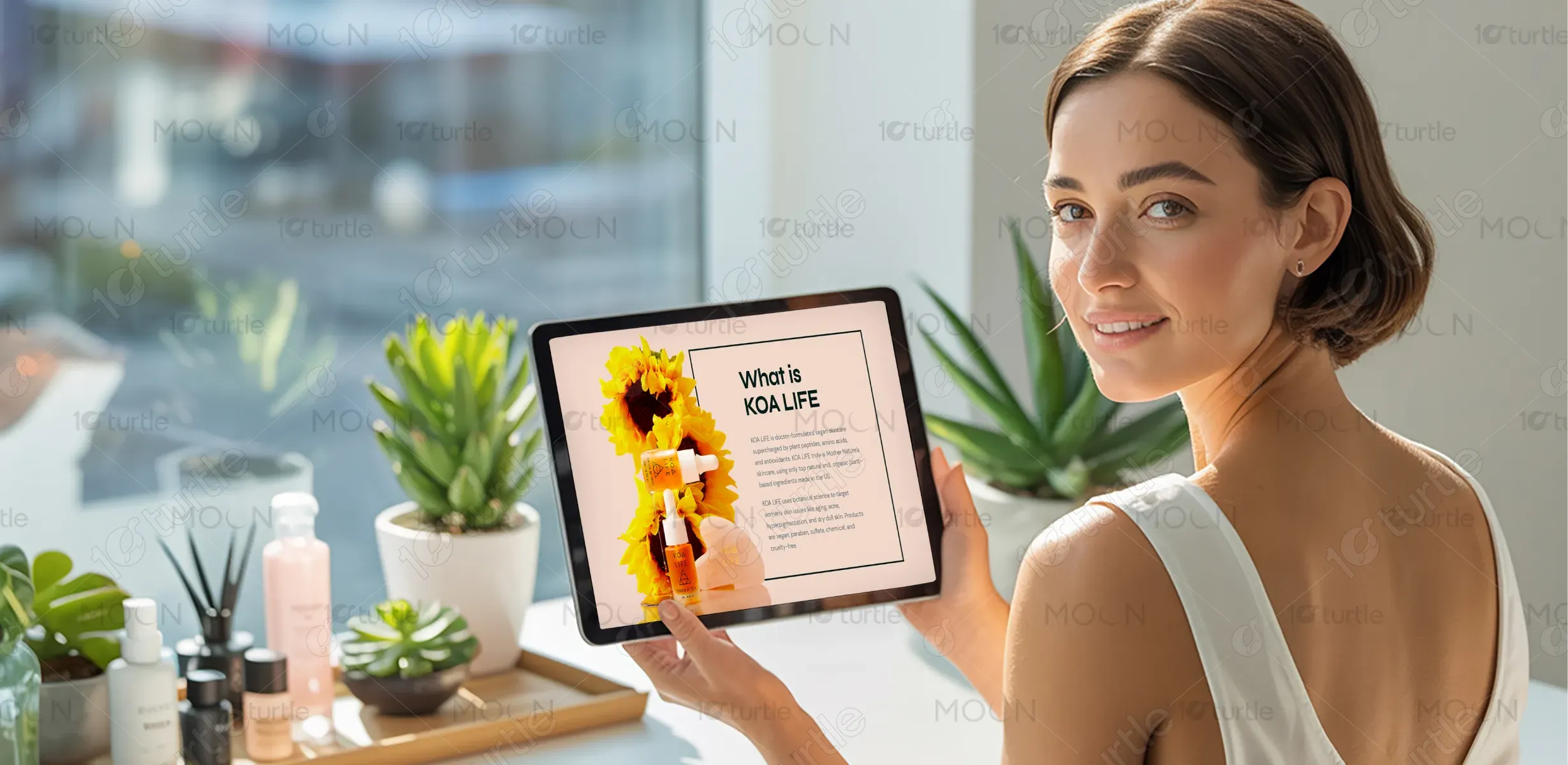
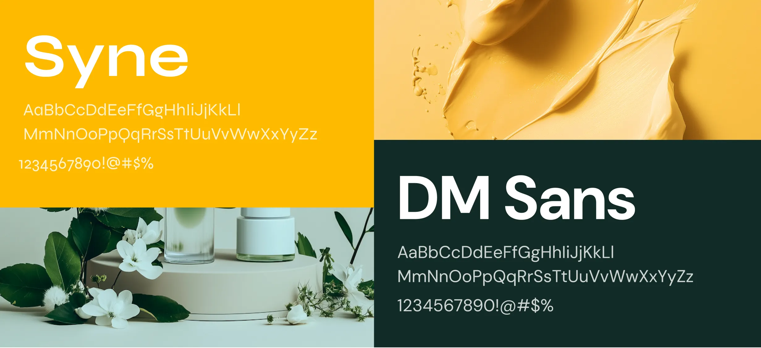
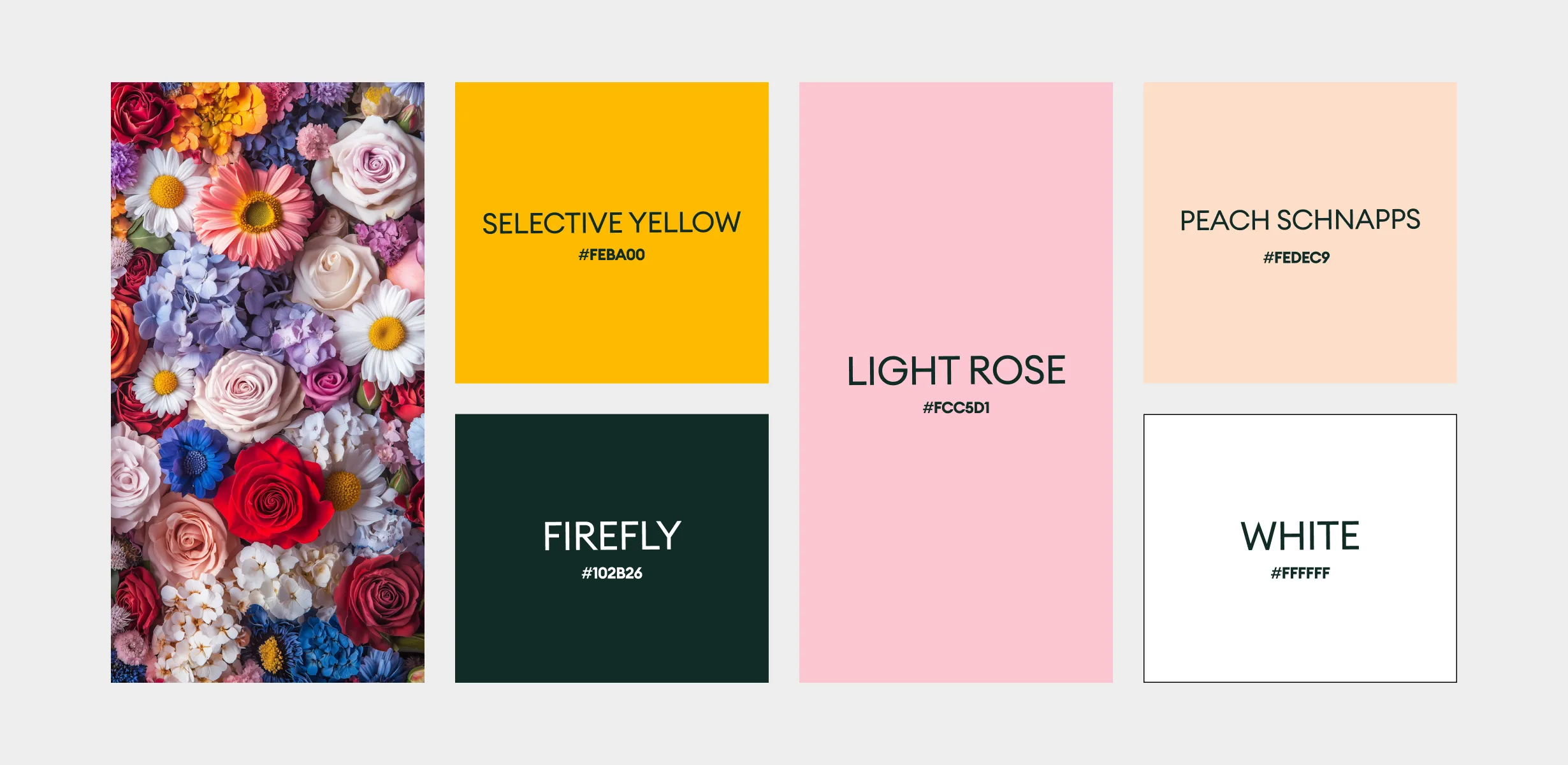
The KOA LIFE color palette is a fusion of soft naturals and vibrant highlights—peachy pinks, sunburst yellows, creamy neutrals, and clean whites. These tones evoke warmth, health, and radiance, while aligning with KOA’s plant-powered identity. Yellow signifies energy, youth, and clarity; soft blush adds approachability and feminine strength. White space ensures breathability and balance, allowing content and visuals to shine. Altogether, the palette supports the brand’s visual storytelling while enhancing emotional engagement.