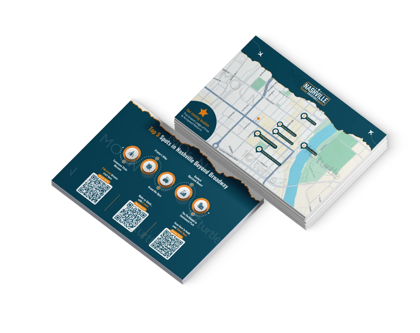
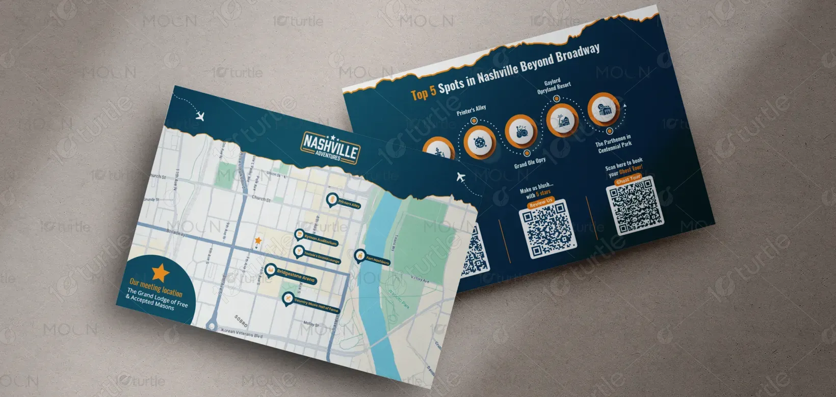
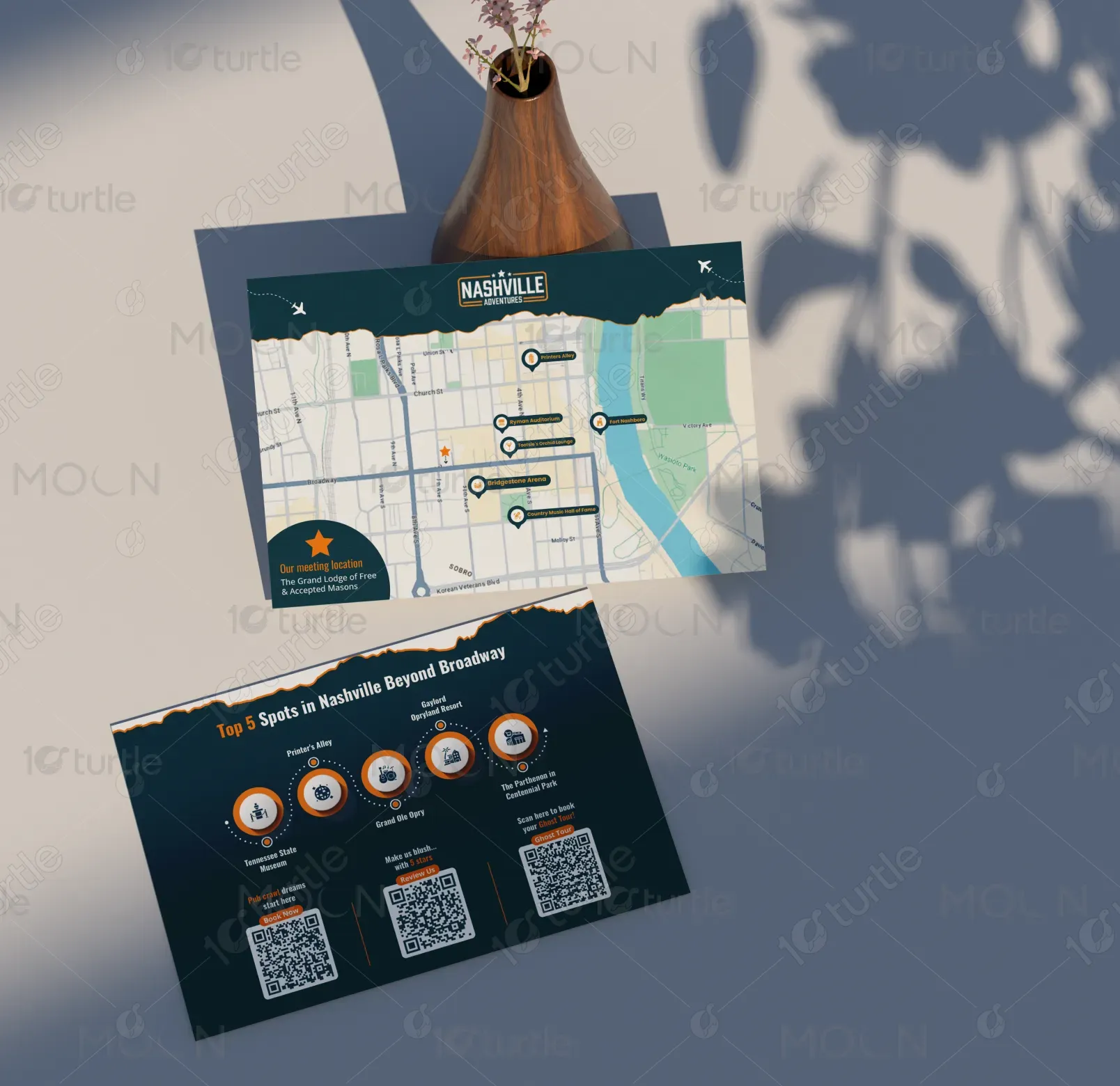
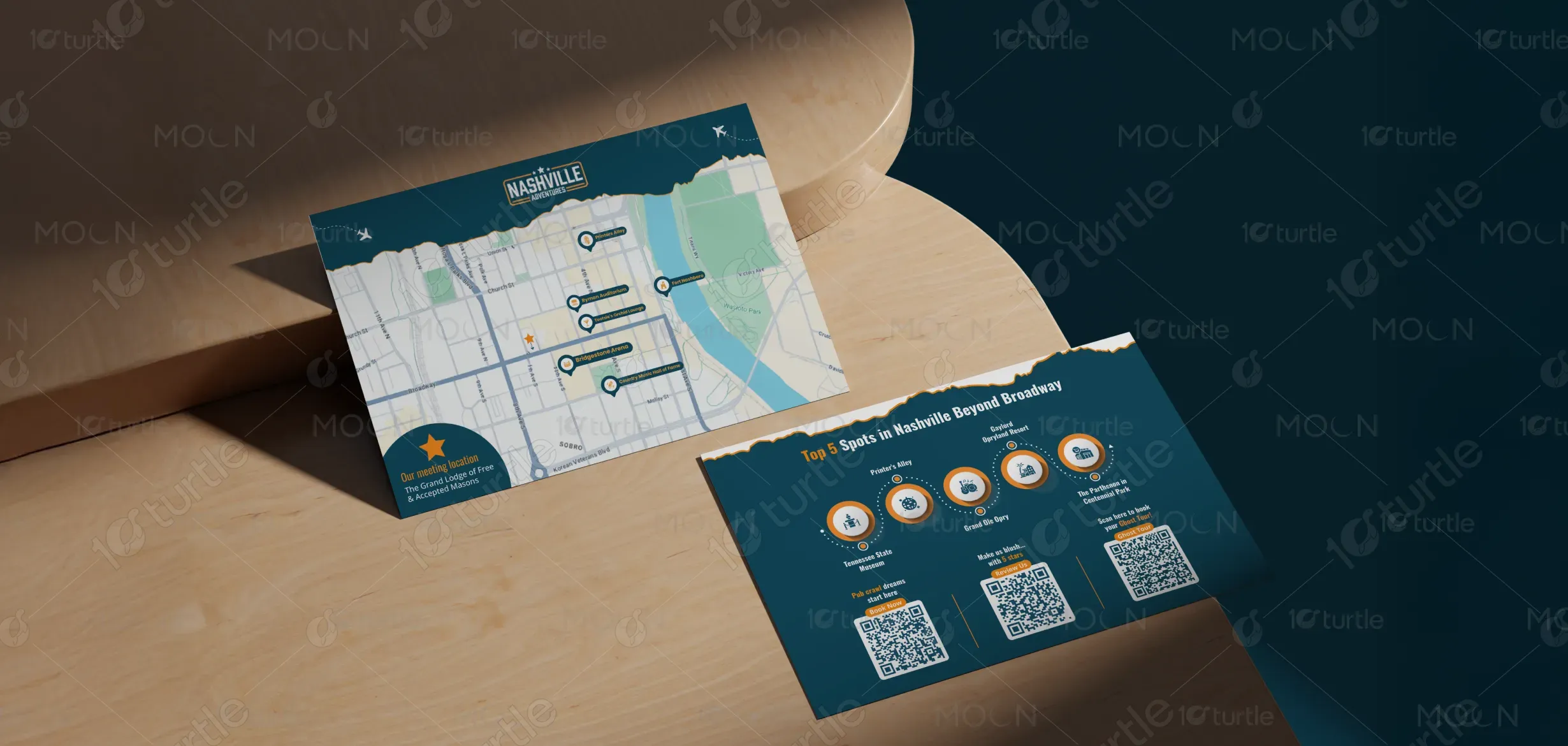
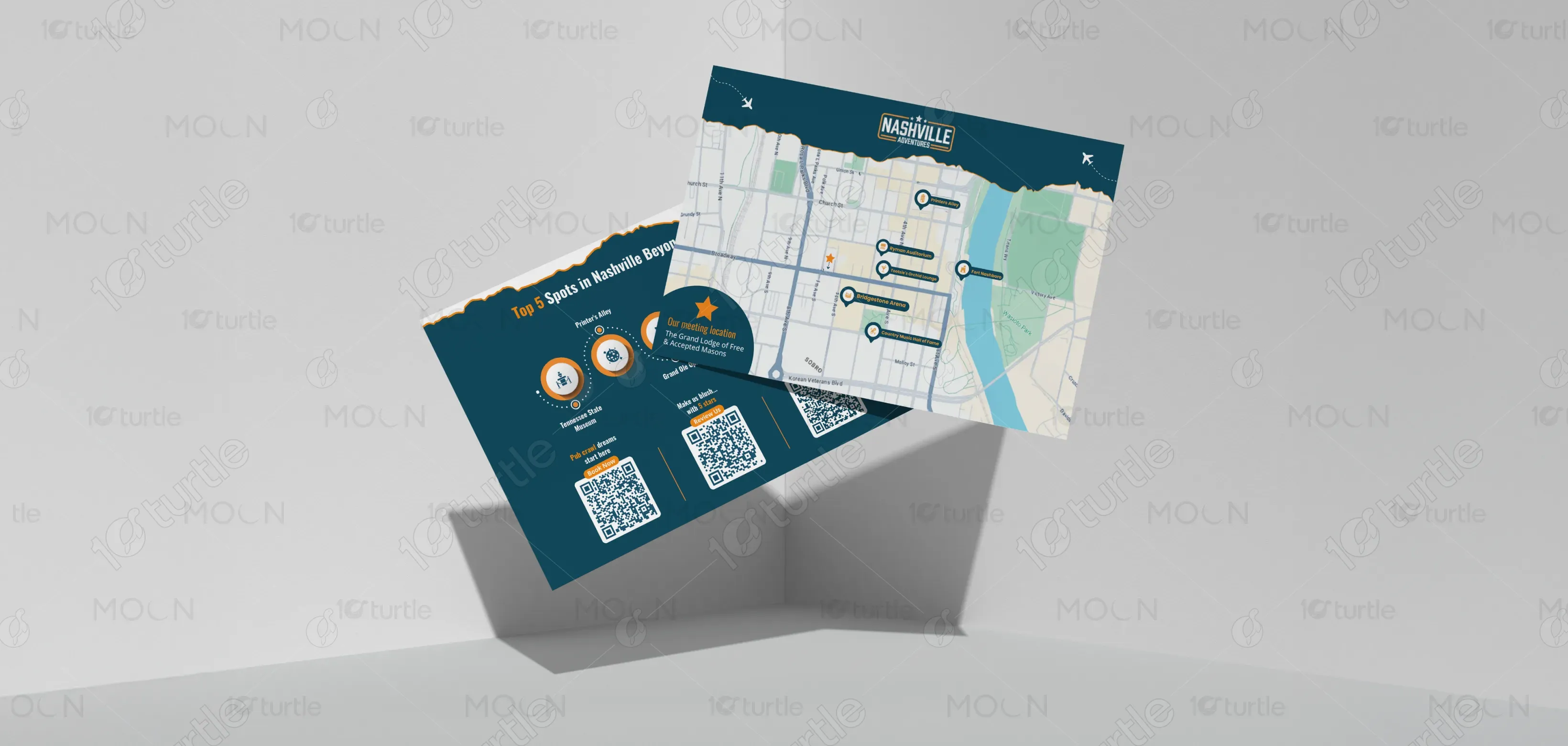
The design captures the essence of Nashville’s vibrant, off-the-beaten-path attractions, focusing on simplicity and elegance. Bold typography and modern iconography are complemented by a rich blue and orange color scheme, reflecting the city’s energy and the spirit of adventure. The layout highlights key spots with clean, minimalistic icons and crisp images, making navigation through the content seamless. QR codes are strategically placed for easy access to bookings, reviews, and further information, ensuring a smooth user experience
Postcard Design
Graphic Design
Industry
Travel, Tourism & Experiences
Tools we used


Project Completion
2025
Key Market
Global
This postcard introduces Nashville’s lesser-known but must-visit spots, inviting users to discover the city beyond Broadway. From historic landmarks to unique experiences, the design aims to pique curiosity and provide essential information at a glance. With its clean structure, visitors are encouraged to scan the QR codes for more details, from booking a ghost tour to exploring local attractions. Its bold call-to-action and user-centric design are tailored to an adventurous spirit seeking new Nashville experiences.

Industry
Travel, Tourism & ExperiencesWhat we did
Postcard DesignGraphic DesignPlatform
-Nashville's vibrant tourist scene is often overshadowed by the overexposure of Broadway. While Broadway offers a bustling nightlife experience, visitors miss out on Nashville's hidden gems like Printer’s Alley and the Gaylord Opryland Resort. The key challenge is to redirect attention from the typical tourist hotspots to these unique spots, offering a broader and more enriched experience. A gap exists in effective promotion and easy access to these alternatives, limiting tourists' exploration options.
This design provides a solution by offering a clear and attractive visual guide to Nashville's hidden spots. The use of iconography, coupled with intuitive QR codes for quick bookings and reviews, allows users to instantly access details about these attractions. The QR-driven approach ensures seamless interaction, making it easier for tourists to explore the lesser-known but valuable parts of Nashville. By simplifying the discovery process, this design enhances the city's overall tourism experience.

The goal is to establish Nashville Adventures as the go-to brand for exploring Nashville beyond the popular Broadway strip. Over time, it aims to build a community of travelers who are passionate about discovering unique experiences. This vision extends to continually evolving the product offerings, enhancing the app and website for a fully integrated experience, and fostering a sense of discovery and local pride through curated tours and experiences.

The design uses a sophisticated combination of black, white, and warm orange accents. Black signifies authority, reliability, and professionalism. White embodies clarity, simplicity, and transparency—crucial values in healthcare communication. The orange accent introduces energy, innovation, and approachability, ensuring the brand feels both credible and forward-looking. The soft gradient watermark complements the palette with subtlety, reinforcing elegance without distraction. This balanced color scheme reflects Diasome’s commitment to trust, innovation, and patient-focused care, making the design both appealing and functional.