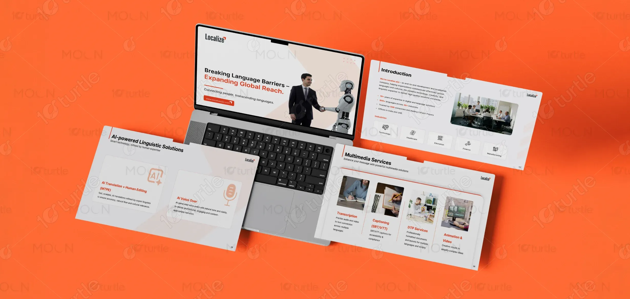
The design focuses on presenting AI-powered services in a clean, professional, and engaging way. It uses modern typography with clear hierarchies to guide the viewer’s attention. The use of vibrant accent colors (primarily shades of red and orange) highlights key areas, making the message stand out. The layout is minimalist, ensuring the core message is delivered without distractions. Icons and illustrations are used to reinforce the message of cutting-edge AI services while maintaining consistency across slides for a coherent visual flow.
PPT Design
Graphic Design
Industry
Technology, SaaS & Startups
Tools we used


Project Completion
2026
Key Market
Global
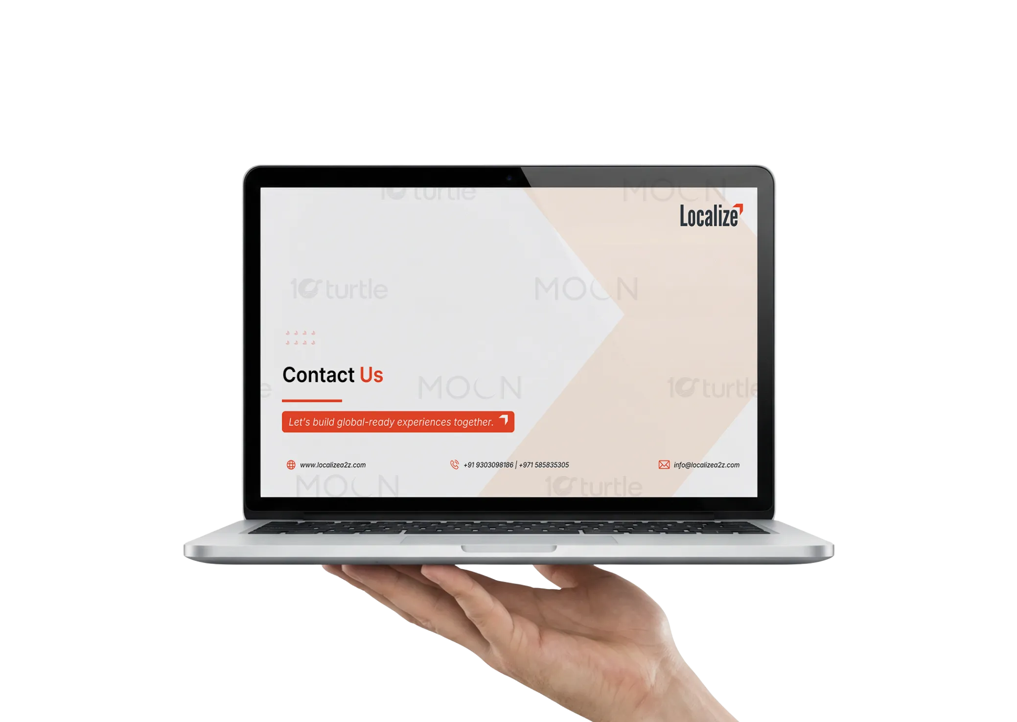
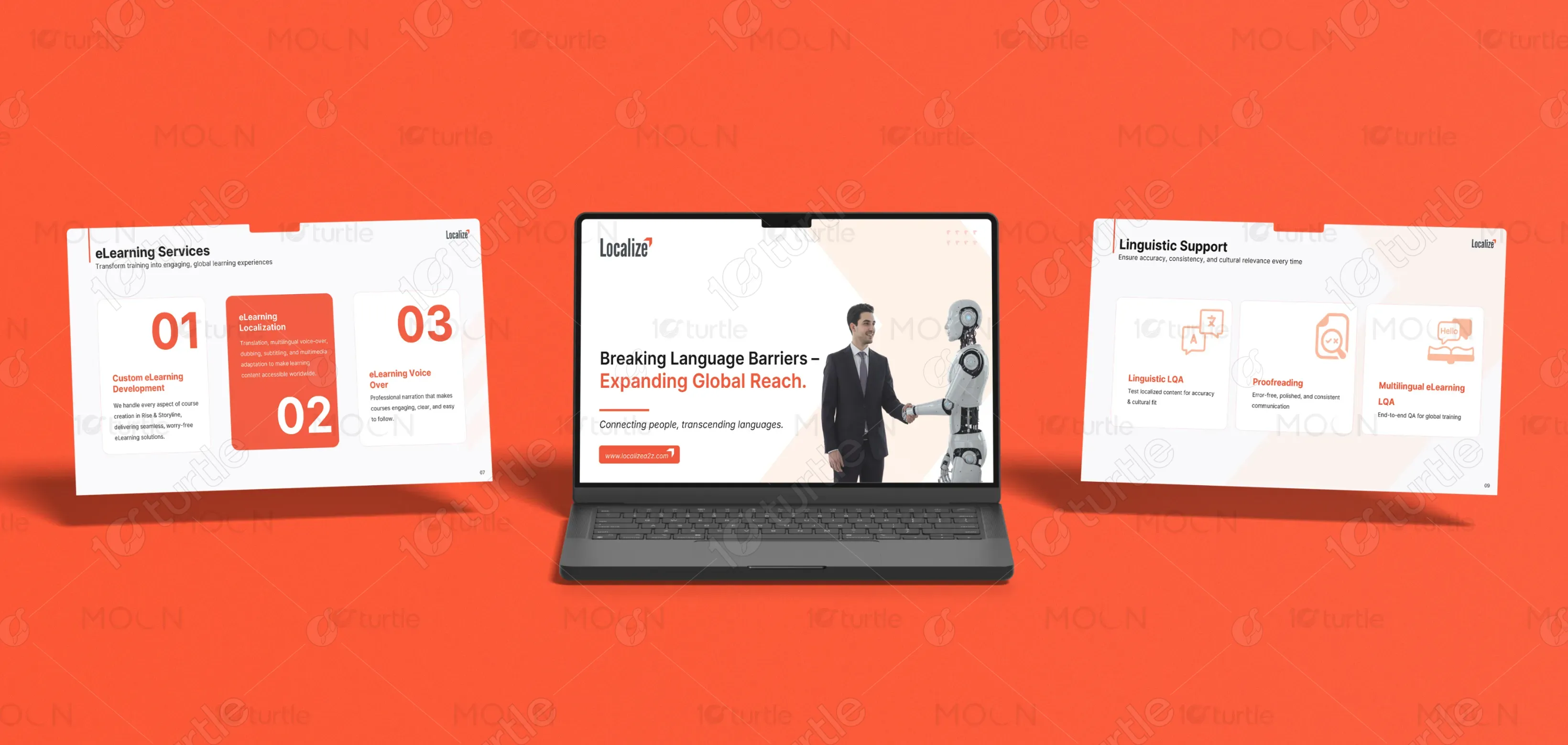
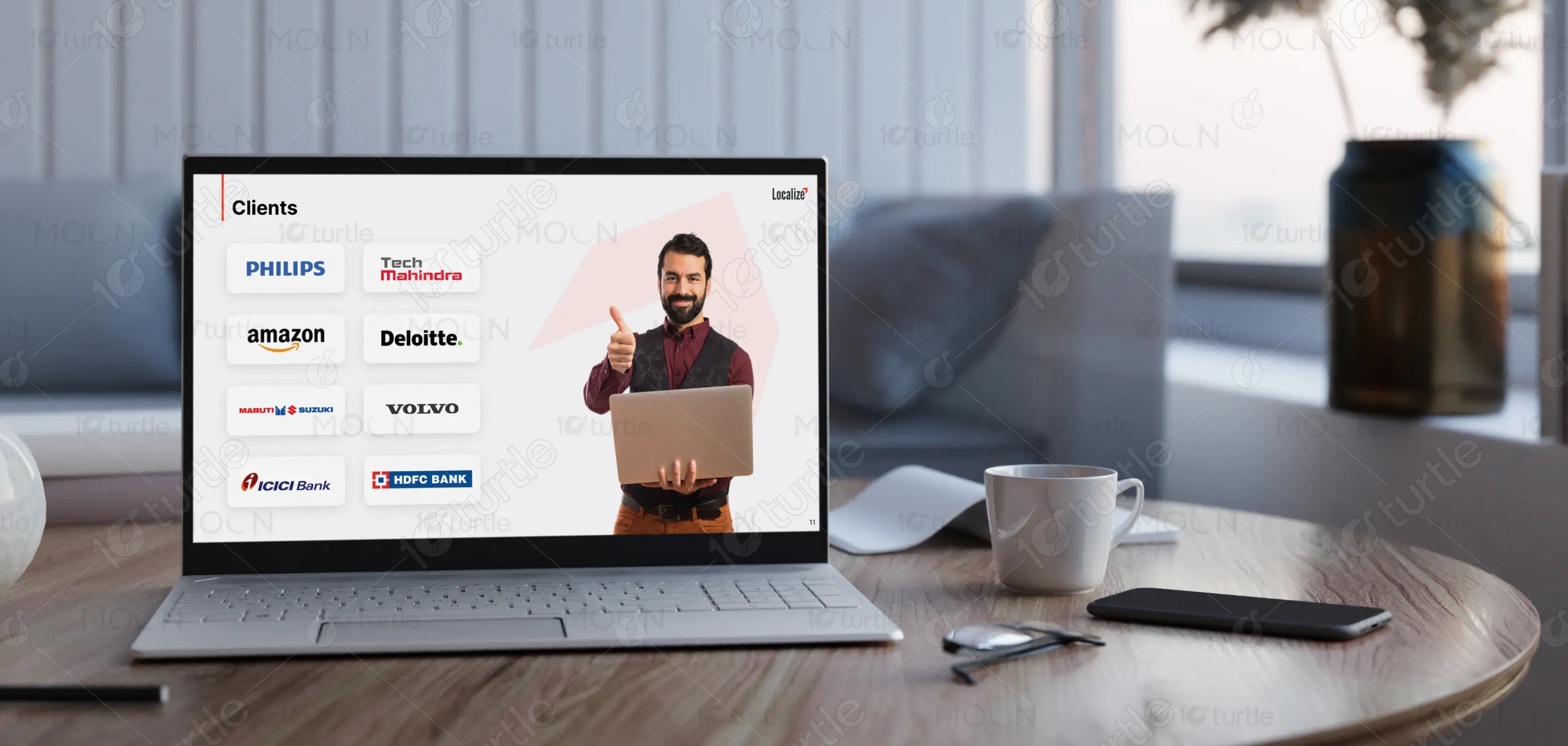
This design represents the services of a linguistic solutions provider that combines AI with human expertise. The brand aims to offer advanced, scalable translation and voice-over services, catering to industries that require precise linguistic accuracy and cultural relevance. The design’s goal is to communicate the sophistication of the services while making them approachable and easily understood by diverse audiences.

Industry
Technology, SaaS & StartupsWhat we did
PPT DesignGraphic DesignPlatform
-In the translation and linguistic service industry, many users struggle with impersonal or inaccurate translations, lack of cultural sensitivity, and the time-consuming nature of manual editing. Additionally, businesses often face challenges in providing high-quality multilingual voice-over content that resonates with a global audience. The core issue is maintaining a balance between speed, accuracy, and personalization in multilingual communications.
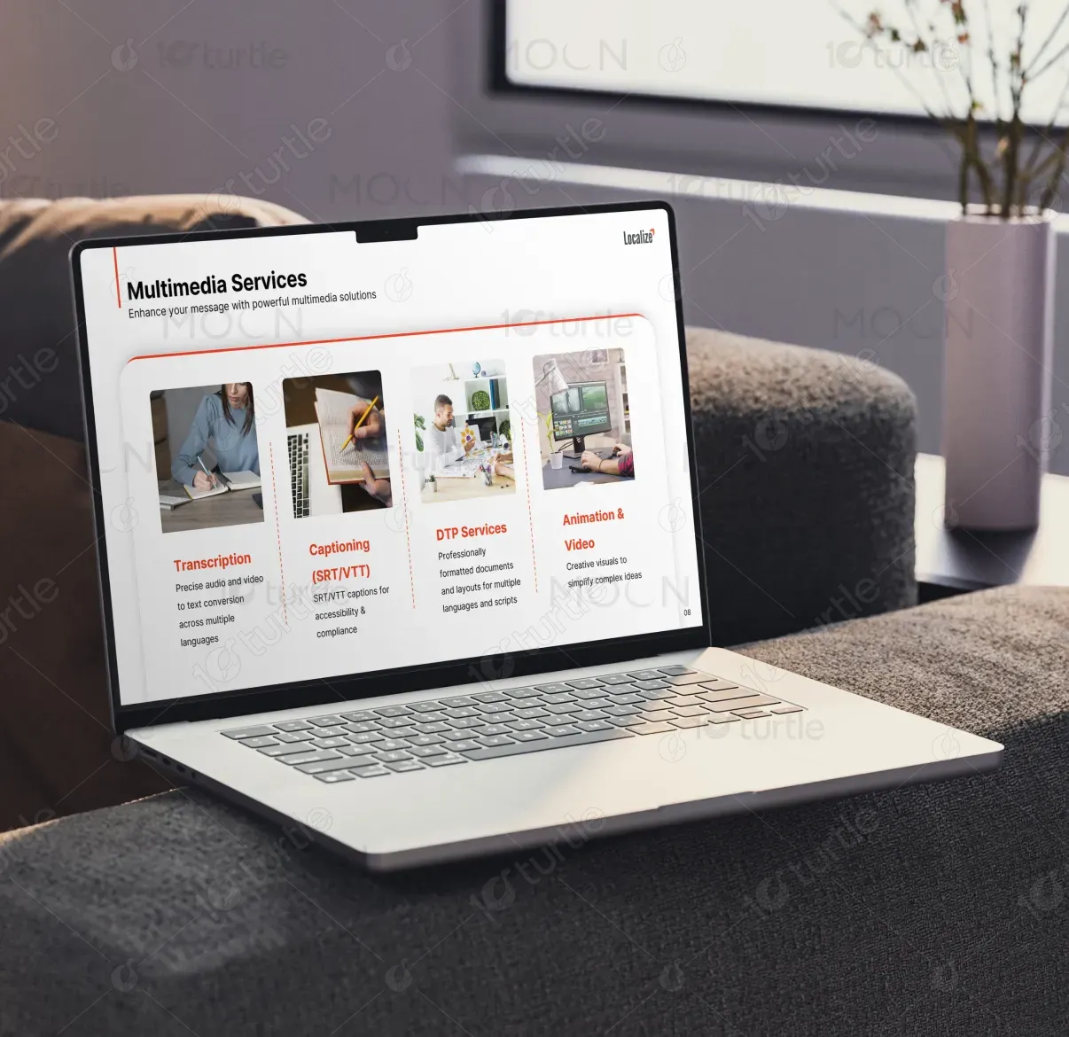
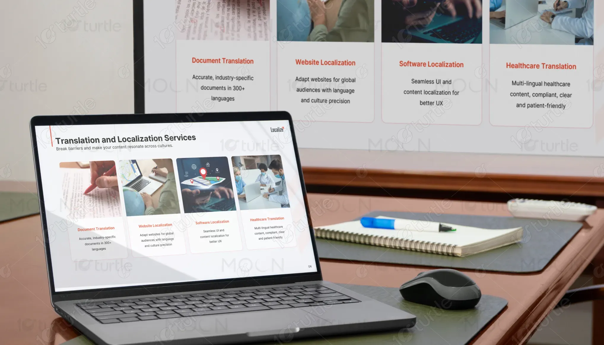
The design addresses these challenges by emphasizing the combination of AI technology with human expertise, highlighting how this approach ensures high-quality, accurate, and culturally relevant outcomes. It showcases two primary offerings: AI Translation + Human Editing and AI Voice Over. The design’s clean, user-friendly layout with clear messaging ensures that users can easily understand how these services solve their problems and meet industry standards.

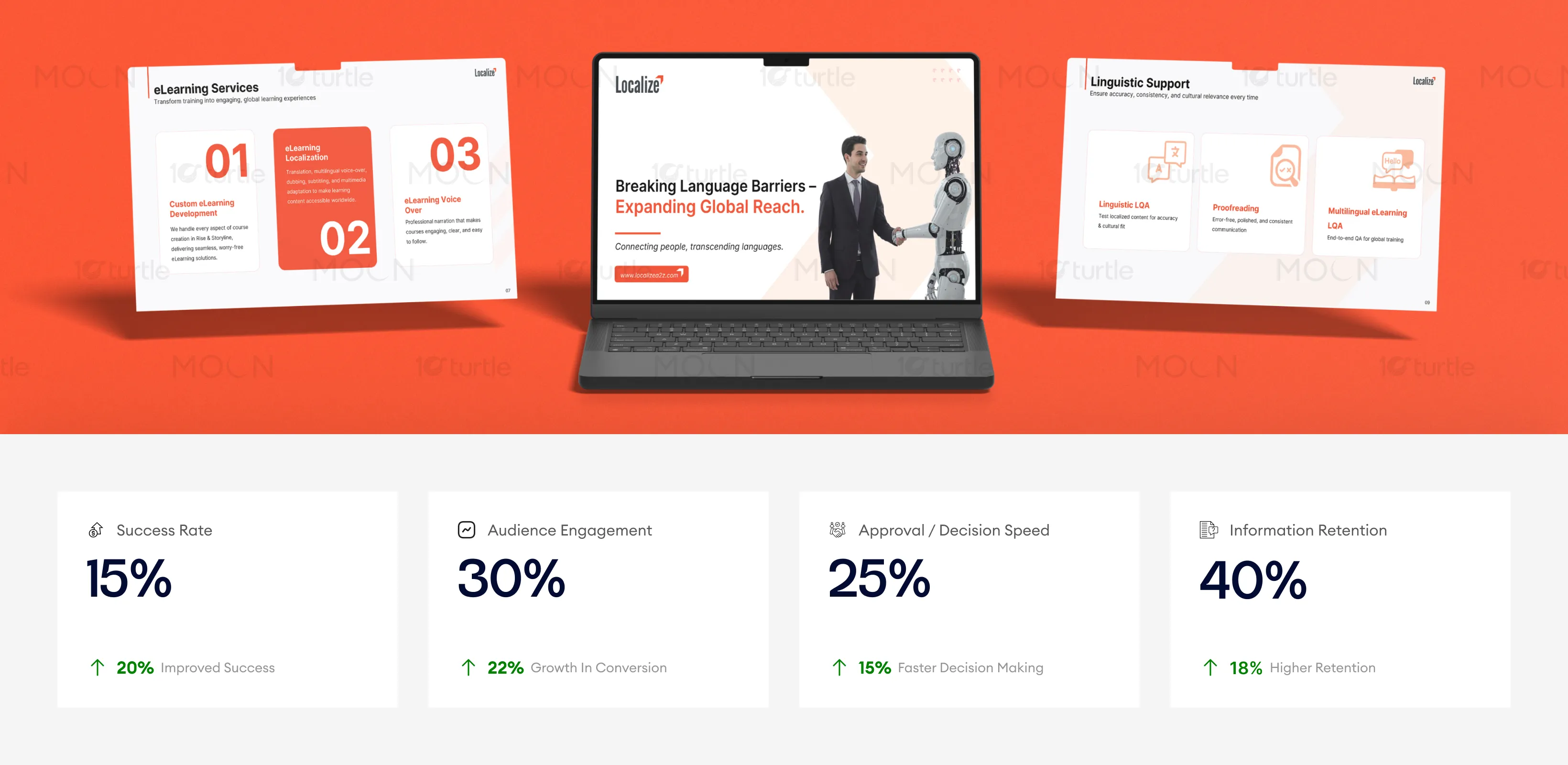
The design efficiently communicates AI-powered services through clear, engaging visuals and structured content, ensuring that the message is easy to absorb. The clean, modern layout and effective use of accent colors improve conversion rates and decision-making speed. By maintaining focus on the core message without distractions, the design leads to better audience engagement and information retention, which ultimately enhances business outcomes.
The long-term vision for the brand is to establish itself as a leader in the AI-powered linguistic solutions market, expanding its reach globally. By integrating advanced AI technology with human expertise, the brand aims to continuously evolve to meet the needs of a multilingual world, ensuring consistent service delivery across various languages and mediums. The design supports this vision by positioning the brand as both innovative and reliable, ensuring future scalability and adaptability across diverse customer touchpoints.
The chosen color palette combines warm tones (reds, oranges) with a neutral background to evoke feelings of energy, innovation, and trust. These colors align with the brand's energetic and forward-thinking persona. The visual language utilizes simple yet striking icons, clear typography, and thoughtful spacing to enhance readability and engagement. The consistent use of the color scheme and visual elements helps create a cohesive and professional brand identity that resonates across various mediums and environments.