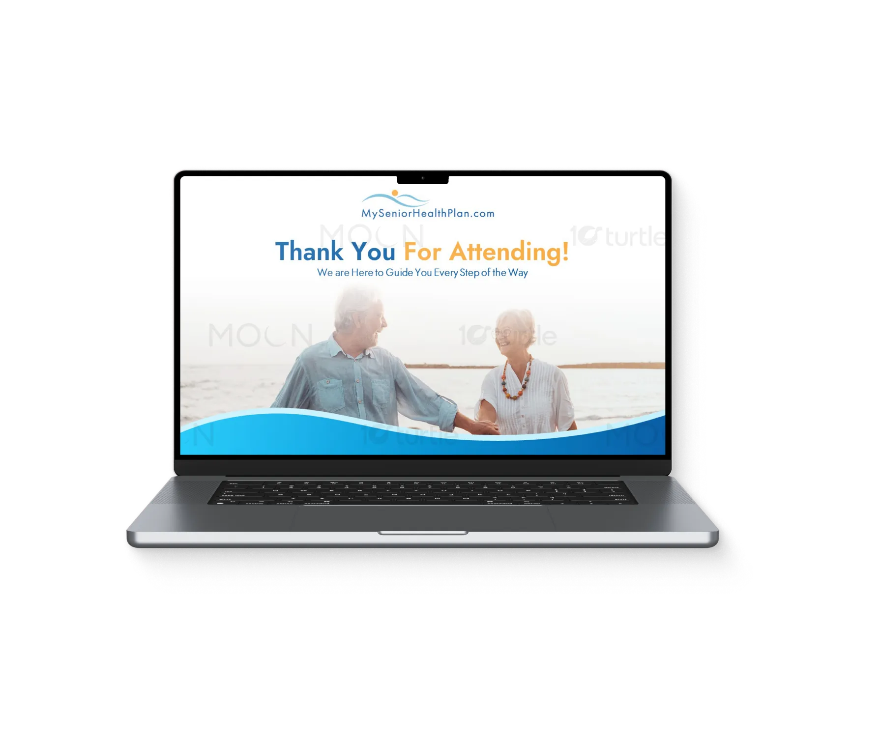
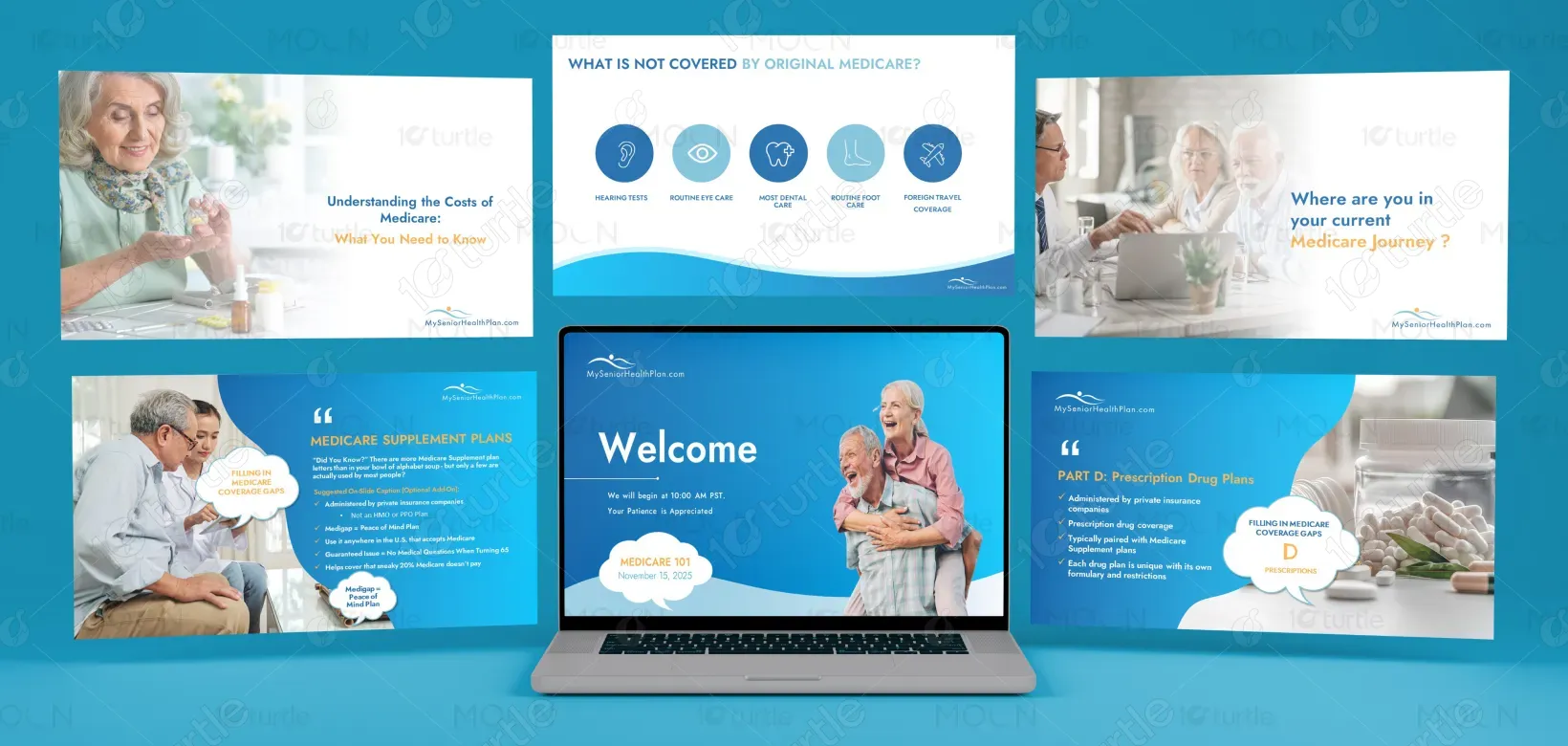
The design follows a clean and approachable visual style tailored for a senior audience, using soft blue tones, ample white space, and warm imagery to create a sense of trust and clarity. A clear visual hierarchy with bold headings and structured content helps simplify complex Medicare information, while consistent typography and minimal, relatable visuals ensure easy readability and understanding throughout the presentation. Overall, the design creates a comfortable and engaging learning experience that supports better information retention.
PPT Design
Graphic Design
Industry
Healthcare & Wellness
Tools we used


Project Completion
2025
Key Market
Global
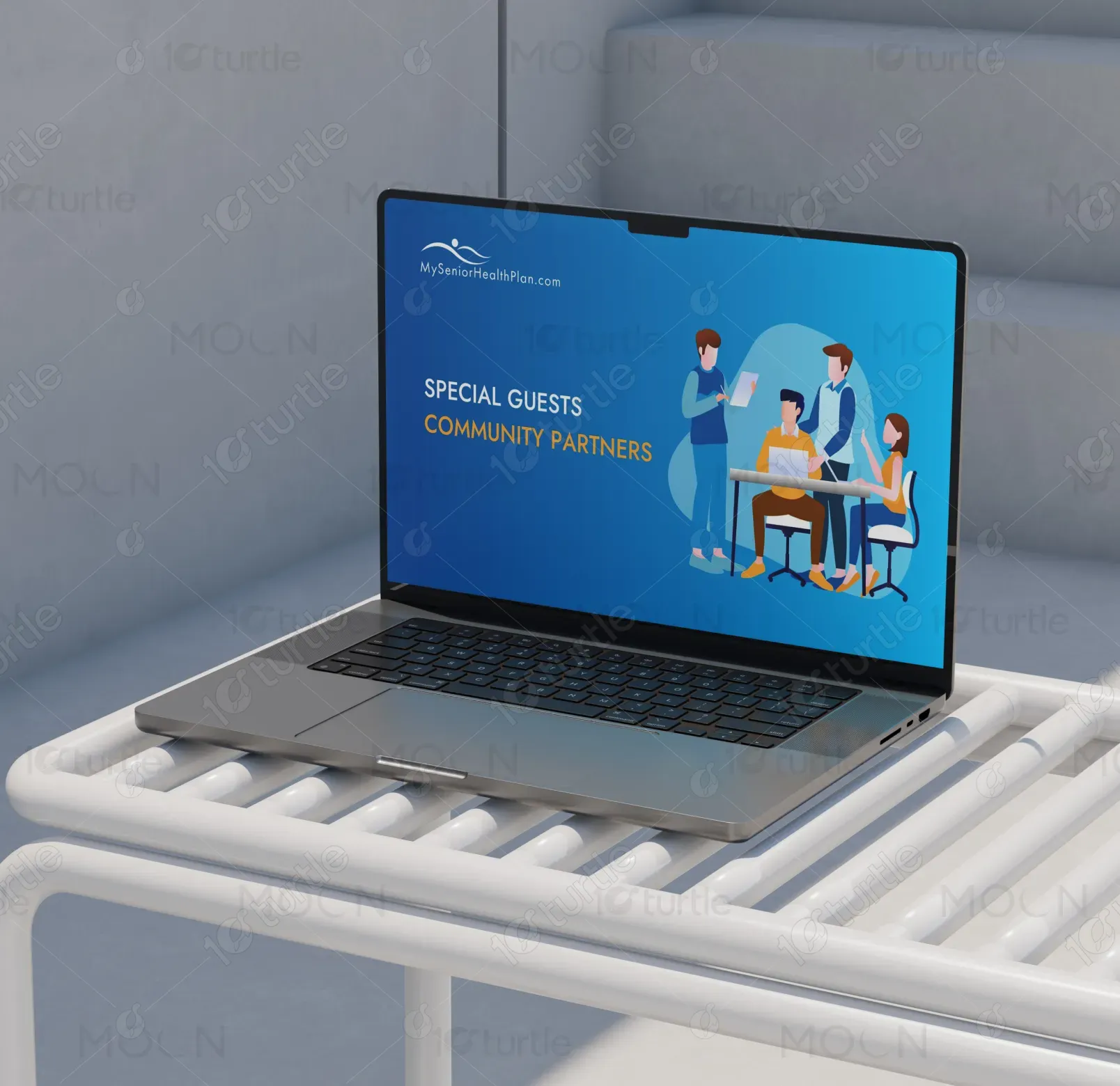
This presentation represents an educational Medicare webinar designed to help individuals understand healthcare coverage options, eligibility, costs, and enrollment processes. It positions the brand as a trusted, independent Medicare resource offering unbiased guidance and long-term support. The primary goal is to educate, simplify decision-making, and build confidence among users navigating Medicare for the first time or reviewing their options. It aligns with the healthcare advisory industry, focusing on clarity, accessibility, and informed decision-making.

Industry
Healthcare & WellnessWhat we did
PPT DesignGraphic DesignPlatform
-Medicare is often perceived as complex, overwhelming, and difficult to navigate, especially for first-time beneficiaries. Users frequently struggle with understanding coverage options (Parts A, B, C, and D), confusion around costs, eligibility, and enrollment timelines, and difficulty comparing plans to choose the best option. Additionally, limited trust in biased or sales-driven information further complicates decision-making. As a result, these challenges can lead to missed deadlines, financial penalties, inadequate coverage, and ultimately impact users’ healthcare security and peace of mind.
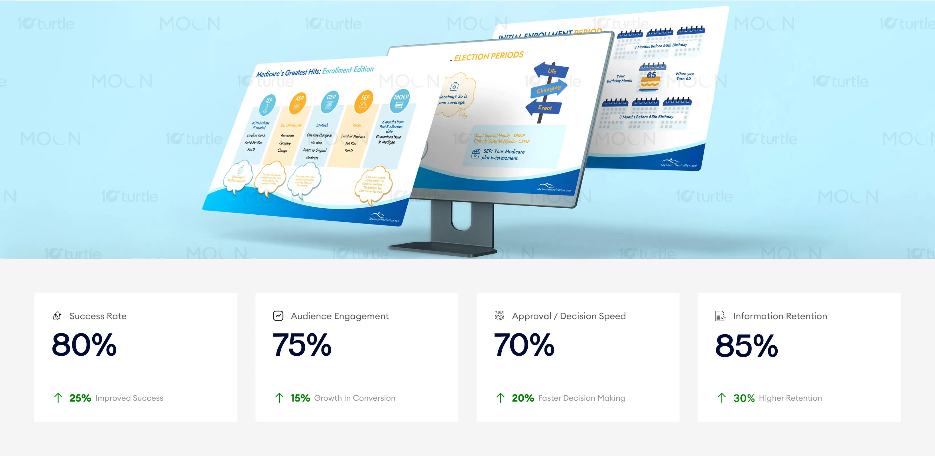
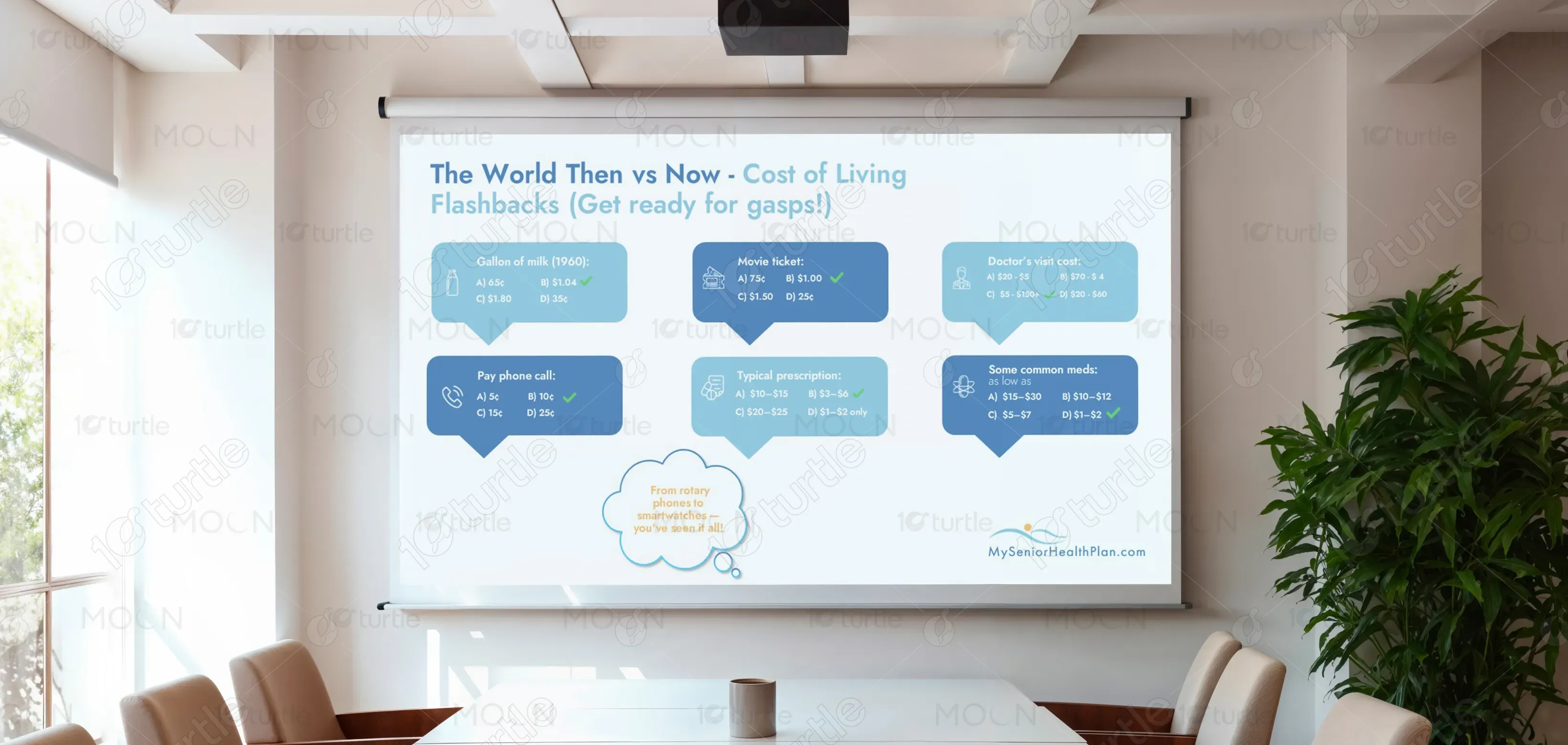
The design addresses these challenges through a user-centric and educational approach by using a structured content flow that moves from basic to advanced topics, making information easier to understand. Clear visual segmentation highlights key areas like eligibility, costs, and coverage, while simplified language and relatable storytelling improve engagement. A consistent visual hierarchy guides user attention and reduces cognitive overload, supported by messaging that emphasizes guidance and assistance. Together, these elements transform complex Medicare information into a clear, engaging, and easy-to-understand experience, improving user comprehension and confidence.

The design delivers strong engagement and information retention by presenting complex content in a simple and relatable way, ideal for a senior audience. Its clear visual hierarchy and warm, trustworthy tones help improve comprehension and decision-making speed. To further increase these metrics, the presentation could incorporate interactive elements to enhance real-time engagement and track user actions more effectively.
The long-term vision is to position the brand as a leading, trusted Medicare guidance partner that simplifies healthcare decisions nationwide. The design supports scalability across webinars, digital platforms, print materials, and consultations, ensuring consistency in communication. It aims to build a strong emotional connection with users by combining professionalism with empathy, ultimately establishing the brand as a go-to resource for lifelong Medicare support and education.
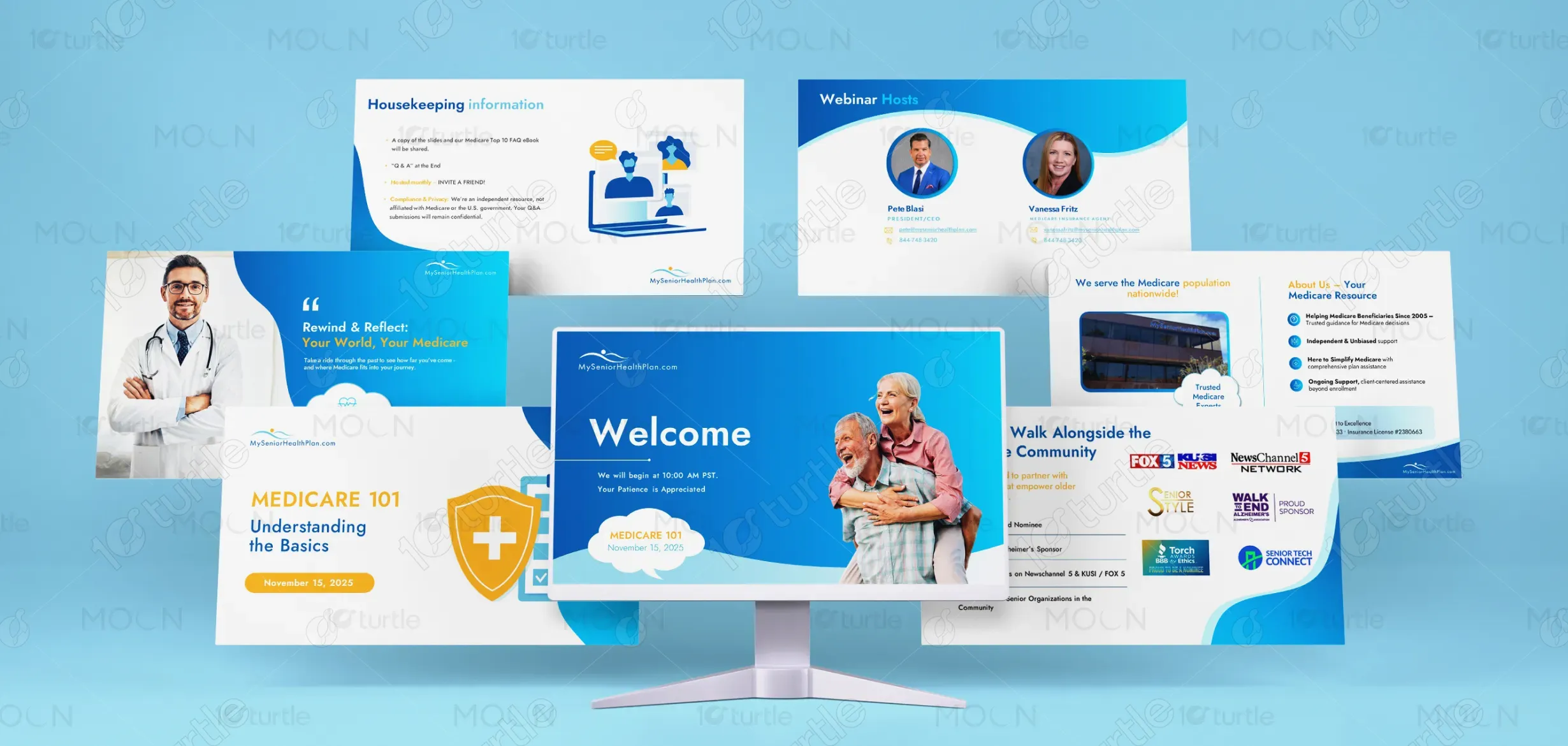

The visual language is built around a calming and trustworthy blue palette, complemented by white and subtle accent colors like orange for highlights. Blue conveys reliability, healthcare trust, and professionalism, while white space enhances readability and reduces visual clutter. Soft gradients and curved shapes add a friendly and modern touch, making the content feel less clinical and more approachable. Supporting imagery of seniors, healthcare professionals, and everyday scenarios reinforces relatability and emotional connection, ensuring the design remains both informative and human-centered.