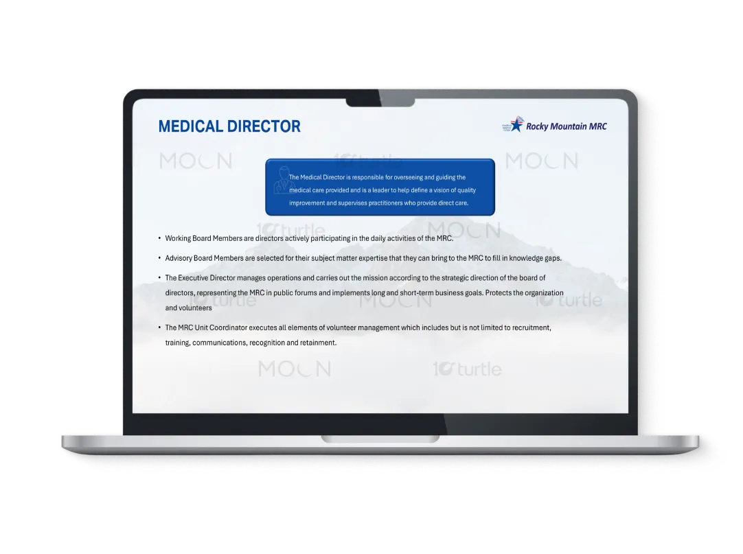
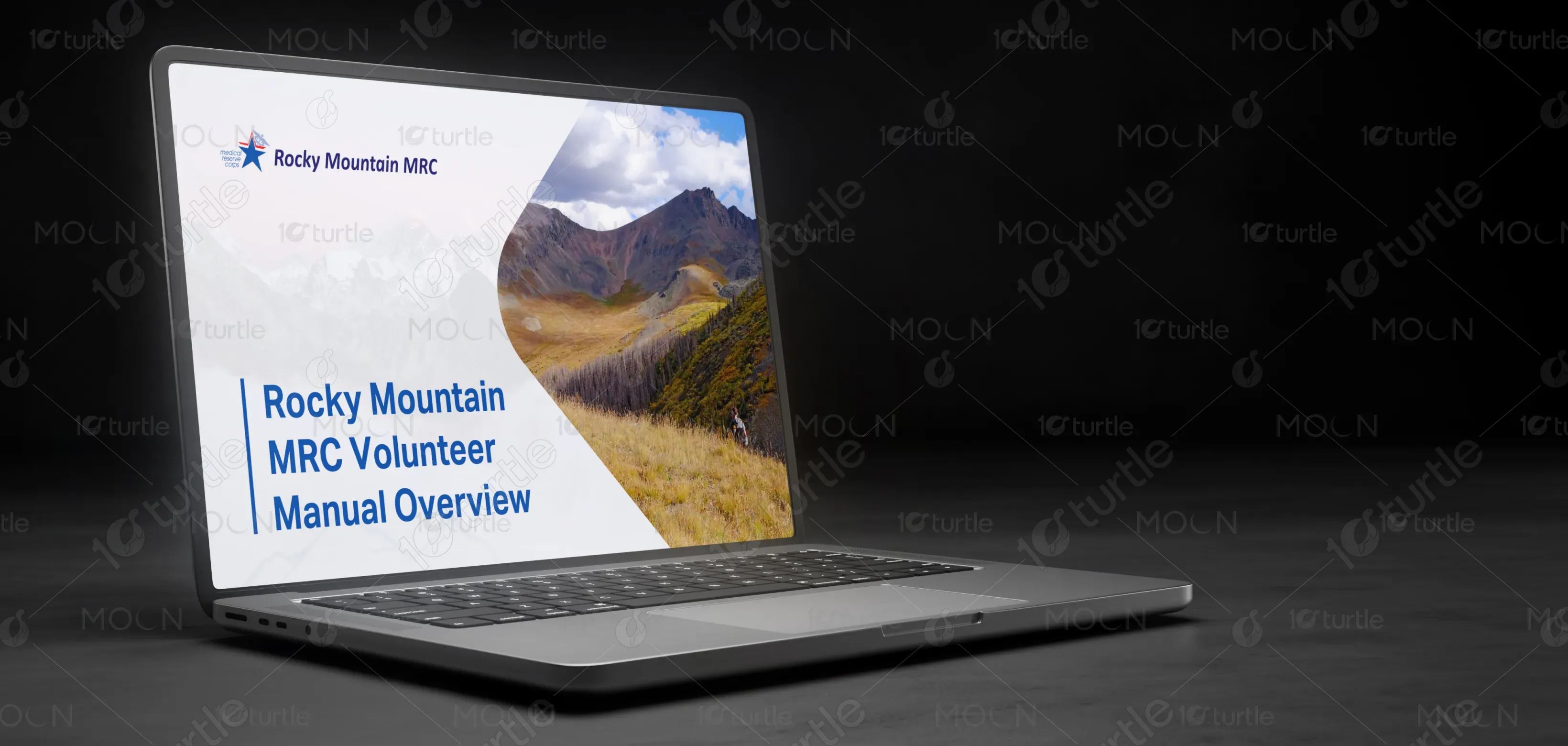
The design focuses on creating a professional, clear, and welcoming experience. The use of minimalist elements paired with a modern color palette ensures that the content is presented in a structured, easy-to-navigate way. The subtle mountain imagery reinforces the connection to Rocky Mountain MRC's community-oriented values. With its clean lines and organized content blocks, the design ensures the information is easily digestible for users, while maintaining a strong and authoritative visual appeal.
PPT Design
Graphic Design
Industry
Healthcare & Wellness
Tools we used


Project Completion
2025
Key Market
Global
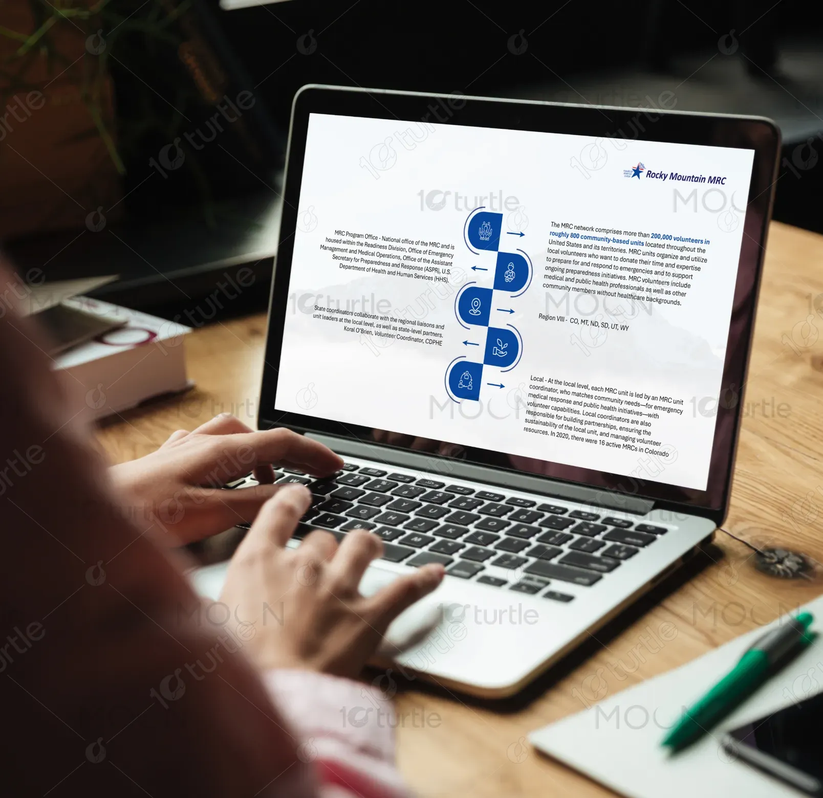
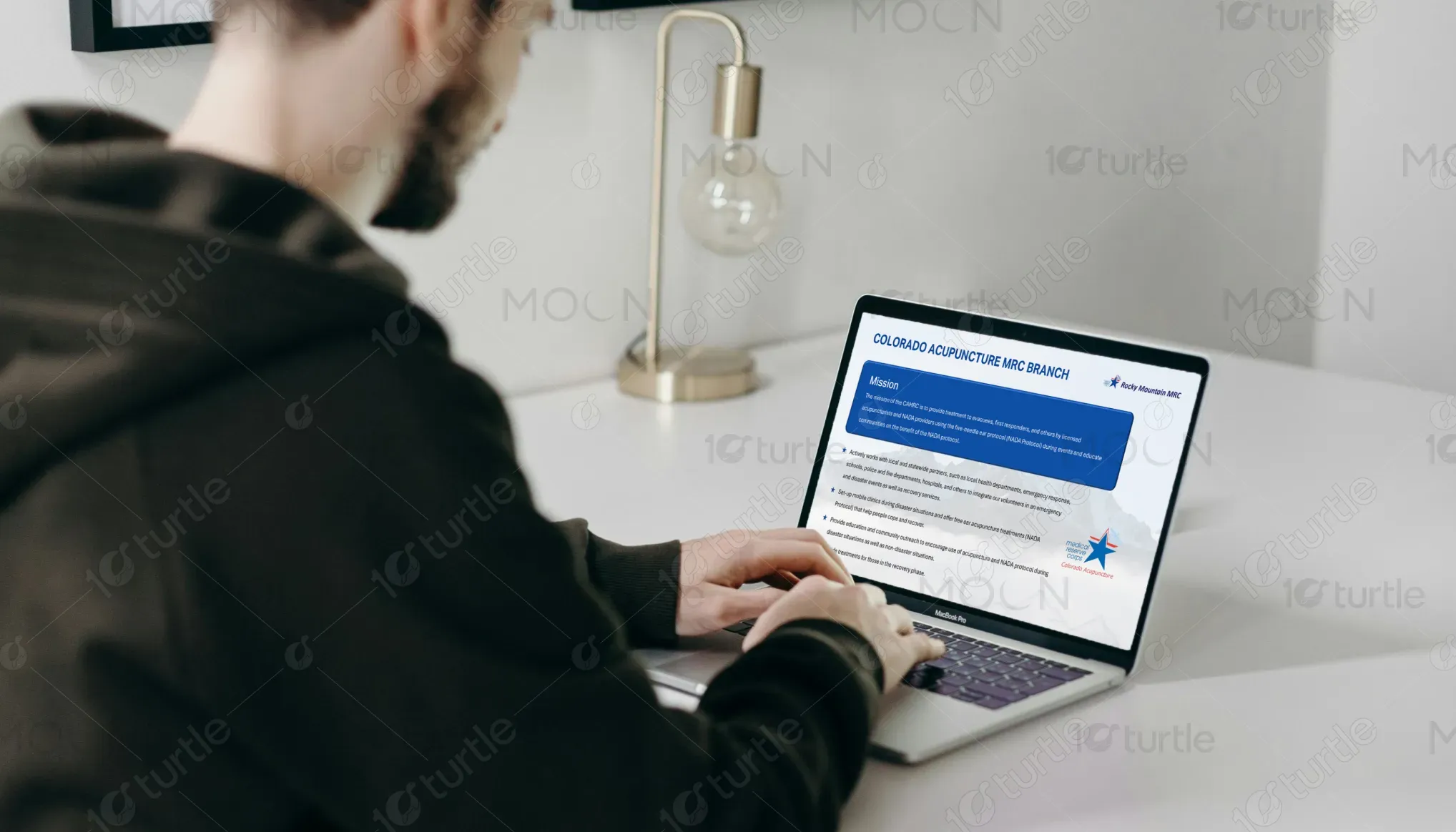
The Rocky Mountain MRC Volunteer Manual is designed to inform and engage volunteers in emergency response efforts. It offers clear, concise information on the organization's role in supporting healthcare systems during emergencies and how volunteers contribute to the mission. The manual's modern design and easy-to-read layout highlight its functional appeal, ensuring that users can quickly navigate through essential guidelines and expectations.

Industry
Healthcare & WellnessWhat we did
PPT DesignGraphic DesignPlatform
-In the healthcare and emergency response industry, information overload can often deter volunteers from understanding their responsibilities. Many volunteer manuals are dense and uninviting, causing disengagement. There’s a need for a design that presents essential information clearly while maintaining the seriousness of the mission. The absence of an intuitive, modern layout makes it difficult for users to quickly digest crucial guidelines and standards.
This design tackles the issue by adopting a clear and visually appealing format. With sections like "What we do" and "What we don’t do," the design breaks down key information into digestible parts, guiding the reader through the content seamlessly. The use of clean typography, a balanced layout, and easy-to-understand language makes the manual more approachable, ensuring volunteers can find the information they need at a glance. Innovative features like color-coded sections and intuitive navigation improve the user experience.

The long-term vision for Rocky Mountain MRC is to become the leading volunteer-driven healthcare support network, recognized for its ability to mobilize communities effectively during emergencies. By continuing to innovate in its training materials and digital resources, the brand aims to increase volunteer engagement, reduce response times, and build a sustainable, resilient healthcare system that empowers both volunteers and professionals.
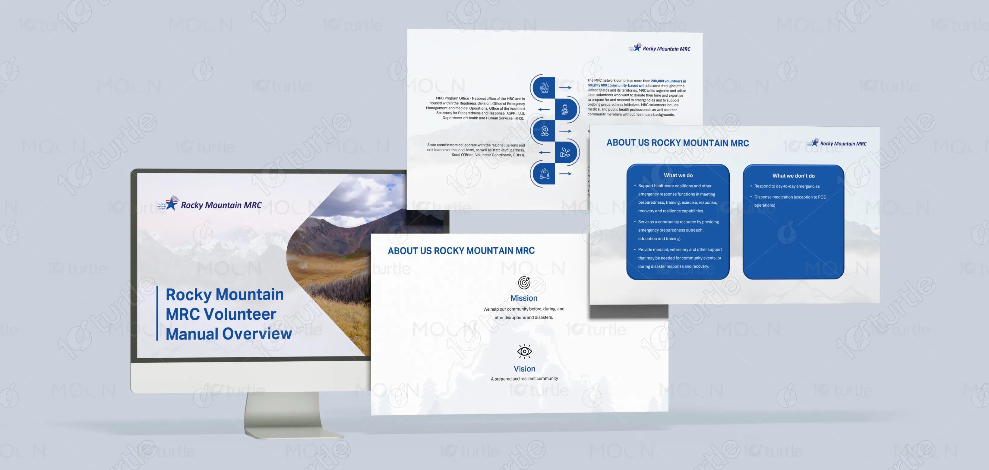

The color palette is centered around deep blues and whites, symbolizing trust, professionalism, and purity. The blues evoke feelings of calm, stability, and reliability—essential qualities for a brand focused on healthcare and emergency response. The neutral whites enhance clarity and emphasize a clean, straightforward design. These colors also align with the brand’s identity, reinforcing its position as a trustworthy and supportive community-driven organization.