
Tube Label Design • Wellness Packaging Design • Personal Care Packaging • Product Label Design
Overview
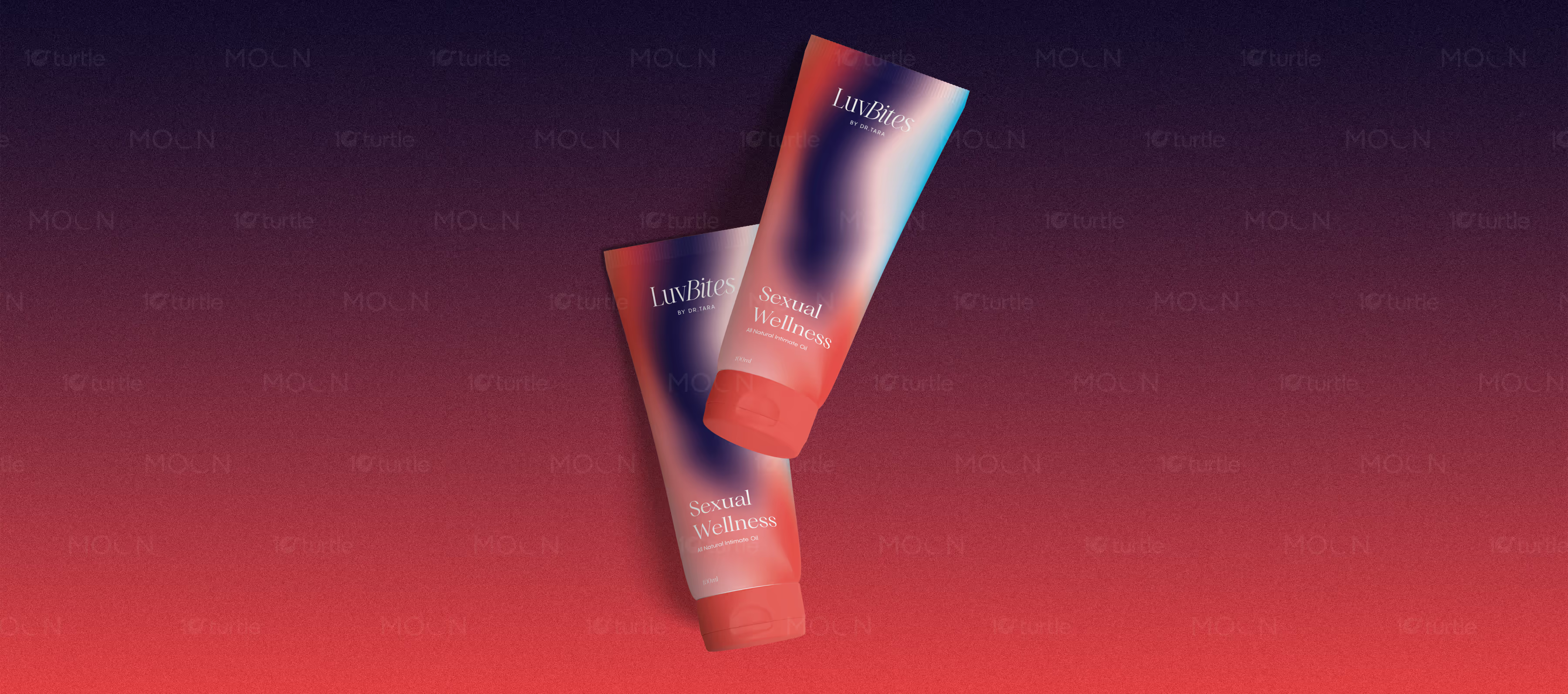
This tube label design collection presents three visual directions for LuvBites by Dr. Tara, an all-natural intimate oil brand. The set includes a gradient sexual wellness tube, a minimal cream label with oversized LB initials, and a warm red tube with delicate line-art illustration, creating a premium wellness identity.
The Challenge

Healthcare and wellness packaging for intimate products must feel trustworthy, discreet, and emotionally approachable at the same time. Poor design can make the product feel either too clinical, too loud, or uncomfortable for the target audience. Intimate wellness products especially need clear labeling, confident brand presence, and a premium tone without becoming overly explicit. The challenge is to balance sensitivity, beauty, and shelf appeal within a small tube format.
The Solution

This collection solves that through three complementary label directions that keep the brand elegant and easy to recognize. The gradient tube uses red, navy, blush, and cyan tones to create a modern sexual wellness mood with soft movement. The cream tube uses minimal black typography, a warm brown cap, and large gold LB initials for a clean premium look. The red tube uses tonal patterning, white product text, and fine line-art figures to create warmth, intimacy, and visual distinction.
The Impact

The designs help LuvBites present intimate care as modern, refined, and approachable. The packaging builds trust through clean typography and restrained layouts while still feeling expressive through color and illustration. The three-label system gives the brand flexibility for product variants, campaign imagery, and retail presentation. Long-term, this visual direction supports stronger recognition in the wellness, beauty, and personal care market.


Tube label design plays an important role in how healthcare and wellness products build trust before purchase. For intimate wellness products, packaging must work even harder because the subject is personal, sensitive, and often connected to privacy. The design needs to feel clear and premium without looking harsh, overly medical, or uncomfortable. This case study presents a three-design tube label collection for LuvBites by Dr. Tara, an all-natural intimate oil brand, with a visual system created to make intimate wellness branding feel modern, confident, and refined.
The creative approach focuses on balancing discretion with emotional warmth. Each tube label design uses a clean structure, minimal product naming, and restrained typography so the packaging remains easy to read and visually calm. The brand name appears in an elegant serif style, giving the product a beauty-led tone rather than a generic healthcare look. The wording “All Natural Intimate Oil” is kept simple and direct, helping the product communicate its purpose without cluttering the label.
The first direction uses a soft gradient across red, navy, blush, and cyan tones. This gives the tube a contemporary sexual wellness feel while keeping the layout minimal. The color movement adds energy and modernity, making the product suitable for lifestyle-focused personal care packaging. The second direction is more minimal, using a cream tube, black typography, a warm brown cap, and oversized gold LB initials. This version feels clean, premium, and discreet, which is important for intimate oil packaging that may need to sit comfortably within beauty or wellness retail spaces.
The third direction uses a deep warm red tube with subtle tonal patterning and delicate white line-art figures. This creates a more expressive and intimate mood without becoming visually heavy. The illustration adds personality and emotional softness, while the monochromatic red finish keeps the packaging elegant and brand-focused. Together, the three designs show how wellness packaging design can support product variation while keeping a consistent brand identity.
As a full product label design system, the collection gives LuvBites flexibility across packaging mockups, product photography, boxed presentation, and digital promotion. The tubes feel premium enough for beauty wellness packaging while still communicating a healthcare and personal care purpose. Long-term, this type of packaging helps the brand stand out in a growing intimate wellness market by making the product feel trustworthy, approachable, and visually memorable. Strong tube packaging does not just decorate the product; it shapes how customers feel about using it.
tube label design
healthcare packaging design
intimate wellness branding
personal care packaging