
Brochure Real Estate Case Study
Print collateral shaped for property decisions
The Challenge
Real estate brochures must communicate trust, location value, space details, and brand credibility within a limited printed format. Poor brochure design can make floor plans difficult to read, property visuals feel disconnected, or service information appear crowded. Developers, brokers, and property service brands need collateral that looks professional during meetings, site visits, leasing conversations, and presentations. The challenge is to organize visual and technical property information without losing clarity or sales appeal.
The Solution
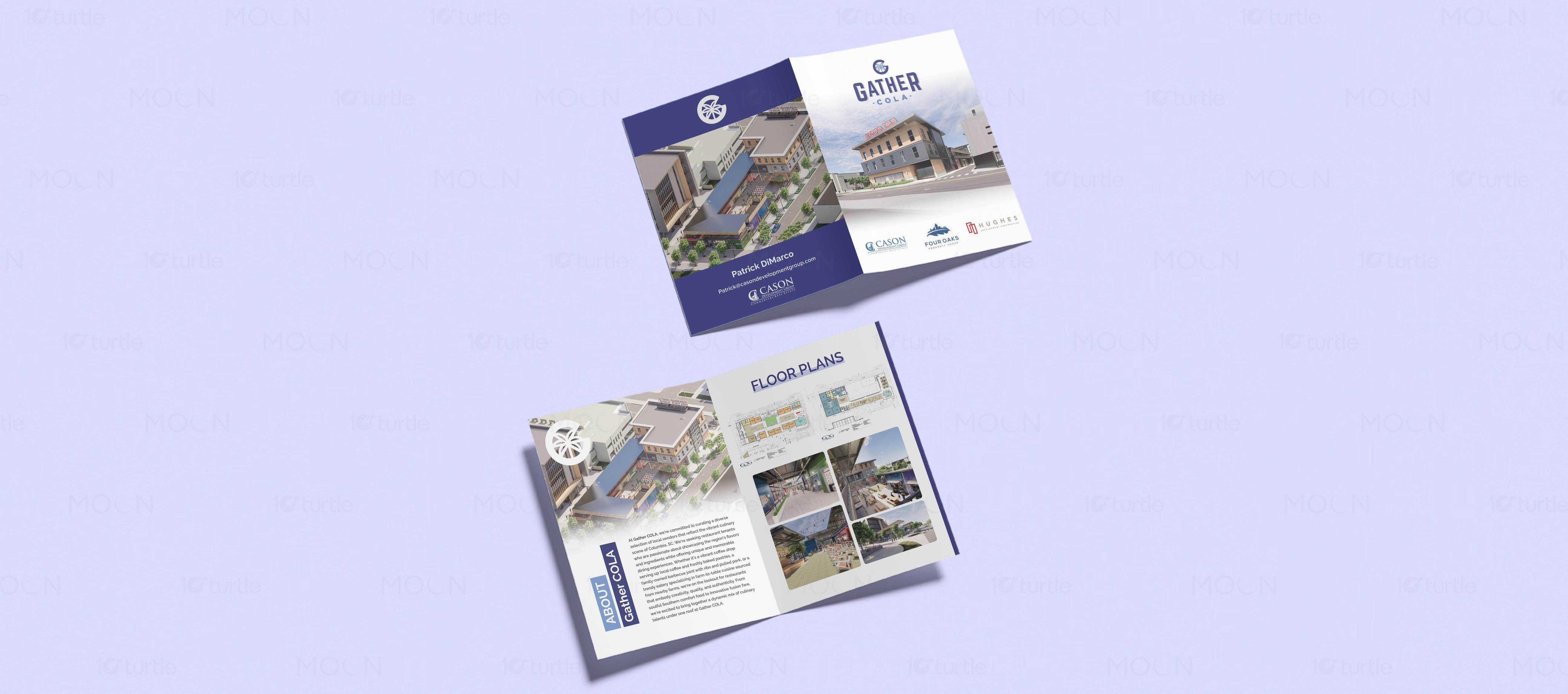
This collection solves that by using each brochure format according to its communication purpose. The Gather COLA bi-fold design uses architectural renders, floor plan visuals, logo placement, partner branding, and blue accent panels to present a commercial property development with structure and confidence. The Habitafio tri-fold design uses warm interior photography, dark navy service panels, olive highlight blocks, icons, and concise copy to explain property management services clearly. Together, the brochures create a polished real estate marketing system that feels informative, visual, and presentation-ready.
/ Project Information
This brochure design collection combines two real estate formats: a bi-fold brochure for Gather COLA and a tri-fold brochure for Habitafio property services. The designs use building renders, floor plans, interior photography, navy and olive accents, clear information blocks, and professional fold layouts to support property marketing and service communication.