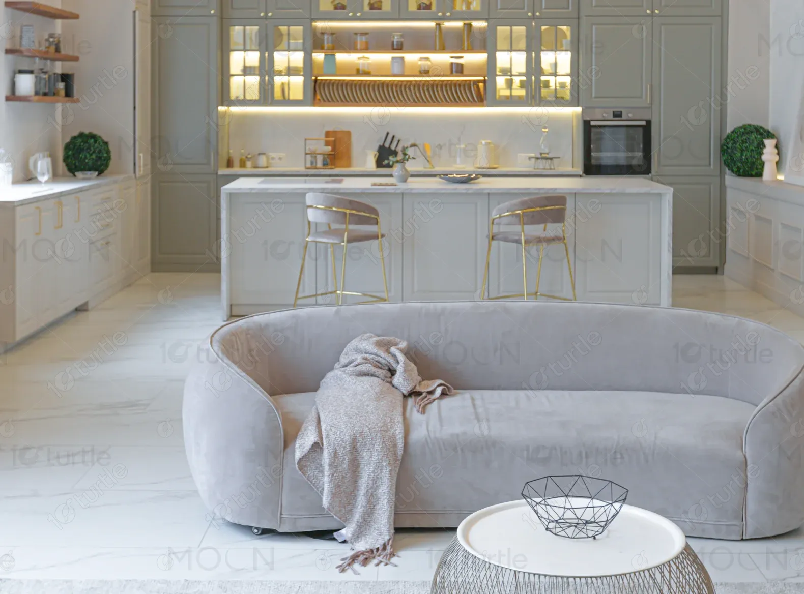
Nacropolis Group is a London-based, privately owned property development company, specializing in residential, commercial, and hospitality real estate. They focus on creating exceptional developments where people can live, work, and relax, with an expanding portfolio across London and the Home Counties.
UX Design
UI Design
Research
Websites Design
Industry
Real Estate
Tools we used


Project Completion
2024
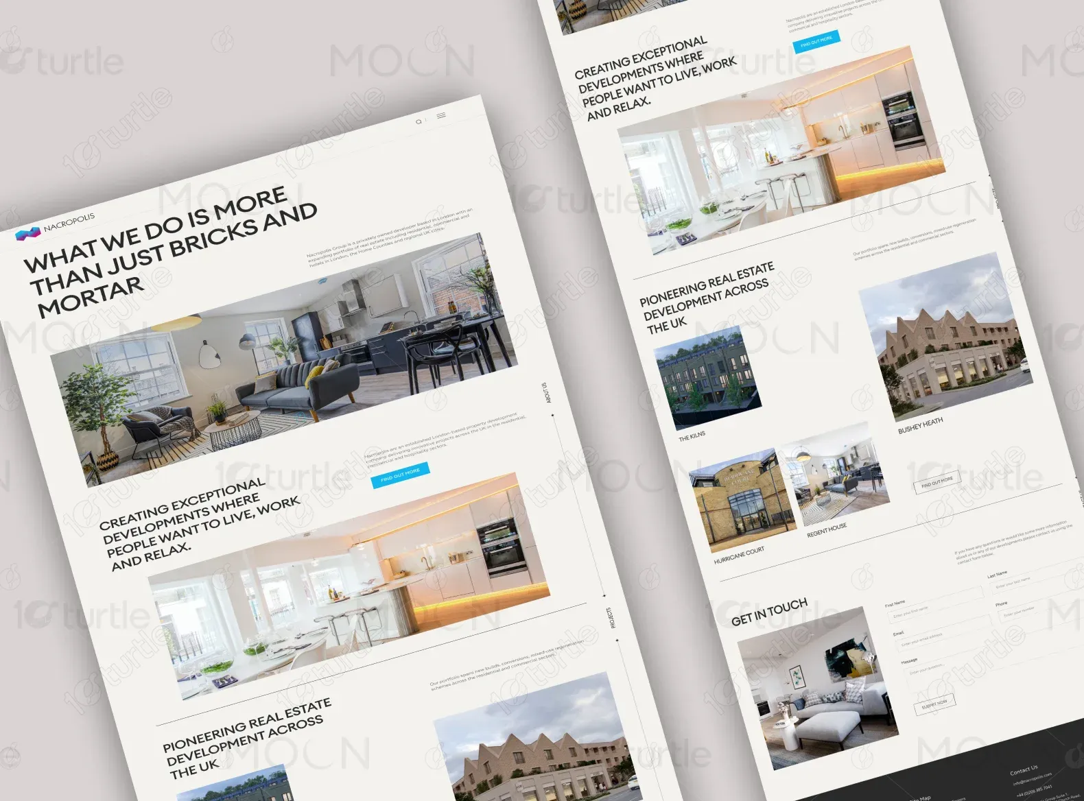
The main goal of the Nacropolis Group website project was to develop a modern, visually appealing, and user-friendly online presence that clearly communicated the company’s vision and portfolio. The client sought a website that would enhance their brand image, highlight ongoing and completed projects, and attract potential clients and investors. The website needed to reflect their expertise in the real estate development industry, showcasing both their past successes and future endeavors.
Industry
Real EstateWhat we did
User ResearchUI/UX RedesignSEO OptimizationPlatform
-Nacropolis Group’s previous website was outdated and lacked the visual appeal necessary to represent the company's innovative approach to property development. The website also failed to effectively communicate their core values and did not highlight their portfolio in a way that would engage potential clients or investors. There was a clear need for a modern design that could elevate their online presence and streamline user engagement.
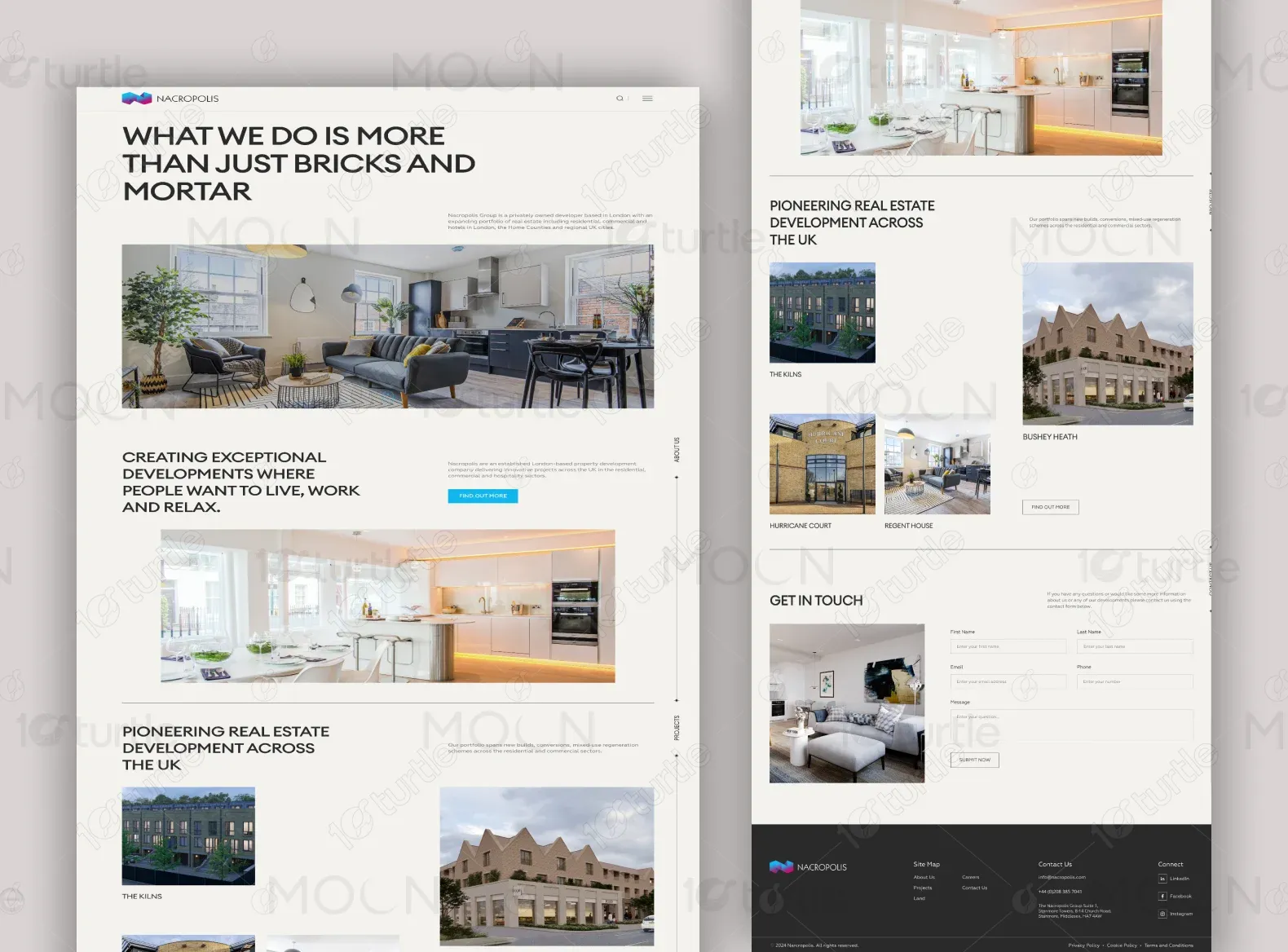
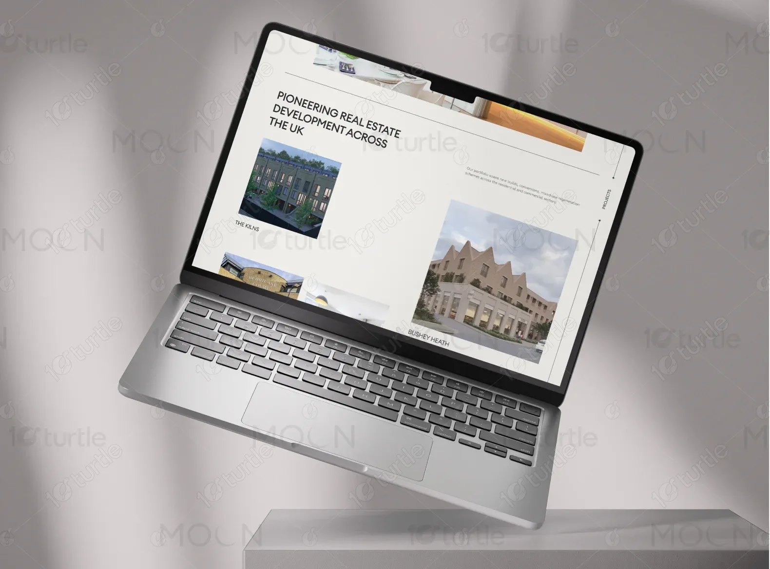
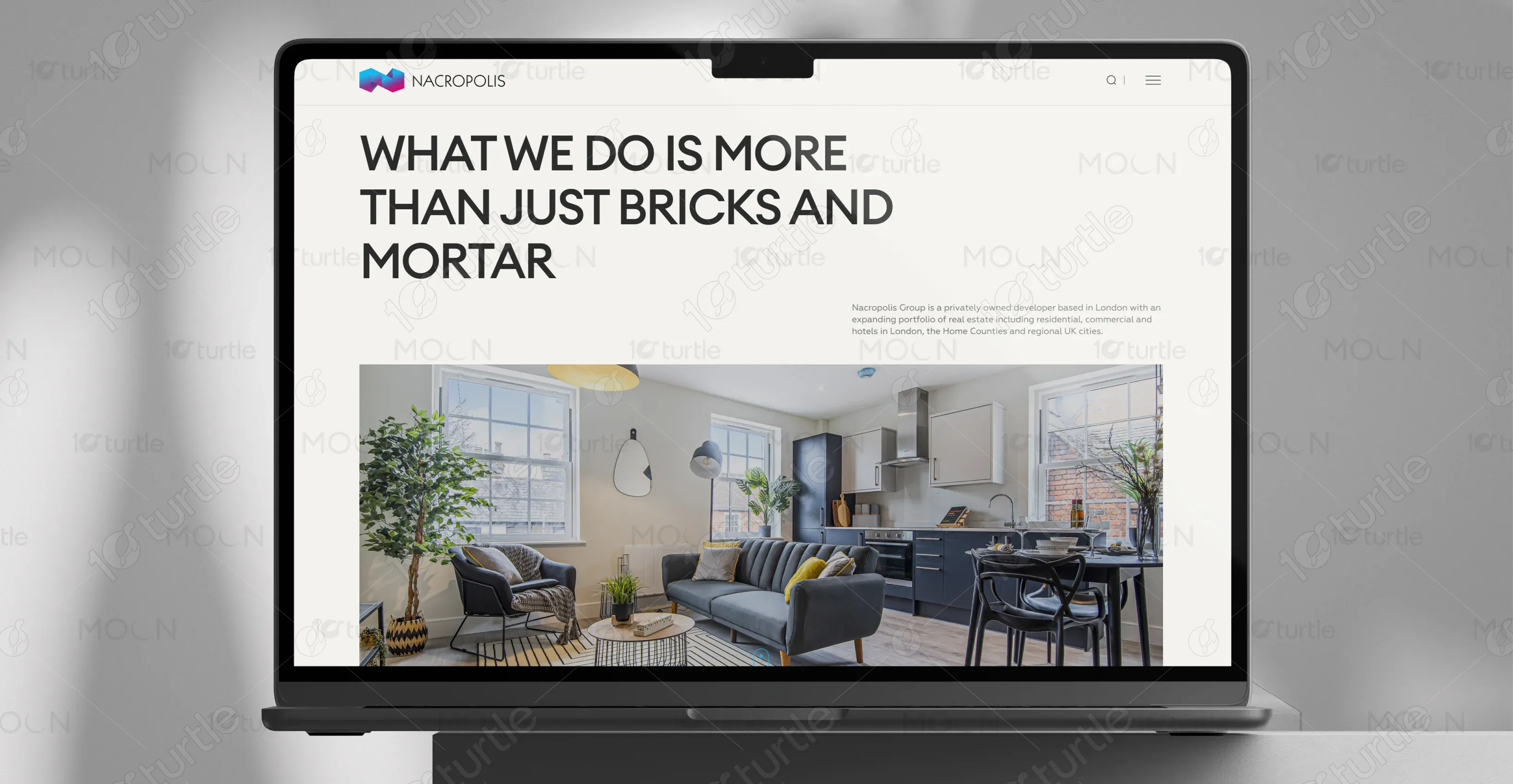
The solution was a sleek, minimalist design that put the company’s portfolio front and center. The homepage highlights the company’s message with a large, attention-grabbing tagline and visuals of their properties, which instantly connect visitors to Nacropolis Group’s mission. The layout was designed for easy navigation, with distinct sections for key projects and detailed information. Strategic use of imagery, clean typography, and interactive features allowed users to explore Nacropolis Group's offerings while reflecting the brand’s high-end development focus.
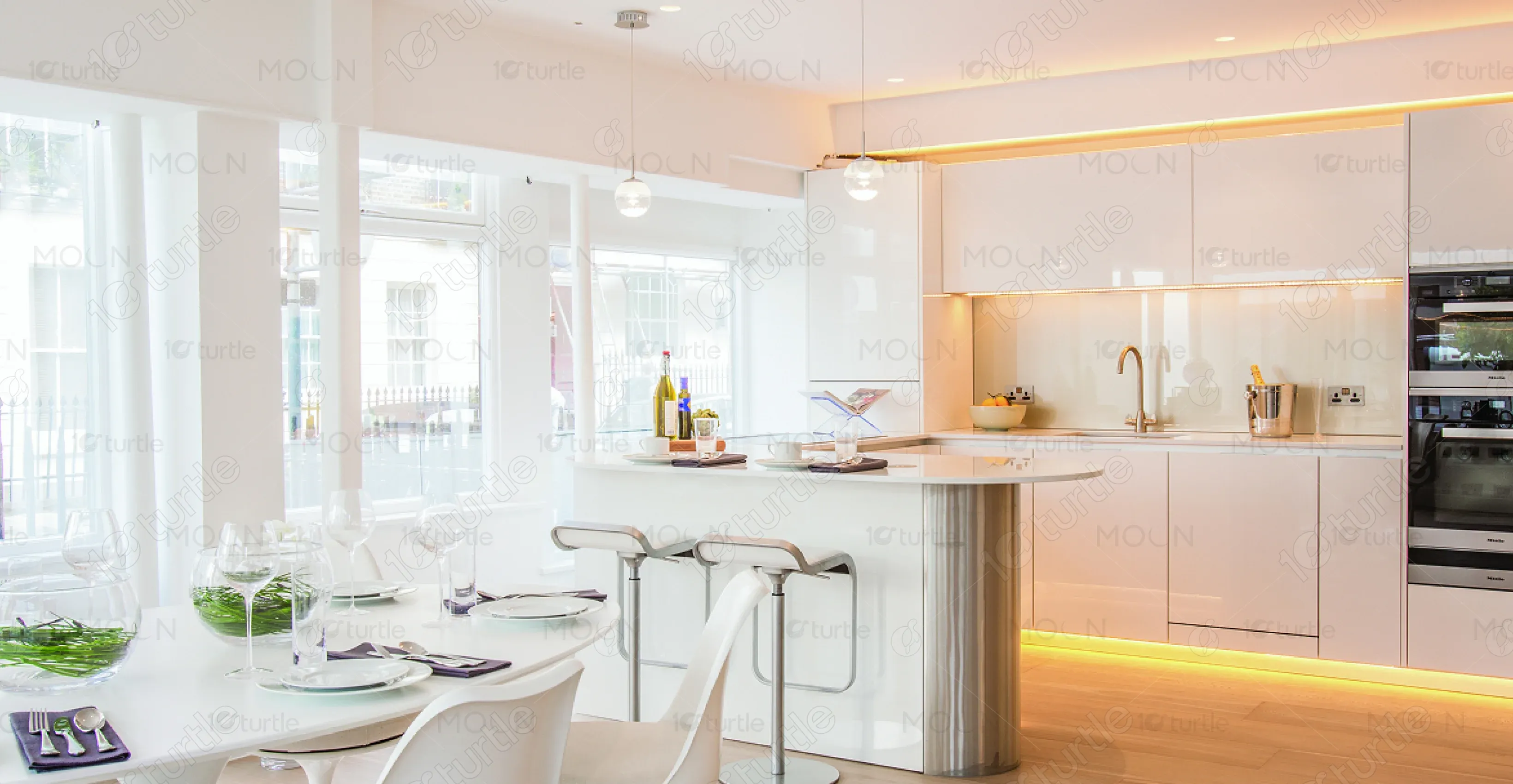
Nacropolis Group envisioned a modern and clean design that conveys sophistication and professionalism. The client wanted to move away from overly complex layouts and opted for simplicity and elegance, using large, high-quality images to showcase their properties. Inspiration came from leading property development websites that feature strong visuals, clean typography, and an easy-to-navigate structure.
The Nacropolis Group logo features a simple yet elegant design that complements the company’s sophisticated approach to property development. The modern, geometric design signifies their innovative nature, while the use of clean lines and minimalist design aligns with the website's aesthetic.
The color palette for Nacropolis Group features a sophisticated combination of neutral tones and subtle contrasts. The primary dark grey (#4B4F53) conveys professionalism, while the light grey (#E6E6E6) offers a modern, clean feel. The vibrant yellow accent (#FFAA00) adds a pop of attention-grabbing highlight, creating a sleek, high-end look that reflects the brand’s reliability and contemporary style in property development.

The wireframe was designed with a focus on simplicity and user experience. The homepage prioritized large, impactful images of the properties, with minimal text to ensure the visuals speak for themselves. Clear navigation paths were mapped out, with easy access to project details, services, and contact information. The layout was designed to adapt seamlessly across devices to ensure a responsive and professional experience.