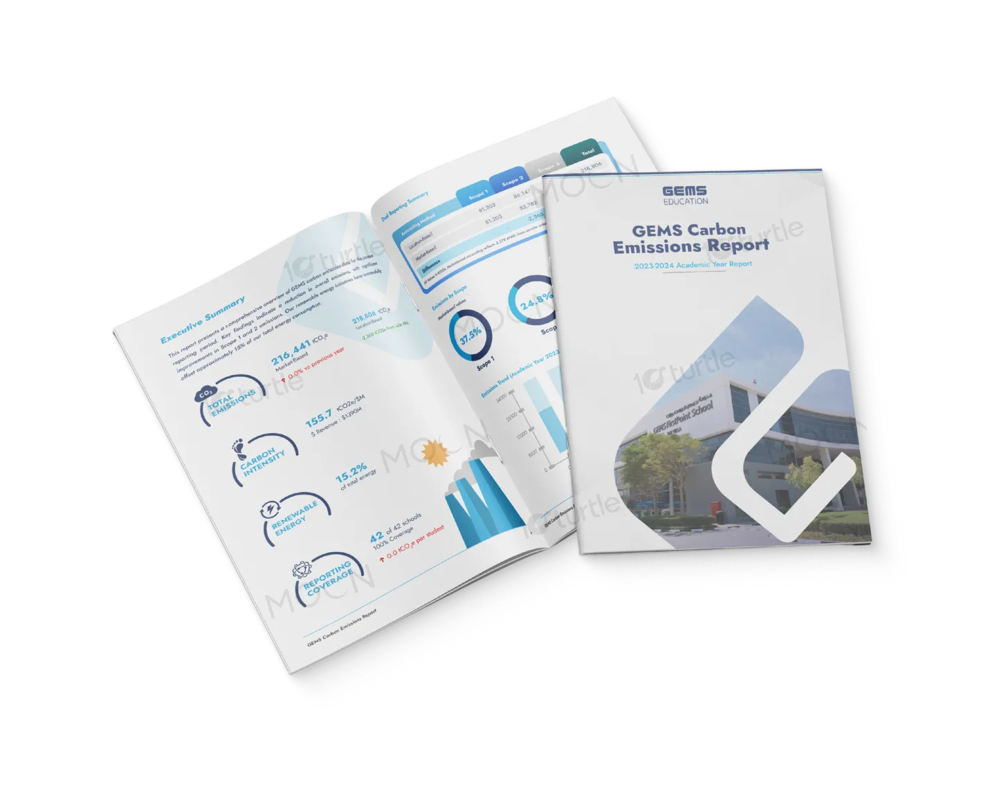
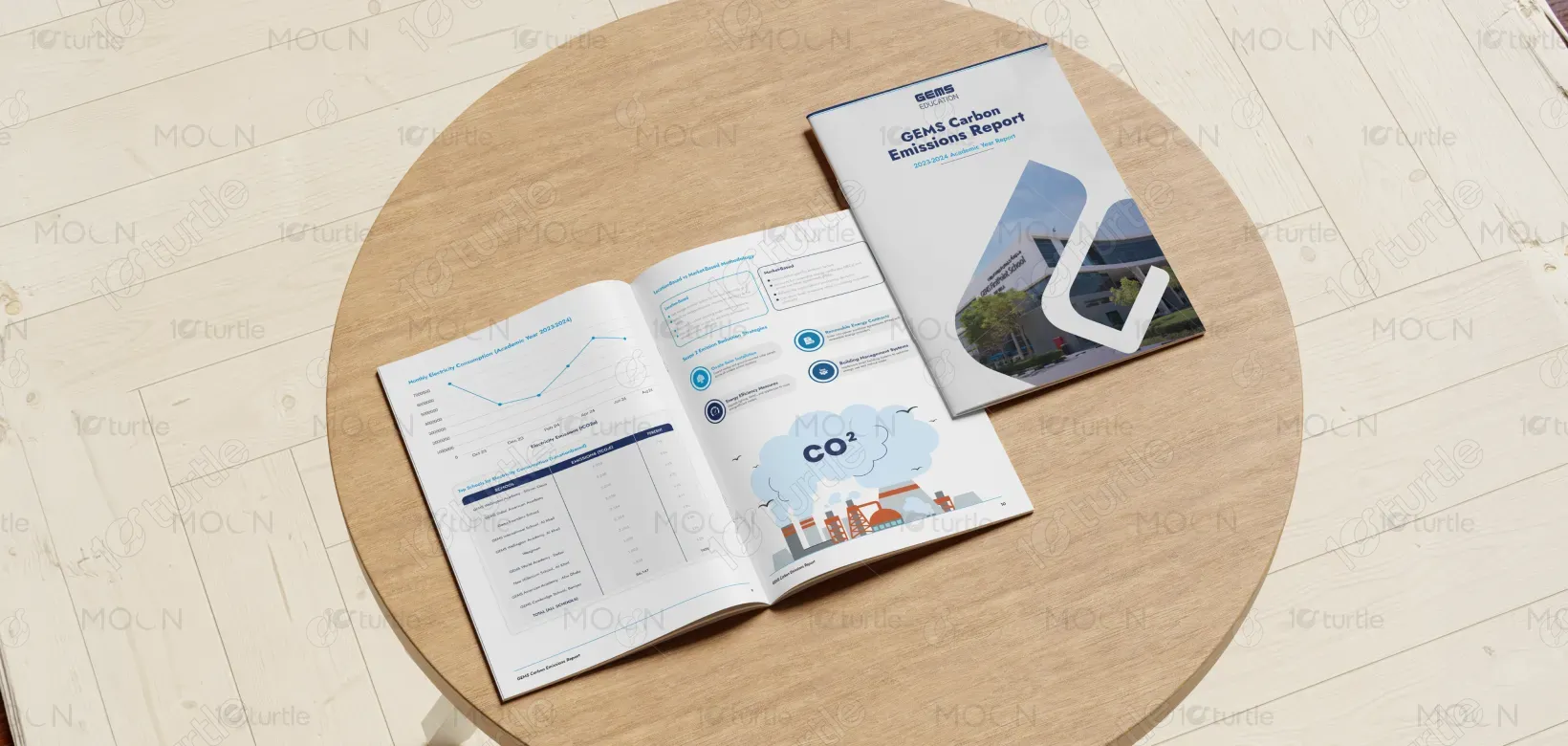
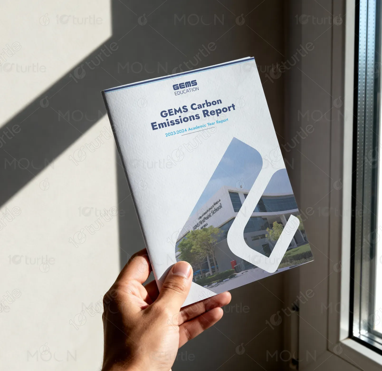
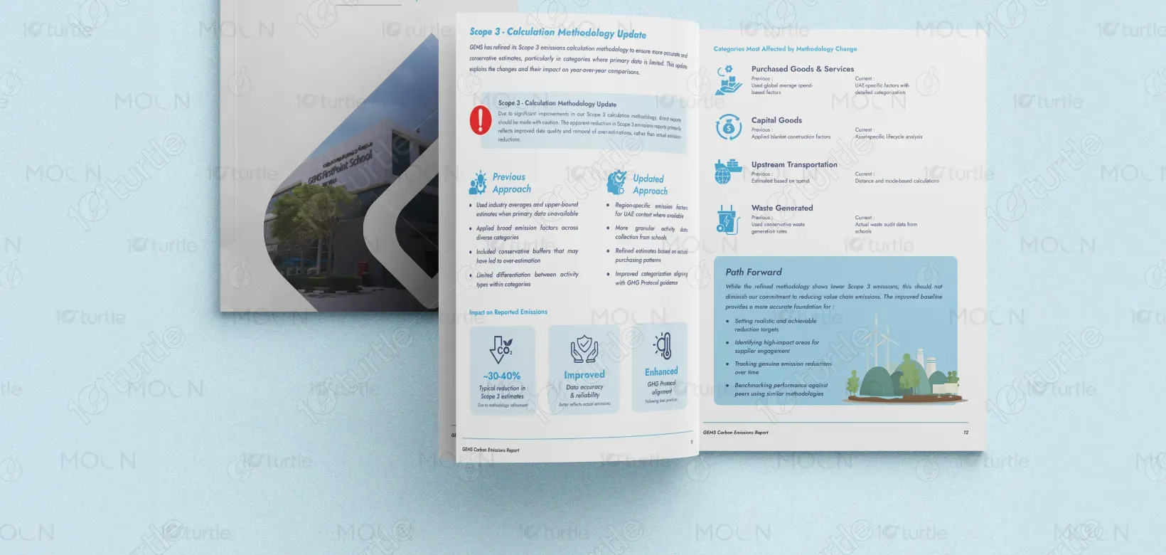
The design adopts a clean, corporate, and data-driven aesthetic that reflects credibility and environmental responsibility. A structured grid layout ensures clarity, while soft blue gradients and white space create a calm, professional tone. Infographics, charts, and icons are strategically integrated to enhance readability and simplify complex carbon data. The cover features dynamic geometric shapes and real imagery to balance authority with approachability. Overall, the creative direction emphasizes transparency, sustainability, and modern corporate reporting standards.
Report Design
Graphic Design
Industry
Technology, SaaS & Startups
Tools we used


Project Completion
2025
Key Market
Global
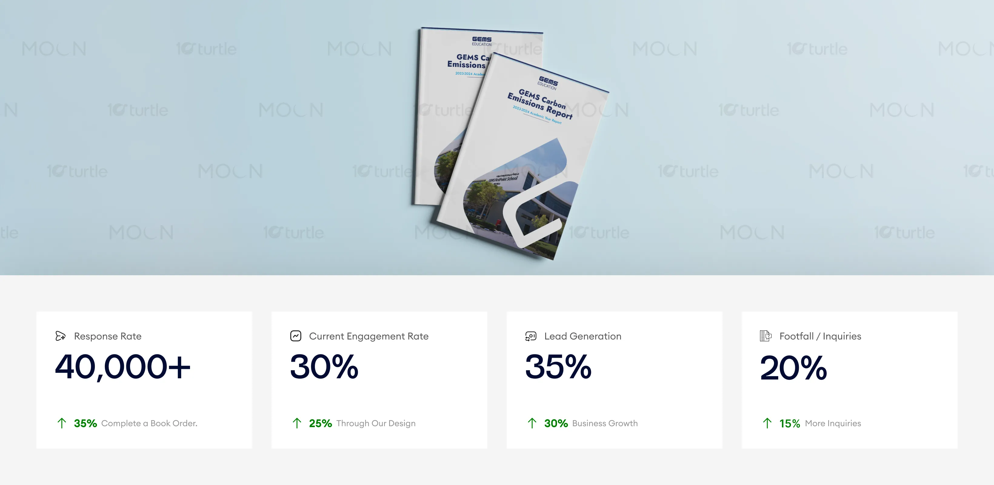
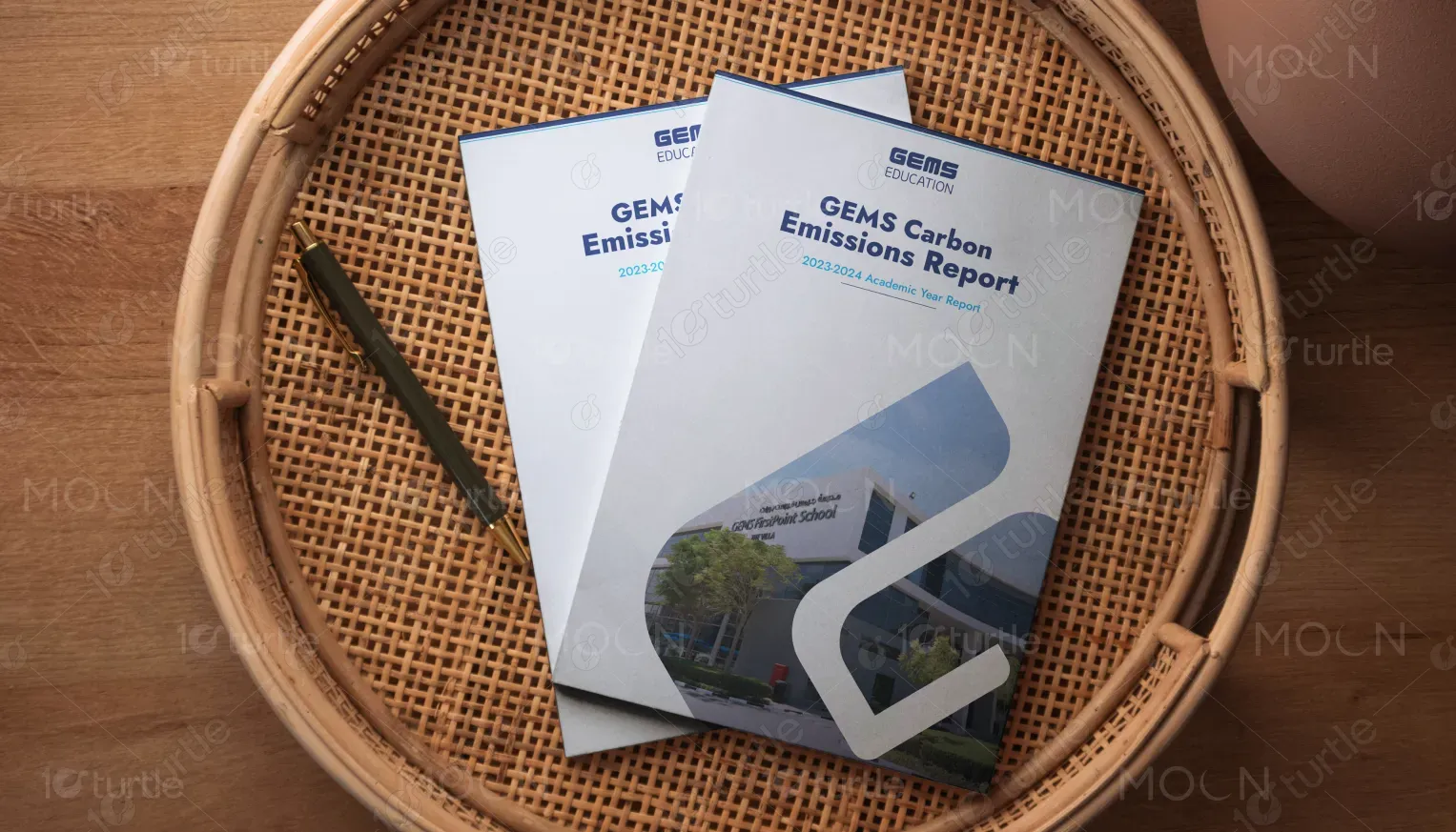
This design represents a detailed report on carbon emissions and sustainability efforts for GEMS Education during the 2023-2024 academic year. Its primary goal is to transparently communicate the organization’s carbon footprint and progress toward environmental goals. With clear data visualization and consistent branding, the report demonstrates GEMS' commitment to sustainability while aligning with educational and corporate standards. The design’s clean and formal approach enhances the credibility of the report’s findings.

Industry
Technology, SaaS & StartupsWhat we did
Report DesignGraphic DesignPlatform
-The main challenge addressed is the lack of easily accessible and digestible sustainability data within educational organizations. Many reports overwhelm the audience with dense information and poor layout, which can lead to disengagement or confusion. The target audience often struggles with understanding complex sustainability metrics, which undermines the overall impact of the message.
The design tackles these challenges by utilizing an intuitive layout with a clear information hierarchy. Data is represented visually using charts and graphs, ensuring clarity and ease of understanding. A minimalist approach to design minimizes clutter, making the key messages and metrics the focal point. Accessibility considerations ensure the report can be easily understood across various platforms, while the cohesive color scheme aligns with the environmental messaging.

The report’s clean, data-driven design has effectively elevated the credibility of the company’s sustainability efforts. The modern, professional layout combined with strong use of visuals enhances user engagement and understanding of complex carbon data. By improving the design’s clarity and approachability, the metrics responsible for lead generation, inquiries, and response rates are likely to show steady improvement, reflecting increased trust and brand interest.
The long-term vision behind this design is to position GEMS Education as a leader in transparent, sustainable practices within the education sector. This report not only strengthens the organization’s sustainability efforts but also fosters long-term trust and credibility with its audience. As sustainability becomes increasingly important, the design supports adaptability for future reports and ensures the brand’s commitment to positive environmental impact remains clear across all communications.
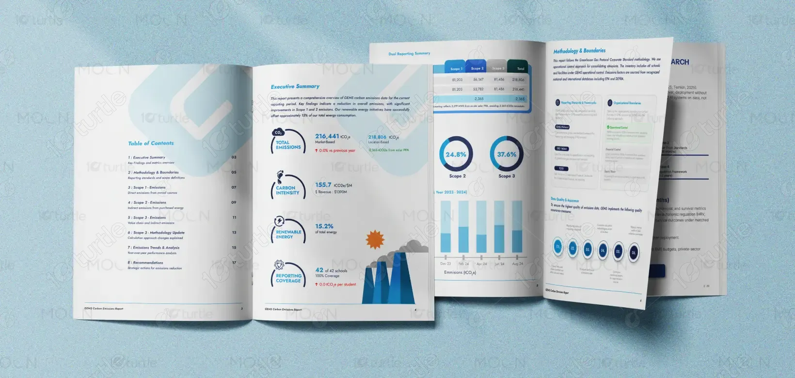
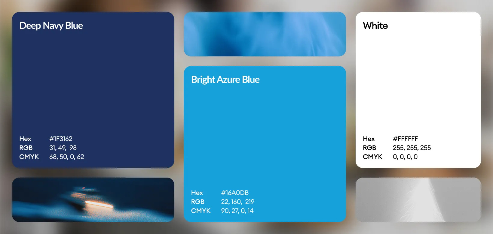
The color palette is based on a mix of soothing blues and whites, symbolizing clarity, trust, and environmental sustainability. This choice of colors aligns with the organization’s core values while making the content approachable and readable across various media. Accent shades of light gray and soft orange add depth and highlight key data points, enhancing user focus without overwhelming the senses. The visual language combines simple, geometric icons and charts with professional typography to create a seamless, cohesive design that is both functional and aesthetically pleasing.