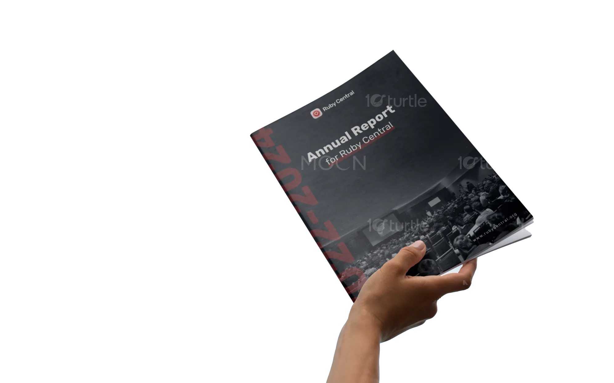
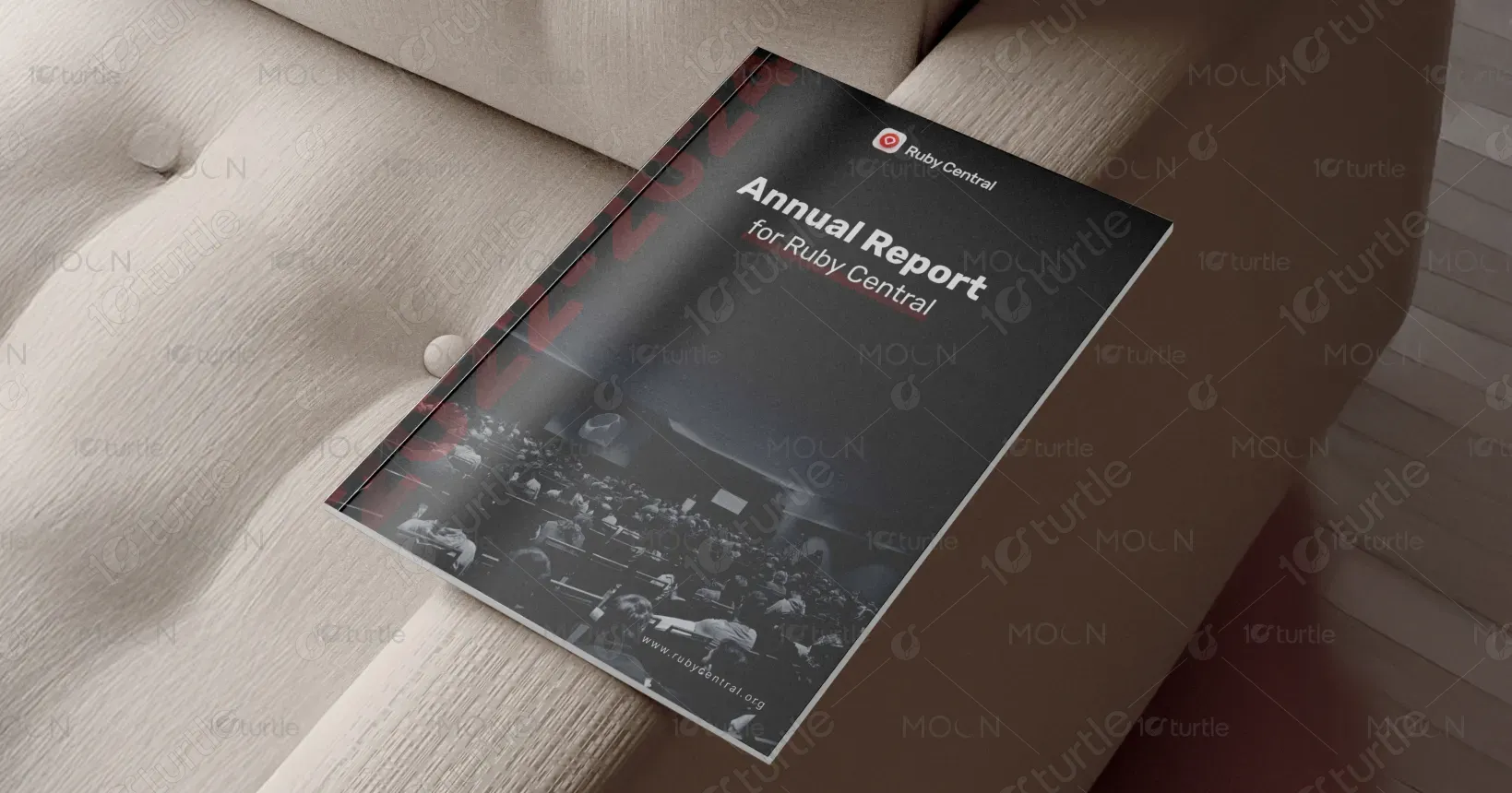
The design captures Ruby Central’s evolution through a clean, data-forward layout that balances professionalism with community warmth. A structured grid system, bold typography, and strategic white space enhance readability and hierarchy. Infographics, minimal icons, and subtle gradients highlight milestones and metrics, ensuring visual clarity. The use of red accents reflects Ruby’s identity while maintaining a modern, nonprofit-report aesthetic that feels transparent, confident, and future-oriented—aligning with the organization’s mission to unite technology, people, and progress.
Report Design
Graphic Design
Industry
Civic, Government & Nonprofits
Tools we used


Project Completion
2025
Key Market
Global
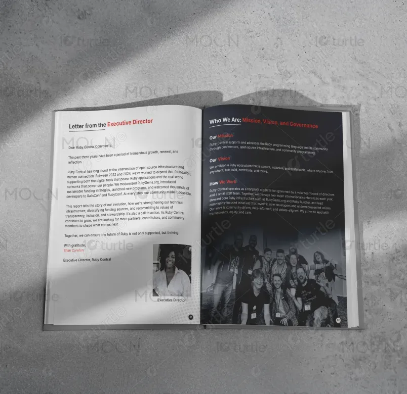
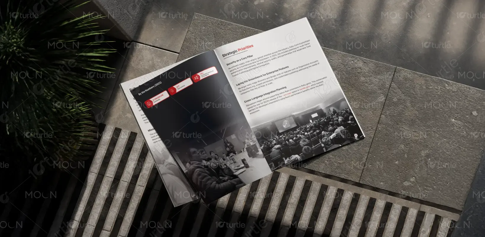
This annual report for Ruby Central presents a three-year overview (2022–2025) of the organization’s work in open-source infrastructure, community programs, and financial growth. It documents major milestones, from security upgrades in RubyGems and Bundler to inclusive initiatives like the Scholars & Guides Program. The design communicates both transparency and innovation—positioning Ruby Central as a global leader in maintaining Ruby’s ecosystem. Its clarity, data visualization, and human-centered tone make complex information accessible and engaging to a diverse audience.
Industry
Civic, Government & NonprofitsWhat we did
Report DesignGraphic DesignPlatform
-The challenge was balancing highly technical content with approachable storytelling. As Ruby Central’s work spans open-source engineering, community engagement, and nonprofit reporting, it required a visual system that could convey precision without alienating non-technical readers. Reports in the tech sector often overwhelm audiences with jargon and dense data, leading to disengagement. The key design problem was to make metrics and achievements both visually digestible and emotionally resonant—bridging the gap between developers, sponsors, and community members.
The design uses a modular structure combining editorial storytelling with visual data representation. Sections are organized around key impact themes, reinforced by infographics, callouts, and concise copy. Consistent use of Ruby’s brand red, modern sans-serif typography, and clean layouts make technical details scannable. Human elements—letters, photos, and community highlights—soften the corporate tone. This hybrid approach transforms a technical report into a narrative of growth, accessibility, and community progress, ensuring both comprehension and connection.
The long-term vision is to position Ruby Central’s report as a benchmark for open-source transparency and nonprofit storytelling. Future editions will evolve into interactive digital formats with live data dashboards and multimedia community highlights. The design aims to cultivate lasting trust and inspire continued participation—showcasing not just numbers, but the global human network behind Ruby. It reflects a vision where technology, accountability, and inclusivity intersect to build a sustainable open-source future.
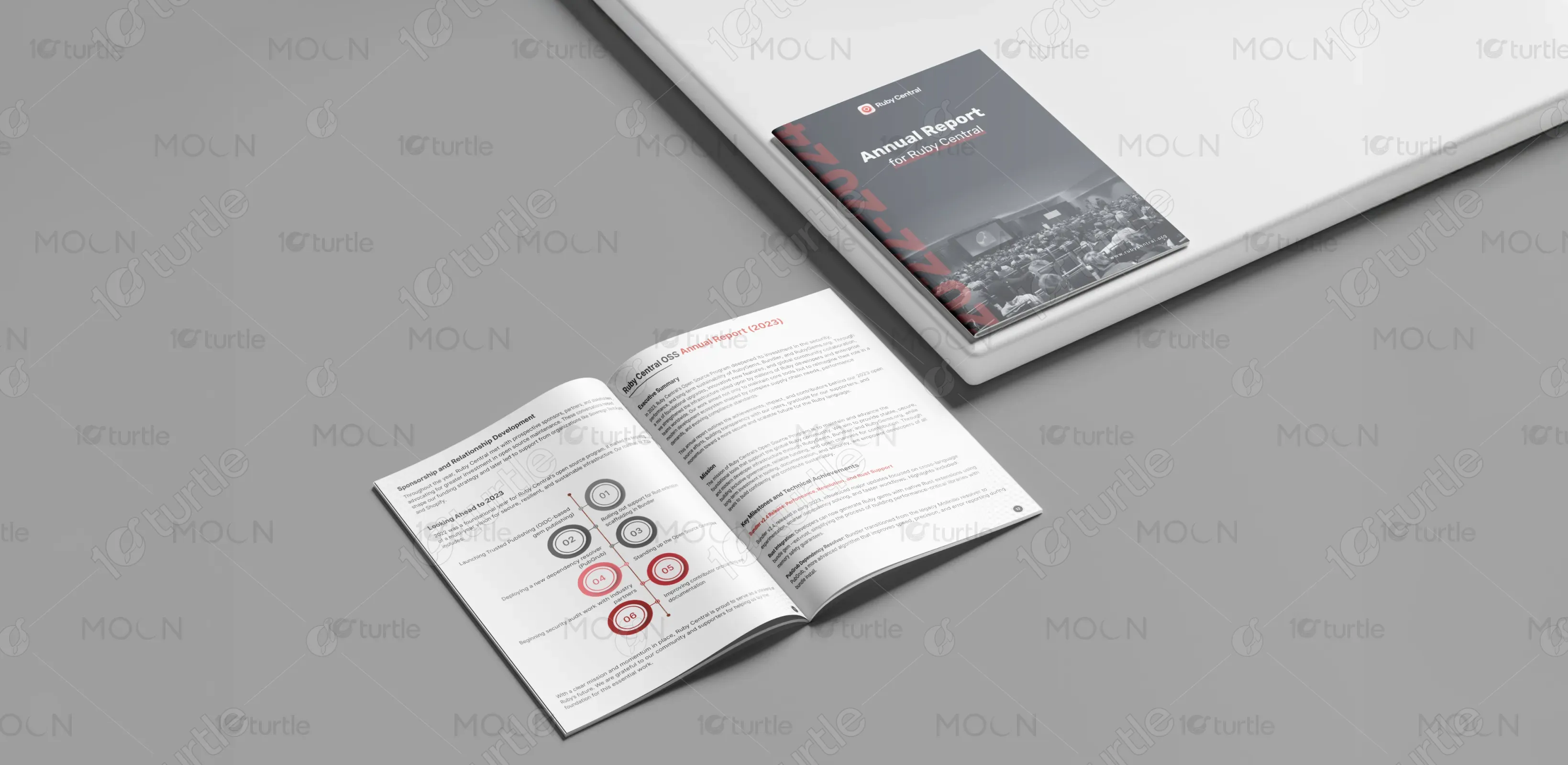

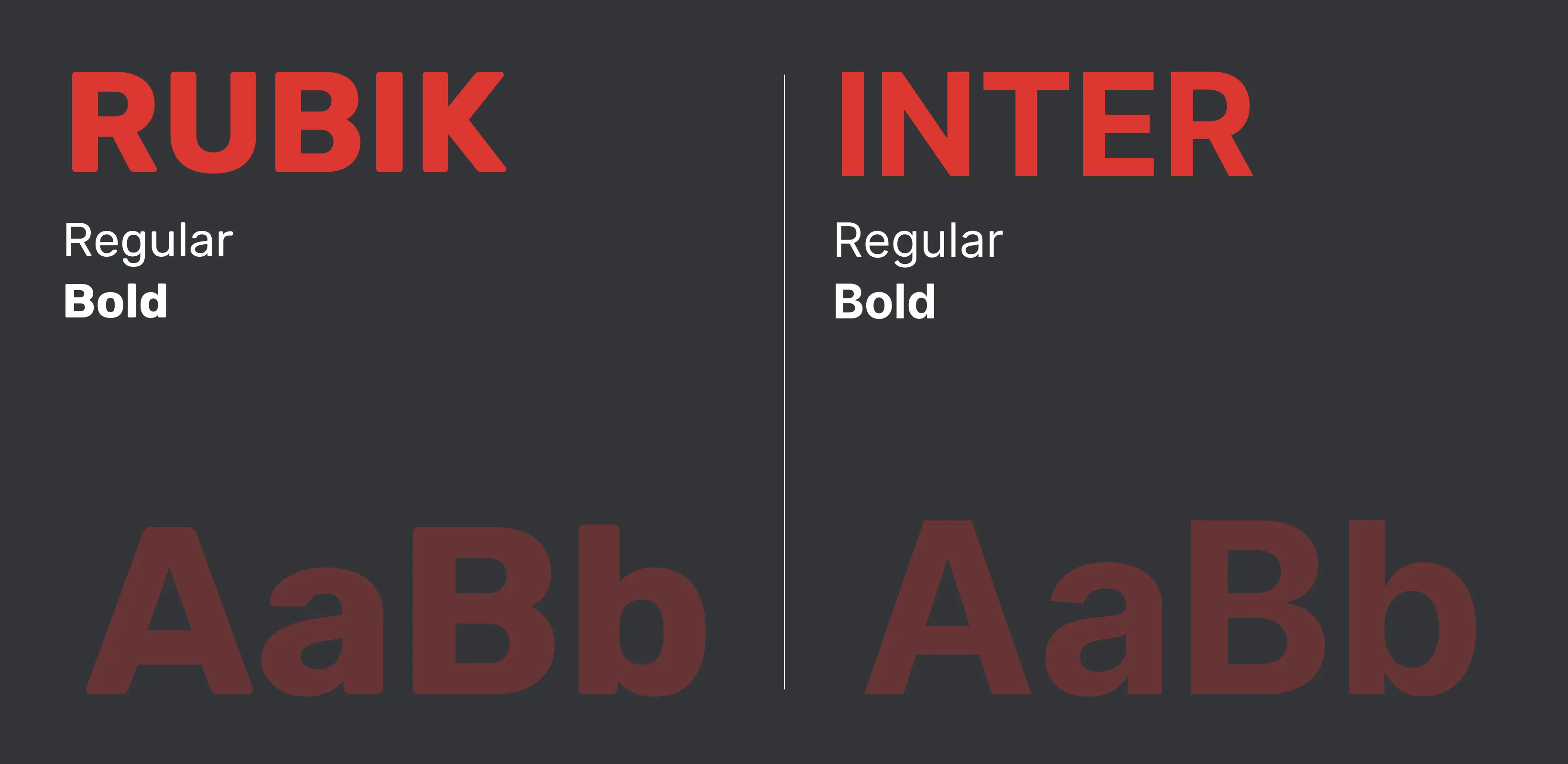
The color scheme revolves around Ruby’s signature crimson red (#AA1E22), paired with white, soft gray (#F4F4F4), and charcoal black (#2C2C2C). Red symbolizes energy, innovation, and passion—the heart of the Ruby community. The grayscale neutrals balance intensity with professionalism, enhancing readability and focus. Strategic use of accent tones (light blues and muted beige) in data sections introduces warmth and diversity. Overall, the palette reinforces Ruby Central’s identity: bold yet grounded, technical yet human.