
Pouch Packaging Food & Drink Case Study
Pouch Packaging Food & Drink Case Studyarrow

Flexible packaging for premium pantry and beverage products

Pouch Packaging Design • Food Packaging Design • Flexible Packaging • Product Branding

Overview

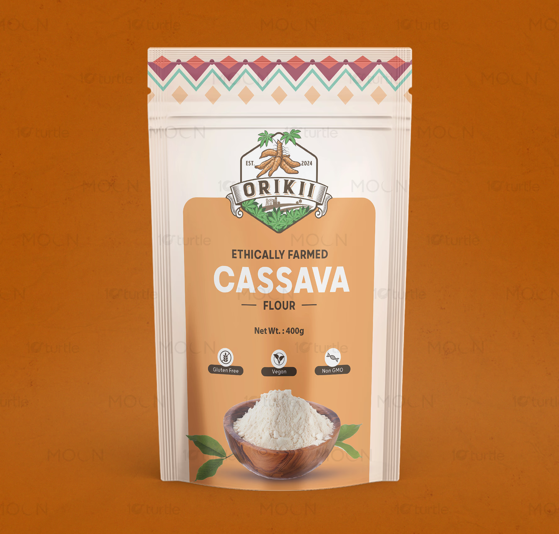
This pouch packaging collection brings together two food and drink product directions: a dark, performance-led coffee pouch for Velocity Coffee and a warm, natural cassava flour pouch for Oriki. Both designs use stand-up pouch formats, clear label hierarchy, product-specific color palettes, and visual cues that support retail recognition.

The Challenge

down-right

Food and drink brands need packaging that communicates trust, taste, quality, and product function within seconds. Poor pouch packaging can make premium products look ordinary, hide key information, or fail to stand out on shelves and online marketplaces. Coffee packaging must feel bold and distinctive, while flour packaging must feel natural, clear, and ingredient-focused. The challenge is to create flexible packaging that feels practical, branded, and visually memorable across different product types.

The Solution

down-right

This collection solves that by giving each pouch a strong front-facing identity while maintaining a clean retail structure. The Velocity Coffee design uses a dark grey pouch, bold vertical typography, stopwatch-inspired graphics, and a white product label to create a modern, energetic coffee presence. The Oriki cassava flour pouch uses a cream base, warm tan center panel, ethnic-inspired top border, product bowl imagery, and dietary icons for gluten-free, vegan, and non-GMO communication. Together, the set shows how pouch packaging can adapt to product personality while keeping information easy to scan.

The Impact

down-right

The designs help food and drink brands build stronger shelf appeal and improve product understanding at first glance. The coffee pouch creates a premium, high-energy identity suited for specialty beverage buyers. The cassava flour pouch supports a natural, wholesome, and culturally rooted food brand image. Long-term, this packaging approach can improve customer trust, strengthen brand recall, and support retail expansion.

02.avif03.avif
04.avif
05.avif06.avif
07.avif
08.avif09.avif
10.avif
11.avif12.avif
Premium Food Packaging Design for Modern Brands

Pouch packaging design plays a major role in how food and drink products are perceived before the customer ever tastes them. In retail environments, marketplaces, and product photography, packaging must quickly communicate what the product is, why it is trustworthy, and where it fits in the buyer’s routine. This case study brings together two different food and drink packaging directions in one flexible packaging project: a dark coffee pouch system and a warm cassava flour pouch design. Both use the stand-up pouch format, but each design responds to a very different product personality.


The coffee pouch packaging direction is built around a bold, performance-driven visual identity. The dark grey pouch, black textured background, oversized vertical “Velocity” typography, and subtle stopwatch graphic create a strong sense of energy and motion. The design feels modern and premium, which suits a specialty coffee product positioned for customers who care about origin, roast level, and a sharp brand experience. A clean white label area anchors the product details, helping the origin, description, roast information, and weight remain readable against the dark pouch surface.


The cassava flour packaging design takes a warmer and more natural route. A cream-colored pouch structure, tan center panel, illustrated Oriki logo, cassava root visual, and patterned top border give the product an earthy, culturally inspired identity. The bowl of flour at the bottom clearly signals the product category, while icons for gluten-free, vegan, and non-GMO benefits help customers understand the product quickly. This approach is especially useful for pantry product packaging, where clarity and trust are essential for purchase confidence.


As a combined food packaging design project, the collection shows how flexible packaging design can support different product categories without relying on one repeated style. The coffee pouch needs contrast, attitude, and a premium beverage feel. The cassava flour pouch needs softness, ingredient clarity, and natural food appeal. Both designs use strong hierarchy, centered product information, practical pouch proportions, and clear branding to make the packaging feel shelf-ready.


The long-term value of this product packaging design lies in recognition and usability. A well-designed pouch helps customers remember the product, compare options faster, and connect packaging quality with product quality. For beverage branding, this can strengthen specialty appeal and repeat purchase behavior. For organic food packaging, it can communicate health, origin, and everyday usefulness. Together, these pouch packaging designs show how visual strategy can turn everyday food and drink products into branded retail experiences.

pouch packaging design

food packaging design

retail packaging design

product packaging design

Next Project

arrow

Fearless Works

BRAND GUIDE • BRANDING • BRAND IDENTITY

Fearless Works