
Multi-Industry Poster Design Case Study
Print visuals that sell events, films, and experiences.
The Challenge
Posters across hospitality, entertainment, and beauty must communicate quickly in crowded physical spaces. If the headline, image, date, or offer is unclear, the viewer may walk past without understanding the message. Each industry also needs a distinct emotional tone: relaxed for hospitality, cinematic for film, and high-energy for beauty events. Poor poster design weakens visibility, reduces audience interest, and makes promotions feel forgettable.
The Solution
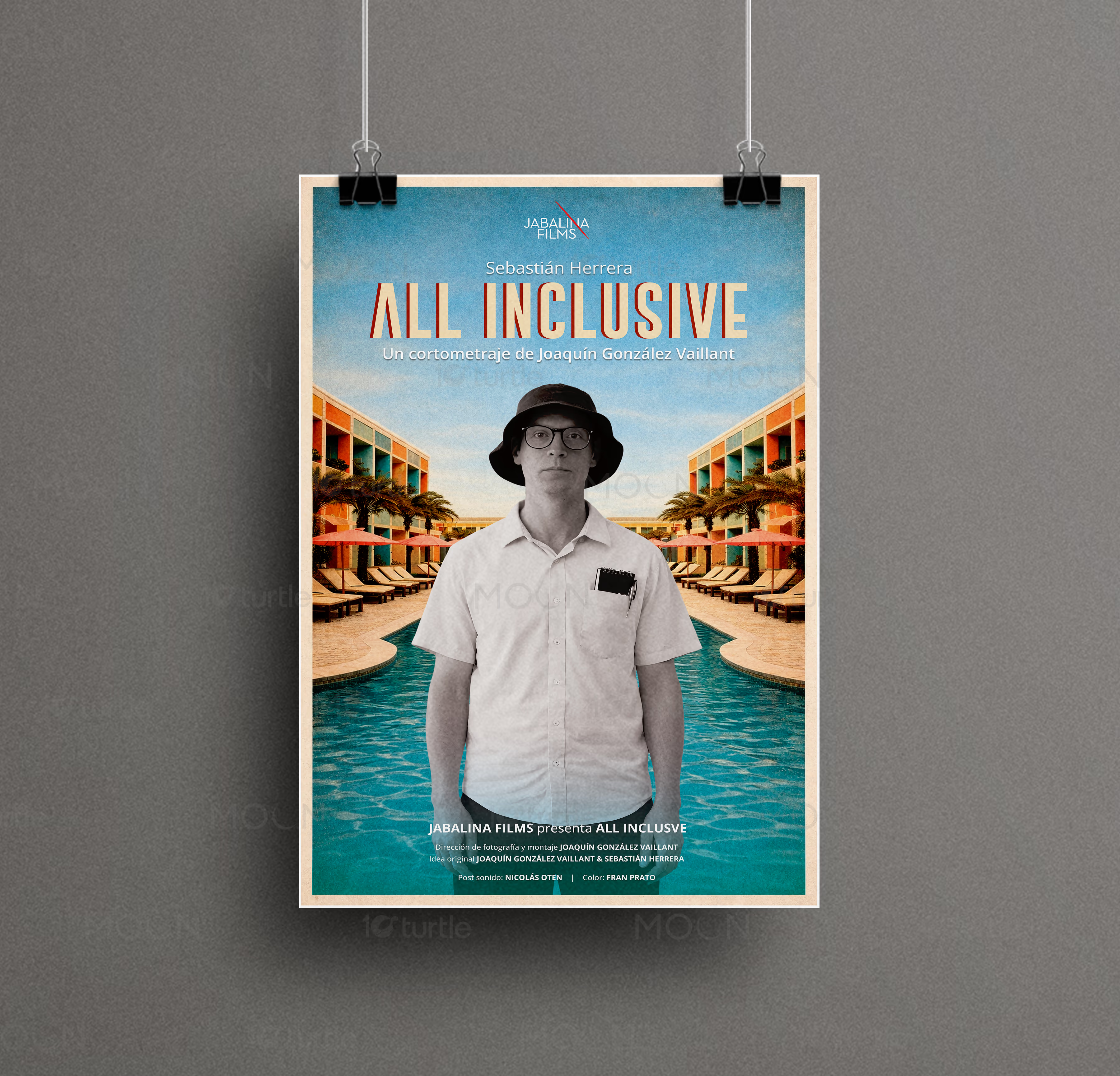
The Denmark Hotel poster uses playful blue typography, tropical palm illustration, cream background, green footer, and weekend schedule blocks to create a relaxed hospitality feel. The All Inclusive poster uses a centered black-and-white figure against a colorful resort and pool background, giving it a cinematic contrast between character and setting. The Beyond The Brush poster uses bold red and white type, a deep purple backdrop, 3D liquid nail-art visuals, and event details for a futuristic beauty tone. Across the set, each poster is designed for strong display impact while keeping information easy to scan.
/ Project Information
This poster collection covers three different promotional needs: a hotel weekend poster, a short-film poster, and a nail-art event poster. Together, they show how poster design can shift tone while staying clear, memorable, and print-ready. Each layout uses strong headline placement, industry-specific imagery, and color contrast to create fast visual recognition.