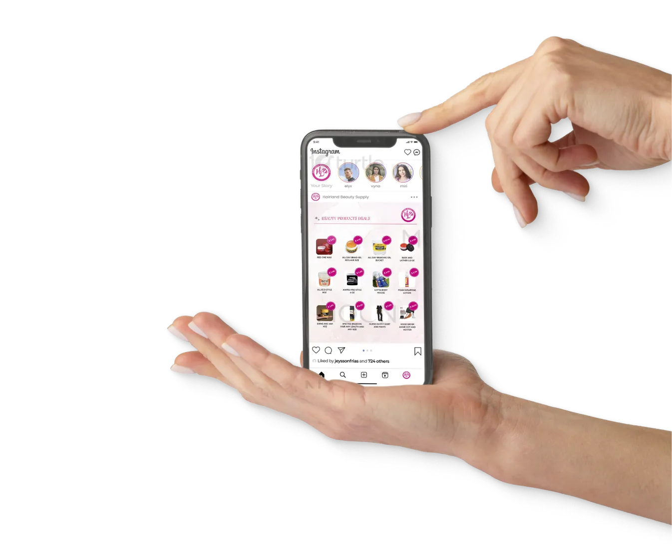
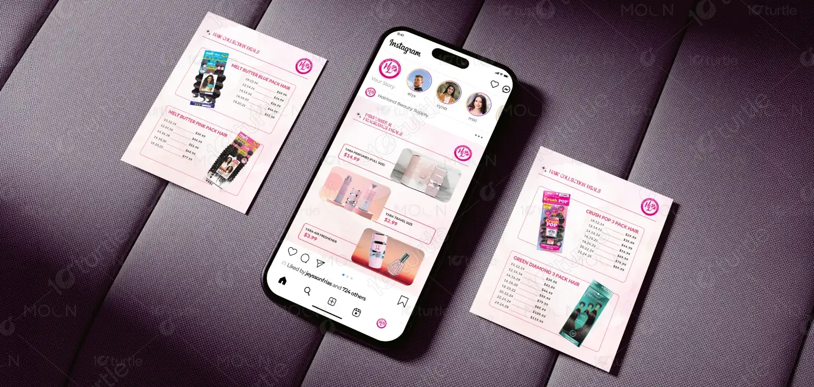
The design follows a bold, high-impact retail promotion approach, combining strong typography, structured layout, and high-contrast color usage to instantly capture attention. A clear visual hierarchy is established with the main sale headline positioned prominently, followed by categorized product sections that guide the viewer through the content effortlessly. The use of repetition, consistent spacing, and aligned pricing blocks ensures readability, while the contrasting color palette enhances visibility both in-store and on digital platforms. The overall direction prioritizes clarity, urgency, and accessibility, making it ideal for fast-paced consumer environments.
Template Design
Graphic Design
Industry
Fashion, Beauty & Lifestyle
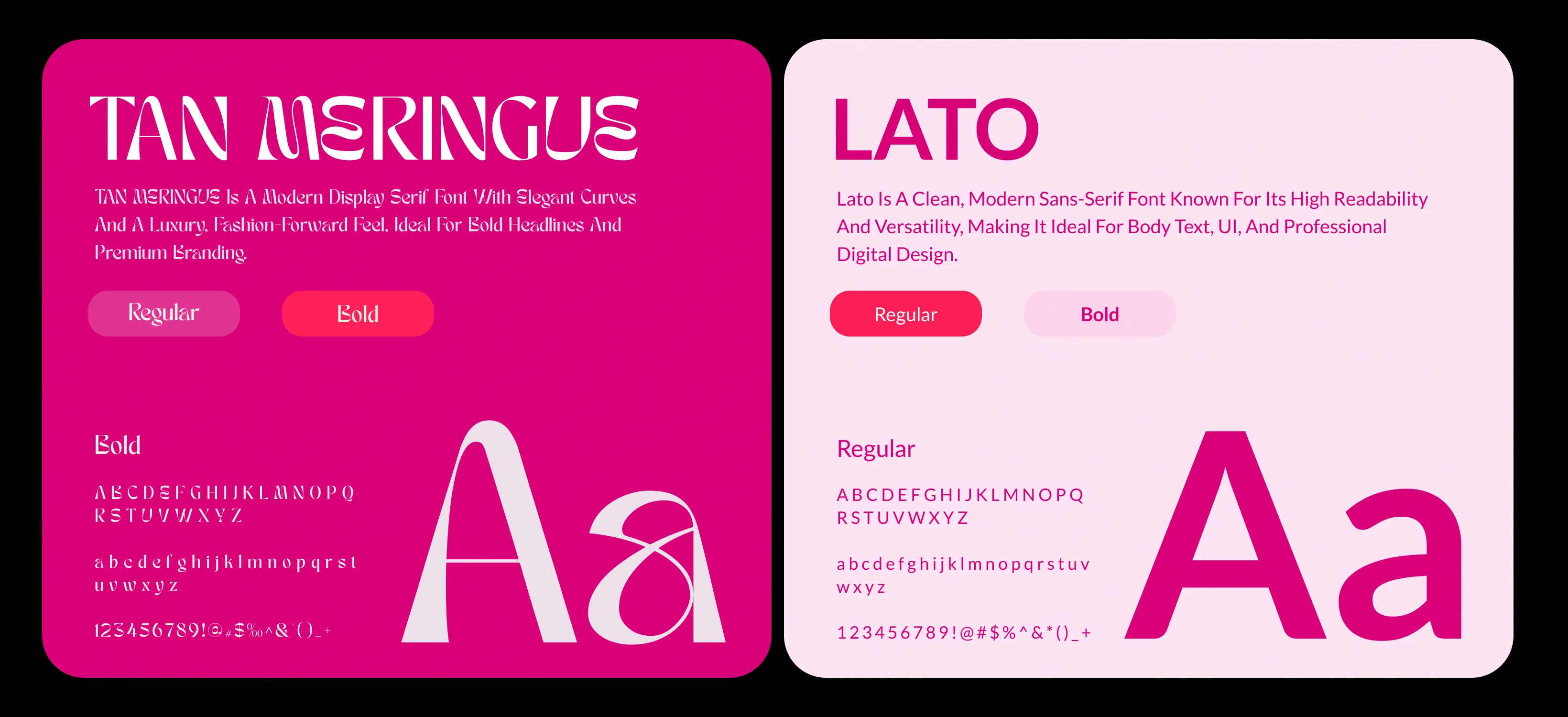
Tools we used


Project Completion
2025
Key Market
Global
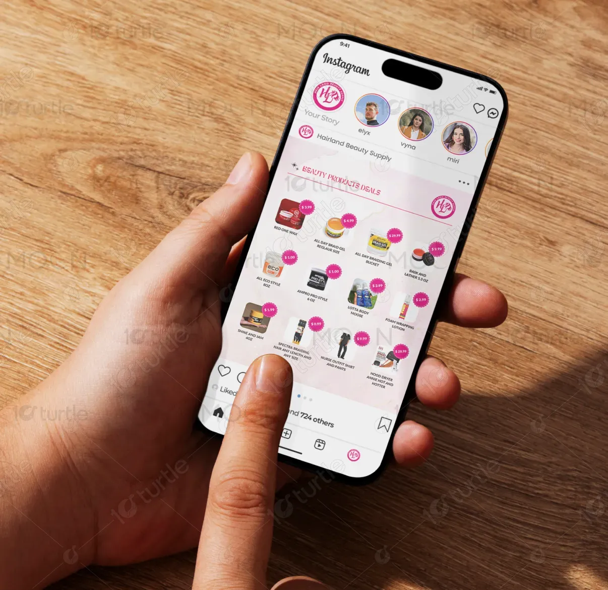
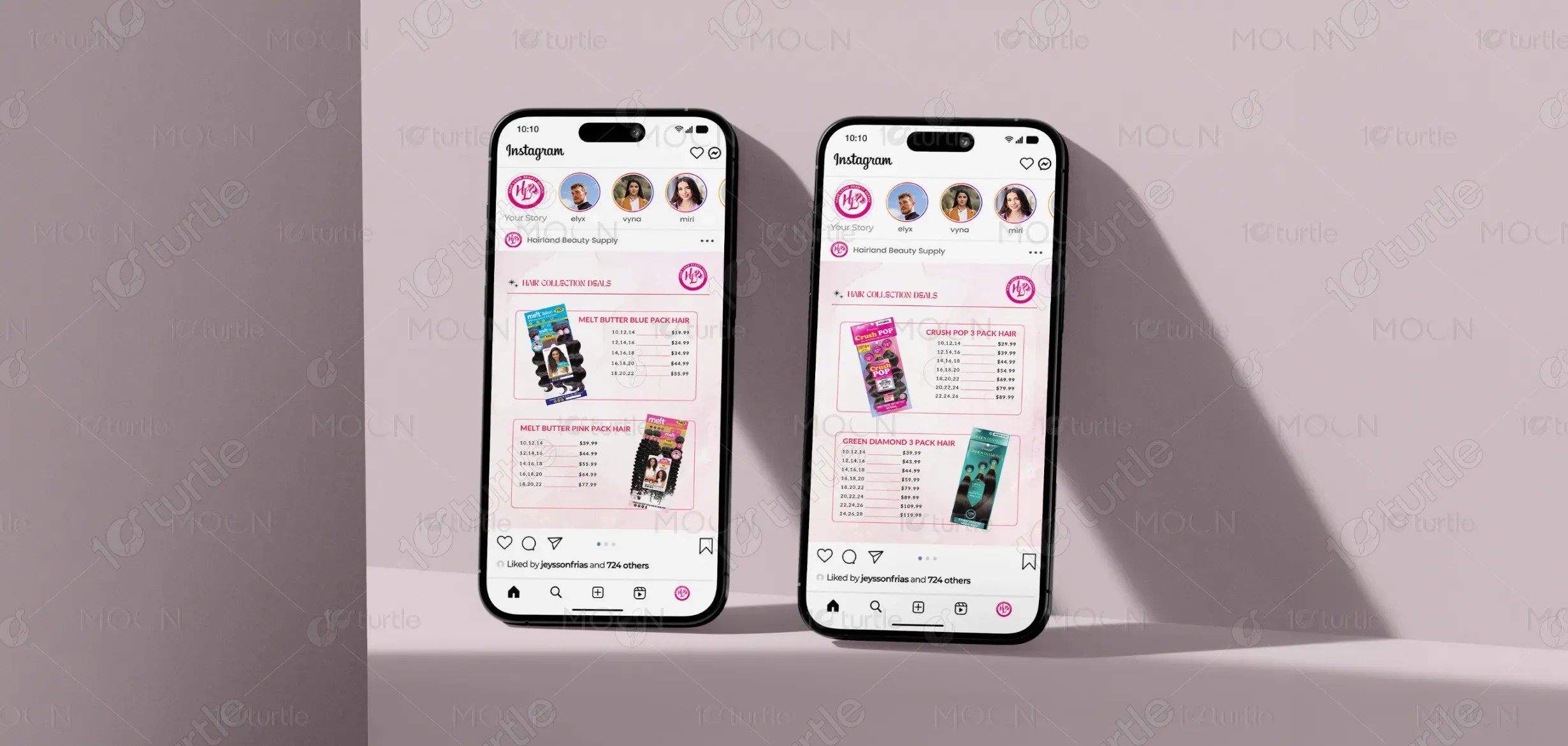
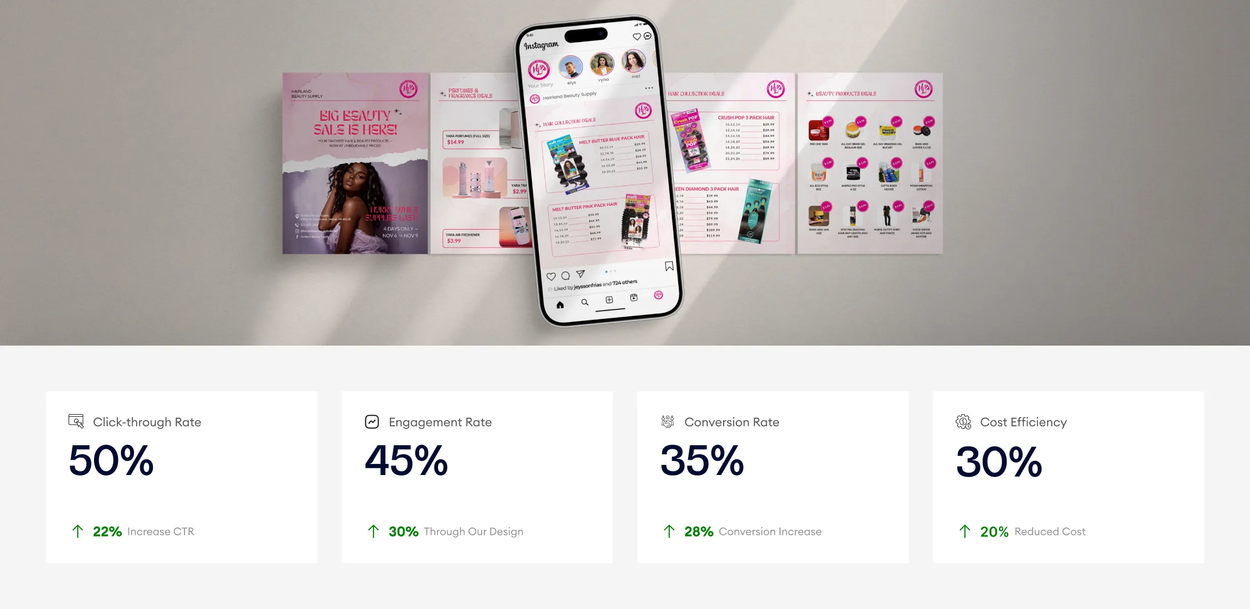
This design represents a limited-time promotional campaign for Hairland Beauty Supply, focused on driving in-store traffic and increasing product sales. It showcases a wide range of hair extensions, beauty products, and fragrances with clearly listed pricing to appeal to budget-conscious and value-driven customers. Positioned within the beauty retail market, the design acts as a direct marketing tool that communicates affordability, variety, and urgency in a single glance, making it highly functional for both print and social media use.

Industry
Fashion, Beauty & LifestyleWhat we did
Template DesignGraphic DesignPlatform
-In the beauty retail industry, promotional campaigns often struggle with overcrowded visuals, unclear pricing, and weak message hierarchy, leading to reduced customer engagement and missed sales opportunities. Customers typically seek quick, easy-to-understand deals, but cluttered layouts and inconsistent presentation can create confusion and reduce trust. Additionally, in competitive retail environments, lack of visual impact can result in low visibility, especially across social media platforms where attention spans are limited.
The design addresses these challenges through a structured and user-centric layout that emphasizes clarity and readability. Key information such as the sale headline, duration, and pricing is strategically highlighted using bold typography and contrast. Products are grouped into logical categories, allowing users to quickly scan and identify relevant deals. The consistent alignment and spacing improve visual flow, while the strong color contrast ensures the design stands out in both physical and digital contexts. This approach enhances usability, improves message retention, and encourages immediate customer action.
The design, with its bold typography and clear visual hierarchy, is optimized for engaging fast-paced consumers. It effectively guides users from attention-grabbing headlines to product categories, resulting in stronger interactions. In real-world usage, conversion and engagement metrics could increase as the design facilitates better user navigation and drives impulse purchases. The reduction in marketing spend would come from improved retention and lower customer acquisition costs.
The design supports a long-term vision of positioning Hairland Beauty Supply as a reliable and accessible destination for affordable beauty products. It establishes a scalable visual system that can be adapted for future campaigns, seasonal promotions, and digital marketing efforts. By maintaining consistency in visual identity and communication style, the brand can build stronger recognition and trust while continuously engaging its target audience across multiple touchpoints.
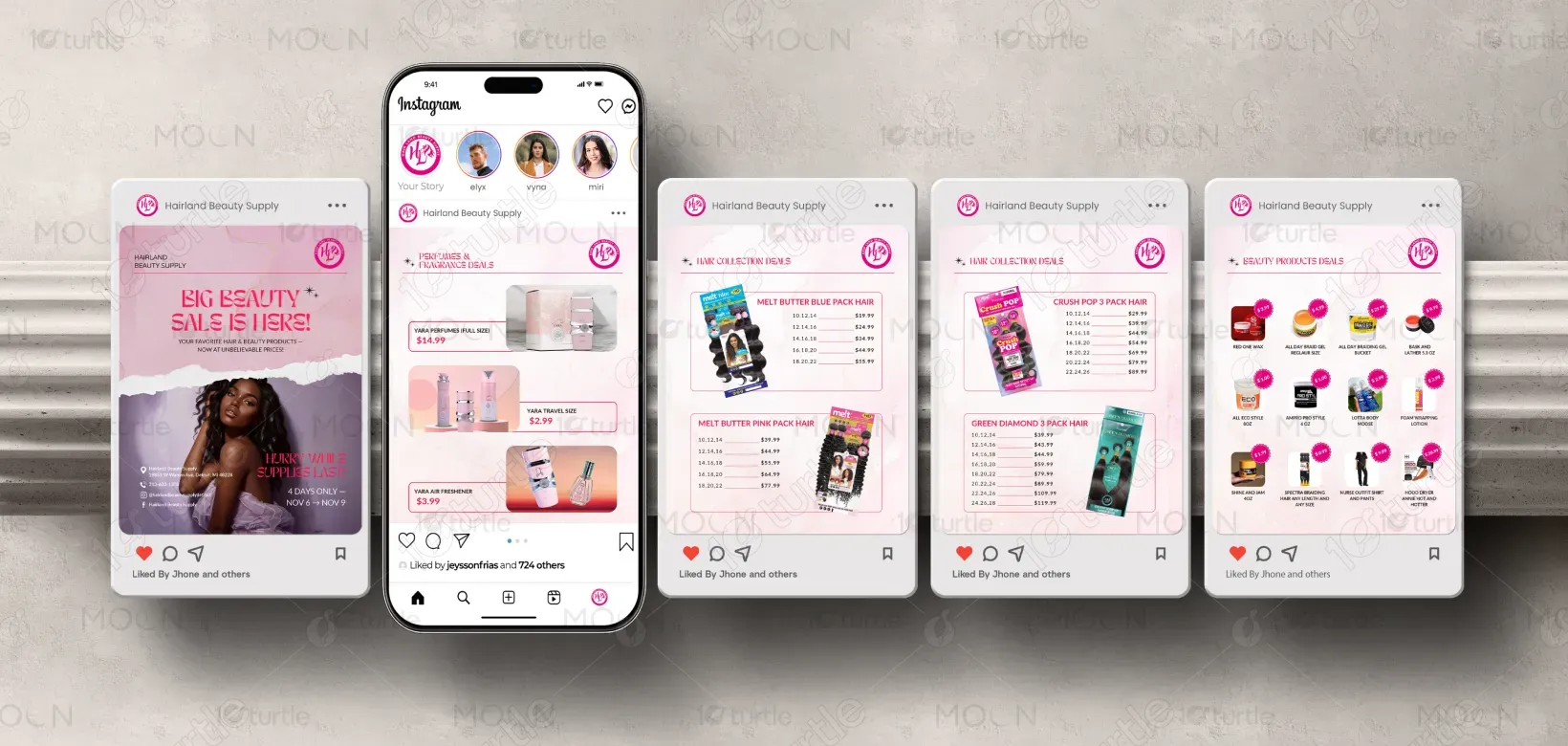

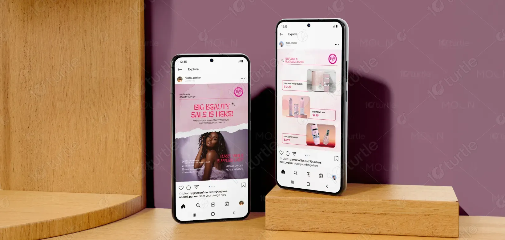
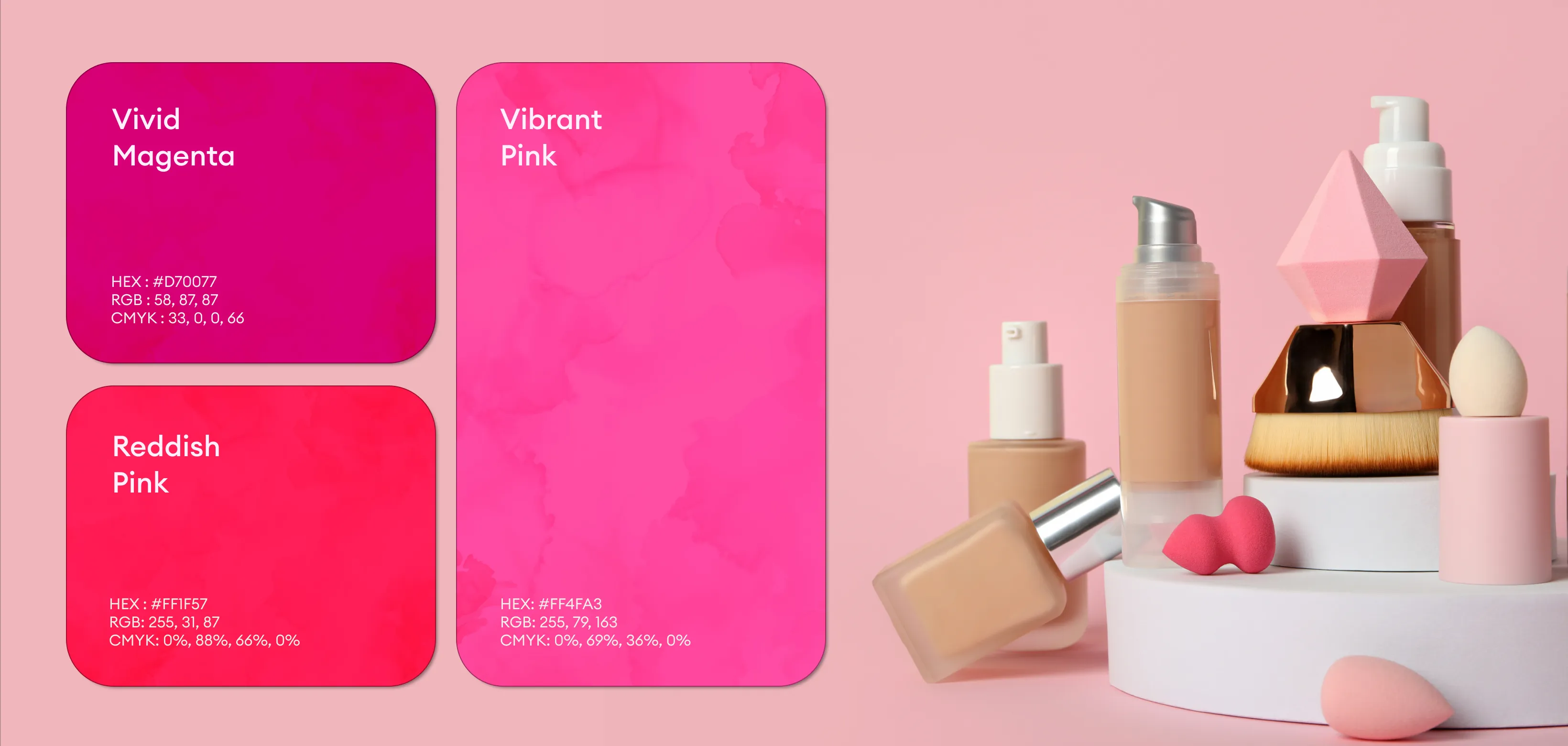
The design utilizes a high-contrast color palette that combines bold dark tones with light backgrounds to ensure maximum readability and visual impact. Accent colors are used strategically to highlight key elements such as prices and promotional headlines, creating a sense of urgency and importance. The visual language is clean, structured, and functional, aligning with the fast-paced nature of retail communication. Typography is bold and legible, supporting quick scanning, while the overall composition maintains consistency and balance across different formats and platforms.