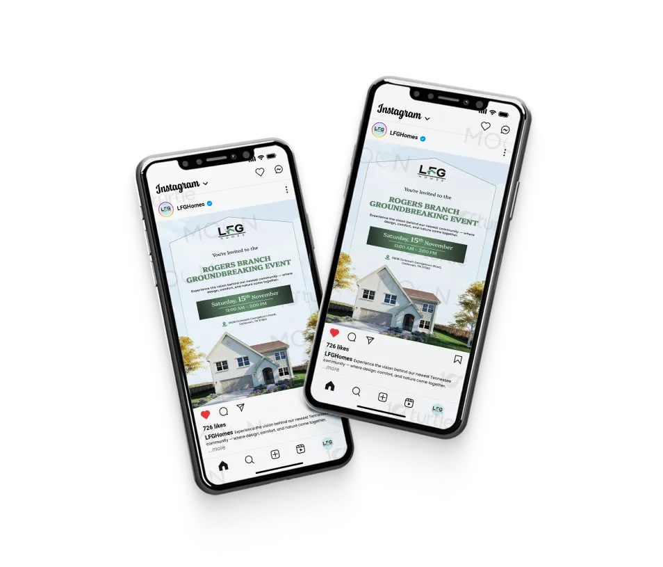
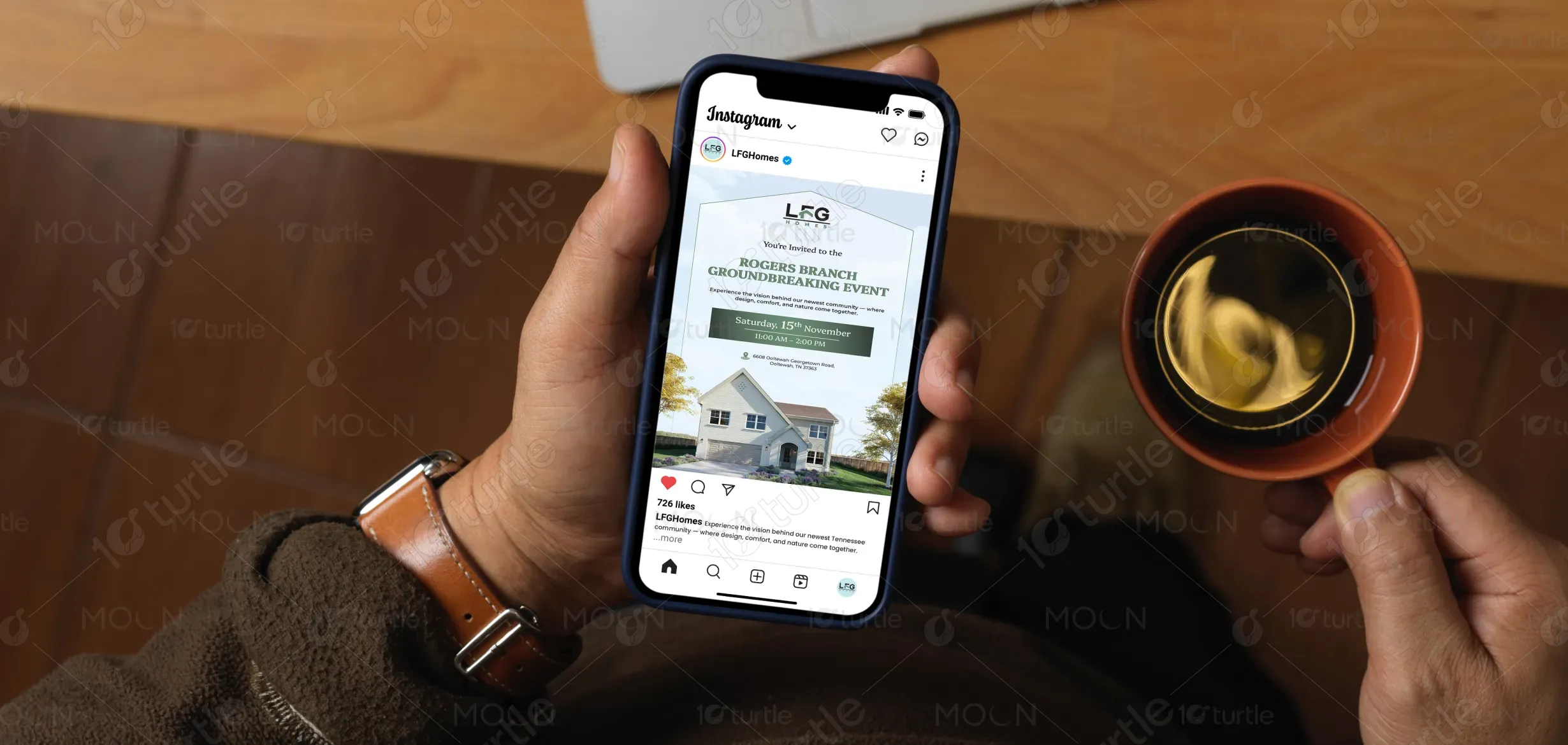
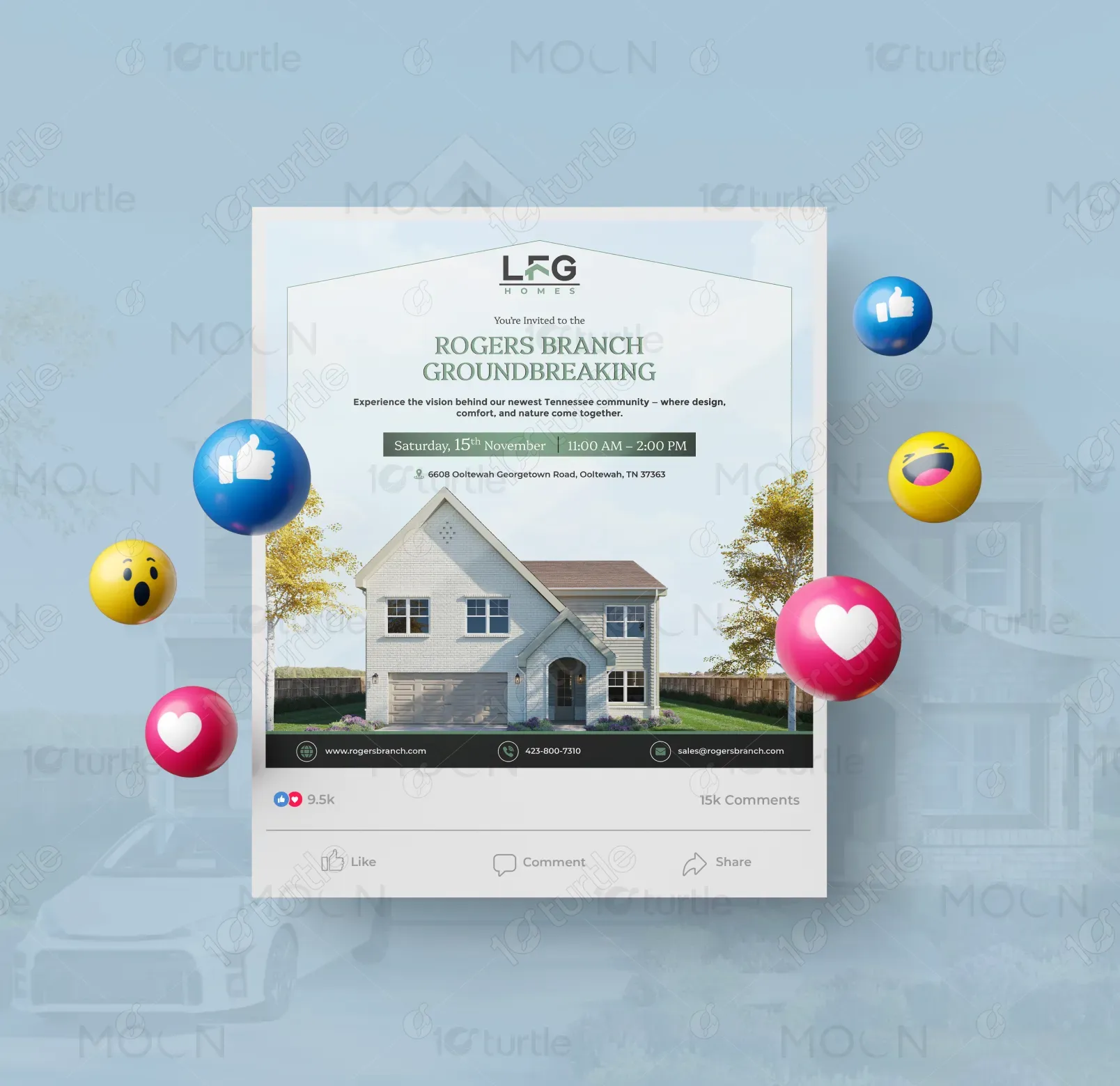
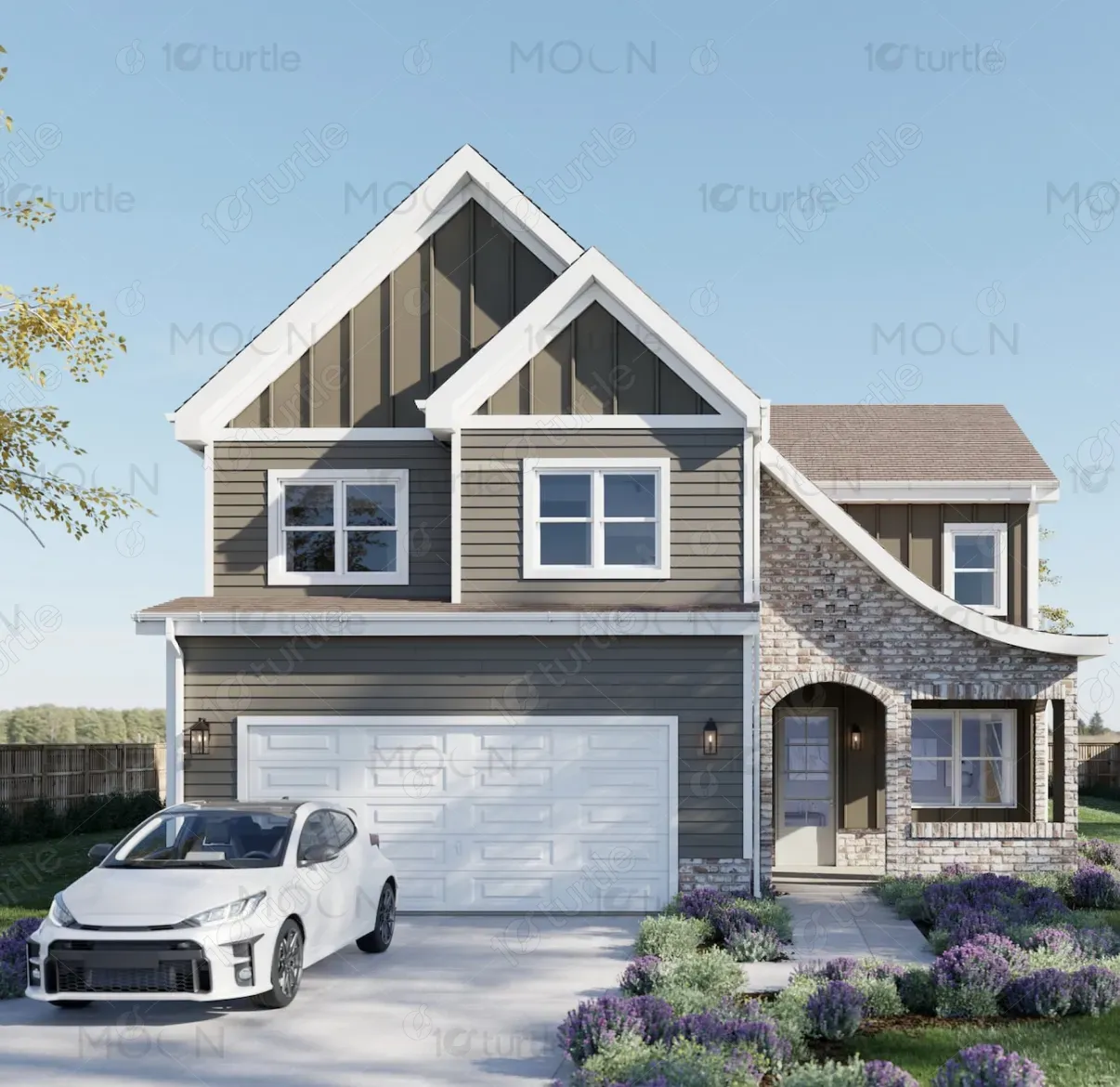
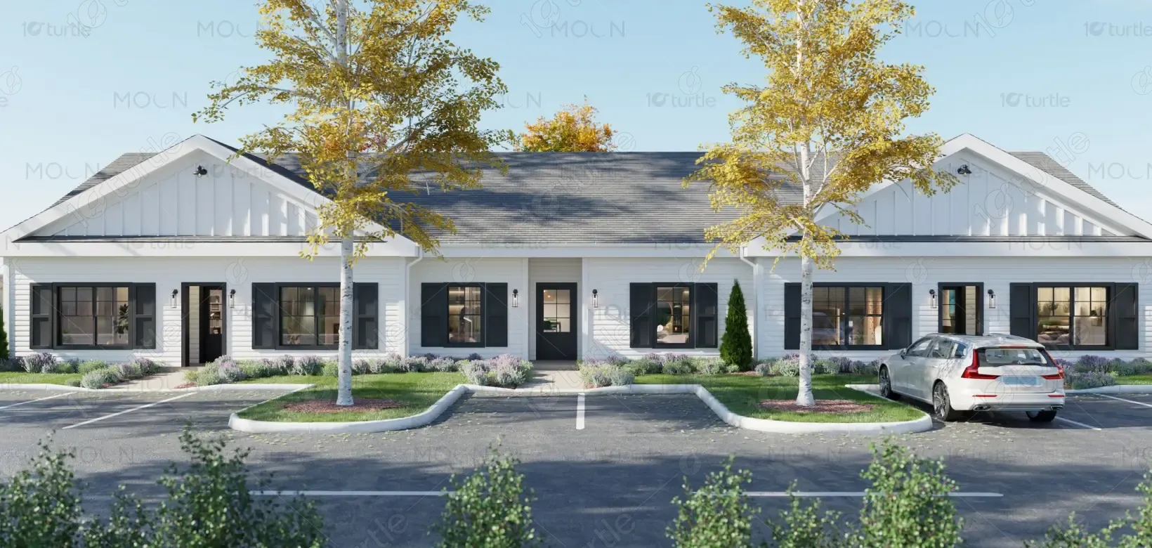
The design focuses on a clean, inviting, and residential aesthetic that reflects the warmth and reliability of a modern housing community. A balanced layout guides the viewer from the brand identity at the top to the event information and property imagery below, ensuring immediate clarity. Elegant serif typography for the headline adds sophistication while modern sans-serif text improves readability for event details. The hero house image anchors the composition and visually communicates the lifestyle being promoted. Soft sky tones, natural greens, and structured spacing create a calm, trustworthy atmosphere suited for real estate marketing.
SMP Design
Graphic Design
Industry
Property, Construction & Real Estate
Tools we used


Project Completion
2025
Key Market
Global
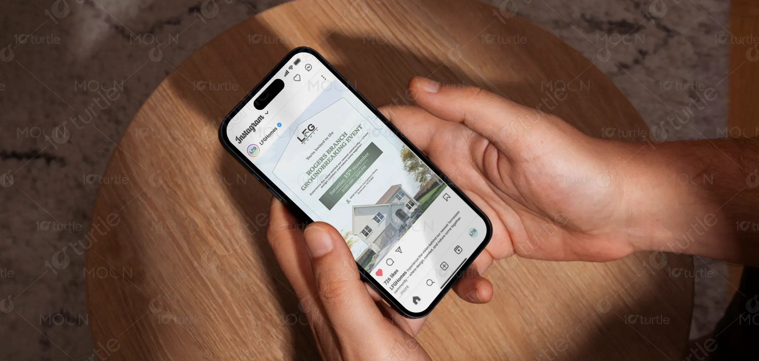
This post design promotes the Rogers Branch Groundbreaking event by LFG Homes, inviting prospective homeowners, community members, and investors to experience the launch of a new residential development in Tennessee. The primary purpose is to communicate key event information clearly while visually showcasing the style and quality of the upcoming community. By combining property imagery with concise event details, the design functions as both an invitation and a promotional asset. It positions Rogers Branch as a thoughtfully designed neighborhood where comfort, nature, and modern living come together.
Industry
Property, Construction & Real EstateWhat we did
SMP DesignGraphic DesignPlatform
-Real estate announcements and community launches often struggle with low visibility and unclear messaging, especially when event details and promotional visuals compete for attention. Without a clear hierarchy or compelling imagery, audiences may overlook key information such as date, location, and purpose of the event. This lack of clarity can reduce engagement and limit attendance for important milestone events like community groundbreakings. Additionally, poorly designed announcements may fail to communicate the quality and vision behind the development.
The design addresses these challenges through a clear visual hierarchy that prioritizes the event name, supporting message, and logistical details in a structured sequence. Strategic typography and contrast ensure that important information such as the date, time, and location is immediately visible and easy to read. The central house image provides a strong visual representation of the development, reinforcing trust and credibility for the project. Consistent spacing, simple iconography, and well-defined sections make the information accessible across both digital and print formats.
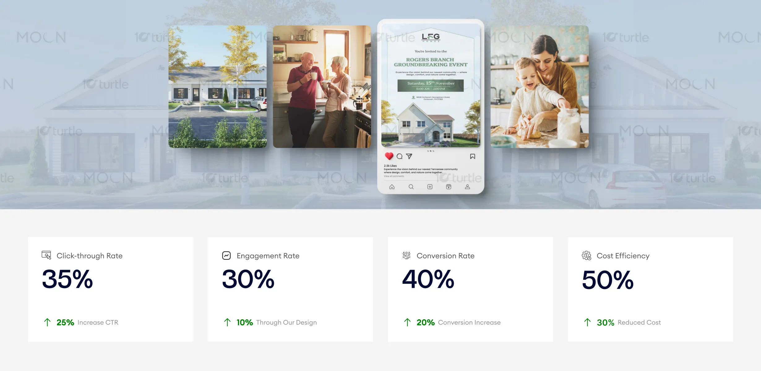
This design excels in creating an inviting, trustworthy atmosphere ideal for real estate marketing, effectively boosting engagement and conversions. The clean aesthetic and clear hierarchy of content ensure users are guided seamlessly through the messaging, leading to higher click-through rates. To further improve these metrics, optimizing targeting based on user demographics and leveraging more personalized calls-to-action could drive even better results.
The long-term vision behind the design is to establish a recognizable and professional visual style for LFG Homes’ community announcements and marketing materials. By maintaining a consistent layout structure and refined aesthetic, the brand can build trust with potential buyers and stakeholders across future developments. The design approach supports scalability across social media campaigns, event promotions, brochures, and property listings. Over time, this consistent presentation strengthens brand recognition and positions LFG Homes as a reliable developer focused on thoughtful community building.
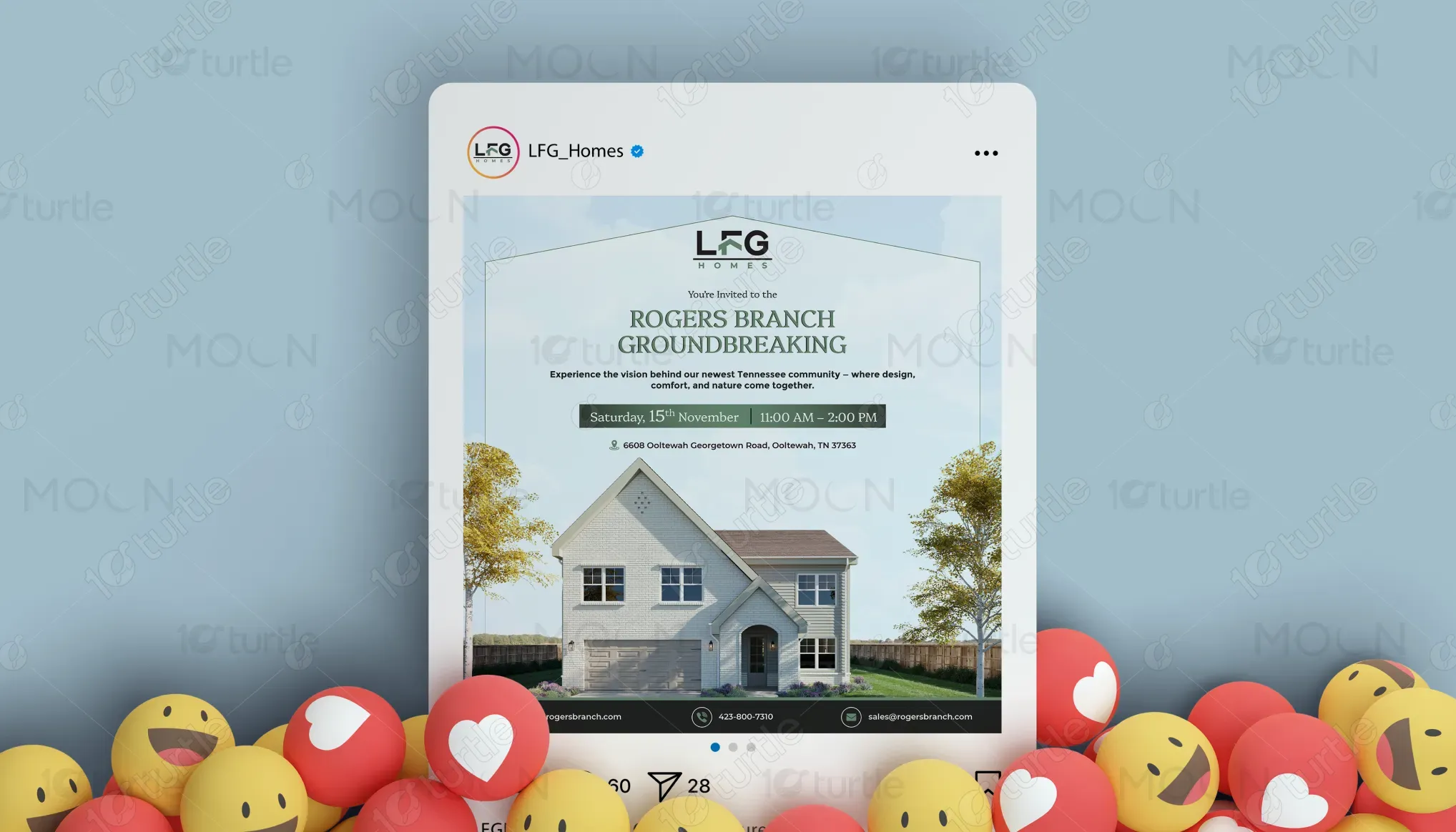
The color palette uses soft sky blues, natural greens, and neutral tones to reflect the themes of nature, stability, and comfortable living associated with residential communities. These colors create a calm and welcoming atmosphere while maintaining strong contrast for readability. Supporting visual elements such as simple icons, clean dividers, and structured spacing reinforce clarity and professionalism throughout the design. The overall visual language emphasizes openness, trust, and modern living, aligning with the brand identity of LFG Homes and the lifestyle vision for Rogers Branch.