
Print Design
Editorial Design
Art Direction
Overview
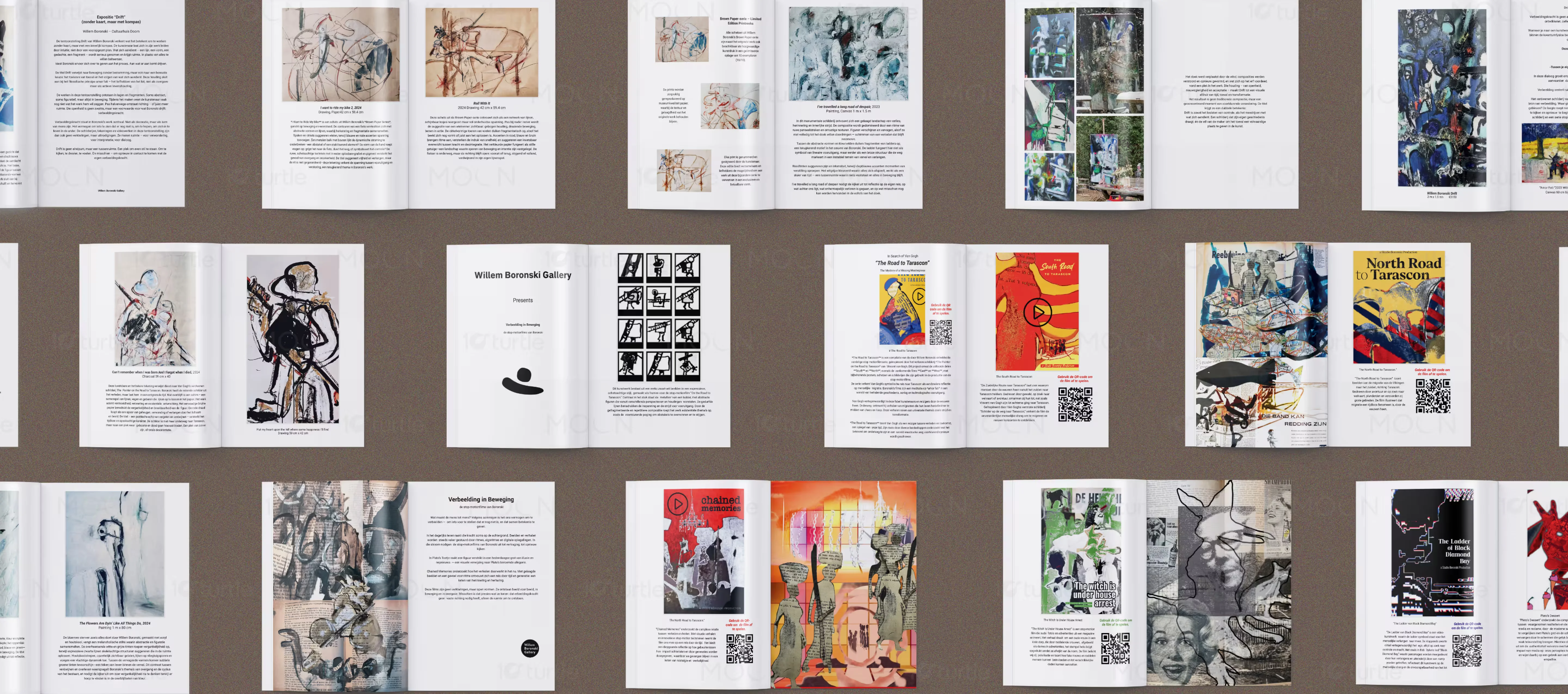
A sophisticated graphic design project for a technology art exhibition exploring themes of transformation and discovery. We developed a comprehensive editorial and visual system that merges technical innovation with a refined gallery aesthetic. The result is an immersive reading experience that elevates the artistic narrative of the collection.
The Challenge

Technology exhibitions often struggle with dense information that feels sterile and inaccessible to high end audiences. The challenge was to create a visual language that felt both cutting edge and artistically profound, moving away from corporate clichés. We needed to solve the problem of engagement in a crowded market through premium design.
The Solution
We implemented a strategic approach that used minimalist layouts and a curated typography system to create a sense of museum quality sophistication. By focusing on image led storytelling and generous white space, we allowed the technology to be perceived as art. This thinking ensured that every page invited the viewer into a journey of imagination.
The Impact
The new design system successfully repositioned the exhibition as a must see event for both tech enthusiasts and art collectors. Visitor dwell time with the printed materials increased significantly, and the brand achieved a consistent, high quality presence across print and digital media. This project established a scalable visual framework for future global initiatives.
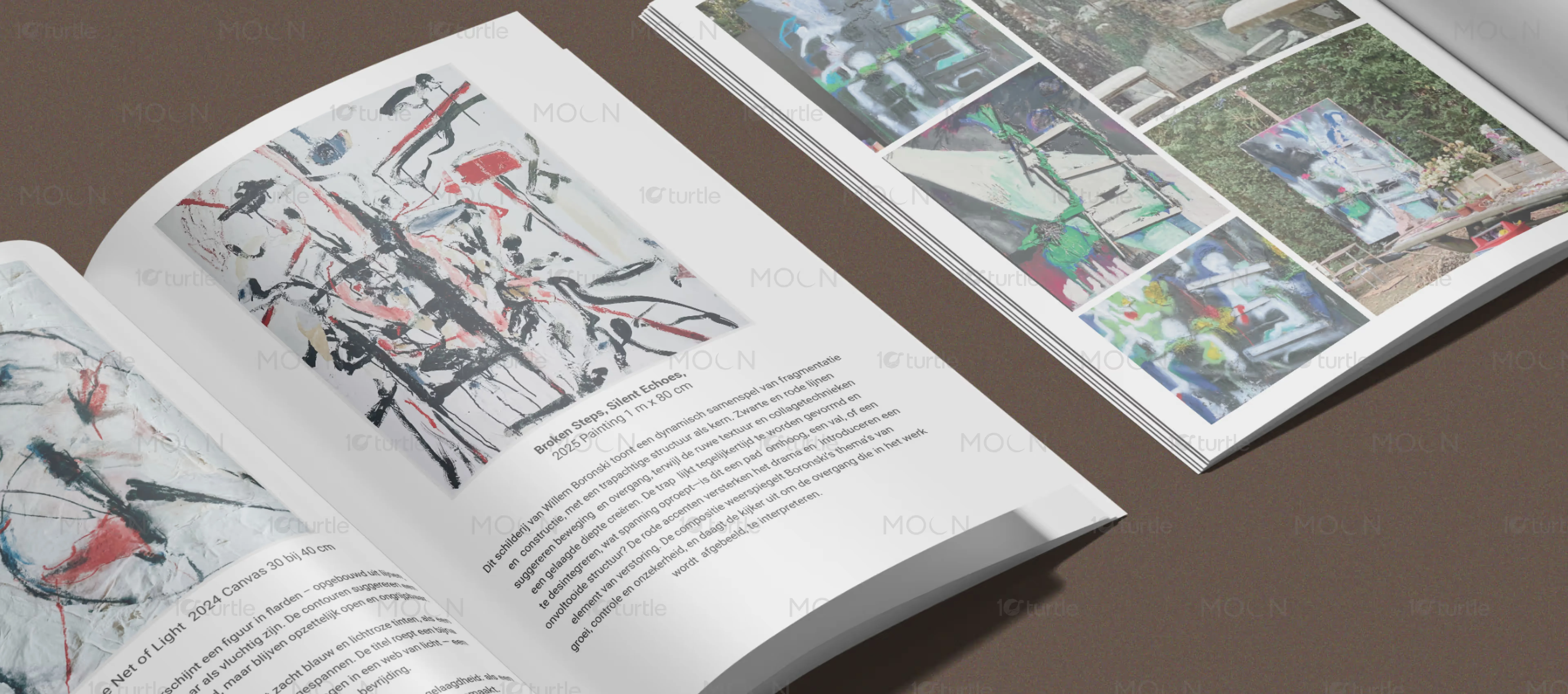
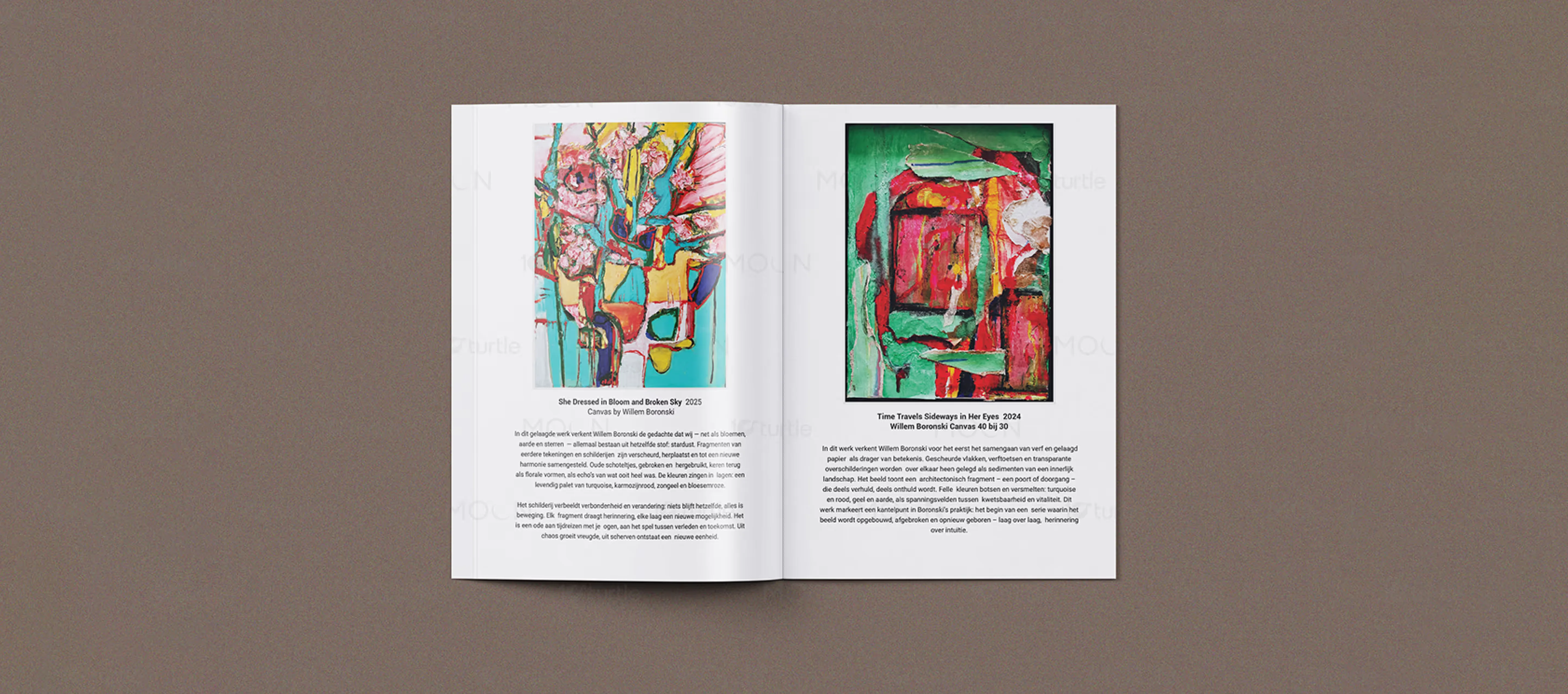
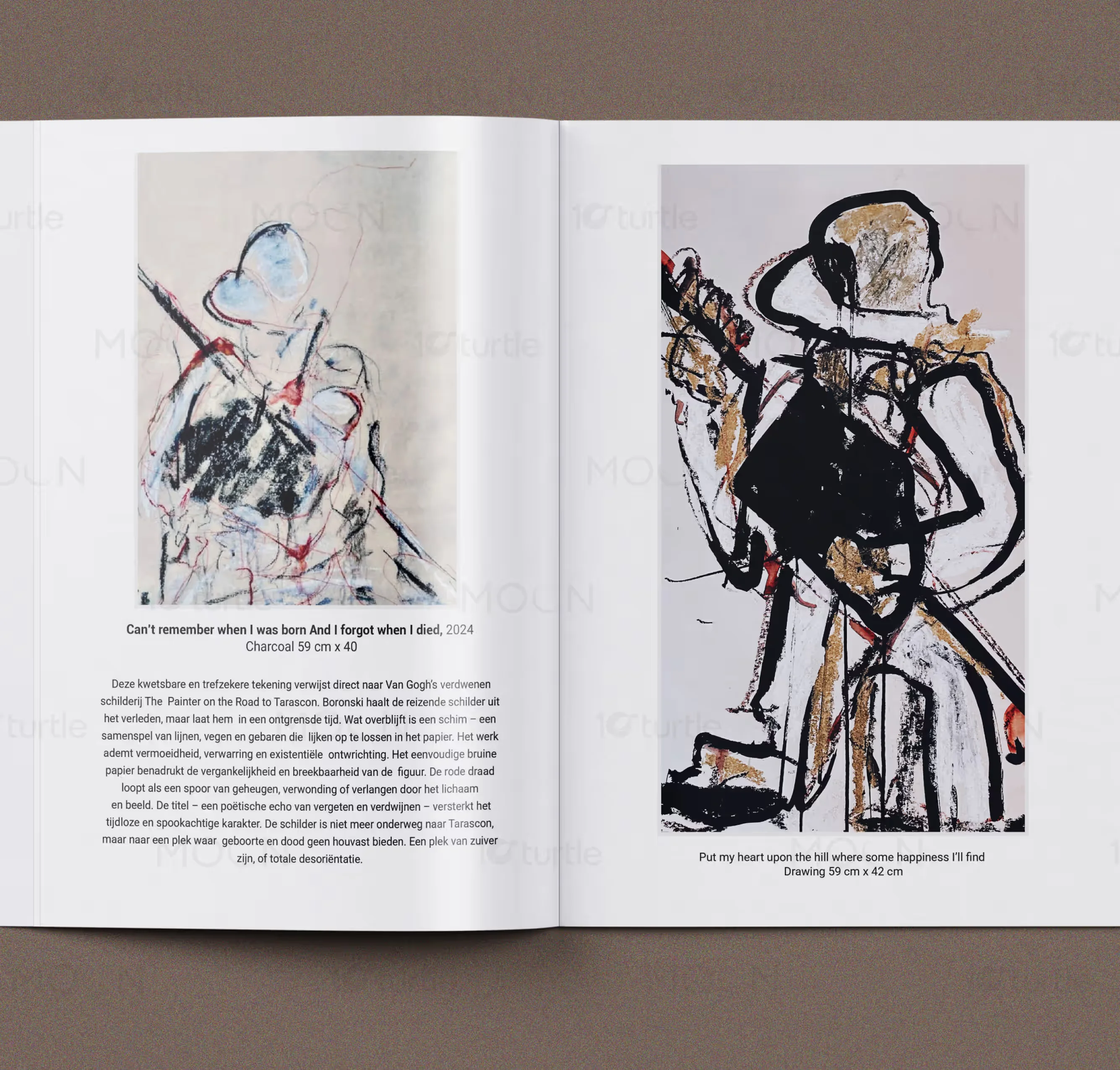
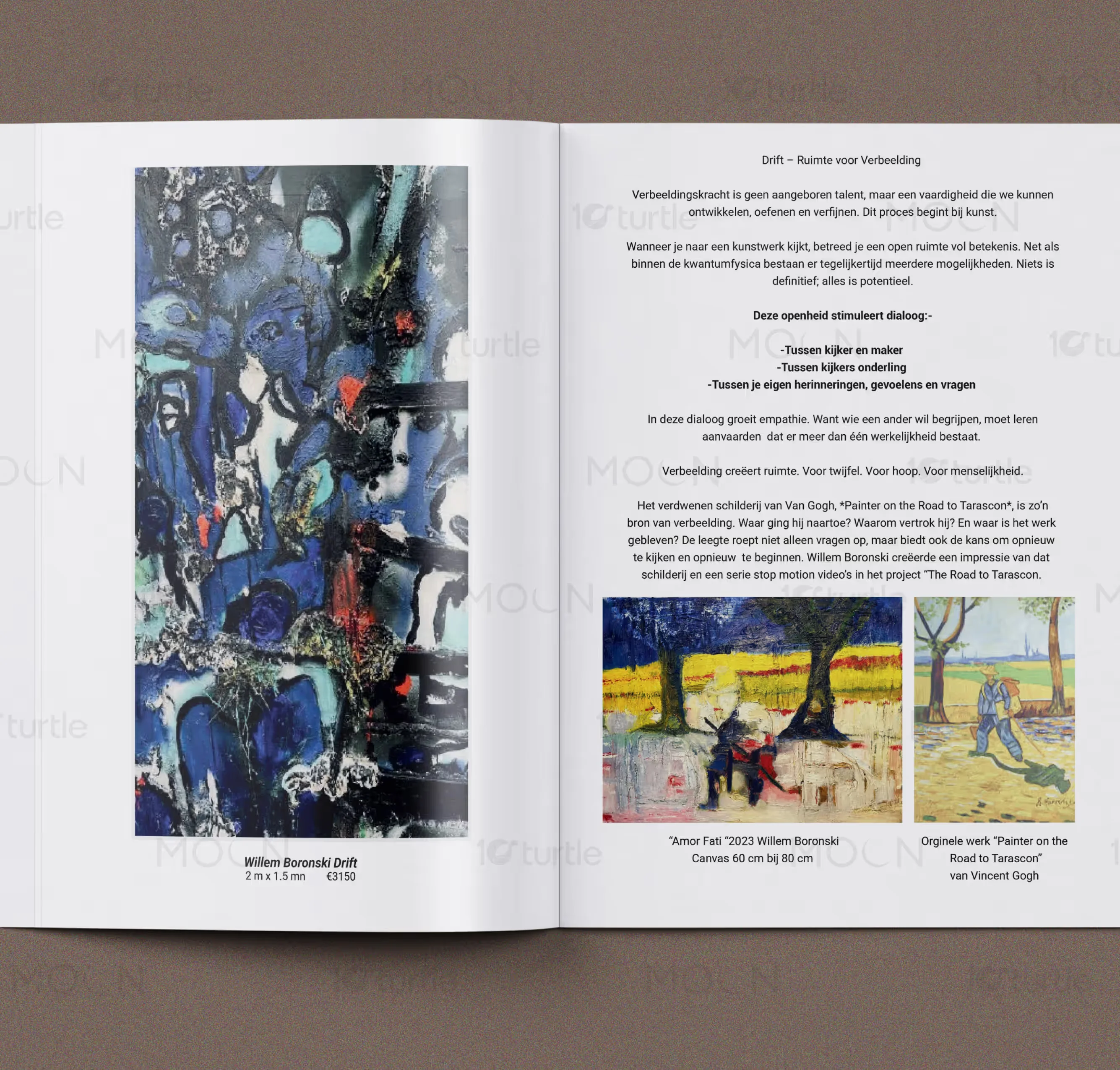
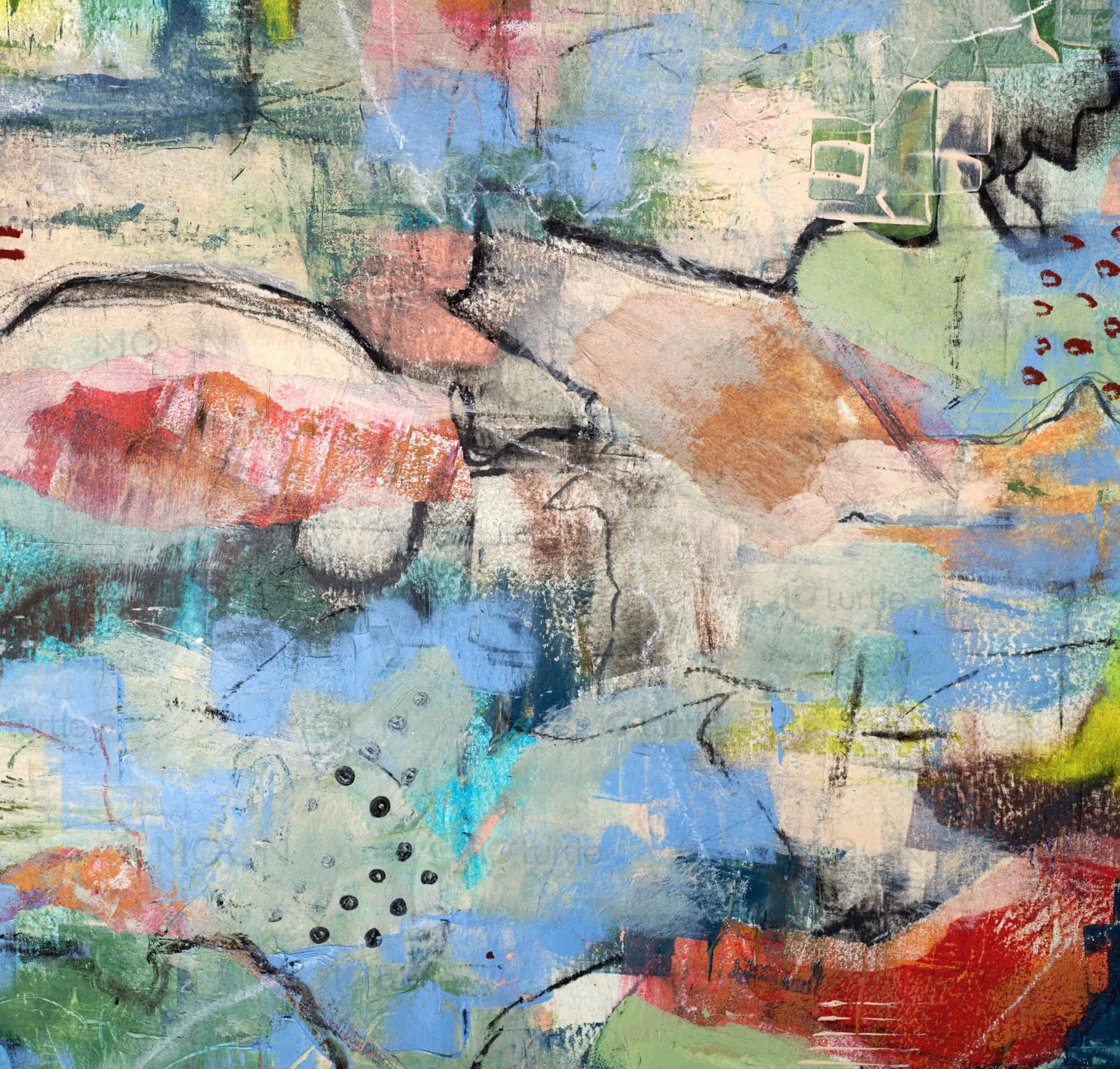
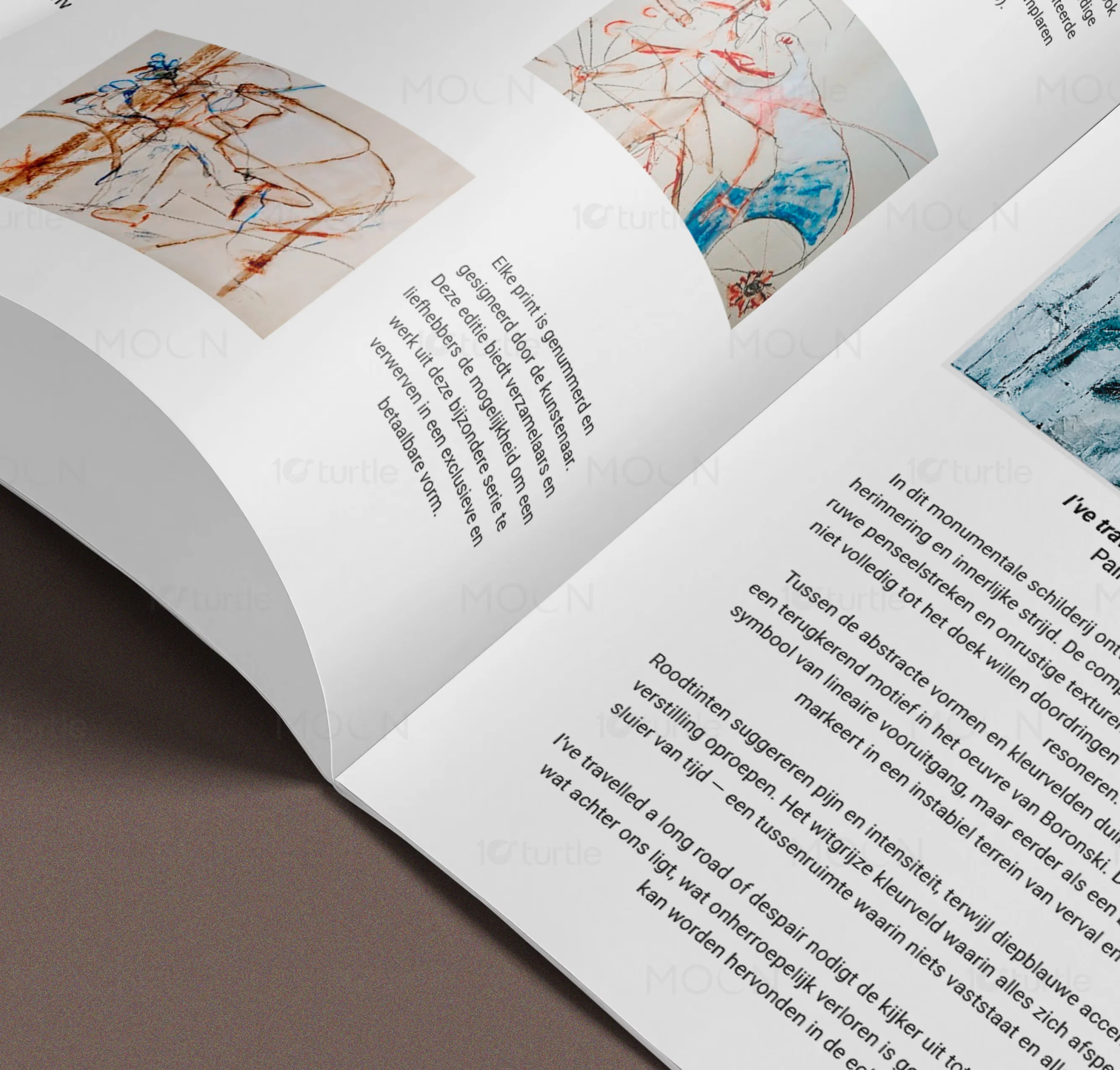
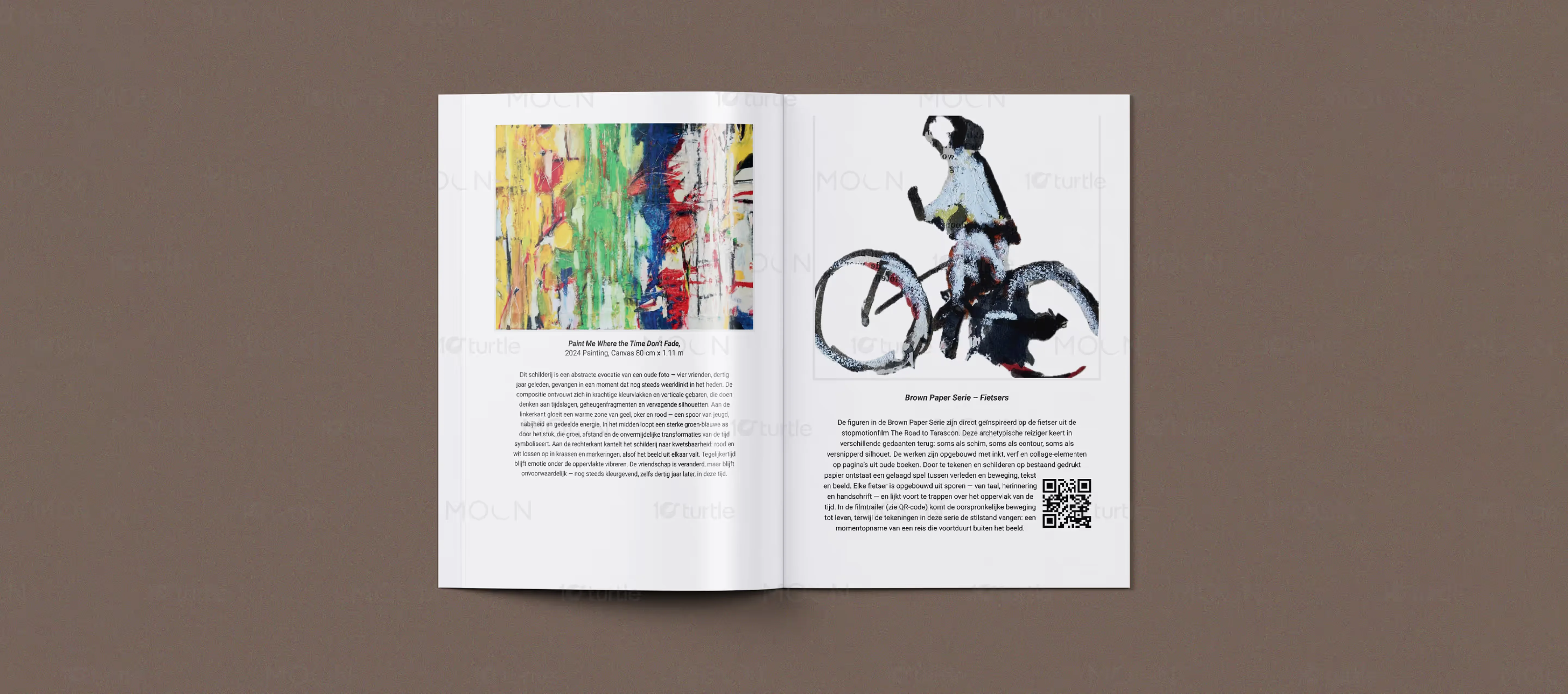
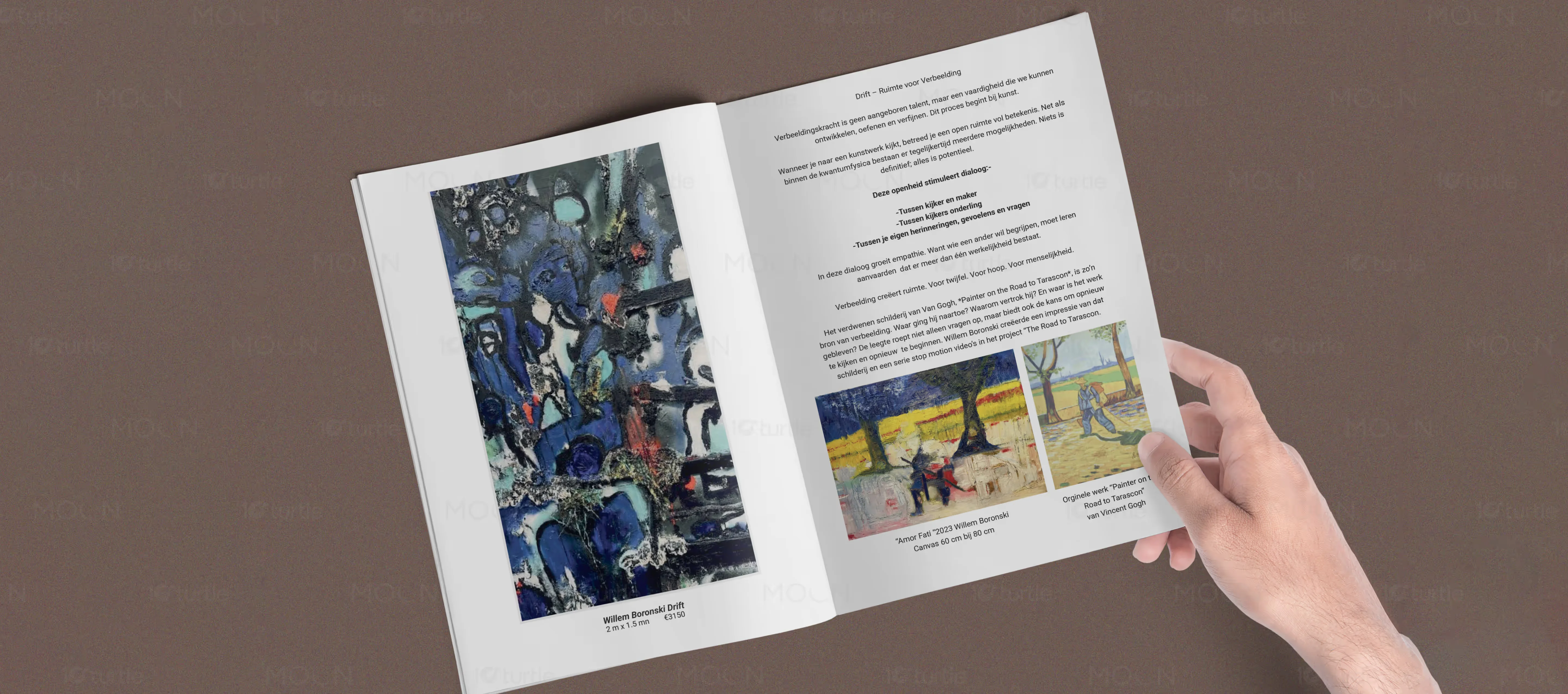
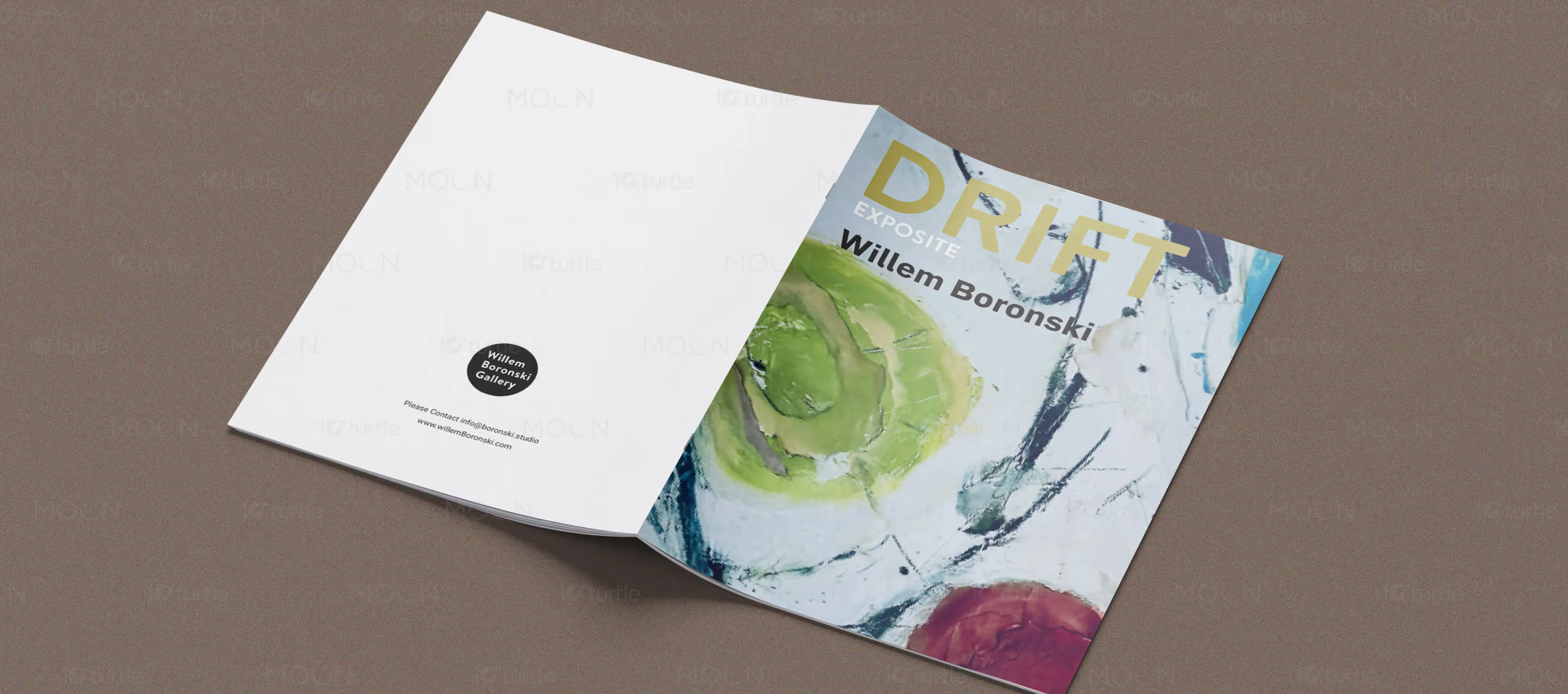
Technology Exhibition Graphic Design - Complete Brand System
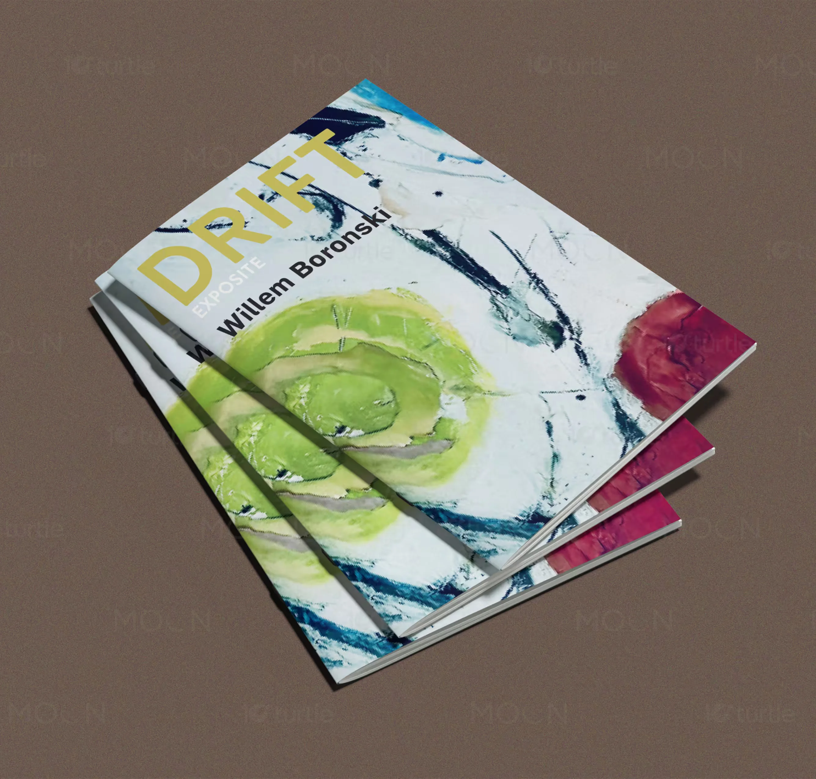
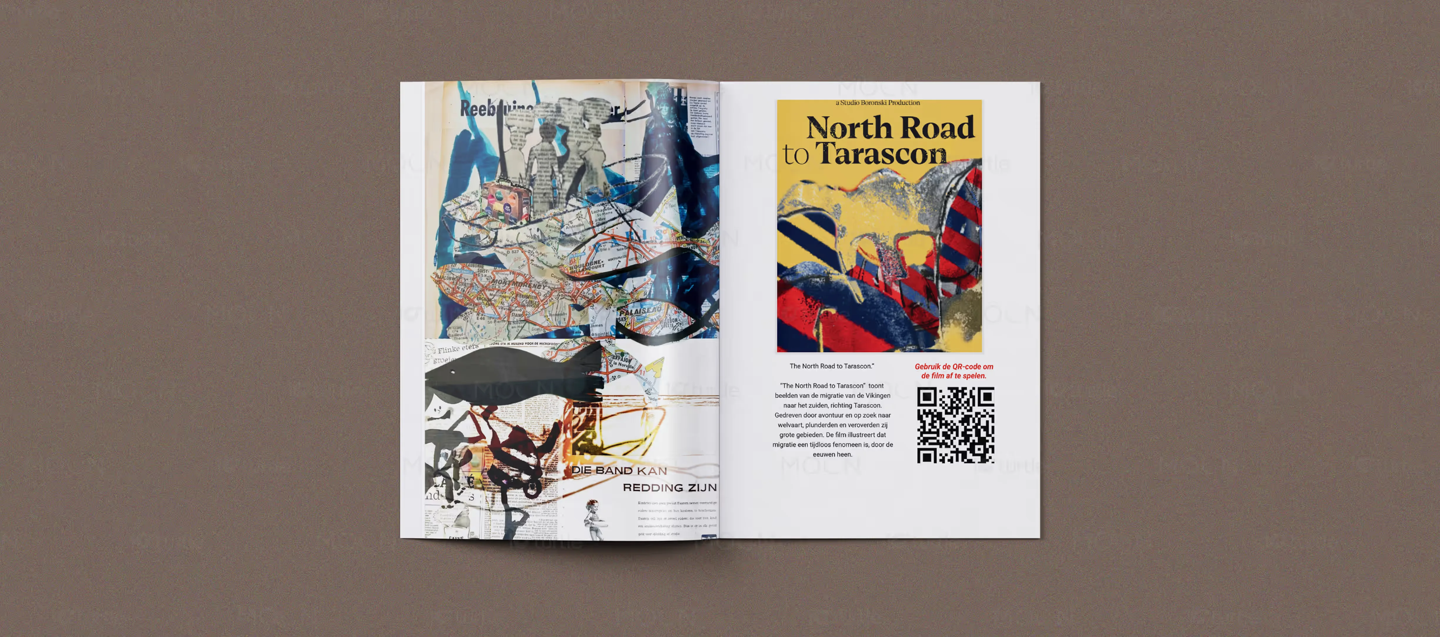
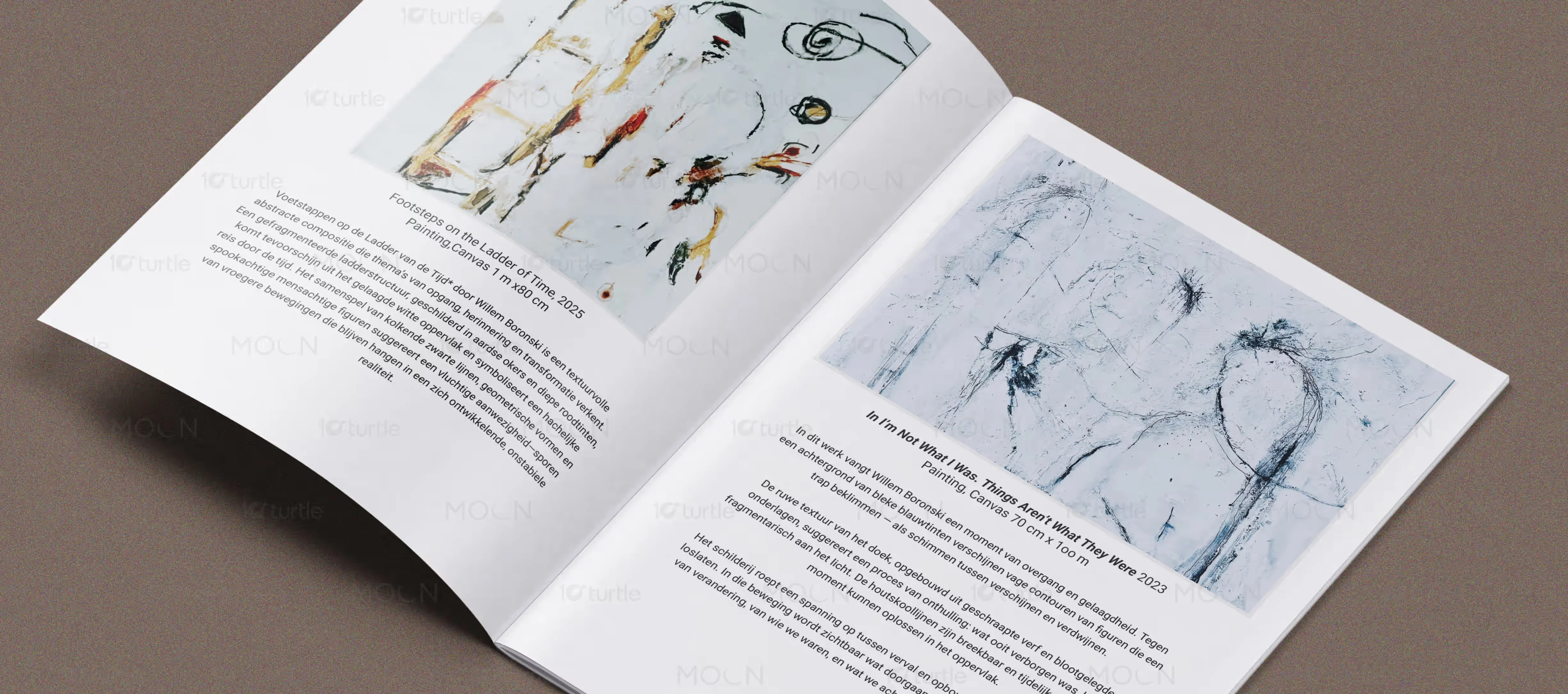
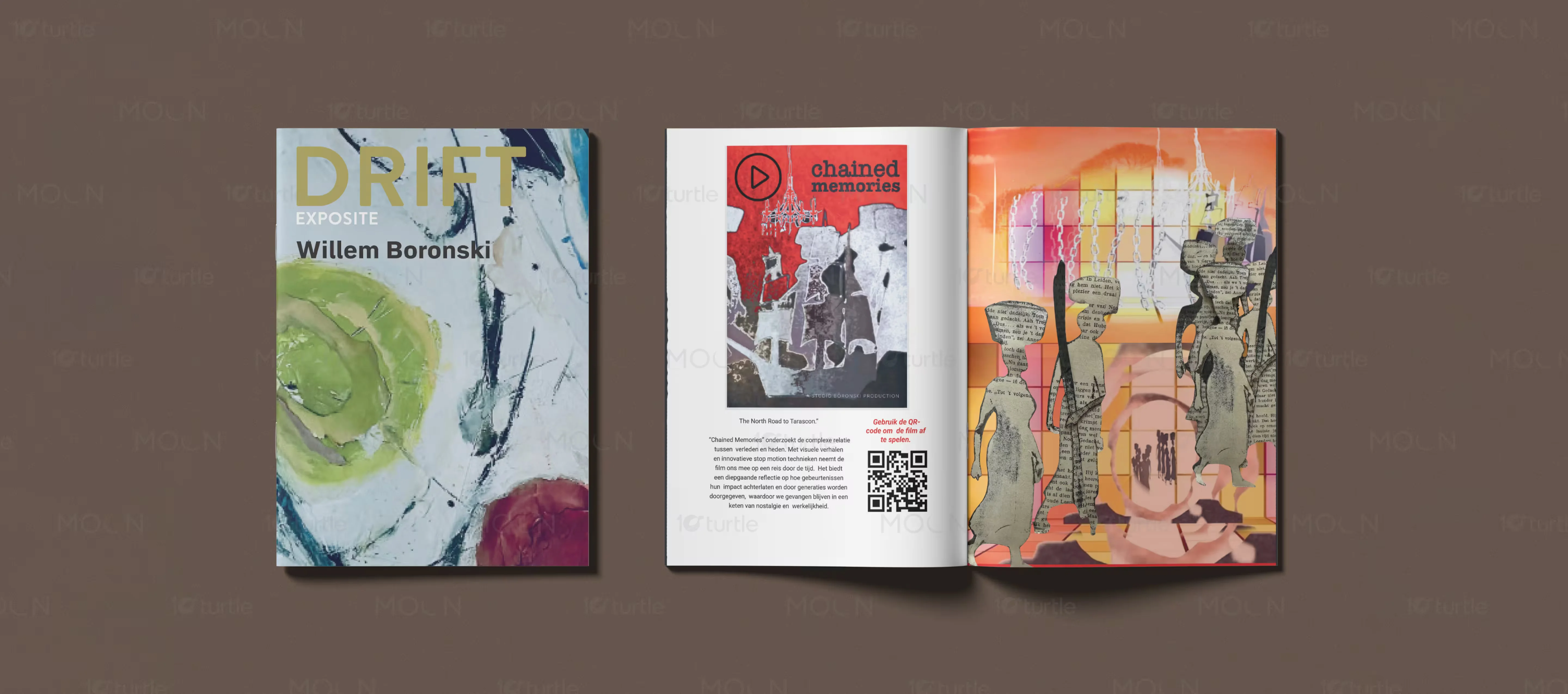
This comprehensive design project encompassed a full suite of exhibition materials, including high end brochure design, bespoke editorial layouts, and a sophisticated typography system. Our team developed a cohesive visual identity that bridges the gap between technical innovation and fine art. Key deliverables included a multi page exhibition guide, digital promotional assets, and environmental graphics that maintain a consistent aesthetic across all touchpoints. By focusing on a minimalist approach with layered artistic details, we ensured that the technical information was presented with clarity and elegance. This technology branding project was completed for a Singapore based cultural technology initiative entering the high end art and tech exhibition segment.
Why Technology Brands Need Strategic Design
In the rapidly evolving landscape of modern innovation, technology brands often struggle to find a balance between technical data and human connection. The industry reality is that visitors at high tech exhibitions are frequently overwhelmed by information density and sterile environments. To stand out, a brand must transition from a vendor of information to a curator of experiences. Consumer expectations in the tech sector have shifted toward a demand for premium, museum quality interactions that respect the viewer intelligence and time. Strategic design serves as the primary tool for this transition, allowing a brand to command authority while fostering emotional resonance. Competitive pressures require that every touchpoint, from a physical brochure to a digital landing page, reflects a position of leadership and sophistication.
Design imperative in the technology sector is no longer about just aesthetics but about information architecture and brand perception. The best brands in this market use design to solve the challenge of complexity, transforming difficult concepts into accessible and beautiful narratives. By employing strategic whitespace and structured content, we allow the core message of innovation to breathe. This approach targets the technology brand strategy keywords that potential clients look for when they want to redefine their market presence. A well designed visual system acts as a silent ambassador, communicating quality and reliability before a single word is read, which is essential for brands looking to establish a legacy in the competitive tech and arts intersection.
Our Approach to Technology Brand Design
Our research and discovery phase focused on the intersection of human movement and digital transformation. We analyzed the current landscape of technology exhibitions to identify a gap where artistic philosophy could meet modern engineering. By understanding the core themes of the collection, we were able to develop a strategic foundation that prioritized storytelling over simple data delivery. This phase involved deep dives into how audience members interact with physical print in a digital age, ensuring the tactile experience of the brochure felt as innovative as the technology it described.
Strategic decisions were made to embrace a gallery inspired aesthetic rather than a traditional corporate tech look. We decided early on that the brand should feel curated and timeless, utilizing a specific color palette and typography system to reinforce themes of imagination and transformation. This foundation allowed our design execution to be purposeful and consistent. Our team translated the strategic goals into a visual direction that leveraged minimalism to highlight complex artworks, ensuring a seamless journey for the viewer from the first page to the final exhibit. We focused on the thinking behind the layout, ensuring every element served a functional and emotional purpose.
Building a Technology Brand System That Performs
Visual Identity
Establishing a strong visual identity for a technology exhibition requires a delicate balance of clarity and expression. We focused on creating a flexible system that could adapt to various scales, from small digital icons to large scale environmental graphics. The identity focuses on the concept of discovery, using layered visual elements to mirror the evolving perspectives of the exhibition itself. This approach ensures the brand is perceived as both innovative and grounded in artistic tradition.
Color and Typography
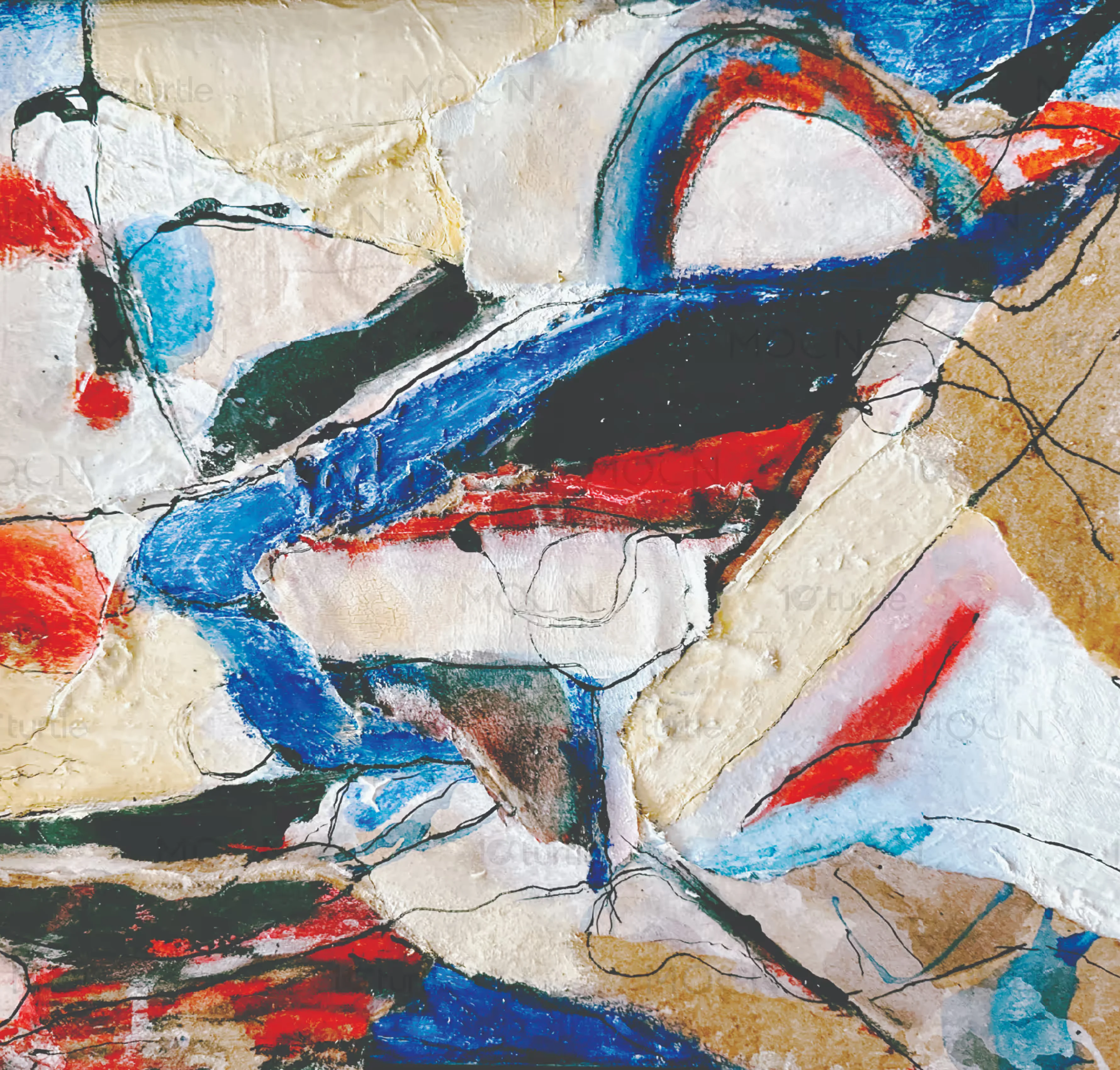
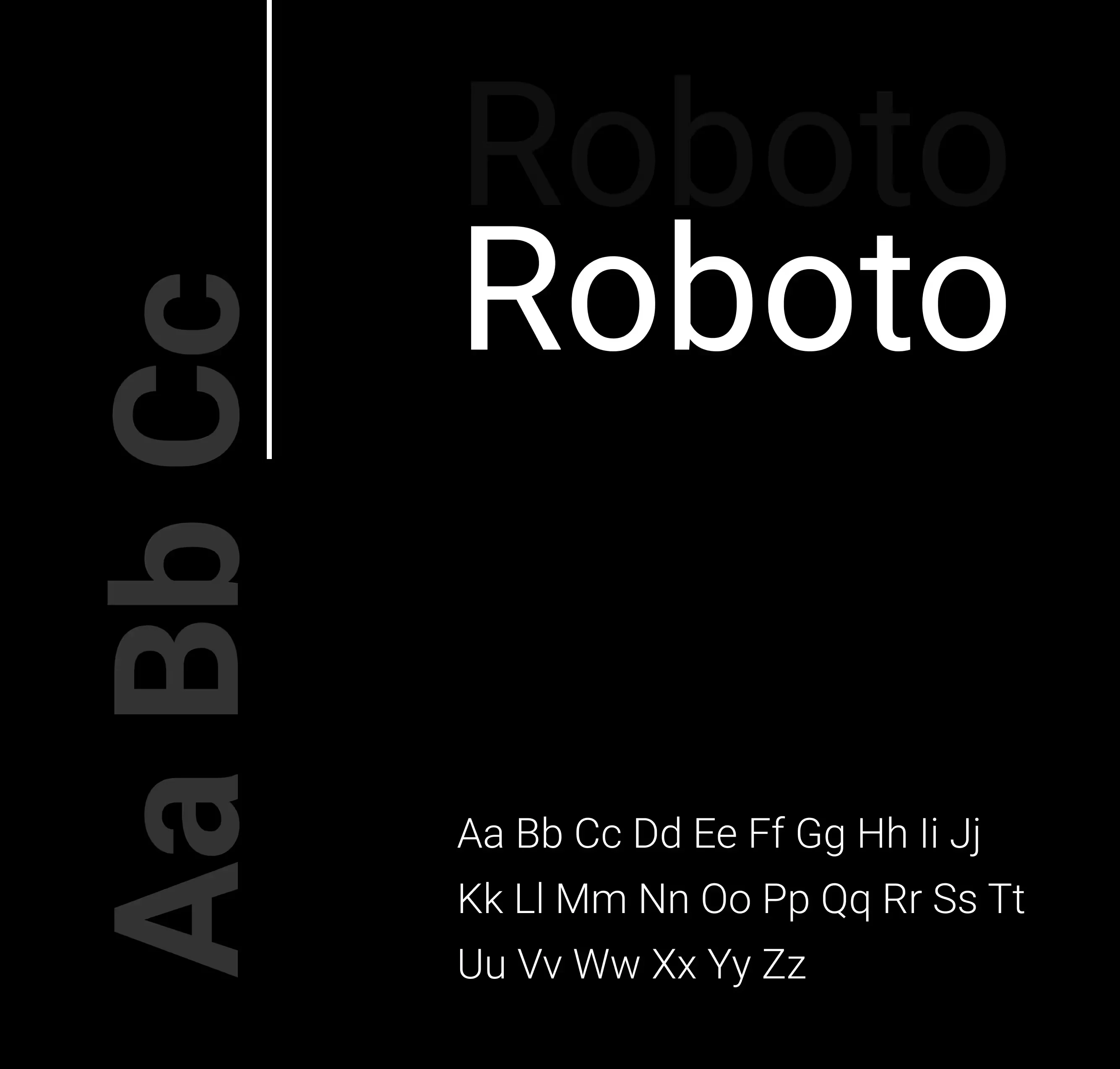
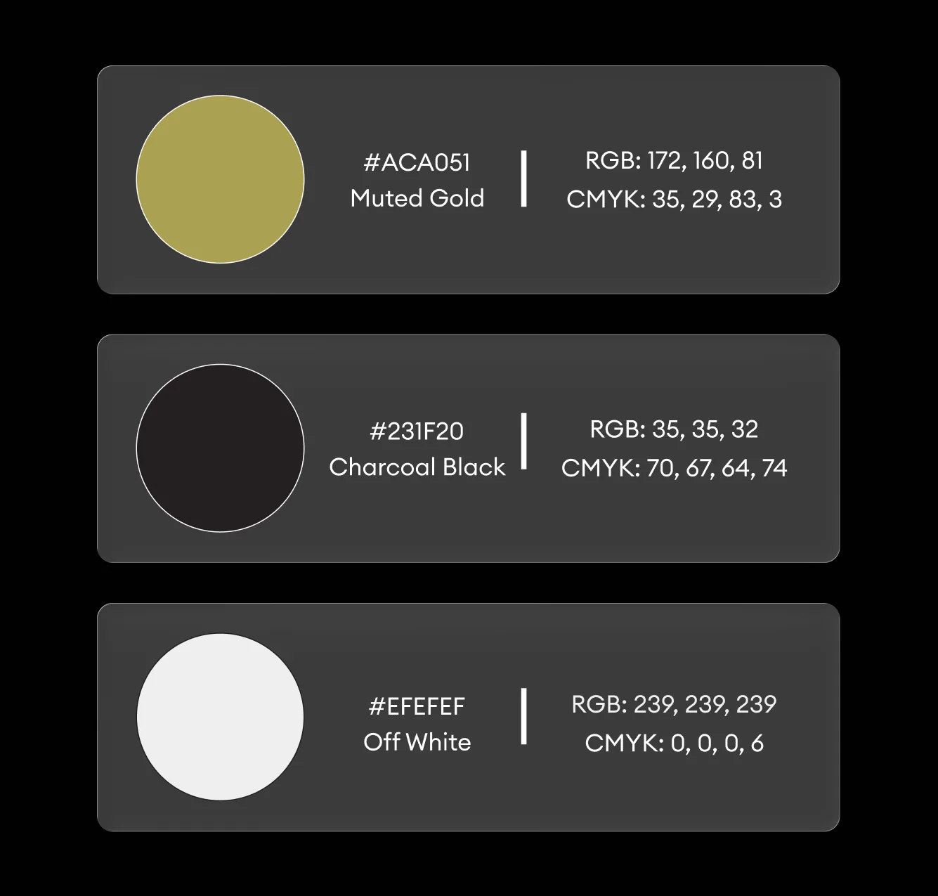
The typography system utilizes an elegant serif for narrative titles to establish a museum quality character, paired with a clean modern sans serif for technical text to ensure high readability. This hierarchy allows for complex information to be parsed easily by the reader. The color palette was carefully curated from the artworks themselves, featuring soft neutrals and charcoal blacks with subtle red accents to evoke emotional depth. This strategic use of color reinforces the brand identity without overshadowing the primary content.
Editorial and Print
For the printed brochure, we focused on high quality materials and a sophisticated layout. Generous white space was used to create a premium feel, allowing the image led storytelling to lead the visitor journey. The print collateral acts as a physical extension of the exhibition, providing a tactile experience that digital platforms cannot replicate. This deliverable was designed to be a keepsake, extending the life of the brand well after the exhibition concludes.
Digital Integration
In the digital realm, the brand system was optimized for accessibility and engagement. The same principles of minimalism and strong imagery were applied to digital layouts to ensure a consistent cross platform experience. By maintaining the same typography and color systems, we created a seamless transition for visitors moving between physical spaces and digital screens. This integrated approach ensures that the technology brand remains recognizable and professional across every modern touchpoint.
The Impact of Strategic Technology Branding
The implementation of this cohesive brand system resulted in a significant elevation of the exhibition profile. By moving away from standard tech marketing and toward a curated gallery experience, the project successfully attracted a high net worth audience and industry leaders. The clear information architecture led to increased visitor engagement times and a higher rate of brochure retention. This structural impact on brand perception has positioned the client as a premier voice in the intersection of technology and art. Moving forward, the brand is now equipped with a scalable framework that can be adapted for future exhibitions and global tours, ensuring long term consistency and market differentiation.
Frequently Asked Questions About Technology Brand Design
What does technology brand identity design include?
Technology brand identity design includes the development of a logo system, typography hierarchy, color palette, and brand guidelines tailored for the tech sector. It also encompasses digital and print deliverables such as brochures, website interfaces, and environmental graphics. A comprehensive system ensures that all communication is consistent and professional across multiple platforms.
How much does technology branding cost?
Technology branding costs vary depending on the scope of the project and the level of strategy required. A complete system for an exhibition or startup typically involves research, identity design, and collateral development, which reflects a premium investment in market positioning. Most high end agencies provide custom quotes based on specific business objectives and deliverables.
How long does technology brand design take?
Technology brand design typically takes between eight to twelve weeks from the initial research phase to final delivery. This timeline allows for deep discovery, strategic development, multiple design iterations, and the production of final assets. A structured process ensures that the final brand system is both strategically sound and visually impactful.
Why is editorial design important for technology brands?
Editorial design is important for technology brands because it allows for the clear communication of complex information through structured narratives. By using professional layout techniques and typography, brands can transform technical data into engaging stories. This builds trust with the audience and positions the brand as an authority in its specific field.
How do I choose a branding agency for my technology business?
Choose a branding agency for your technology business by evaluating their portfolio for strategic depth and industry experience. Look for an agency that understands the nuances of the tech market and can demonstrate a clear process for solving business challenges through design. The right partner should prioritize long term brand value over short term trends.
More Brand Identity Work
Explore our portfolio for more examples of high impact brand identity and editorial design. We specialize in creating custom visual systems for the technology and cultural sectors, helping brands reach their full potential through strategic design. Our previous work includes comprehensive rebranding projects and bespoke print collateral for international exhibitions. By combining technical precision with artistic flair, we deliver results that resonate with modern audiences and drive business growth.
Related Categories
Technology, Graphics Design, Print Design, Editorial Design, Art Direction, Typography, Exhibition Design, Digital Brand Identity
technology exhibition graphics
modern editorial design
brochure design for tech
gallery inspired branding
visual identity system
premium print design
technology brand strategy