Typography System
Digital Design
Art Direction
Overview
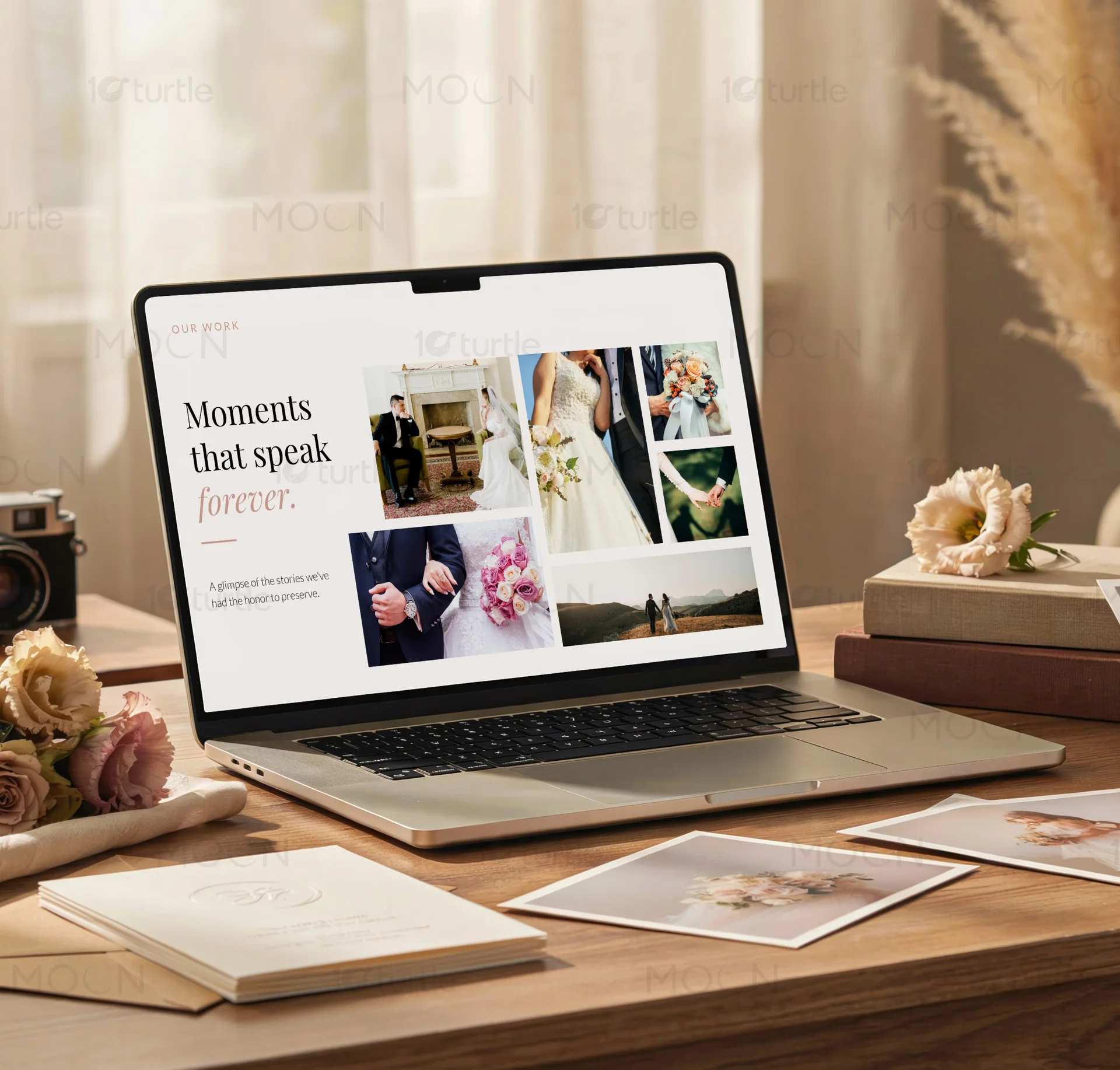
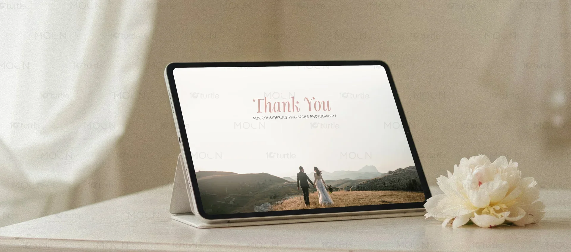
We designed a premium, grid-based presentation system for a sophisticated technology platform that hosts elite art and photography portfolios. Utilizing a high-contrast typographic pairing of classical serifs and clean sans-serifs, we elevated standard slide decks into editorial-grade visual assets. The restrained neutral color palette of sand and warm stone reflects the calming atmosphere of physical art galleries. This unified multi-slide template ensures a seamless, luxurious communication experience across both high-resolution digital displays and high-end printed portfolio monographs.
The Challenge

The client needed to present complex technical metadata and platform statistics alongside beautiful, high-resolution artistic imagery without creating visual friction. Standard technology templates felt cold and corporate, failing to respect the highly refined aesthetic standards of their elite artistic community. Prices, technical descriptions, and platform features were competing with the actual portfolio work, burying high-value visual assets in cluttered, disorganized slide layouts.
The Solution
We developed an asymmetric, multi-column presentation grid that isolates portfolio imagery from technical specifications, providing expansive white space for each component. The use of soft neutral tones replaces sterile corporate blues, allowing the true colors of the artwork to take center stage. High-contrast serif headlines establish immediate editorial prestige, while structured sans-serif blocks manage detailed platform data with clean, sophisticated hierarchy.
The Impact
The new presentation design successfully elevated the brand's market positioning, instantly establishing visual trust with premium creative partners. The clean, spacious layout structure resolved information density issues, allowing high-level stakeholders to quickly digest key data and platform benefits. The unified design system ensures absolute visual consistency, enabling seamless transitions from digital screens to beautifully bound physical print formats.

The intersection of digital technology and high-end creative portfolios requires a specialized approach to presentation design that rejects traditional corporate templates. For this technology presentation design project, we designed a highly refined, multi-slide layout system that speaks directly to premium creative audiences. Technology brands often struggle to present dense technical specs alongside visual content, resulting in cluttered slides that fail to engage viewers. Our design solution addresses this by utilizing a spacious, gallery-like layout grid that allows photography and art portfolios to shine while maintaining absolute readability. By centering our design strategy on premium editorial principles, we created a presentation deck that establishes authority and elevates the brand.
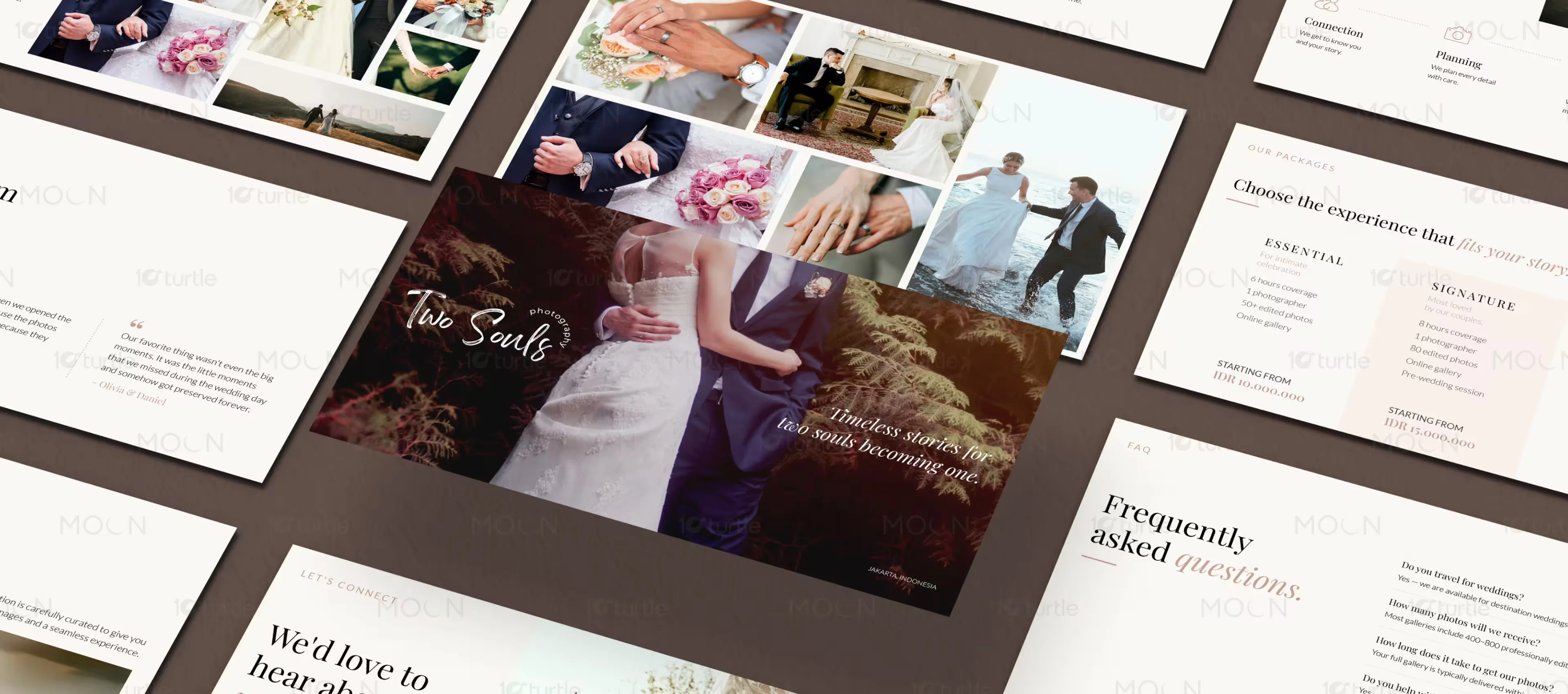
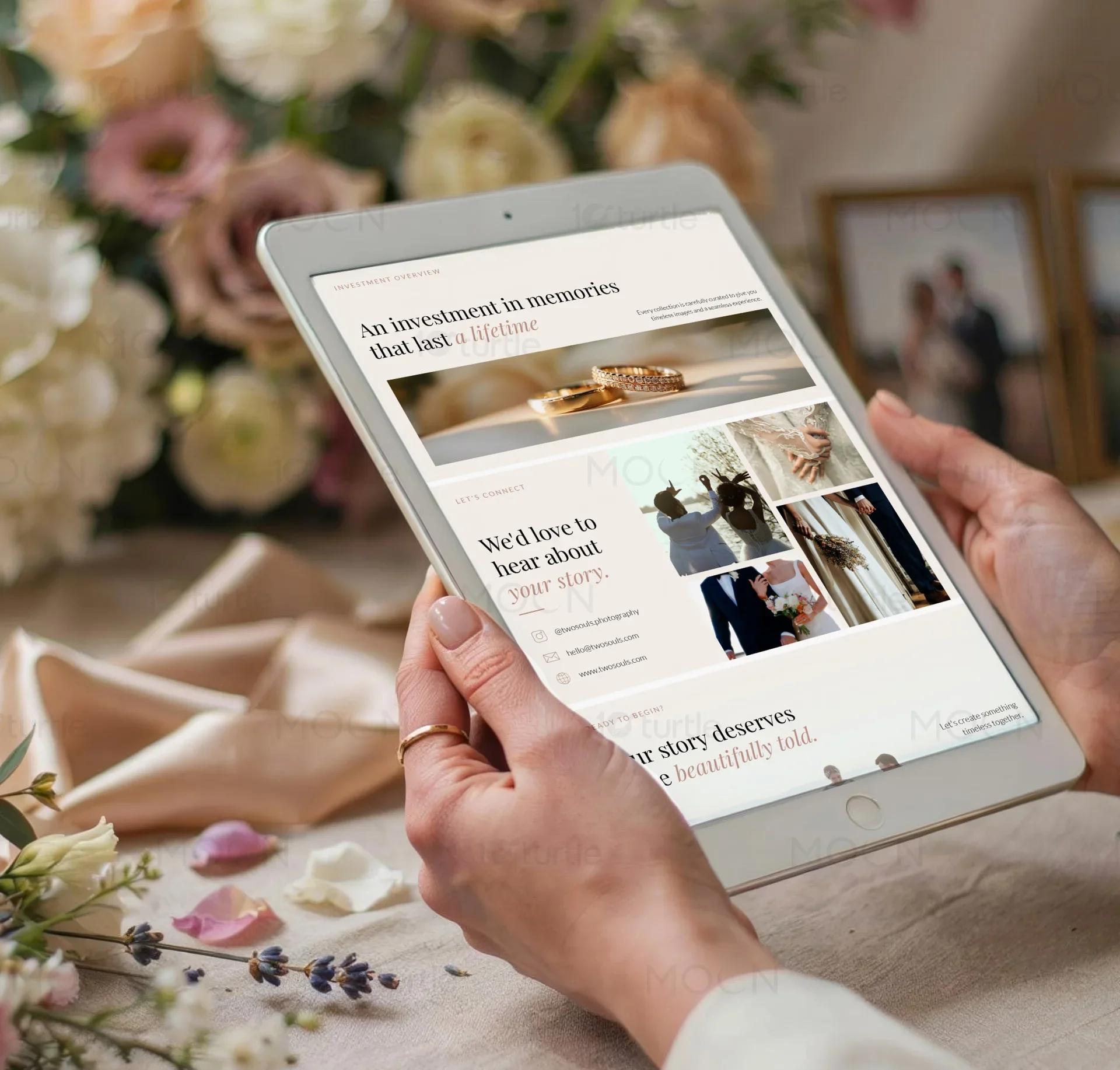
Every decision in this technology presentation design project was informed by the structural discipline of modern print monographs and museum catalogs. Instead of crowded bullet points and generic icons, we built an asymmetrical grid that forces content into elegant, readable blocks. This layout logic ensures that key technical performance metrics can coexist with large, high-resolution imagery without causing visual conflict. The underlying columns provide a flexible structure that accommodates different media formats, ensuring that wide landscapes, portrait crops, and detailed technical copy sit harmoniously on the same screen canvas. This approach results in a seamless visual journey that feels cohesive from the cover slide to the closing remarks.
Typography serves as the cornerstone of our layout strategy, bridging the gap between historical editorial quality and modern screen readability. We paired a high-contrast serif typeface for main headers with a clean, low-contrast, geometric sans-serif typeface for supporting data and descriptions. The high-contrast serif headlines evoke the prestige of classical publishing, demanding attention while setting a sophisticated tone. In contrast, the clean geometric sans-serif body copy ensures that smaller technical details, metadata tags, and descriptive paragraphs remain perfectly legible across diverse screens and projectors. The generous tracking and open line heights applied to the text blocks create a light, readable texture on the page, matching the premium feel of high-end digital galleries.
Color management in this presentation design project plays a crucial role in establishing a premium brand identity away from predictable tech tropes. Rather than using sterile blues or high-energy neons, we curated a soft neutral palette featuring sand, warm stone, and muted gray tones. These warm, organic tones create a gentle, low-contrast background that reduces eye strain during prolonged screen viewing while mimicking the premium tactile feel of physical gallery walls. Subtle gray accents are used selectively to define structural containers, slide numbers, and category tags, organizing the content without introducing distracting visual elements. This restrained color system serves as a calm frame, ensuring that the vibrant colors of the showcased portfolios remain the primary focus.
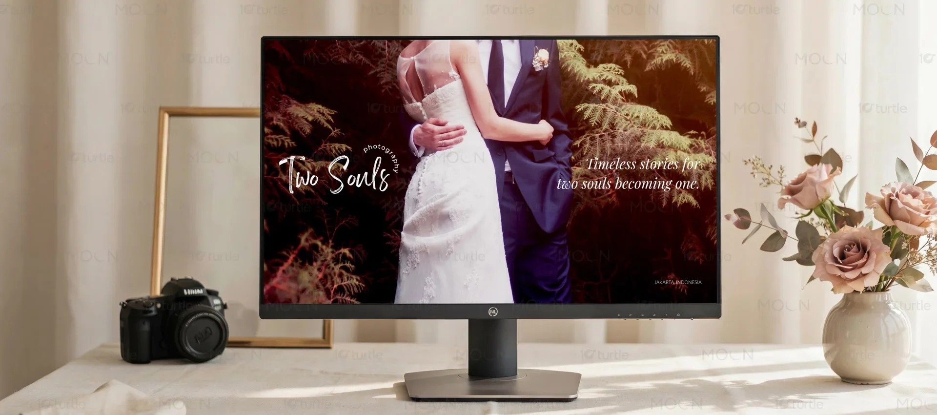
To translate this refined aesthetic across digital and physical mediums, we optimized the final templates for dual-format compatibility. While the primary use case is high-resolution digital screen display, we designed the vector grids, line weights, and image resolution standards to meet high-end print specifications. This dual-purpose optimization means that the technology platform can seamlessly export the presentation deck as a PDF for digital sharing or output it as a beautifully bound physical portfolio book for high-stakes investor meetings. Every grid alignment, font scale, and margins setting was thoroughly verified to guarantee that the sophisticated design retains its visual balance and luxury feel, whether viewed on a small mobile device, a conference room projector, or physical paper stock.
The visual pacing of the presentation was curated like an exhibition to keep viewers engaged across multiple slides. We avoided repetitive layouts by designing several distinct slide templates, including title cards, narrative-heavy layouts, full-bleed portfolio spreads, and clean data tables. This deliberate variation in page structure creates a natural rhythm, allowing the presenter to transition from high-level brand storytelling to detailed technical specifications without losing visual momentum. Each template variation adheres strictly to the core mathematical grid, ensuring that despite the layout changes, the underlying structural rhythm remains completely unified. This careful balance of repetition and variety forms the foundation of our strategic presentation design process.
Ultimately, this technology presentation design showcases how premium graphic principles can elevate a digital software brand above the noise of standard tech templates. By treating each slide as a carefully curated gallery wall, we built a visual system that respects the intelligence of the audience and honors the quality of the creative portfolios on display. The clean, spacious layout, paired with high-contrast typography and soft neutral colors, successfully transforms standard brand communication into an immersive editorial experience. This sophisticated design framework provides the technology brand with a powerful, versatile tool that builds immediate credibility, enhances partner trust, and supports long-term commercial growth in the highly competitive global market.
technology presentation design
premium presentation layouts
grid presentation template
portfolio slide design
editorial slide layout
presentation design services