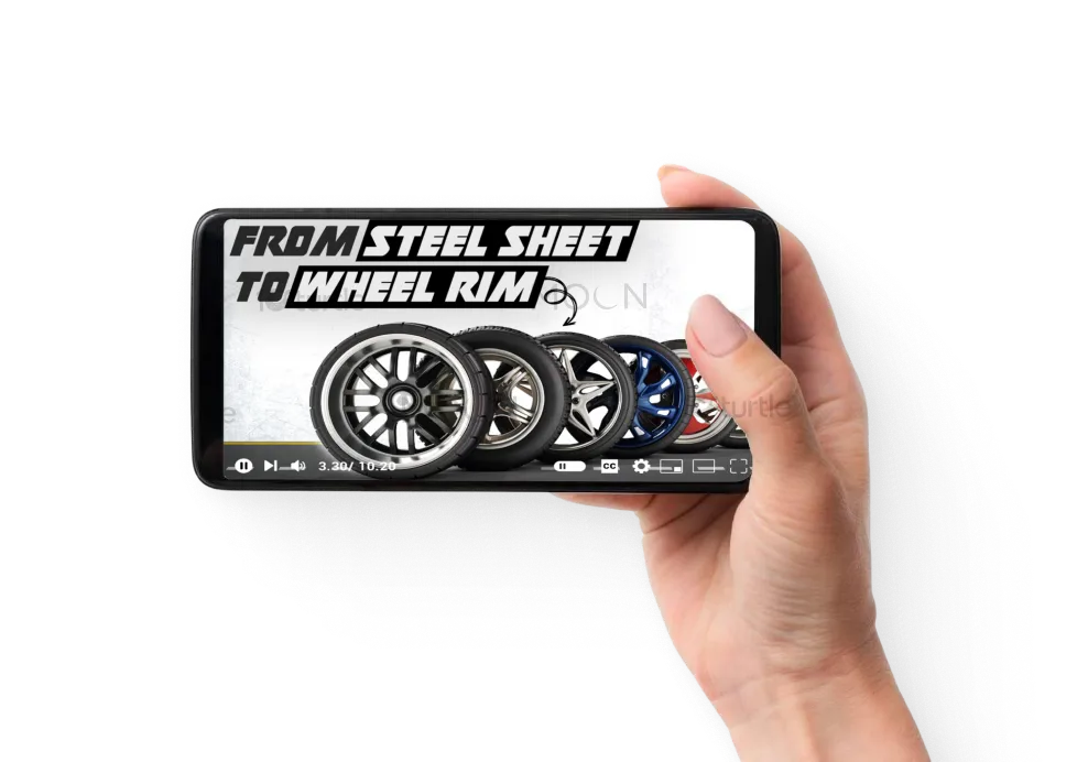
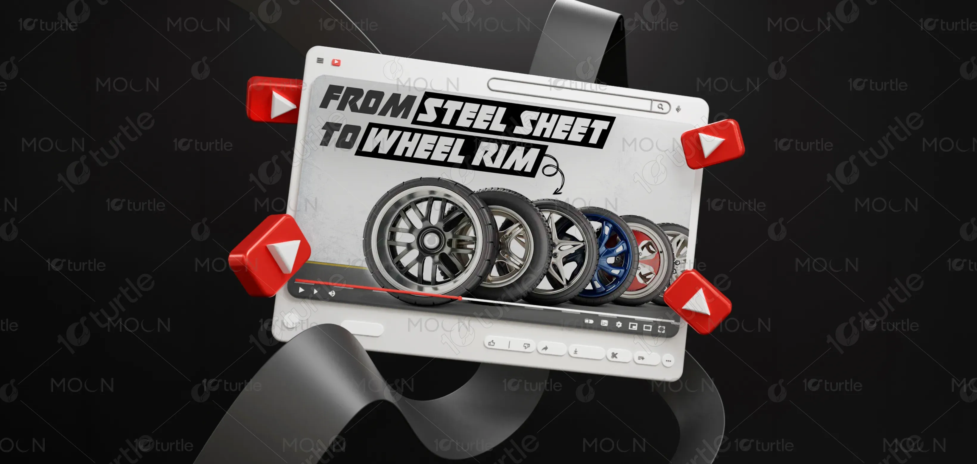
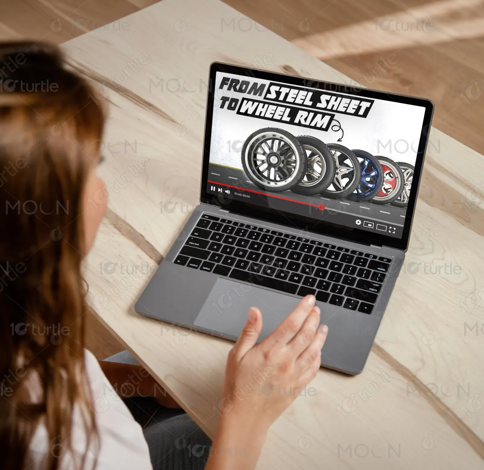
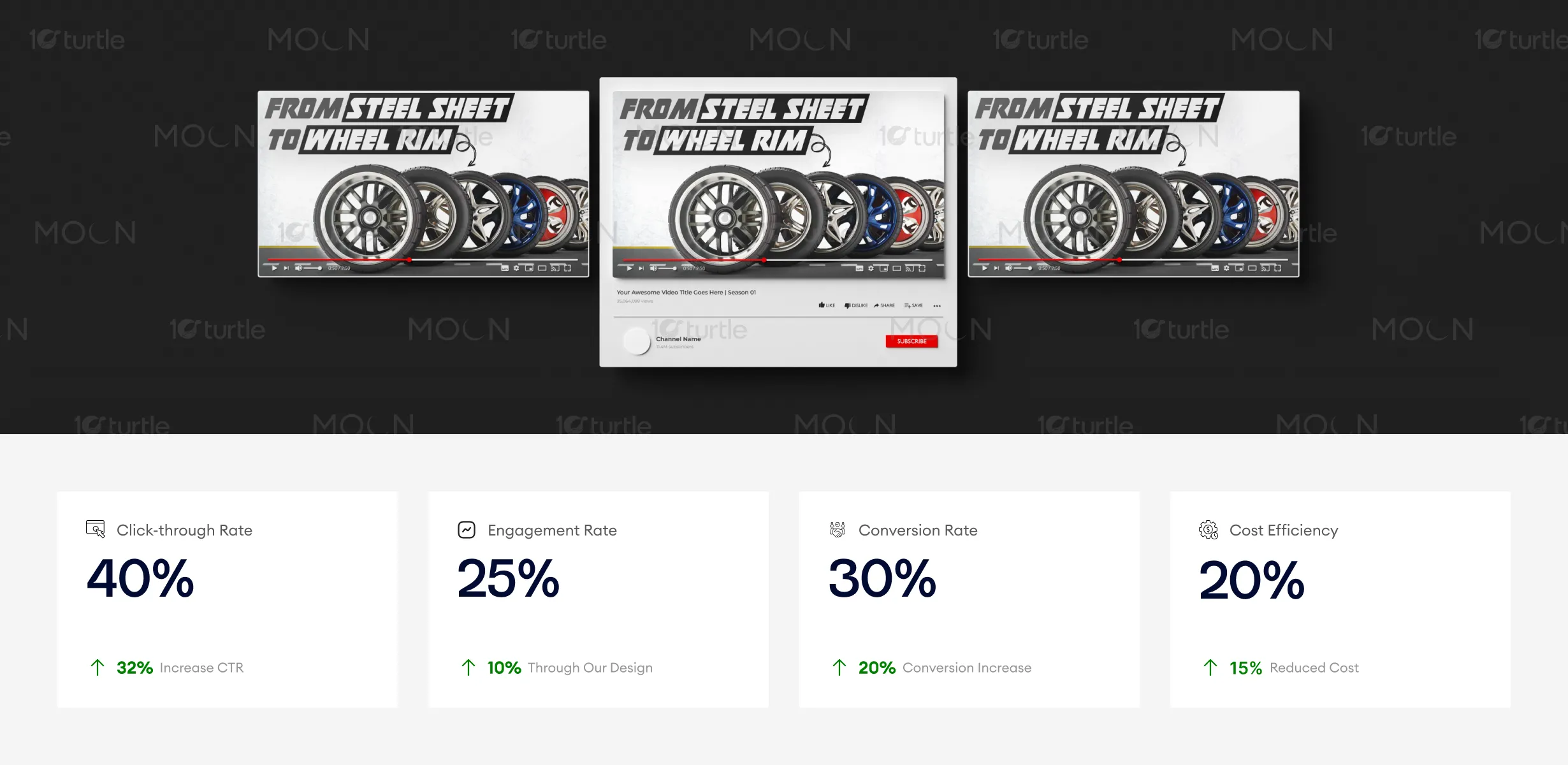
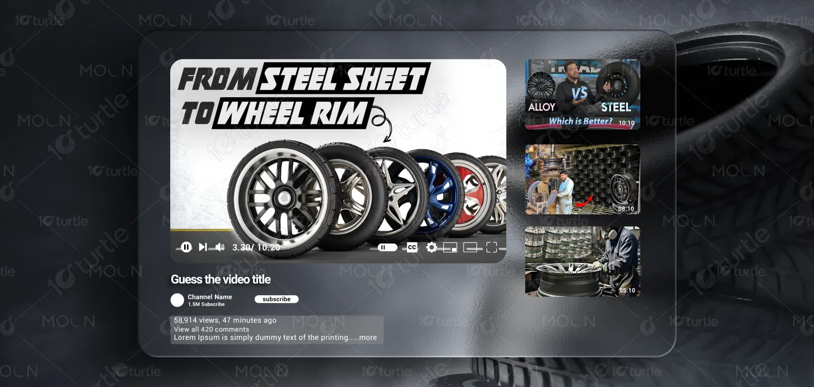
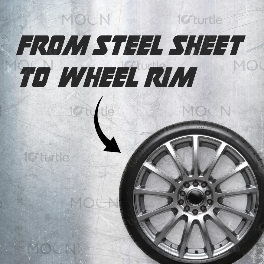
The design utilizes a clean, modern aesthetic with a focus on dynamic imagery that conveys motion and craftsmanship. The use of a video player interface is both familiar and engaging, allowing the viewer to immediately recognize the process and technology involved. The layout balances bold typography ("From Steel Sheet to Wheel Rim") with high-quality images of the different stages and variations of the wheel rim, emphasizing the transformation process. The choice of red accents highlights key interaction points, such as play buttons and navigational arrows, ensuring clarity and actionability.
Thumbnail Design
Graphic Design
Industry
Transport, Automotive & Logistics
Tools we used


Project Completion
2025
Key Market
Global
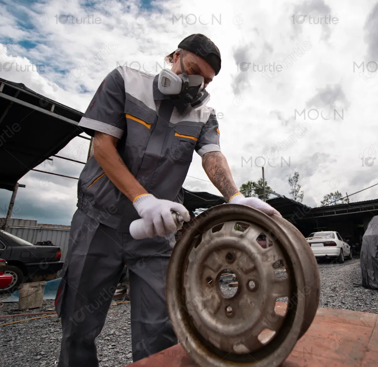
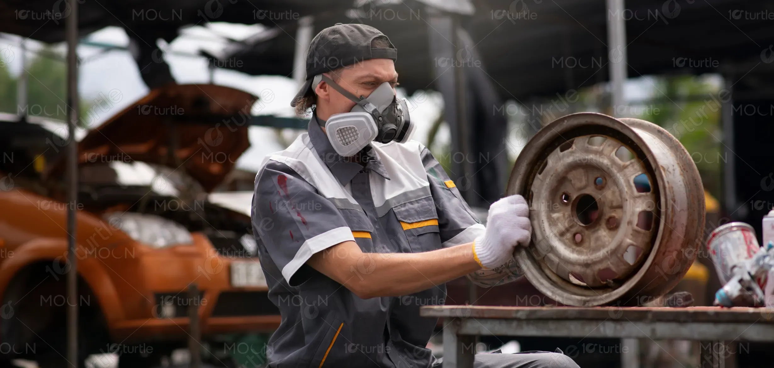
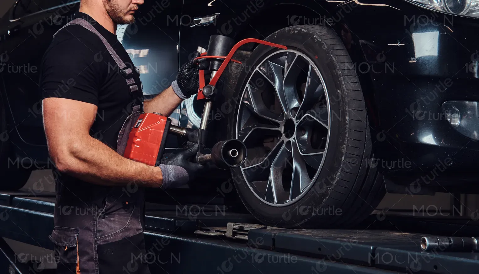
This design highlights the evolution from raw material (steel sheet) to a finished product (wheel rim), showcasing the intricacies of manufacturing. It is a visual narrative that brings to life the quality and precision involved in wheel rim production. This design fits within the automotive industry, specifically targeting manufacturers, car enthusiasts, and individuals interested in the mechanical and aesthetic aspects of automotive parts.
Industry
Transport, Automotive & LogisticsWhat we did
Thumbnail DesignGraphic DesignPlatform
-In an industry flooded with generic and technical visuals, the challenge is to captivate and engage an audience while communicating the complex manufacturing process clearly. The target audience may struggle with finding compelling content that balances technical information with an emotional connection to the craftsmanship behind the product. The design also addresses the need for better product visibility and clear communication of the quality and variety of wheel rims available.
The design solves this problem by incorporating a clean, intuitive layout that simplifies complex information. The video interface allows for an interactive experience that makes the learning process dynamic, while the image-rich design conveys the various wheel rim styles and stages of manufacturing. The bold typography and modern color palette work together to create an immersive and engaging experience for users, making the process easier to understand and more exciting to explore.
The design increases both engagement and conversion rates by providing a clear, visually compelling user experience that highlights the product's craftsmanship through dynamic visuals. Key metrics like CTR and conversion improvements are likely driven by the intuitive layout and the engaging video interface, which enhances customer understanding and trust in the product.
This design supports the long-term vision of positioning the brand as an innovator and leader in the automotive parts market. By focusing on high-quality visuals and interactivity, the design will adapt seamlessly across various touchpoints, whether online, in social media campaigns, or marketing collateral. Over time, the design will continue to evolve with future product offerings and manufacturing advancements, fostering deeper connections with an ever-growing audience.
The color palette is centered around bold, modern colors that evoke energy and excitement—specifically red, black, and white. Red accentuates key interaction points, drawing attention to important elements like the video player interface, while black and white provide a strong contrast, ensuring readability and visual clarity. The design incorporates clean lines and minimalistic elements, maintaining a professional, yet dynamic tone that reflects the brand’s commitment to quality and innovation in wheel rim manufacturing.