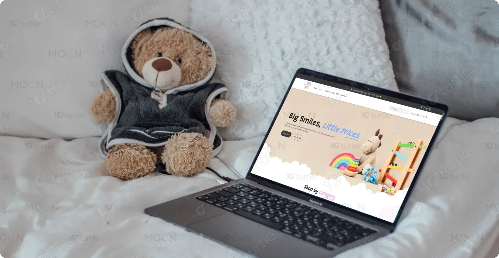
Toy Bargains UK is a children’s toy retail brand that provides educational, playful, and development-friendly toys for various age groups. The platform caters primarily to parents looking for trusted products that combine fun, learning, and value. The brand positions itself as warm, friendly, and family-oriented.
UX Design
UI Design
Research
Industry
E-commerce | Kids Toys & Educational Products
Tools we used


Project Completion
2025
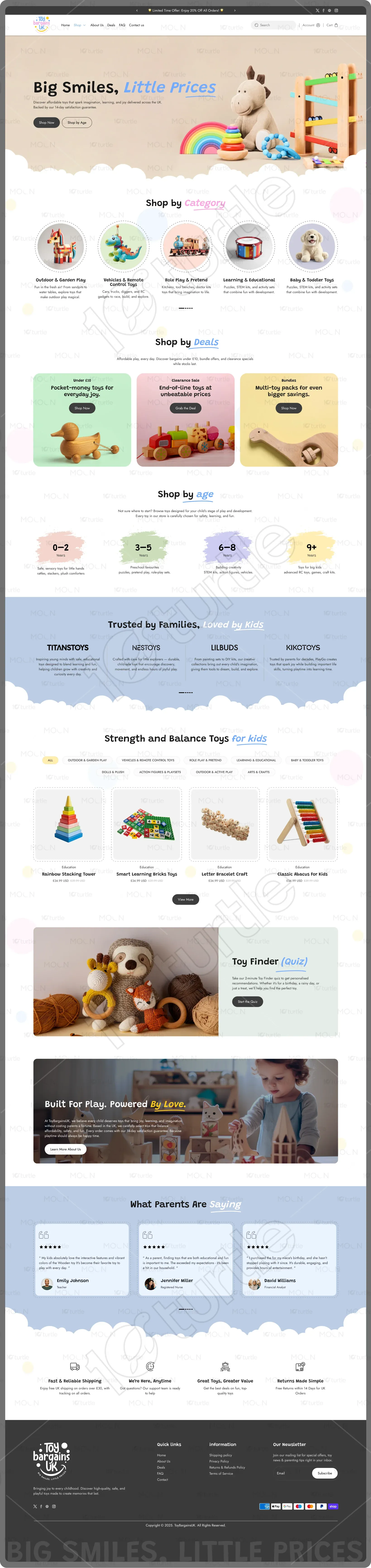
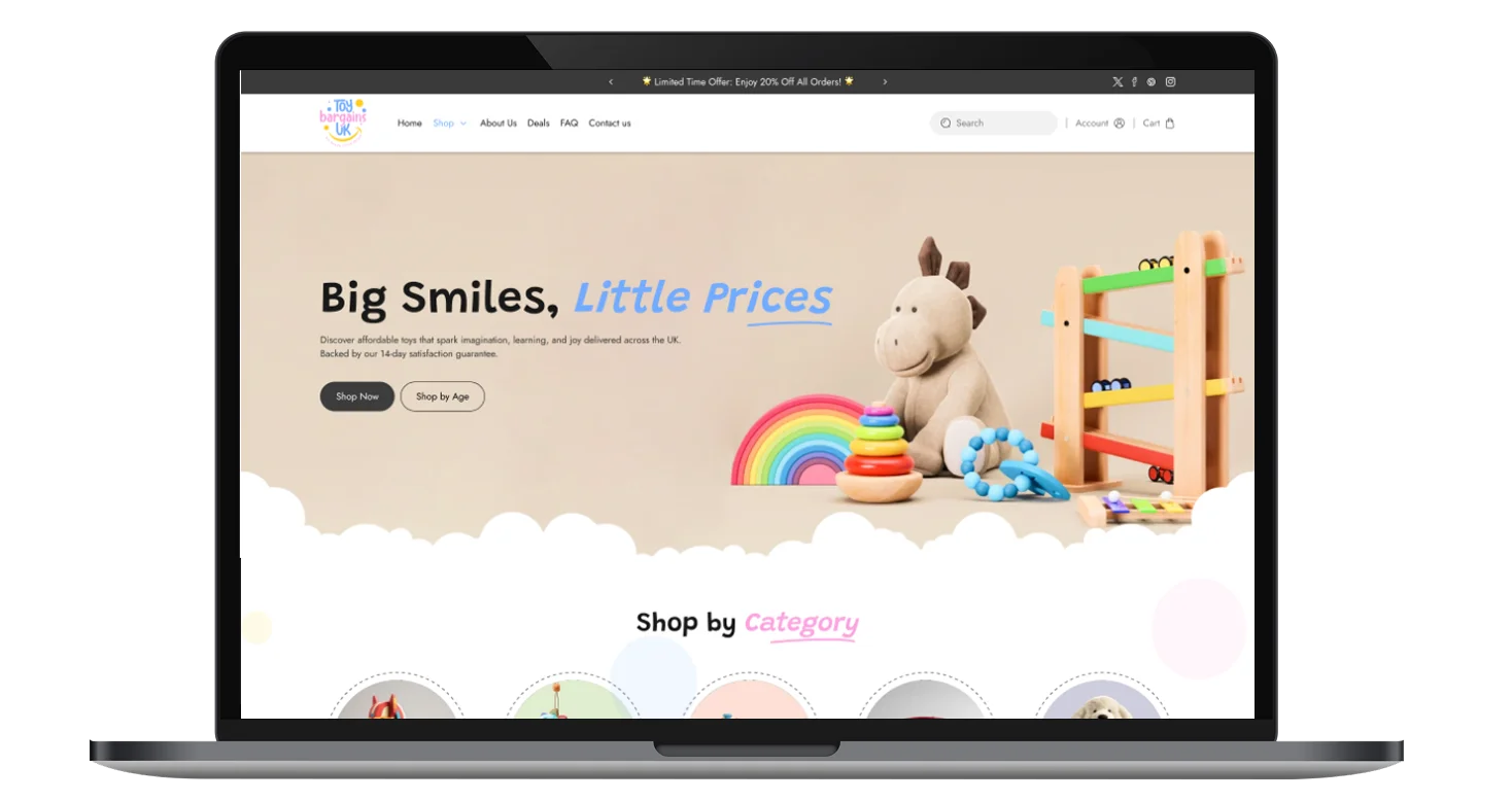
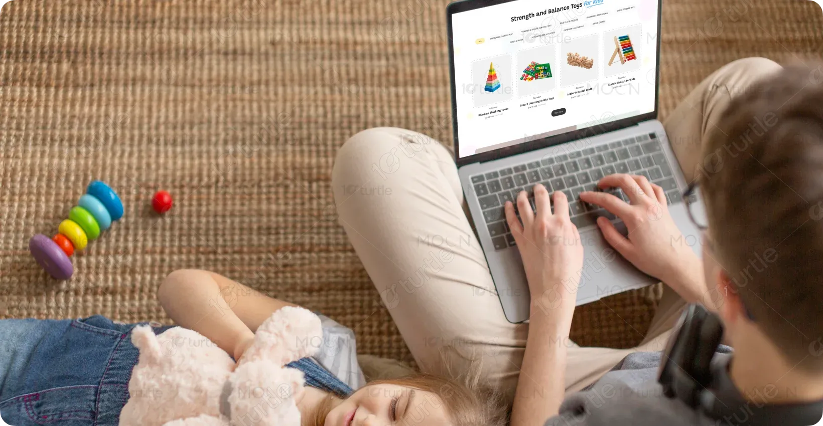
The goal of this project was to design a visually engaging and conversion-focused homepage that simplifies toy discovery while maintaining a playful, child-friendly identity. The client wanted a website that appeals to kids emotionally while giving parents clarity, trust, and ease of navigation. The scope included homepage UX, visual hierarchy, and content structuring.
Industry
E-commerce | Kids Toys & Educational ProductsWhat we did
User ResearchUI UX DesigningResponsive ExperiencePlatform
-Parents often find toy-shopping websites cluttered, overwhelming, and time-consuming, especially when filtering by age, purpose, or budget. Many platforms fail to balance playful visuals with usability, leading to confusion and drop-offs. The challenge was to reduce decision fatigue while keeping the experience joyful and engaging.
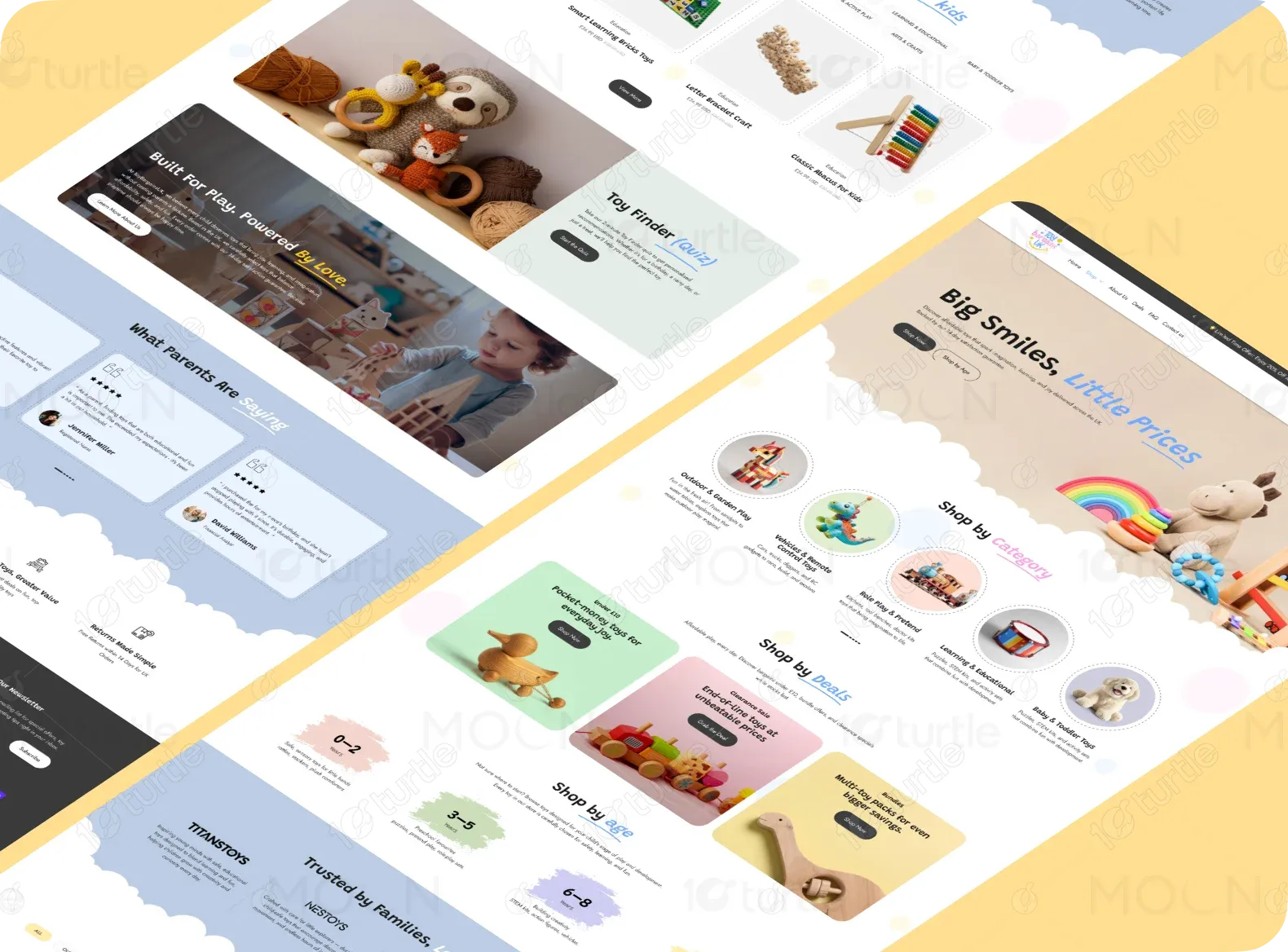
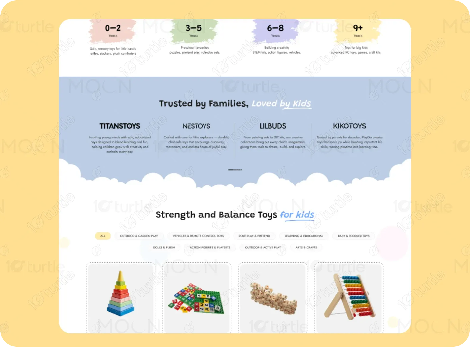
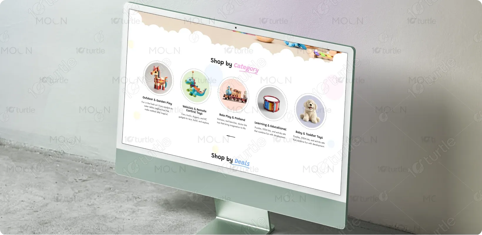
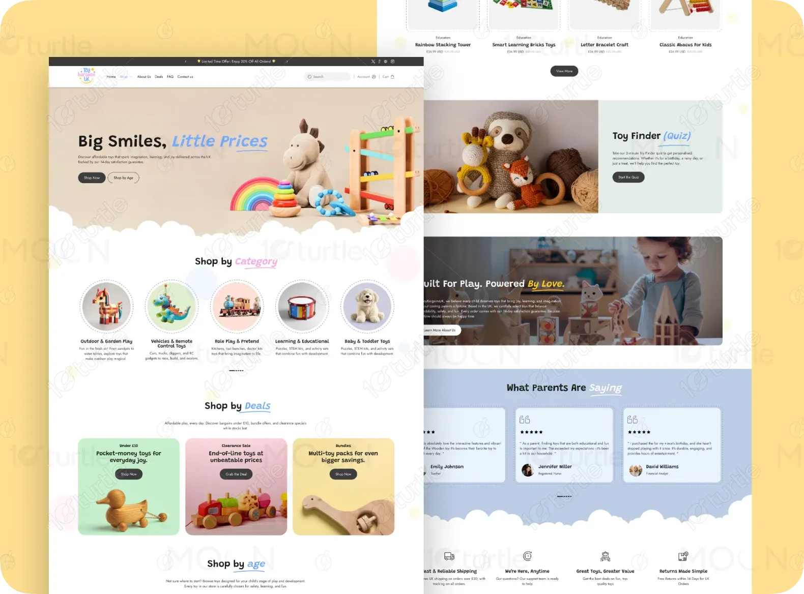
The solution focused on creating a guided, category-driven homepage that leads users naturally through discovery, deals, and trust-building sections. Clear segmentation such as “Shop by Category,” “Shop by Age,” and “Deals” allows parents to make quick decisions. Playful visuals, rounded UI elements, and friendly microcopy enhance emotional connection.
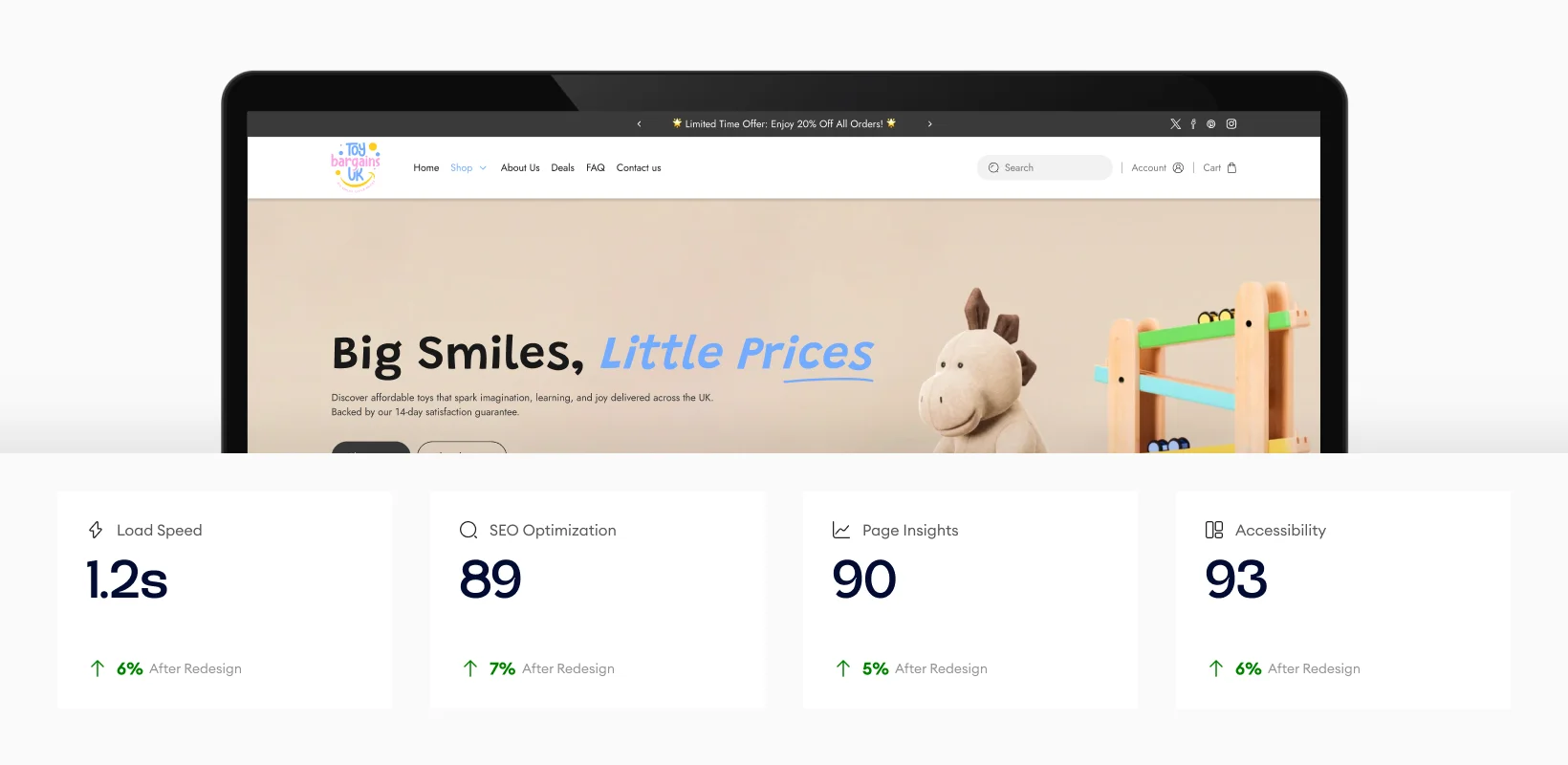
The design optimizes load speed, SEO, and accessibility, leading to a faster and more efficient experience. The improvements ensure smooth navigation, better search engine visibility, and higher engagement, with users experiencing quicker load times and a more inclusive, accessible platform that enhances the overall performance of the site.
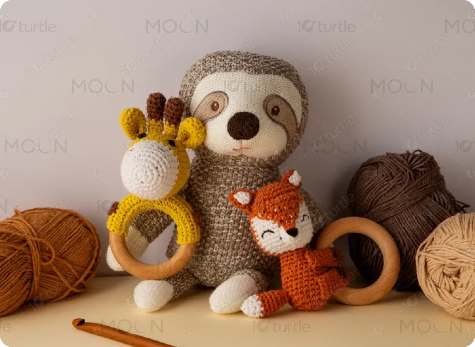
The client envisioned a modern, cheerful website with soft colors, friendly illustrations, and a warm tone that resonates with families. The design needed to feel safe, trustworthy, and joyful, drawing inspiration from premium kids brands that balance minimal layouts with playful storytelling and emotional visuals.
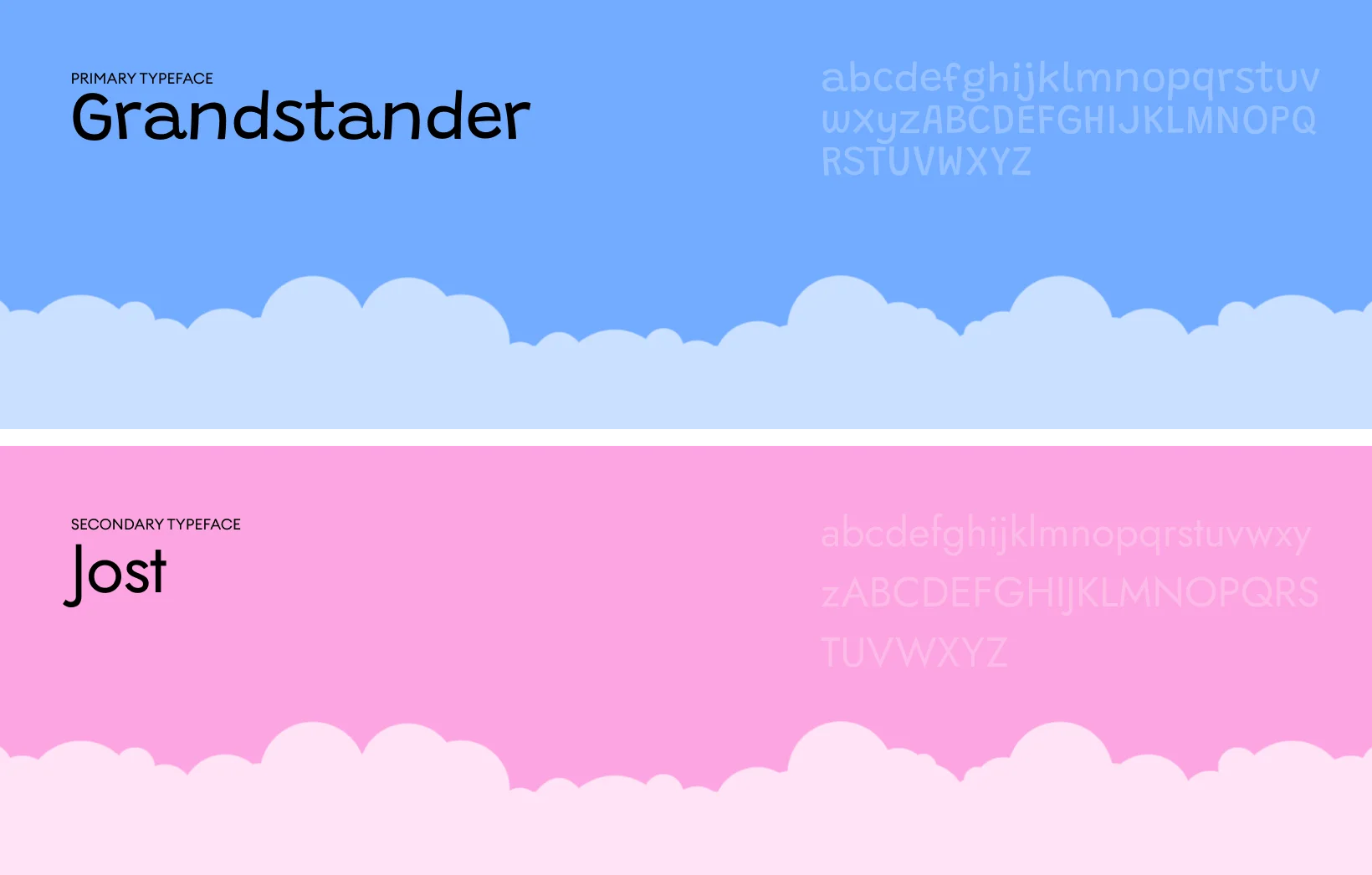
The logo reflects a playful yet reliable brand personality using friendly typography and child-inspired visual cues. Its simple structure ensures strong recognition while remaining adaptable across digital touchpoints. The logo reinforces warmth, trust, and a family-first approach.
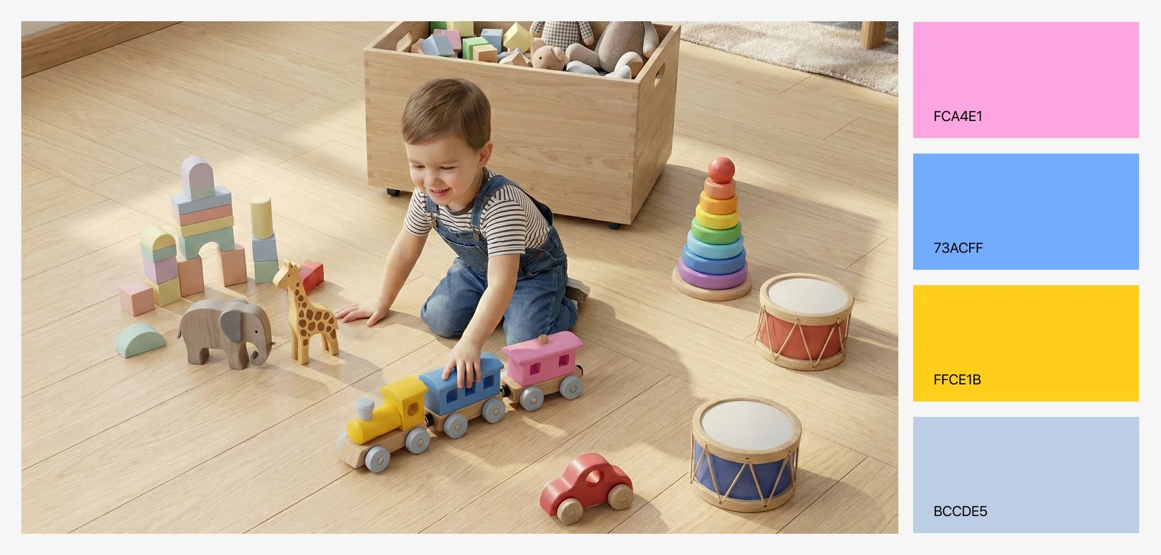
The color palette uses soft pastels, warm neutrals, and gentle accent tones to create a calm yet playful environment. These colors evoke happiness, trust, and comfort while avoiding visual overload. The palette supports long browsing sessions and reinforces the brand’s family-friendly personality.
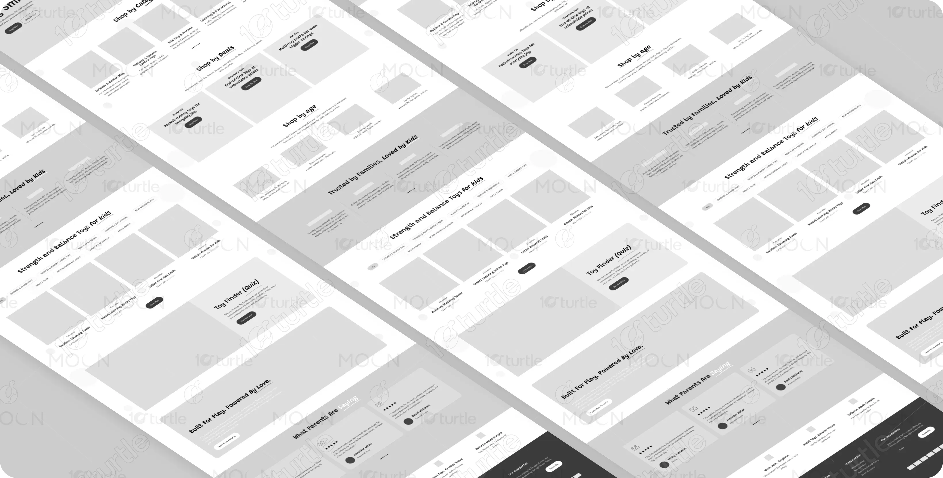
The wireframes focused on content hierarchy and flow before visual styling. Key sections were placed strategically to guide users from awareness to action without friction. The layout prioritizes discoverability, ensuring that parents can quickly find relevant toys without feeling overwhelmed.