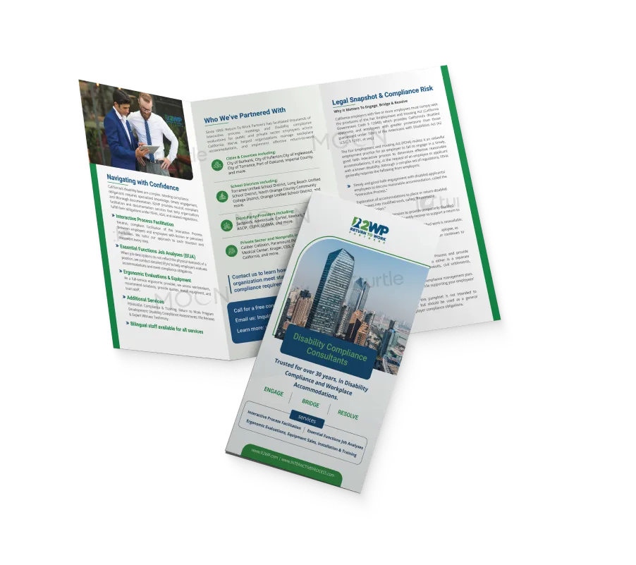
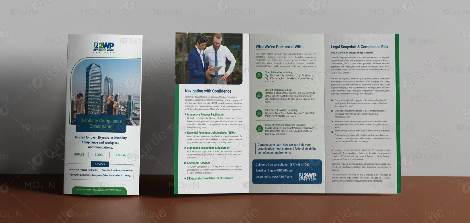
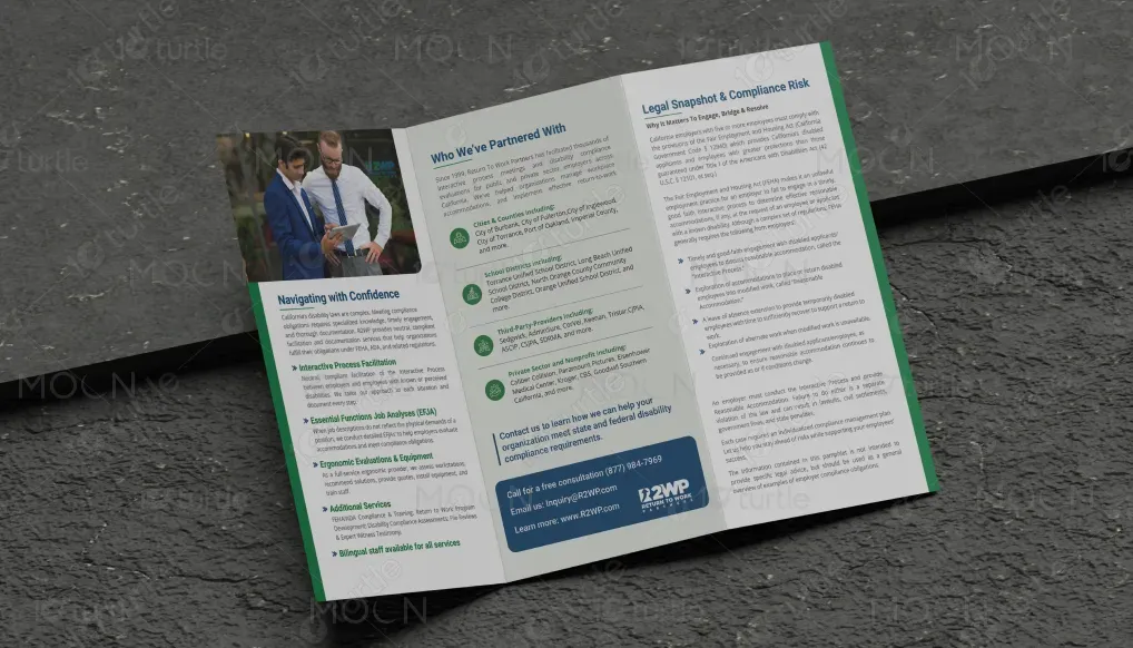
The design takes a professional and clean approach, aligning with the industry’s requirements for clarity and trust. The layout integrates a balanced use of typography, imagery, and color. The chosen colors of green and blue promote calmness and professionalism while ensuring clarity. The hierarchical structure of the content allows for easy navigation, ensuring that key information stands out for quick comprehension. The imagery, featuring professional individuals in a workplace context, reinforces the brand’s authority in the disability compliance field.
Tri-fold Design
Graphic Design
Industry
Professional & B2B Services
Tools we used


Project Completion
2025
Key Market
Global
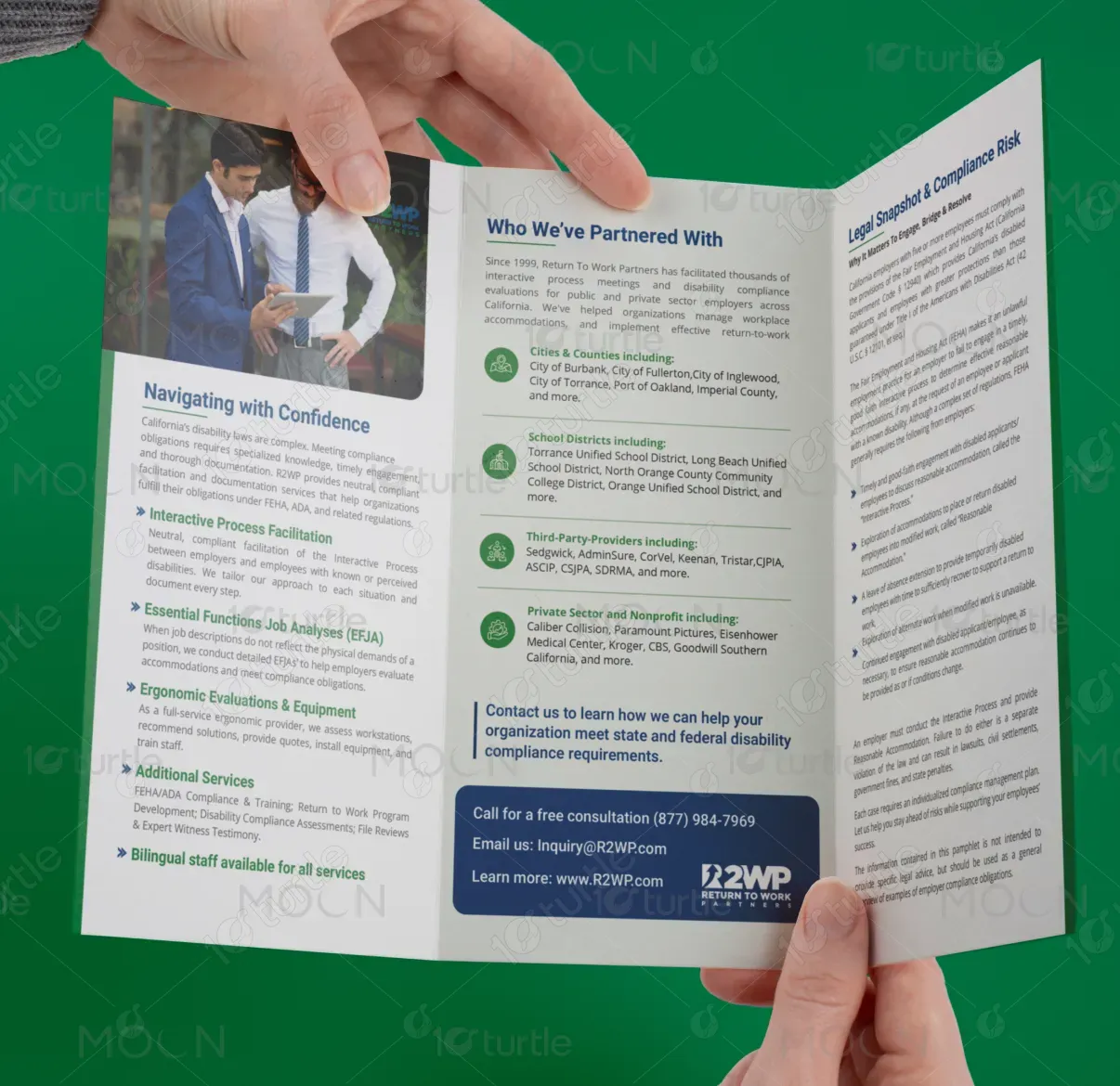
This design represents Return to Work Partners (R2WP), a company specializing in disability compliance and workplace accommodations. The primary purpose of this brochure is to communicate R2WP’s services to organizations in need of assistance with legal compliance, job assessments, ergonomic evaluations, and other workplace solutions. The design's layout is structured to appeal to businesses seeking reliable, expert solutions in the compliance space.

Industry
Professional & B2B ServicesWhat we did
Tri-fold DesignGraphic DesignPlatform
-Many organizations struggle with navigating complex disability compliance regulations, which can lead to costly legal challenges or inadequate workplace accommodations. Companies often face unclear guidance or inefficient systems for handling disability-related compliance needs, risking fines, litigation, and employee dissatisfaction. This brochure addresses these pain points by offering a clear, professional, and concise message that positions R2WP as a trusted advisor in navigating these challenges.
The design effectively communicates the services and solutions offered by R2WP through a clean, organized layout and concise copy. The use of a clear hierarchy and informative sections allows users to easily find relevant information regarding the company’s services. Visual consistency is maintained throughout, making the design both accessible and professional. The brochure highlights R2WP's extensive experience and expertise, ensuring trust and confidence in the brand. The solution addresses industry problems by presenting a user-friendly format that is both informative and visually appealing.

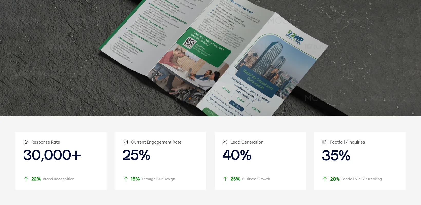
This brochure's design effectively combines professionalism with ease of use, making it highly accessible to its target audience. By balancing structured content with engaging imagery and thoughtful use of color, it helps generate significant interest and trust. The high-quality visual presentation drives conversions, boosts lead generation, and increases footfall/inquiries through clear calls-to-action and easy navigation. These metrics reflect the successful application of strategic design elements to enhance both business and user outcomes.
The long-term vision of this design is to support R2WP’s brand as a leader in the disability compliance space. The clean, professional layout ensures adaptability for future touchpoints, whether online or offline. This design will help establish R2WP as a go-to resource for companies looking to stay compliant with disability regulations, building lasting relationships with clients. As the brand grows, this design will remain relevant across various media, strengthening its reputation for professionalism and expertise.
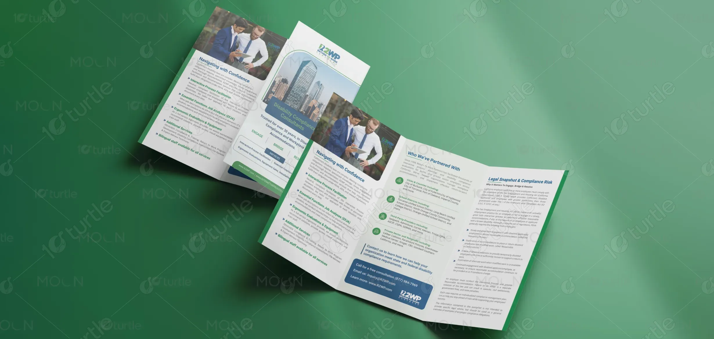
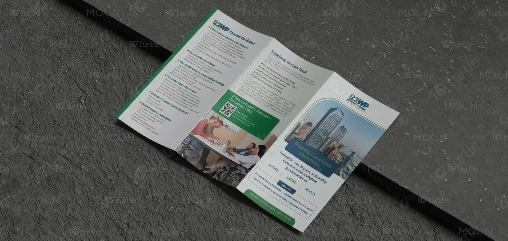
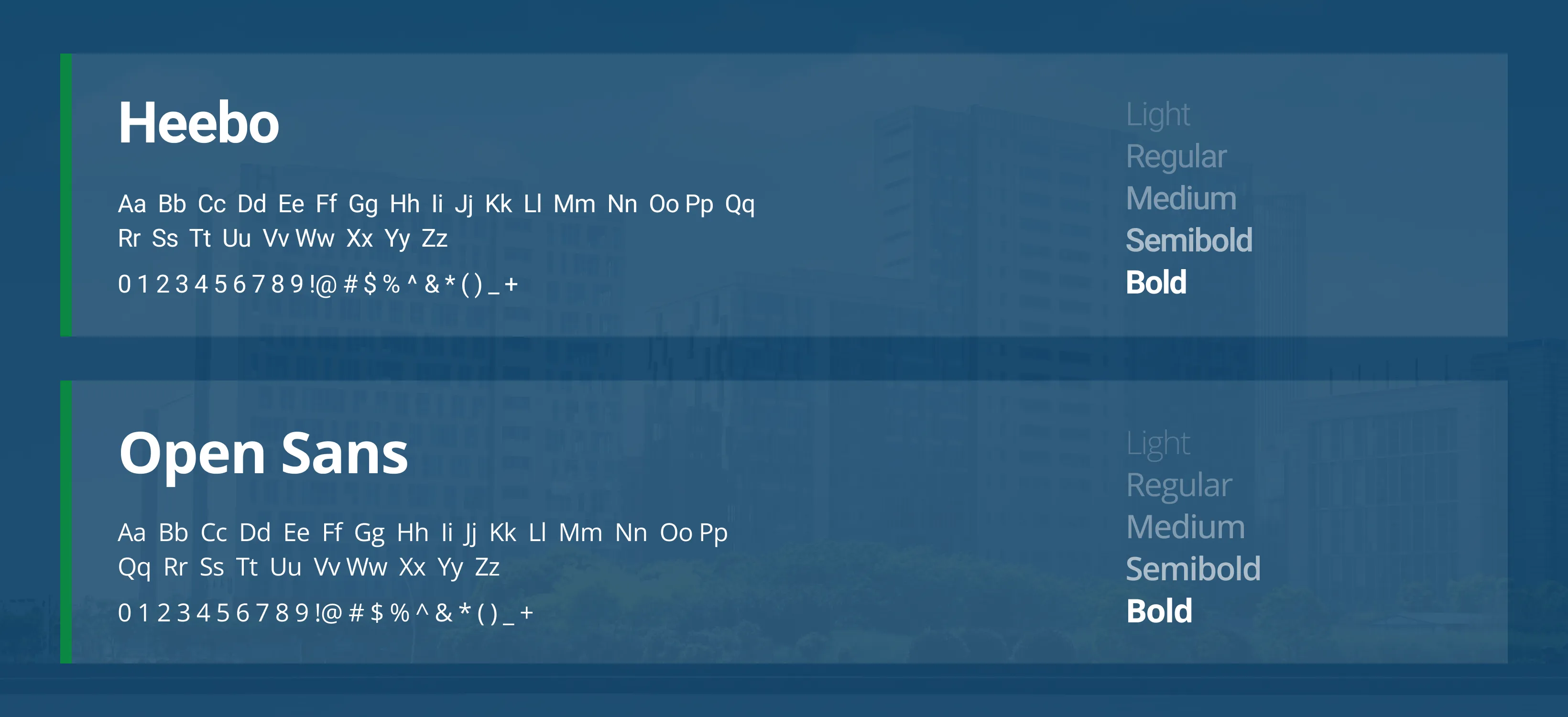
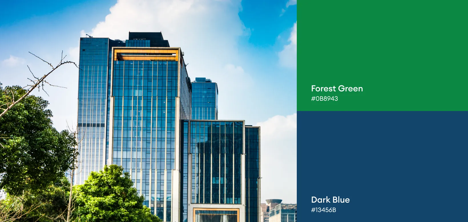
The design utilizes a soothing and professional color palette of green and blue, which align with the brand’s values of trust, professionalism, and calmness. Green signifies growth, health, and stability, while blue conveys trust, security, and competence—ideal for a company providing compliance and workplace solutions. The typography and supporting visuals are clean and simple, ensuring readability and strong brand recognition across different formats.