Comprehensive Traffic Control Solutions Website
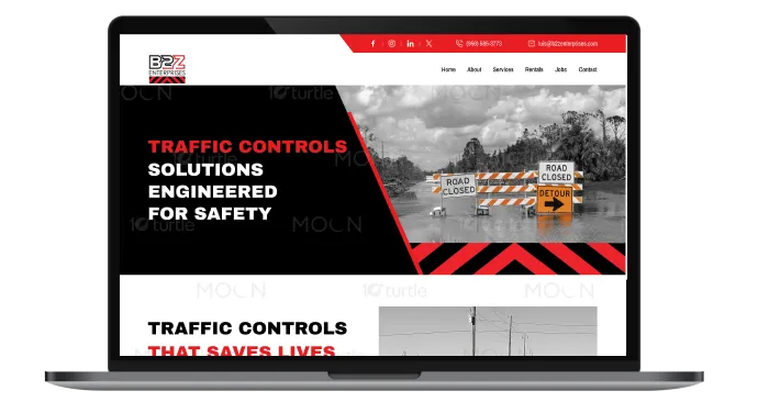
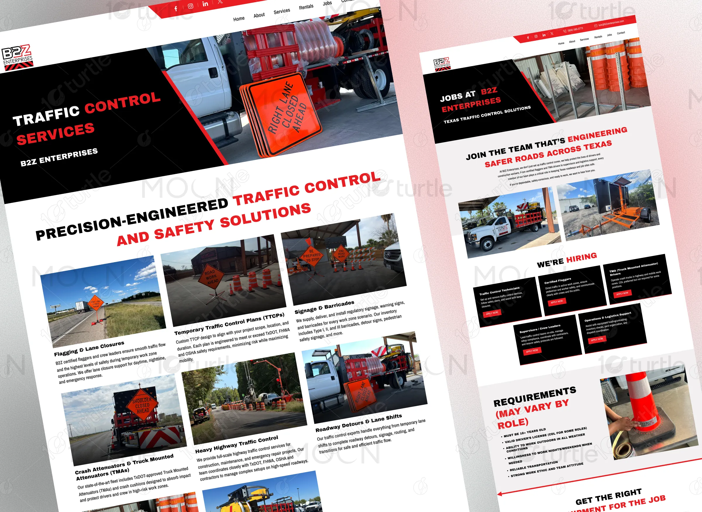
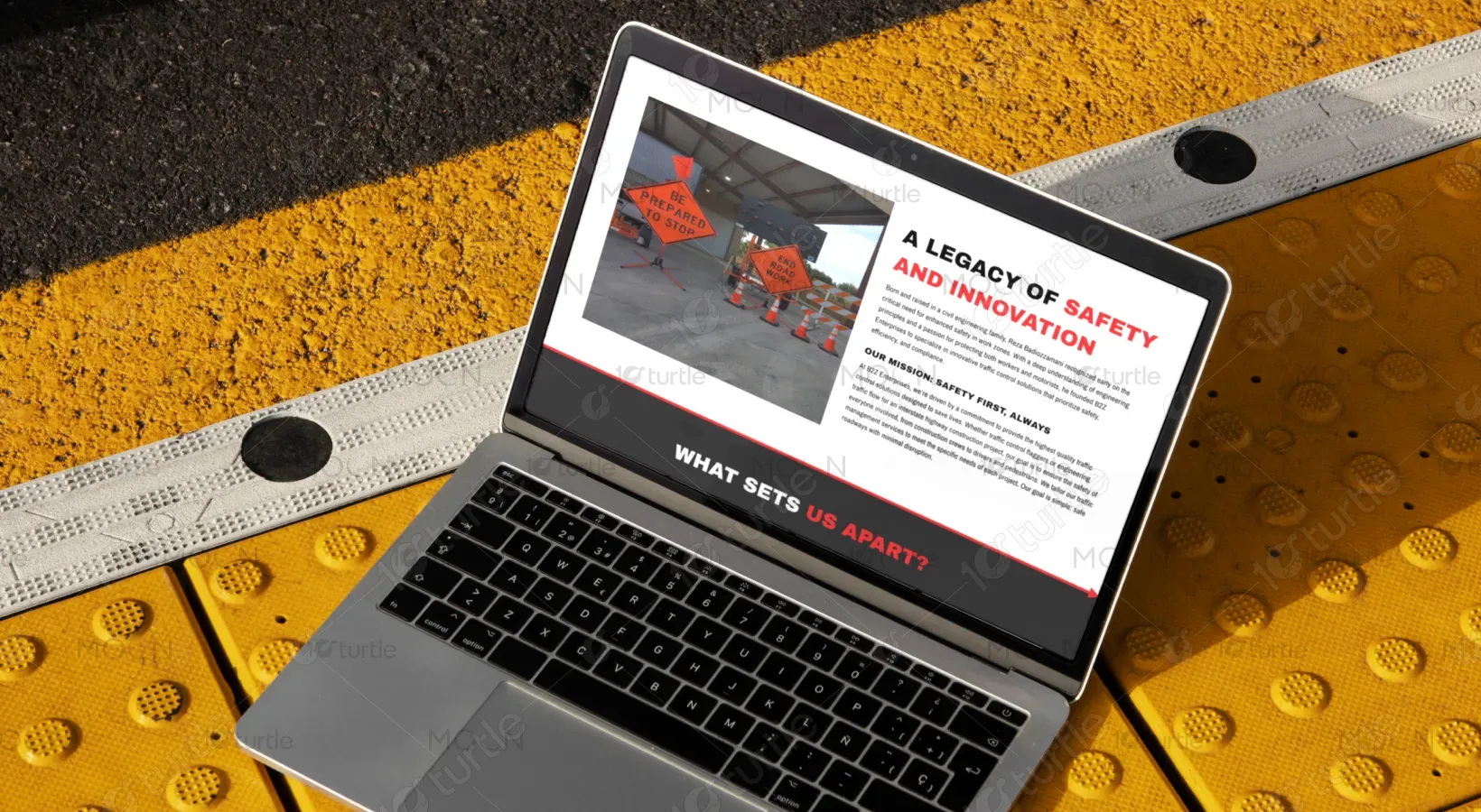
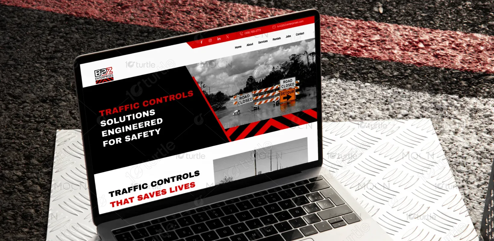
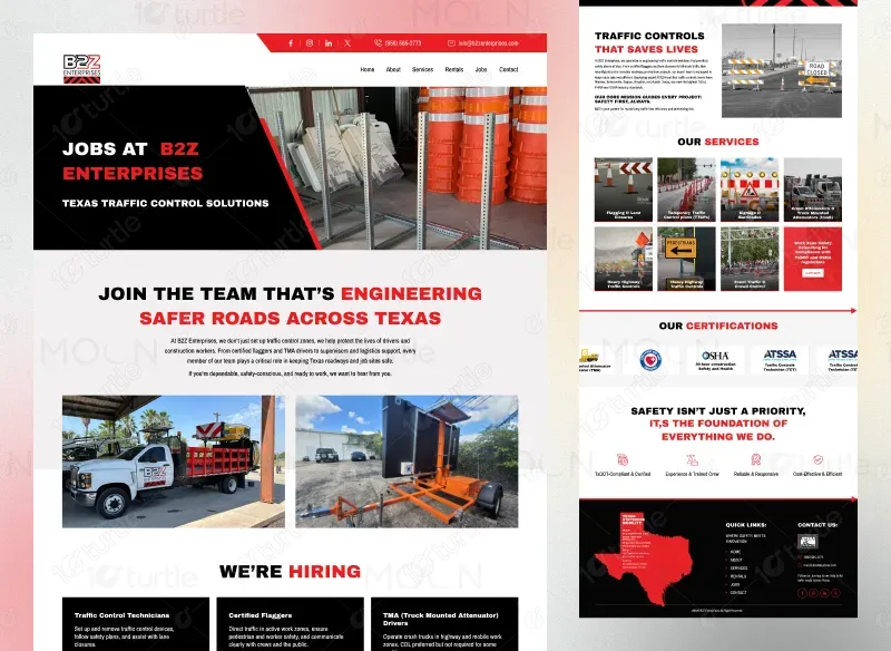
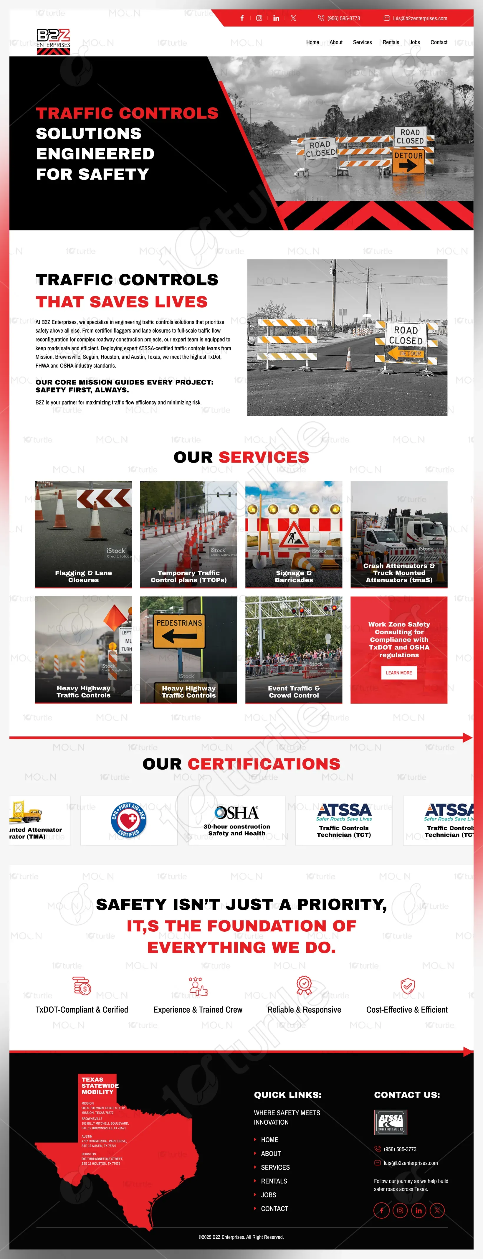
The website is designed to provide clear, user-friendly navigation with an emphasis on safety and professionalism. The visual approach integrates bold, easy-to-read typography with vibrant imagery to highlight traffic control solutions, services, and safety. The design ensures intuitive access to services, job listings, rentals, and more.
Project Focus
User Engagement
Market Research
Website Design
Industry
Property, Construction & Real Estate
Tools we used


Project Completion
2025
OVERVIEW
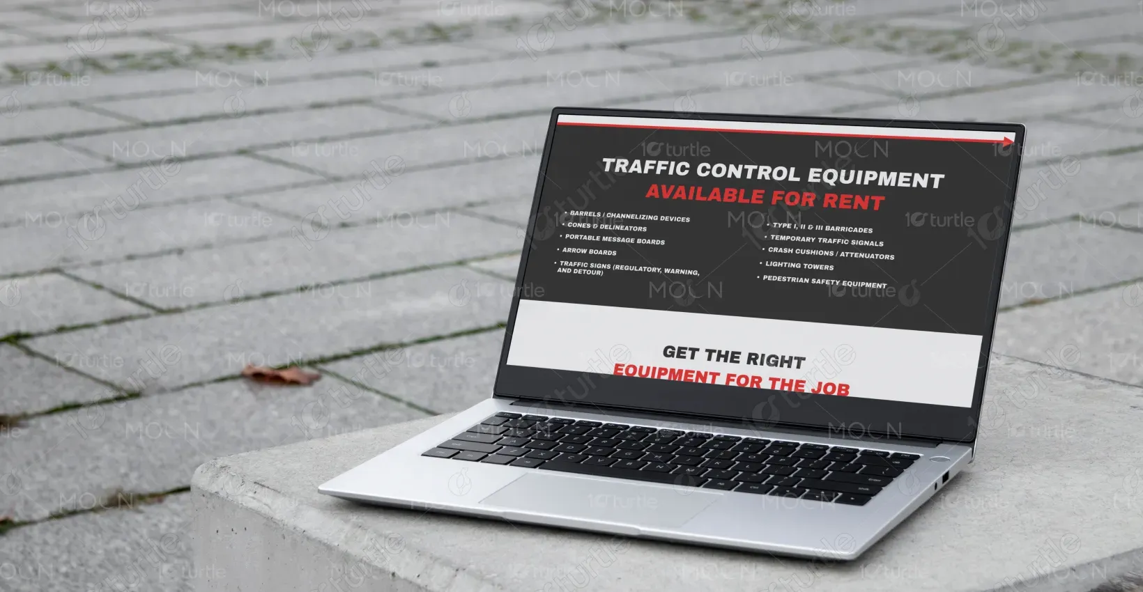
The design balances professionalism and user engagement through a straightforward layout, combining strong visuals and functional elements. It reflects the brand's focus on safety and efficiency, with clearly defined sections for services, equipment rentals, and job opportunities, ensuring easy navigation across devices.
Industry
Property, Construction & Real EstateWhat we did
User ResearchUI UX DesigningPlatform
-PROBLEM
Visitors faced difficulty navigating a cluttered layout that made it hard to find key services and information such as traffic control rentals and job opportunities.
SOLUTION
The new design features a streamlined layout with clearly defined sections, including "Services," "Rentals," and "Jobs," ensuring that users can quickly find the information they need. Simplified navigation enhances user experience across mobile and desktop platforms.
ROI
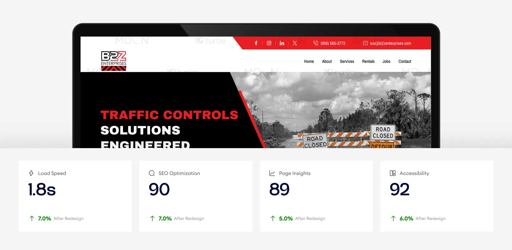
With a 1.4-second load time and strong SEO score of 90, the website ensures faster access and improved search visibility. High page insights and accessibility scores enhance usability and inclusivity. These performance upgrades create a smoother browsing experience, increase engagement, and support higher booking conversions.
CLIENT'S DESIGN VISION
How can we make our services more prominent without overwhelming visitors?
By grouping services under clearly labeled categories and using bold headings and icons, the design prioritizes visibility while keeping the layout clean. This approach directs attention to key services without creating clutter, offering users an intuitive browsing experience.
LOGO
The logo is bold, utilizing a sharp, angular design that conveys strength and professionalism, reinforcing the brand’s identity in traffic control and safety.

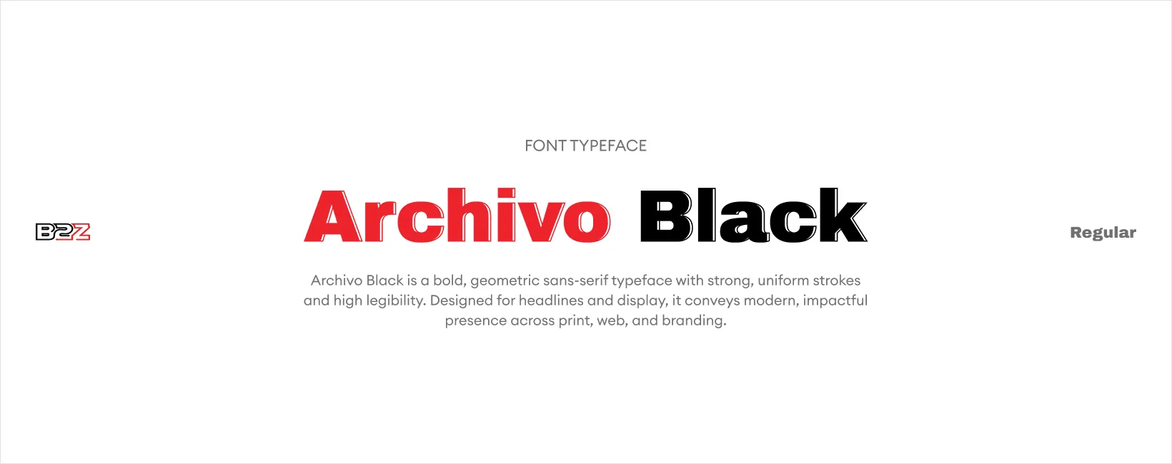
TYPOGRAPHY
Color Palette
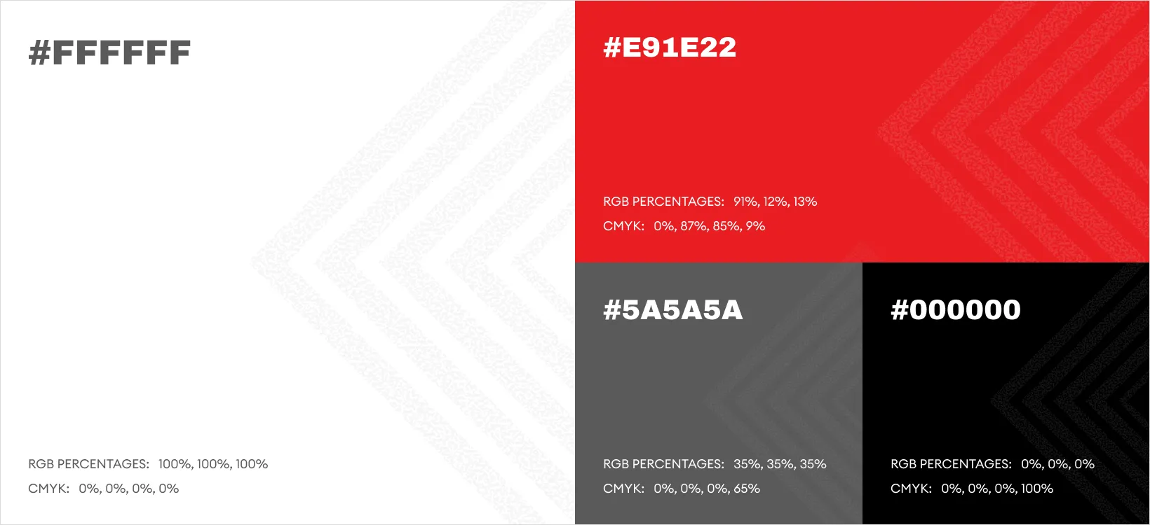
The color scheme incorporates red, black, and white, providing high contrast and ensuring visibility. Red evokes a sense of urgency, aligning with the theme of safety, while black and white balance the design with clarity and professionalism.
WIREFRAME
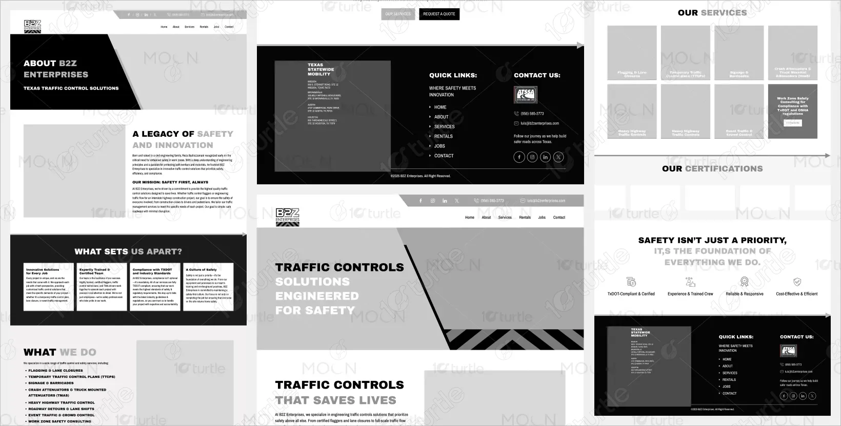
The wireframe organizes content into clear sections: navigation at the top, followed by service categories, and a call to action. Each section leads to a focused user experience without overwhelming the page, with plenty of space between elements for easy navigation.
Let’s connect