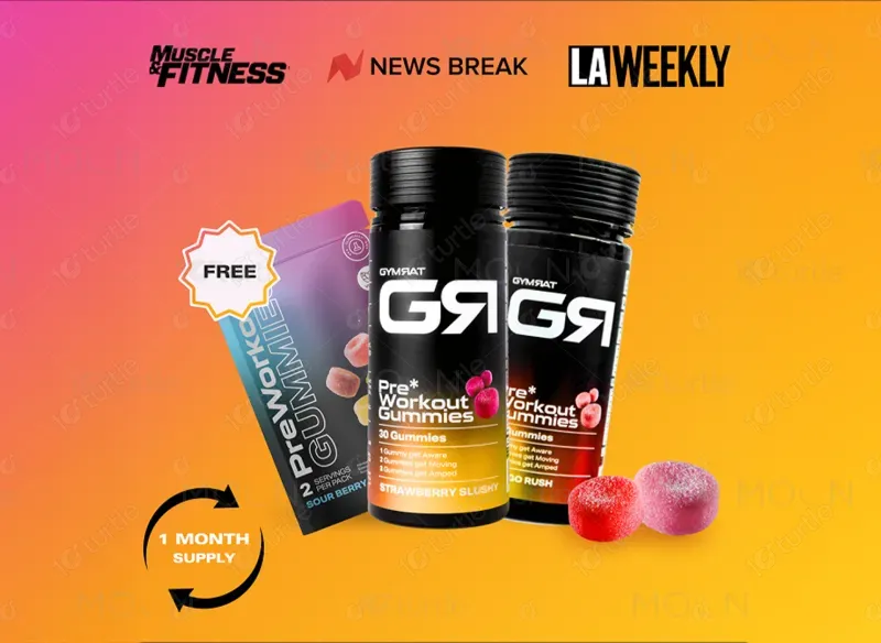
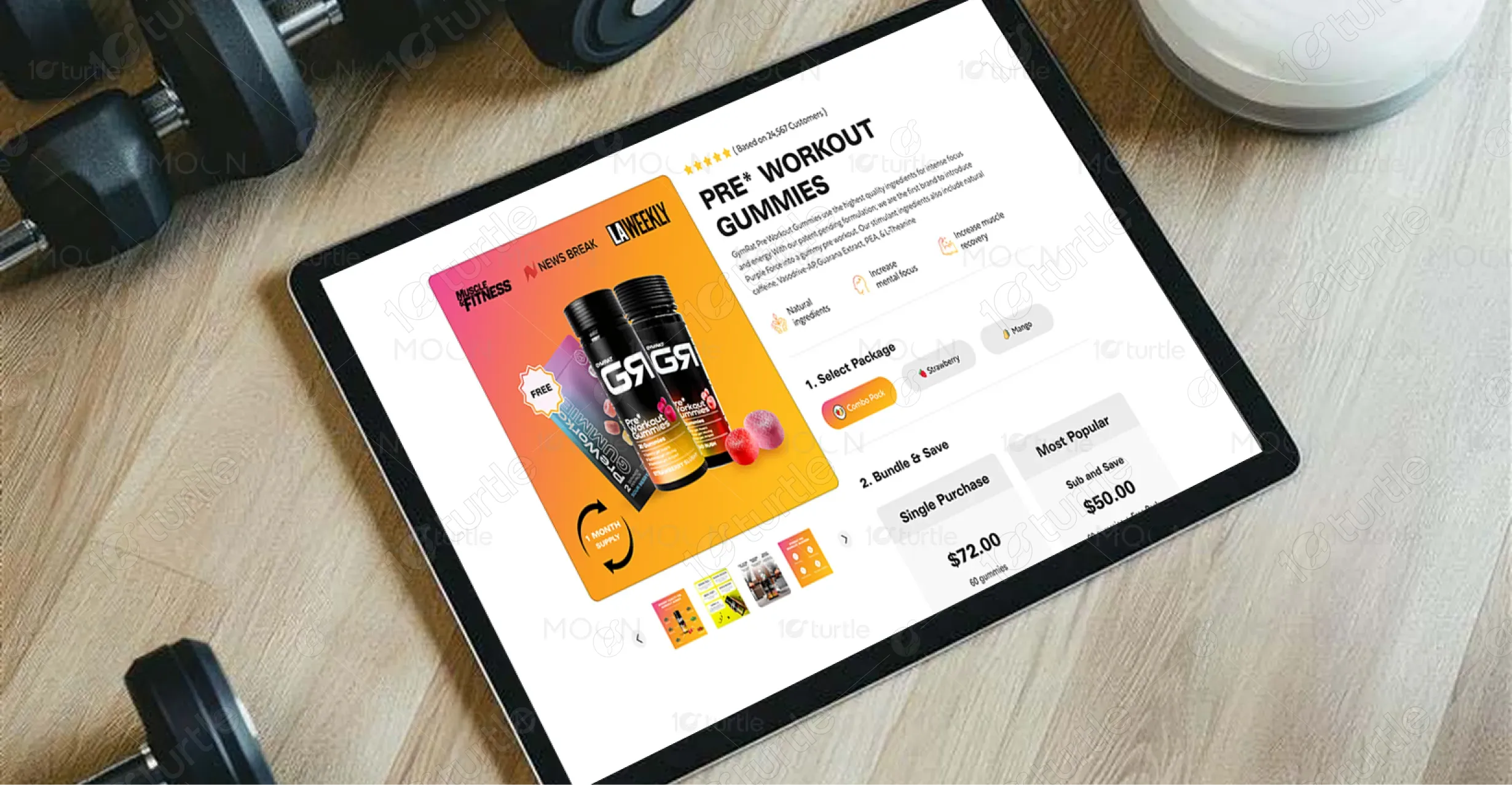
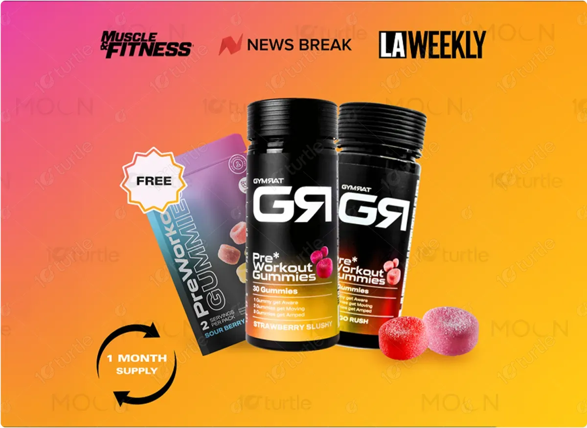
Gymrat is a performance-driven brand transforming the supplement experience. By introducing pre-workout gummies, they make fitness nutrition more convenient, effective, and enjoyable-challenging the outdated powder-based approach with bold innovation and design.
UX Design
UI Design
Research
Website Design
Industry
Consumer Goods & Retail
Tools we used

Project Completion
2024
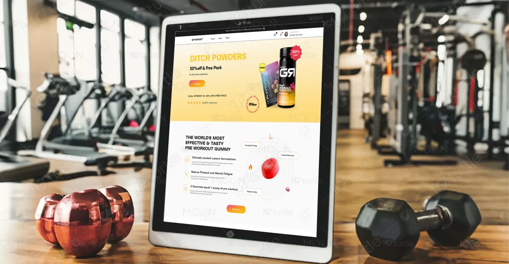
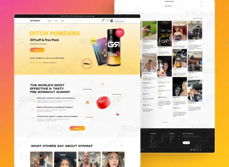
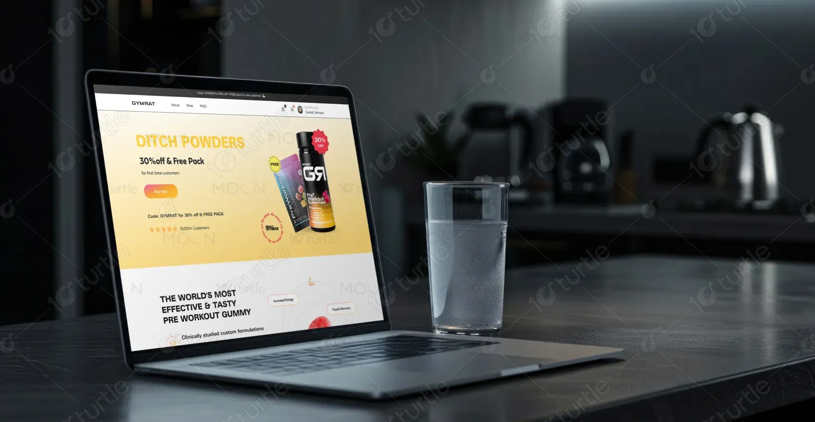
The project aimed to design a high-converting digital experience that clearly communicated the benefits of a new pre-workout gummy product. The goal was to simplify complex supplement information, highlight key differentiators from traditional powders, and create a visually engaging flow that guided visitors from curiosity to purchase with minimal friction.
Industry
Consumer Goods & RetailWhat we did
User ResearchUI UX DesigningResponsive ExperiencePlatform
-The client struggled to generate quality leads and present their product effectively. Their generic marketing failed in a competitive market. Poor SEO, weak storytelling, and limited design reduced visibility and engagement.
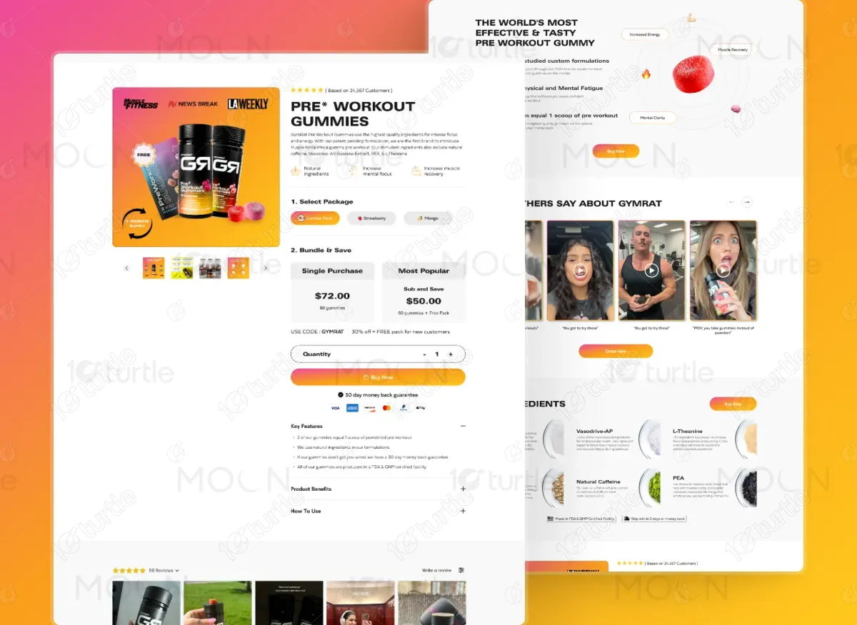
We created a user-focused design that showcased the product’s unique gummy format and addressed customer pain points. By using clear messaging, persuasive visuals, and a conversion-oriented layout, we enhanced product presentation and brand authority.
The page is optimized for fast loading and high accessibility, ensuring a smooth user experience. With strong SEO performance, it is more likely to attract organic traffic. The persuasive design elements, including customer reviews and CTAs, significantly enhance user engagement and conversion rates, improving overall sales.
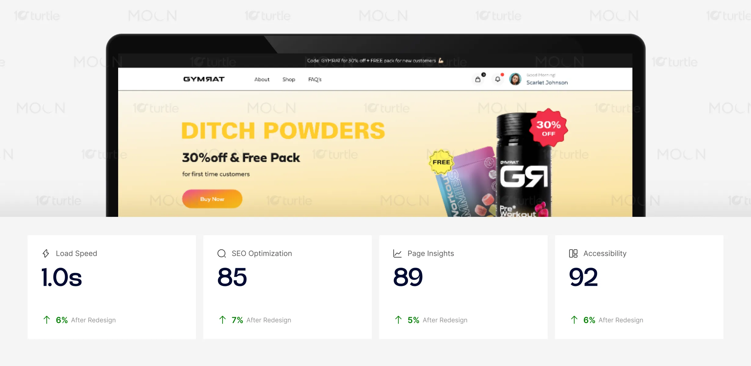
The client wanted a design that showcased their gummy product and created a seamless customer journey. They aimed to differentiate from powder competitors, highlight product benefits visually, and enhance SEO. The look should be modern, bold, and conversion-focused, combining trust elements with an energetic fitness vibe.
The logo was designed to reflect the bold and high-energy personality of the brand. Its clean typography and strong visual weight capture the essence of performance and strength, while the minimal black design ensures versatility across digital and print mediums. The simplicity of the mark allows it to adapt seamlessly, whether displayed on the website, product packaging, or promotional materials.
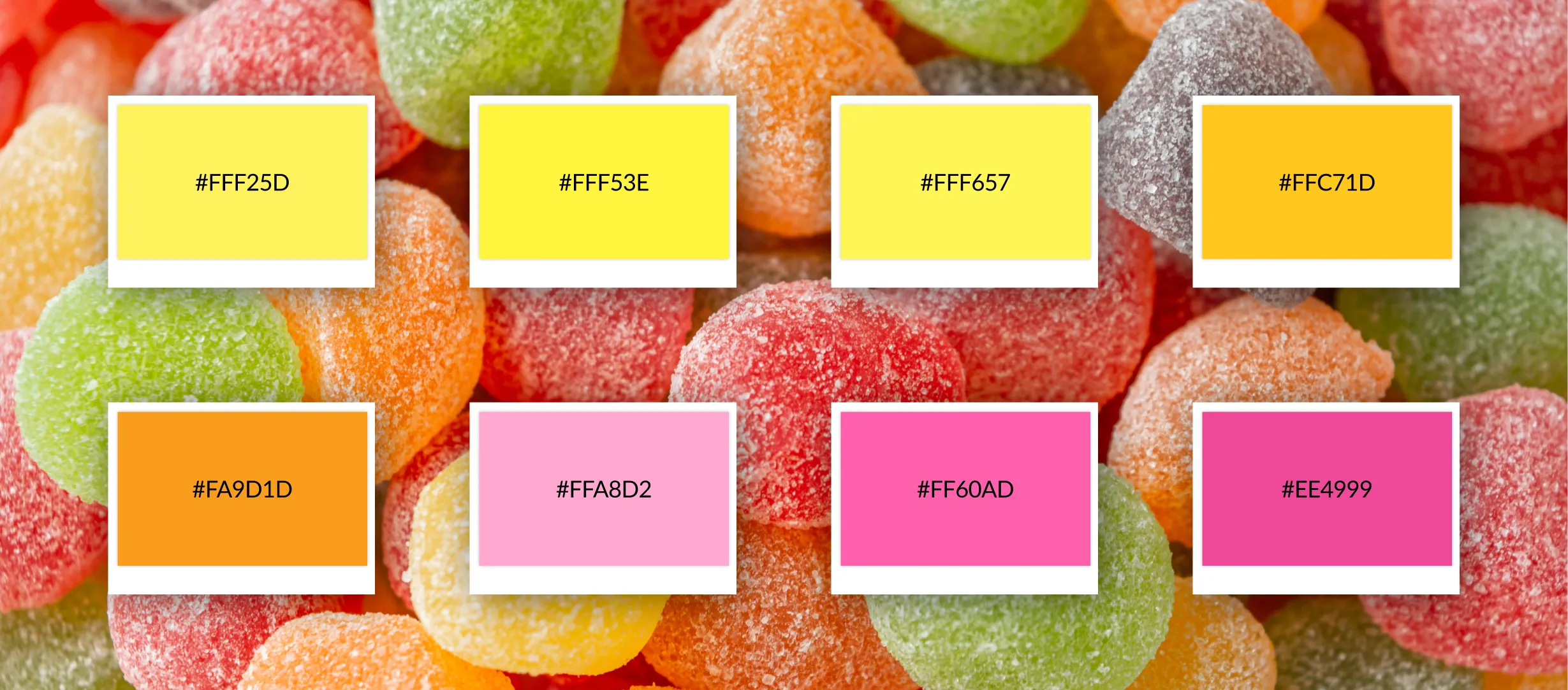
The color palette features bright, energetic tones conveying joy and creativity. Dominant shades include vivid yellows symbolizing optimism and warmth. Orange tones add enthusiasm, while pinks and purples bring vibrancy and a youthful feel. Together, these colors create a dynamic identity reflecting positivity and energy.
The wireframes were crafted to establish a clean, user-friendly layout that emphasized hierarchy and flow. Key elements such as the bold hero section, benefit highlights, testimonial placements, and call-to-action buttons were positioned to guide users naturally through the journey. This design-first approach ensured the structure was intuitive, visually balanced, and ready to scale into high-fidelity visuals.