This project focused on creating a clean, intuitive, and engaging landing page for a consulting service that helps businesses implement and optimize Smartsheet solutions. The goal was to reflect expertise, build trust quickly, and guide users toward taking action.
UX Design
UI Design
Research
Websites Design
Industry
Professional & B2B Services
Tools we used

Project Completion
2024
The client needed a high-converting landing page that communicates their Smartsheet expertise while staying approachable and easy to navigate. They wanted to simplify complex service offerings, show credibility, and motivate users to get in touch or start a project.
Industry
Professional & B2B ServicesWhat we did
User ResearchUI UX DesigningResponsive ExperiencePlatform
-Smartsheet services are highly valuable, but often misunderstood by potential clients due to technical jargon and vague service positioning. The original presence lacked clarity, structure, and emotional appeal—resulting in missed opportunities for engagement and conversions.
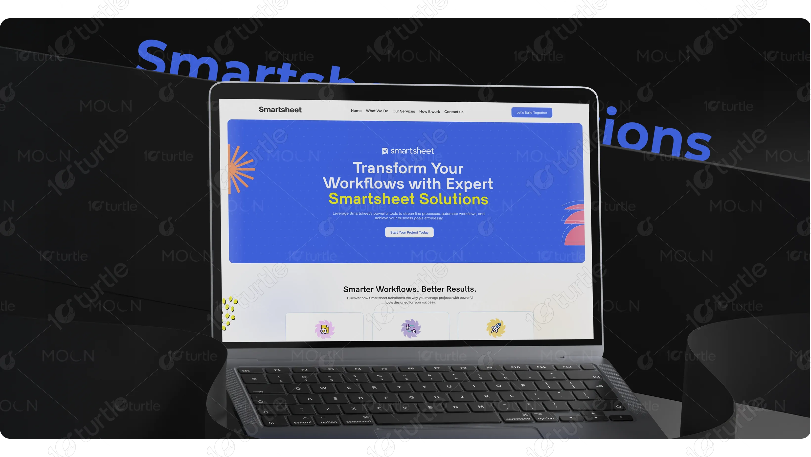
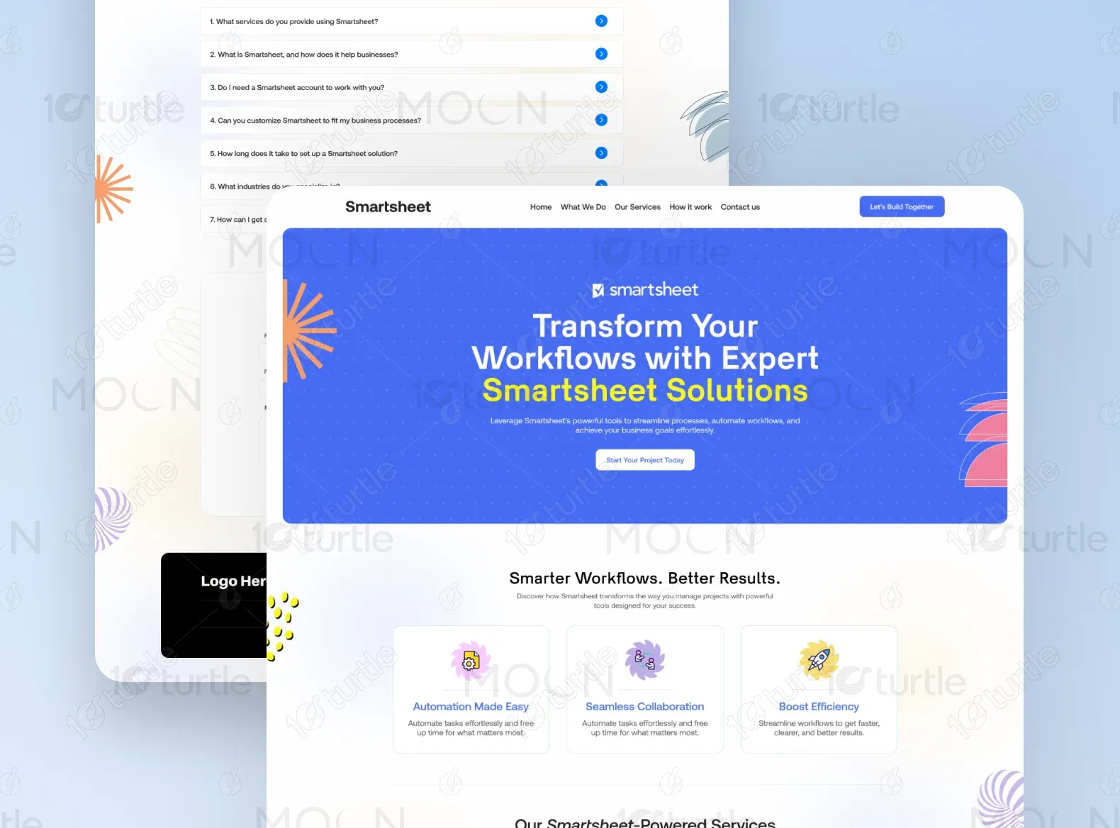
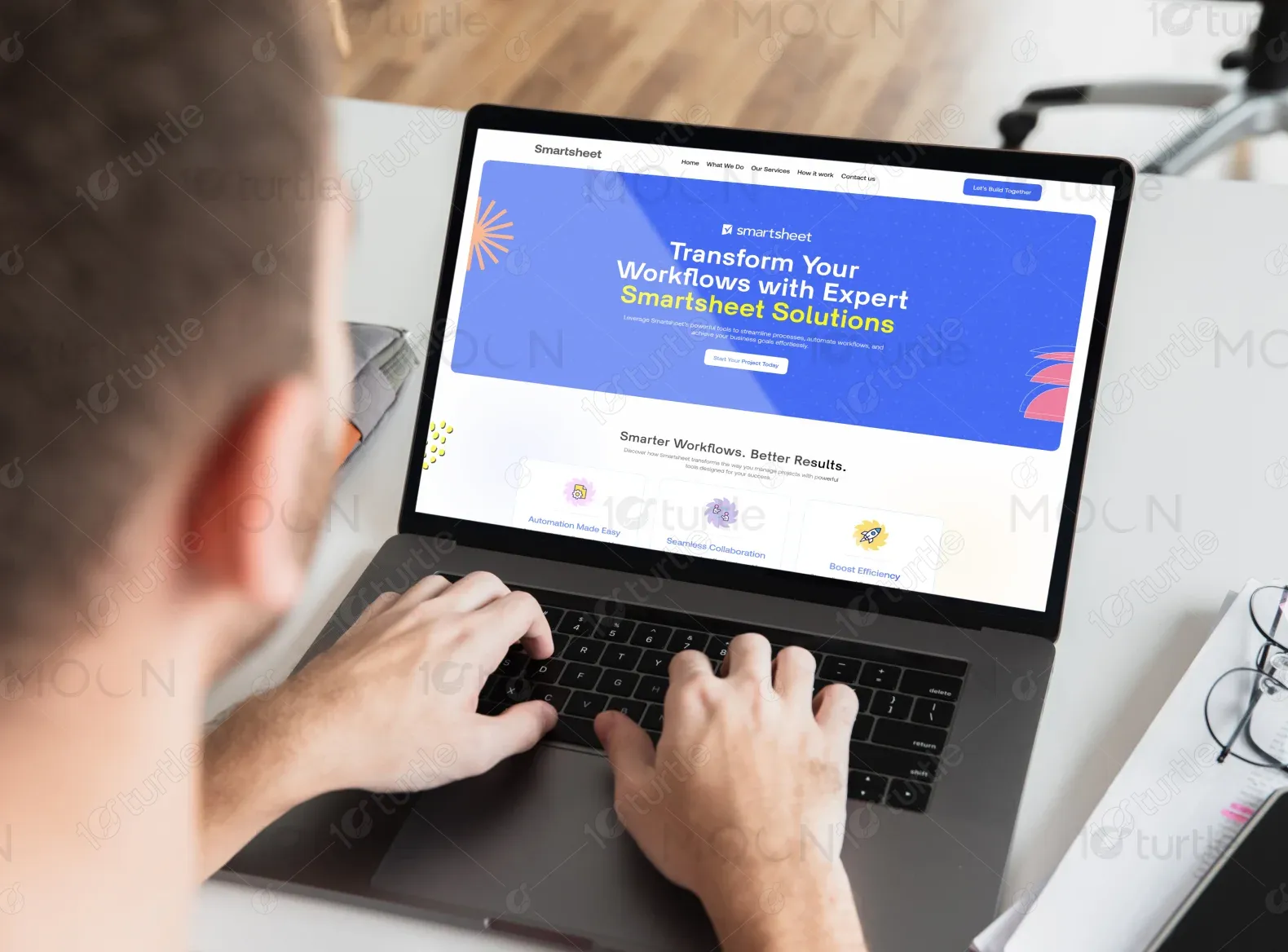
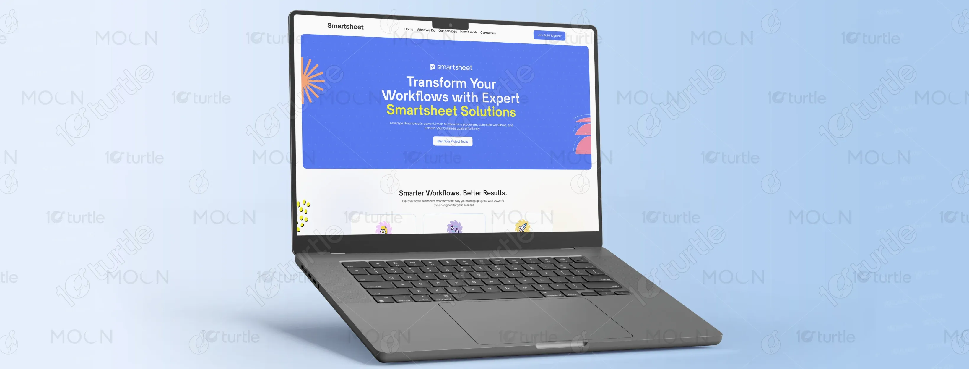
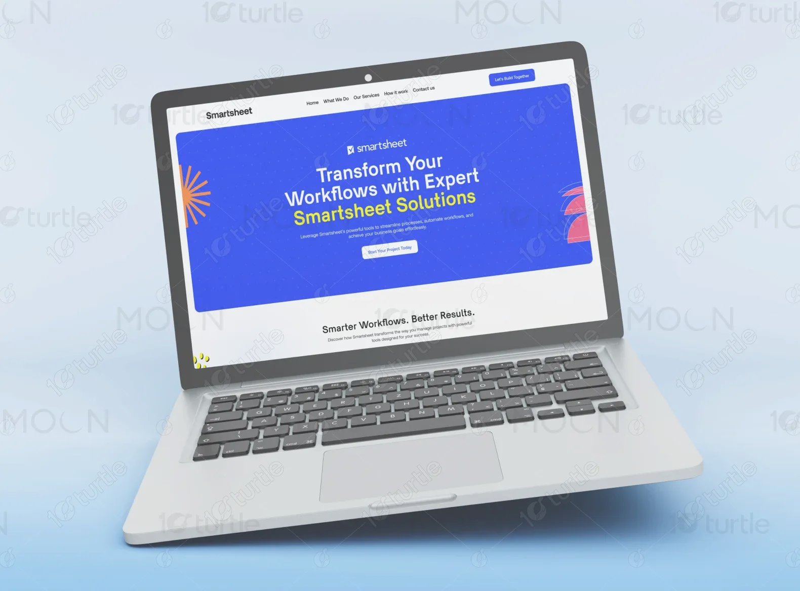
We designed a modern, scroll-driven landing page with clearly segmented sections that walk users through what the brand offers, how it works, and why they should trust it. From vibrant icons to FAQs and a direct contact form, every element was crafted to reduce friction and encourage interaction. We focused on a calm yet confident tone, clear service categories, and simplified Smartsheet concepts into digestible bites of information. The result is a highly scannable, conversion-friendly page.

The client requested a clean and modern design with light, professional colors and a sense of innovation. They emphasized the need for clarity, accessibility, and a polished brand presence that still felt human and warm. They were inspired by SaaS websites like Asana and Notion for their soft aesthetic and clear UX.

The logo represents simplicity and efficiency, aligning with the brand’s mission of providing streamlined workflow solutions. It features a modern and minimalistic design, reinforcing a sense of professionalism and trust.

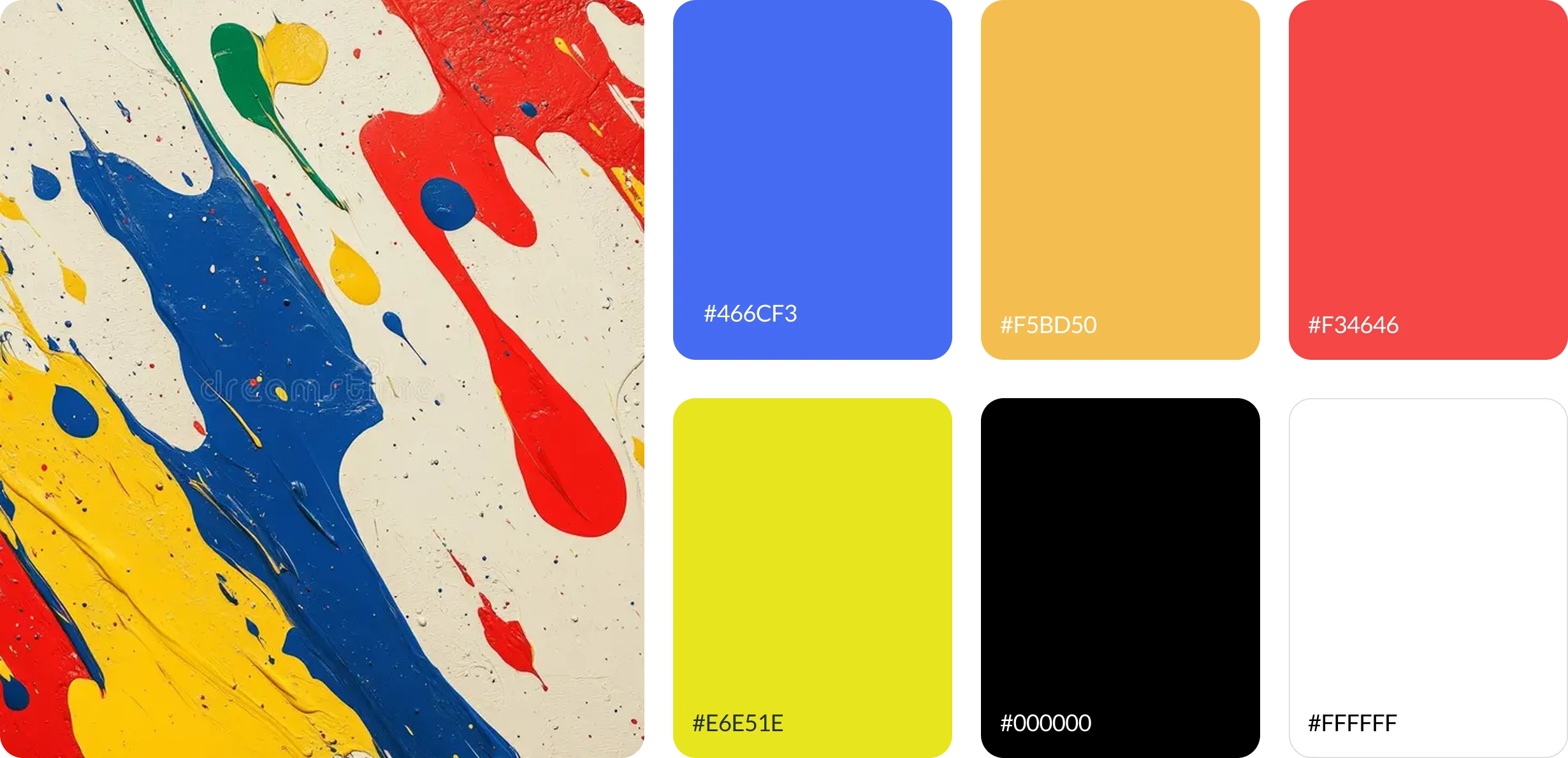
The color palette was carefully curated to reflect the brand’s identity. The primary colors include blue, symbolizing trust and reliability, with accents of white and light gray to maintain a clean and modern look. These colors were chosen to create a sense of professionalism and innovation while ensuring readability and accessibility.
The initial wireframe focused on creating a structured layout that emphasized clear navigation and user engagement. The design ensured that key information was easily accessible, with intuitive placement of service sections, testimonials, and call-to-action buttons. Wireframes served as the foundation for refining the website’s usability and overall flow.