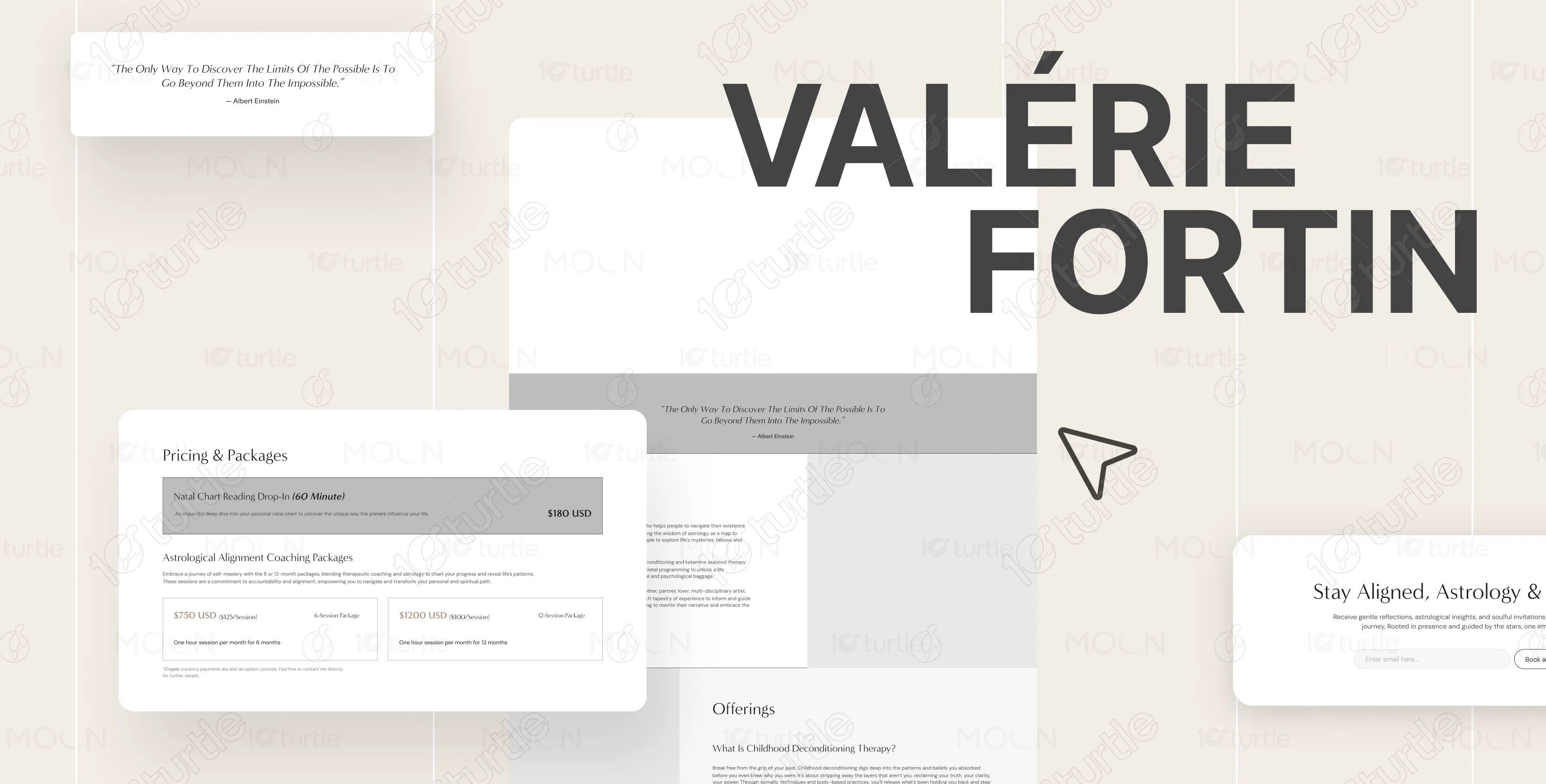
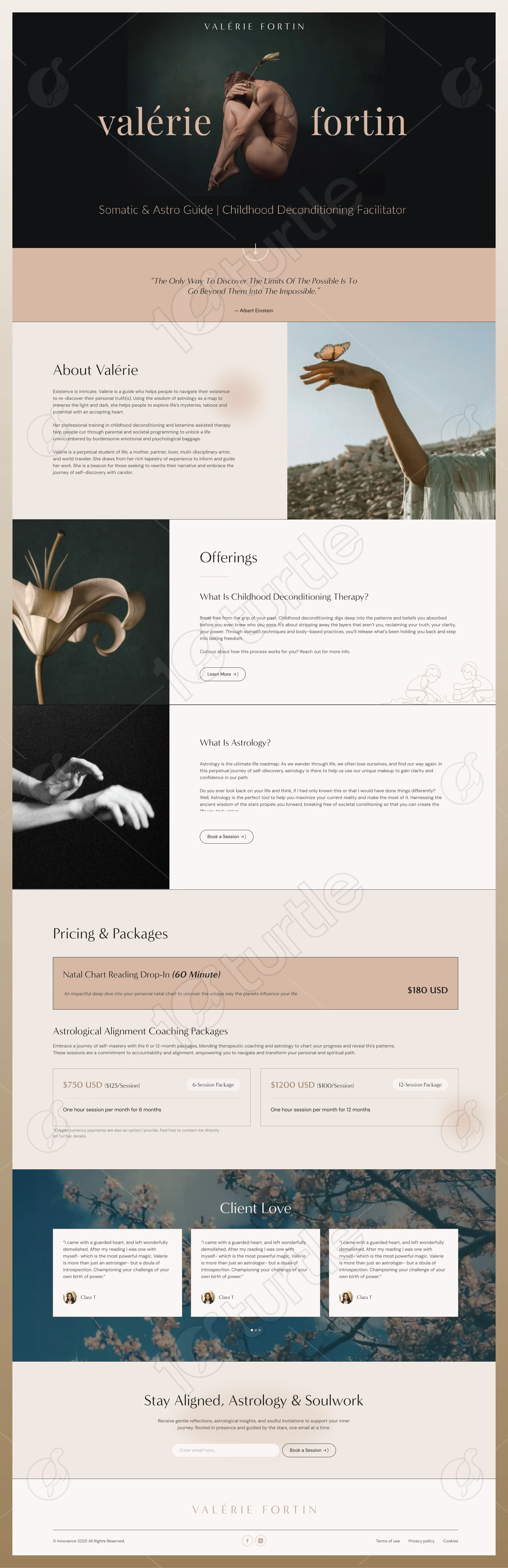
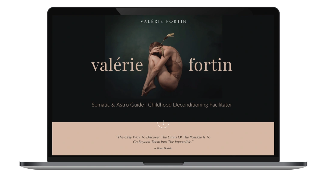
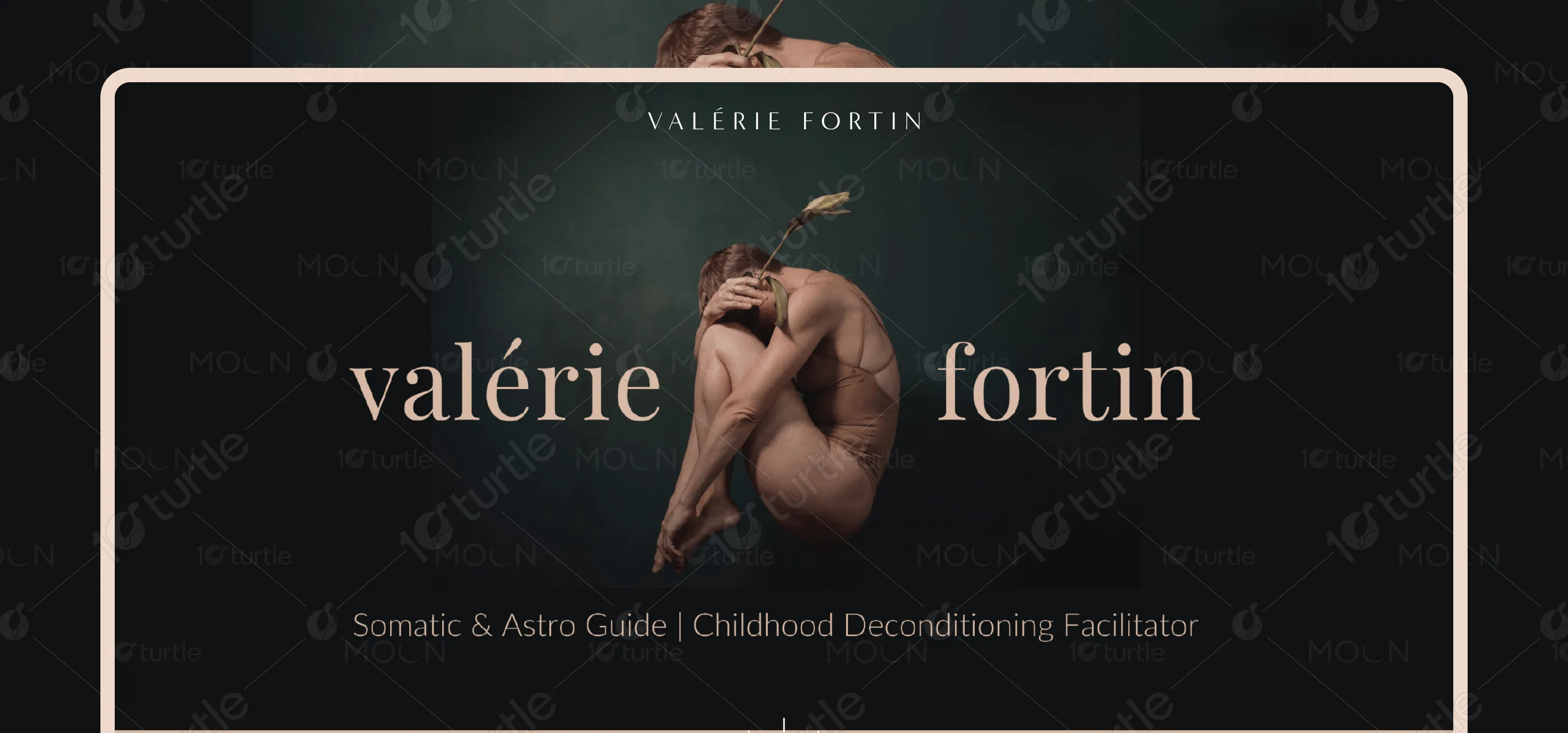
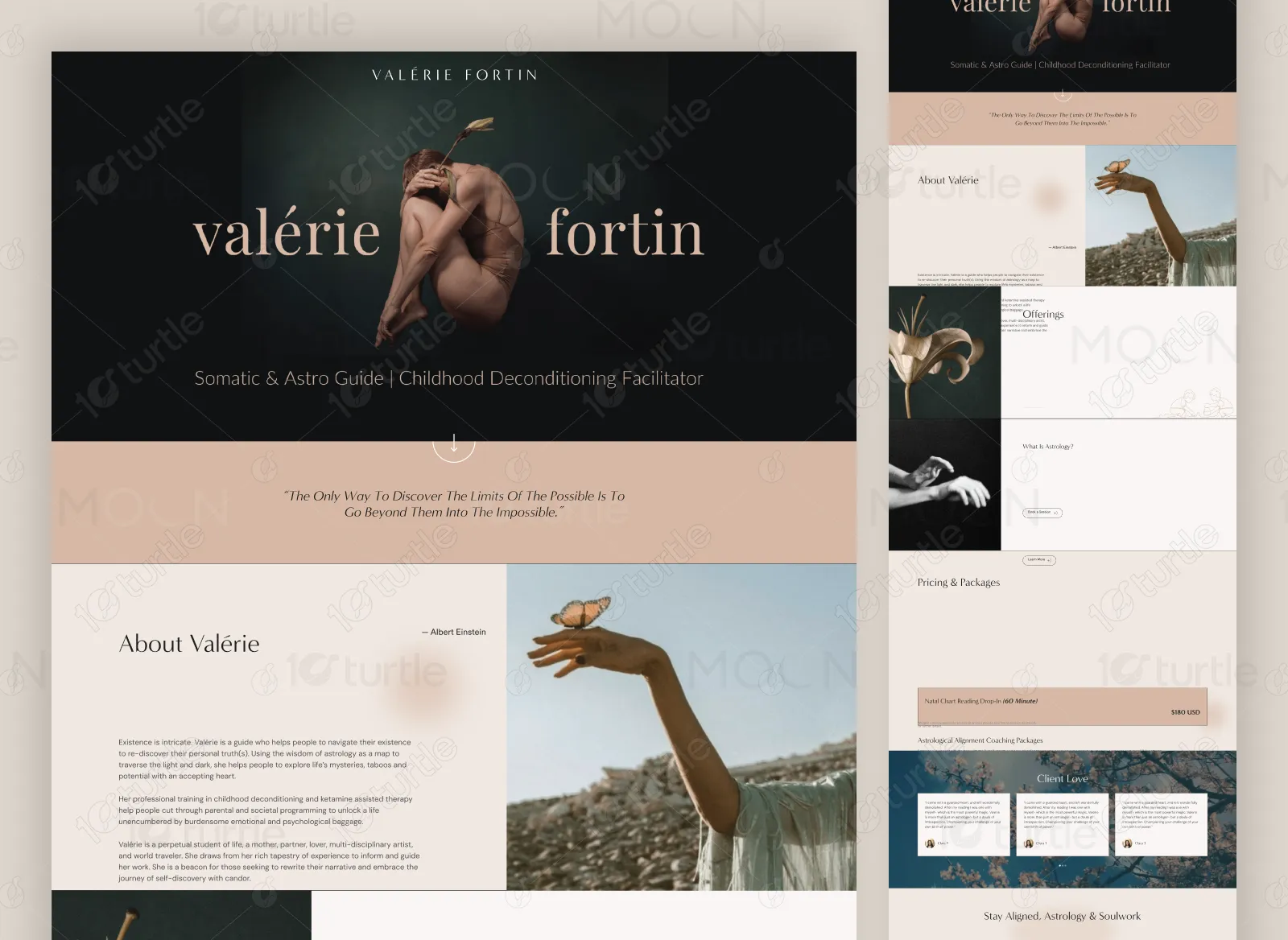
The Valérie Fortin website is a serene, editorial-style personal brand platform that blends storytelling with service clarity. The layout combines soft neutral tones, artistic imagery, and refined typography to create an emotionally resonant experience. Each section flows intentionally - from introduction to offerings, pricing, testimonials, and booking—guiding visitors through a journey of trust and alignment.
Conversion Optimization
UX Strategy
Ul Design
Brand Identity
Industry
Healthcare & Wellness
Tools we used

Project Completion
2025
Key Market
Wellness
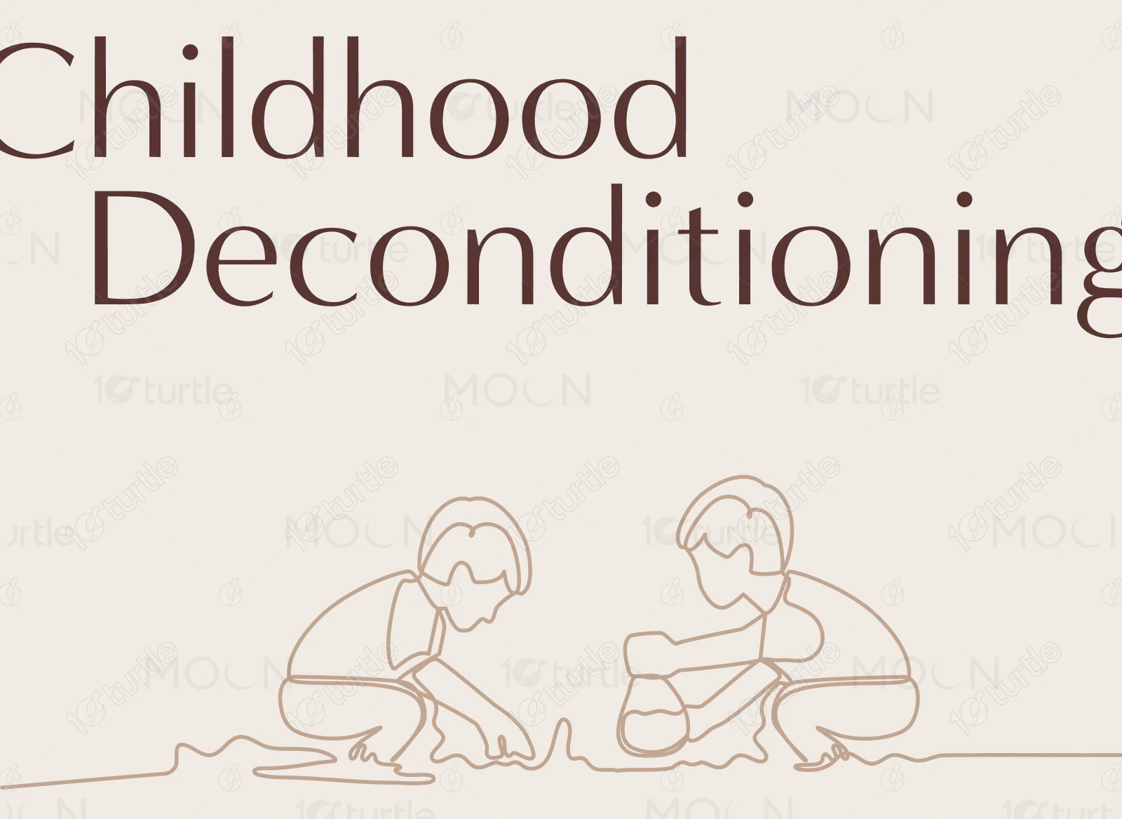
Valérie Fortin is a Somatic & Astro Guide and Childhood Deconditioning Facilitator who helps individuals reconnect with their authentic selves through therapy, astrology, and soul-led guidance. The objective of this project was to design a deeply immersive and calming website that reflects her spiritual philosophy while creating clarity around her services, offerings, and booking experience.
Industry
Healthcare & WellnessWhat we did
UX/UI DesignBrandingPlatform
-The main challenge was translating deeply personal and spiritual services into a structured, easy-to-navigate digital experience. Topics such as childhood deconditioning therapy and astrology require emotional safety, clarity, and trust. The website needed to communicate depth without overwhelming visitors with heavy language or dense content.
The final website delivers a harmonious balance between spirituality and structure. A powerful hero section introduces Valérie’s identity with refined typography and atmospheric imagery. The “About” section builds trust through storytelling, while the “Offerings” section clearly explains her services in approachable language.

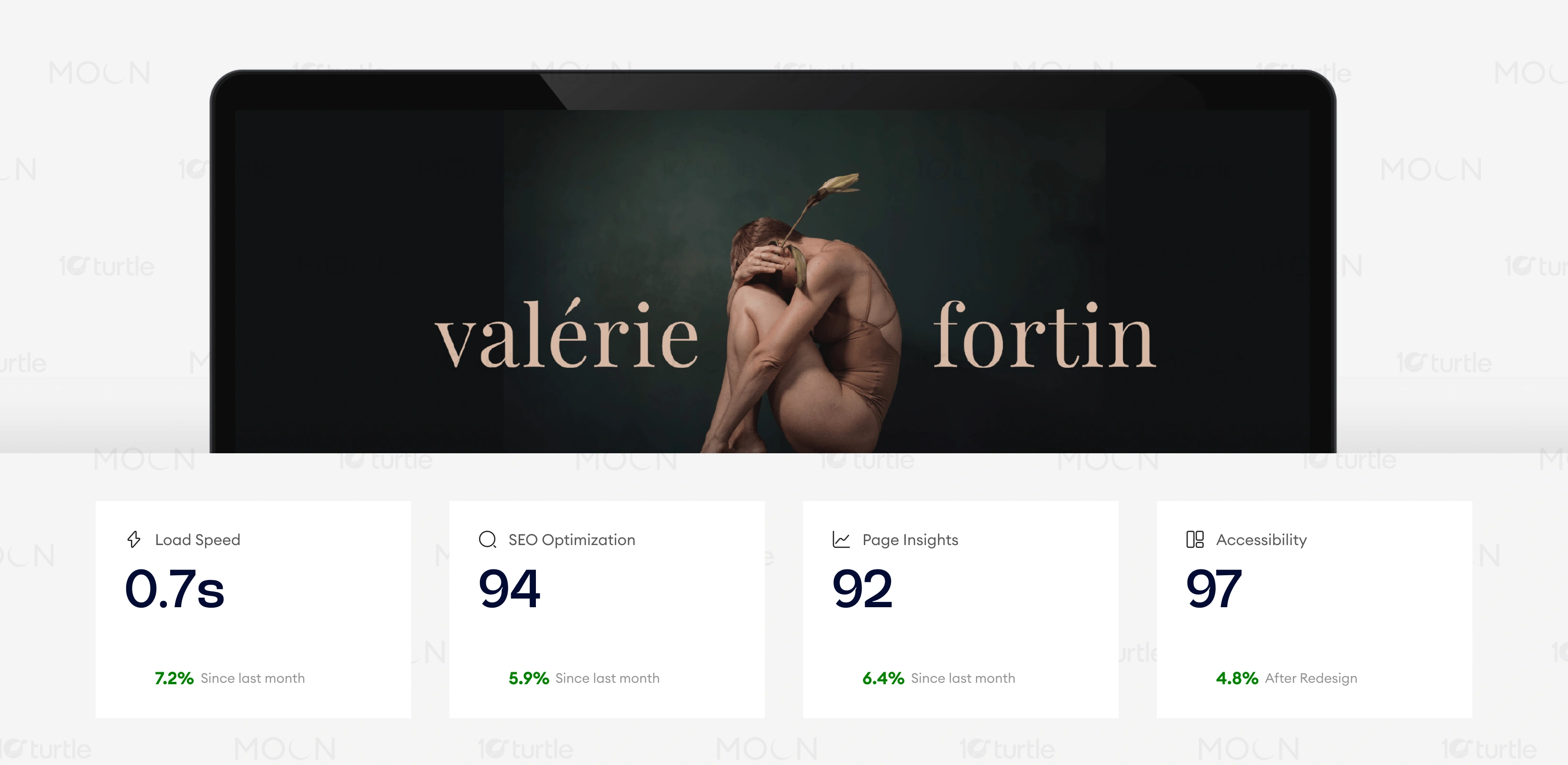
The redesigned Valérie Fortin website was built not only as a visual transformation, but as a strategic growth tool. By clarifying services, structuring pricing transparently, and creating an emotionally safe digital environment, the platform significantly improved user trust and booking intent.
The client envisioned a website that felt like stepping into a calm, sacred space—intimate, elegant, and transformative. It needed to reflect her dual expertise in somatics and astrology while positioning her as both a guide and facilitator of inner evolution.
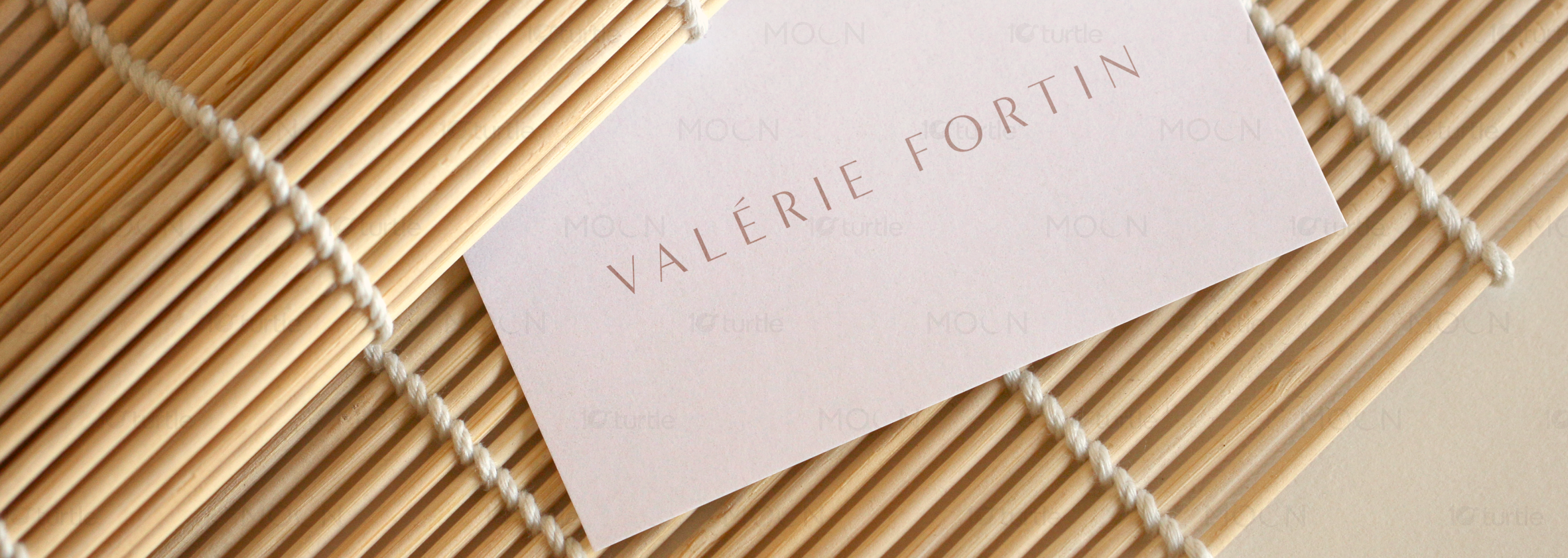
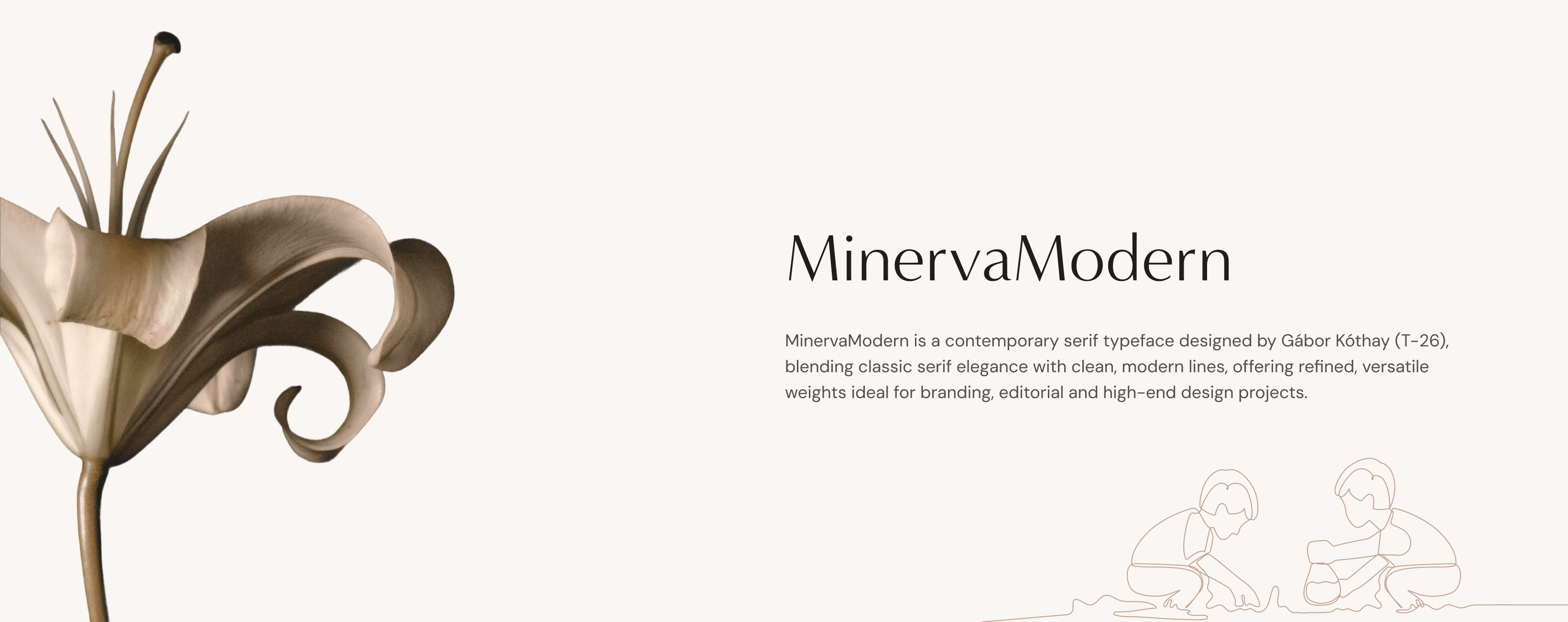
The Valérie Fortin logo is elegant and minimal, relying on refined typography rather than graphic complexity. The wordmark emphasizes sophistication and personal identity, aligning with the brand’s intimate and guide-led nature. Its simplicity ensures versatility across hero sections, footers, and digital touchpoints while maintaining a premium presence.
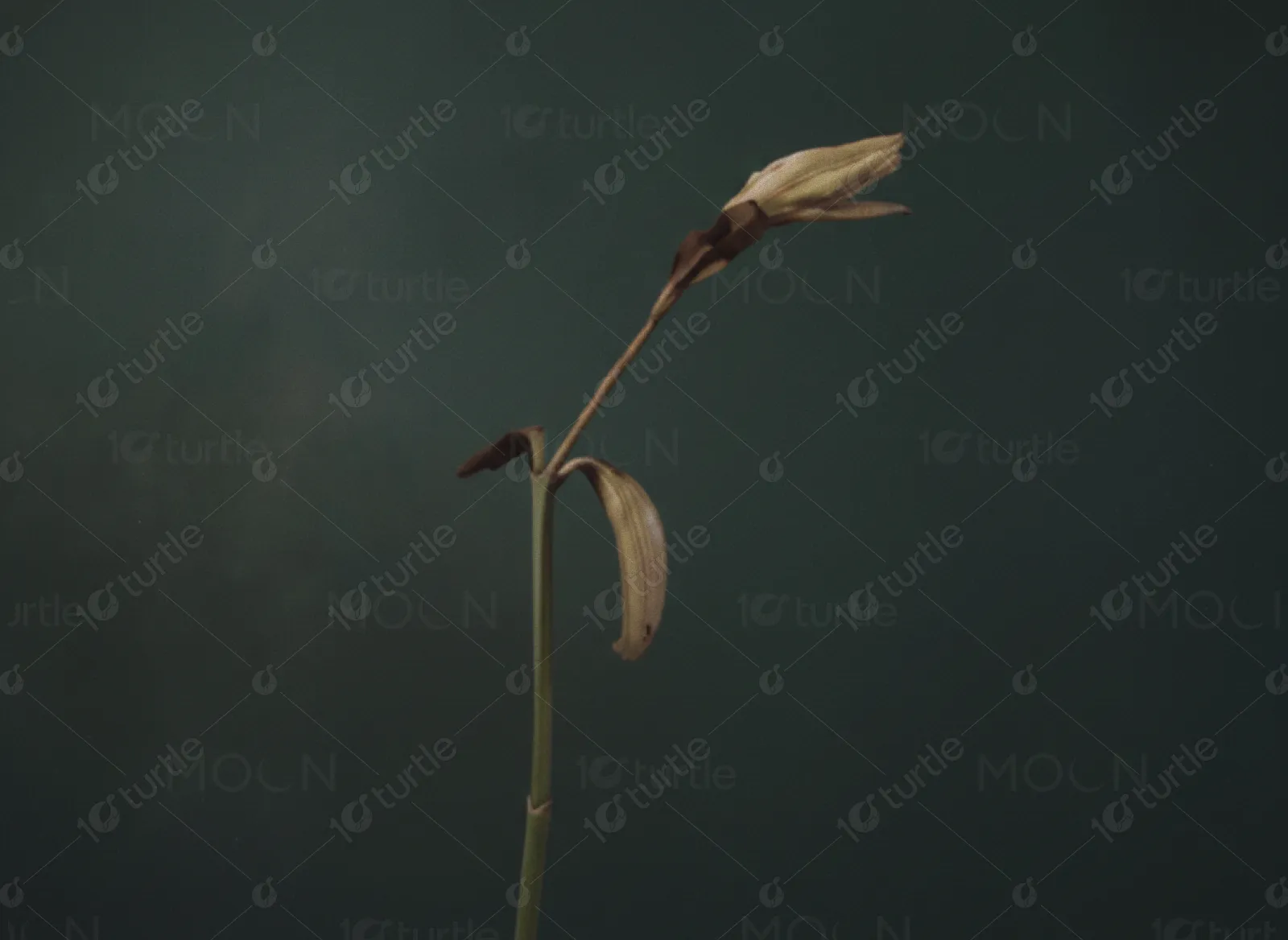
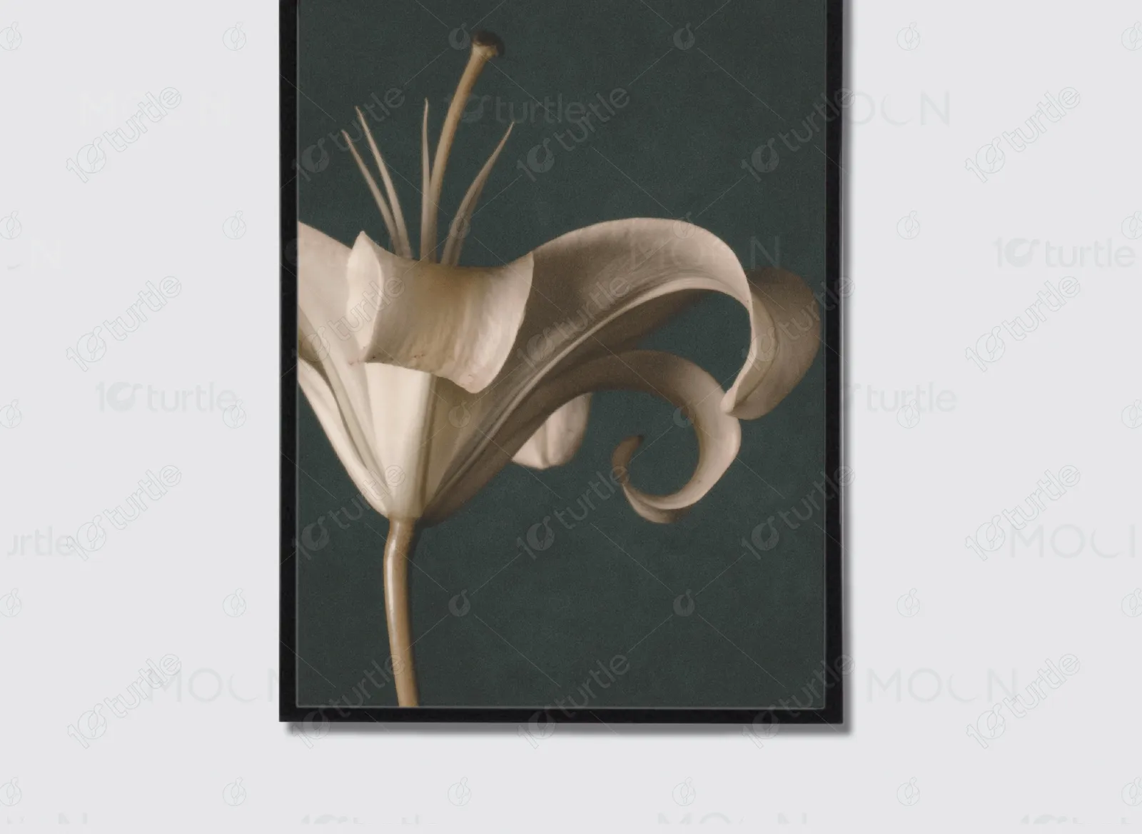
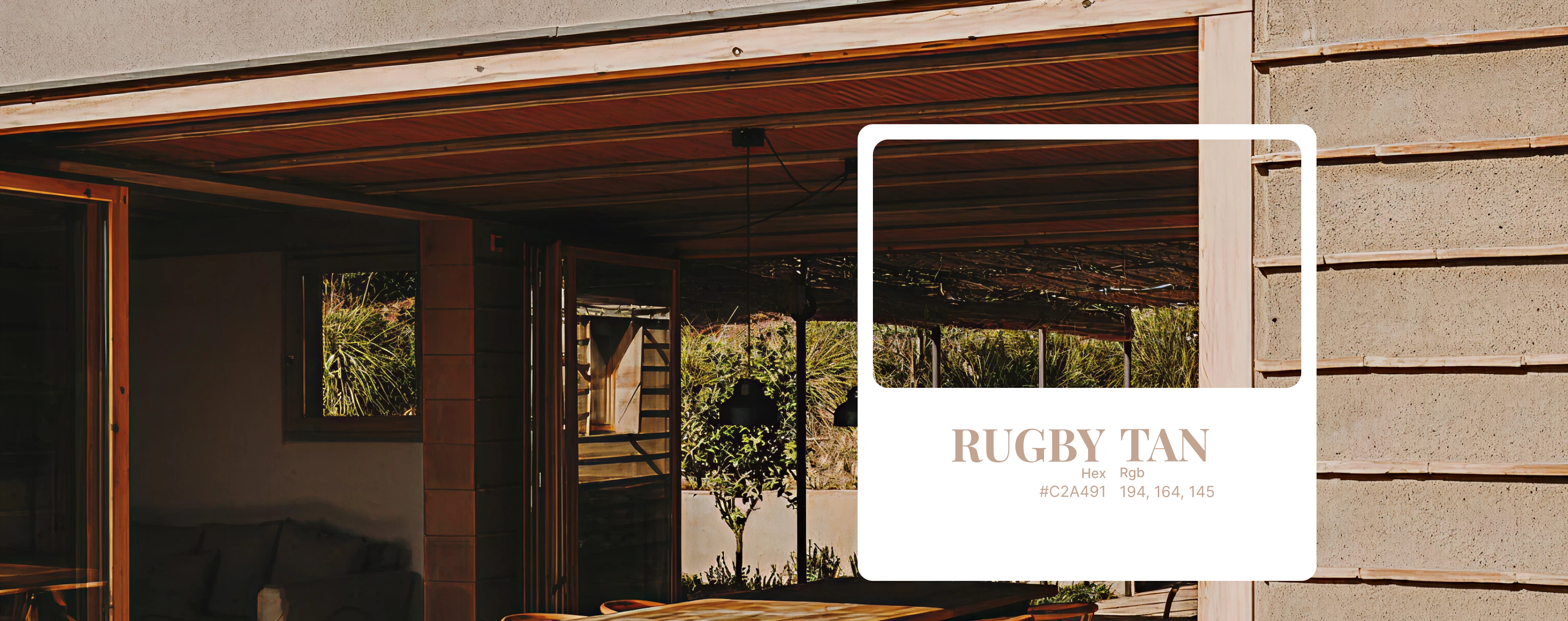
The primary color is a deep muted forest green (#1E2A28), used in hero backgrounds to create depth and grounding. This is balanced with warm beige tones such as (#D6C2B2) and (#C9A78F), which introduce softness and approachability.
The wireframing phase focused on building a calm, intentional content structure before introducing visual styling. Given the emotional depth of Valérie’s services, the layout needed to feel spacious, intuitive, and gently guided rather than transactional.